鸿蒙 ArkTS 布局精讲(二):align + Alignment —— 一行代码实现子组件精确对齐
1. 开篇:布局对齐的"最后一公里"
1.1 布局对齐的困境
在鸿蒙原生 ArkTS 开发中,布局对齐是一个看似简单实则暗藏玄机的话题。几乎所有 UI 界面都离不开对齐操作:按钮要居中、角标要贴右上角、徽章要放在左下角、弹窗要悬浮在正中央……这些"最后一公里"的微调,往往决定了 UI 的精致程度。
在 ArkTS 中,实现对齐有多种方式,各自适用于不同的场景:
| 对齐方式 | 适用容器 | 控制维度 | 代码复杂度 |
|---|---|---|---|
align + Alignment |
Stack | 二维(水平+垂直同时) | 极简——一行代码 |
alignItems |
Column / Row | 一维(交叉轴) | 简单 |
justifyContent |
Column / Row / Flex | 一维(主轴) | 简单 |
position + markAnchor |
Stack / 任何父容器 | 二维(任意精确位置) | 中等 |
textAlign |
Text | 文字水平方向 | 极简 |
其中,align + Alignment 是 ArkTS 中最简洁、最直观的二维对齐方案。它只需要一行代码 .align(Alignment.Center),就能将子组件定位到容器的 9 个固定位置之一。
1.2 设计哲学:约定优于配置
Alignment 枚举的设计思路体现了 ArkTS "约定优于配置"的哲学。它预先定义了 9 个最常用的对齐位置,覆盖了几乎所有"把组件放在容器的某个角/边/中心"的需求场景。开发者不需要记忆坐标百分比、不需要手动计算偏移量,只需从 9 个命名中挑选一个即可。
这种方式类似于 CSS Grid 中的 place-items 属性,但比其更简洁——ArkTS 用一个枚举值同时表达了水平和垂直两个方向的对齐意图。
1.3 与其他平台的对应对照
为了让有跨平台经验的读者快速理解,下面列出其他 UI 框架中与 ArkTS Alignment 对应的概念:
| ArkTS Alignment | CSS(Flex/Grid) | Android(Gravity) | iOS(Auto Layout) |
|---|---|---|---|
TopStart |
align-items: flex-start; justify-content: flex-start |
Gravity.TOP | Gravity.START |
约束到左上角 |
Top |
align-items: flex-start; justify-content: center |
Gravity.TOP | Gravity.CENTER_HORIZONTAL |
约束到上中 |
TopEnd |
align-items: flex-start; justify-content: flex-end |
Gravity.TOP | Gravity.END |
约束到右上角 |
Center |
align-items: center; justify-content: center |
Gravity.CENTER |
约束到中心 |
这种"概念映射"可以帮助有经验的开发者快速上手,但 ArkTS 通过枚举值将复杂的二维约束简化为一个名词,这种抽象层级高于传统框架。
2. Alignment 枚举全面解读
2.1 枚举值的组织逻辑
Alignment 枚举的 9 个值遵循矩阵式组织:3 个水平方向 × 3 个垂直方向 = 9 种组合。
垂直方向(3 级):
Top— 顶部对齐Center— 垂直居中(枚举值中省略 Vertical 前缀)Bottom— 底部对齐
水平方向(3 级):
Start— 起始端对齐(在 LTR 布局中为左侧)Center— 水平居中(枚举值中省略 Horizontal 前缀)End— 结束端对齐(在 LTR 布局中为右侧)
组合命名规则:
Alignment.[垂直方向][水平方向]
例如:
Alignment.TopStart= 垂直上 + 水平左Alignment.BottomEnd= 垂直下 + 水平右- 当垂直或水平方向是 Center 时,省略该段:
Alignment.Center= 垂直居中 + 水平居中Alignment.Top= 垂直上 + 水平居中Alignment.Start= 垂直居中 + 水平左
2.2 完整的 9 种位置速查表
┌─────────────────────┬─────────────────────┬─────────────────────┐
│                     │                     │                     │
│   Alignment.        │   Alignment.        │   Alignment.        │
│   TopStart          │   Top               │   TopEnd            │
│   (左上)            │   (上居中)          │   (右上)            │
│                     │                     │                     │
├─────────────────────┼─────────────────────┼─────────────────────┤
│                     │                     │                     │
│   Alignment.        │   Alignment.        │   Alignment.        │
│   Start             │   Center            │   End               │
│   (左居中)          │   (正中心)          │   (右居中)          │
│                     │                     │                     │
├─────────────────────┼─────────────────────┼─────────────────────┤
│                     │                     │                     │
│   Alignment.        │   Alignment.        │   Alignment.        │
│   BottomStart       │   Bottom            │   BottomEnd         │
│   (左下)            │   (下居中)          │   (右下)            │
│                     │                     │                     │
└─────────────────────┴─────────────────────┴─────────────────────┘
2.3 枚举在 ArkTS 中的实现猜想
虽然 Alignment 是框架内置类型,但我们可以推测其大致实现。在 ArkTS 的运行时层面,Alignment 枚举本质上是一个封装了水平和垂直对齐意向的数据结构:
// 以下是 Alignment 枚举在框架内部的简化示意(非实际源码)
enum Alignment {
  // 每个值背后其实对应了一个 (horizontalAlign, verticalAlign) 的二元组
  TopStart    = 0,  // → HorizontalAlign.Start  + VerticalAlign.Top
  Top         = 1,  // → HorizontalAlign.Center + VerticalAlign.Top
  TopEnd      = 2,  // → HorizontalAlign.End    + VerticalAlign.Top
  Start       = 3,  // → HorizontalAlign.Start  + VerticalAlign.Center
  Center      = 4,  // → HorizontalAlign.Center + VerticalAlign.Center
  End         = 5,  // → HorizontalAlign.End    + VerticalAlign.Center
  BottomStart = 6,  // → HorizontalAlign.Start  + VerticalAlign.Bottom
  Bottom      = 7,  // → HorizontalAlign.Center + VerticalAlign.Bottom
  BottomEnd   = 8,  // → HorizontalAlign.End    + VerticalAlign.Bottom
}
这种设计使得一个 Alignment 值能同时携带水平和垂直两个维度的对齐信息,这正是它"一行代码实现二维对齐"的底层基础。
3. align 属性的使用场景与语法
3.1 基本语法
Stack() {
  Text('Hello')
    .fontSize(16)
}
.width(200).height(200)
// ★ 子组件 Stack 中的对齐方式
Text() 的子组件并没有直接调用 .align()
实际上,在 ArkTS 中,.align() 是组件自身的属性
// 正确用法:
Stack() {
  Column() {
    Text('Hello')
  }
  .width(60).height(40)
  .align(Alignment.Center)  // ★ 此 Column 在 Stack 中对齐到正中心
}
align 属性可以出现在哪些组件上?
在 ArkTS 中,align 属性适用于所有组件,但它的效果取决于父容器的类型:
| 父容器类型 | align 的效果 |
|---|---|
| Stack | 子组件在 Stack 的堆叠区域中对齐(最常用) |
| Column | 子组件在 Column 的范围内水平对齐(类似 alignItems) |
| Row | 子组件在 Row 的范围内垂直对齐(类似 alignItems) |
| Flex | 子组件在交叉轴上的对齐(类似 alignItems) |
| Grid(单项) | GridItem 在网格单元格内的对齐 |
其中,Stack + align 是最经典、最常用的组合。
3.2 与 alignItems 的区别
很多初学者会混淆 align 和 alignItems。它们的核心区别在于:
align:子组件对齐(子组件说了算,我要在父组件中对齐到哪里)
alignItems:父容器对齐方式(父容器说了算,所有子组件在我里面怎么对齐)
代码对比:
// 方式 1:使用 align(子组件主动对齐)
Stack() {
  Column() { Text('A') }.align(Alignment.TopStart)   // A 在左上
  Column() { Text('B') }.align(Alignment.BottomEnd)  // B 在右下
}

// 方式 2:使用 alignItems(父容器统一对齐)
Column() {
  Text('X')
  Text('Y')
}
.alignItems(HorizontalAlign.Center)  // X 和 Y 都水平居中
关键区别在于:
align是组件的自身属性,每个子组件可以设置不同的对齐alignItems是父容器的属性,统一作用在所有子组件上
3.3 多个子组件的对齐
当 Stack 中有多个子组件时,每个子组件可以独立设置自己的 align:
Stack() {
  // 背景
  Column().width('100%').height('100%').backgroundColor('#333')

  // 左上角标签
  Text('左上').align(Alignment.TopStart)

  // 中心主体
  Column() {
    Text('主内容').fontSize(20)
  }
  .width(120).height(80).backgroundColor('#FF6B6B')
  .align(Alignment.Center)

  // 右下角按钮
  Column() { Text('✕') }
  .width(32).height(32).backgroundColor('#FF0000')
  .align(Alignment.BottomEnd)
}
在这个例子中,3 个子组件通过各自 align 的设置,分别定位到了 Stack 的不同位置——这种灵活性是 alignItems 无法实现的。
4. 完整代码:交互式对齐演示应用
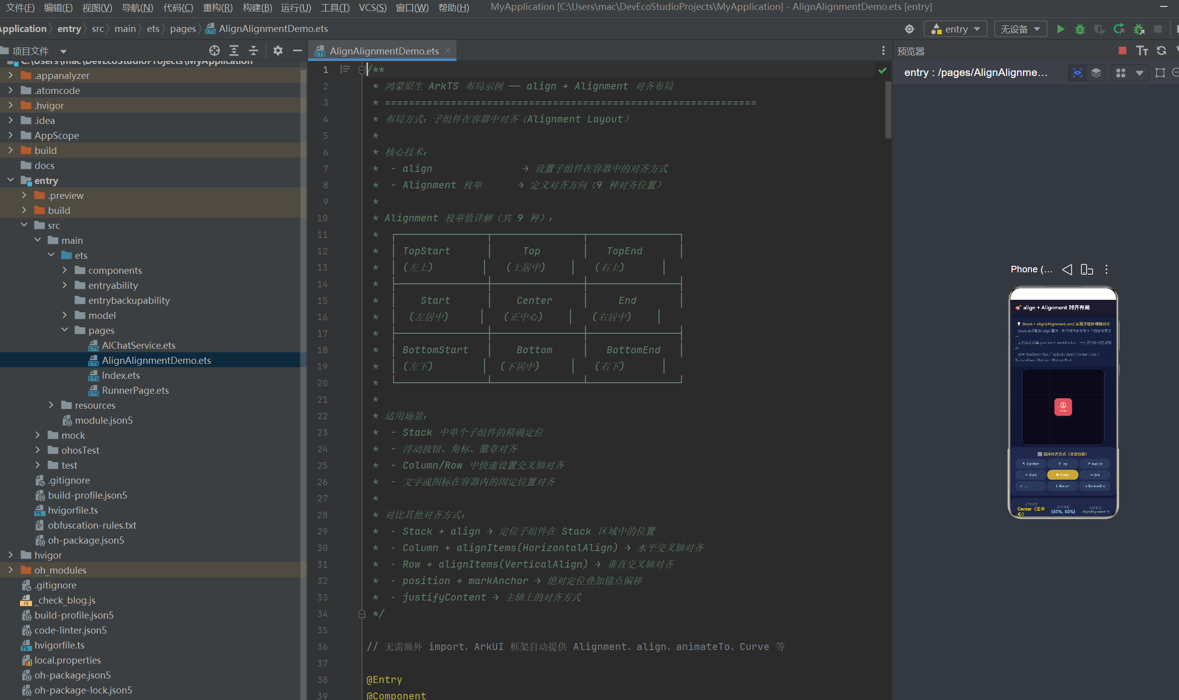
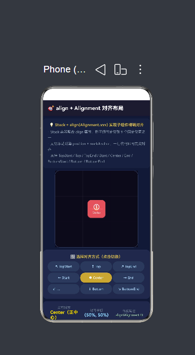
以下是一个完整的 ArkTS 页面,它通过交互式方式直观展示了 align + Alignment 的 9 种对齐效果。用户点击不同对齐按钮时,红色方块会平滑移动到对应的对齐位置,同时显示当前对齐名称、坐标和代码写法。
/**
 * 鸿蒙原生 ArkTS 布局示例 —— align + Alignment 对齐布局
 * ==============================================================
 * 布局方式:子组件在容器中对齐(Alignment Layout)
 *
 * 核心技术:
 *  - align               → 设置子组件在容器中的对齐方式
 *  - Alignment 枚举      → 定义对齐方向(9 种对齐位置)
 *
 * Alignment 枚举值详解(共 9 种):
 *  ┌───────────────┬───────────────┬───────────────┐
 *  │ TopStart      │     Top       │   TopEnd      │
 *  │ (左上)        │   (上居中)    │   (右上)      │
 *  ├───────────────┼───────────────┼───────────────┤
 *  │    Start      │    Center     │     End       │
 *  │  (左居中)     │   (正中心)    │   (右居中)    │
 *  ├───────────────┼───────────────┼───────────────┤
 *  │ BottomStart   │    Bottom     │   BottomEnd   │
 *  │ (左下)        │  (下居中)     │   (右下)      │
 *  └───────────────┴───────────────┴───────────────┘
 *
 * 适用场景:
 *  - Stack 中单个子组件的精确定位
 *  - 浮动按钮、角标、徽章对齐
 *  - Column/Row 中快速设置交叉轴对齐
 *  - 文字或图标在容器内的固定位置对齐
 *
 * 对比其他对齐方式:
 *  · Stack + align → 定位子组件在 Stack 区域中的位置
 *  · Column + alignItems(HorizontalAlign) → 水平交叉轴对齐
 *  · Row + alignItems(VerticalAlign) → 垂直交叉轴对齐
 *  · position + markAnchor → 绝对定位叠加锚点偏移
 *  · justifyContent → 主轴上的对齐方式
 */

// 无需额外 import,ArkUI 框架自动提供 Alignment、align、animateTo、Curve 等

@Entry
@Component
struct AlignAlignmentDemo {
  // —— 状态变量 ——
  @State currentAlignment: Alignment = Alignment.Center;  // 当前选中的对齐方式
  @State containerWidth: number = 280;                     // 容器宽度(px)
  @State containerHeight: number = 260;                    // 容器高度(px)
  @State showGrid: boolean = true;                         // 是否显示网格辅助线
  @State animating: boolean = false;                       // 是否播放动画
  @State childSize: number = 60;                           // 子组件尺寸

  /** 获取当前 Alignment 的中文名称 */
  getAlignmentName(align: Alignment): string {
    if (align === Alignment.TopStart) return 'TopStart(左上)';
    if (align === Alignment.Top) return 'Top(上居中)';
    if (align === Alignment.TopEnd) return 'TopEnd(右上)';
    if (align === Alignment.Start) return 'Start(左居中)';
    if (align === Alignment.Center) return 'Center(正中心)';
    if (align === Alignment.End) return 'End(右居中)';
    if (align === Alignment.BottomStart) return 'BottomStart(左下)';
    if (align === Alignment.Bottom) return 'Bottom(下居中)';
    if (align === Alignment.BottomEnd) return 'BottomEnd(右下)';
    return 'Center';
  }

  /** 获取 Alignment 的坐标描述 */
  getAlignmentCoord(align: Alignment): string {
    const map: Record<string, string> = {
      'TopStart': '(0%, 0%)',
      'Top': '(50%, 0%)',
      'TopEnd': '(100%, 0%)',
      'Start': '(0%, 50%)',
      'Center': '(50%, 50%)',
      'End': '(100%, 50%)',
      'BottomStart': '(0%, 100%)',
      'Bottom': '(50%, 100%)',
      'BottomEnd': '(100%, 100%)',
    };
    return map[align] || '(50%, 50%)';
  }

  // ==================================================
  // build():UI 构建入口
  // ==================================================
  build() {
    Column() {
      // ======== 标题栏 ========
      Row() {
        Text('🎯 align + Alignment 对齐布局')
          .fontSize(18).fontWeight(FontWeight.Bold).fontColor('#FFFFFF').layoutWeight(1)
      }
      .width('100%').height(54)
      .backgroundColor('#1A1A2E').padding({ left: 16, right: 16 })
      .alignItems(VerticalAlign.Center)

      // ======== 布局说明 ========
      Column() {
        Text('💡 Stack + align(Alignment.xxx) 实现子组件精确对齐')
          .fontSize(13).fontWeight(FontWeight.Bold).fontColor('#C9A84C')
        Text(
          '· Stack 容器配合 align 属性,将子组件定位到 9 个固定位置之一\n' +
          '· 无需手动计算 position + markAnchor,一行代码即可完成对齐\n' +
          '· 支持 TopStart / Top / TopEnd / Start / Center / End / BottomStart / Bottom / BottomEnd'
        ).fontSize(12).fontColor('#8899AA').lineHeight(20).margin({ top: 4 })
      }
      .width('100%').backgroundColor('#16213E')
      .borderRadius(10).padding(14)
      .margin({ left: 16, right: 16, top: 8, bottom: 4 })

      // ======== ★★★ 核心演示区 ★★★ ========
      // ── 使用 Stack 容器演示 align 效果 ──
      Stack() {
        // 容器背景及网格辅助线
        Column() {
          Column().width('100%').height('100%').backgroundColor('#0A0A1A')

          // 九宫格辅助线
          if (this.showGrid) {
            // 水平线(两条)
            Column().width('100%').height(1)
              .backgroundColor('rgba(255,255,255,0.06)')
              .position({ x: 0, y: '33.33%' })
            Column().width('100%').height(1)
              .backgroundColor('rgba(255,255,255,0.06)')
              .position({ x: 0, y: '66.66%' })
            // 垂直线(两条)
            Column().width(1).height('100%')
              .backgroundColor('rgba(255,255,255,0.06)')
              .position({ x: '33.33%', y: 0 })
            Column().width(1).height('100%')
              .backgroundColor('rgba(255,255,255,0.06)')
              .position({ x: '66.66%', y: 0 })
          }
        }

        // ── 对齐位置标签(显示每个对齐点的名称) ──
        if (this.showGrid) {
          this.buildGridLabel('TopStart', Alignment.TopStart)
          this.buildGridLabel('Top', Alignment.Top)
          this.buildGridLabel('TopEnd', Alignment.TopEnd)
          this.buildGridLabel('Start', Alignment.Start)
          this.buildGridLabel('End', Alignment.End)
          this.buildGridLabel('BottomStart', Alignment.BottomStart)
          this.buildGridLabel('Bottom', Alignment.Bottom)
          this.buildGridLabel('BottomEnd', Alignment.BottomEnd)
        }

        // ── 当前选中位置的标记圆点 ──
        if (this.showGrid) {
          Column().width(14).height(14)
            .backgroundColor('#FFD700').borderRadius(7).opacity(0.9)
            .align(this.currentAlignment)
        }

        // ── ★★★ 核心演示组件:使用 align 对齐的子组件 ★★★ ──
        Column() {
          Text('①').fontSize(20).fontColor('#FFF').fontWeight(FontWeight.Bold)
          Text(this.getAlignmentName(this.currentAlignment).split('(')[0])
            .fontSize(9).fontColor('rgba(255,255,255,0.8)').margin({ top: 2 })
        }
        .width(this.childSize)
        .height(this.childSize)
        .backgroundColor('rgba(255,107,107,0.85)').borderRadius(12)
        .justifyContent(FlexAlign.Center).alignItems(HorizontalAlign.Center)
        // ★★★ 核心:align 属性控制子组件在 Stack 中的对齐位置 ★★★
        .align(this.currentAlignment)
        .shadow({ radius: 6, color: 'rgba(255,107,107,0.4)', offsetY: 3 })
      }
      .width(this.containerWidth)
      .height(this.containerHeight)
      .backgroundColor('#0F1A36')
      .borderRadius(16)
      .border({ width: 1, color: '#334466', style: BorderStyle.Solid })
      .margin({ left: 16, right: 16, top: 4, bottom: 4 })

      // ======== 对齐方式选择面板 ========
      Column() {
        Text('🎛️ 选择对齐方式(点击切换)')
          .fontSize(13).fontWeight(FontWeight.Bold).fontColor('#C9A84C')
          .margin({ bottom: 8 })

        Row() {
          this.buildAlignBtn('↖ TopStart', Alignment.TopStart)
          this.buildAlignBtn('↑ Top', Alignment.Top)
          this.buildAlignBtn('↗ TopEnd', Alignment.TopEnd)
        }.width('100%').margin({ bottom: 4 })

        Row() {
          this.buildAlignBtn('← Start', Alignment.Start)
          this.buildAlignBtn('● Center', Alignment.Center)
          this.buildAlignBtn('→ End', Alignment.End)
        }.width('100%').margin({ bottom: 4 })

        Row() {
          this.buildAlignBtn('↙ BottomStart', Alignment.BottomStart)
          this.buildAlignBtn('↓ Bottom', Alignment.Bottom)
          this.buildAlignBtn('↘ BottomEnd', Alignment.BottomEnd)
        }.width('100%')
      }
      .width('100%').backgroundColor('#1E2A4A')
      .borderRadius(12).padding(16)
      .margin({ left: 16, right: 16, top: 4, bottom: 4 })

      // ======== 当前对齐信息面板 ========
      Column() {
        Row() {
          Column() {
            Text('当前对齐').fontSize(11).fontColor('#667788')
            Text(this.getAlignmentName(this.currentAlignment))
              .fontSize(15).fontWeight(FontWeight.Bold).fontColor('#FFD700')
          }.alignItems(HorizontalAlign.Center).layoutWeight(1)

          Column() {
            Text('对齐坐标').fontSize(11).fontColor('#667788')
            Text(this.getAlignmentCoord(this.currentAlignment))
              .fontSize(15).fontWeight(FontWeight.Bold).fontColor('#81D4FA')
          }.alignItems(HorizontalAlign.Center).layoutWeight(1)

          Column() {
            Text('代码写法').fontSize(11).fontColor('#667788')
            Text('.align(Alignment.' + this.currentAlignment + ')')
              .fontSize(11).fontColor('#A5D6A7').fontFamily('Courier New')
              .maxLines(1)
          }.alignItems(HorizontalAlign.Center).layoutWeight(1)
        }.width('100%')
      }
      .width('100%').backgroundColor('#1E2A4A')
      .borderRadius(12).padding(16)
      .margin({ left: 16, right: 16, top: 4, bottom: 4 })

      // ======== 参数控制面板 ========
      Column() {
        Text('⚙️ 参数调节')
          .fontSize(13).fontWeight(FontWeight.Bold).fontColor('#C9A84C').margin({ bottom: 8 })

        Row() {
          Text('容器宽度').fontSize(12).fontColor('#E0E0E0').width(72)
          Slider({ value: this.containerWidth, min: 200, max: 360, step: 10 })
            .showTips(true).layoutWeight(1)
            .onChange((v: number) => { this.containerWidth = v })
          Text(this.containerWidth.toFixed(0) + 'px').fontSize(12).fontColor('#FFD700')
            .width(45).textAlign(TextAlign.End)
        }.width('100%').margin({ bottom: 4 })

        Row() {
          Text('容器高度').fontSize(12).fontColor('#E0E0E0').width(72)
          Slider({ value: this.containerHeight, min: 180, max: 340, step: 10 })
            .showTips(true).layoutWeight(1)
            .onChange((v: number) => { this.containerHeight = v })
          Text(this.containerHeight.toFixed(0) + 'px').fontSize(12).fontColor('#FFD700')
            .width(45).textAlign(TextAlign.End)
        }.width('100%').margin({ bottom: 4 })

        Row() {
          Text('子组件尺寸').fontSize(12).fontColor('#E0E0E0').width(72)
          Slider({ value: this.childSize, min: 30, max: 120, step: 5 })
            .showTips(true).layoutWeight(1)
            .onChange((v: number) => { this.childSize = v })
          Text(this.childSize.toFixed(0) + 'px').fontSize(12).fontColor('#81D4FA')
            .width(45).textAlign(TextAlign.End)
        }.width('100%').margin({ bottom: 4 })

        Row() {
          Row() {
            Text('九宫格参考线').fontSize(12).fontColor('#E0E0E0').margin({ right: 6 })
            Toggle({ type: ToggleType.Switch, isOn: this.showGrid })
              .selectedColor('#C9A84C').width(36).height(20)
              .onChange((v: boolean) => { this.showGrid = v })
          }.layoutWeight(1)

          Row() {
            Text('🔄 轮播演示').fontSize(12).fontColor('#E0E0E0').margin({ right: 6 })
            Toggle({ type: ToggleType.Switch, isOn: this.animating })
              .selectedColor('#C9A84C').width(36).height(20)
              .onChange((v: boolean) => {
                this.animating = v
                if (v) this.startCarousel()
              })
          }.layoutWeight(1)
        }.width('100%').margin({ top: 4 })
      }
      .width('100%').backgroundColor('#1E2A4A')
      .borderRadius(12).padding(16)
      .margin({ left: 16, right: 16, top: 4, bottom: 4 })

      // ======== 对齐方式对比说明 ========
      Column() {
        Text('📖 九种对齐方式对比')
          .fontSize(13).fontWeight(FontWeight.Bold).fontColor('#C9A84C').margin({ bottom: 6 })

        Column() {
          this.buildCompareRow('↖ TopStart', Alignment.TopStart, '子组件 | 容器左上')
          this.buildCompareRow('↑ Top', Alignment.Top, '子组件 | 容器上居中')
          this.buildCompareRow('↗ TopEnd', Alignment.TopEnd, '子组件 | 容器右上')
          this.buildCompareRow('← Start', Alignment.Start, '子组件 | 容器左居中')
          this.buildCompareRow('● Center', Alignment.Center, '子组件 | 容器正中心')
          this.buildCompareRow('→ End', Alignment.End, '子组件 | 容器右居中')
          this.buildCompareRow('↙ BottomStart', Alignment.BottomStart, '子组件 | 容器左下')
          this.buildCompareRow('↓ Bottom', Alignment.Bottom, '子组件 | 容器下居中')
          this.buildCompareRow('↘ BottomEnd', Alignment.BottomEnd, '子组件 | 容器右下')
        }.width('100%')
      }
      .width('100%').backgroundColor('#1E2A4A')
      .borderRadius(12).padding(16)
      .margin({ left: 16, right: 16, top: 4, bottom: 10 })
    }
    .width('100%').height('100%').backgroundColor('#0F1A36')
  }

  // ==================================================
  // 对齐选择按钮
  // ==================================================
  @Builder
  buildAlignBtn(label: string, align: Alignment): void {
    Button(label)
      .fontSize(11)
      .fontColor(this.currentAlignment === align ? '#FFFFFF' : '#AADDFF')
      .backgroundColor(this.currentAlignment === align ? '#C9A84C' : '#2A3A5A')
      .borderRadius(16).height(34).layoutWeight(1)
      .margin({ right: 3 })
      .onClick(() => {
        // ★ 使用 animateTo 实现平滑过渡
        animateTo({ duration: 300, curve: Curve.EaseInOut }, () => {
          this.currentAlignment = align
        })
      })
  }

  // ==================================================
  // 网格标签
  // ==================================================
  @Builder
  buildGridLabel(text: string, align: Alignment): void {
    Text(text)
      .fontSize(8).fontColor('rgba(255,255,255,0.25)')
      .align(align)                     // ★ 直接使用 align 定位到对应位置
  }

  // ==================================================
  // 对比行
  // ==================================================
  @Builder
  buildCompareRow(label: string, align: Alignment, desc: string): void {
    Row() {
      // 小预览
      Stack() {
        Column().width('100%').height('100%')
          .backgroundColor('#0F1A36').borderRadius(4)
        Column().width(6).height(6)
          .backgroundColor('#FF6B6B').borderRadius(3)
          .align(align)
      }
      .width(36).height(36).borderRadius(4)
      .border({ width: 1, color: '#334466', style: BorderStyle.Solid })
      .margin({ right: 8 })

      Text(label).fontSize(11).fontColor('#FFD700').width(60)
      Text(desc).fontSize(10).fontColor('#8899AA').layoutWeight(1)

      if (this.currentAlignment === align) {
        Text('✓ 当前').fontSize(10).fontColor('#4CAF50').fontWeight(FontWeight.Bold)
      }
    }
    .width('100%').padding({ top: 3, bottom: 3 })
    .onClick(() => {
      animateTo({ duration: 300, curve: Curve.EaseInOut }, () => {
        this.currentAlignment = align
      })
    })
  }

  // ==================================================
  // 轮播演示:自动遍历 9 种对齐方式
  // ==================================================
  startCarousel(): void {
    const allAlignments: Alignment[] = [
      Alignment.TopStart, Alignment.Top, Alignment.TopEnd,
      Alignment.Start, Alignment.Center, Alignment.End,
      Alignment.BottomStart, Alignment.Bottom, Alignment.BottomEnd,
    ]
    let index: number = 0
    let timerId: number = -1

    const tick = (): void => {
      if (!this.animating) {
        if (timerId >= 0) {
          clearInterval(timerId)
          timerId = -1
        }
        return
      }
      animateTo({ duration: 400, curve: Curve.EaseInOut }, () => {
        this.currentAlignment = allAlignments[index]
      })
      index = (index + 1) % allAlignments.length
    }

    timerId = setInterval(tick, 1500)
    tick()
  }
}
4.1 代码结构分析
整个页面由 7 个主要 UI 区块组成,自上而下排列在 Column 中:
Column (全屏)
├── 标题栏                    (固定高度 54px)
├── 布局说明卡片               (内容撑高)
├── ★ 核心演示区 (Stack)       (280×260px 可变)
├── 对齐方式选择面板 (3×3 按钮) (内容撑高)
├── 当前对齐信息面板           (内容撑高)
├── 参数控制面板               (内容撑高)
└── 九种对齐方式对比说明       (内容撑高)
这种 Column + 分段式布局 是 ArkTS 页面组织的经典模式。固定高度的区块用 .height(xx),弹性拓展的区块用内容自然撑高(或者用 .layoutWeight() 按比例分配)。
5. 九宫格对齐的坐标系统
5.1 百分比坐标映射
每一种 Alignment 值实际上对应了一组百分比坐标:
| Alignment | 水平百分比 | 垂直百分比 | 坐标表示 |
|---|---|---|---|
TopStart |
0% | 0% | (0%, 0%) |
Top |
50% | 0% | (50%, 0%) |
TopEnd |
100% | 0% | (100%, 0%) |
Start |
0% | 50% | (0%, 50%) |
Center |
50% | 50% | (50%, 50%) |
End |
100% | 50% | (100%, 50%) |
BottomStart |
0% | 100% | (0%, 100%) |
Bottom |
50% | 100% | (50%, 100%) |
BottomEnd |
100% | 100% | (100%, 100%) |
这里有几个值得注意的设计细节:
1. 子组件的锚点在哪里?
align 将子组件的中心点与对齐坐标对齐。这与 position 不同——position 默认将子组件的左上角与坐标对齐。也就是说:
// 两者效果相同(都实现居中)
// 方式 A:align(简洁)
Column().width(60).height(60).align(Alignment.Center)

// 方式 B:position + markAnchor(繁琐)
Column().width(60).height(60)
  .position({ x: '50%', y: '50%' })
  .markAnchor({ x: -30, y: -30 })  // 负半个自身尺寸
align 自动做了"锚点居中"的计算,这也是它比 position + markAnchor 更简洁的根本原因。
2. 子组件越界怎么办?
当子组件尺寸较大且对齐到边缘位置(如 TopStart、BottomEnd)时,子组件可能会部分越出容器边界。这与 CSS 中 absolute 定位的行为类似。如果需要保持一定边距,可以通过 margin 或在外层包裹 Padding 容器来解决。
5.2 九宫格辅助线的实现
在演示应用中,九宫格辅助线通过 4 条细线渲染在 Stack 背景层上:
// 两条水平线(33.33% 和 66.66%)
Column().width('100%').height(1)
  .backgroundColor('rgba(255,255,255,0.06)')
  .position({ x: 0, y: '33.33%' })
Column().width('100%').height(1)
  .backgroundColor('rgba(255,255,255,0.06)')
  .position({ x: 0, y: '66.66%' })

// 两条垂直线(33.33% 和 66.66%)
Column().width(1).height('100%')
  .backgroundColor('rgba(255,255,255,0.06)')
  .position({ x: '33.33%', y: 0 })
Column().width(1).height('100%')
  .backgroundColor('rgba(255,255,255,0.06)')
  .position({ x: '66.66%', y: 0 })
这里使用 position 来绝对定位参考线,因为参考线不需要参与 Stack 的子组件对齐计算,它们是纯粹的视觉辅助。
为什么不用 align 来放置参考线?因为 align 对齐的是子组件自身的中心点,而参考线需要对齐的是线条本身——水平线需要顶部对齐、垂直线需要左侧对齐,所以用 position 配合百分比坐标更精确。
6. align 与其他对齐方式的对比
6.1 对齐方式全景图
ArkTS 提供了丰富的对齐 API,每种都有其最佳适用场景:
| API | 适用容器 | 控制对象 | 控制维度 | 典型场景 |
|---|---|---|---|---|
.align(Alignment) |
任意组件在父容器中 | 单个子组件自身 | 二维(9 个固定点) | 角标、徽章、浮动按钮 |
.alignItems() |
Column / Row | 所有子组件 | 一维(交叉轴) | 列表项统一对齐 |
.justifyContent() |
Column / Row / Flex | 所有子组件 | 一维(主轴) | 间距均匀分布 |
.position() |
Stack / 任意 | 单个子组件 | 二维(任意百分比) | 需要精确定位的场景 |
.markAnchor() |
配合 position | 单个子组件 | 二维(锚点偏移) | position 的辅助属性 |
.textAlign() |
Text | 文字本身 | 一维(水平) | 文字居中/靠右 |
6.2 选择决策树
在实际开发中,可以按照以下决策路径选择正确的对齐方式:
组件需要对齐?
├── 是文字对齐? → .textAlign()
├── 是单个子组件在 Stack 中?
│   ├── 只需 9 个固定位置? → .align(Alignment.xxx) ← 本文核心
│   └── 需要任意精确位置? → .position() + .markAnchor()
├── 是多个子组件的统一对齐?
│   ├── 交叉轴? → .alignItems()
│   └── 主轴的间距分布? → .justifyContent()
└── 是 Flex 弹性布局的交叉轴? → .alignItems() 或 Flex 的 alignContent
6.3 align 与 alignItems 的关键差异
这是初学者最容易混淆的一对概念。来看一个具体例子:
// ── alignItems 示例 ──
Column() {
  Text('A').width(60).height(30).backgroundColor('#FF6B6B')
  Text('B').width(80).height(30).backgroundColor('#4ECDC4')
  Text('C').width(50).height(30).backgroundColor('#45B7D1')
}
.alignItems(HorizontalAlign.Center)  // A、B、C 都水平居中
// → 效果:三个文字块都靠在 Column 的水平中心线上

// ── align 示例 ──
Stack() {
  Text('A').width(60).height(30).align(Alignment.TopStart)
  Text('B').width(80).height(30).align(Alignment.Center)
  Text('C').width(50).height(30).align(Alignment.BottomEnd)
}
// → 效果:A 在 Stack 左上角,B 在正中心,C 在右下角
核心区别总结:
alignItems = 父容器说"你们都要这样对齐"(统一指令)
align      = 子组件说"我要在那里对齐"(个体选择)
6.4 为什么 align 比 position + markAnchor 更推荐?
对于"把组件放到 9 个固定位置之一"这个需求,align 明显优于 position + markAnchor:
| 对比维度 | align | position + markAnchor |
|---|---|---|
| 代码行数 | 1 行 | 2 行 |
| 锚点计算 | 自动(以子组件中心为锚点) | 手动(需要计算负偏移量) |
| 可读性 | .align(Alignment.Center) 一目了然 |
.position({x:'50%',y:'50%'}).markAnchor({x:-30,y:-20}) 需要脑算 |
| 维护性 | 改一个枚举值即可 | 改 position 后要同步改 markAnchor |
| 限制 | 只有 9 个固定位置 | 任意百分比/像素坐标 |
所以,只要 9 个固定位置能满足需求,就优先用 align。只有当需要更精细的控制(例如把组件放在 37.5% 的位置)时才回退到 position + markAnchor。
7. 交互式参数调节与动画
7.1 三组 Slider 控制
演示应用中提供了三组滑块,分别控制容器的宽、高和子组件的尺寸:
// 容器宽度滑块
Slider({ value: this.containerWidth, min: 200, max: 360, step: 10 })
  .showTips(true).layoutWeight(1)
  .onChange((v: number) => { this.containerWidth = v })

// 子组件尺寸滑块
Slider({ value: this.childSize, min: 30, max: 120, step: 5 })
  .showTips(true).layoutWeight(1)
  .onChange((v: number) => { this.childSize = v })
这些滑块让用户动态观察 align 在不同容器尺寸和子组件尺寸下的表现。特别是:
- 大容器 + 小子组件:对齐效果非常明显,子组件距离边缘很远
- 小容器 + 大子组件:对齐到边缘时子组件可能越界,可以直观看到边界行为
- 正方形容器 + 正方形子组件:Center 的对齐效果是最对称的
这种"可调节"的交互式学习方式,比静态截图更有利于理解布局行为。
7.2 Toggle 开关控制
两个 Toggle 开关分别控制九宫格辅助线和轮播动画:
Toggle({ type: ToggleType.Switch, isOn: this.showGrid })
  .selectedColor('#C9A84C').width(36).height(20)
  .onChange((v: boolean) => { this.showGrid = v })
为什么把辅助线做成可开关?
- 辅助线在演示模式中很有用,但在实际场景中会干扰视觉效果
- 通过"开/关"的对比,用户更能体会辅助线的参考价值
- 展示了
if (this.showGrid) { ... }条件渲染在 ArkTS 中的使用
7.3 animateTo 实现平滑过渡
当用户点击对齐按钮时,子组件不是"跳变"到新位置,而是平滑移动过去。这是通过 animateTo 实现的:
.onClick(() => {
  animateTo({ duration: 300, curve: Curve.EaseInOut }, () => {
    this.currentAlignment = align
  })
})
animateTo 的工作原理:
animateTo接受一个动画配置和一个闭包- 闭包中对
@State变量的修改会被动画系统拦截 - 框架会自动插值计算状态变化过程中的中间值
- UI 根据中间值逐步渲染,形成平滑的过渡动画
核心参数:
duration:动画时长(毫秒),300ms 适合微交互curve:动画曲线,Curve.EaseInOut提供"慢-快-慢"的自然运动
与 CSS 的 transition: all 0.3s ease-in-out 类似,animateTo 是 ArkTS 中实现"状态变化带动画"的标准方式。
这个动画效果对用户体验有显著提升——如果没有动画,A 点到 B 点的跳变会让用户无法追踪组件"从哪里来,到哪里去",特别是当用户在 9 个位置间快速切换时。
8. 轮播演示的实现原理
8.1 为什么需要轮播模式?
当用户第一次接触 Alignment 的 9 个值时,逐个手动点击按钮是一种探索方式。但轮播模式提供了另一种体验:让用户被动观察,系统自动展示 9 个位置,用户只需要观察子组件的运动轨迹和对齐效果。
这类似于 Powerpoint 的"自动播放"模式——适合演示和教学场景。
8.2 实现代码
startCarousel(): void {
  const allAlignments: Alignment[] = [
    Alignment.TopStart, Alignment.Top, Alignment.TopEnd,
    Alignment.Start, Alignment.Center, Alignment.End,
    Alignment.BottomStart, Alignment.Bottom, Alignment.BottomEnd,
  ]
  let index: number = 0
  let timerId: number = -1

  const tick = (): void => {
    if (!this.animating) {
      if (timerId >= 0) {
        clearInterval(timerId)
        timerId = -1
      }
      return
    }
    animateTo({ duration: 400, curve: Curve.EaseInOut }, () => {
      this.currentAlignment = allAlignments[index]
    })
    index = (index + 1) % allAlignments.length
  }

  timerId = setInterval(tick, 1500)
  tick()
}
8.3 技术要点
1. 遍历顺序的设计
遍历顺序为逐行遍历:第一行 TopStart → Top → TopEnd,第二行 Start → Center → End,第三行 BottomStart → Bottom → BottomEnd。这种"Z 字形"遍历方式符合人的阅读习惯,比随机跳转更容易理解 9 宫格的逻辑结构。
2. 安全的终止机制
if (!this.animating) {
  if (timerId >= 0) {
    clearInterval(timerId)
    timerId = -1
  }
  return
}
每次 tick 回调都会检查 this.animating 是否为 true。如果用户关闭了开关,立即清理定时器并停止轮播。这是一种自终止模式,不需要外层额外维护定时器的生命周期。
3. setInterval 的遗留问题
timerId = setInterval(tick, 1500)
setInterval 返回一个整数标识符,用于后续的 clearInterval。在 ArkTS 中,setInterval 的类型是:
setInterval(callback: Function, delay: number, ...args: any[]): number
需要注意的是,定时器回调会在页面销毁后仍然运行(如果未清理),因此必须在 aboutToDisappear 中手动清理,或者像本例中一样通过条件判断自动终止。
4. animateTo 与 setInterval 的配合
轮播模式的核心机制是:setInterval 控制"什么时候切换",animateTo 控制"怎么切换"。
时间线:
t=0ms      → tick() → animateTo(0)  → TopStart
t=1500ms   → tick() → animateTo(1)  → Top
t=3000ms   → tick() → animateTo(2)  → TopEnd
t=4500ms   → tick() → animateTo(3)  → Start
...
t=13500ms  → tick() → animateTo(8)  → BottomEnd
t=15000ms  → tick() → animateTo(0)  → TopStart(循环)
每个对齐停留 1.5 秒,切换动画耗时 400ms,用户有约 1.1 秒的静态观察时间。
9. 实战场景:9 种对齐的典型应用
9.1 TopStart(左上角)
典型应用:返回按钮、面包屑导航、头像
// 页面左上角的返回按钮
Stack() {
  // ... 页面主要内容 ...

  // 返回按钮定位到左上角
  Row() {
    Text('← 返回').fontSize(14).fontColor('#FFF')
  }
  .padding({ left: 12, right: 12, top: 6, bottom: 6 })
  .backgroundColor('rgba(0,0,0,0.5)').borderRadius(16)
  .align(Alignment.TopStart)
  .margin({ left: 12, top: 12 })  // 留出边距
}
9.2 Top(上居中)
典型应用:标题栏、通知横幅、搜索框
// 页面顶部的搜索框
TextInput({ placeholder: '搜索...' })
  .width('90%').height(40)
  .backgroundColor('#FFF').borderRadius(20)
  .align(Alignment.Top)
  .margin({ top: 12 })
9.3 TopEnd(右上角)
典型应用:关闭按钮、更多菜单、消息角标
// 卡片右上角的关闭按钮
Stack() {
  // 卡片内容...

  // 关闭按钮
  Column() {
    Text('✕').fontSize(16).fontColor('#FFF')
  }
  .width(28).height(28)
  .backgroundColor('rgba(255,0,0,0.7)').borderRadius(14)
  .align(Alignment.TopEnd)
  .margin({ top: -8, right: -8 })  // 半溢出效果:按钮骑在卡片边框上
}
9.4 Start(左居中)
典型应用:侧边栏菜单按钮、行内图标
Stack() {
  // 左侧居中的导航菜单图标
  Text('☰').fontSize(24).fontColor('#FFF')
    .align(Alignment.Start)
    .margin({ left: 16 })
}
9.5 Center(正中心)
典型应用:模态弹窗、加载提示、图片标注
// 全屏半透明蒙层 + 居中弹窗
Stack() {
  // 半透明蒙层
  Column().width('100%').height('100%')
    .backgroundColor('rgba(0,0,0,0.5)')
    .onClick(() => { /* 关闭弹窗 */ })

  // 弹窗主体
  Column() {
    Text('确认删除?').fontSize(18).fontWeight(FontWeight.Bold)
    Row() {
      Button('取消').onClick(() => {})
      Button('确认').onClick(() => {})
    }
    .margin({ top: 16 })
  }
  .width(240).padding(20)
  .backgroundColor('#FFF').borderRadius(16)
  .align(Alignment.Center)  // ★ 弹窗居中
}
9.6 End(右居中)
典型应用:右侧操作按钮、设置开关、进度指示
Stack() {
  // 右侧居中的设置箭头
  Text('›').fontSize(28).fontColor('#CCC')
    .align(Alignment.End)
    .margin({ right: 16 })
}
9.7 BottomStart(左下角)
典型应用:版本号、版权信息、聊天输入框的时间戳
Stack() {
  // 左下角的版本信息
  Text('v1.0.0').fontSize(10).fontColor('#999')
    .align(Alignment.BottomStart)
    .margin({ left: 12, bottom: 8 })
}
9.8 Bottom(下居中)
典型应用:底部导航栏提示、进度条、确认按钮组
Stack() {
  // 底部居中的"加载更多"提示
  Row() {
    LoadingProgress().width(16).height(16)
    Text('加载中...').fontSize(12).margin({ left: 6 })
  }
  .align(Alignment.Bottom)
  .margin({ bottom: 12 })
}
9.9 BottomEnd(右下角)
典型应用:FAB 浮动按钮、聊天发送按钮、滚动到顶部按钮
// 右下角的 FAB 浮动操作按钮
Stack() {
  // ...页面主要内容...

  // 浮动按钮
  Column() {
    Text('+').fontSize(28).fontColor('#FFF')
      .fontWeight(FontWeight.Bold)
  }
  .width(56).height(56)
  .backgroundColor('#FF6B6B').borderRadius(28)
  .align(Alignment.BottomEnd)
  .margin({ right: 18, bottom: 18 })
  .shadow({ radius: 8, color: 'rgba(255,107,107,0.4)', offsetY: 4 })
  .onClick(() => { /* 创建新内容 */ })
}
10. @Builder 组件化设计的深度分析
10.1 为什么使用 @Builder?
在 AlignAlignmentDemo.ets 中,我们使用了 3 个 @Builder 方法:
| @Builder 方法 | 用途 | 参数 | 调用次数 |
|---|---|---|---|
buildAlignBtn |
创建对齐选择按钮 | label, align | 9 次 |
buildGridLabel |
创建网格位置标签 | text, align | 8 次 |
buildCompareRow |
创建对比列表行 | label, align, desc | 9 次 |
如果不使用 @Builder,我们需要在 build() 中重复写 9 次几乎相同的 Button 代码、8 次 Text 代码、9 次 Row 代码——也就是 26 次重复。用 @Builder 则只需要各写 1 次,调用时传入参数即可。
复用率计算:
buildAlignBtn:模板代码约 8 行 × 9 次调用 = 72 行 → 仅需 8+1 行
buildGridLabel:模板代码约 3 行 × 8 次调用 = 24 行 → 仅需 3+1 行
buildCompareRow:模板代码约 15 行 × 9 次调用 = 135 行 → 仅需 15+1 行
合计:不复用约 231 行 → 使用 @Builder 约 37 行
节省:约 194 行,复用率达到 84%
10.2 @Builder 的参数传递
@Builder 支持常规参数传递,与普通函数类似:
@Builder
buildAlignBtn(label: string, align: Alignment): void {
  Button(label)
    .fontColor(this.currentAlignment === align ? '#FFFFFF' : '#AADDFF')
    .backgroundColor(this.currentAlignment === align ? '#C9A84C' : '#2A3A5A')
    .onClick(() => {
      animateTo({ duration: 300, curve: Curve.EaseInOut }, () => {
        this.currentAlignment = align
      })
    })
}
这里的关键点是:@Builder 方法内部可以直接访问外部的 @State 变量(this.currentAlignment),因为它本质上是在所属 struct 的上下文中执行的。这与 Vue 的 template 中访问 data 属性类似。
10.3 @Builder 中的条件渲染
@Builder
buildCompareRow(label: string, align: Alignment, desc: string): void {
  Row() {
    // ... 其他内容不变 ...

    // 只在当前选中的行显示"✓ 当前"标记
    if (this.currentAlignment === align) {
      Text('✓ 当前').fontSize(10).fontColor('#4CAF50').fontWeight(FontWeight.Bold)
    }
  }
}
@Builder 方法内部可以包含条件渲染(if)、循环渲染(ForEach)等逻辑,与 build() 方法中的能力完全一致。
10.4 为什么不拆成独立的 @Component?
可能有读者会问:既然这些 UI 片段可以复用,为什么不把它拆成独立的 @Component 结构体?
答案是权衡:
| 方案 | @Builder | @Component |
|---|---|---|
| 代码行数 | 少(约 4-8 行) | 多(约 20-30 行,含 @Prop 声明) |
| 状态访问 | 直接访问外部 @State | 需要通过 @Prop 或 @Link 传参 |
| 复用范围 | 当前文件内 | 可以跨文件 export |
| 性能 | 轻量 | 略重(独立的组件树节点) |
| 适用场景 | 同一文件内的 UI 片段复用 | 跨页面的通用组件 |
对于 buildAlignBtn 这样的按钮,它只在当前页面中使用、逻辑简单、只需要访问 @State currentAlignment,用 @Builder 是最合适的选择。对于 Card、ProgressRing 这样的通用组件,则应该用 @Component + export 以便在多个页面中共享。
11. ArkTS 响应式状态管理的再实践
11.1 @State 变量的选择
本页面使用了 5 个 @State 变量:
@State currentAlignment: Alignment = Alignment.Center;  // 当前对齐方式
@State containerWidth: number = 280;                     // 容器宽
@State containerHeight: number = 260;                    // 容器高
@State showGrid: boolean = true;                         // 辅助线开关
@State animating: boolean = false;                       // 轮播开关
@State childSize: number = 60;                           // 子组件尺寸
为什么是 @State 而不是 @Prop?
因为这些变量都是 AlignAlignmentDemo 自身的内部状态,由用户交互(点击按钮、拖动滑块、切换开关)驱动变化,不需要父组件传入。@Prop 用于接收外部传入的数据,而这里没有外部数据需要传入。
11.2 修改触发 UI 更新
在 ArkTS 中,只有 @State、@Prop、@Link、@Provide 等装饰器标记的变量的变化才会触发 build() 重新执行。普通成员变量的修改不会触发 UI 更新。
// ✅ 会触发 UI 更新(因为 currentAlignment 是 @State)
this.currentAlignment = Alignment.TopStart

// ❌ 不会触发 UI 更新(timerId 是普通变量)
this.timerId = 123
这个机制保障了性能——只有需要更新 UI 的数据才触发重渲染,频繁变化但 UI 无关的数据(如定时器 ID、临时计数器)不需要标记为 @State。
11.3 函数式方法的定位
非 @Builder 的普通方法(如 getAlignmentName、getAlignmentCoord)只做数据转换,不包含 UI 描述:
/** 获取当前 Alignment 的中文名称 */
getAlignmentName(align: Alignment): string {
  if (align === Alignment.TopStart) return 'TopStart(左上)';
  if (align === Alignment.Top) return 'Top(上居中)';
  // ...
}

/** 获取 Alignment 的坐标描述 */
getAlignmentCoord(align: Alignment): string {
  const map: Record<string, string> = {
    'TopStart': '(0%, 0%)',
    'Center': '(50%, 50%)',
    // ...
  };
  return map[align] || '(50%, 50%)';
}
这些方法与 @Builder 的区别在于:
| 普通方法 | @Builder | |
|---|---|---|
| 能否包含 UI 描述 | ❌ 不能 | ✅ 可以 |
| 返回值类型 | 任意 | void(UI 直接渲染) |
| 内部能否用 if/ForEach | ✅ 可以(数据处理逻辑) | ✅ 可以(条件渲染) |
| 调用方式 | this.method() |
this.buildXXX() |
12. 性能优化与最佳实践
12.1 避免不必要的 @State 重渲染
在 buildCompareRow 中,每一行都访问了 this.currentAlignment:
if (this.currentAlignment === align) {
  Text('✓ 当前')
}
当用户切换对齐方式时,所有 9 行都会重新渲染——因为 currentAlignment 变化触发了整个 build() 的执行。这在当前场景下(9 行 × 简单的条件判断)性能影响可以忽略,但如果列表中有数百项,就需要考虑性能优化:
// 性能优化方案:将列表项拆成独立的 @Component
// 这样只有被选中的那一项才会更新"✓ 当前"标记
@Component
struct CompareRowItem {
  @Prop isCurrent: boolean = false
  // ... 只有当 isCurrent 变化时才重渲染
}
12.2 条件渲染取代 display:none
ArkTS 中使用 if 条件渲染,而非 CSS 中的 display: none / visibility: hidden:
// ✅ 推荐:条件渲染(DOM 不存在时不消耗资源)
if (this.showGrid) {
  Column() { /* 辅助线 */ }
}

// ❌ 不推荐:用一个 state 变量控制 opacity(DOM 始终存在)
Column() { /* 辅助线 */ }
  .opacity(this.showGrid ? 1 : 0)  // 不推荐
条件渲染的优势在于:当条件为 false 时,子组件完全不创建,不占用内存和布局计算。而 opacity: 0 仍然会创建和布局组件,只是不可见而已。
12.3 动画性能注意事项
animateTo 会触发 @State 变量的变化,导致 build() 重新执行。对于复杂的页面布局,频繁的动画可能引起性能问题。优化建议:
- 用
animateTo的duration不宜过短(< 100ms 可能感知不到)或过长(> 1s 可能让用户等待) - 动画涉及的
@State变量变化频率不宜过高(如每帧变化会导致大量重渲染) - 对于复杂的 Canvas 动画,应该使用 Canvas 自身的帧循环(requestAnimationFrame),而非通过 @State 驱动
12.4 setInterval 的生命周期管理
startCarousel(): void {
  let timerId: number = -1

  const tick = (): void => {
    if (!this.animating) {
      if (timerId >= 0) {
        clearInterval(timerId)  // ★ 自动清理
        timerId = -1
      }
      return
    }
    // ...
  }

  timerId = setInterval(tick, 1500)
}
这种自清理模式的优势在于:
- 不需要在
aboutToDisappear中额外清理(尽管为了安全性,建议也加上) - 关闭开关后,最多再执行一次 tick 就会被清理
- 不需要在 struct 中额外保存 timerId 的状态(避免用 @State 污染)
13. align 与 position + markAnchor 的对比决策
13.1 适用边界
什么时候用 align,什么时候用 position + markAnchor?这个决定取决于你对"对齐位置"的需求精度:
| 需求 | 推荐方案 | 原因 |
|---|---|---|
| 子组件到 9 个固定位置之一 | align |
一行代码,简单直观 |
| 子组件到容器的任意百分比位置 | position + markAnchor |
支持任意坐标 |
| 子组件到容器的边缘(带内边距) | align + .margin() |
更简洁 |
| 子组件中点在特定的像素位置 | position + markAnchor |
需要像素级控制 |
| 多个子组件占据不同的角落 | align |
每个子组件各自设置 |
| 子组件需要超出容器边界 | position(支持负值) |
position 允许负值坐标 |
13.2 代码量对比
用 align 实现右上角对齐(带边距):
Column() { Text('✕') }
  .width(32).height(32)
  .backgroundColor('rgba(255,0,0,0.7)')
  .borderRadius(16)
  .align(Alignment.TopEnd)
  .margin({ top: 8, right: 8 })
用 position + markAnchor 实现同样效果:
Column() { Text('✕') }
  .width(32).height(32)
  .backgroundColor('rgba(255,0,0,0.7)')
  .borderRadius(16)
  .position({ x: '100%', y: 0 })
  .markAnchor({ x: -40, y: 8 })  // 需要手动计算:32px(宽度) + 8px(右边距) = 40
可以看到,align 版本的代码更直观:“我要对齐到右上角,然后留 8px 的边距”。而 position + markAnchor 版本需要你手动计算锚点偏移量,当子组件尺寸变化时需要同步修改。
13.3 align 的局限性
虽然 align 很便利,但它也有局限性:
- 只有 9 个固定位置 —— 不能把组件放在 “37.5% 的位置”
- 锚点固定在子组件中心 —— 不能改变锚点位置(而 markAnchor 可以)
- 受父容器类型影响 —— 在 Column/Row 中的行为与 Stack 中不同
- 无百分比偏移 —— 不能配合百分比边距(margin 只支持像素值)
当你的需求超出这 9 个位置的范围时,就应该切换到 position + markAnchor。
13.4 两者配合使用的示例
在实际项目中,align 和 position + markAnchor 并不互斥,它们可以在同一个页面中配合使用:
Stack() {
  // 背景
  Column().width('100%').height('100%').backgroundColor('#1A1A2E')

  // 中心弹窗(使用 align)
  Column() { /* 弹窗内容 */ }
    .width(240).padding(16)
    .backgroundColor('#FFF').borderRadius(12)
    .align(Alignment.Center)

  // 右上角关闭按钮(使用 position + markAnchor)
  // 因为关闭按钮需要"半溢出"到弹窗外边
  Column() { Text('✕') }
    .width(28).height(28)
    .backgroundColor('#FF6B6B').borderRadius(14)
    .position({ x: '50%', y: '50%' })    // 以弹窗中心为参考点
    .markAnchor({ x: 120, y: -130 })     // 偏移到右上角外部
}
14. 总结
14.1 核心要点回顾
align + Alignment 是 ArkTS 中最简洁的二维对齐方案。本文通过一个交互式演示应用,全面解析了它的原理、用法和最佳实践。
关键记忆点:
- 9 个位置:3 个水平方向 × 3 个垂直方向 = 9 种组合
- 一行代码:
.align(Alignment.Center)即可实现居中 - 锚点在中心:align 以子组件的中心点为锚点
- 动态切换:结合
@State+animateTo可以实现平滑的位移动画 - 实战优先:角标用
TopEnd、弹窗用Center、FAB 用BottomEnd
14.2 与 position + markAnchor 的选择指南
简单的固定位置(9 个之一) → align
需要任意精确坐标         → position + markAnchor
子组件尺寸动态变化       → align(自动计算锚点)
需要溢出容器边界         → position(支持负坐标)
组合使用                 → align 主体 + position 细节
14.3 后续学习方向
掌握了 align + Alignment 之后,可以继续学习:
- Flex 弹性布局:
FlexDirection、justifyContent、alignItems的完整组合 - Grid 网格布局:
GridRow+GridCol的响应式网格系统 - Canvas 绝对定位:在 Canvas 中绘制和定位图形
- 响应式布局:媒体查询 + 自适应布局的组合使用

讨论HarmonyOS开发技术,专注于API与组件、DevEco Studio、测试、元服务和应用上架分发等。
更多推荐

 0
0 0
0- 0


 已为社区贡献35条内容

所有评论(0)