ArkTS:高频基础 UI 组件
·
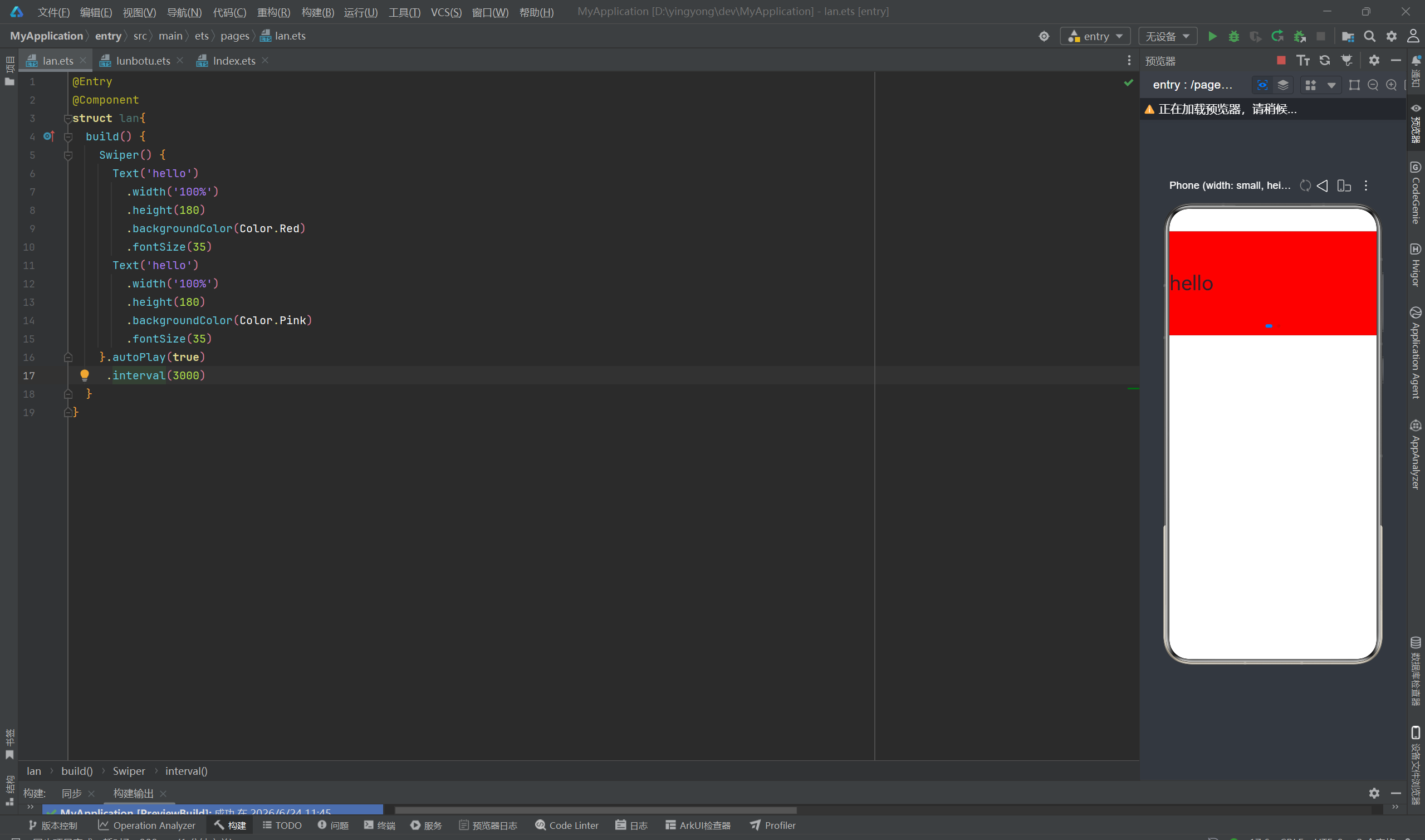
1.轮播图Swiper
功能:自动 / 手动左右滑动切换多张图片、广告横幅
常用配置:自动播放、循环滑动、指示器、切换间隔时长
@Entry
@Component
struct lan{
  build() {
    Swiper() {
      Text('hello')
        .width('100%')
        .height(180)
        .backgroundColor(Color.Red)
        .fontSize(35)
      Text('hello')
        .width('100%')
        .height(180)
        .backgroundColor(Color.Pink)
        .fontSize(35)
    }.autoPlay(true)  #是否自动切换
     .interval(3000)  #切换速度
  }
}
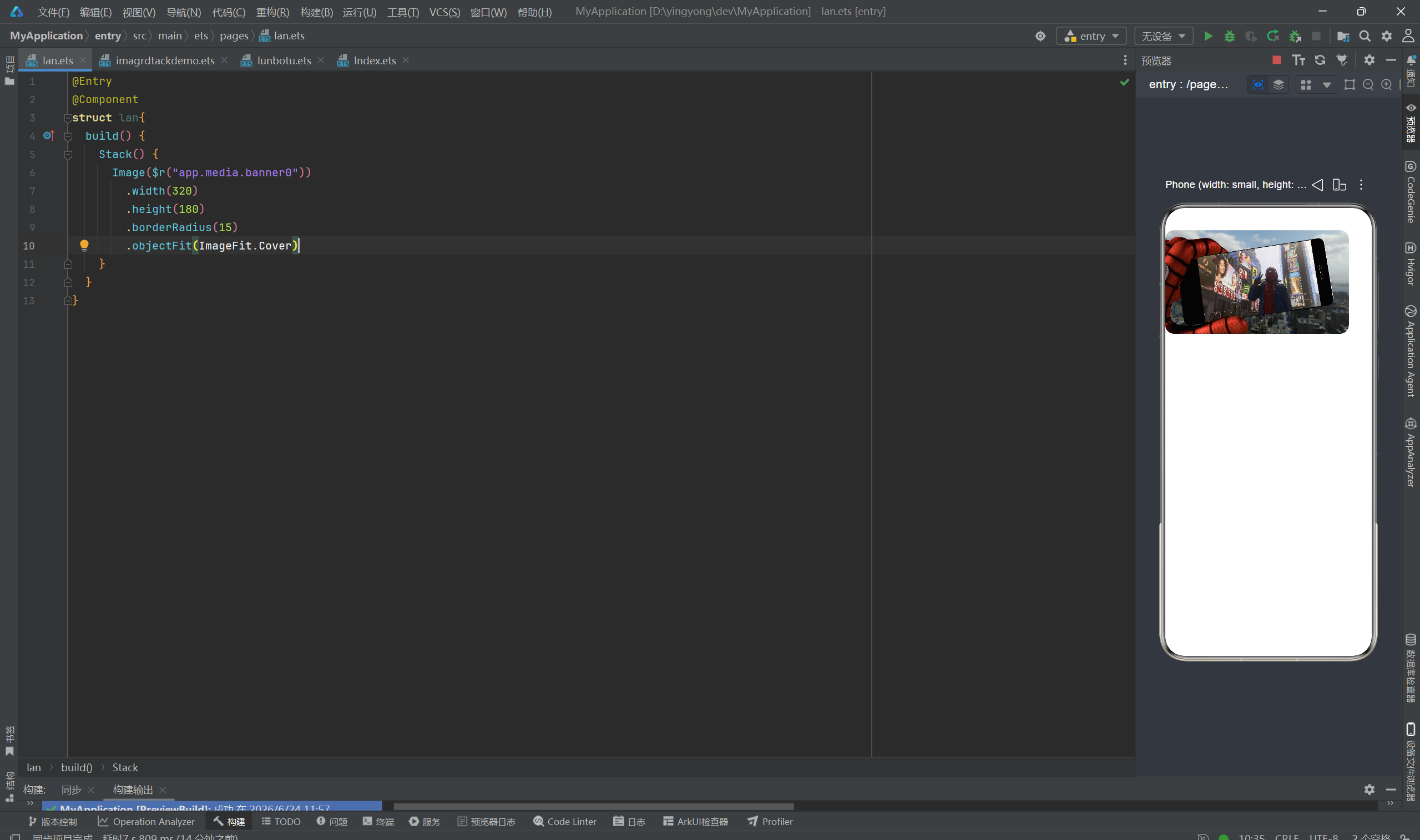
2.图片Image
功能:展示本地资源图、网络图片、SVG 图标,支持圆角、缩放、模糊
图片来源:$r("app.media.xxx")本地资源、$rawfile("xxx.png")、网络 url
本地资源使用时要先在entry>src>main>resources>base>media下添加图片
@Entry
@Component
struct lan{
  build() {
    Stack() {
      Image($r("app.media.banner0"))
        .width(320)
        .height(180)
        .borderRadius(15) #设置圆角
        .objectFit(ImageFit.Cover) #设置图片填充缩放
    }
  }
}
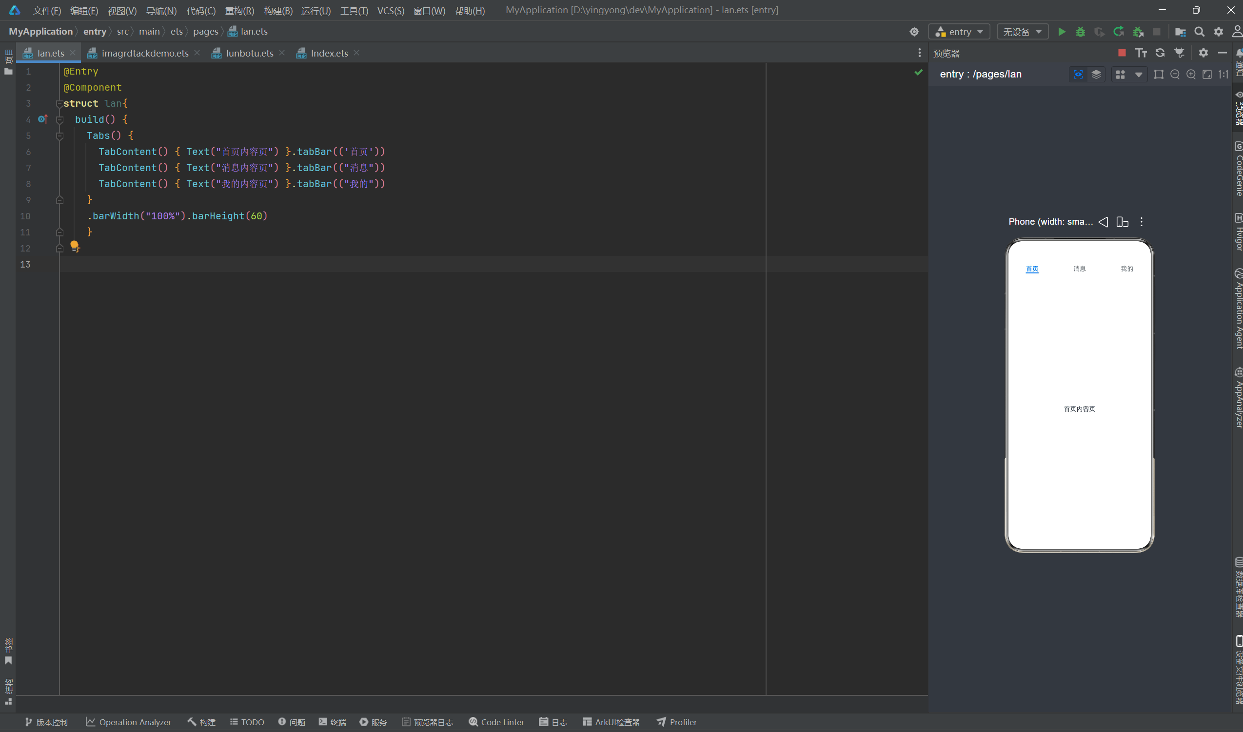
3.选项卡
功能:顶部 / 底部多标签切换页面(首页 / 我的 / 消息)
结构:Tabs 为外层容器,内部多个 TabContent 对应每个标签页内容
@Entry
@Component
struct lan{
  build() {
    Tabs() {
      TabContent() { Text("首页内容页") }.tabBar(('首页'))
      TabContent() { Text("消息内容页") }.tabBar(("消息"))
      TabContent() { Text("我的内容页") }.tabBar(("我的"))
    }
    .barWidth("100%").barHeight(60)
    }
  }
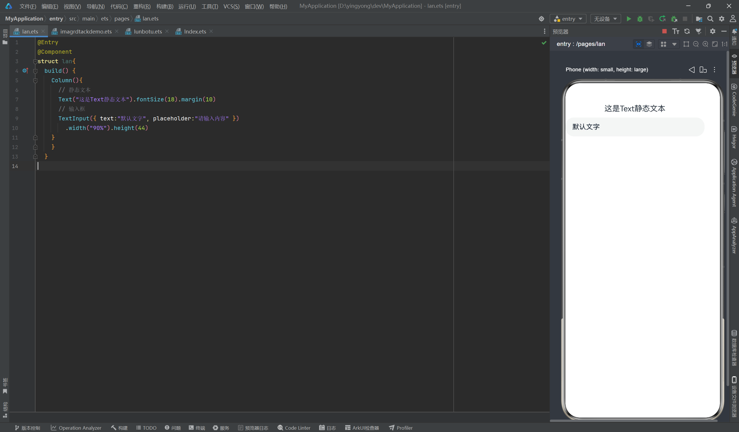
4.文本Text/输入框TextInput
Text:静态文字展示,控制字号、颜色、字重、多行省略、行间距
TextInput:用户输入交互,支持密码框、提示文字、输入监听、最大字数
@Entry
@Component
struct lan{
  build() {
    Column(){
      // 静态文本
      Text("这是Text静态文本").fontSize(18).margin(10)
      // 输入框
      TextInput({ text:"默认文字", placeholder:"请输入内容" })
        .width("90%").height(44)
    }
    }
  }
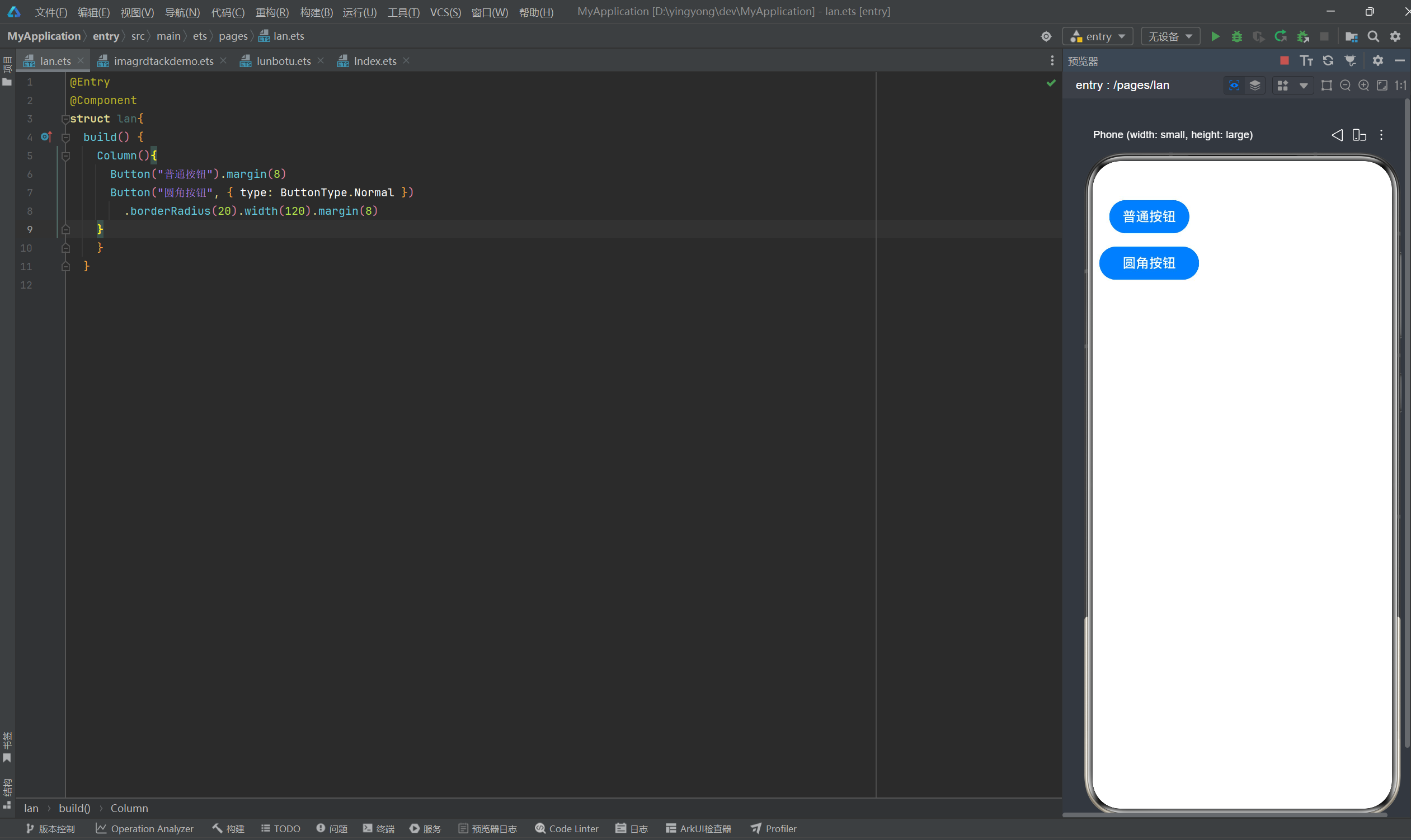
5.按钮Button
功能:点击交互载体,支持文字按钮、图片按钮、圆角、渐变背景、点击态
@Entry
@Component
struct lan{
  build() {
    Column(){
      Button("普通按钮").margin(8)
      Button("圆角按钮", { type: ButtonType.Normal })
        .borderRadius(20).width(120).margin(8)
    }
    }
  }
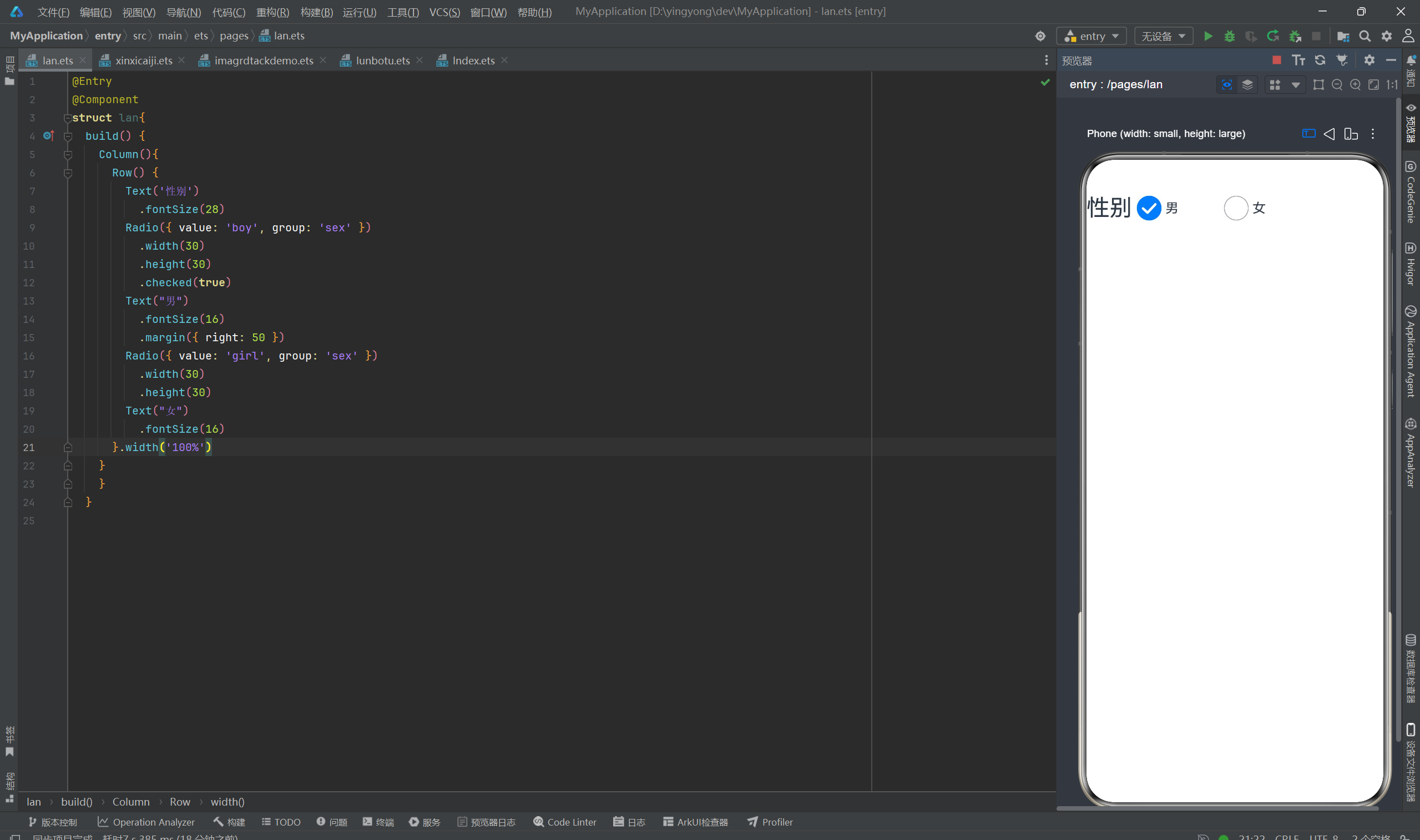
6.单选框Radio
功能:多选一交互,同一分组内只能选中一个选项,常用于性别、类型选择
@Entry
@Component
struct lan{
  build() {
    Column(){
      Row() {
        Text('性别')
          .fontSize(28)
        Radio({ value: 'boy', group: 'sex' })
          .width(30)
          .height(30)
          .checked(true)
        Text("男")
          .fontSize(16)
          .margin({ right: 50 })
        Radio({ value: 'girl', group: 'sex' })
          .width(30)
          .height(30)
        Text("女")
          .fontSize(16)
      }.width('100%')
    }
    }
  }

讨论HarmonyOS开发技术,专注于API与组件、DevEco Studio、测试、元服务和应用上架分发等。
更多推荐


 4
4 0
0- 0


 已为社区贡献4条内容

所有评论(0)