ArkUI布局
·
1. Column 垂直布局
(1)先创建一个ArkTS文件(名字自定义)
(2)打入代码
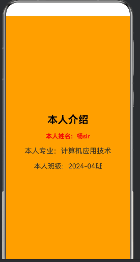
@Entry
@Component
struct ArkTsDemo //文件名字{
  //1.arkTS数据层,定义了页面所需要的数据
  userName:string = '杨sir';
  major:string = '计算机应用技术';
  studyYear = '2024-04班';

  //2.视图层,可以build中显示出来
  build() {
    Column({space:20}){  //控制字间的距离
      Text('本人介绍')
        .fontSize(30)

        .fontColor(Color.Black)
        .fontWeight(FontWeight.Bold)

      Text(`本人姓名:${this.userName}`)
        .fontSize(18)
        .fontWeight(FontWeight.Bold)
        .fontColor(Color.Red)

      Text(`本人专业:${this.major}`)
        .fontSize(21)

      Text(`本人班级:${this.studyYear}`)
        .fontSize(20)
    }
    .width('100%')   //高度比例
    .height('100%')  //宽度比例
    .backgroundColor(Color.Orange)  //颜色
    .justifyContent(FlexAlign.Center)  //居中对齐
  }
}
(3)实例图
2. Row垂直布局
(1)创建一个ArkTS文件(名字自定义)
(2)代码
@Entry
@Component
struct RowBaseDemo{
build() {
Column(){
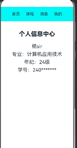
Row({space:30}){ //{space:30}是内容之间的距离(也可以加在最外面的Column里)
Text('首页').fontSize(20)
Text('课程').fontSize(20)
Text('消息').fontSize(20)
Text('我的').fontSize(20)
}
.width('100%')
.height('10%')
.justifyContent(FlexAlign.Center)
.alignItems(VerticalAlign.Center)
.backgroundColor(0x00f5f5)
Column({space:10}){
Text('个人信息中心')
.fontSize(30)
.fontWeight(FontWeight.Bolder)
.margin(20)
Text('杨sir').fontSize(25)
Text('专业:计算机应用技术').fontSize(25)
Text('年纪:24级').fontSize(25)
Text('学号:240*******').fontSize(25)
}
.width('100%')
.height('40%')
.backgroundColor('0x00f5f5')
.justifyContent(FlexAlign.Center) //垂直居中
.alignItems(HorizontalAlign.Center) //水平居中
}
.width('100%') //高度比例
.height('100%') //宽度比例
}
}
先构建一个垂直布局(Column),再在里面加入纵向布局(Row)分为上下两部分,在王纵向布局里面输入想要的内容
(3)示例图
3. Stack层叠布局
(1)创建一个ArkTS文件(名字自定义)
(2)代码
@Entry
@Component
struct StackBase{
build() {
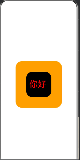
Stack(){ //层叠
Text()
.width(220)
.height(220)
.backgroundColor(Color.Orange) //外边框的颜色
.borderRadius(30) //边框弧度
Text('你好')
.fontSize(40) //字体大小
.fontColor(Color.Red) //字体颜色
.width(120)
.height(120)
.backgroundColor(Color.Black) //内边框的颜色
.borderRadius(30)
.padding({left:15,right:0,top:0,bottom:0}) //给当前组件设置单侧内边距,仅左侧留出 15px 空白,上、右、下三边内边距为 0。
}
.width('100%')
.height('100%')
}
}
(3).示例图
4.Flex弹性布局
自适应屏幕宽度,子组件超出自动换行,适配不同尺寸设备。
(1)创建一个ArkTS文件(名字自定义)
(2)代码
@Entry
@Component
struct FlexDemo2{
  build() {
    Flex({wrap:FlexWrap.Wrap}){    //控制 Flex 容器内子元素空间不足时是否自动换行
      Text("鸿蒙基础").padding(15).backgroundColor(0xe8f4ff).borderRadius(5).fontSize(16).margin(1)
      Text("ArkTS语法").padding(15).backgroundColor(0xe8f4ff).borderRadius(5).fontSize(16).margin(1)
      Text("ArkTS布局").padding(15).backgroundColor(0xe8f4ff).borderRadius(5).fontSize(16).margin(1)
      Text("组件开发").padding(15).backgroundColor(0xe8f4ff).borderRadius(5).fontSize(16).margin(1)
      Text("页面跳转").padding(15).backgroundColor(0xe8f4ff).borderRadius(5).fontSize(16).margin(1)
      Text("数据存储").padding(15).backgroundColor(0xe8f4ff).borderRadius(5).fontSize(16).margin(1)
    }
    .width('100%')
    .padding(10)  // 上下左右全部10
  }
}
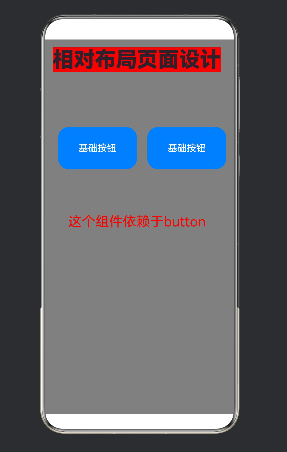
5.相对布局
子组件不按线性顺序排列,而是以锚点为参照物(父容器 / 其他子组件)实现自由定位,适合复杂重叠、角标、图文混排、弹窗按钮等场景,弥补 Column/Row/Flex 线性布局的局限
(1)创建一个ArkTS文件(名字自定义)
(2)代码
@Entry
@Component
struct RelativeDemo1 {
  build() {
    RelativeContainer() {
      // 标题
      Text('相对布局页面设计')
        .fontSize(40)
        .fontWeight(FontWeight.Bolder)
        .id('title')
        .alignRules({
          top: { anchor: '__container__', align: VerticalAlign.Top },
          left: { anchor: '__container__', align: HorizontalAlign.Start }
        })
        .margin(15)
        .backgroundColor(Color.Red)

      // 按钮行(唯一id:btnRow)
      Row(){
        Button('基础按钮')
          .width(150)
          .height(80)
          .fontSize(18)
          .margin(10)
        Button('基础按钮')
          .width(150)
          .height(80)
          .fontSize(18)
          .margin(10)
      }
      .id('btnRow')
      .height('35%')
      alignRules({
// 垂直定位:top / bottom / middle(垂直居中)
top: { anchor: '参照组件id', align: 垂直对齐方式 },
// 水平定位:left / right / middle(水平居中)
middle: { anchor: '参照组件id', align: 水平对齐方式 } })
      .margin(20)

      Text('这个组件依赖于button')
        .fontSize(26)
        .fontColor(Color.Red)
        .id('descText')
        .alignRules({
          top: { anchor: 'btnRow', align: VerticalAlign.Bottom },
          middle: { anchor: 'btnRow', align: HorizontalAlign.Center }
        })

    }
    .width('100%')
    .height('100%')
    .backgroundColor(Color.Gray)
  }
}
(3).示例图
5.不管是那种布局,他只能有一个根布局,可以在根布局里面嵌套其他布局

讨论HarmonyOS开发技术,专注于API与组件、DevEco Studio、测试、元服务和应用上架分发等。
更多推荐


 6
6 0
0- 0


 已为社区贡献5条内容

所有评论(0)