ArkUI布局大全
一、ArkUI的三要素
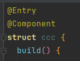
1.@Entry:页面入口的装饰器,用于标记当前自定义组件作为页面入口的组件,可以独立运行。
2.@Component:组件装饰器,用于定义自定义UI组件,被标记的结构体可以用于构建界面视图
3.@build:构建组件的方法,所有的布局内容必须在写这个方法的内部。
二、arkUI布局
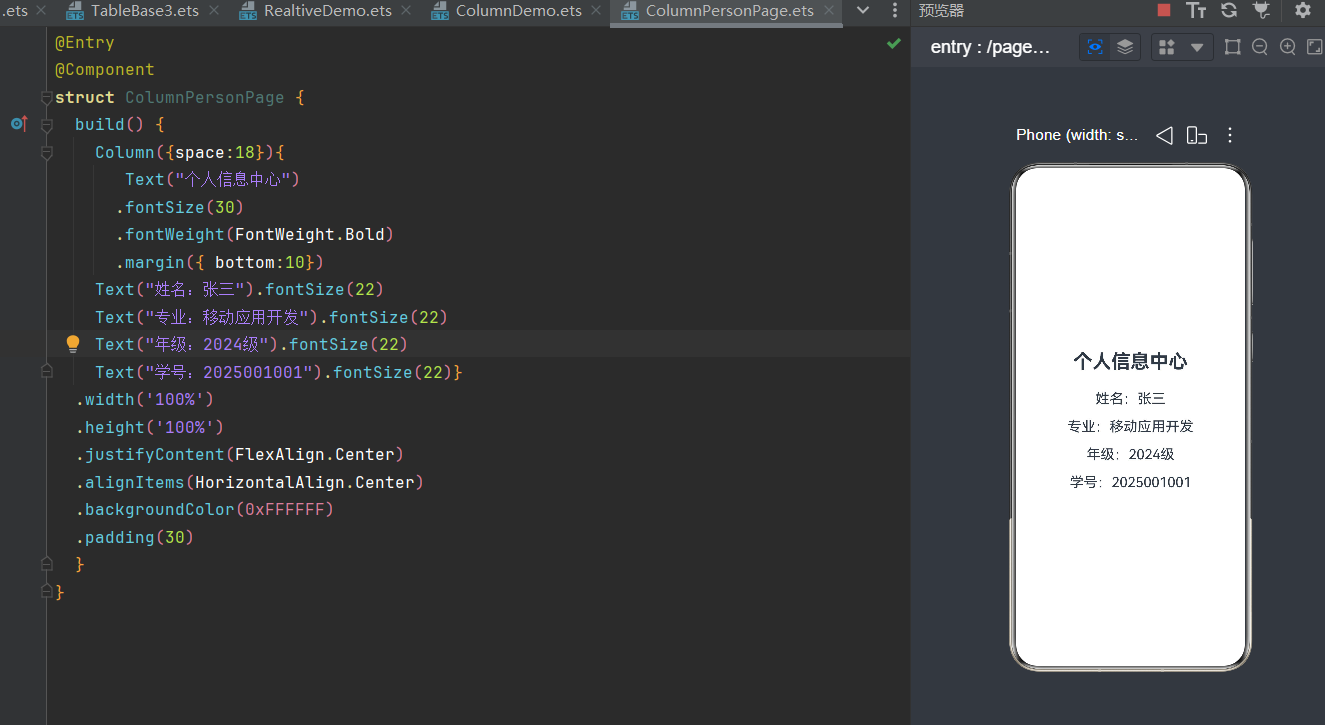
1. Column 垂直布局
• space:统一设置子组件间距,官方推荐写法,替代手动margin,界面更规整
• justifyContent:主轴(垂直)对齐,包含居顶、居中、居底、均分对齐
• alignItems:交叉轴(水平)对齐,包含左对齐、居中、右对齐
• width/height:布局容器尺寸,铺满屏幕是页面布局基础
• backgroundColor:布局背景色,用于区分页面模块
|
@Entry @Component struct ColumnPersonPage { build() { Column({ space: 18 }) { Text("个人信息中心") .fontSize(30) .fontWeight(FontWeight.Bold) .margin({ bottom: 10 }) Text("姓名:张三").fontSize(22) Text("专业:移动应用开发").fontSize(22) Text("年级:2024级").fontSize(22) Text("学号:2025001001").fontSize(22) } .width('100%') .height('100%') .justifyContent(FlexAlign.Center) .alignItems(HorizontalAlign.Center) .backgroundColor(0xFFFFFF) .padding(30) } } |
效果预览图
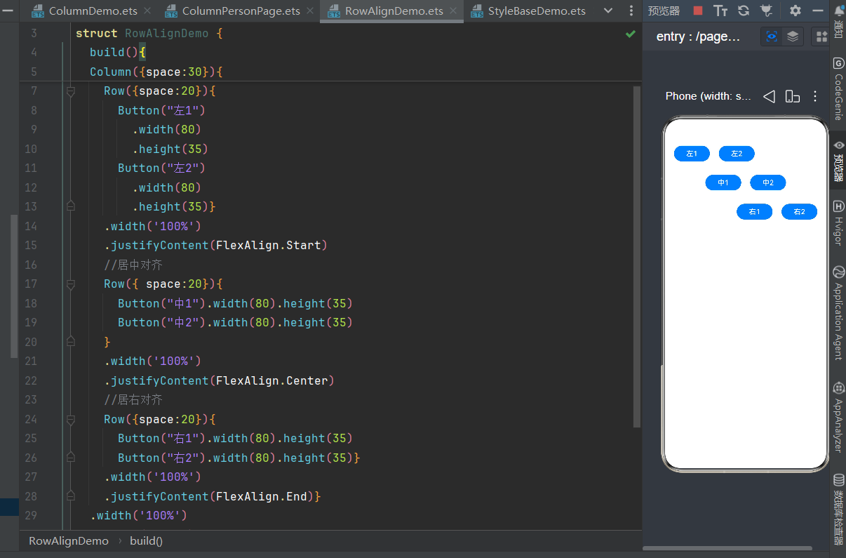
2.Row 水平布局
定义:元素从左至右依次排列,主轴为水平方向,交叉轴为垂直方向
@Entry
@Component
struct RowAlignDemo { build() {
Column({ space: 30 }) { // 居左对齐
Row({ space: 20 }) {
Button("左1").width(80).height(35)
Button("左2").width(80).height(35) }
.width('100%')
.justifyContent(FlexAlign.Start)
// 居中对齐
Row({ space: 20 }) {
Button("中1").width(80).height(35)
Button("中2").width(80).height(35) }
.width('100%')
.justifyContent(FlexAlign.Center)
// 居右对齐
Row({ space: 20 }) {
Button("右1").width(80).height(35)
Button("右2").width(80).height(35) }
.width('100%')
.justifyContent(FlexAlign.End) }
.width('100%')
.height('100%')
.padding(20) }
}
3.Stack层叠布局
定义:一个组件嵌套一个组件
@Entry
@Component
struct StackNestDemo { build() {
Column({ space: 30 }) {
Text("个人主页")
.fontSize(30)
.fontWeight(FontWeight.Bold)
// 内层嵌套:Stack层叠 + Row横向布局
Row({ space: 20 }) { Stack() {
Image($r('app.media.start_icon'))
.width(100)
.height(100)
.borderRadius(50) Text("VIP")
.fontSize(14)
.fontColor(Color.White)
.backgroundColor(0xFF3333)
.padding(4)
.borderRadius(6) }
Column({ space: 10 }) {
Text("鸿蒙开发者").fontSize(22).fontWeight(FontWeight.Medium) Text("专注鸿蒙应用开发实训").fontSize(18).fontColor(Color.Gray)
}
}
}
.width('100%')
.height('100%')
.justifyContent(FlexAlign.Center)
.alignItems(HorizontalAlign.Center)
.backgroundColor(0xFFFFFF) }
}
4.Flex弹性布局
定义:自适应屏幕宽度,子组件超出自动换行,适配不同尺寸设备。
@Entry
@Component
struct FlexBaseDemo { build() {
Flex({ wrap: FlexWrap.Wrap, space: 12 }) { Text("鸿蒙基础")
.padding({ left: 12, right: 12, top: 6, bottom: 6 })
.backgroundColor(0xE8F4FF)
.borderRadius(20)
.fontSize(16) Text("ArkTS语法")
.padding({ left: 12, right: 12, top: 6, bottom: 6 })
.backgroundColor(0xE8F4FF)
.borderRadius(20)
.fontSize(16) Text("ArkUI布局")
.padding({ left: 12, right: 12, top: 6, bottom: 6 })
.backgroundColor(0xE8F4FF)
.borderRadius(20)
.fontSize(16) Text("组件开发")
.padding({ left: 12, right: 12, top: 6, bottom: 6 })
.backgroundColor(0xE8F4FF)
.borderRadius(20)
.fontSize(16) Text("页面跳转")
.padding({ left: 12, right: 12, top: 6, bottom: 6 })
.backgroundColor(0xE8F4FF)
.borderRadius(20)
.fontSize(16) Text("数据存储")
.padding({ left: 12, right: 12, top: 6, bottom: 6 })
.backgroundColor(0xE8F4FF)
.borderRadius(20)
.fontSize(16) }
.width('100%')
.padding(20) }
}
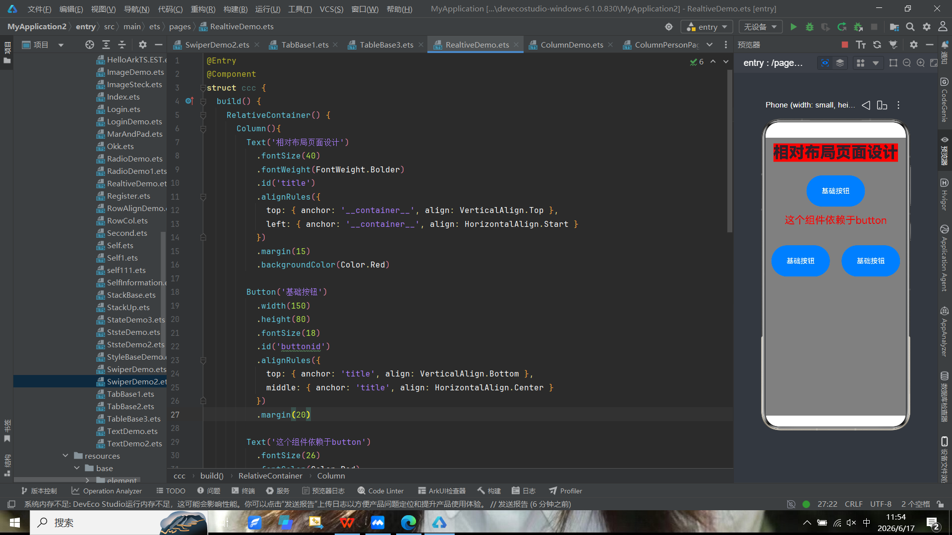
5.相对布局
定义:RelativeLayout 相对布局,是安卓传统五大布局之一,控件位置通过相对关系确定:以父容器、其他控件作为参照物,设置左、右、上、下、居中、对齐等规则摆放控件,无需固定坐标,适配性强。
@Entry
@Component
struct ccc {
  build() {
    RelativeContainer() {
      Column(){
        Text('相对布局页面设计')
          .fontSize(40)
          .fontWeight(FontWeight.Bolder)
          .id('title')
          .alignRules({
            top: { anchor: '__container__', align: VerticalAlign.Top },
            left: { anchor: '__container__', align: HorizontalAlign.Start }
          })
          .margin(15)
          .backgroundColor(Color.Red)

        Button('基础按钮')
          .width(150)
          .height(80)
          .fontSize(18)
          .id('buttonid')
          .alignRules({
            top: { anchor: 'title', align: VerticalAlign.Bottom },
            middle: { anchor: 'title', align: HorizontalAlign.Center }
          })
          .margin(20)

        Text('这个组件依赖于button')
          .fontSize(26)
          .fontColor(Color.Red)
          .id('textid')
          .alignRules({
            top: { anchor: 'buttonid', align: VerticalAlign.Bottom },
            middle: { anchor: 'buttonid', align: HorizontalAlign.Center }
          })
        Row(){
          Button('基础按钮')
            .width(150)
            .height(80)
            .fontSize(18)
            .id('buttonid')
            .alignRules({
              top: { anchor: 'title', align: VerticalAlign.Bottom },
              middle: { anchor: 'title', align: HorizontalAlign.Center }
            })
            .margin(15)
          Button('基础按钮')
            .width(150)
            .height(80)
            .fontSize(18)
            .id('buttonid')
            .alignRules({
              top: { anchor: 'title', align: VerticalAlign.Center},
              middle: { anchor: 'title', align: HorizontalAlign.Center }
            })
            .margin(15)
          Image($r('app.media.first'))
            .width('97%')
            .id('')
        }
        .height('25%')
      }
    }
    .width('100%')
    .height('100%')
    .backgroundColor(Color.Gray)
  }
}
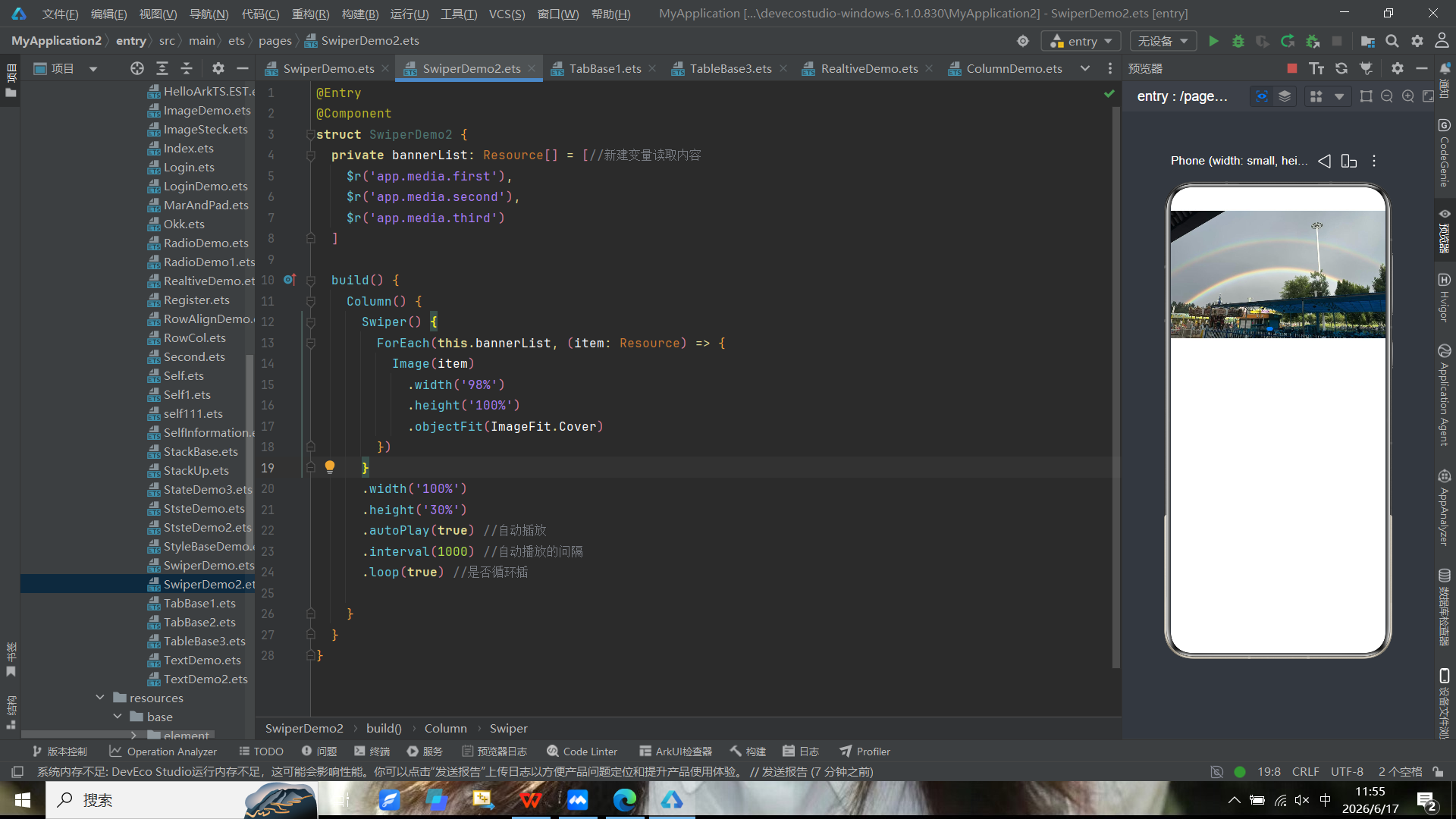
6.轮播图
定义:是一组多张图片自动循环切换展示的 UI 组件,同时支持手动左右滑动切换图片,常附带指示器小圆点、左右切换箭头。
@Entry
@Component
struct SwiperDemo2 {
  private bannerList: Resource[] = [//新建变量读取内容
    $r('app.media.first'),
    $r('app.media.second'),
    $r('app.media.third')
  ]

  build() {
    Column() {
      Swiper() {
        ForEach(this.bannerList, (item: Resource) => {
          Image(item)
            .width('98%')
            .height('100%')
            .objectFit(ImageFit.Cover)
        })
      }
      .width('100%')
      .height('30%')
      .autoPlay(true) //自动插放
      .interval(1000) //自动播放的问隔
      .loop(true) //是否循环插

    }
  }
}
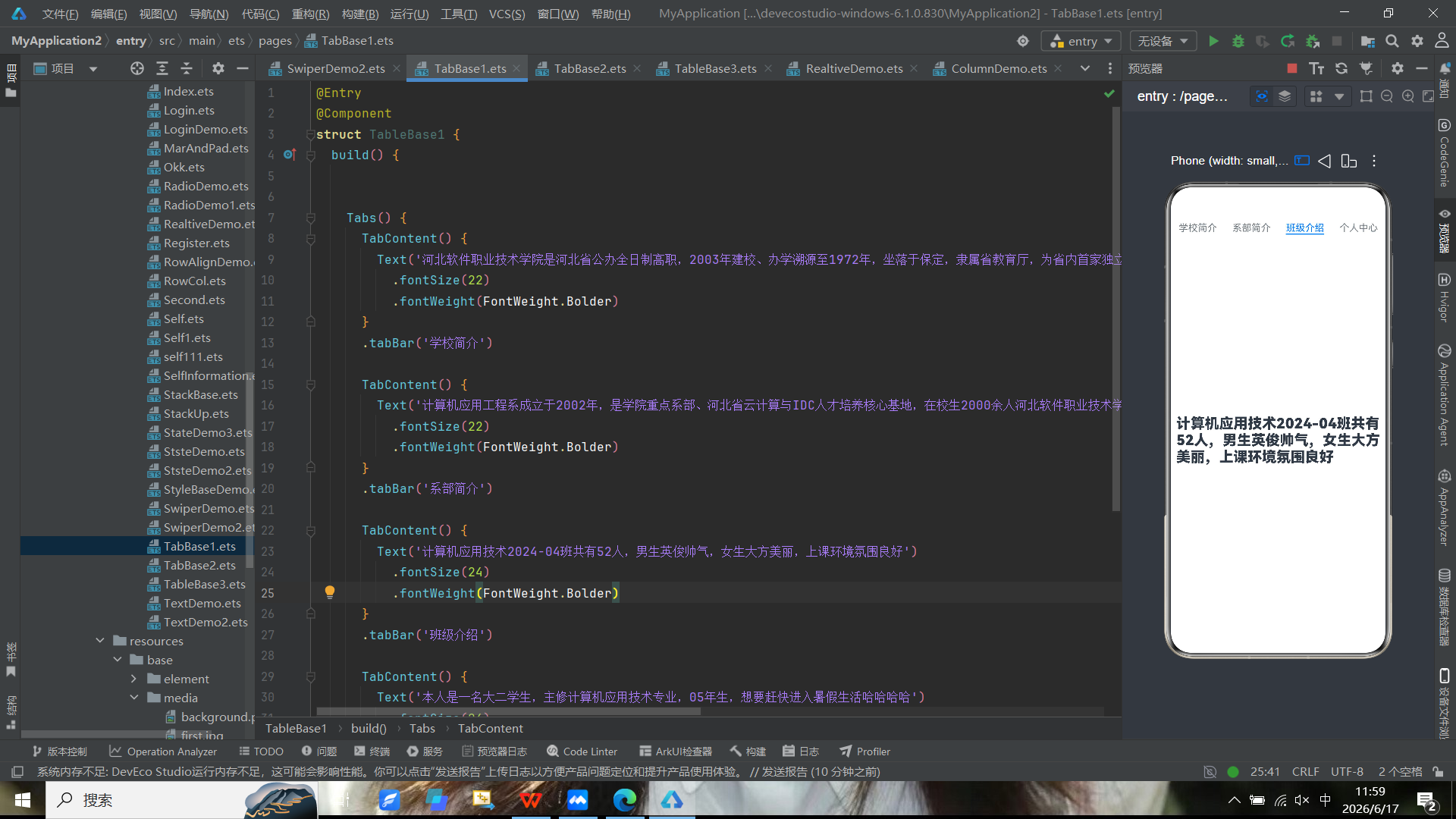
7.tabs
定义:是移动端 / 网页常用 UI 组件,由多个标签(Tab)组成,点击不同标签,下方区域切换对应内容,实现同一页面多模块快速切换,不用新开页面。
@Entry
@Component
struct TableBase1 {
  build() {


    Tabs() {
      TabContent() {
        Text('河北软件职业技术学院是河北省公办全日制高职,2003年建校、办学溯源至1972年,坐落于保定,隶属省教育厅,为省内首家独立建制、以信息技术(ICT)为核心的公办高职,是国家“双高计划”建设单位、国家优质专科、国家示范性软件职业技术学院河北软件职业技术学院')
          .fontSize(22)
          .fontWeight(FontWeight.Bolder)
      }
      .tabBar('学校简介')

      TabContent() {
        Text('计算机应用工程系成立于2002年,是学院重点系部、河北省云计算与IDC人才培养核心基地,在校生2000余人河北软件职业技术学院。立足京津冀,聚焦云计算、信息安全、区块链等新一代信息技术,办学实力与就业质量位居省内同类院校前列河北软件职业技术学院。')
          .fontSize(22)
          .fontWeight(FontWeight.Bolder)
      }
      .tabBar('系部简介')

      TabContent() {
        Text('计算机应用技术2024-04班共有52人,男生英俊帅气,女生大方美丽,上课环境氛围良好')
          .fontSize(24)
          .fontWeight(FontWeight.Bolder)
      }
      .tabBar('班级介绍')

      TabContent() {
        Text('本人是一名大二学生,主修计算机应用技术专业,05年生,想要赶快进入暑假生活哈哈哈哈')
          .fontSize(24)
          .fontWeight(FontWeight.Bolder)
      }
      .tabBar('个人中心')

    }
    .barPosition(BarPosition.Start)
  }
}

讨论HarmonyOS开发技术,专注于API与组件、DevEco Studio、测试、元服务和应用上架分发等。
更多推荐


 7
7 0
0- 0


 已为社区贡献5条内容

所有评论(0)