ArkTS五大布局
·
一、前言
本文将详细讲解最常用的 5 大布局:垂直布局、水平布局、层叠布局、弹性布局、相对布局。
二、布局介绍
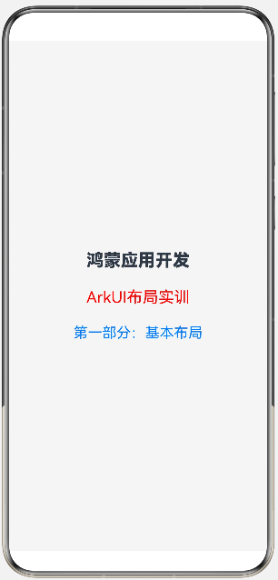
1.Column(垂直布局)
沿垂直方向布局的容器,内部组件默认从上到下依次排列,是 ArkTS 最基础的线性布局之一。
核心属性
justifyContent:主轴(垂直方向)对齐方式(居中、顶部、底部、均分等)alignItems:交叉轴(水平方向)对齐方式(左、中、右)space:子组件之间的固定间距
案例:
@Entry
@Component
struct ColumnDemo{
  build() {
    Column({space:25}){
      Text('鸿蒙应用开发')
        .fontSize(24)
        .fontWeight(FontWeight.Bolder)
      Text('ArkUI布局实训')
        .fontSize(22)
        .fontColor(Color.Red)
      Text('第一部分:基本布局')
        .fontSize(20)
        .fontColor(0x007dff)
    }
    .width('100%')
    .height('100%')
    .justifyContent(FlexAlign.Center)
    .alignItems(HorizontalAlign.Center)
    .backgroundColor(0xf5f5f5)
  }
}
展示:
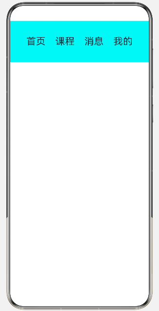
2.Row(水平布局)
沿水平方向布局的容器,内部子组件从左到右水平依次排列,是 ArkTS 最基础的线性布局之一。
核心属性
justifyContent:主轴(水平方向)对齐alignItems:交叉轴(垂直方向)对齐space:子组件水平间距
案例:
@Entry
@Component
struct RowBaseDemo{
  build() {
    Row({space:25}){
      Text('首页').fontSize(25)
      Text('课程').fontSize(25)
      Text('消息').fontSize(25)
      Text('我的').fontSize(25)

    }
    .width('100%')
    .height('15%')
    .justifyContent(FlexAlign.Center)
    .alignItems(VerticalAlign.Center)
    .backgroundColor(0x00f5f5)
  }
}
展示:
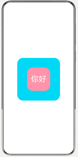
3.Stack(层叠布局)
子组件会默认从下到上层层叠加,后写的组件会覆盖在先写的组件上方。
核心属性
alignContent:所有子组件整体对齐方式- 子组件独立设置
align:单独控制单个元素在堆叠容器中的位置
案例:
@Entry
@Component
struct StackBase{
  build() {
    Stack(){
      Text()
        .width(220)
        .height(220)
        .backgroundColor(0x00d5f2)
        .borderRadius(30)

      Text('你好')
        .fontSize(40)
        .fontColor(Color.White)
        .width(120)
        .height(120)
        .backgroundColor(0xFFFF99AA)
        .borderRadius(30)
        .padding({left:20,right:0,top:0,bottom:0})
    }
    .width('100%')
    .height('100%')
  }
}
展示:
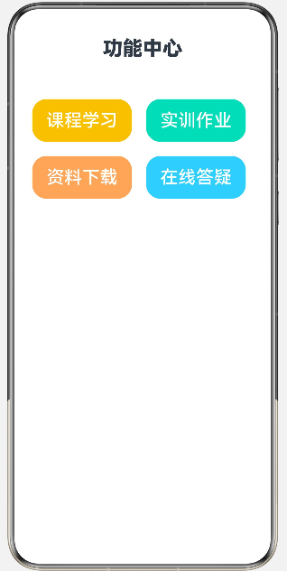
4.Flex(弹性布局)
支持自动均分、自动换行、弹性缩放,适配不同屏幕尺寸,是自适应布局首选
核心属性
direction:主轴方向(行、列、反向行 / 列)wrap:是否自动换行justifyContent:主轴对齐alignItems:交叉轴对齐
案例:
@Entry
@Component
struct FlexDemo3{
  build() {
    Column({space:30}){
      Text("功能中心")
        .fontSize(28)
        .fontWeight(FontWeight.Bolder)
        .width('100%')
        .textAlign(TextAlign.Center)

      Flex({wrap:FlexWrap.Wrap}){
        Button("课程学习").width(140).height(60).fontSize(25).margin(10).backgroundColor(0xFFF0C239)
        Button("实训作业").width(140).height(60).fontSize(25).margin(10).backgroundColor(0xFF36D9B9)
        Button("资料下载").width(140).height(60).fontSize(25).margin(10).backgroundColor(0xFFFFAA66)
        Button("在线答疑").width(140).height(60).fontSize(25).margin(10).backgroundColor(0xFF66CCFF)
      }
      .width('100%')
      .padding(15)
    }
    .width('100%')
    .height('100%')
  }
}
展示:
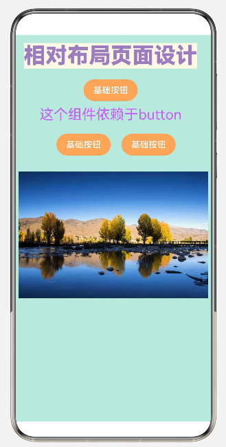
5.Relative(相对布局)
子组件不按线性排列,而是通过 相对其他组件 / 容器边界 来定位
核心属性
- 给每个子组件设置唯一
id - 通过
alignRules绑定相对关系(左对齐、右对齐、顶部对齐、居中、偏移等)
案例:
@Entry
@Component
struct RealtiveDemo1{
  build() {
    RelativeContainer(){
      Text('相对布局页面设计')
        .fontSize(40)
        .fontWeight(FontWeight.Bolder)
        .fontColor(0xFF9D7CBF)
        .id('title')
        .alignRules({
          top:{anchor:'__container__',align:VerticalAlign.Top},
          left:{anchor:'__container__','align':HorizontalAlign.Start}
        })
        .margin(15)
        .backgroundColor(0xFFFFF8E7)

      Button('基础按钮')
        .width(100)
        .id('buttonid')
        .height(40)
        .backgroundColor(0xFFFFAA66)
        .alignRules({
          top:{anchor:'title',align:VerticalAlign.Bottom},
          middle:{anchor:'title',align:HorizontalAlign.Center}
        })
        .margin(20)

      Text('这个组件依赖于button')
        .fontSize(26)
        .fontColor(0xFFC95DFF)
        .id('textid')
        .alignRules({
          top:{anchor:'buttonid',align:VerticalAlign.Center},
          middle:{anchor:'buttonid',align:HorizontalAlign.Center}
        })
        .margin({top:30})

      Button('基础按钮')
        .width(100)
        .id('button2')
        .height(40)
        .backgroundColor(0xFFFFAA66)
        .alignRules({
          top: { anchor: 'textid', align: VerticalAlign.Bottom },
          right:{anchor:'textid',align:HorizontalAlign.Center}
        })

        .margin({top:20,left:20})

      Button('基础按钮')
        .width(100)
        .id('button3')
        .height(40)
        .backgroundColor(0xFFFFAA66)
        .alignRules({
          top: { anchor: 'button2', align: VerticalAlign.Top },
          left:{anchor:'button2',align:HorizontalAlign.End}
        })
        .margin({left:20})

      Image($r('app.media.fifth'))
        .width('97%')
        .id('image1')
        .alignRules({
          top:{anchor:'button2',align:VerticalAlign.Bottom},
          middle:{anchor:'__container__',align:HorizontalAlign.Center}
        })
        .margin({top:30})
    }
    .width('100%')
    .height('100%')
    .backgroundColor(0xFFC1E8DD)
  }
}
展示:
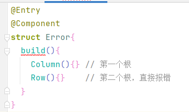
三、注意事项
build () 有且只能有1 个根容器组件
错误写法(并列两个根组件):
正确写法(用单个容器包裹全部内容):
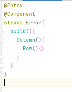
可用根容器:Column(纵向)、Row(横向)、Stack(层叠)等

讨论HarmonyOS开发技术,专注于API与组件、DevEco Studio、测试、元服务和应用上架分发等。
更多推荐


 6
6 0
0- 0


 已为社区贡献8条内容

所有评论(0)