ArkUI布局方式
1.Column
Column 让子组件从上到下依次排列。
主轴:垂直方向(控制上下位置)
交叉轴:水平方向(控制左右位置)
完整示例
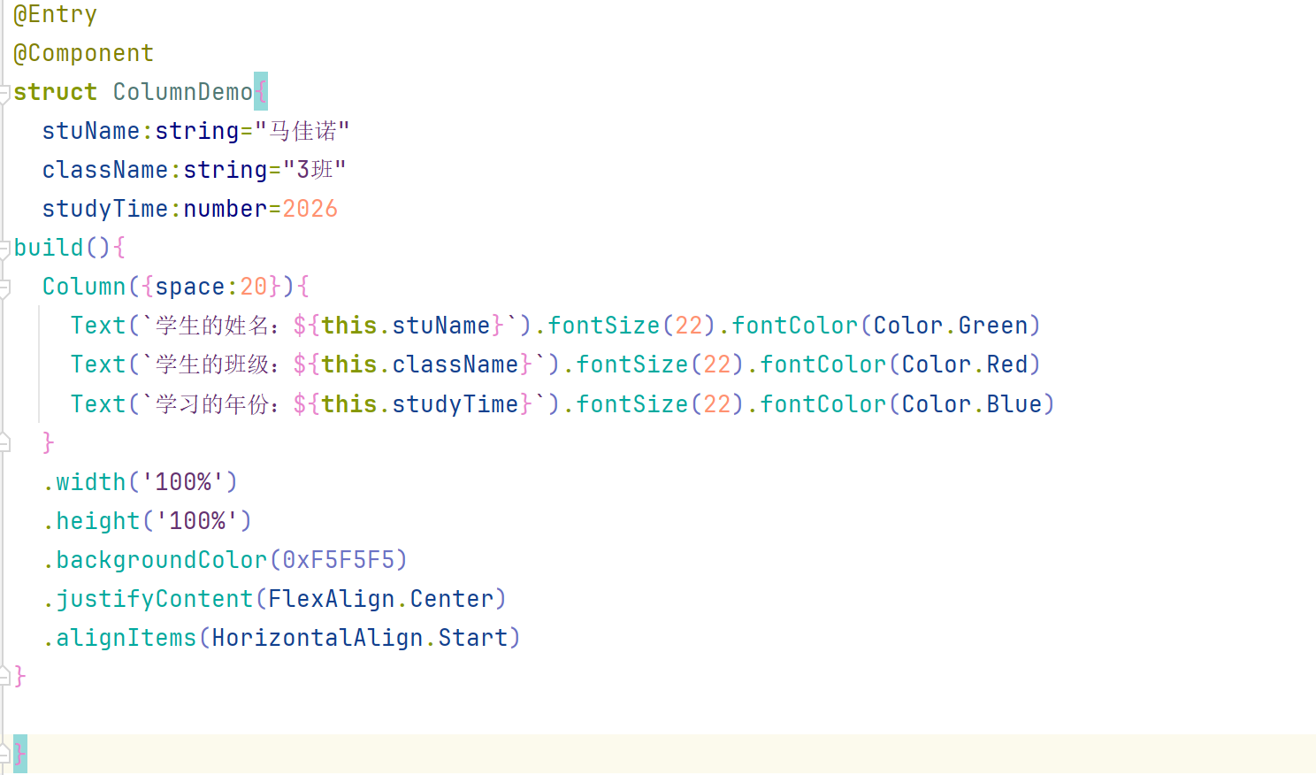
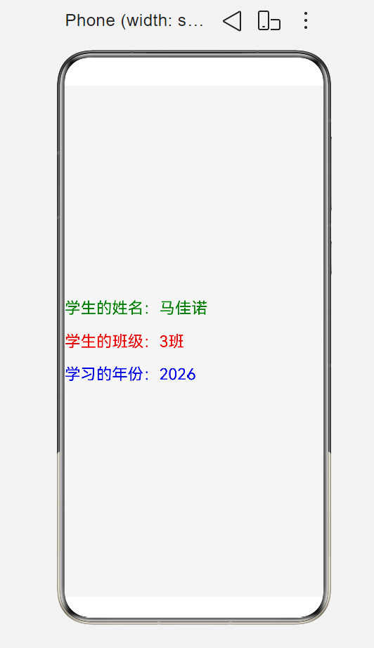
它的效果就是:三个文本垂直排列,间距20,整个背景浅灰色,内容整体垂直居中,文字靠左对齐。
2.Row
Row 让子组件从左到右依次排列。
主轴:水平方向(控制左右位置)
交叉轴:垂直方向(控制上下位置)
完整示例
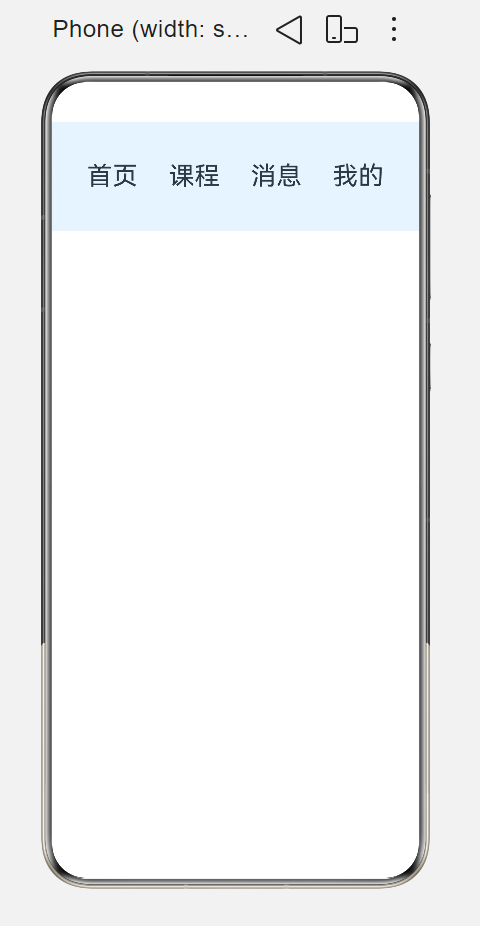
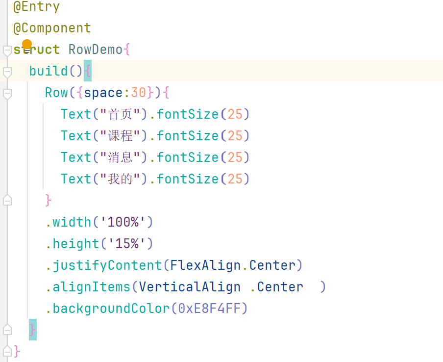 效果:四个文本横向排列,间距30,浅蓝色背景,整体区域水平垂直都居中。
3. Stack 层叠布局(叠罗汉)
控件一层层叠在一起,后写的盖在先写的上面 = 叠积木,类似图层,下面打底,上面盖着。
特点
所有子组件默认全部在左上角重叠
alignContent:统一控制所有子组件整体位置(居中 / 左下 / 右上)
书写顺序:代码越靠下,层级越靠上,盖住前面组件
4. Flex 弹性布局(万能自适应横竖)
升级版 Row/Column,可以自由切换横 / 竖,自动均分剩余空间、自动换行,万能自适应布局。
两个核心
.flexDirection(FlexDirection.Row):横着排(默认 =Row)
.flexDirection(FlexDirection.Column):竖着排(=Column)
.wrap(FlexWrap.Wrap):空间不够自动换行(超出屏幕自动换下一行)
flex:1:组件自动平分剩余屏幕宽度 / 高度
例子:两个盒子各占一半宽度
5. RelativeContainer 相对布局(参照物摆放)
不靠横竖,以某个组件当参照物摆放别的控件:A 在 B 的下边 / 右边 / 左上方,就是相对布局,你之前 6 个方框就是这个。
核心规则:
被当作参照物的组件必须写 .id('自定义名字')
新组件用 .alignRules({锚点规则}),指定依托哪个 id、贴哪边
anchor:'xxx' :参照物 id
align:VerticalAlign.Bottom :贴参照物底部
align:HorizontalAlign.End :贴参照物右边
6. Swiper 轮播图(左右滑动翻页)
多张页面左右滑动切换、自动轮播,首页横幅广告,就是轮播。
常用属性:
.autoPlay(true):开启自动轮播
.interval(3000):3000 毫秒 = 3 秒切一张
.indicator(true):底部显示小圆点指示器
.loop(true):循环轮播(滑到最后一页切回第一页)
7. Tabs 标签页(底部导航切换页面)
底部导航栏(首页 / 推荐 / 发现 / 我的),点标签切换上面内容页面,就是你写的底部四个按钮布局。
固定格式:
1.Tabs外层容器
2.每一项:TabContent{页面内容}.tabBar('底部按钮文字')
3..barPosition(BarPosition.End):标签栏放底部(End = 底部,Start = 顶部)
快速选用口诀(做题 / 开发直接用)
单纯竖着排→Column
单纯横着排→Row
控件叠在一起→Stack
需要自适应、自动换行、平分空间→Flex
A 放在 B 旁边 / 上下(按参照物摆)→RelativeContainer
左右滑动广告图→Swiper
底部导航切换多页面→Tabs
HarmonyOS
@Entry
@Component
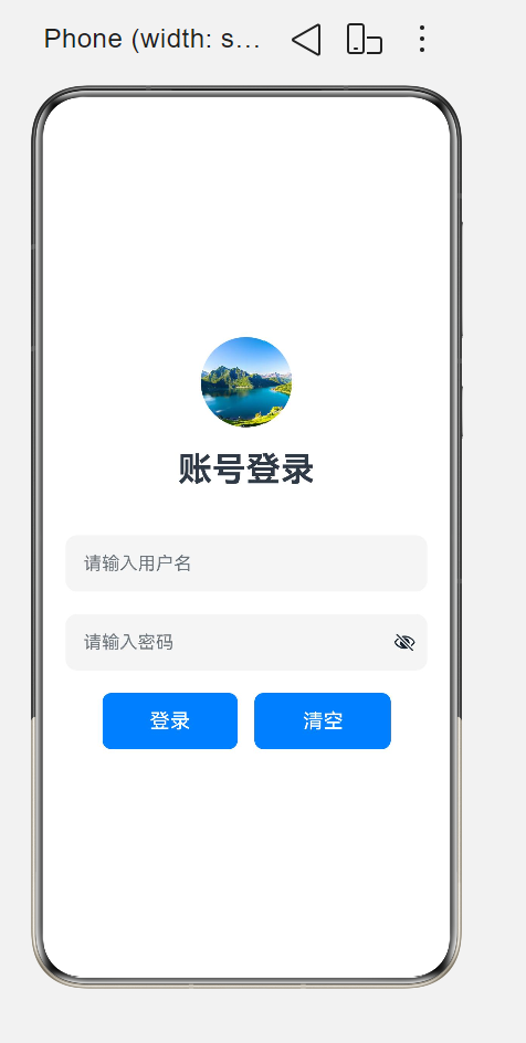
struct StyleDemo1{
build() {
Column({space:20}){
Image($r("app.media.4"))
.width(80)
.height(80)
.borderRadius(40)
Text('账号登录')
.fontSize(30)
.fontWeight(FontWeight.Bold)
.width("100%")
.textAlign(TextAlign.Center)
.margin({ bottom: 20 })
TextInput({ placeholder: "请输入用户名" })
.width(320)
.height(50)
.backgroundColor(0xf5f5f5)
.fontSize(20)
.borderRadius(10)
TextInput({ placeholder: "请输入密码" })
.type(InputType.Password)
.width(320)
.height(50)
.backgroundColor(0xf5f5f5)
.fontSize(20)
.borderRadius(10)
Row({space:15}){
Button("登录")
.width(120)
.height(50)
.borderRadius(8)
.backgroundColor(0x007dff)
.fontSize(18)
.fontColor(Color.White)
Button("清空")
.width(120)
.height(50)
.borderRadius(8)
.backgroundColor(0x007dff)
.fontSize(18)
.fontColor(Color.White)
}
.width("100%")
.justifyContent(FlexAlign.Center)
}
.width('100%')
.height('100%')
.padding(15)
.justifyContent(FlexAlign.Center)
.alignItems(HorizontalAlign.Center)
}
}
二、(只能在Index文件中写)
注意:要把视频上传到
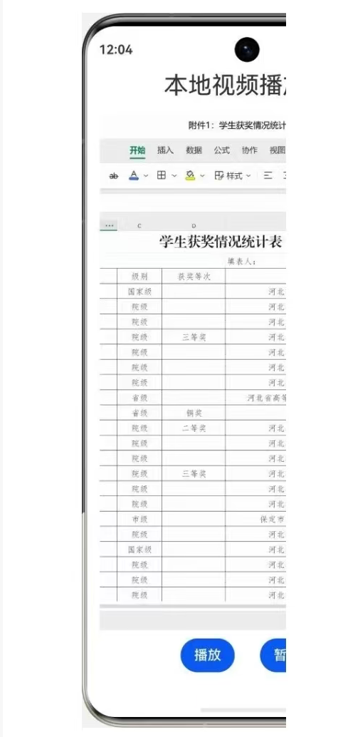
C:\Huawei\Application\entry\src\main\resources\rawfile这个文件中在Index中写入下方代码
@Entry
@Component
struct LocalVideoPlayer {
private videoController: VideoController = new VideoController();
build() {
Column() {
Text('本地视频播放器')
.fontSize(28)
.textAlign(TextAlign.Center)
.width('100%')
.margin({ bottom: 15 });
Video({
src: $rawfile('1.mp4'),
previewUri: $r('app.media.background'),
controller: this.videoController
})
.width('100%')
.layoutWeight(1) // 核心修改:占满剩余高度,限制视频不溢出屏幕
.controls(false)
.autoPlay(true)
.loop(true)
.muted(false)
.objectFit(ImageFit.Cover)
.margin({ bottom: 10 });
Row({ space: 30 }) {
Button('播放')
Button('暂停')
}
.justifyContent(FlexAlign.Center)
.margin({ bottom: 10 })
}
.padding(15)
.width('100%')
.height('100%');
}
}
运行结果
6.17
一、计算器-按钮的事件
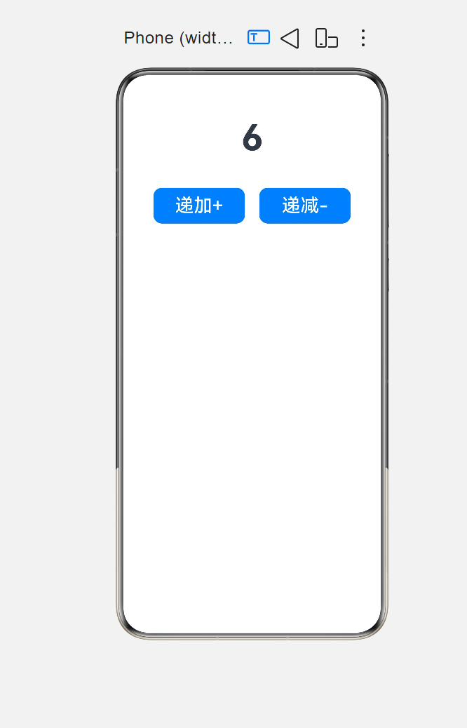
@Entry
@Component
struct jisuanqi1{
@State count: number = 0
build() {
Column({space:40}){
Text(`${this.count}`)
.fontSize(50)
.fontWeight(FontWeight.Bold)
Row({space:20}){
Button('递加+')
.width('40%')
.height(50)
.borderRadius(12)
.fontSize(26)
.onClick(()=>{
if (this.count < 10) {
this.count = this.count + 2
}
})
Button('递减-')
.width('40%')
.height(50)
.borderRadius(12)
.fontSize(26)
.onClick(()=>{
if (this.count > 0) {
this.count = this.count - 2
}
})
}
}
.height('100%')
.width('100%')
.padding(20)
}
}
二、登录@Entry
@Component
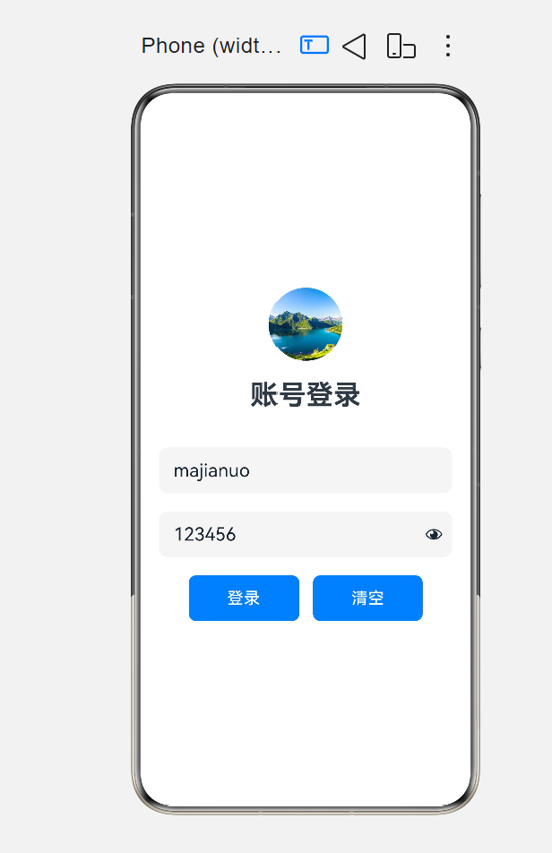
struct StyleDemo1{
@State flage:boolean=false
@State username:string=""
@State password:string=""
build() {
Column({space:20}){
Image($r("app.media.4"))
.width(80)
.height(80)
.borderRadius(40)
Text('账号登录')
.fontSize(30)
.fontWeight(FontWeight.Bold)
.width("100%")
.textAlign(TextAlign.Center)
.margin({ bottom: 20 })
TextInput({text:this.username, placeholder: "请输入用户名" })
.width(320)
.height(50)
.backgroundColor(0xf5f5f5)
.fontSize(20)
.padding({left:20})
.borderRadius(10)
.onChange((value:string)=>{
this.username=value
})
TextInput({text:this.password, placeholder: "请输入密码" })
.type(InputType.Password)
.width(320)
.height(50)
.backgroundColor(0xf5f5f5)
.fontSize(20)
.borderRadius(10)
.onChange((value:string)=>{
this.password=value
})
Row(){
Text("记住密码")
.fontSize(20)
Toggle({ type: ToggleType.Switch, isOn: this.flage })
.height(25)
.width(50)
.onChange((value: boolean) => {
this.flage = value
})
}
Row({space:15}){
Button("登录")
.width(120)
.height(50)
.borderRadius(8)
.backgroundColor(0x007dff)
.fontSize(18)
.fontColor(Color.White)
.onClick(()=>{
if (this.username && this.password) {
AlertDialog.show({
title:`登录成功`,
message:`欢迎你,${this.username}`
})
}else {
AlertDialog.show({
title:`登录失败`,
message:`用户名${this.username}或密码错误`
})
}
})
Button("清空")
.width(120)
.height(50)
.borderRadius(8)
.backgroundColor(0x007dff)
.fontSize(18)
.fontColor(Color.White)
.onClick(()=>{
this.username=this.username=''
this.password=this.password=''
})
}
.width("100%")
.justifyContent(FlexAlign.Center)
}
.width('100%')
.height('100%')
.padding(15)
.justifyContent(FlexAlign.Center)
.alignItems(HorizontalAlign.Center)
}
}
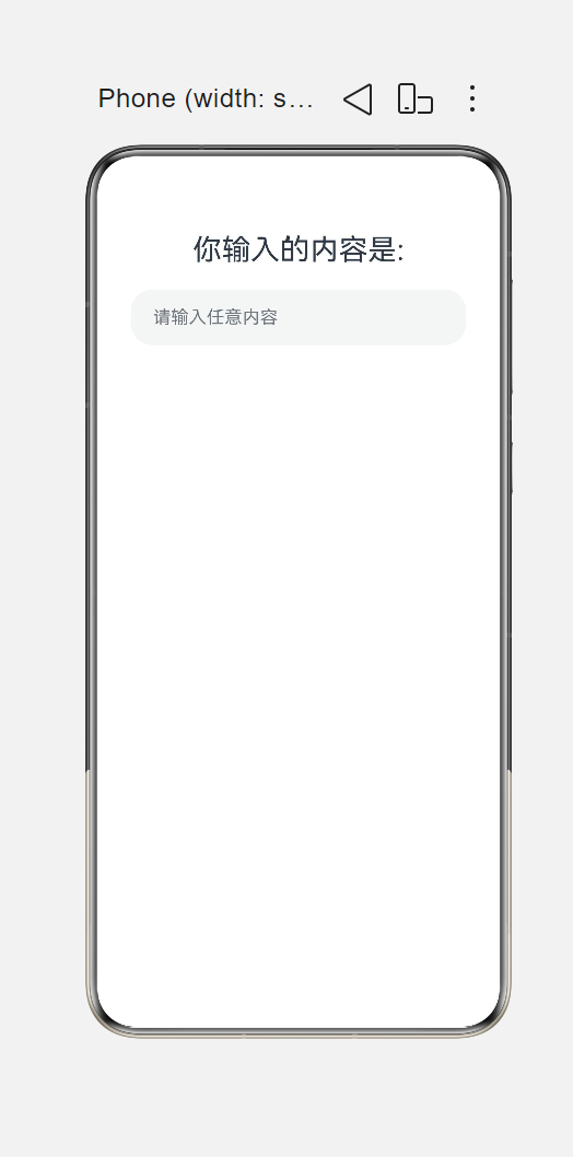
 四、显四、显示输入的内容@Entry
@Component
struct StatesDemo3{
@State inputText:string=""
build() {
Column({space:20}){
Text(`你输入的内容是: ${this.inputText}`)
.fontSize(26)
TextInput({text:this.inputText,placeholder:"请输入任意内容"})
.width('100%')
.height(50)
.padding({left:20})
.onChange((value: string) => {
this.inputText = value
})
}
.width('100%')
.height('100%')
.padding(30)
}
}
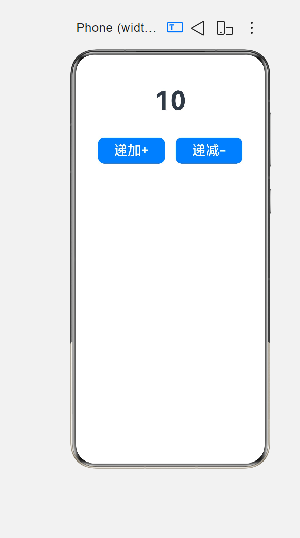
五、计算递增还是递减
@Entry
@Component
struct jisuanqi1{
@State count: number = 0
build() {
Column({space:40}){
Text(`${this.count}`)
.fontSize(50)
.fontWeight(FontWeight.Bold)
Row({space:20}){
Button('递加+')
.width('40%')
.height(50)
.borderRadius(12)
.fontSize(26)
.onClick(()=>{
if (this.count < 10) {
this.count = this.count + 2
}
})
Button('递减-')
.width('40%')
.height(50)
.borderRadius(12)
.fontSize(26)
.onClick(()=>{
if (this.count > 0) {
this.count = this.count - 2
}
})
}
}
.height('100%')
.width('100%')
.padding(20)
}
}
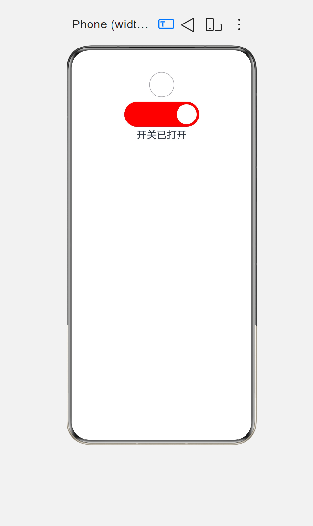
六、开关
@Entry
@Component
struct Toggle1{
@State isOpen:boolean = true
build() {
Column(){
Toggle({
type:ToggleType.Checkbox,
isOn:false
})
.width(50)
Toggle({
type:ToggleType.Switch,
isOn:this.isOpen
})
.width(150)
.height(50)
.selectedColor(Color.Red)
.onChange((value:boolean)=>{
this.isOpen = !this.isOpen
})
Text(this.isOpen?"开关已打开":"开关已关闭")
.fontSize(20)
}
.width('100%')
.height('100%')
}
}

讨论HarmonyOS开发技术,专注于API与组件、DevEco Studio、测试、元服务和应用上架分发等。
更多推荐
 6
6 0
0- 0


 已为社区贡献6条内容

所有评论(0)