ArkUI的组件
·
1.轮播图
(1)多图自动 / 手动滑动轮播,常用于首页 banner
(2)
@Entry
@Component
struct SwiperDemo {
  build() {
    Column() {
      Swiper() {
        Text('0')
          .backgroundColor(Color.Gray)
          .fontSize(30)
        Text('1')
          .backgroundColor(Color.Green)
          .fontSize(30)
        Text('2')
          .backgroundColor(Color.Orange)
          .fontSize(30)
        Text('3')
          .backgroundColor(Color.Pink)
          .fontSize(30)
      }
      .width('100%')
      .height('30%')
      .autoPlay(true) //开启自动轮播,true= 开启,false= 关闭(默认关闭)
      .interval(2000) //设置时间2000毫秒(ms)
      .loop(true) //开启循环轮播,true = 循环,false = 到最后一页停止
    }
  }
}
2.图片
(1).先把需要的图片放进
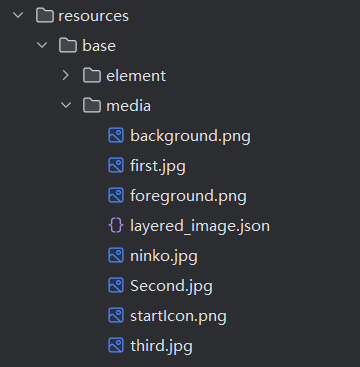
(2)
@Entry
@Component
struct disanye{
  private bannerList: Resource[] = [
    $r('app.media.图片的名字')] // 私有轮播图资源数组,存放本地图片资源图片的名字不加后缀
  build() {
    Column({space:20}){

      Image($r('app.media.图片的名字'))
        .width('100%')
        .height('25%')
        .shadow({
radius: 50, // 模糊半径(必填常用)
color: Color.Red, // 阴影颜色
offsetX: 10, // X轴水平偏移:正数向右,负数向左
offsetY: 10 // Y轴垂直偏移:正数向下,负数向上 })
    }
  }
}
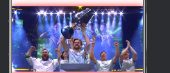
(3) .示例图
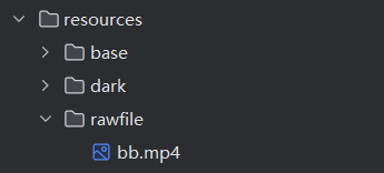
3.视频
(1).视频必须放进rawfile文件里
(2).把代码写入Index.ets文件里面
@Entry
@Component
struct Index {
  private videoSrc:Resource = $rawfile('bb.mp4')
  private pict:Resource=$r('app.media.background')
  private controller:VideoController = new VideoController()
  build() {
    Column(){
      Text('鸿蒙应用开发').fontSize(35)
      Row(){
        Video({
          //src用来设置视频资源(本地的)
          src:this.videoSrc,
          //设置视频的封面
          previewUri:this.pict,
          //控制器,控制前进后退的按钮等
          controller:this.controller
        })
          .height('50%')
          .muted(true)//是否静音
          .loop(true)//循环播放
          .autoPlay(false)//自动播放
          .controls(true) // 设置是否显示默认控制条
      }
      .width('90%')
      .height('45%')
      Column(){
        Button('开始学习')
          .width(200)
          .height(50)
          .fontSize(25)
          .border({width:3,color:Color.Black})
      }

    }
    .width('100%')
    .height('100%')
  }
}
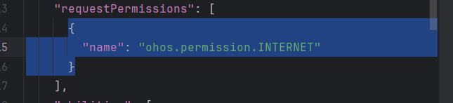
(3).还需要更改module.json5文件里的内容
{
  "name": "ohos.permission.INTERNET"
}
(4).打开
才能看见
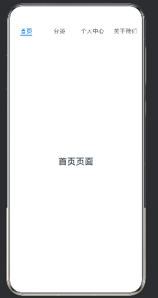
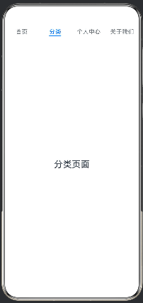
4.选项卡
(1).用来实现顶部 / 底部标签切换多页面
(2).
@Entry
@Component
struct TabBase1{
  build() {
    Tabs(){
      TabContent(){
        Text('首页页面')
          .fontSize(24)
      }
      .tabBar('首页')
      TabContent(){
        Text('分类页面')
          .fontSize(24)
      }
      .tabBar('分类')
      TabContent(){
        Text('个人中心页面')
          .fontSize(24)
      }
      .tabBar('个人中心')
      TabContent(){
        Text('关于我们页面')
          .fontSize(24)
      }
      .tabBar('关于我们')
    }
    .barPosition(BarPosition.Start) //横向排列,显示在页面顶部
  }
}
(3).示例图
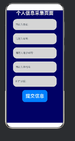
5.文本/输入框
(1).
@Entry
@Component
struct TextDemo{
  build() {
    Column({space:20}){
      Text('个人信息采集页面')
        .fontSize(30)
        .fontColor(0xd5d5d5)
        .textAlign(TextAlign.Center)
        .width('100%')
        .fontWeight(FontWeight.Bolder)

      TextInput({placeholder:"请输入姓名:"})
        .type(InputType.USER_NAME) //选择的属性
        .height(70)
        .width(280)
        .backgroundColor(0xd5d5d5) //颜色
        .borderRadius(24)  //圆角弧
      TextInput({placeholder:"请输入年龄:"})
        .type(InputType.Number)
        .height(70)
        .width(280)
        .backgroundColor(0xd5d5d5)
        .borderRadius(24)

      TextInput({placeholder:"请输入电子邮箱:"})
        .type(InputType.Email)
        .height(70)
        .width(280)
        .backgroundColor(0xd5d5d5)
        .borderRadius(24)

      Button('提交信息')
        .fontSize(30)
        .padding(21) //组件内容与自身边框之间的空白距离
    }

    .height('100%')
    .width('100%')
    .backgroundColor(0x15f) //最后卡片的颜色
  }
}
(2).示例图
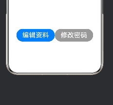
6.按钮
(1).
Row(){
  Button('编辑资料')
    .height(50)
    .width(150)
    .fontSize(26) //字体大小
    .borderRadius(35) //圆角的弧度

  Button('修改密码')
    .height(50)
    .backgroundColor(0x999999)
    .width(150)
    .fontSize(26)
    .borderRadius(35)
}
(2).示例图
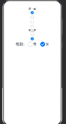
7.单选框
(1).性别选择、单项问卷、单一等级选择等只能选一项的场景;只有group值相同的 Radio 才会互斥,不同分组互不干扰;
(2).
@Entry
@Component
struct RadioDemo1 {
  build() {
    Column() {
      Text('第一题')
      Radio({ value: 'Radio1', group: 'radioGroup' })
        .checked(false)
      Radio({ value: 'Radio2', group: 'radioGroup' })
        .checked(true)
      Radio({ value: 'Radio3', group: 'radioGroup' })
        .checked(false)
      Radio({ value: 'Radio4', group: 'radioGroup' })
        .checked(false)
      Text('第二题')
      Radio({ value: 'Radio1', group: 'radioGroup1' })
        .checked(false)
      Radio({ value: 'Radio2', group: 'radioGroup1' })
        .checked(true)
      Row() {
        Text('性别:')
          .fontSize(24)
        Radio({ value: '男', group: 'sex' })
          .checked(false)
          .height(30)
          .width(30)
        Text('男')
          .fontSize(20)
          .margin({ right: 20 })
        Radio({ value: '女', group: 'sex' })
          .checked(true)
          .height(30)
          .width(30)
        Text('女')
          .fontSize(20)
      }
    }
    .width('100%')
    .height('100%')
  }
}
(3).示例图
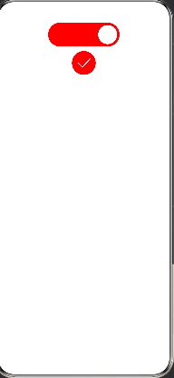
8.Toggle
(1).Toggle 是布尔型开关控件,只有「开启 / 关闭」两种状态,常用于设置页功能开关(推送、深色模式、自动播放等)。
(2).
@Entry
@Component
struct ToggleDemo{
  build() {
    Column(){  // 两个不同类型的Toggle开关
      Toggle({
        type: ToggleType.Switch,  //滑动开关样式
        isOn: true   //默认状态为开启,滑块在右侧
      })
        .width(150)
        .height(50)
        .selectedColor(Color.Red)  //颜色
        .id('n1')

      Toggle({
        type: ToggleType.Checkbox,  //复选框样式
        isOn: false          //默认状态为关闭
      })
        .width(150)
        .height(50)
        .selectedColor(Color.Red)
        .id('n2')
    }
    .width('100%')
    .height('100%')
  }
}
(3).示例图

讨论HarmonyOS开发技术,专注于API与组件、DevEco Studio、测试、元服务和应用上架分发等。
更多推荐

 1
1 0
0- 0


 已为社区贡献5条内容

所有评论(0)