ArkUI 轮播图,选项卡,视频,图片组件全解 1
·
一、Swiper(轮播图)
轮播组件,专门实现图片 / 页面自动轮播、左右滑动切换
核心属性
index:默认显示第几个页面loop:是否循环轮播autoPlay:是否自动播放interval:自动播放间隔时间(毫秒)
案例:
@Entry
@Component
struct SwiperDemo2{
private bannerList:Resource[] = [
$r('app.media.forth'),
$r('app.media.fifth'),
$r('app.media.sixth'),
]
build() {
Column(){
Swiper(){
ForEach(this.bannerList,(item:Resource)=>{
Image(item)
.width('98%')
.height('100%')
.objectFit(ImageFit.Cover)
.borderRadius(20)
})
}
.width('100%')
.height('30%')
.autoPlay(true) //自动播放
.interval(2000) //自动播放间隔
.loop(true) //是否循环播放
}
}
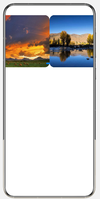
}展示:
二、Tabs(选项卡)
实现顶部 / 底部标签栏 + 对应内容切换,点击标签切换不同页面
核心属性
barPosition:标签栏位置(顶部 / 底部)
案例:
@Entry
@Component
struct TabsBase1{
private bannerList:Resource[] = [
$r('app.media.forth'),
$r('app.media.fifth'),
$r('app.media.sixth'),
]
build() {
Column() {
Swiper() {
ForEach(this.bannerList, (item: Resource) => {
Image(item)
.width('98%')
.height('100%')
.objectFit(ImageFit.Cover)
.borderRadius(20)
})
}
.width('100%')
.height('30%')
.autoPlay(true) //自动播放
.interval(1000) //自动播放间隔
.loop(true) //是否循环播放
Tabs() {
TabContent() {
Text('首页页面')
.fontSize(24)
}
.tabBar('首页')
TabContent() {
Text('分类页面')
.fontSize(24)
}
.tabBar('分类')
TabContent() {
Text('个人中心页面')
.fontSize(24)
}
.tabBar('个人中心')
TabContent() {
Text('关于我们页面')
.fontSize(24)
}
.tabBar('关于我们')
}
.barPosition(BarPosition.Start)
}
}
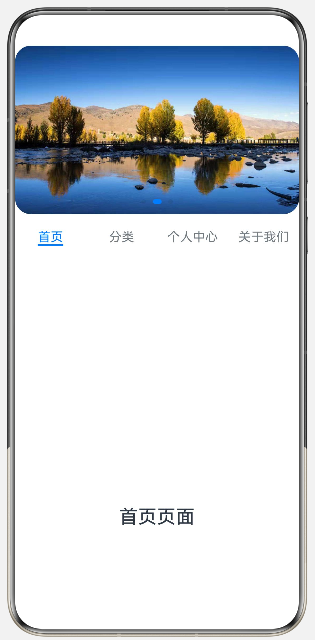
}展示:
三、Video(视频)
课程教学视频、商品介绍短视频、首页宣传视频、本地视频预览等页面。
核心属性
- width:播放器宽度,支持固定数值 / 百分比
- height:播放器高度,必须设置,否则视频无法渲染
- muted:是否静音播放,true 静音,false 正常出声
- loop:是否循环播放,true 播放完成自动重播
- autoPlay:页面加载后是否自动播放视频
- controls:是否显示系统自带播放控制条(进度、暂停、音量)
案例:
import UIExtensionContentSession from '@ohos.app.ability.UIExtensionContentSession';
@Entry
@Component
struct Index {
private videoSrc:Resource = $rawfile('first.mp4')
private pict:Resource = $r('app.media.fifth')
private controller:VideoController = new VideoController()
// private videoStr:string='http://www.w3school.com.cn/example/html5/mov_bbb.mp4';
build() {
Column(){
Text('鸿蒙应用开发视频资源')
.fontSize(30)
.fontWeight(FontWeight.Bold)
Video({
src:this.videoSrc, //设置视频本地资源
previewUri:this.pict, //视频封面
controller:this.controller //控制器,控制前进后退的按钮
})
.height('50%')
.width('90%')
.muted(true) //是否静音
.loop(true) // 循环播放
.autoPlay(false) //自动播放
.controls(true) //是否显示默认控制条
/* Video({
src:this.videoStr
})
.height('50%') */
Button('开始学习')
.width(150)
.height(50)
.fontSize(20)
.backgroundColor(0xFF6B798E)
.border({width:5, radius:10,color:0xFF3A506B})
}
.width('100%')
.height('100%')
.justifyContent(FlexAlign.SpaceEvenly)
}
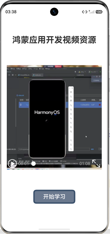
}展示:
四、Image(图片)
渲染展示本地 / 网络图片资源,支持设置圆角、填充适配、尺寸、对齐等样式,用于页面图文内容展示。
核心属性
- borderRadius:设置图片圆角,圆形头像宽高相等时设置一半数值即可
- objectFit:图片填充适配模式,常用 ImageFit.Cover 等 5 种填充规则
案例:
@Entry
@Component
struct ImageDemo1{
  build() {
    Column({space:20}){
      Text('欢迎来到鸿蒙应用开发')
        .fontSize(30)
        .fontWeight(FontWeight.Bolder)
        .width('100%')
        .textAlign(TextAlign.Center)
        .padding(20)

      Image($r('app.media.forth'))
        .width('90%')
        .height(200)
        .borderRadius(15)
        .objectFit(ImageFit.Cover)
      //cover是等比例缩放,铺满页面,多余部分裁掉


      Row(){
        Column(){
          Text("鸿蒙应用开发")
            .fontSize(22)
            .width('45%')
            .textAlign(TextAlign.Center)
          Text("ArkUI实战开发")
            .fontSize(20)
            .width('45%')
            .textAlign(TextAlign.Center)

        }

        Image($r('app.media.fifth'))
          .width('50%')
      }
    }
    .width('100%')
    .height('100%')
  }
}
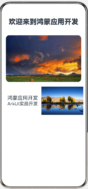
展示:
五、弹窗
在当前页面上层弹出浮层提示窗口;不会跳转、销毁原有页面,底层页面完整保留,专门用来做操作反馈、表单报错、消息提醒等轻量临时交互,开箱即用不用自定义布局。
核心属性
title:弹窗顶部标题文本,字符串类型,自定义弹窗大标题message:弹窗主体提示内容,支持模板字符串插值,可读取页面 @State 变量AlertDialog.show():弹窗全局弹出方法,传入配置对象即可唤起弹窗
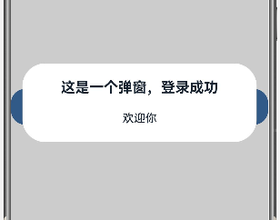
案例1:
@Entry
@Component
struct TanChuang {
  build() {
    Column() {
      Button("弹窗")
        .width('100%')
        .height(50)
        .fontSize(20)
        .backgroundColor(0xFF4A6FA5)
        .onClick(() => {
          AlertDialog.show({
            title: "这是一个弹窗,登录成功",
            message: `欢迎你`
          })
        })
    }
    .width('100%')
    .height('100%')
    .justifyContent(FlexAlign.Center)
  }
}
展示:
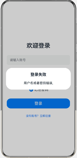
案例2:
import router from '@ohos.router';
@Entry
@Component
struct Logins{
  @State username:string = ""
  build() {
    Column({space:30}){
      Text("欢迎登录")
        .fontSize(30)
        .fontWeight(FontWeight.Bold)

      TextInput({text:this.username,placeholder:"请输入账号"})
        .type(InputType.Normal)
        .width('100%')
        .height(50)
        .borderRadius(10)
        .onChange((value:string)=>{
          this.username = value
        })

      TextInput({placeholder:"请输入密码"})
        .type(InputType.Password)
        .width('100%')
        .height(50)
        .borderRadius(10)

      Row(){
        Toggle({
          type: ToggleType.Checkbox,
          isOn: true
        })

        Text("记住密码")
          .fontSize(18)
      }

      Button("登录")
        .width('100%')
        .height(50)
        .fontSize(20)
        .onClick(() => {
          if (this.username=="root") {
            router.pushUrl({
              url:'pages/ShouYe'
            })
          }else {
            AlertDialog.show({
              title:"登录失败",
              message:`用户名或者密码错误,${this.username}`
            })
          }


        })

      Text("没有账号?立即注册")
        .fontSize(14)
        .fontColor(0x1677ff)
        .onClick(() => {
          router.pushUrl({
            url:'pages/Registers'
          })
        })

    }
    .width('100%')
    .height('100%')
    .padding(20)
    .justifyContent(FlexAlign.Center)
    .alignItems(HorizontalAlign.Center)
  }
}
展示:
开发使用总结
- AlertDialog 浮在当前页面之上,不会切换页面,适合临时消息提示场景;
- message 支持动态变量,非常适合表单输入校验、错误反馈这类业务;
- 弹窗关闭方式简单,点击弹窗外侧灰色遮罩区域即可自动关闭。

讨论HarmonyOS开发技术,专注于API与组件、DevEco Studio、测试、元服务和应用上架分发等。
更多推荐


 8
8 0
0- 0


 已为社区贡献8条内容

所有评论(0)