ArkUI 文本/输入框,按钮,单选框,Toggle 组件全解 2
·
一、Text/TextInput(文本/输入框)
Text 用于展示静态文字内容;TextInput 提供输入交互区域,接收用户手动输入文本,常用于登录、表单填写页面。
核心属性
Text 组件属性
- fontSize:文字字号大小
- fontWeight:文字粗细,支持 Bold 粗体、Medium 常规等枚举
- textAlign:文本对齐方式,TextAlign.Center 居中
- width:组件宽度,支持数值 / 百分比
TextInput 组件属性
- placeholder:输入框空白时的灰色提示文字
- type:输入框类型,InputType.Normal 普通文本模式
- backgroundColor:组件背景色十六进制色值
- borderRadius:输入框圆角大小
案例:
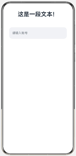
@Entry
@Component
struct TextDemo1{
  build() {
    Column({space:50}){
      Text('这是一段文本!')
        .fontSize(30)
        .fontWeight(FontWeight.Bold)
        .textAlign(TextAlign.Center)
        .width('100%')

      TextInput({placeholder:"请输入账号"})
        .type(InputType.Normal)
        .height(60)
        .width(300)
        .backgroundColor(0xFFF0F2F5 )
        .borderRadius(16)
    }
    .width('100%')
    .height('100%')

  }
}
展示:
二、Button(按钮)
提供可点击交互控件,绑定点击事件执行业务逻辑,支持自定义尺寸、背景、文字、边框、圆角样式。
核心属性
- backgroundColor:按钮背景颜色
- fontSize:按钮内文字字号
- fontWeight:按钮文字粗细
- fontColor:按钮文字颜色
- border:自定义边框(宽度、颜色)
- borderRadius:按钮圆角数值
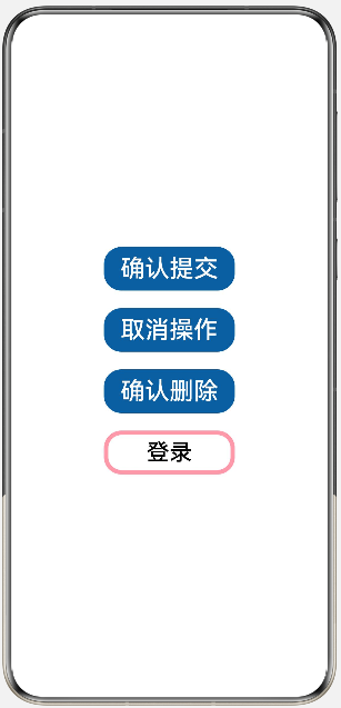
案例:
@Entry
@Component
struct ButtonDemo1{
  build() {
    Column({space:20}){
      Button('确认提交')
        .height(50)
        .width(150)
        .backgroundColor(0xFF2A5E9E)
        .fontSize(28)
        .fontWeight(FontWeight.Medium)

      Button('取消操作')
        .height(50)
        .width(150)
        .backgroundColor(0xFF2A5E9E)
        .fontSize(28)
        .fontWeight(FontWeight.Medium)

      Button('确认删除')
        .height(50)
        .width(150)
        .backgroundColor(0xFF2A5E9E)
        .fontSize(28)
        .fontWeight(FontWeight.Medium)

      Button('登录')
        .height(50)
        .width(150)
        .backgroundColor(Color.Transparent)
        .fontSize(26)
        .fontColor(Color.Black)
        .borderRadius(35)
        .border({width:5,color:0xFFFF99AA})
        .fontWeight(FontWeight.Medium)


    }
    .width('100%')
    .height('100%')
    .justifyContent(FlexAlign.Center)
    .alignItems(HorizontalAlign.Center)
  }
}
展示:
三、Radio(单选框)
分组单选控件,同一 group 分组内仅可选中一项,用于问卷、性别、单项选择表单场景。
核心属性
- value:单选框唯一标识值
- group:分组名称,同组 Radio 互斥单选
- checked:是否默认选中(true 选中 /false 未选中)
案例:
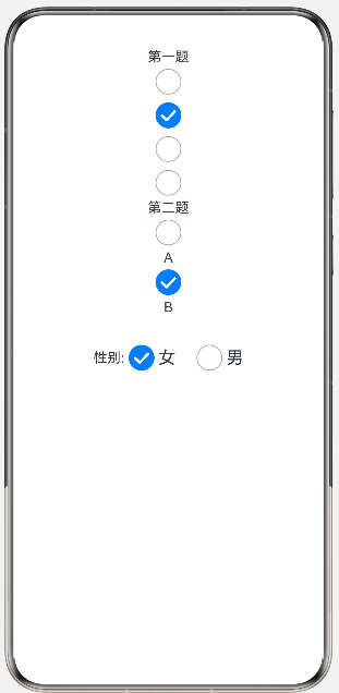
@Entry
@Component
struct RadioDemo1{
  build() {
    Column(){
      Text('第一题')
      Radio({ value: 'Radio1', group: 'radioGroup' })
        .checked(false)
        .height(30)
        .width(30)
      Radio({ value: 'Radio2', group: 'radioGroup' })
        .checked(true)
        .height(30)
        .width(30)
      Radio({ value: 'Radio3', group: 'radioGroup' })
        .checked(false)
        .height(30)
        .width(30)
      Radio({ value: 'Radio4', group: 'radioGroup' })
        .checked(false)
        .height(30)
        .width(30)

      Text('第二题')
      Radio({ value: 'Radio1', group: 'radioGroup1' })
        .checked(false)
        .height(30)
        .width(30)
      Text('A')
      Radio({ value: 'Radio2', group: 'radioGroup1' })
        .checked(true)
        .height(30)
        .width(30)
      Text('B')

      Row(){
        Text('性别:')
        Radio({ value: '女', group: 'sex' })
          .checked(true)
          .height(30)
          .width(30)
        Text('女')
          .fontSize(20)
          .margin({right:20})
        Radio({ value: '男', group: 'sex' })
          .checked(false)
          .height(30)
          .width(30)
        Text('男')
          .fontSize(20)
      }
      .margin({top:30})

    }
    .width('100%')
    .height('100%')
  }
}
展示:
四、Toggle(切换按钮)
二元切换控件,支持按钮样式、滑块开关样式,用于开启 / 关闭类功能设置。
核心属性
- type:开关类型,ToggleType.Button 按钮型、ToggleType.Switch 滑块型
- isOn:开关默认状态,true 开启 /false 关闭
- selectedColor:开关开启状态背景色
- switchPointColor:滑块圆点颜色
- id:组件唯一标识
案例:
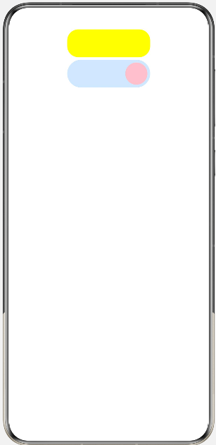
@Entry
@Component
struct ToggleDemo{
  build() {
    Column(){
      Toggle({
        type:ToggleType.Button,
        isOn:true
      })
        .width(150)
        .height(50)
        .selectedColor(Color.Yellow)
        .id('n1')

      Toggle({
        type:ToggleType.Switch,
        isOn:false
      })
        .width(150)
        .height(50)
        .selectedColor(0xFFD0E8FF)
        .switchPointColor(Color.Pink)
        .id('n2')
    }
    .width('100%')
    .height('100%')
  }
}
展示:

讨论HarmonyOS开发技术,专注于API与组件、DevEco Studio、测试、元服务和应用上架分发等。
更多推荐

 6
6 0
0- 0


 已为社区贡献8条内容

所有评论(0)