ArkUI弹性布局介绍
概述
弹性布局(Flex)提供更加有效的方式对容器中的子元素进行排列、对齐和分配剩余空间。常用于页面头部导航栏的均匀分布、页面框架的搭建、多行数据的排列等。
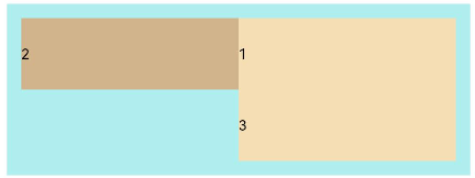
容器默认存在主轴与交叉轴,子元素默认沿主轴排列,子元素在主轴方向的尺寸称为主轴尺寸,在交叉轴方向的尺寸称为交叉轴尺寸。
图1 主轴为水平方向的Flex容器示意图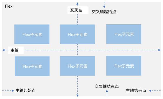
基本概念
-
主轴:Flex组件布局方向的轴线,子元素默认沿着主轴排列。主轴开始的位置称为主轴起始点,结束位置称为主轴结束点。
-
交叉轴:垂直于主轴方向的轴线。交叉轴开始的位置称为交叉轴起始点,结束位置称为交叉轴结束点。
布局方向
在弹性布局中,容器的子元素可以按照任意方向排列。通过设置FlexOptions的参数direction,可以决定主轴的方向,从而控制子元素的排列方向。
图2 弹性布局方向图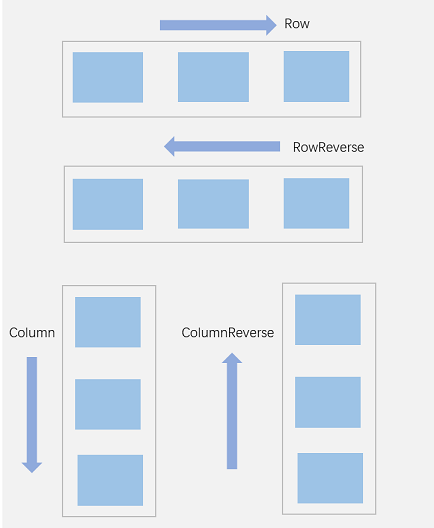
-
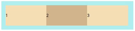
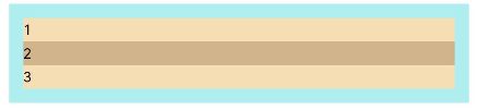
FlexDirection.Row(默认值):主轴为水平方向,子元素从起始端沿着水平方向开始排布。
- Flex({ direction: FlexDirection.Row }) {
- Text('1').width('33%').height(50).backgroundColor('#F5DEB3')
- Text('2').width('33%').height(50).backgroundColor('#D2B48C')
- Text('3').width('33%').height(50).backgroundColor('#F5DEB3')
- }
- .height(70)
- .width('90%')
- .padding(10)
- .backgroundColor('#AFEEEE')
-
FlexDirection.RowReverse:主轴为水平方向,子元素从终点端沿着FlexDirection.Row相反的方向开始排布。
- Flex({ direction: FlexDirection.RowReverse }) {
- Text('1').width('33%').height(50).backgroundColor('#F5DEB3')
- Text('2').width('33%').height(50).backgroundColor('#D2B48C')
- Text('3').width('33%').height(50).backgroundColor('#F5DEB3')
- }
- .height(70)
- .width('90%')
- .padding(10)
- .backgroundColor('#AFEEEE')
-
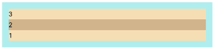
FlexDirection.Column:主轴为垂直方向,子元素从起始端沿着垂直方向开始排布。
- Flex({ direction: FlexDirection.Column }) {
- Text('1').width('100%').height(50).backgroundColor('#F5DEB3')
- Text('2').width('100%').height(50).backgroundColor('#D2B48C')
- Text('3').width('100%').height(50).backgroundColor('#F5DEB3')
- }
- .height(70)
- .width('90%')
- .padding(10)
- .backgroundColor('#AFEEEE')
-
FlexDirection.ColumnReverse:主轴为垂直方向,子元素从终点端沿着FlexDirection.Column相反的方向开始排布。
- Flex({ direction: FlexDirection.ColumnReverse }) {
- Text('1').width('100%').height(50).backgroundColor('#F5DEB3')
- Text('2').width('100%').height(50).backgroundColor('#D2B48C')
- Text('3').width('100%').height(50).backgroundColor('#F5DEB3')
- }
- .height(70)
- .width('90%')
- .padding(10)
- .backgroundColor('#AFEEEE')
 https://gitcode.com/HarmonyOS_Samples/guide-snippets/blob/HarmonyOS-7.0-beta-20260514/ArkUISample/MultipleLayoutProject/entry/src/main/ets/pages/flexlayout/FlexDirectionRowReverse.ets#L20-L30
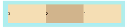
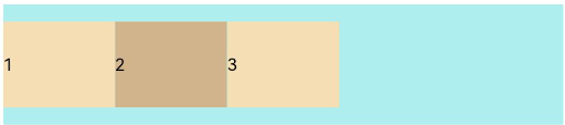
布局换行
弹性布局分为单行布局和多行布局。默认情况下,Flex容器中的子元素都排在一条线(又称“轴线”)上。wrap属性控制当子元素主轴尺寸之和大于容器主轴尺寸时,Flex是单行布局还是多行布局。在多行布局时,通过交叉轴方向,确认新行排列方向。
-
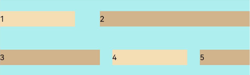
FlexWrap.NoWrap(默认值):不换行。如果子元素的宽度总和大于父元素的宽度,则子元素会被压缩宽度。
- Flex({ wrap: FlexWrap.NoWrap }) {
- Text('1').width('50%').height(50).backgroundColor('#F5DEB3')
- Text('2').width('50%').height(50).backgroundColor('#D2B48C')
- Text('3').width('50%').height(50).backgroundColor('#F5DEB3')
- }
- .width('90%')
- .padding(10)
- .backgroundColor('#AFEEEE')
-
FlexWrap.Wrap:换行,每一行子元素按照主轴方向排列。
- Flex({ wrap: FlexWrap.Wrap }) {
- Text('1').width('50%').height(50).backgroundColor('#F5DEB3')
- Text('2').width('50%').height(50).backgroundColor('#D2B48C')
- Text('3').width('50%').height(50).backgroundColor('#D2B48C')
- }
- .width('90%')
- .padding(10)
- .backgroundColor('#AFEEEE')
-
FlexWrap.WrapReverse:换行,每一行子元素按照主轴反方向排列。
- Flex({ wrap: FlexWrap.WrapReverse}) {
- Text('1').width('50%').height(50).backgroundColor('#F5DEB3')
- Text('2').width('50%').height(50).backgroundColor('#D2B48C')
- Text('3').width('50%').height(50).backgroundColor('#F5DEB3')
- }
- .width('90%')
- .padding(10)
- .backgroundColor('#AFEEEE')
主轴对齐方式
通过justifyContent参数设置子元素在主轴方向的对齐方式。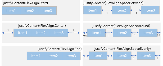
-
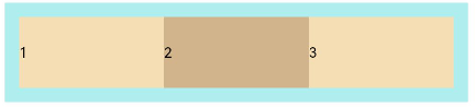
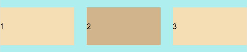
FlexAlign.Start(默认值):子元素在主轴方向起始端对齐, 第一个子元素与父元素边沿对齐,其他元素与前一个元素对齐。
- Flex({ justifyContent: FlexAlign.Start }) {
- Text('1').width('20%').height(50).backgroundColor('#F5DEB3')
- Text('2').width('20%').height(50).backgroundColor('#D2B48C')
- Text('3').width('20%').height(50).backgroundColor('#F5DEB3')
- }
- .width('90%')
- .padding({ top: 10, bottom: 10 })
- .backgroundColor('#AFEEEE')
-
FlexAlign.Center:子元素在主轴方向居中对齐。
- Flex({ justifyContent: FlexAlign.Center }) {
- Text('1').width('20%').height(50).backgroundColor('#F5DEB3')
- Text('2').width('20%').height(50).backgroundColor('#D2B48C')
- Text('3').width('20%').height(50).backgroundColor('#F5DEB3')
- }
- .width('90%')
- .padding({ top: 10, bottom: 10 })
- .backgroundColor('#AFEEEE')
-
FlexAlign.End:子元素在主轴方向终点端对齐,最后一个子元素与父元素边沿对齐,其他元素与后一个元素对齐。
- Flex({ justifyContent: FlexAlign.End }) {
- Text('1').width('20%').height(50).backgroundColor('#F5DEB3')
- Text('2').width('20%').height(50).backgroundColor('#D2B48C')
- Text('3').width('20%').height(50).backgroundColor('#F5DEB3')
- }
- .width('90%')
- .padding({ top: 10, bottom: 10 })
- .backgroundColor('#AFEEEE')
-
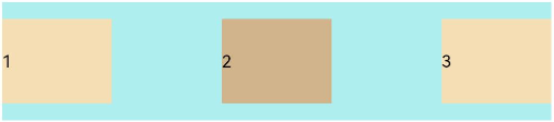
FlexAlign.SpaceBetween:Flex主轴方向均匀分配弹性元素,相邻子元素之间距离相同。第一个子元素和最后一个子元素与父元素边沿对齐。
- Flex({ justifyContent: FlexAlign.SpaceBetween }) {
- Text('1').width('20%').height(50).backgroundColor('#F5DEB3')
- Text('2').width('20%').height(50).backgroundColor('#D2B48C')
- Text('3').width('20%').height(50).backgroundColor('#F5DEB3')
- }
- .width('90%')
- .padding({ top: 10, bottom: 10 })
- .backgroundColor('#AFEEEE')
内容对齐
可以通过alignContent参数设置子元素各行在交叉轴剩余空间内的对齐方式,只在多行的Flex布局中生效,可选值有:
-
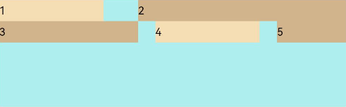
FlexAlign.Start:子元素各行与交叉轴起点对齐。
- Flex({ justifyContent: FlexAlign.SpaceBetween, wrap: FlexWrap.Wrap, alignContent: FlexAlign.Start }) {
- Text('1').width('30%').height(20).backgroundColor('#F5DEB3')
- Text('2').width('60%').height(20).backgroundColor('#D2B48C')
- Text('3').width('40%').height(20).backgroundColor('#D2B48C')
- Text('4').width('30%').height(20).backgroundColor('#F5DEB3')
- Text('5').width('20%').height(20).backgroundColor('#D2B48C')
- }
- .width('90%')
- .height(100)
- .backgroundColor('#AFEEEE')
-
FlexAlign.Center:子元素各行在交叉轴方向居中对齐。
- Flex({ justifyContent: FlexAlign.SpaceBetween, wrap: FlexWrap.Wrap, alignContent: FlexAlign.Center }) {
- Text('1').width('30%').height(20).backgroundColor('#F5DEB3')
- Text('2').width('60%').height(20).backgroundColor('#D2B48C')
- Text('3').width('40%').height(20).backgroundColor('#D2B48C')
- Text('4').width('30%').height(20).backgroundColor('#F5DEB3')
- Text('5').width('20%').height(20).backgroundColor('#D2B48C')
- }
- .width('90%')
- .height(100)
- .backgroundColor('#AFEEEE')
-
FlexAlign.End:子元素各行与交叉轴终点对齐。
- Flex({ justifyContent: FlexAlign.SpaceBetween, wrap: FlexWrap.Wrap, alignContent: FlexAlign.End }) {
- Text('1').width('30%').height(20).backgroundColor('#F5DEB3')
- Text('2').width('60%').height(20).backgroundColor('#D2B48C')
- Text('3').width('40%').height(20).backgroundColor('#D2B48C')
- Text('4').width('30%').height(20).backgroundColor('#F5DEB3')
- Text('5').width('20%').height(20).backgroundColor('#D2B48C')
- }
- .width('90%')
- .height(100)
- .backgroundColor('#AFEEEE')
-
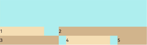
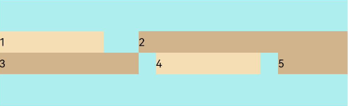
FlexAlign.SpaceBetween:子元素各行与交叉轴两端对齐,各行间垂直间距平均分布。
- Flex({ justifyContent: FlexAlign.SpaceBetween, wrap: FlexWrap.Wrap, alignContent: FlexAlign.SpaceBetween }) {
- Text('1').width('30%').height(20).backgroundColor('#F5DEB3')
- Text('2').width('60%').height(20).backgroundColor('#D2B48C')
- Text('3').width('40%').height(20).backgroundColor('#D2B48C')
- Text('4').width('30%').height(20).backgroundColor('#F5DEB3')
- Text('5').width('20%').height(20).backgroundColor('#D2B48C')
- }
- .width('90%')
- .height(100)
- .backgroundColor('#AFEEEE')
-
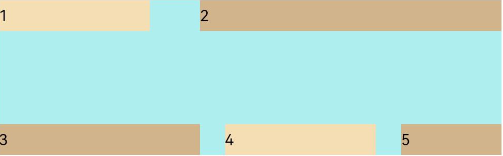
FlexAlign.SpaceAround:子元素各行间距相等,是元素首尾行与交叉轴两端距离的两倍。
- Flex({ justifyContent: FlexAlign.SpaceBetween, wrap: FlexWrap.Wrap, alignContent: FlexAlign.SpaceAround }) {
- Text('1').width('30%').height(20).backgroundColor('#F5DEB3')
- Text('2').width('60%').height(20).backgroundColor('#D2B48C')
- Text('3').width('40%').height(20).backgroundColor('#D2B48C')
- Text('4').width('30%').height(20).backgroundColor('#F5DEB3')
- Text('5').width('20%').height(20).backgroundColor('#D2B48C')
- }
- .width('90%')
- .height(100)
- .backgroundColor('#AFEEEE')
自适应拉伸
在弹性布局父组件尺寸过小时,通过子元素的以下属性设置其在父容器的占比,达到自适应布局。
场景示例
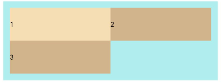
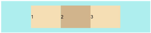
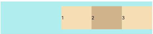
使用弹性布局,可以实现子元素沿水平方向排列,两端对齐,子元素间距平分,垂直方向上子元素居中的效果。
- @Entry
- @Component
- struct FlexExample {
- build() {
- Column() {
- Column({ space: 5 }) {
- Flex({
- direction: FlexDirection.Row,
- wrap: FlexWrap.NoWrap,
- justifyContent: FlexAlign.SpaceBetween,
- alignItems: ItemAlign.Center
- }) {
- Text('1').width('30%').height(50).backgroundColor('#F5DEB3')
- Text('2').width('30%').height(50).backgroundColor('#D2B48C')
- Text('3').width('30%').height(50).backgroundColor('#F5DEB3')
- }
- .height(70)
- .width('90%')
- .backgroundColor('#AFEEEE')
- }.width('100%').margin({ top: 5 })
- }.width('100%')
- }
- }
以上内容均参考于弹性布局 (Flex)-构建布局-组件布局-UI开发 (ArkTS声明式开发范式)-ArkUI(方舟UI框架)-应用框架 - 华为HarmonyOS开发者
实战运用

讨论HarmonyOS开发技术,专注于API与组件、DevEco Studio、测试、元服务和应用上架分发等。
更多推荐


 0
0 0
0- 0


 已为社区贡献8条内容

所有评论(0)