ArkUI组件(Text,TextInput)介绍
TextInput、TextArea是输入框组件,用于响应用户输入,比如评论区的输入、聊天框的输入、表格的输入等,也可以结合其它组件构建功能页面,例如登录注册页面。具体用法请参考TextInput和TextArea组件的API文档。Search是特殊的输入框组件,称为搜索框,默认样式包含搜索图标。具体用法请参考Search组件的API文档。
说明
仅支持单文本样式,若需实现富文本样式,建议使用RichEditor组件。
创建输入框
TextInput是单行输入框,TextArea是多行输入框,Search是搜索框。通过以下接口创建这些组件。
- TextInput(value?:{placeholder?: ResourceStr, text?: ResourceStr, controller?: TextInputController})
- TextArea(value?:{placeholder?: ResourceStr, text?: ResourceStr, controller?: TextAreaController})
- Search(options?:{placeholder?: ResourceStr, value?: ResourceStr, controller?: SearchController, icon?: string})
-
单行输入框。
- TextInput()
-
多行输入框。
- TextArea()
-
多行输入框文字超出一行时会自动折行。
- /* 请将$r('app.string.CreatTextInput_textContent')替换为实际资源文件,在本示例中该资源文件的value值为
- * "我是TextArea我是TextArea我是TextArea我是TextArea"
- */
- TextArea({ text: $r('app.string.CreatTextInput_textContent') })
- .width(300)
-
搜索框。
- Search()
- // 请将$r('app.string.Creat_TextInput_Content')替换为实际资源文件,在本示例中该资源文件的value值为"搜索"
- .searchButton($r('app.string.Creat_TextInput_Content'))


设置输入框类型
TextInput、TextArea和Search都支持设置输入框类型,通过type属性进行设置,但是各组件的枚举值略有不同。下面以单行输入框为例进行说明。
TextInput有以下类型可选择:Normal基本输入模式、Password密码输入模式、Email邮箱地址输入模式、Number纯数字输入模式、PhoneNumber电话号码输入模式、USER_NAME用户名输入模式、NEW_PASSWORD新密码输入模式、NUMBER_PASSWORD纯数字密码输入模式、NUMBER_DECIMAL带小数点的数字输入模式、带URL的输入模式。通过type属性进行设置:
基本输入模式(默认类型)
- TextInput()
- .type(InputType.Normal)

密码模式
包括Password密码输入模式、NUMBER_PASSWORD纯数字密码模式、NEW_PASSWORD新密码输入模式。
以下示例是Password密码输入模式的输入框。
- TextInput()
- .type(InputType.Password)

邮箱地址输入模式
邮箱地址输入模式的输入框,只能存在一个@符号。
- TextInput()
- .type(InputType.Email)

纯数字输入模式
纯数字输入模式的输入框,只能输入数字[0-9]。
- TextInput()
- .type(InputType.Number)

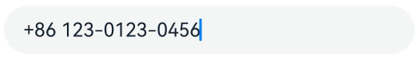
电话号码输入模式
电话号码输入模式的输入框,支持输入数字、空格、+ 、-、*、#、(、),长度不限。
- TextInput()
- .type(InputType.PhoneNumber)
带小数点的数字输入模式
带小数点的数字输入模式的输入框,只能输入数字[0-9]和小数点,只能存在一个小数点。
- TextInput()
- .type(InputType.NUMBER_DECIMAL)

带URL的输入模式
带URL的输入模式,无特殊限制。
- TextInput()
- .type(InputType.URL)

设置输入框多态样式
TextInput、TextArea支持设置输入框多态样式,通过style属性进行设置。下面以多行输入框TextArea为例进行说明。
TextArea有以下2种类型可选择:默认风格,入参是TextContentStyle.DEFAULT;内联模式,也称内联输入风格,入参是TextContentStyle.INLINE。
默认风格
默认风格的输入框,在编辑态和非编辑态,样式没有区别。
- TextArea()
- .style(TextContentStyle.DEFAULT)

自定义样式
-
设置无输入时的提示文本。
- // 请将$r('app.string.i_am_placeholder')替换为实际资源文件,在本示例中该资源文件的value值为"我是提示文本"
- TextInput({ placeholder: $r('app.string.i_am_placeholder') })
-
设置输入框当前的文本内容。
- TextInput({
- // 请将$r('app.string.i_am_placeholder')替换为实际资源文件,在本示例中该资源文件的value值为"我是提示文本"
- placeholder: $r('app.string.i_am_placeholder'),
- // 请将$r('app.string.i_am_current_text_content')替换为实际资源文件,在本示例中该资源文件的value值为"我是当前文本内容"
- text: $r('app.string.i_am_current_text_content')
- })
-
添加backgroundColor改变输入框的背景颜色。
- TextInput({
- // 请将$r('app.string.i_am_placeholder')替换为实际资源文件,在本示例中该资源文件的value值为"我是提示文本"
- placeholder: $r('app.string.i_am_placeholder'),
- // 请将$r('app.string.i_am_current_text_content')替换为实际资源文件,在本示例中该资源文件的value值为"我是当前文本内容"
- text: $r('app.string.i_am_current_text_content')
- })
- .backgroundColor(Color.Pink)
更丰富的样式可以结合通用属性实现。


添加事件
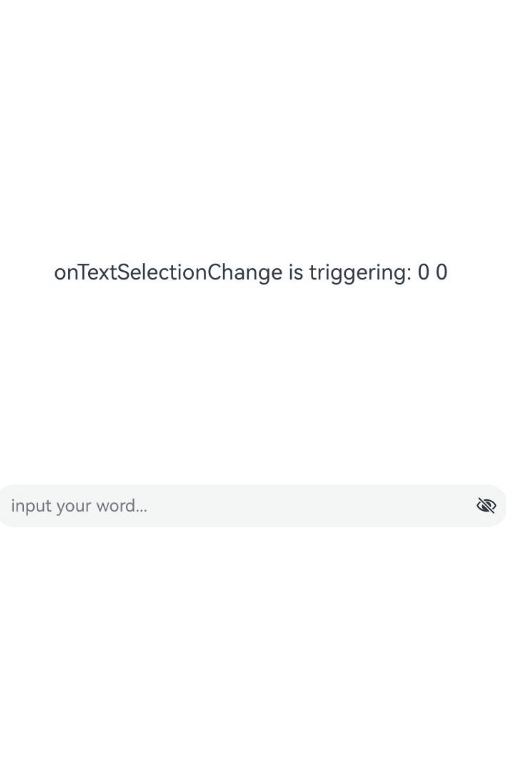
文本框主要用于获取用户输入的信息,并将信息处理成数据进行上传,绑定onChange事件可以获取输入框内改变的文本内容,绑定onSubmit事件可以获取回车提交的文本信息,绑定onTextSelectionChange事件可以获取文本选中时手柄的位置信息或者编辑时光标的位置信息等等。用户也可以使用通用事件进行相应的交互操作。
说明
在密码模式下,设置showPassword属性时,在onSecurityStateChange回调中,建议增加状态同步,具体详见如下示例。
onWillInsert、onDidInsert、onWillDelete、onDidDelete回调仅支持系统输入法的场景。
onWillChange的回调时序晚于onWillInsert、onWillDelete,早于onDidInsert、onDidDelete。
- import { hilog } from '@kit.PerformanceAnalysisKit';
- const TAG = '[Sample_Textcomponent]';
- const DOMAIN = 0xF811;
- const BUNDLE = 'Textcomponent_';
- @Entry
- @Component
- struct TextInputEventAdd {
- @State text: string = '';
- @State textStr1: string = '';
- @State textStr2: string = '';
- @State textStr3: string = '';
- @State textStr4: string = '';
- @State textStr5: string = '';
- @State textStr6: string = '';
- @State textStr7: string = '';
- @State textStr8: string = '';
- @State textStr9: string = '';
- @State passwordState: boolean = false;
- controller: TextInputController = new TextInputController();
- build() {
- Row() {
- Column() {
- Text(`${this.textStr1}\n${this.textStr2}\n${this.textStr3}
- \n${this.textStr4}\n${this.textStr5}\n${this.textStr6}
- \n${this.textStr7}\n${this.textStr8}\n${this.textStr9}`)
- .fontSize(20)
- .width('70%')
- TextInput({ text: this.text, placeholder: 'input your word...', controller: this.controller })
- .type(InputType.Password)
- .showPassword(this.passwordState)
- .onChange((value: string) => {
- // 文本内容发生变化时触发该回调
- hilog.info(DOMAIN, TAG, BUNDLE + 'onChange is triggering: ' + value);
- this.textStr1 = `onChange is triggering: ${value}`;
- })
- .onSubmit((enterKey: EnterKeyType, event: SubmitEvent) => {
- // 按下输入法回车键时触发该回调
- hilog.info(DOMAIN, TAG, BUNDLE + 'onSubmit is triggering: ' + enterKey + event.text);
- this.textStr2 = `onSubmit is triggering: ${enterKey} ${event.text}`;
- })
- .onTextSelectionChange((selectionStart: number, selectionEnd: number) => {
- // 文本选择的位置发生变化或编辑状态下光标位置发生变化时,触发该回调
- hilog.info(DOMAIN, TAG, BUNDLE + 'onTextSelectionChange is triggering: ' + selectionStart + selectionEnd);
- this.textStr3 = `onTextSelectionChange is triggering: ${selectionStart} ${selectionEnd}`;
- })
- .onSecurityStateChange((isShowPassword: boolean) => {
- // 密码显隐状态切换时,触发该回调
- hilog.info(DOMAIN, TAG, BUNDLE + 'onSecurityStateChange is triggering: ' + isShowPassword);
- this.passwordState = isShowPassword;
- this.textStr4 = `onSecurityStateChange is triggering: ${isShowPassword}`;
- })
- .onWillInsert((info: InsertValue) => {
- // 在将要输入时,触发该回调
- hilog.info(DOMAIN, TAG, BUNDLE + 'onWillInsert is triggering: ' + info.insertValue + info.insertOffset);
- this.textStr5 = `onWillInsert is triggering: ${info.insertValue} ${info.insertOffset}`;
- return true;
- })
- .onDidInsert((info: InsertValue) => {
- // 在输入完成时,触发该回调
- hilog.info(DOMAIN, TAG, BUNDLE + 'onDidInsert is triggering: ' + info.insertValue + info.insertOffset);
- this.textStr6 = `onDidInsert is triggering: ${info.insertValue} ${info.insertOffset}`;
- })
- .onWillDelete((info: DeleteValue) => {
- // 在将要删除时,触发该回调
- hilog.info(DOMAIN, TAG, BUNDLE + 'onWillDelete is triggering: ' + info.deleteValue + info.deleteOffset);
- this.textStr7 = `onWillDelete is triggering: ${info.deleteValue} ${info.deleteOffset}`;
- return true;
- })
- .onDidDelete((info: DeleteValue) => {
- // 在删除完成时,触发该回调
- hilog.info(DOMAIN, TAG, BUNDLE + 'onDidDelete is triggering: ' + info.deleteValue + info.deleteOffset);
- this.textStr8 = `onDidDelete is triggering: ${info.deleteValue} ${info.deleteOffset}`;
- })
- .onFocus(() => {
- // 绑定通用事件,输入框获焦时触发该回调
- hilog.info(DOMAIN, TAG, BUNDLE + 'onFocus is triggering');
- this.textStr9 = `onFocus is triggering`;
- })
- }.width('100%')
- }
- .height('100%')
- }
- }
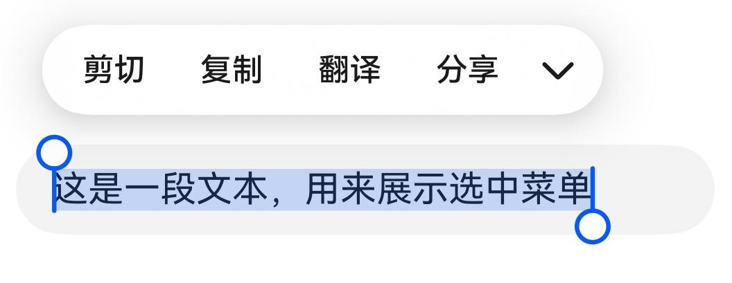
选中菜单
输入框中的文字被选中时会弹出包含剪切、复制、翻译、分享的菜单。
TextInput:
- // 请将$r('app.string.show_selected_menu')替换为实际资源文件,在本示例中该资源文件的value值为"这是一段文本,用来展示选中菜单"
- TextInput({ text: $r('app.string.show_selected_menu') })
以上内容均参考于文本输入 (TextInput/TextArea/Search)-使用文本-UI开发 (ArkTS声明式开发范式)-ArkUI(方舟UI框架)-应用框架 - 华为HarmonyOS开发者
实战演示

讨论HarmonyOS开发技术,专注于API与组件、DevEco Studio、测试、元服务和应用上架分发等。
更多推荐


 0
0 0
0- 0


 已为社区贡献8条内容

所有评论(0)