ArkUI层叠布局介绍
概述
层叠布局(StackLayout)用于在屏幕上预留一块区域来显示组件中的元素,提供元素可以重叠的布局。层叠布局通过Stack容器组件实现位置的固定定位与层叠,容器中的子元素依次入栈,后一个子元素覆盖前一个子元素,子元素可以叠加,也可以设置位置。
层叠布局具有较强的页面层叠、位置定位能力,其使用场景有广告、卡片层叠效果等。
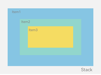
如图1,Stack作为容器,容器内的子元素的顺序为Item1->Item2->Item3。
图1 层叠布局
说明
过多的嵌套组件数会导致性能劣化。在部分场景中,直接使用组件属性或借助系统API的能力可以替代层叠布局的效果,减少了嵌套组件数进而优化性能。最佳实践请参考组件嵌套优化-优先使用组件属性代替嵌套组件。
开发布局
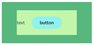
Stack组件为容器组件,容器内可包含各种子元素。其中子元素默认进行居中堆叠。子元素被约束在Stack下,进行自己的样式定义以及排列。
- // xxx.ets
- let mTop:Record<string,number> = { 'top': 50 }
- @Entry
- @Component
- struct StackLayoutExample {
- build() {
- Column(){
- Stack({ }) {
- Column(){}.width('90%').height('100%').backgroundColor('#ff58b87c')
- Text('text').width('60%').height('60%').backgroundColor('#ffc3f6aa')
- Button('button').width('30%').height('30%').backgroundColor('#ff8ff3eb').fontColor('#000')
- }.width('100%').height(150).margin(mTop)
- }
- }
- }
对齐方式
Stack组件通过alignContent参数实现位置的相对移动。如图2所示,支持九种对齐方式。
图2 Stack容器内元素的对齐方式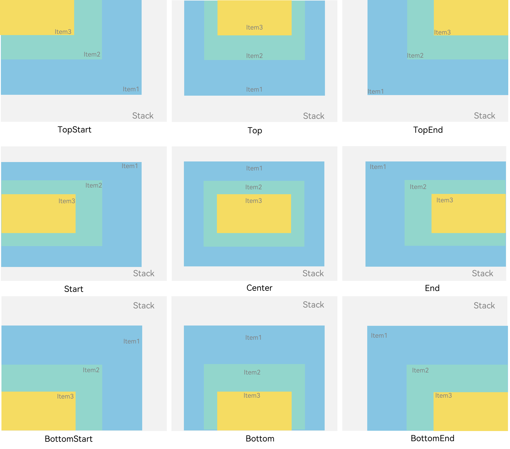
- // xxx.ets
- @Entry
- @Component
- struct StackAlignContentExample {
- build() {
- Stack({ alignContent: Alignment.TopStart }) {
- Text('Stack').width('90%').height('100%').backgroundColor('#e1dede').align(Alignment.BottomEnd)
- Text('Item 1').width('70%').height('80%').backgroundColor(0xd2cab3).align(Alignment.BottomEnd)
- Text('Item 2').width('50%').height('60%').backgroundColor(0xc1cbac).align(Alignment.BottomEnd)
- }.width('100%').height(150).margin({ top: 5 })
- }
- }
Z序控制
Stack容器中兄弟组件显示层级关系可以通过Z序控制的zIndex属性改变。zIndex值越大,显示层级越高,即zIndex值大的组件会覆盖在zIndex值小的组件上方。
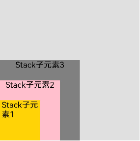
在层叠布局中,如果后面子元素尺寸大于前面子元素尺寸,则前面子元素完全隐藏。
- Stack({ alignContent: Alignment.BottomStart }) {
- Column() {
- // 请将$r('app.string.stack_num1')替换为实际资源文件,在本示例中该资源文件的value值为"Stack子元素1"
- Text($r('app.string.stack_num1')).textAlign(TextAlign.End).fontSize(20)
- }.width(100).height(100).backgroundColor(0xffd306)
- Column() {
- // 请将$r('app.string.stack_num2')替换为实际资源文件,在本示例中该资源文件的value值为"Stack子元素2"
- Text($r('app.string.stack_num2')).fontSize(20)
- }.width(150).height(150).backgroundColor(Color.Pink)
- Column() {
- // 请将$r('app.string.stack_num3')替换为实际资源文件,在本示例中该资源文件的value值为"Stack子元素3"
- Text($r('app.string.stack_num3')).fontSize(20)
- }.width(200).height(200).backgroundColor(Color.Grey)
- }.width(350).height(350).backgroundColor(0xe0e0e0)
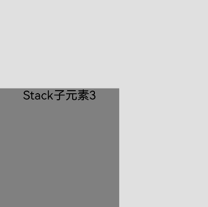
上图中,最后的子元素3的尺寸大于前面的所有子元素,所以,前面两个元素完全隐藏。改变子元素1、子元素2的zIndex属性后,可以将元素展示出来。
- Stack({ alignContent: Alignment.BottomStart }) {
- Column() {
- // 请将$r('app.string.stack_num1')替换为实际资源文件,在本示例中该资源文件的value值为"Stack子元素1"
- Text($r('app.string.stack_num1')).fontSize(20)
- }.width(100).height(100).backgroundColor(0xffd306).zIndex(2)
- Column() {
- // 请将$r('app.string.stack_num2')替换为实际资源文件,在本示例中该资源文件的value值为"Stack子元素2"
- Text($r('app.string.stack_num2')).fontSize(20)
- }.width(150).height(150).backgroundColor(Color.Pink).zIndex(1)
- Column() {
- // 请将$r('app.string.stack_num3')替换为实际资源文件,在本示例中该资源文件的value值为"Stack子元素3"
- Text($r('app.string.stack_num3')).fontSize(20)
- }.width(200).height(200).backgroundColor(Color.Grey)
- }.width(350).height(350).backgroundColor(0xe0e0e0)
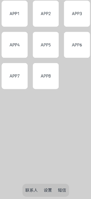
场景示例
使用层叠布局快速搭建页面。
- @Entry
- @Component
- struct StackSample {
- private arr: string[] = ['APP1', 'APP2', 'APP3', 'APP4', 'APP5', 'APP6', 'APP7', 'APP8'];
- build() {
- Stack({ alignContent: Alignment.Bottom }) {
- Flex({ wrap: FlexWrap.Wrap }) {
- ForEach(this.arr, (item:string) => {
- Text(item)
- .width(100)
- .height(100)
- .fontSize(16)
- .margin(10)
- .textAlign(TextAlign.Center)
- .borderRadius(10)
- .backgroundColor(0xFFFFFF)
- }, (item:string):string => item)
- }.width('100%').height('100%')
- Flex({ justifyContent: FlexAlign.SpaceAround, alignItems: ItemAlign.Center }) {
- // 请将$r('app.string.contacts')替换为实际资源文件,在本示例中该资源文件的value值为"联系人"
- Text($r('app.string.contacts')).fontSize(16)
- // 请将$r('app.string.setting')替换为实际资源文件,在本示例中该资源文件的value值为"设置"
- Text($r('app.string.setting')).fontSize(16)
- // 请将$r('app.string.text_message')替换为实际资源文件,在本示例中该资源文件的value值为"短信"
- Text($r('app.string.text_message')).fontSize(16)
- }
- .width('50%')
- .height(50)
- .backgroundColor('#16302e2e')
- .margin({ bottom: 15 })
- .borderRadius(15)
- }.width('100%').height('100%').backgroundColor('#CFD0CF')
- }
- }
以上内容均参考于层叠布局 (Stack)-构建布局-组件布局-UI开发 (ArkTS声明式开发范式)-ArkUI(方舟UI框架)-应用框架 - 华为HarmonyOS开发者
实战运用

讨论HarmonyOS开发技术,专注于API与组件、DevEco Studio、测试、元服务和应用上架分发等。
更多推荐


 0
0 0
0- 0


 已为社区贡献8条内容

所有评论(0)