ArkUI(轮播图,图片)组件介绍
Swiper组件提供滑动轮播显示的能力。Swiper本身是一个容器组件,当设置了多个子组件后,可以对这些子组件进行轮播显示。通常,在一些应用首页显示推荐的内容时,需要用到轮播显示的能力。
针对复杂页面场景,可以使用Swiper组件的预加载机制,利用主线程的空闲时间来提前构建和布局绘制组件,优化滑动体验。
布局与约束
Swiper作为一个容器组件,如果设置了自身尺寸属性,则在轮播显示过程中均以该尺寸生效。如果自身尺寸属性未被设置,则分两种情况:如果设置了prevMargin或者nextMargin属性,则Swiper自身尺寸会跟随其父组件;如果未设置prevMargin或者nextMargin属性,则会自动根据子组件的大小设置自身的尺寸。
循环播放
通过loop属性控制是否循环播放,该属性默认值为true。
当loop为true时,在显示第一页或最后一页时,可以继续往前切换到前一页或者往后切换到后一页。如果loop为false,则在第一页或最后一页时,无法继续向前或者向后切换页面。
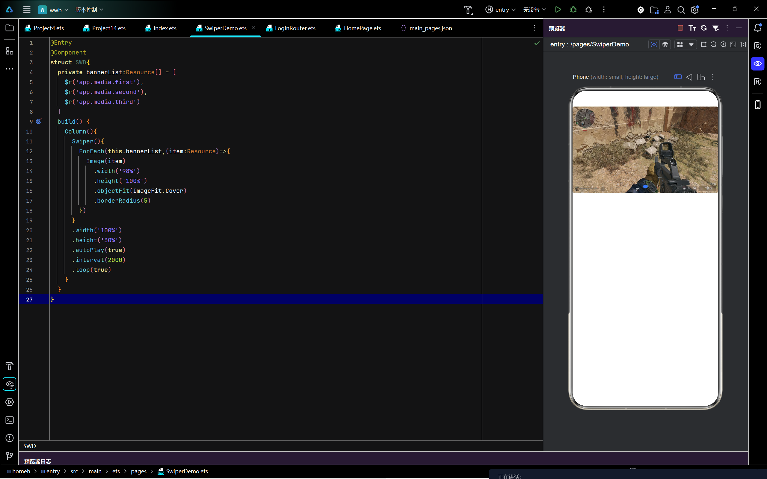
- loop为true
- Swiper() {
- Text('0')
- .width('90%')
- .height('100%')
- .backgroundColor(Color.Gray)
- .textAlign(TextAlign.Center)
- .fontSize(30)
- Text('1')
- .width('90%')
- .height('100%')
- .backgroundColor(Color.Green)
- .textAlign(TextAlign.Center)
- .fontSize(30)
- Text('2')
- .width('90%')
- .height('100%')
- .backgroundColor(Color.Pink)
- .textAlign(TextAlign.Center)
- .fontSize(30)
- }
- // ···
- .loop(true)
- loop为false
- Swiper() {
- // ···
- }
- // ···
- .loop(false)
自动轮播
Swiper通过设置autoPlay属性,控制是否自动轮播子组件。该属性默认值为false。
autoPlay为true时,会自动切换播放子组件,子组件与子组件之间的播放间隔通过interval属性设置。interval属性默认值为3000,单位毫秒。
- Swiper() {
- // ···
- }
- // ···
- .loop(true)
- .autoPlay(true)
- .interval(1000)
页面切换方式
Swiper支持手指滑动、点击导航点和通过控制器三种方式切换页面,以下示例展示通过控制器切换页面的方法。
- // 如需作为页面入口,请取消@Entry的注释并删除export关键字
- // @Entry
- @Component
- export struct SwiperPageSwitchMethod {
- private swiperBackgroundColors: Color[] = [Color.Blue, Color.Brown, Color.Gray, Color.Green, Color.Orange,
- Color.Pink, Color.Red, Color.Yellow];
- private swiperAnimationMode: (SwiperAnimationMode | boolean | undefined)[] = [undefined, true, false,
- SwiperAnimationMode.NO_ANIMATION, SwiperAnimationMode.DEFAULT_ANIMATION, SwiperAnimationMode.FAST_ANIMATION];
- private swiperController: SwiperController = new SwiperController();
- private animationModeIndex: number = 0;
- private animationMode: (SwiperAnimationMode | boolean | undefined) = undefined;
- @State animationModeStr: string = 'undefined';
- @State targetIndex: number = 0;
- aboutToAppear(): void {
- this.toSwiperAnimationModeStr();
- }
- build() {
- // ...
- Column({ space: 5 }) {
- Swiper(this.swiperController) {
- ForEach(this.swiperBackgroundColors, (backgroundColor: Color, index: number) => {
- Text(index.toString())
- .width(250)
- .height(250)
- .backgroundColor(backgroundColor)
- .textAlign(TextAlign.Center)
- .fontSize(30)
- })
- }
- // ...
- .indicator(true)
- Row({ space: 12 }) {
- Button('showNext')
- .onClick(() => {
- this.swiperController.showNext(); // 通过controller切换到后一页
- })
- Button('showPrevious')
- .onClick(() => {
- this.swiperController.showPrevious(); // 通过controller切换到前一页
- })
- }.margin(5)
- Row({ space: 12 }) {
- Text('Index:')
- Button(this.targetIndex.toString())
- .onClick(() => {
- this.targetIndex = (this.targetIndex + 1) % this.swiperBackgroundColors.length;
- })
- }.margin(5)
- Row({ space: 12 }) {
- Text('AnimationMode:')
- Button(this.animationModeStr)
- .onClick(() => {
- this.animationModeIndex = (this.animationModeIndex + 1) % this.swiperAnimationMode.length;
- this.toSwiperAnimationModeStr();
- })
- }.margin(5)
- Row({ space: 12 }) {
- Button('changeIndex(' + this.targetIndex + ', ' + this.animationModeStr + ')')
- .onClick(() => {
- this.swiperController.changeIndex(this.targetIndex, this.animationMode); // 通过controller切换到指定页
- })
- }.margin(5)
- }
- // ...
- }
- private toSwiperAnimationModeStr() {
- this.animationMode = this.swiperAnimationMode[this.animationModeIndex];
- if ((this.animationMode === true) || (this.animationMode === false)) {
- this.animationModeStr = '' + this.animationMode;
- } else if ((this.animationMode === SwiperAnimationMode.NO_ANIMATION) ||
- (this.animationMode === SwiperAnimationMode.DEFAULT_ANIMATION) ||
- (this.animationMode === SwiperAnimationMode.FAST_ANIMATION)) {
- this.animationModeStr = SwiperAnimationMode[this.animationMode];
- } else {
- this.animationModeStr = 'undefined';
- }
- }
- }
开发者经常需要在应用中显示一些图片,例如:按钮中的icon、网络图片、本地图片等。在应用中显示图片需要使用Image组件实现,Image支持多种图片格式,包括png、jpg、jpeg等格式,不支持apng和svga格式,具体支持格式和用法请参考Image组件。
Image通过调用接口来创建,接口调用形式如下:
- Image(src: PixelMap | ResourceStr | DrawableDescriptor)
该接口通过图片数据源获取图片,支持本地图片和网络图片的渲染展示。其中,src是图片的数据源,加载方式请参考加载图片资源。
如果图片加载过程中出现白色块,请参考Image白块解决方案。如果图片加载时间过长,请参考预置图片资源加载优化。
加载图片资源
Image支持加载存档图、多媒体像素图和可绘制描述符三种类型。
存档图类型数据源
存档图类型的数据源可以分为本地资源、网络资源、Resource资源、媒体库资源和base64。
-
本地资源
创建文件夹,将本地图片放入ets文件夹下的任意位置。
Image组件引入本地图片路径,即可显示图片(根目录为ets文件夹)。不支持跨包、跨模块调用该Image组件。
说明
从DevEco Studio 6.0.0 Beta2版本开始,新建工程或模块时,默认创建的模块不会对非resources目录下的资源进行打包,需使相关模块:build-profile.json5中buildOption > resOptions > copyCodeResource > enable设置为true,详见resOptions中copyCodeResource相关介绍。
- // 'images/view.jpg'需要替换为开发者所需的资源文件
- Image('images/view.jpg')
- .width(200)
加载本地图片过程中,如果对图片进行修改或者替换,可能会引起应用崩溃。因此需要覆盖图片文件时,应该先删除该文件再重新创建一个同名文件。
-
网络资源
引入网络图片需申请权限ohos.permission.INTERNET,具体申请方式请参考声明权限。此时,Image组件的src参数为网络图片的链接。
当前Image组件仅支持加载简单网络图片。
首次加载网络图片时,Image组件需要请求网络资源;非首次加载时,默认从缓存中直接读取图片。
更多图片缓存设置请参考setImageCacheCount、setImageRawDataCacheSize和setImageFileCacheSize。这三个图片缓存接口主要用于支持简单、通用的场景,后续不再继续演进,且在灵活和扩展性方面存在一定限制,例如:
- 无法获取当前缓存占用信息。Image组件目前不支持查询磁盘缓存的实时状态,包括文件总大小和文件数量。
- 缓存策略不可定制,缺乏缓存状态观测能力。开发者无法通过接口感知缓存命中率、淘汰次数等运行时的指标,难以基于实际缓存效果进行动态调优。
对于复杂情况,推荐使用ImageKnife,该图像库提供了更灵活、可扩展的缓存策略以及完善的生命周期管理能力,更适合复杂业务需求。
网络图片必须支持RFC 9113标准,否则会导致加载失败。如果下载的网络图片大于10MB或一次下载的网络图片数量较多,建议使用HTTP工具提前下载,提高图片加载性能,方便应用侧管理数据。
在显示网络图片时,Image组件在机制上会依赖缓存下载模块,开发者可参考示例3(下载与显示网络gif图片)了解具体用法。
缓存下载模块提供独立的预下载接口,允许应用开发者在创建Image组件前预下载所需图片。组件创建后,Image组件可直接从缓存下载模块中获取已下载的图片数据,从而加快图片的显示速度,优化加载体验,并有效避免网络图片加载延迟。网络缓存的位置位于应用根目录下的cache目录中。
- // $r('app.string.LoadingResources')需要替换为开发者所需的资源文件,资源文件中的value值请替换为真实路径
- Image($r('app.string.LoadingResources'))
-
Resource资源
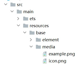
使用资源格式可以跨包/跨模块引入图片,resources文件夹下的图片都可以通过$r资源接口读取到并转换到Resource格式。
图1 resources
调用方式:
- // 请将$r('app.media.icon')替换为实际资源文件
- Image($r('app.media.icon'))
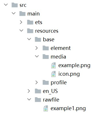
还可以将图片放在rawfile文件夹下。
图2 rawfile
调用方式:
- // $rawfile('example1.png')需要替换为开发者所需的资源文件
- Image($rawfile('example1.png'))
-
媒体库file://data/storage
支持file://路径前缀的字符串,用于访问通过选择器提供的图片路径。
- 调用接口获取图库的照片url。
- import { photoAccessHelper } from '@kit.MediaLibraryKit';
- import { BusinessError } from '@kit.BasicServicesKit';
- import { hilog } from '@kit.PerformanceAnalysisKit';
- const DOMAIN = 0x0001;
- const TAG = 'Sample_imagecomponent';
- @Entry
- @Component
- struct MediaLibraryFile {
- @State imgDatas: string[] = [];
- // 使用PhotoViewPicker唤起图片选择器,选择图片并且渲染到页面中
- // 获取照片url集
- getAllImg() {
- try {
- let photoSelectOptions:photoAccessHelper.PhotoSelectOptions = new photoAccessHelper.PhotoSelectOptions();
- photoSelectOptions.MIMEType = photoAccessHelper.PhotoViewMIMETypes.IMAGE_TYPE;
- photoSelectOptions.maxSelectNumber = 5;
- let photoPicker:photoAccessHelper.PhotoViewPicker = new photoAccessHelper.PhotoViewPicker();
- photoPicker.select(photoSelectOptions).then((photoSelectResult:photoAccessHelper.PhotoSelectResult) => {
- this.imgDatas = photoSelectResult.photoUris;
- hilog.info(DOMAIN, TAG,'PhotoViewPicker.select successfully, photoSelectResult uri: ' + JSON.stringify(photoSelectResult));
- }).catch((err:Error) => {
- let message = (err as BusinessError).message;
- let code = (err as BusinessError).code;
- hilog.info(DOMAIN, TAG,`PhotoViewPicker.select failed with. Code: ${code}, message: ${message}`);
- });
- } catch (err) {
- let message = (err as BusinessError).message;
- let code = (err as BusinessError).code;
- hilog.info(DOMAIN, TAG,`PhotoViewPicker failed with. Code: ${code}, message: ${message}`);
- };
- };
- // aboutToAppear中调用上述函数,获取图库的所有图片url,存在imgDatas中
- async aboutToAppear() {
- this.getAllImg();
- };
- // 使用imgDatas的url加载图片
- build() {
- Column() {
- Grid() {
- ForEach(this.imgDatas, (item:string) => {
- GridItem() {
- Image(item)
- .width(200)
- }
- }, (item:string):string => JSON.stringify(item))
- }
- }.width('100%').height('100%')
- }
- }
- 从媒体库获取的url格式通常如下。
- // 'file://media/Photos/5'需要替换为开发者所需的资源文件,资源文件中的value值请替换为真实路径
- Image('file://media/Photos/5')
- .width(200)
- 调用接口获取图库的照片url。
以上内容均参考于显示图片 (Image)-媒体展示-UI开发 (ArkTS声明式开发范式)-ArkUI(方舟UI框架)-应用框架 - 华为HarmonyOS开发者
创建轮播 (Swiper)-媒体展示-UI开发 (ArkTS声明式开发范式)-ArkUI(方舟UI框架)-应用框架 - 华为HarmonyOS开发者
实战演示

讨论HarmonyOS开发技术,专注于API与组件、DevEco Studio、测试、元服务和应用上架分发等。
更多推荐


 0
0 0
0- 0


 已为社区贡献8条内容

所有评论(0)