HarmonyOS7 动画做不出高级感?animateTo 和共享元素转场够你用了
前言
动画是 App 质感的分水岭。同样的功能,加上丝滑的转场和恰到好处的动效,用户感知上就是"高级"。HarmonyOS 7 在动画能力上做了一次大升级,animateTo 更稳定了,transition 支持不对称动画,geometryTransition 终于能跨页面做共享元素转场了。
这篇把这三个 API 全过一遍,最后用一个商品列表到详情页的实战案例串起来。
animateTo:让状态变化自带缓动
animateTo 的用法很简单——把状态修改的代码包进去,框架自动给你加动画。但很多人只拿它做显隐切换,太浪费了。
它能驱动任何数值型状态的变化,配合 @State 可以做到很多效果:
@Component
struct CounterAnimation {
  @State count: number = 0
  @State scaleValue: number = 1
  @State rotation: number = 0

  build() {
    Column({ space: 20 }) {
      Text(`${this.count}`)
        .fontSize(60)
        .fontWeight(FontWeight.Bold)
        .scale({ x: this.scaleValue, y: this.scaleValue })
        .rotate({ angle: this.rotation })

      Button('点我 +1')
        .onClick(() => {
          animateTo({
            duration: 400,
            curve: Curve.EaseOut,
            iterations: 1,
            // 动画结束的回调
            onFinish: () => {
              // 弹回效果
              animateTo({ duration: 200, curve: Curve.EaseIn }, () => {
                this.scaleValue = 1
              })
            }
          }, () => {
            this.count += 1
            this.scaleValue = 1.3
            this.rotation += 360
          })
        })
    }
    .width('100%')
    .height('100%')
    .justifyContent(FlexAlign.Center)
  }
}
每次点击数字会放大旋转,然后弹回原位。这种"奖励感"的微交互,对用户体验提升很大。
有个容易踩坑的点:animateTo 的回调函数里,只能修改 @State、@Prop、@Link 这些响应式变量。如果你改的是普通变量,动画不会触发。
transition:组件进出场的灵魂
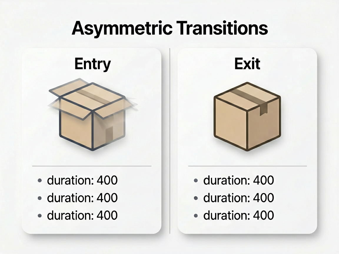
transition 给组件的创建和销毁加动画。基础用法大家都会,这里重点讲不对称转场——入场和出场用不同的动画效果。
@Component
struct ToastNotification {
  @State show: boolean = false

  build() {
    Column() {
      Button('显示通知')
        .onClick(() => {
          this.show = !this.show
        })

      if (this.show) {
        Row() {
          Text('✓ 操作成功')
            .fontSize(16)
            .fontColor('#FFFFFF')
        }
        .padding(16)
        .borderRadius(12)
        .backgroundColor('#333333')
        // 不对称转场:从底部滑入,淡出消失
        .transition(TransitionEffect.translate({ y: 80 })
          .opacity(0)
          .animation({ duration: 400, curve: Curve.FastOutSlowIn })
          .combine(TransitionEffect.scale({ x: 0.8, y: 0.8 })),
        TransitionEffect.opacity()
          .animation({ duration: 300, curve: Curve.EaseIn }))
      }
    }
  }
}
transition 接受两个参数,第一个是入场效果,第二个是出场效果。两个可以完全不同,这就是不对称转场。上面这个例子里,通知从底部滑入并放大,消失时直接淡出。
再来看一个更高级的——结合 asymmetric 和自定义曲线:
.transition(
  asymmetric(
    // 入场:从左侧弹入 + 缩放
    TransitionEffect.translate({ x: -200 })
      .scale({ x: 0.5, y: 0.5 })
      .animation({ duration: 500, curve: Curve.EaseOutBack }),
    // 出场:向右滑出 + 缩小
    TransitionEffect.translate({ x: 200 })
      .scale({ x: 0.5, y: 0.5 })
      .opacity(0)
      .animation({ duration: 400, curve: Curve.EaseIn })
  )
)
Curve.EaseOutBack 会在末尾有一个轻微回弹,做卡片列表的时候用这个曲线特别有弹性感。
geometryTransition:跨页面共享元素
这才是重头戏。共享元素转场就是"列表里的小图,点开变成详情页的大图"那种效果。之前只能在同一个页面里用 sharedTransition,跨页面搞不定。HarmonyOS 7 的 geometryTransition 解决了这个问题。
核心思路:给两个页面的对应元素设置相同的 geometryTransition ID,框架会自动计算位置差,补间动画。
列表页的商品卡片:
@Component
struct ProductCard {
  @Prop product: ProductItem

  build() {
    Column() {
      Image(this.product.coverUrl)
        .width(120)
        .height(120)
        .borderRadius(8)
        // 关键:设置共享元素 ID
        .geometryTransition(`product-cover-${this.product.id}`)

      Text(this.product.title)
        .fontSize(14)
        .maxLines(2)
        .geometryTransition(`product-title-${this.product.id}`)
    }
    .onClick(() => {
      RouterManager.getInstance().push('ProductDetail', {
        id: this.product.id
      })
    })
  }
}
详情页的对应元素:
@Component
struct ProductDetailPage {
  @State productId: string = ''
  @State product: ProductItem = new ProductItem()

  build() {
    Scroll() {
      Column() {
        Image(this.product.coverUrl)
          .width('100%')
          .height(300)
          // 和列表页相同的 ID
          .geometryTransition(`product-cover-${this.productId}`)

        Text(this.product.title)
          .fontSize(22)
          .fontWeight(FontWeight.Bold)
          .geometryTransition(`product-title-${this.productId}`)

        // 详情页的其他内容...
        this.DetailContent()
      }
    }
  }

  @Builder
  DetailContent() {
    Column({ space: 16 }) {
      Text(`¥${this.product.price}`)
        .fontSize(28)
        .fontColor('#FF4D4F')
      Text(this.product.description)
        .fontSize(14)
        .fontColor('#666666')
    }
    .padding(16)
    // 详情内容用 transition 淡入
    .transition(TransitionEffect.opacity()
      .animation({ duration: 300, delay: 200 }))
  }
}
注意几个要点:两边的 geometryTransition ID 必须完全一致;跳转必须用 NavPathStack 的 pushPath,router 模块不支持;详情页的非共享内容建议加 delay,等共享元素动画快结束时再淡入,视觉上更连贯。
实战串联:商品列表到详情页的完整效果
把上面三个能力组合起来,做一个完整的转场效果。列表页用 transition 做卡片入场,跳转时用 geometryTransition 做共享元素过渡,详情页内容用 animateTo 做数字动画:
// 详情页的价格跳动动画
@Component
struct PriceAnimator {
  @State displayPrice: number = 0
  @Prop targetPrice: number = 0

  aboutToAppear() {
    // 延迟触发,等共享元素转场完成
    setTimeout(() => {
      animateTo({
        duration: 800,
        curve: Curve.EaseOutCubic
      }, () => {
        this.displayPrice = this.targetPrice
      })
    }, 350)
  }

  build() {
    Text(`¥${this.displayPrice.toFixed(2)}`)
      .fontSize(32)
      .fontWeight(FontWeight.Bold)
      .fontColor('#FF4D4F')
  }
}
用户从列表点进详情页:商品封面从小图平滑放大到大图,标题位置自然移动,价格从 0 跳到实际金额,其他内容依次淡入。整个流程不到一秒,但用户感知到的就是"流畅"和"精致"。
几点经验
animateTo 的 duration 别太长,200-400ms 是甜区。超过 500ms 用户就会觉得慢。
geometryTransition 目前对复杂布局的支持还有限,共享元素最好是简单的矩形图片和文字。嵌套太深的容器做共享元素,位置计算可能会飘。
转场动画别叠加太多效果。一个共享元素 + 一个淡入就够了,效果越多越容易翻车,尤其在低端机上。
动画是锦上添花,不是越多越好。该快的地方快(按钮反馈 100ms),该慢的地方慢(页面转场 350ms),节奏感比炫酷效果更重要。

讨论HarmonyOS开发技术,专注于API与组件、DevEco Studio、测试、元服务和应用上架分发等。
更多推荐


 8
8 0
0- 0


 已为社区贡献333条内容

所有评论(0)