鸿蒙开发:RelativeContainer相对布局组件实战——实现5个文本组件对齐
·
一、引言
在鸿蒙应用开发中,布局是构建用户界面的基础。当遇到复杂场景下的元素对齐需求时,使用传统的定位方式虽然可以实现,但代码会变得繁琐且难以维护。鸿蒙提供的相对布局组件 RelativeContainer,正是为了解决这类问题而生。本文将通过一个包含 5 个文本组件的实战案例,带你快速掌握 RelativeContainer 的核心用法。
二、案例效果与核心思路
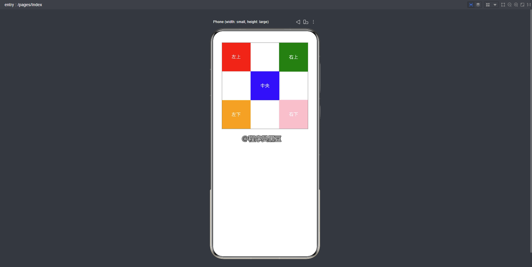
我们的目标是实现一个布局:一个文本组件位于中央,其余四个文本组件分别对齐到中央组件的四个角(左上、右上、左下、右下)。
核心思路是利用 RelativeContainer 的锚点对齐机制,让四个角的组件以中央组件为锚点进行定位。
三、关键属性解析
在开始编码前,我们先了解几个核心属性:
alignRules:这是设置在子组件上的属性,用于定义子组件在相对容器中的对齐规则。它通常包含 6 个值,分别对应组件的左、中、右、上、中、下六个方向的对齐方式。id:作为锚点组件的唯一标识。如果一个组件要相对于另一个组件对齐,被参照的组件必须设置一个id属性。__container__:这是一个特殊的关键字,在alignRules中使用,代表父容器(即RelativeContainer本身)。
四、实战:5 个文本组件的布局
下面我们通过代码来实现这个布局。
4.1 定义中央组件
首先,我们在 RelativeContainer 中添加一个文本组件作为中心锚点,并为其设置 id。
@Entry
@Component
struct RelativeContainerExample {
  build() {
    RelativeContainer() {
      // 1. 中央组件,作为锚点
      Text('中央')
        .id('center')
        .width(100)
        .height(100)
        .backgroundColor(Color.Blue)
        .fontColor(Color.White)
        .textAlign(TextAlign.Center)
        .alignRules({
          center: { anchor: '__container__', align: VerticalAlign.Center },
          middle: { anchor: '__container__', align: HorizontalAlign.Center }
        })
    }
    .width('100%')
    .height(300)
    .border({ width: 1, color: Color.Gray })
  }
}
代码解读:
.id('center'):为中央组件设置 ID 为center。alignRules:设置中央组件相对于父容器居中。center:垂直方向居中,锚点为父容器(__container__),对齐方式为VerticalAlign.Center。middle:水平方向居中,锚点为父容器,对齐方式为HorizontalAlign.Center。
4.2 添加四个角的组件
接下来,我们添加四个文本组件,分别对齐到中央组件的四个角。
@Entry
@Component
struct RelativeContainerExample {
  build() {
    Column() {
      RelativeContainer() {
        // 1. 中央组件
        Text('中央')
          .id('center')
          .width(100)
          .height(100)
          .backgroundColor(Color.Blue)
          .fontColor(Color.White)
          .textAlign(TextAlign.Center)
          .alignRules({
            center: { anchor: '__container__', align: VerticalAlign.Center },
            middle: { anchor: '__container__', align: HorizontalAlign.Center }
          })

        // 2. 左上角组件:自己的底部对齐中央组件的上边,自己的右边对齐中央组件的左边
        Text('左上')
          .id('top-left')
          .width(100)
          .height(100)
          .backgroundColor(Color.Red)
          .fontColor(Color.White)
          .textAlign(TextAlign.Center)
          .alignRules({
            bottom: { anchor: 'center', align: VerticalAlign.Top },
            right: { anchor: 'center', align: HorizontalAlign.Start }
          })

        // 3. 右上角组件:自己的上边对齐容器组件的上边,自己的右边对齐容器组件的右边
        Text('右上')
          .id('top-right')
          .width(100)
          .height(100)
          .backgroundColor(Color.Green)
          .fontColor(Color.White)
          .textAlign(TextAlign.Center)
          .alignRules({
            top: { anchor: '__container__', align: VerticalAlign.Top },
            right: { anchor: '__container__', align: HorizontalAlign.End }
          })

        // 4. 左下角组件:自己的顶部对齐中央组件的底部,自己的右边对齐中央组件的左边
        Text('左下')
          .id('bottom-left')
          .width(100)
          .height(100)
          .backgroundColor(Color.Orange)
          .fontColor(Color.White)
          .textAlign(TextAlign.Center)
          .alignRules({
            top: { anchor: 'center', align: VerticalAlign.Bottom },
            right: { anchor: 'center', align: HorizontalAlign.Start }
          })

        // 5. 右下角组件:自己的底部对齐容器组件的底部,自己的右边对齐容器组件的右边
        Text('右下')
          .id('bottom-right')
          .width(100)
          .height(100)
          .backgroundColor(Color.Pink)
          .fontColor(Color.White)
          .textAlign(TextAlign.Center)
          .alignRules({
            bottom: { anchor: '__container__', align: VerticalAlign.Bottom },
            right: { anchor: '__container__', align: HorizontalAlign.End }
          })
      }
      .width(300)
      .height(300)
      .border({ width: 1, color: Color.Gray })
    }
    .width("100%")
  }
}
运行效果如下:
代码解读:
- 左上角组件(
bottom+right锚定中央组件左上角):bottom: { anchor: 'center', align: VerticalAlign.Top }:自己的底部(bottom)对齐中央组件的上边(VerticalAlign.Top),使左上角组件的下边缘紧贴中央组件的上边缘。right: { anchor: 'center', align: HorizontalAlign.Start }:自己的右边(right)对齐中央组件的左边(HorizontalAlign.Start),使左上角组件的右边缘紧贴中央组件的左边缘。- 组合效果:左上角组件位于中央组件的左上方,两者边缘恰好相接。
- 右上角组件(
top+right锚定容器右上角):top: { anchor: '__container__', align: VerticalAlign.Top }:自己的顶部(top)对齐父容器的顶部(VerticalAlign.Top),使右上角组件紧贴容器上边缘。right: { anchor: '__container__', align: HorizontalAlign.End }:自己的右边(right)对齐父容器的右边(HorizontalAlign.End),使右上角组件紧贴容器右边缘。- 组合效果:右上角组件固定在容器的右上角,与中央组件无直接锚定关系。
- 左下角组件(
top+right锚定中央组件左下角):top: { anchor: 'center', align: VerticalAlign.Bottom }:自己的顶部(top)对齐中央组件的底部(VerticalAlign.Bottom),使左下角组件的上边缘紧贴中央组件的下边缘。right: { anchor: 'center', align: HorizontalAlign.Start }:自己的右边(right)对齐中央组件的左边(HorizontalAlign.Start),使左下角组件的右边缘紧贴中央组件的左边缘。- 组合效果:左下角组件位于中央组件的左下方,两者边缘恰好相接。
- 右下角组件(
bottom+right锚定容器右下角):bottom: { anchor: '__container__', align: VerticalAlign.Bottom }:自己的底部(bottom)对齐父容器的底部(VerticalAlign.Bottom),使右下角组件紧贴容器下边缘。right: { anchor: '__container__', align: HorizontalAlign.End }:自己的右边(right)对齐父容器的右边(HorizontalAlign.End),使右下角组件紧贴容器右边缘。- 组合效果:右下角组件固定在容器的右下角,与中央组件无直接锚定关系。
五、总结
通过这个案例,我们可以看到 RelativeContainer 的强大之处。它通过 alignRules 和 id 属性,让子组件之间可以建立灵活的锚点对齐关系,从而轻松实现复杂的布局效果,避免了繁琐的坐标计算。掌握这个组件,将大大提升你在鸿蒙应用开发中的布局效率。

讨论HarmonyOS开发技术,专注于API与组件、DevEco Studio、测试、元服务和应用上架分发等。
更多推荐
 0
0 0
0- 0


 已为社区贡献14条内容

所有评论(0)