【精通篇】打造React Native鸿蒙跨平台开发高级复合组件库开发系列:Calendar 日历(用于选择日期或日期区间)
在React Native中开发针对鸿蒙操作系统的应用时,可以使用一些跨平台的UI库来构建日历组件,比如使用react-native-calendars库。但是,值得注意的是,鸿蒙操作系统是基于Android系统的,因此在大多数情况下,你可以使用在Android上广泛使用的库,并通过一些适配使其在鸿蒙上运行。
步骤1:安装react-native-calendars
首先,你需要安装react-native-calendars库。打开你的终端或命令提示符,并运行以下命令:
npm install react-native-calendars --save
或者如果你使用yarn:
yarn add react-native-calendars
步骤2:使用react-native-calendars
在你的React Native组件中,你可以这样使用react-native-calendars来创建一个日历组件:
import React, { Component } from 'react';
import { Calendar } from 'react-native-calendars';

class CalendarExample extends Component {
  render() {
    return (
      <Calendar
        // 配置项
        style={{ borderWidth: 1, borderColor: 'gray' }}
        theme={{
          backgroundColor: 'ffffff',
          calendarBackground: 'ffffff',
          textSectionTitleColor: 'b6c1cd',
          selectedDayBackgroundColor: '00adf5',
          todayTextColor: '00adf5',
          dayTextColor: '2d4150',
          textDisabledColor: 'd9e1e8',
          dotColor: '00adf5',
          selectedDotColor: 'ffffff',
          arrowColor: 'orange',
          disabledArrowColor: 'd9e1e8',
          monthTextColor: 'blue'
        }}
        // 其他属性如marking 等...
      />
    );
  }
}

export default CalendarExample;
步骤3:适配鸿蒙操作系统(如果需要)
虽然鸿蒙操作系统是基于Android的,理论上大部分Android适配的库都应该能在鸿蒙上运行。但是,如果你发现某些样式或行为不符合鸿蒙的设计规范,你可能需要进行一些特定的适配。你可以通过修改样式或使用鸿蒙特定的UI组件来实现。例如,鸿蒙有自己的主题和设计指南,你可以根据这些指南调整你的应用UI。
步骤4:测试和调试
在鸿蒙设备或模拟器上测试你的应用以确保一切工作正常。注意检查日历组件在不同屏幕尺寸和方向上的表现。
结论
使用react-native-calendars在React Native应用中实现日历组件是一个相对直接的过程。对于鸿蒙开发,由于它是基于Android的,大部分现有的React Native库应该可以不经修改或仅需少量修改即可使用。确保进行充分的测试和适配以确保最佳的用户体验。如果你遇到特定于鸿蒙的UI问题,查阅鸿蒙的官方文档和设计指南来获取更多信息。
真实组件案例演示:
import React, { useState } from 'react';
import { View, Text, StyleSheet, TouchableOpacity, ScrollView, Dimensions } from 'react-native';

// Simple Icon Component using Unicode symbols
interface IconProps {
  name: string;
  size?: number;
  color?: string;
  style?: object;
}

const Icon: React.FC<IconProps> = ({
  name,
  size = 24,
  color = '#333333',
  style
}) => {
  const getIconSymbol = () => {
    switch (name) {
      case 'prev': return '‹';
      case 'next': return '›';
      case 'today': return '◎';
      case 'event': return '•';
      case 'date': return '📅';
      case 'month': return '📅';
      case 'year': return '📅';
      default: return '●';
    }
  };

  return (
    <View style={[{ width: size, height: size, justifyContent: 'center', alignItems: 'center' }, style]}>
      <Text style={{ fontSize: size * 0.8, color, includeFontPadding: false, textAlign: 'center' }}>
        {getIconSymbol()}
      </Text>
    </View>
  );
};

// Calendar Component
interface CalendarProps {
  events?: { date: string; title: string }[];
  onDateSelect?: (date: string) => void;
  selectedDate?: string;
}

const Calendar: React.FC<CalendarProps> = ({
  events = [],
  onDateSelect,
  selectedDate
}) => {
  const [currentDate, setCurrentDate] = useState(new Date());

  // Get days in month
  const getDaysInMonth = (year: number, month: number) => {
    return new Date(year, month + 1, 0).getDate();
  };

  // Get first day of month (0 = Sunday, 1 = Monday, etc)
  const getFirstDayOfMonth = (year: number, month: number) => {
    return new Date(year, month, 1).getDay();
  };

  // Format date as YYYY-MM-DD
  const formatDate = (date: Date) => {
    const year = date.getFullYear();
    const month = String(date.getMonth() + 1).padStart(2, '0');
    const day = String(date.getDate()).padStart(2, '0');
    return `${year}-${month}-${day}`;
  };

  // Check if date has events
  const hasEvents = (dateStr: string) => {
    return events.some(event => event.date === dateStr);
  };

  // Navigate to previous month
  const prevMonth = () => {
    setCurrentDate(new Date(currentDate.getFullYear(), currentDate.getMonth() - 1, 1));
  };

  // Navigate to next month
  const nextMonth = () => {
    setCurrentDate(new Date(currentDate.getFullYear(), currentDate.getMonth() + 1, 1));
  };

  // Go to today
  const goToToday = () => {
    const today = new Date();
    setCurrentDate(new Date(today.getFullYear(), today.getMonth(), 1));
    if (onDateSelect) {
      onDateSelect(formatDate(today));
    }
  };

  // Render calendar header
  const renderHeader = () => {
    const year = currentDate.getFullYear();
    const month = currentDate.toLocaleString('zh-CN', { month: 'long' });

    return (
      <View style={styles.calendarHeader}>
        <TouchableOpacity onPress={prevMonth} style={styles.navButton}>
          <Icon name="prev" size={24} color="#4a5568" />
        </TouchableOpacity>

        <View style={styles.monthYearContainer}>
          <Text style={styles.monthText}>{month}</Text>
          <Text style={styles.yearText}>{year}年</Text>
        </View>

        <TouchableOpacity onPress={nextMonth} style={styles.navButton}>
          <Icon name="next" size={24} color="#4a5568" />
        </TouchableOpacity>
      </View>
    );
  };

  // Render weekdays
  const renderWeekdays = () => {
    const weekdays = ['日', '一', '二', '三', '四', '五', '六'];

    return (
      <View style={styles.weekdaysContainer}>
        {weekdays.map((day, index) => (
          <View key={index} style={styles.weekdayCell}>
            <Text style={[styles.weekdayText, index === 0 && styles.sundayText]}>{day}</Text>
          </View>
        ))}
      </View>
    );
  };

  // Render calendar days
  const renderDays = () => {
    const year = currentDate.getFullYear();
    const month = currentDate.getMonth();
    const daysInMonth = getDaysInMonth(year, month);
    const firstDayOfMonth = getFirstDayOfMonth(year, month);

    const today = new Date();
    const isCurrentMonth = today.getFullYear() === year && today.getMonth() === month;
    const todayDate = today.getDate();

    const days = [];

    // Previous month's days
    const prevMonthDays = getDaysInMonth(year, month - 1);
    for (let i = firstDayOfMonth - 1; i >= 0; i--) {
      const day = prevMonthDays - i;
      days.push(
        <View key={`prev-${day}`} style={styles.dayCell}>
          <Text style={styles.otherMonthDay}>{day}</Text>
        </View>
      );
    }

    // Current month's days
    for (let day = 1; day <= daysInMonth; day++) {
      const dateObj = new Date(year, month, day);
      const dateStr = formatDate(dateObj);
      const isToday = isCurrentMonth && day === todayDate;
      const isSelected = selectedDate === dateStr;
      const hasEvent = hasEvents(dateStr);

      days.push(
        <TouchableOpacity
          key={`curr-${day}`}
          style={[
            styles.dayCell,
            isToday && styles.todayCell,
            isSelected && styles.selectedCell
          ]}
          onPress={() => onDateSelect && onDateSelect(dateStr)}
        >
          <View style={styles.dayNumberContainer}>
            <Text style={[
              styles.dayNumber,
              isToday && styles.todayText,
              isSelected && styles.selectedText
            ]}>
              {day}
            </Text>
            {hasEvent && (
              <View style={styles.eventIndicator}>
                <Icon name="event" size={8} color="#e53e3e" />
              </View>
            )}
          </View>
        </TouchableOpacity>
      );
    }

    // Next month's days
    const totalCells = 42; // 6 rows * 7 days
    const remainingCells = totalCells - days.length;
    for (let day = 1; day <= remainingCells; day++) {
      days.push(
        <View key={`next-${day}`} style={styles.dayCell}>
          <Text style={styles.otherMonthDay}>{day}</Text>
        </View>
      );
    }

    return (
      <View style={styles.daysContainer}>
        {days}
      </View>
    );
  };

  // Render today button
  const renderTodayButton = () => {
    return (
      <TouchableOpacity style={styles.todayButton} onPress={goToToday}>
        <Icon name="today" size={16} color="#4a5568" style={styles.todayIcon} />
        <Text style={styles.todayButtonText}>今天</Text>
      </TouchableOpacity>
    );
  };

  return (
    <View style={styles.calendarContainer}>
      {renderHeader()}
      {renderWeekdays()}
      {renderDays()}
      {renderTodayButton()}
    </View>
  );
};

// Main App Component
const CalendarComponentApp = () => {
  const [selectedDate, setSelectedDate] = useState<string>('');
  const [events] = useState([
    { date: new Date().toISOString().split('T')[0], title: '会议' },
    { date: new Date(Date.now() + 86400000).toISOString().split('T')[0], title: '生日' },
    { date: new Date(Date.now() + 172800000).toISOString().split('T')[0], title: '假期' },
  ]);

  const handleDateSelect = (date: string) => {
    setSelectedDate(date);
  };

  return (
    <ScrollView style={styles.container}>
      <View style={styles.header}>
        <Text style={styles.headerTitle}>日历组件</Text>
        <Text style={styles.headerSubtitle}>美观实用的日历组件</Text>
      </View>

      <View style={styles.section}>
        <Text style={styles.sectionTitle}>日历展示</Text>
        <View style={styles.calendarWrapper}>
          <Calendar
            events={events}
            onDateSelect={handleDateSelect}
            selectedDate={selectedDate}
          />
        </View>
      </View>

      {selectedDate ? (
        <View style={styles.section}>
          <Text style={styles.sectionTitle}>选中日期</Text>
          <View style={styles.selectedDateCard}>
            <Text style={styles.selectedDateText}>{selectedDate}</Text>
            <Text style={styles.selectedDateDesc}>您已选择以上日期</Text>
          </View>
        </View>
      ) : null}

      <View style={styles.section}>
        <Text style={styles.sectionTitle}>功能演示</Text>
        <View style={styles.demosContainer}>
          <View style={styles.demoItem}>
            <Icon name="date" size={24} color="#3182ce" style={styles.demoIcon} />
            <View>
              <Text style={styles.demoTitle}>日期选择</Text>
              <Text style={styles.demoDesc}>点击任意日期进行选择</Text>
            </View>
          </View>

          <View style={styles.demoItem}>
            <Icon name="event" size={24} color="#e53e3e" style={styles.demoIcon} />
            <View>
              <Text style={styles.demoTitle}>事件标记</Text>
              <Text style={styles.demoDesc}>带有红点标记的日期有事件</Text>
            </View>
          </View>

          <View style={styles.demoItem}>
            <Icon name="month" size={24} color="#38a169" style={styles.demoIcon} />
            <View>
              <Text style={styles.demoTitle}>月份切换</Text>
              <Text style={styles.demoDesc}>使用左右箭头切换月份</Text>
            </View>
          </View>
        </View>
      </View>

      <View style={styles.usageSection}>
        <Text style={styles.sectionTitle}>使用方法</Text>
        <View style={styles.codeBlock}>
          <Text style={styles.codeText}>{'<Calendar'}</Text>
          <Text style={styles.codeText}>  events={'{events}'}</Text>
          <Text style={styles.codeText}>  onDateSelect={'{handleDateSelect}'}</Text>
          <Text style={styles.codeText}>  selectedDate={'{selectedDate}'}</Text>
          <Text style={styles.codeText}>{'/>'}</Text>
        </View>
        <Text style={styles.description}>
          Calendar组件提供了完整的日历功能,包括日期选择、事件标记和月份切换。
          通过events属性传递事件数据,通过onDateSelect处理日期选择事件。
        </Text>
      </View>

      <View style={styles.featuresSection}>
        <Text style={styles.sectionTitle}>功能特性</Text>
        <View style={styles.featuresList}>
          <View style={styles.featureItem}>
            <Icon name="date" size={20} color="#3182ce" style={styles.featureIcon} />
            <Text style={styles.featureText}>日期选择功能</Text>
          </View>
          <View style={styles.featureItem}>
            <Icon name="event" size={20} color="#e53e3e" style={styles.featureIcon} />
            <Text style={styles.featureText}>事件标记显示</Text>
          </View>
          <View style={styles.featureItem}>
            <Icon name="month" size={20} color="#38a169" style={styles.featureIcon} />
            <Text style={styles.featureText}>月份导航</Text>
          </View>
          <View style={styles.featureItem}>
            <Icon name="today" size={20} color="#d69e2e" style={styles.featureIcon} />
            <Text style={styles.featureText}>快速返回今天</Text>
          </View>
        </View>
      </View>

      <View style={styles.footer}>
        <Text style={styles.footerText}>© 2023 日历组件 | 现代化UI组件库</Text>
      </View>
    </ScrollView>
  );
};

const { width } = Dimensions.get('window');

const styles = StyleSheet.create({
  container: {
    flex: 1,
    backgroundColor: '#f7fafc',
  },
  header: {
    backgroundColor: '#ffffff',
    paddingVertical: 30,
    paddingHorizontal: 20,
    marginBottom: 10,
    borderBottomWidth: 1,
    borderBottomColor: '#e2e8f0',
  },
  headerTitle: {
    fontSize: 28,
    fontWeight: '700',
    color: '#2d3748',
    textAlign: 'center',
    marginBottom: 5,
  },
  headerSubtitle: {
    fontSize: 16,
    color: '#718096',
    textAlign: 'center',
  },
  section: {
    marginBottom: 25,
  },
  sectionTitle: {
    fontSize: 20,
    fontWeight: '700',
    color: '#2d3748',
    paddingHorizontal: 20,
    paddingBottom: 15,
  },
  calendarWrapper: {
    backgroundColor: '#ffffff',
    marginHorizontal: 15,
    borderRadius: 15,
    padding: 15,
    elevation: 4,
    shadowColor: '#000',
    shadowOffset: { width: 0, height: 2 },
    shadowOpacity: 0.1,
    shadowRadius: 8,
  },
  selectedDateCard: {
    backgroundColor: '#ebf8ff',
    marginHorizontal: 15,
    borderRadius: 12,
    padding: 20,
    borderWidth: 1,
    borderColor: '#bee3f8',
  },
  selectedDateText: {
    fontSize: 18,
    fontWeight: '700',
    color: '#2b6cb0',
    textAlign: 'center',
    marginBottom: 5,
  },
  selectedDateDesc: {
    fontSize: 14,
    color: '#4a5568',
    textAlign: 'center',
  },
  demosContainer: {
    backgroundColor: '#ffffff',
    marginHorizontal: 15,
    borderRadius: 15,
    padding: 20,
    elevation: 3,
    shadowColor: '#000',
    shadowOffset: { width: 0, height: 2 },
    shadowOpacity: 0.08,
    shadowRadius: 4,
  },
  demoItem: {
    flexDirection: 'row',
    alignItems: 'center',
    marginBottom: 20,
  },
  demoItemLast: {
    marginBottom: 0,
  },
  demoIcon: {
    marginRight: 15,
  },
  demoTitle: {
    fontSize: 16,
    fontWeight: '600',
    color: '#2d3748',
    marginBottom: 3,
  },
  demoDesc: {
    fontSize: 14,
    color: '#718096',
  },
  usageSection: {
    backgroundColor: '#ffffff',
    marginHorizontal: 15,
    borderRadius: 15,
    padding: 20,
    marginBottom: 20,
    elevation: 3,
    shadowColor: '#000',
    shadowOffset: { width: 0, height: 2 },
    shadowOpacity: 0.08,
    shadowRadius: 4,
  },
  codeBlock: {
    backgroundColor: '#2d3748',
    borderRadius: 8,
    padding: 15,
    marginBottom: 15,
  },
  codeText: {
    fontFamily: 'monospace',
    color: '#e2e8f0',
    fontSize: 14,
    lineHeight: 22,
  },
  description: {
    fontSize: 15,
    color: '#4a5568',
    lineHeight: 22,
  },
  featuresSection: {
    backgroundColor: '#ffffff',
    marginHorizontal: 15,
    borderRadius: 15,
    padding: 20,
    marginBottom: 20,
    elevation: 3,
    shadowColor: '#000',
    shadowOffset: { width: 0, height: 2 },
    shadowOpacity: 0.08,
    shadowRadius: 4,
  },
  featuresList: {
    paddingLeft: 10,
  },
  featureItem: {
    flexDirection: 'row',
    alignItems: 'center',
    marginBottom: 15,
  },
  featureIcon: {
    marginRight: 15,
  },
  featureText: {
    fontSize: 16,
    color: '#2d3748',
  },
  footer: {
    paddingVertical: 20,
    alignItems: 'center',
  },
  footerText: {
    color: '#a0aec0',
    fontSize: 14,
  },
  // Calendar Styles
  calendarContainer: {
    backgroundColor: '#ffffff',
  },
  calendarHeader: {
    flexDirection: 'row',
    justifyContent: 'space-between',
    alignItems: 'center',
    paddingHorizontal: 10,
    paddingVertical: 15,
  },
  navButton: {
    padding: 10,
  },
  monthYearContainer: {
    alignItems: 'center',
  },
  monthText: {
    fontSize: 18,
    fontWeight: '700',
    color: '#2d3748',
  },
  yearText: {
    fontSize: 14,
    color: '#718096',
  },
  weekdaysContainer: {
    flexDirection: 'row',
    borderBottomWidth: 1,
    borderBottomColor: '#edf2f7',
    paddingBottom: 10,
    marginBottom: 5,
  },
  weekdayCell: {
    flex: 1,
    alignItems: 'center',
  },
  weekdayText: {
    fontSize: 14,
    fontWeight: '600',
    color: '#4a5568',
  },
  sundayText: {
    color: '#e53e3e',
  },
  daysContainer: {
    flexDirection: 'row',
    flexWrap: 'wrap',
  },
  dayCell: {
    width: '14.28%',
    aspectRatio: 1,
    justifyContent: 'center',
    alignItems: 'center',
  },
  dayNumberContainer: {
    position: 'relative',
  },
  dayNumber: {
    fontSize: 16,
    color: '#4a5568',
    fontWeight: '500',
  },
  otherMonthDay: {
    fontSize: 16,
    color: '#cbd5e0',
  },
  todayCell: {
    backgroundColor: '#ebf8ff',
    borderRadius: 30,
  },
  todayText: {
    color: '#3182ce',
    fontWeight: '700',
  },
  selectedCell: {
    backgroundColor: '#3182ce',
    borderRadius: 30,
  },
  selectedText: {
    color: '#ffffff',
    fontWeight: '700',
  },
  eventIndicator: {
    position: 'absolute',
    top: -3,
    right: -3,
  },
  todayButton: {
    flexDirection: 'row',
    justifyContent: 'center',
    alignItems: 'center',
    paddingVertical: 15,
    borderTopWidth: 1,
    borderTopColor: '#edf2f7',
    marginTop: 5,
  },
  todayIcon: {
    marginRight: 8,
  },
  todayButtonText: {
    fontSize: 16,
    fontWeight: '600',
    color: '#4a5568',
  },
});

export default CalendarComponentApp;
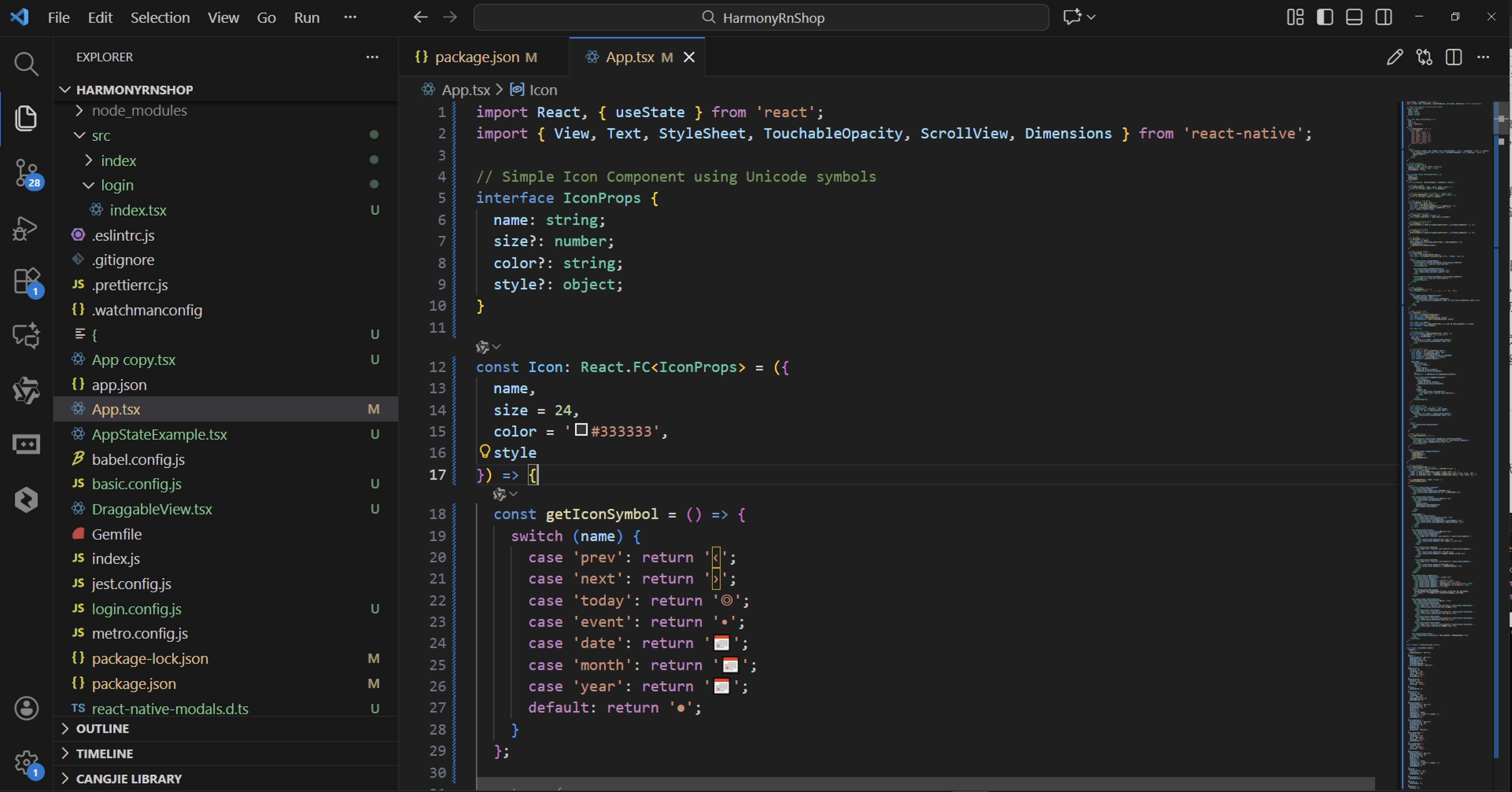
这段代码实现了一个基于 React Native 的日历组件,整体架构分为图标组件和日历主组件两部分。
图标组件通过 Unicode 符号来呈现各种图标,包括前后导航箭头、今日标识、事件标记和日期相关图标。这个组件采用了灵活的配置方式,允许自定义尺寸、颜色和样式,通过一个映射函数将图标名称转换为对应的 Unicode 字符。
日历组件是整个系统的核心,它管理着当前显示的月份状态,并提供了一系列日期计算工具函数。这些函数能够准确获取指定月份的天数,计算月首所在的星期位置,以及将日期格式化为标准字符串。组件还实现了事件检测功能,可以判断特定日期是否有预定事件。
在交互功能方面,日历组件支持月份导航,用户可以向前或向后切换月份查看不同时期的日历。同时提供了快速返回今日的功能,方便用户快速定位到当前日期。组件头部展示了当前月份和年份信息,并配备了直观的导航按钮。
日期网格的渲染逻辑相当完整,不仅显示当前月的所有日期,还包含了上月剩余天数和下月开头天数,形成一个完整的日历视图。对于每一天,组件会检查是否是当前月份、是否是今日、是否有事件等状态,并为不同状态的日期应用相应的视觉样式。
整个组件采用了模块化的设计思路,将不同的功能拆分为独立的渲染函数,包括头部、星期栏和日期网格。这种设计使得代码结构清晰,易于维护和扩展。组件还支持外部传入的事件列表和日期选择回调,提供了良好的扩展性。
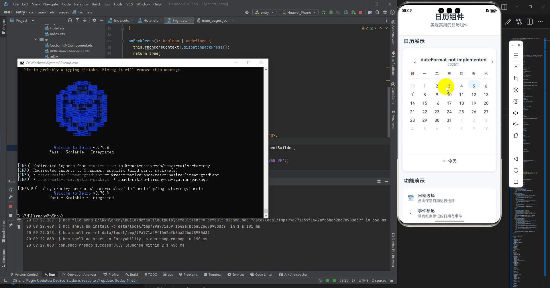
打包
接下来通过打包命令npn run harmony将reactNative的代码打包成为bundle,这样可以进行在开源鸿蒙OpenHarmony中进行使用。

打包之后再将打包后的鸿蒙OpenHarmony文件拷贝到鸿蒙的DevEco-Studio工程目录去:

最后运行效果图如下显示:

讨论HarmonyOS开发技术,专注于API与组件、DevEco Studio、测试、元服务和应用上架分发等。
更多推荐

 27
27 0
0- 0


 已为社区贡献13条内容

所有评论(0)