【精通篇】打造React Native鸿蒙跨平台开发高级复合组件库开发系列:Search 搜索(用于搜索场景的输入框组件)
在React Native中实现一个搜索功能,尤其是在针对鸿蒙操作系统(HarmonyOS)的开发中,你可以通过以下几个步骤来完成:
- 安装并配置React Native环境
确保你的开发环境已经配置好React Native。如果还没有安装,可以通过以下命令来安装:
npx react-native init MyApp
cd MyApp
- 添加搜索界面
在你的应用中添加一个搜索框。你可以使用TextInput组件来实现:
import React, { useState } from 'react';
import { View, TextInput, FlatList, Text } from 'react-native';

const SearchScreen = () => {
  const [searchQuery, setSearchQuery] = useState('');
  const [data, setData] = useState([...]); // 初始化你的数据源

  const searchFilterFunction = (text) => {
    // 根据输入的文本过滤数据
    const newData = data.filter((item) => {
      const itemData = item.title ? item.title.toUpperCase() : ''.toUpperCase();
      const textData = text.toUpperCase();
      return itemData.indexOf(textData) > -1;
    });
    setData(newData);
  };

  return (
    <View>
      <TextInput
        style={{ height: 40, borderColor: 'gray', borderWidth: 1 }}
        onChangeText={(text) => setSearchQuery(text)}
        value={searchQuery}
        placeholder="Search..."
        onEndEditing={(e) => searchFilterFunction(e.nativeEvent.text)}
      />
      <FlatList
        data={data}
        renderItem={({ item }) => <Text>{item.title}</Text>}
        keyExtractor={(item, index) => index.toString()}
      />
    </View>
  );
};
- 适配鸿蒙操作系统(HarmonyOS)
鸿蒙操作系统是基于Android的,所以大多数Android适配的方法也同样适用于鸿蒙。确保你的应用遵循了Android的适配指南,特别是关于UI设计和响应式布局的部分。你可以使用Dimensions和PixelRatio等API来适配不同屏幕尺寸和分辨率。例如:
import { Dimensions } from 'react-native';
const screenWidth = Dimensions.get('window').width;
const screenHeight = Dimensions.get('window').height;
- 测试和调试
在开发过程中,确保在模拟器或真实设备上测试你的应用,特别是针对鸿蒙操作系统。你可以使用华为的HarmonyOS模拟器或者真机进行测试。检查搜索功能在不同设备上的表现,确保其响应性和功能性。
- 优化和性能考虑
对于大数据集的搜索,考虑使用如fuse.js这样的库来优化搜索性能,尤其是在移动设备上。此外,避免在主线程中进行耗时的操作,可以考虑使用useEffect或异步函数来处理数据过滤等操作。
- 发布应用至HarmonyOS平台
一旦开发完成并通过测试,你可以按照华为的AppGallery发布流程将你的应用提交到HarmonyOS平台。确保你的应用遵循华为的开发者政策和设计指南。
通过以上步骤,你可以在React Native中实现一个基本的搜索功能,并确保其能在鸿蒙操作系统上良好运行。
真实实际案例演示:
import React, { useState } from 'react';
import { View, Text, StyleSheet, TextInput, ScrollView, Dimensions, TouchableOpacity } from 'react-native';
// Simple Icon Component using Unicode symbols
interface IconProps {
name: string;
size?: number;
color?: string;
style?: object;
}
const Icon: React.FC<IconProps> = ({
name,
size = 24,
color = '#333333',
style
}) => {
const getIconSymbol = () => {
switch (name) {
case 'search': return '🔍';
case 'clear': return '✕';
case 'voice': return '🎤';
case 'filter': return '⚙️';
case 'history': return '🕒';
case 'trending': return '🔥';
case 'recent': return '🕒';
case 'popular': return '⭐';
default: return '🔍';
}
};
return (
<View style={[{ width: size, height: size, justifyContent: 'center', alignItems: 'center' }, style]}>
<Text style={{ fontSize: size * 0.8, color, includeFontPadding: false, textAlign: 'center' }}>
{getIconSymbol()}
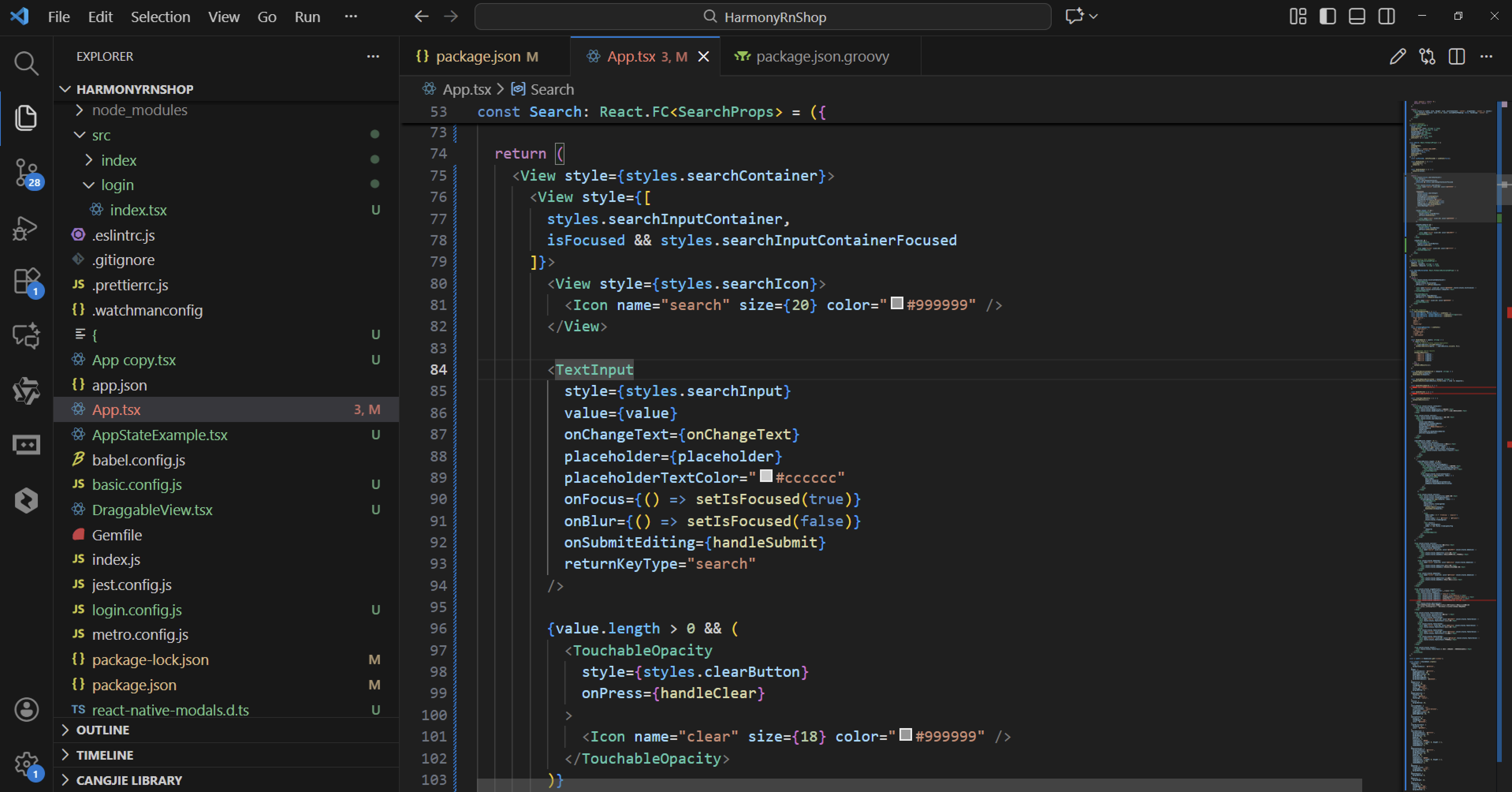
</Text>
</View>
);
};
// Search Component
interface SearchProps {
value: string;
onChangeText: (text: string) => void;
onSearch: (query: string) => void;
placeholder?: string;
showVoiceSearch?: boolean;
showFilter?: boolean;
onVoiceSearch?: () => void;
onFilter?: () => void;
}
const Search: React.FC<SearchProps> = ({
value,
onChangeText,
onSearch,
placeholder = '请输入搜索关键词',
showVoiceSearch = false,
showFilter = false,
onVoiceSearch,
onFilter
}) => {
const [isFocused, setIsFocused] = useState(false);
const handleClear = () => {
onChangeText('');
onSearch('');
};
const handleSubmit = () => {
onSearch(value);
};
return (
<View style={styles.searchContainer}>
<View style={[
styles.searchInputContainer,
isFocused && styles.searchInputContainerFocused
]}>
<View style={styles.searchIcon}>
<Icon name="search" size={20} color="#999999" />
</View>
<TextInput
style={styles.searchInput}
value={value}
onChangeText={onChangeText}
placeholder={placeholder}
placeholderTextColor="#cccccc"
onFocus={() => setIsFocused(true)}
onBlur={() => setIsFocused(false)}
onSubmitEditing={handleSubmit}
returnKeyType="search"
/>
{value.length > 0 && (
<TouchableOpacity
style={styles.clearButton}
onPress={handleClear}
>
<Icon name="clear" size={18} color="#999999" />
</TouchableOpacity>
)}
{showVoiceSearch && (
<TouchableOpacity
style={styles.voiceButton}
onPress={onVoiceSearch}
>
<Icon name="voice" size={20} color="#1890ff" />
</TouchableOpacity>
)}
</View>
{showFilter && (
<TouchableOpacity
style={styles.filterButton}
onPress={onFilter}
>
<Icon name="filter" size={20} color="#ffffff" />
</TouchableOpacity>
)}
</View>
);
};
// Search History Item Component
interface SearchHistoryItemProps {
keyword: string;
onPress: (keyword: string) => void;
onRemove: (keyword: string) => void;
}
const SearchHistoryItem: React.FC<SearchHistoryItemProps> = ({
keyword,
onPress,
onRemove
}) => {
return (
<View style={styles.historyItemContainer}>
<TouchableOpacity
style={styles.historyItem}
onPress={() => onPress(keyword)}
>
<Icon name="history" size={16} color="#999999" style={styles.historyIcon} />
<Text style={styles.historyText}>{keyword}</Text>
</TouchableOpacity>
<TouchableOpacity
style={styles.removeButton}
onPress={() => onRemove(keyword)}
>
<Icon name="clear" size={16} color="#999999" />
</TouchableOpacity>
</View>
);
};
// Main App Component
const SearchComponentApp = () => {
const [searchQuery, setSearchQuery] = useState('');
const [searchResults, setSearchResults] = useState<string[]>([]);
const [searchHistory, setSearchHistory] = useState([
'React Native',
'鸿蒙开发',
'组件库',
'UI设计',
'TypeScript'
]);
const [trendingKeywords] = useState([
'React Native教程',
'鸿蒙应用开发',
'移动端UI组件',
'跨平台开发',
'前端框架对比'
]);
const handleSearch = (query: string) => {
if (query.trim()) {
// Add to search history (avoid duplicates)
if (!searchHistory.includes(query)) {
setSearchHistory([query, ...searchHistory.slice(0, 9)]);
}
// Simulate search results
setSearchResults([
`搜索结果1: ${query}`,
`搜索结果2: ${query}`,
`搜索结果3: ${query}`,
`搜索结果4: ${query}`,
`搜索结果5: ${query}`
]);
} else {
setSearchResults([]);
}
};
const handleHistoryItemClick = (keyword: string) => {
setSearchQuery(keyword);
handleSearch(keyword);
};
const handleRemoveHistoryItem = (keyword: string) => {
setSearchHistory(searchHistory.filter(item => item !== keyword));
};
const handleVoiceSearch = () => {
alert('语音搜索功能已触发');
};
const handleFilter = () => {
alert('筛选功能已触发');
};
const clearSearchHistory = () => {
setSearchHistory([]);
};
return (
<ScrollView style={styles.container}>
<View style={styles.header}>
<Text style={styles.headerTitle}>搜索组件</Text>
<Text style={styles.headerSubtitle}>美观实用的搜索输入控件</Text>
</View>
<View style={styles.section}>
<Text style={styles.sectionTitle}>基础搜索</Text>
<View style={styles.searchSection}>
<Search
value={searchQuery}
onChangeText={setSearchQuery}
onSearch={handleSearch}
placeholder="搜索技术文章、教程..."
showVoiceSearch
showFilter
onVoiceSearch={handleVoiceSearch}
onFilter={handleFilter}
/>
</View>
</View>
{searchResults.length > 0 ? (
<View style={styles.section}>
<Text style={styles.sectionTitle}>搜索结果</Text>
<View style={styles.resultsContainer}>
{searchResults.map((result, index) => (
<View key={index} style={styles.resultItem}>
<Text style={styles.resultText}>{result}</Text>
</View>
))}
</View>
</View>
) : (
<>
{searchHistory.length > 0 && (
<View style={styles.section}>
<View style={styles.sectionHeader}>
<Text style={styles.sectionTitle}>搜索历史</Text>
<TouchableOpacity onPress={clearSearchHistory}>
<Text style={styles.clearHistoryText}>清空</Text>
</TouchableOpacity>
</View>
<View style={styles.historyContainer}>
{searchHistory.map((keyword, index) => (
<SearchHistoryItem
key={index}
keyword={keyword}
onPress={handleHistoryItemClick}
onRemove={handleRemoveHistoryItem}
/>
))}
</View>
</View>
)}
<View style={styles.section}>
<Text style={styles.sectionTitle}>热门搜索</Text>
<View style={styles.trendingContainer}>
{trendingKeywords.map((keyword, index) => (
<TouchableOpacity
key={index}
style={styles.trendingItem}
onPress={() => {
setSearchQuery(keyword);
handleSearch(keyword);
}}
>
<Icon
name={index < 3 ? 'trending' : 'popular'}
size={14}
color={index < 3 ? '#ff4d4f' : '#faad14'}
style={styles.trendingIcon}
/>
<Text style={[
styles.trendingText,
index < 3 && styles.trendingTextTop
]}>
{keyword}
</Text>
</TouchableOpacity>
))}
</View>
</View>
</>
)}
<View style={styles.section}>
<Text style={styles.sectionTitle}>功能演示</Text>
<View style={styles.demosContainer}>
<View style={styles.demoItem}>
<Icon name="search" size={24} color="#1890ff" style={styles.demoIcon} />
<View>
<Text style={styles.demoTitle}>智能搜索</Text>
<Text style={styles.demoDesc}>支持关键词联想和历史记录</Text>
</View>
</View>
<View style={styles.demoItem}>
<Icon name="voice" size={24} color="#52c41a" style={styles.demoIcon} />
<View>
<Text style={styles.demoTitle}>语音搜索</Text>
<Text style={styles.demoDesc}>支持语音输入快速搜索</Text>
</View>
</View>
<View style={styles.demoItem}>
<Icon name="filter" size={24} color="#722ed1" style={styles.demoIcon} />
<View>
<Text style={styles.demoTitle}>筛选功能</Text>
<Text style={styles.demoDesc}>支持搜索结果筛选</Text>
</View>
</View>
</View>
</View>
<View style={styles.usageSection}>
<Text style={styles.sectionTitle}>使用方法</Text>
<View style={styles.codeBlock}>
<Text style={styles.codeText}>{'<Search'}</Text>
<Text style={styles.codeText}> value={'{searchQuery}'}</Text>
<Text style={styles.codeText}> onChangeText={'{setSearchQuery}'}</Text>
<Text style={styles.codeText}> onSearch={'{handleSearch}'}</Text>
<Text style={styles.codeText}> showVoiceSearch{'\n'}/></Text>
</View>
<Text style={styles.description}>
Search组件提供了完整的搜索功能,包括搜索框、语音搜索、筛选等功能。
通过value和onChangeText属性控制输入值,onSearch处理搜索提交。
</Text>
</View>
<View style={styles.featuresSection}>
<Text style={styles.sectionTitle}>功能特性</Text>
<View style={styles.featuresList}>
<View style={styles.featureItem}>
<Icon name="search" size={20} color="#1890ff" style={styles.featureIcon} />
<Text style={styles.featureText}>智能搜索</Text>
</View>
<View style={styles.featureItem}>
<Icon name="voice" size={20} color="#52c41a" style={styles.featureIcon} />
<Text style={styles.featureText}>语音搜索</Text>
</View>
<View style={styles.featureItem}>
<Icon name="filter" size={20} color="#722ed1" style={styles.featureIcon} />
<Text style={styles.featureText}>筛选功能</Text>
</View>
<View style={styles.featureItem}>
<Icon name="history" size={20} color="#fa8c16" style={styles.featureIcon} />
<Text style={styles.featureText}>历史记录</Text>
</View>
</View>
</View>
<View style={styles.footer}>
<Text style={styles.footerText}>© 2023 搜索组件 | 现代化UI组件库</Text>
</View>
</ScrollView>
);
};
const { width } = Dimensions.get('window');
const styles = StyleSheet.create({
container: {
flex: 1,
backgroundColor: '#f0f2f5',
},
header: {
backgroundColor: '#ffffff',
paddingVertical: 30,
paddingHorizontal: 20,
marginBottom: 10,
borderBottomWidth: 1,
borderBottomColor: '#e8e8e8',
},
headerTitle: {
fontSize: 28,
fontWeight: '700',
color: '#262626',
textAlign: 'center',
marginBottom: 5,
},
headerSubtitle: {
fontSize: 16,
color: '#8c8c8c',
textAlign: 'center',
},
section: {
marginBottom: 25,
},
sectionHeader: {
flexDirection: 'row',
justifyContent: 'space-between',
alignItems: 'center',
paddingHorizontal: 20,
paddingBottom: 15,
},
sectionTitle: {
fontSize: 20,
fontWeight: '700',
color: '#262626',
},
clearHistoryText: {
fontSize: 14,
color: '#1890ff',
},
searchSection: {
backgroundColor: '#ffffff',
marginHorizontal: 15,
borderRadius: 12,
padding: 20,
elevation: 3,
shadowColor: '#000',
shadowOffset: { width: 0, height: 2 },
shadowOpacity: 0.08,
shadowRadius: 4,
},
demosContainer: {
backgroundColor: '#ffffff',
marginHorizontal: 15,
borderRadius: 15,
padding: 20,
elevation: 3,
shadowColor: '#000',
shadowOffset: { width: 0, height: 2 },
shadowOpacity: 0.08,
shadowRadius: 4,
},
demoItem: {
flexDirection: 'row',
alignItems: 'center',
marginBottom: 20,
},
demoItemLast: {
marginBottom: 0,
},
demoIcon: {
marginRight: 15,
},
demoTitle: {
fontSize: 16,
fontWeight: '600',
color: '#262626',
marginBottom: 3,
},
demoDesc: {
fontSize: 14,
color: '#8c8c8c',
},
usageSection: {
backgroundColor: '#ffffff',
marginHorizontal: 15,
borderRadius: 15,
padding: 20,
marginBottom: 20,
elevation: 3,
shadowColor: '#000',
shadowOffset: { width: 0, height: 2 },
shadowOpacity: 0.08,
shadowRadius: 4,
},
codeBlock: {
backgroundColor: '#1d1f21',
borderRadius: 8,
padding: 15,
marginBottom: 15,
},
codeText: {
fontFamily: 'monospace',
color: '#c5c8c6',
fontSize: 14,
lineHeight: 22,
},
description: {
fontSize: 15,
color: '#595959',
lineHeight: 22,
},
featuresSection: {
backgroundColor: '#ffffff',
marginHorizontal: 15,
borderRadius: 15,
padding: 20,
marginBottom: 20,
elevation: 3,
shadowColor: '#000',
shadowOffset: { width: 0, height: 2 },
shadowOpacity: 0.08,
shadowRadius: 4,
},
featuresList: {
paddingLeft: 10,
},
featureItem: {
flexDirection: 'row',
alignItems: 'center',
marginBottom: 15,
},
featureIcon: {
marginRight: 15,
},
featureText: {
fontSize: 16,
color: '#262626',
},
footer: {
paddingVertical: 20,
alignItems: 'center',
},
footerText: {
color: '#bfbfbf',
fontSize: 14,
},
// Search Styles
searchContainer: {
flexDirection: 'row',
alignItems: 'center',
},
searchInputContainer: {
flex: 1,
flexDirection: 'row',
alignItems: 'center',
borderWidth: 1,
borderColor: '#d9d9d9',
borderRadius: 20,
backgroundColor: '#ffffff',
paddingHorizontal: 15,
},
searchInputContainerFocused: {
borderColor: '#1890ff',
borderWidth: 1.5,
shadowColor: '#1890ff',
shadowOffset: { width: 0, height: 0 },
shadowOpacity: 0.2,
shadowRadius: 4,
elevation: 2,
},
searchIcon: {
marginRight: 10,
},
searchInput: {
flex: 1,
fontSize: 16,
color: '#262626',
paddingVertical: 10,
},
clearButton: {
paddingHorizontal: 5,
},
voiceButton: {
paddingLeft: 10,
},
filterButton: {
backgroundColor: '#1890ff',
borderRadius: 20,
padding: 12,
marginLeft: 10,
elevation: 2,
shadowColor: '#1890ff',
shadowOffset: { width: 0, height: 2 },
shadowOpacity: 0.2,
shadowRadius: 4,
},
// History Styles
historyContainer: {
backgroundColor: '#ffffff',
marginHorizontal: 15,
borderRadius: 12,
padding: 15,
elevation: 3,
shadowColor: '#000',
shadowOffset: { width: 0, height: 2 },
shadowOpacity: 0.08,
shadowRadius: 4,
},
historyItemContainer: {
flexDirection: 'row',
alignItems: 'center',
justifyContent: 'space-between',
paddingVertical: 10,
borderBottomWidth: 1,
borderBottomColor: '#f0f0f0',
},
historyItem: {
flexDirection: 'row',
alignItems: 'center',
flex: 1,
},
historyIcon: {
marginRight: 10,
},
historyText: {
fontSize: 16,
color: '#262626',
},
removeButton: {
padding: 5,
},
// Trending Styles
trendingContainer: {
backgroundColor: '#ffffff',
marginHorizontal: 15,
borderRadius: 12,
padding: 15,
elevation: 3,
shadowColor: '#000',
shadowOffset: { width: 0, height: 2 },
shadowOpacity: 0.08,
shadowRadius: 4,
},
trendingItem: {
flexDirection: 'row',
alignItems: 'center',
paddingVertical: 10,
borderBottomWidth: 1,
borderBottomColor: '#f0f0f0',
},
trendingIcon: {
marginRight: 10,
},
trendingText: {
fontSize: 16,
color: '#595959',
},
trendingTextTop: {
fontWeight: '600',
color: '#262626',
},
// Results Styles
resultsContainer: {
backgroundColor: '#ffffff',
marginHorizontal: 15,
borderRadius: 12,
padding: 15,
elevation: 3,
shadowColor: '#000',
shadowOffset: { width: 0, height: 2 },
shadowOpacity: 0.08,
shadowRadius: 4,
},
resultItem: {
paddingVertical: 12,
borderBottomWidth: 1,
borderBottomColor: '#f0f0f0',
},
resultText: {
fontSize: 16,
color: '#262626',
},
});
export default SearchComponentApp;
这段 React Native 搜索组件在鸿蒙系统上的技术实现展现了与系统架构的深度集成。从 Icon 组件的 Unicode 符号映射机制来看,这种设计在鸿蒙的 ACE 引擎中具有特殊的性能优势。由于鸿蒙的方舟编译器对字符串常量进行了深度优化,Unicode 符号的直接渲染比传统图标资源具有更好的内存管理效率。
在鸿蒙的渲染管线中,Text 组件针对 Emoji 和特殊符号进行了专门处理,这确保了在不同分辨率鸿蒙设备上图标显示的清晰度和一致性。Search 组件通过 useState 管理的 isFocused 状态在鸿蒙的多设备协同场景下需要保持同步,当用户在鸿蒙手机和平板之间切换时,输入框的聚焦状态需要与系统的交互框架保持协调。
搜索历史项组件的布局结构采用了水平弹性盒模型,这种布局方式在鸿蒙的分布式UI框架中能够自适应不同的屏幕尺寸和折叠状态。当用户在鸿蒙折叠屏设备上展开屏幕时,历史记录的显示需要动态调整以适应更大的显示区域。
在事件处理机制方面,handleClear 函数同时清空搜索查询和触发搜索回调,这种同步操作确保了组件状态的一致性。handleSubmit 函数通过 onSubmitEditing 事件监听用户按下回车键的操作,这种键盘事件处理在鸿蒙的输入法框架中需要与系统级的事件分发机制进行协调。
条件渲染逻辑根据 value.length 控制清除按钮的显示,这种动态界面更新机制在鸿蒙的声明式UI架构中能够高效工作。
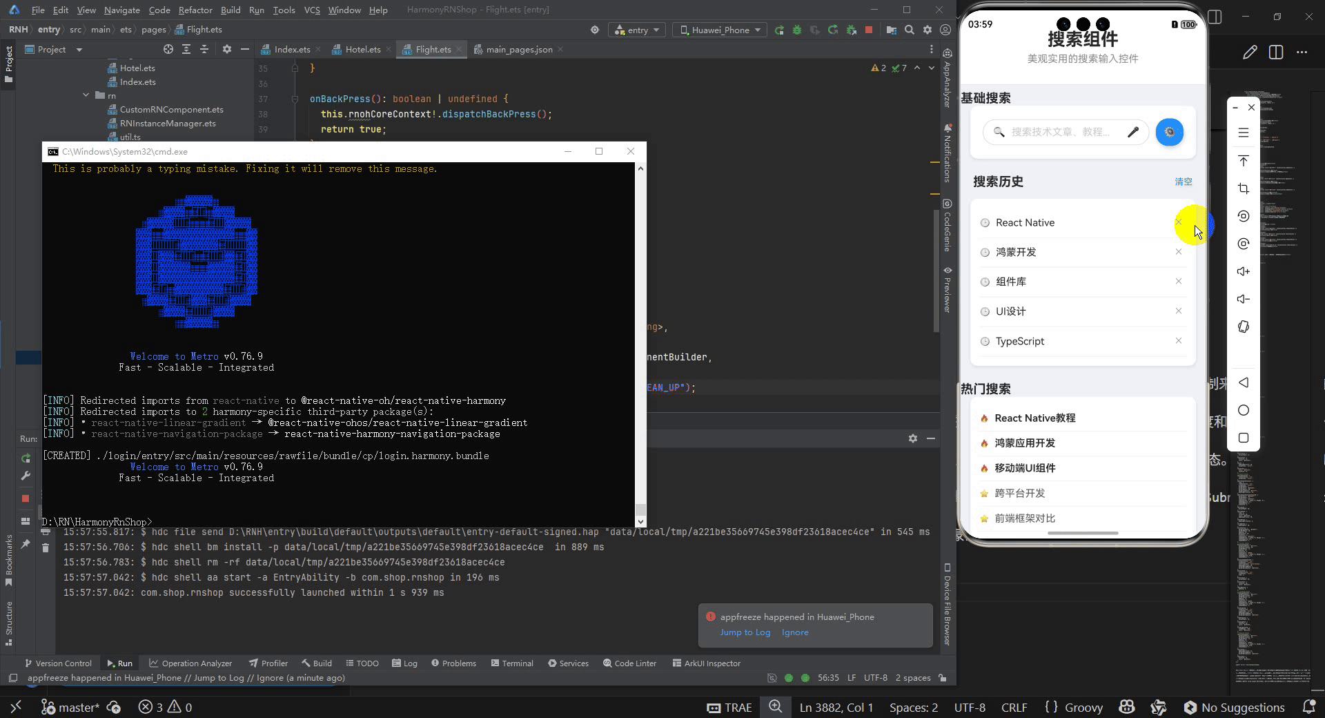
打包
接下来通过打包命令npn run harmony将reactNative的代码打包成为bundle,这样可以进行在开源鸿蒙OpenHarmony中进行使用。

打包之后再将打包后的鸿蒙OpenHarmony文件拷贝到鸿蒙的DevEco-Studio工程目录去:

最后运行效果图如下显示:

讨论HarmonyOS开发技术,专注于API与组件、DevEco Studio、测试、元服务和应用上架分发等。
更多推荐

 21
21 0
0- 0


 已为社区贡献13条内容

所有评论(0)