Flutter到 OpenHarmony,不是有手就行吗? (仿掘金点赞按钮)
前言
Flutter 提供了丰富的动画支持,使开发者能够轻松创建各种类型的动画效果,从简单的渐变和旋转到复杂的交互式动画都可以实现。而 ArkUI 从 api 上面看起来更简单,更容易编写代码。我们今天迁移的是 Flutter 上面的 like_button , 它使我们的点赞效果更简单酷炫和简单。
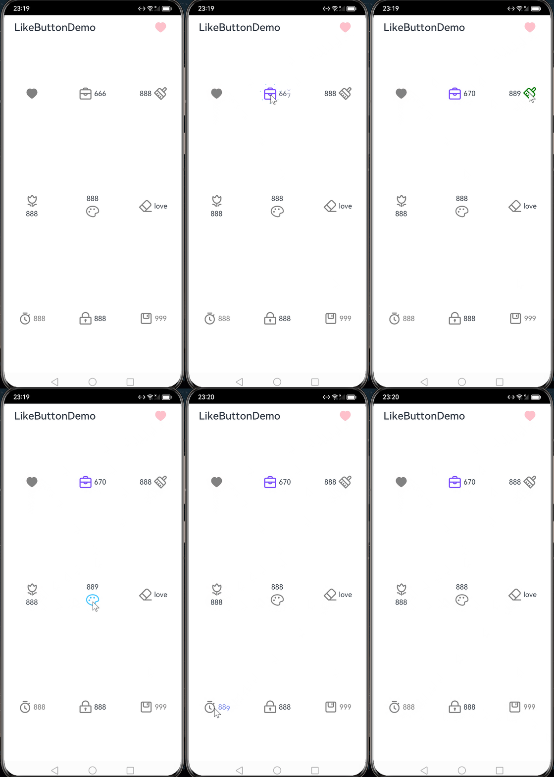
点赞按钮
Like Button 支持推特点赞效果和喜欢数量动画的 ArkUI 库.
安装
ohpm install @candies/like_button
参数
配置参数
| 参数 | 类型 | 描述 |
|---|---|---|
| likeWidgetSize | number | LikeWidget 的大小(默认 30) |
| bubblesSize | number | 动画时候的泡泡的大小(默认为 likeWidgetSize 的 2 倍) |
| bubblesColor | BubblesColor | 动画时候的泡泡的颜色,可以分别设置 4 种(默认为 dotPrimaryColor: ‘#FFFFC107’,dotSecondaryColor: ‘#FFFF9800’,dotThirdColor: ‘#FFFF5722’,dotLastColor: ‘#FFF44336’ |
| circleSize | number | 动画时候的圈的最大大小(默认为 likeWidgetSize 的 0.8 倍) |
| circleColor | BubblesColor | 动画时候的圈的颜色,需要设置 2 种 (默认为 start: ‘#FFFF5722’, end: ‘#FFFFC107’) |
| isLiked | boolean | 是否喜欢。(默认 false) |
| animationDuration | number | LikeWidget 动画时长(默认 1000 毫秒) |
| likeCount | number | 喜欢数量。如果不设置(undefined),不显示 LikeCountWidget |
| flexOptions | FlexOptions | LikeWidget 和 LikeCountWidget 2 个组件位置的配置(默认为 direction: FlexDirection.Row, justifyContent: FlexAlign.Center, alignItems: ItemAlign.Center) |
| likeCountAnimationType | LikeCountAnimationType | 喜欢数量动画的类型(none,part,all)。没有动画;只动画改变的部分;全部部分 |
| widgetsMargin | number | LikeWidget and LikeCountWidget 的距离 |
| likeCountAnimationDuration | number | LikeCountWidget 动画时长(默认 1000 毫秒) |
| controller | Controller | 可以通过调用 Controller 的 Tap 的方法,执行动画 |
回调
这是一个异步回调,你可以等待服务返回之后再改变状态。也可以先改变状态,请求失败之后重置回状态
onTap: (isLike: boolean) => Promise<boolean> = async (isLike: boolean) => {
    return !isLike;
  };
组件创建回调
| 回调 | 参数 | 描述 |
|---|---|---|
| likeWidgetBuilder | isLiked: boolean | 用于自定义 LikeWidget |
| likeCountWidgetBuilder | isLiked: boolean,likeCount: number,showText: string | 用于自定义 LikeCountWidget |
@BuilderParam
  likeWidgetBuilder?: ($$: { isLiked: boolean }) => void = this.buildLikeWidget.bind(this);
  @BuilderParam
  likeCountWidgetBuilder?: ($$: {
    isLiked: boolean,
    likeCount: number,
    showText: string
  }) => void = this.buildLikeCountWidget.bind(this);
例子
无限点赞
将 onTap 固定返回 true,可以实现无限点赞的效果。
LikeButton(
  {
    likeCount: 666,
    onTap: async (isLike: boolean): Promise<true> => {
      return true;
    },
  }
)
LikeCountWidget 特殊处理逻辑
你可以根据 likeCount 的值的不同,做一些特殊的处理。
LikeButton(
  {
    likeCount: 999,
    likeWidgetBuilder: this.buildLikeWidget8,
    bubblesColor: new BubblesColor({
      dotPrimaryColor: '#FF00796B',
      dotSecondaryColor: '#FF004D40',
    },),
    circleColor: new CircleColor({
      start: '#FF26A69A',
      end: '#FFB2DFDB',
    }),
    likeCountWidgetBuilder: this.buildLikeCountWidget2,
  }
)

@Builder
buildLikeCountWidget2($$: {
  isLiked: boolean,
  likeCount: number,
  showText: string
}) {
  if ($$.likeCount >= 1000)
    Text(`${($$.likeCount / 1000).toFixed(1)}k`).fontColor($$.isLiked ? '#FF004D40' : Color.Gray)
  else
    Text(`${$$.showText}`).fontColor($$.isLiked ? '#FF004D40' : Color.Gray)
}

@Builder
buildLikeWidget8($$: { isLiked: boolean }) {
  Image($r('app.media.save'))
    .fillColor($$.isLiked ? '#FF004D40' : Color.Gray)
}
设置 LikeWidget 和 LikeCountWidget 的位置
LikeButton(
 {
   likeCount: 888,
   flexOptions: {
     direction: FlexDirection.Column,
     justifyContent: FlexAlign.Center,
     alignItems: ItemAlign.Center,
   },
 }
)
学废了
动画
ArkUI 里面使用动画蛮简单的。
动画概述-使用动画-基于 ArkTS 的声明式开发范式-UI 开发-开发-HarmonyOS 应用开发
@Entry
@Component
struct LayoutChange2 {
  @State myWidth: number = 100;
  @State myHeight: number = 50;
  // 标志位,true和false分别对应一组myWidth、myHeight值
  @State flag: boolean = false;

  build() {
    Column({ space: 10 }) {
      Button("text")
        .type(ButtonType.Normal)
        .width(this.myWidth)
        .height(this.myHeight)
        .margin(20)
      Button("area: click me")
        .fontSize(12)
        .margin(20)
        .onClick(() => {
          animateTo({ duration: 1000, curve: Curve.Ease }, () => {
            // 动画闭包中根据标志位改变控制第一个Button宽高的状态变量,使第一个Button做宽高动画
            if (this.flag) {
              this.myWidth = 100;
              this.myHeight = 50;
            } else {
              this.myWidth = 200;
              this.myHeight = 100;
            }
            this.flag = !this.flag;
          });
        })
    }
    .width("100%")
    .height("100%")
  }
}
但是你没法获取到每一帧的动画值。我们需要另外一个 api 来实现。
@ohos.animator (动画)-UI 界面-ArkTS 接口参考-ArkTS API 参考-HarmonyOS 应用开发
let options: AnimatorOptions = {
  duration: 1000,
  easing: "ease",
  delay: 0,
  fill: "forwards",
  direction: "normal",
  iterations: 1,
  begin: 0.0,
  end: 1.0
};

let animatorResult = animator.create(options);
animatorResult.onframe=(progress: number)=>{

};
animatorResult.onfinish=()=>{

};

animatorResult.play();
animatorResult.pause();
animatorResult.cancel();
animatorResult.reverse();
animatorResult.reset(options);
onframe 方法中的 progress 在 begin 和 end 之间的值。你可以在这个方法里面对某个属性做改变,达到动画的效果。
不过这个 api 没法像 Flutter 中一样, 使用同一个 Controller 对不同的属性,在不同时间段做不同的动画效果。比如下面的 Controller 的动画总时间为 1000 秒,那么就 _innerCircleAnimation 就是一个值从 0.2 开始 1.0 结束,并且是从 200 秒开始 500 秒结束的 Curves.ease 动画。虽然
ArkUI 中 AnimatorOptions 中可以设置 delay 来控制开始的时间,但是这也会影响整个动画的曲线。
_innerCircleAnimation = Tween<double>(
      begin: 0.2,
      end: 1.0,
    ).animate(
      CurvedAnimation(
        parent: _controller!,
        curve: const Interval(
          0.2,
          0.5,
          curve: Curves.ease,
        ),
      ),
    );
最终我的实现方案是将 Flutter 中的动画曲线迁移到 ArkUI 中,使用固定的 0.0 到 1.0 的 AnimatorOptions 来作为 Flutter 中的
AnimationController 来驱动动画。
let options: AnimatorOptions = {
  duration: this.animationDuration,
  easing: "ease",
  delay: 0,
  fill: "forwards",
  direction: "normal",
  iterations: 1,
  begin: 0.0,
  end: 1.0
};

_outerCircleCurve = new Interval({
  begin: 0.0,
  end: 0.3,
  curve: Cubic.ease,
  beginValue: 0.1,
  endValue: 1.0,
});
_innerCircleCurve = new Interval({
  begin: 0.2,
  end: 0.5,
  curve: Cubic.ease,
  beginValue: 0.2,
  endValue: 1.0,
});
_bubblesCurve = new Interval({
  begin: 0.1,
  end: 1.0,
  curve: new DecelerateCurve(),
  beginValue: 0.0,
  endValue: 1.0,
});
_iconScaleCurve = new Interval({
  begin: 0.35,
  end: 0.7,
  curve: new OvershootCurve(),
  beginValue: 0.1,
  endValue: 1.0
});

this._animatorResult.onframe = (value: number) => {
  this._outerCircleRadiusProgress = this._outerCircleCurve.transform(value);
  this._innerCircleRadiusProgress = this._innerCircleCurve.transform(value);
  this._bubblesProgress = this._bubblesCurve.transform(value);
  this._iconScale = this._iconScaleCurve.transform(value);
};
这样子就能实现跟 Flutter 一模一样的动画曲线了。
结语
从 Flutter 迁移到 ArkUI 过程蛮简单的,只需要去找准对应的 api 即可,关于 Canvas 的 api 各种平台的都大差不差的。
为了能让大家更好的学习鸿蒙(HarmonyOS NEXT)开发技术,这边特意整理了《鸿蒙开发学习手册》(共计890页),希望对大家有所帮助:https://qr21.cn/FV7h05
《鸿蒙开发学习手册》:
如何快速入门:https://qr21.cn/FV7h05
- 基本概念
- 构建第一个ArkTS应用
- ……

开发基础知识:https://qr21.cn/FV7h05
- 应用基础知识
- 配置文件
- 应用数据管理
- 应用安全管理
- 应用隐私保护
- 三方应用调用管控机制
- 资源分类与访问
- 学习ArkTS语言
- ……

基于ArkTS 开发:https://qr21.cn/FV7h05
- Ability开发
- UI开发
- 公共事件与通知
- 窗口管理
- 媒体
- 安全
- 网络与链接
- 电话服务
- 数据管理
- 后台任务(Background Task)管理
- 设备管理
- 设备使用信息统计
- DFX
- 国际化开发
- 折叠屏系列
- ……

鸿蒙开发面试真题(含参考答案):https://qr18.cn/F781PH

鸿蒙开发面试大盘集篇(共计319页):https://qr18.cn/F781PH
1.项目开发必备面试题
2.性能优化方向
3.架构方向
4.鸿蒙开发系统底层方向
5.鸿蒙音视频开发方向
6.鸿蒙车载开发方向
7.鸿蒙南向开发方向


讨论HarmonyOS开发技术,专注于API与组件、DevEco Studio、测试、元服务和应用上架分发等。
更多推荐



 9
9 0
0- 0


 已为社区贡献201条内容

所有评论(0)