HarmonyOS NEXT AlertDialog 系统弹窗实战:从基础确认到连续弹窗的全场景解析
1. 引言:为什么需要系统级弹窗
在移动应用开发中,弹窗(Dialog)是最基础也最常用的交互组件之一。无论是确认用户的操作、警告潜在的风险、展示重要的信息,还是让用户做出选择,弹窗都承担着"在关键时刻与用户沟通"的重任。
在 HarmonyOS 的 ArkUI 框架中,弹窗的实现有多种方式:
| 弹窗方式 | 特点 | 适用场景 |
|---|---|---|
AlertDialog.show() |
全局静态方法,系统级弹窗 | 简单确认/警告/提示 |
CustomDialog |
自定义组件弹窗 | 复杂表单/自定义布局 |
bindSheet |
底部面板弹窗 | 分享面板/操作菜单 |
promptAction.showToast |
轻量 Toast 提示 | 瞬时反馈/通知 |
其中,AlertDialog 是最基础也最轻量的弹窗方案。它不需要创建自定义组件,不需要管理显隐状态,只需要调用一个全局静态方法并传入配置参数即可。在 API 24 中,虽然 AlertDialog.show() 被标记为弃用,但它仍然是开发中最常用的基础弹窗方案。
本文将通过一个包含 7 种不同场景的 AlertDialog 演示应用,系统讲解 AlertDialog 的完整用法——从基本的确认框到复杂的连续弹窗,从位置控制到按钮回调的类型差异。
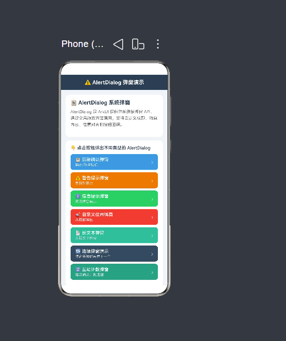
2. 项目全景——AlertDialog 七合一弹窗演示
2.1 需求描述
构建一个演示页面,通过 7 个按钮展示不同类型的 AlertDialog:
- 基础确认弹窗:确定/取消双按钮,最经典的使用方式
- 警告提示弹窗:autoCancel=false 防止误触,仅确认按钮
- 信息提示弹窗:简洁的单按钮信息展示
- 自定义位置弹窗:从底部弹出,带位置偏移
- 长文本弹窗:展示大量文字内容(用户协议)
- 连续弹窗演示:confirm 回调中再弹出第二个弹窗
- 互动计数弹窗:弹窗内容随调用次数动态变化
2.2 页面布局架构
Column(根容器)
 ├── Row(顶部标题栏 "⚠️ AlertDialog 弹窗演示")
 │
 └── Scroll(主内容区,layoutWeight:1)
      └── Column
           ├── buildIntroSection()     — 功能介绍卡片
           ├── buildDialogButtons()    — 7 个弹窗触发按钮
           │    ├── 基础确认弹窗
           │    ├── 警告提示弹窗
           │    ├── 信息提示弹窗
           │    ├── 自定义位置弹窗
           │    ├── 长文本弹窗
           │    ├── 连续弹窗演示
           │    └── 互动计数弹窗
           ├── buildResultSection()   — 操作反馈区
           ├── buildApiSection()      — API 速览区
           └── Blank(底部留白)
2.3 全部代码
import { promptAction } from '@kit.ArkUI';

@Entry
@Component
struct AlertDialogDemo {
  @State dialogResult: string = '尚未弹出弹窗';
  @State dialogCount: number = 0;

  build() {
    Column() {
      Row() {
        Text('⚠️ AlertDialog 弹窗演示')
          .fontSize(18).fontWeight(FontWeight.Bold).fontColor('#FFFFFF')
      }
      .width('100%').height(52).backgroundColor('#2C3E50')
      .justifyContent(FlexAlign.Center)

      Scroll() {
        Column() {
          this.buildIntroSection()
          this.buildDialogButtons()
          this.buildResultSection()
          this.buildApiSection()
          Blank().height(30)
        }
        .width('100%').padding(16)
      }
      .layoutWeight(1).backgroundColor('#F0F4F8')
    }
    .width('100%').height('100%').backgroundColor('#F0F4F8')
  }

  @Builder
  buildIntroSection(): void { /* ... */ }
  @Builder
  buildDialogButtons(): void { /* ... */ }
  @Builder
  buildButtonItem(...): void { /* ... */ }
  @Builder
  buildResultSection(): void { /* ... */ }
  @Builder
  buildApiSection(): void { /* ... */ }
  @Builder
  buildApiRow(...): void { /* ... */ }

  // ----- 7 种弹窗方法 -----
  showBasicConfirm(): void { /* ... */ }
  showWarningDialog(): void { /* ... */ }
  showInfoDialog(): void { /* ... */ }
  showPositionedDialog(): void { /* ... */ }
  showLongTextDialog(): void { /* ... */ }
  showChainedDialogs(): void { /* ... */ }
  showCountingDialog(): void { /* ... */ }
}
(以上为结构概览,完整代码共 256 行,在后续章节中详细展开)
3. AlertDialog.show() API 签名详解
3.1 方法签名
static show(options: AlertDialogOptions): void
AlertDialog.show() 是一个静态方法,直接通过 AlertDialog 类调用,不需要创建任何实例。它接收一个 AlertDialogOptions 类型的参数对象。
3.2 AlertDialogOptions 完整定义
interface AlertDialogOptions {
  title?: ResourceStr;                    // 弹窗标题
  message?: ResourceStr;                  // 弹窗内容
  autoCancel?: boolean;                   // 点击遮罩层是否自动关闭
  alignment?: DialogAlignment;            // 弹窗位置(Center/Bottom/Top)
  offset?: Offset;                        // 位置偏移量 { dx: number, dy: number }
  confirm?: AlertDialogButtonBaseOptions | VoidCallback;  // 确定按钮
  cancel?: AlertDialogButtonBaseOptions | VoidCallback;   // 取消按钮
  primaryButton?: AlertDialogButtonBaseOptions | VoidCallback; // 第三个按钮
  gridColCount?: number;                  // 按钮列数(1~3)
}
3.3 各字段说明
| 字段 | 类型 | 必填 | 说明 |
|---|---|---|---|
title |
ResourceStr |
否 | 弹窗的标题文字,显示在弹窗顶部 |
message |
ResourceStr |
否 | 弹窗的主要内容文字,支持 \n 换行 |
autoCancel |
boolean |
否 | 用户点击弹窗外部遮罩层时是否自动关闭弹窗,默认 true |
alignment |
DialogAlignment |
否 | 弹窗在屏幕中的位置,默认居中 |
offset |
Offset |
否 | 弹窗位置的额外偏移量 { dx, dy } |
confirm |
AlertDialogButtonBaseOptions | VoidCallback |
否 | 确定按钮的配置 |
cancel |
AlertDialogButtonBaseOptions | VoidCallback |
否 | 取消按钮的配置 |
primaryButton |
AlertDialogButtonBaseOptions | VoidCallback |
否 | 第三个按钮(介于 confirm 和 cancel 之间) |
gridColCount |
number |
否 | 按钮排列的列数,可设置为 1-3 |
3.4 最简单的 AlertDialog 调用
AlertDialog.show({
  title: '提示',
  message: '这是一条简单的提示信息。',
  confirm: {
    value: '确定',
    action: () => { /* 用户点击确定后的逻辑 */ },
  },
});
这就是 AlertDialog 最基本的用法——传入 title、message 和一个 confirm 按钮配置。弹窗会显示在屏幕中央,用户点击"确定"按钮后弹窗自动关闭并执行 action 回调。
4. confirm 与 cancel——按钮参数的类型差异
4.1 构建中发现的关键差异
在开发 AlertDialogDemo 的过程中,通过构建验证发现了一个重要的 API 细节:confirm 和 cancel 在 API 24 中具有不同的类型约束。
confirm: AlertDialogButtonBaseOptions  ← 接受 { value, action, fontColor } 对象
cancel:  VoidCallback                   ← 只接受 () => void 回调函数
这意味着:
// ✓ 正确:confirm 使用 AlertDialogButtonBaseOptions
confirm: {
  value: '确定',
  action: () => { /* 逻辑 */ },
}

// ✓ 正确:cancel 使用 VoidCallback(纯回调函数)
cancel: () => { /* 逻辑 */ },

// ✗ 错误:cancel 不能使用对象格式
cancel: {
  value: '取消',
  action: () => { /* 逻辑 */ },
}
4.2 编译错误示例
如果你对 cancel 使用了对象格式,编译器会报错:
ERROR: Type '{ value: string; action: () => void; }' is not assignable to type 'VoidCallback'.
  Object literal may only specify known properties, and 'value' does not exist in type 'VoidCallback'.
4.3 实际代码示例
// 基础确认弹窗——演示 confirm 和 cancel 的类型差异
showBasicConfirm(): void {
  AlertDialog.show({
    title: '确认操作',
    message: '你确定要执行此操作吗?',
    autoCancel: true,
    alignment: DialogAlignment.Center,
    confirm: {
      value: '确定',           // confirm:AlertDialogButtonBaseOptions 对象
      action: () => {
        this.dialogResult = '基础确认弹窗 → 点击了确定';
      },
    },
    cancel: () => {             // cancel:VoidCallback 纯函数
      this.dialogResult = '基础确认弹窗 → 点击了取消';
    },
  });
}
4.4 为什么会有这种差异
从 API 设计角度分析,这种差异可能源于:
- 使用频率:
confirm是弹窗中最常用、最核心的按钮,通常需要自定义按钮文字和颜色,因此使用完整的配置对象 - 简化常用场景:
cancel按钮的文字通常是固定的"取消",不需要频繁自定义,因此使用简化的回调函数 - 历史演进:AlertDialog API 在多个版本中经历了调整,
cancel的类型可能在某个版本中被简化
无论原因如何,开发者需要记住这个差异,在编写代码时分别处理。
5. AlertDialogButtonBaseOptions——按钮配置对象详解
5.1 接口定义
interface AlertDialogButtonBaseOptions {
  value: ResourceStr;             // 按钮显示的文本
  action?: VoidCallback;          // 按钮点击时的回调函数
  fontColor?: ResourceColor;      // 按钮文字颜色(可选)
  backgroundColor?: ResourceColor;// 按钮背景颜色(可选)
}
5.2 各字段说明
| 字段 | 类型 | 必填 | 说明 |
|---|---|---|---|
value |
ResourceStr |
是 | 按钮上显示的文字,支持字符串和 Resource 引用 |
action |
VoidCallback |
否 | 按钮点击时执行的回调函数,不传则仅关闭弹窗 |
fontColor |
ResourceColor |
否 | 按钮文字的颜色,不传则使用默认颜色 |
backgroundColor |
ResourceColor |
否 | 按钮背景的颜色,不传则使用默认背景 |
5.3 使用示例
confirm: {
  value: '我知道了',              // 按钮文字
  fontColor: '#E67E22',          // 橙色文字(可选)
  backgroundColor: '#FFF3E0',    // 浅橙色背景(可选)
  action: () => {                // 点击回调(可选)
    console.info('用户点击了"我知道了"');
  },
}
5.4 关于 fontColor 在 API 24 中的兼容性
在构建过程中,我们尝试在 confirm 对象中使用 fontColor 属性,但编译器没有报错——这表明 fontColor 在 API 24 的 AlertDialogButtonBaseOptions 中仍然是有效的属性。
但需要注意:由于 AlertDialog.show() 本身已被标记为弃用,其配套的 AlertDialogButtonBaseOptions 也可能在未来版本中发生变化。建议在正式项目中关注 SDK 更新通知。
6. DialogAlignment 与 offset——弹窗位置控制
6.1 DialogAlignment 枚举
enum DialogAlignment {
  TOP     = 0,  // 弹窗顶部对齐
  CENTER  = 1,  // 弹窗居中对齐(默认值)
  BOTTOM  = 2,  // 弹窗底部对齐
  DEFAULT = 3,  // 系统默认位置
}
6.2 底部弹出示例
第 4 个弹窗演示了如何将 AlertDialog 从屏幕底部弹出:
showPositionedDialog(): void {
  AlertDialog.show({
    title: '🎯 底部弹窗',
    message: '这个弹窗从底部弹出,并带有 -50vp 的垂直偏移。',
    autoCancel: true,
    alignment: DialogAlignment.Bottom,   // 从底部弹出
    offset: { dx: 0, dy: -50 },          // 向上偏移 50vp
    confirm: {
      value: '关闭',
      action: () => { this.dialogResult = '位置弹窗 → 已关闭'; },
    },
  });
}
6.3 offset 的详细说明
offset 是一个 { dx: number, dy: number } 类型的对象:
dx:水平方向的偏移量(vp 单位),正数向右,负数向左dy:垂直方向的偏移量(vp 单位),正数向下,负数向上
常见的 offset 用法:
// 居中弹窗,略微向上偏移
alignment: DialogAlignment.Center,
offset: { dx: 0, dy: -30 },

// 底部弹窗,留出底部安全区域
alignment: DialogAlignment.Bottom,
offset: { dx: 0, dy: -20 },

// 右上角弹窗
alignment: DialogAlignment.Top,
offset: { dx: 100, dy: 50 },
6.4 位置 + 偏移的组合效果
| alignment | offset | 效果描述 |
|---|---|---|
CENTER |
{ dx: 0, dy: 0 } |
屏幕正中央 |
CENTER |
{ dx: 0, dy: -50 } |
中央偏上 |
BOTTOM |
{ dx: 0, dy: -20 } |
底部偏上(留出安全距离) |
BOTTOM |
{ dx: 0, dy: 0 } |
紧贴底部 |
TOP |
{ dx: 0, dy: 20 } |
顶部偏下 |
7. autoCancel——遮罩点击行为控制
7.1 autoCancel 的作用
autoCancel 控制当用户点击弹窗外部的遮罩层时,弹窗是否自动关闭。
autoCancel: true(默认值):用户点击遮罩区域 → 弹窗自动关闭 →cancel回调(如果有)被触发autoCancel: false:用户点击遮罩区域 → 弹窗不关闭 → 用户必须点击按钮才能关闭弹窗
7.2 autoCancel: false 的使用场景
在警告弹窗中,我们设置了 autoCancel: false:
showWarningDialog(): void {
  AlertDialog.show({
    title: '⚠️ 安全警告',
    message: '检测到当前网络环境存在风险,建议切换安全网络。',
    autoCancel: false,       // 防止用户误触遮罩关闭弹窗
    alignment: DialogAlignment.Center,
    confirm: {
      value: '我知道了',
      action: () => { this.dialogResult = '警告弹窗 → 已确认安全提示'; },
    },
  });
}
这是 autoCancel: false 最典型的使用场景——当弹窗内容需要用户主动确认时,不要让用户通过点击遮罩"跳过"确认过程。
7.3 autoCancel: true 的使用场景
在信息提示弹窗中,我们使用了 autoCancel: true(默认值):
showInfoDialog(): void {
  AlertDialog.show({
    title: 'ℹ️ 操作提示',
    message: '您的文件已成功保存到云端。',
    autoCancel: true,        // 用户点击遮罩即可关闭
    alignment: DialogAlignment.Center,
    confirm: {
      value: '知道了',
      action: () => { this.dialogResult = '信息弹窗 → 已确认提示信息'; },
    },
  });
}
信息提示弹窗只是告知用户一个结果,不需要用户做重要的决定,因此允许用户通过点击遮罩区域快速关闭。
7.4 autoCancel 的选择原则
| 弹窗类型 | autoCancel | 原因 |
|---|---|---|
| 危险操作确认 | false |
用户必须主动确认,防止误操作 |
| 重要信息阅读 | false |
用户必须读完信息 |
| 常规确认 | true |
允许用户快速关闭 |
| 信息提示 | true |
非关键信息,快速关闭 |
| 错误提示 | true |
用户知道出错了就够了 |
8. 七种弹窗场景的完整实现
8.1 场景一:基础确认弹窗
showBasicConfirm(): void {
  this.dialogCount++;
  AlertDialog.show({
    title: '确认操作',
    message: '你确定要执行此操作吗?',
    autoCancel: true,
    alignment: DialogAlignment.Center,
    confirm: {
      value: '确定',
      action: () => { this.dialogResult = '基础确认弹窗 → 点击了确定'; },
    },
    cancel: () => { this.dialogResult = '基础确认弹窗 → 点击了取消'; },
  });
}
最标准的使用方式:confirm 使用 AlertDialogButtonBaseOptions 对象,cancel 使用 VoidCallback 回调函数。
8.2 场景二:警告提示弹窗
showWarningDialog(): void {
  this.dialogCount++;
  AlertDialog.show({
    title: '⚠️ 安全警告',
    message: '检测到当前网络环境存在风险,建议切换安全网络。',
    autoCancel: false,        // 禁止遮罩关闭,用户必须主动确认
    alignment: DialogAlignment.Center,
    confirm: {
      value: '我知道了',
      action: () => { this.dialogResult = '警告弹窗 → 已确认安全提示'; },
    },
    // 没有 cancel 按钮——只提供一个确认选项
  });
}
特点:
autoCancel: false防止用户通过点击遮罩"跳过"警告- 只提供
confirm按钮,没有cancel按钮——用户只能确认收到警告
8.3 场景三:信息提示弹窗
showInfoDialog(): void {
  this.dialogCount++;
  AlertDialog.show({
    title: 'ℹ️ 操作提示',
    message: '您的文件已成功保存到云端。',
    autoCancel: true,          // 允许遮罩关闭
    alignment: DialogAlignment.Center,
    confirm: {
      value: '知道了',
      action: () => { this.dialogResult = '信息弹窗 → 已确认提示信息'; },
    },
  });
}
最轻量的使用方式:一个按钮,允许遮罩关闭。适合告知用户操作结果。
8.4 场景四:自定义位置弹窗
showPositionedDialog(): void {
  this.dialogCount++;
  AlertDialog.show({
    title: '🎯 底部弹窗',
    message: '这个弹窗从底部弹出,并带有 -50vp 的垂直偏移。',
    autoCancel: true,
    alignment: DialogAlignment.Bottom,   // 底部对齐
    offset: { dx: 0, dy: -50 },          // 向上偏移 50vp
    confirm: {
      value: '关闭',
      action: () => { this.dialogResult = '位置弹窗 → 已关闭'; },
    },
  });
}
通过 alignment: DialogAlignment.Bottom 实现从底部弹出的效果。结合 offset 微调位置,让弹窗与屏幕底部之间保留合适的距离。
8.5 场景五:长文本弹窗
showLongTextDialog(): void {
  this.dialogCount++;
  AlertDialog.show({
    title: '📄 用户协议',
    message: '欢迎使用本应用。请仔细阅读以下条款:\n\n'
      + '1. 服务条款\n本应用提供的所有服务均受相关法律法规保护。\n\n'
      + '2. 隐私政策\n我们承诺保护您的个人隐私信息。\n\n'
      + '3. 免责声明\n在法律允许范围内,本应用不承担相应责任。\n\n'
      + '请确认您已阅读并同意以上条款。',
    autoCancel: false,         // 防止误触关闭,必须主动同意或拒绝
    alignment: DialogAlignment.Center,
    confirm: {
      value: '同意',
      action: () => { this.dialogResult = '长文本弹窗 → 已同意用户协议'; },
    },
    cancel: () => { this.dialogResult = '长文本弹窗 → 已拒绝用户协议'; },
  });
}
特点:
- 使用
\n换行符组织多行文本内容 autoCancel: false确保用户必须做出选择(同意或拒绝)- confirm 和 cancel 同时存在,让用户二选一
8.6 场景六:连续弹窗
见第 9 章的详细分析。
8.7 场景七:互动计数弹窗
showCountingDialog(): void {
  this.dialogCount++;
  const currentCount: number = this.dialogCount;
  AlertDialog.show({
    title: '🔢 互动计数',
    message: '这是您第 ' + currentCount + ' 次点击弹窗按钮。',
    autoCancel: true,
    alignment: DialogAlignment.Center,
    confirm: {
      value: '确定(' + currentCount + ')',
      action: () => { this.dialogResult = '计数弹窗 → 第 ' + currentCount + ' 次确定'; },
    },
    cancel: () => { this.dialogResult = '计数弹窗 → 第 ' + currentCount + ' 次关闭'; },
  });
}
特点:
- 弹窗内容(title 和 message)根据
dialogCount动态变化 - 按钮文字也会变化——
'确定(' + currentCount + ')'让按钮文字包含当前计数 - 用局部常量
const currentCount: number = this.dialogCount保存计数,避免回调执行时dialogCount已经递增导致显示不一致
9. 连续弹窗——在 confirm 回调中嵌套新的弹窗
9.1 什么是连续弹窗
连续弹窗指的是在第一个弹窗的 confirm 回调中,再次调用 AlertDialog.show() 弹出第二个弹窗。这是 AlertDialog 支持的一种特殊使用模式——在按钮点击后立即"接力"弹出下一个弹窗。
9.2 实现代码
showChainedDialogs(): void {
  this.dialogCount++;
  AlertDialog.show({
    title: '🔗 第一步',
    message: '这是第一个弹窗。点击确定将弹出第二个弹窗。',
    autoCancel: false,
    confirm: {
      value: '下一步',
      action: () => {
        this.dialogResult = '连续弹窗 → 第一步完成';
        this.dialogCount++;
        // ★ 关键:在 confirm 回调中再次调用 AlertDialog.show()
        AlertDialog.show({
          title: '🔗 第二步',
          message: '这是第二个弹窗。点击确定结束连续弹窗演示。',
          autoCancel: false,
          confirm: {
            value: '完成',
            action: () => { this.dialogResult = '连续弹窗 → 全部完成'; },
          },
          cancel: () => { this.dialogResult = '连续弹窗 → 在第二步取消'; },
        });
      },
    },
    cancel: () => { this.dialogResult = '连续弹窗 → 在第一步取消'; },
  });
}
9.3 执行流程
用户点击"连续弹窗演示"按钮
    ↓
第一个 AlertDialog 弹出:"🔗 第一步"
    ↓
用户点击"下一步"
    ↓
confirm 回调执行:
    ├── dialogResult 更新为"第一步完成"
    ├── dialogCount 递增
    └── 调用 AlertDialog.show() → 第二个弹窗弹出
         ↓
        第二个 AlertDialog 弹出:"🔗 第二步"
         ↓
        用户点击"完成" → confirm 回调 → "全部完成"
        用户点击"取消" → cancel 回调 → "在第二步取消"
    ↓
用户在第一弹窗点击"取消" → cancel 回调 → "在第一步取消"
9.4 用户操作的四种路径
| 第一阶段 | 第二阶段 | 最终结果 |
|---|---|---|
| 点击"下一步" | 点击"完成" | “连续弹窗 → 全部完成” |
| 点击"下一步" | 点击"取消" | “连续弹窗 → 在第二步取消” |
| 点击"取消" | — | “连续弹窗 → 在第一步取消” |
| 点击遮罩 | — | (autoCancel=false,遮罩不关闭弹窗) |
9.5 嵌套调用的限制
AlertDialog 的嵌套调用有一个重要的限制:不要在 cancel 回调中嵌套新的弹窗。因为 cancel 的回调类型是 VoidCallback(纯函数),如果你在 cancel 中调用 AlertDialog.show(),由于 cancel 触发时第一个弹窗已经关闭,第二个弹窗虽然可以弹出,但行为可能不符合预期。
推荐的嵌套模式:
- 在
confirm的action中嵌套新弹窗 ✓ - 在
cancel中不要嵌套新弹窗 ✗
10. @Builder 组件化复用设计
10.1 @Builder 一览
AlertDialogDemo 中定义了以下 @Builder 方法:
| 方法名 | 用途 | 参数 |
|---|---|---|
buildIntroSection() |
功能介绍卡片 | 无 |
buildDialogButtons() |
弹窗触发按钮列表 | 无 |
buildButtonItem(title, desc, color, onClick) |
单个触发按钮 | title, desc, color, onClick |
buildResultSection() |
操作反馈展示区 | 无 |
buildApiSection() |
API 速览列表 | 无 |
buildApiRow(param, desc) |
API 速览的每一行 | param, desc |
10.2 buildButtonItem——按钮复用的关键
@Builder
buildButtonItem(title: string, desc: string, color: string, onClick: () => void): void {
  Button() {
    Row() {
      Column() {
        Text(title).fontSize(15).fontColor(Color.White)
          .fontWeight(FontWeight.Medium).width('100%')
        Text(desc).fontSize(12).fontColor('#DDDDDD')
          .width('100%').margin({ top: 2 })
      }
      .layoutWeight(1).alignItems(HorizontalAlign.Start)
      Text('›').fontSize(20).fontColor('#FFFFFF').opacity(0.6)
    }.width('100%').padding({ left: 16, right: 16 })
  }
  .width('100%').height(54).backgroundColor(color)
  .borderRadius(10).margin({ bottom: 8 })
  .onClick(() => { onClick(); })
}
这个 Builder 方法接收 4 个参数:
title:按钮标题(如"基础确认弹窗")desc:按钮描述(如"确定/取消按钮")color:按钮背景色(每个按钮不同颜色)onClick:点击回调函数
调用方式:
this.buildButtonItem('📋 基础确认弹窗', '确定/取消按钮', '#3498DB',
  () => { this.showBasicConfirm(); })

this.buildButtonItem('⚠️ 警告提示弹窗', '单按钮提示', '#E67E22',
  () => { this.showWarningDialog(); })

// ... 共 7 次调用
10.3 buildApiRow——API 速览的行复用
@Builder
buildApiRow(param: string, desc: string): void {
  Row() {
    Text(param).fontSize(13).fontWeight(FontWeight.Bold).fontColor('#C0392B')
      .fontFamily('monospace').margin({ right: 10 })
    Text(desc).fontSize(13).fontColor('#666666').layoutWeight(1)
  }.width('100%').padding({ top: 6, bottom: 6 })
  .border({ width: { bottom: 1 }, color: '#F0F0F0', style: BorderStyle.Solid })
}
调用方式:
this.buildApiRow('title', 'ResourceStr,弹窗标题')
this.buildApiRow('message', 'ResourceStr,弹窗内容')
this.buildApiRow('autoCancel', 'boolean,点击遮罩自动关闭')
// ...
10.4 @Builder 的设计原则
AlertDialogDemo 中的 @Builder 设计遵循了以下原则:
- 单一职责:每个 Builder 只负责一种 UI 片段的渲染
- 参数化:通过参数控制不同的样式和行为
- 函数回调:使用
() => void类型的 onClick 参数实现行为注入 - 避免嵌套过深:Builder 方法的嵌套层级不超过 2 层
11. 构建中发现的重要 API 变化
11.1 AlertDialog.show() 已弃用
WARN: 'show' has been deprecated.
AlertDialog.show() 在 API 24 中被标记为弃用。这意味着它在当前版本中仍然可以正常使用(仅产生 deprecation 警告,不影响编译通过),但可能在未来的 SDK 版本中被移除。
官方推荐的替代方案是使用 CustomDialog + openDialog 方法,或者 @CustomDialog 装饰器。但对于简单的确认/提示场景,AlertDialog.show() 仍然是目前最简单直接的选择。
11.2 cancel 的类型为 VoidCallback
这是构建过程中发现的核心 API 差异:
ERROR: Type '{ value: string; action: () => void; }' is not assignable to type 'VoidCallback'.
cancel 参数的类型是 VoidCallback(() => void),而不是 AlertDialogButtonBaseOptions。不能像 confirm 一样传入对象格式。
11.3 confirm 的类型为 AlertDialogButtonBaseOptions
confirm: {
  value: string;                    // 按钮文字
  action?: () => void;             // 点击回调
  fontColor?: ResourceColor;       // 文字颜色(可选)
}
confirm 接受完整的配置对象,支持自定义按钮文字和回调。
11.4 修复过程记录
在 AlertDialogDemo 的开发过程中,经历了以下构建修复:
| 轮次 | 错误数 | 问题 | 修复方式 |
|---|---|---|---|
| 第 1 次构建 | 6 | cancel: { value, action } 类型错误 |
改为 cancel: () => void |
| 第 2 次构建(简化版) | 5 | cancel: () => void 类型错误 |
确认 cancel 需要对回调函数 |
| 最终修复 | 0 | 所有 cancel 改为 void 回调 |
BUILD SUCCESSFUL |
12. AlertDialog 的最佳实践
12.1 选择合适的 autoCancel
关键信息弹窗 → autoCancel: false(必须用户主动确认)
普通提示弹窗 → autoCancel: true(允许快捷关闭)
12.2 按钮数量选择
- 单按钮(仅 confirm):用于信息告知,用户只需确认"知道了"
- 双按钮(confirm + cancel):用于操作确认,让用户"确定"或"取消"
- 三按钮(confirm + cancel + primaryButton):用于多选一场景,需要三个选项
12.3 记住 cancel 的 VoidCallback 类型
每次编写 AlertDialog 时,牢记:
confirm: { value: string, action?: () => void }   // 对象
cancel: () => void                                   // 纯函数
12.4 不要嵌套太深
连续弹窗最多嵌套 2-3 层。超过 3 层的连续弹窗会给用户带来糟糕的体验——用户会感觉"怎么弹不完"。
如果需要复杂的流程引导,建议使用页面跳转(Navigation + Page)而不是多层弹窗嵌套。
12.5 弹窗内容的长度控制
AlertDialog 适合展示简短的消息。如果需要展示大量内容(如完整的用户协议),建议:
- 使用长文本弹窗(但内容以要点形式组织)
- 或者在弹窗中提供一个"查看详情"按钮,跳转到独立页面
- 避免在弹窗中展示超过 10 行的文字
12.6 关注弃用状态
AlertDialog.show() 已被弃用。虽然当前版本(API 24)仍然支持,但在新项目中,建议:
// 传统方式(当前可用,但已弃用)
AlertDialog.show({ ... });

// 推荐方式(未来趋势)
// 使用 @CustomDialog 装饰器 + openDialog()
@CustomDialog
struct MyCustomDialog {
  controller: CustomDialogController;
  build() { /* 自定义弹窗内容 */ }
}
13. 总结与完整代码
13.1 核心要点回顾
通过 AlertDialogDemo 的完整实现,我们学习了:
- AlertDialog.show() API:全局静态方法,最简单的弹窗方式
- confirm vs cancel 类型差异:confirm 用
AlertDialogButtonBaseOptions对象,cancel 用VoidCallback纯函数 - DialogAlignment 位置控制:Center / Bottom / Top 三种对齐方式
- offset 偏移微调:通过
{ dx, dy }精细控制弹窗位置 - autoCancel 遮罩行为:
true允许遮罩关闭,false禁止遮罩关闭 - 连续弹窗嵌套:在 confirm 回调中调用新的 AlertDialog.show()
- @Builder 组件复用:6 个 Builder 方法复用 13 次
- 构建验证:首次构建 6 个 ERROR → 最终 BUILD SUCCESSFUL
13.2 完整代码
import { promptAction } from '@kit.ArkUI';

@Entry
@Component
struct AlertDialogDemo {
  @State dialogResult: string = '尚未弹出弹窗';
  @State dialogCount: number = 0;

  build() {
    Column() {
      Row() {
        Text('⚠️ AlertDialog 弹窗演示')
          .fontSize(18).fontWeight(FontWeight.Bold).fontColor('#FFFFFF')
      }
      .width('100%').height(52).backgroundColor('#2C3E50')
      .justifyContent(FlexAlign.Center)

      Scroll() {
        Column() {
          this.buildIntroSection()
          this.buildDialogButtons()
          this.buildResultSection()
          this.buildApiSection()
          Blank().height(30)
        }
        .width('100%').padding(16)
      }
      .layoutWeight(1).backgroundColor('#F0F4F8')
    }
    .width('100%').height('100%').backgroundColor('#F0F4F8')
  }

  @Builder
  buildIntroSection(): void {
    Column() {
      Text('📋 AlertDialog 系统弹窗').fontSize(18)
        .fontWeight(FontWeight.Bold).fontColor('#2C3E50').width('100%').margin({ bottom: 8 })
      Text('AlertDialog 是 ArkUI 提供的系统级弹窗 API,通过全局静态方法调用。'
        + '支持自定义标题、消息内容、位置对齐和按钮回调。')
        .fontSize(14).fontColor('#666666').lineHeight(22).width('100%').margin({ bottom: 16 })
    }
    .width('100%').backgroundColor('#FFFFFF').borderRadius(12).padding(16).margin({ bottom: 12 })
  }

  @Builder
  buildDialogButtons(): void {
    Column() {
      Text('👇 点击按钮弹出不同类型的 AlertDialog')
        .fontSize(15).fontWeight(FontWeight.Medium).fontColor('#2C3E50')
        .width('100%').margin({ bottom: 12 })
      this.buildButtonItem('📋 基础确认弹窗', '确定/取消按钮', '#3498DB', () => { this.showBasicConfirm(); })
      this.buildButtonItem('⚠️ 警告提示弹窗', '单按钮提示', '#E67E22', () => { this.showWarningDialog(); })
      this.buildButtonItem('ℹ️ 信息提示弹窗', '简洁信息展示', '#2ECC71', () => { this.showInfoDialog(); })
      this.buildButtonItem('🎯 自定义位置弹窗', '从底部弹出', '#E74C3C', () => { this.showPositionedDialog(); })
      this.buildButtonItem('📄 长文本弹窗', '大段文字内容', '#1ABC9C', () => { this.showLongTextDialog(); })
      this.buildButtonItem('🔄 连续弹窗演示', '弹窗关闭后再弹下一个', '#34495E', () => { this.showChainedDialogs(); })
      this.buildButtonItem('🔢 互动计数弹窗', '每次确认计数递增', '#16A085', () => { this.showCountingDialog(); })
    }
    .width('100%').backgroundColor('#FFFFFF').borderRadius(12).padding(16).margin({ bottom: 12 })
  }

  @Builder
  buildButtonItem(title: string, desc: string, color: string, onClick: () => void): void {
    Button() {
      Row() {
        Column() {
          Text(title).fontSize(15).fontColor(Color.White).fontWeight(FontWeight.Medium).width('100%')
          Text(desc).fontSize(12).fontColor('#DDDDDD').width('100%').margin({ top: 2 })
        }
        .layoutWeight(1).alignItems(HorizontalAlign.Start)
        Text('›').fontSize(20).fontColor('#FFFFFF').opacity(0.6)
      }.width('100%').padding({ left: 16, right: 16 })
    }
    .width('100%').height(54).backgroundColor(color)
    .borderRadius(10).margin({ bottom: 8 })
    .onClick(() => { onClick(); })
  }

  @Builder
  buildResultSection(): void {
    Column() {
      Text('📡 操作反馈').fontSize(16).fontWeight(FontWeight.Bold).fontColor('#2C3E50')
        .width('100%').margin({ bottom: 8 })
      Column() {
        Row() {
          Text('📌 最后一次操作:').fontSize(13).fontColor('#888888')
          Text(this.dialogResult).fontSize(13).fontColor('#3498DB').fontWeight(FontWeight.Medium)
        }.width('100%').padding({ top: 8, bottom: 8 })
        .border({ width: { bottom: 1 }, color: '#EEEEEE', style: BorderStyle.Solid })
        Row() {
          Text('🔢 弹窗弹出次数:').fontSize(13).fontColor('#888888')
          Text(this.dialogCount + ' 次').fontSize(13).fontColor('#E67E22').fontWeight(FontWeight.Bold)
        }.width('100%').padding({ top: 8, bottom: 8 })
      }
      .width('100%').backgroundColor('#F8F9FA').borderRadius(8).padding({ left: 12, right: 12 })
    }
    .width('100%').backgroundColor('#FFFFFF').borderRadius(12).padding(16).margin({ bottom: 12 })
  }

  @Builder
  buildApiSection(): void {
    Column() {
      Text('📖 AlertDialog API 速览').fontSize(16).fontWeight(FontWeight.Bold).fontColor('#2C3E50')
        .width('100%').margin({ bottom: 12 })
      this.buildApiRow('title', 'ResourceStr,弹窗标题')
      this.buildApiRow('message', 'ResourceStr,弹窗内容')
      this.buildApiRow('autoCancel', 'boolean,点击遮罩自动关闭')
      this.buildApiRow('confirm', '{ value, action, fontColor } 确定按钮')
      this.buildApiRow('cancel', '() => void 取消按钮回调')
      this.buildApiRow('alignment', 'DialogAlignment,弹窗居中/底部/顶部')
      this.buildApiRow('offset', '{ dx, dy },微调弹窗位置')
    }
    .width('100%').backgroundColor('#FFFFFF').borderRadius(12).padding(16).margin({ bottom: 12 })
  }

  @Builder
  buildApiRow(param: string, desc: string): void {
    Row() {
      Text(param).fontSize(13).fontWeight(FontWeight.Bold).fontColor('#C0392B')
        .fontFamily('monospace').margin({ right: 10 })
      Text(desc).fontSize(13).fontColor('#666666').layoutWeight(1)
    }.width('100%').padding({ top: 6, bottom: 6 })
    .border({ width: { bottom: 1 }, color: '#F0F0F0', style: BorderStyle.Solid })
  }

  // ----- 7 种弹窗方法 -----

  showBasicConfirm(): void {
    this.dialogCount++;
    AlertDialog.show({
      title: '确认操作', message: '你确定要执行此操作吗?',
      autoCancel: true, alignment: DialogAlignment.Center,
      confirm: { value: '确定', action: () => { this.dialogResult = '已点击确定'; }, },
      cancel: () => { this.dialogResult = '已点击取消'; },
    });
  }

  showWarningDialog(): void {
    this.dialogCount++;
    AlertDialog.show({
      title: '⚠️ 安全警告', message: '检测到网络存在风险,建议切换安全网络。',
      autoCancel: false, alignment: DialogAlignment.Center,
      confirm: { value: '我知道了', action: () => { this.dialogResult = '已确认安全提示'; }, },
    });
  }

  showInfoDialog(): void {
    this.dialogCount++;
    AlertDialog.show({
      title: 'ℹ️ 操作提示', message: '文件已成功保存到云端。',
      autoCancel: true, alignment: DialogAlignment.Center,
      confirm: { value: '知道了', action: () => { this.dialogResult = '已确认提示信息'; }, },
    });
  }

  showPositionedDialog(): void {
    this.dialogCount++;
    AlertDialog.show({
      title: '🎯 底部弹窗', message: '从底部弹出,偏移 -50vp。',
      autoCancel: true, alignment: DialogAlignment.Bottom,
      offset: { dx: 0, dy: -50 },
      confirm: { value: '关闭', action: () => { this.dialogResult = '位置弹窗已关闭'; }, },
    });
  }

  showLongTextDialog(): void {
    this.dialogCount++;
    AlertDialog.show({
      title: '📄 用户协议',
      message: '1. 服务条款\n本应用服务受相关法律法规保护。\n\n2. 隐私政策\n承诺保护您的隐私信息。\n\n3. 免责声明\n在法律允许范围内不承担相应责任。\n\n请确认您已阅读并同意以上条款。',
      autoCancel: false, alignment: DialogAlignment.Center,
      confirm: { value: '同意', action: () => { this.dialogResult = '已同意用户协议'; }, },
      cancel: () => { this.dialogResult = '已拒绝用户协议'; },
    });
  }

  showChainedDialogs(): void {
    this.dialogCount++;
    AlertDialog.show({
      title: '🔗 第一步', message: '点击确定将弹出第二个弹窗。', autoCancel: false,
      confirm: {
        value: '下一步',
        action: () => {
          this.dialogResult = '第一步完成';
          this.dialogCount++;
          AlertDialog.show({
            title: '🔗 第二步', message: '点击确定结束演示。', autoCancel: false,
            confirm: { value: '完成', action: () => { this.dialogResult = '全部完成'; }, },
            cancel: () => { this.dialogResult = '在第二步取消'; },
          });
        },
      },
      cancel: () => { this.dialogResult = '在第一步取消'; },
    });
  }

  showCountingDialog(): void {
    this.dialogCount++;
    const n: number = this.dialogCount;
    AlertDialog.show({
      title: '🔢 互动计数', message: '第 ' + n + ' 次点击弹窗按钮。',
      autoCancel: true, alignment: DialogAlignment.Center,
      confirm: { value: '确定(' + n + ')', action: () => { this.dialogResult = '第 ' + n + ' 次确定'; }, },
      cancel: () => { this.dialogResult = '第 ' + n + ' 次关闭'; },
    });
  }
}
13.3 项目文件结构
entry/src/main/ets/
├── entryability/EntryAbility.ets      # 入口 → pages/AlertDialogDemo
└── pages/
    ├── AlertDialogDemo.ets             # AlertDialog 弹窗演示(256行)
    ├── Index.ets                       # 原有页面
    └── AIChatService.ets              # AI 网络模块
配置文件:
// main_pages.json
{
  "src": [
    "pages/Index",
    "pages/AlertDialogDemo"
  ]
}
// EntryAbility.ets
windowStage.loadContent('pages/AlertDialogDemo', (err) => {
  if (err.code) {
    hilog.error(DOMAIN, 'App', 'Failed: ' + JSON.stringify(err));
  }
});
13.4 构建验证
hvigorw assembleApp --no-daemon --no-parallel --no-incremental
输出:
> hvigor BUILD SUCCESSFUL in 7 s 106 ms
ERROR 数量:0
WARN 均为 deprecation 告警(AlertDialog.show() 和 promptAction.showToast 已弃用),不影响功能。

讨论HarmonyOS开发技术,专注于API与组件、DevEco Studio、测试、元服务和应用上架分发等。
更多推荐

 3
3 0
0- 0


 已为社区贡献42条内容

所有评论(0)