HarmonyOS7 主题切换别只做黑白两套:亮色、暗色和自定义主题完整方案
前言
上次聊了 Design Token,但 Token 只是基础值,真正的挑战是怎么让整套 Token 在运行时切换。之前我做一个电商 App,产品经理说"要支持亮色、暗色、品牌色三套主题,用户自己选",我当时觉得这不难,结果搞了两天才跑通。今天把完整方案整理出来。
系统级暗色模式 vs App 内主题切换
HarmonyOS 本身支持跟随系统的亮暗色切换,你只要在 resources/dark/ 目录下放一套暗色资源,系统会自动帮你切换。这方案对简单场景够用。
但如果你的 App 需要"不跟随系统、用户自己选主题",或者要支持品牌色这种自定义主题,光靠系统资源切换就不够了。你需要一套自己的主题管理架构。
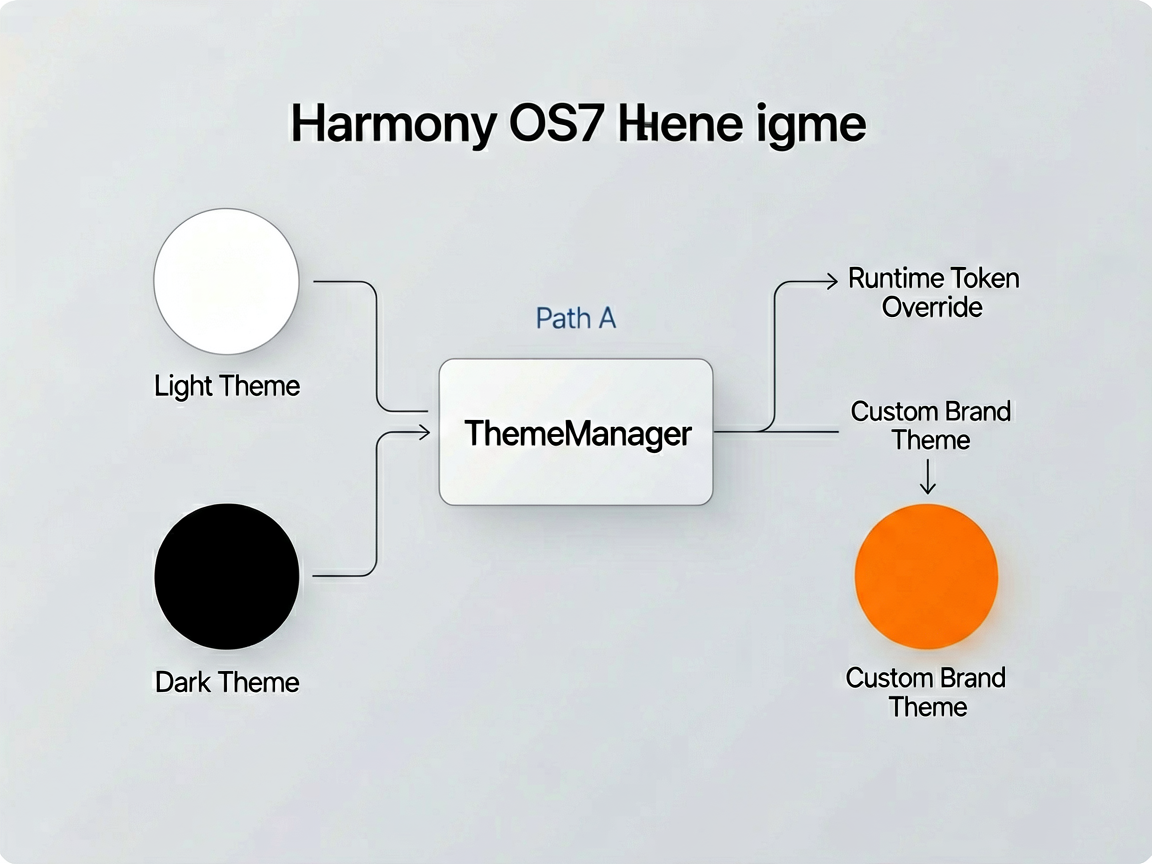
我的方案是两条腿走路:基础的亮色/暗色用系统资源做,保证跟随系统时零成本;自定义主题用 ThemeManager 做 Token 覆盖,支持运行时动态切换。
主题架构设计
核心思路是这样的:定义一个 Theme 接口,每套主题就是这个接口的一个实现。ThemeManager 持有当前主题的引用,组件通过 ThemeManager 拿 Token 值。
// theme/ThemeTokens.ets - 主题 Token 接口定义
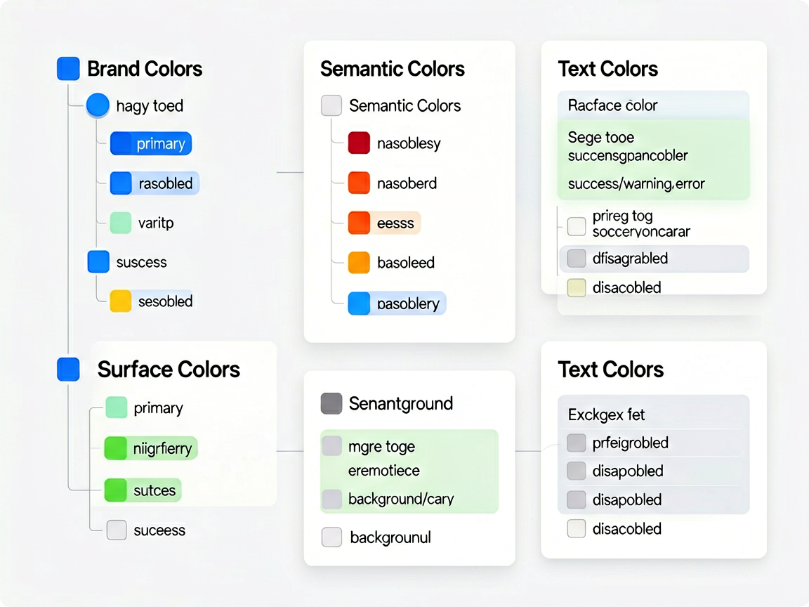
export interface ThemeTokens {
// 品牌色
colorPrimary: string
colorPrimaryLight: string
colorPrimaryDark: string
// 语义色
colorSuccess: string
colorWarning: string
colorError: string
// 表面色
colorSurface: string
colorSurfaceVariant: string
colorBackground: string
// 文本色
colorTextPrimary: string
colorTextSecondary: string
colorTextDisabled: string
colorTextOnPrimary: string
// 边框与分割线
colorBorder: string
colorDivider: string
// 组件色
colorInputBg: string
colorCardBg: string
colorNavBarBg: string
}
然后定义具体的主题实现:
// theme/LightTheme.ets
import { ThemeTokens } from './ThemeTokens'
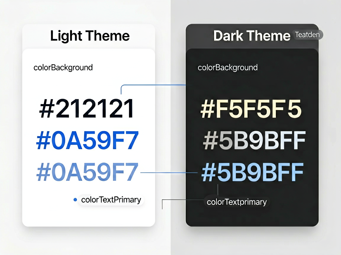
export const LightTheme: ThemeTokens = {
colorPrimary: '#0A59F7',
colorPrimaryLight: '#3B82F6',
colorPrimaryDark: '#0040C0',
colorSuccess: '#34C759',
colorWarning: '#FF9500',
colorError: '#FF3B30',
colorSurface: '#FFFFFF',
colorSurfaceVariant: '#F5F5F5',
colorBackground: '#FAFAFA',
colorTextPrimary: '#212121',
colorTextSecondary: '#757575',
colorTextDisabled: '#BDBDBD',
colorTextOnPrimary: '#FFFFFF',
colorBorder: '#EEEEEE',
colorDivider: '#EEEEEE',
colorInputBg: '#F5F5F5',
colorCardBg: '#FFFFFF',
colorNavBarBg: '#FFFFFF'
}
// theme/DarkTheme.ets

import { ThemeTokens } from './ThemeTokens'

export const DarkTheme: ThemeTokens = {
  colorPrimary: '#5B9BFF',
  colorPrimaryLight: '#7EB3FF',
  colorPrimaryDark: '#3A7AE0',

  colorSuccess: '#4CD964',
  colorWarning: '#FFB340',
  colorError: '#FF6961',

  colorSurface: '#1C1C1E',
  colorSurfaceVariant: '#2C2C2E',
  colorBackground: '#000000',

  colorTextPrimary: '#F5F5F5',
  colorTextSecondary: '#ABABAB',
  colorTextDisabled: '#5C5C5C',
  colorTextOnPrimary: '#FFFFFF',

  colorBorder: '#3A3A3C',
  colorDivider: '#3A3A3C',

  colorInputBg: '#2C2C2E',
  colorCardBg: '#1C1C1E',
  colorNavBarBg: '#1C1C1E'
}
再来一套品牌色主题,比如电商 App 的橙色主题:
// theme/BrandTheme.ets

import { ThemeTokens } from './ThemeTokens'

export const BrandTheme: ThemeTokens = {
  colorPrimary: '#FF6600',
  colorPrimaryLight: '#FF8533',
  colorPrimaryDark: '#CC5200',

  colorSuccess: '#34C759',
  colorWarning: '#FF9500',
  colorError: '#FF3B30',

  colorSurface: '#FFFFFF',
  colorSurfaceVariant: '#FFF8F2',
  colorBackground: '#FFFAF5',

  colorTextPrimary: '#1A1A1A',
  colorTextSecondary: '#666666',
  colorTextDisabled: '#CCCCCC',
  colorTextOnPrimary: '#FFFFFF',

  colorBorder: '#FFE8D6',
  colorDivider: '#FFE8D6',

  colorInputBg: '#FFF5EB',
  colorCardBg: '#FFFFFF',
  colorNavBarBg: '#FFFFFF'
}
ThemeManager:核心管理器
ThemeManager 要做几件事:管理当前主题、支持切换、持久化用户选择、通知组件刷新。
// theme/ThemeManager.ets

import { ThemeTokens } from './ThemeTokens'
import { LightTheme } from './LightTheme'
import { DarkTheme } from './DarkTheme'
import { BrandTheme } from './BrandTheme'

export enum ThemeMode {
  LIGHT = 'light',
  DARK = 'dark',
  BRAND = 'brand',
  SYSTEM = 'system'  // 跟随系统
}

const PREF_KEY_THEME = 'user_theme_mode'

@Observed
export class ThemeManager {
  private static instance: ThemeManager
  private currentTheme: ThemeTokens = LightTheme
  private currentMode: ThemeMode = ThemeMode.SYSTEM

  private constructor() {}

  static getInstance(): ThemeManager {
    if (!ThemeManager.instance) {
      ThemeManager.instance = new ThemeManager()
    }
    return ThemeManager.instance
  }

  // 初始化,读取用户上次的选择
  init(context: Context): void {
    try {
      const prefs = context.getSharedPreferencesSync('theme_prefs', 0)
      const savedMode = prefs.getSync(PREF_KEY_THEME, ThemeMode.SYSTEM) as string
      this.applyMode(savedMode as ThemeMode, context)
    } catch (e) {
      // 首次启动,跟随系统
      this.applyMode(ThemeMode.SYSTEM, context)
    }
  }

  // 切换主题
  switchTheme(mode: ThemeMode, context: Context): void {
    this.applyMode(mode, context)
    // 持久化用户选择
    const prefs = context.getSharedPreferencesSync('theme_prefs', 0)
    prefs.putSync(PREF_KEY_THEME, mode)
    prefs.flush()
  }

  private applyMode(mode: ThemeMode, context: Context): void {
    this.currentMode = mode
    switch (mode) {
      case ThemeMode.LIGHT:
        this.currentTheme = LightTheme
        break
      case ThemeMode.DARK:
        this.currentTheme = DarkTheme
        break
      case ThemeMode.BRAND:
        this.currentTheme = BrandTheme
        break
      case ThemeMode.SYSTEM:
        // 根据系统配置决定亮暗色
        const config = context.config
        if (config.colorMode === 1) {  // COLOR_MODE_DARK
          this.currentTheme = DarkTheme
        } else {
          this.currentTheme = LightTheme
        }
        break
    }
  }

  // 获取当前主题 Token
  getTheme(): ThemeTokens {
    return this.currentTheme
  }

  // 获取当前模式
  getMode(): ThemeMode {
    return this.currentMode
  }
}
ThemeProvider:让页面感知主题变化
ThemeManager 用了 @Observed,配合 @ObjectLink 就能让组件自动响应主题变化。我封装了一个 ThemeProvider 组件来做这件事:
// theme/ThemeProvider.ets

import { ThemeManager } from './ThemeManager'
import { ThemeTokens } from './ThemeTokens'

@Component
export struct ThemeProvider {
  @ObjectLink themeManager: ThemeManager
  @BuilderParam content: (theme: ThemeTokens) => void

  build() {
    Column() {
      this.content(this.themeManager.getTheme())
    }
    .width('100%')
    .height('100%')
    .backgroundColor(this.themeManager.getTheme().colorBackground)
  }
}
页面里这样用:
import { ThemeManager, ThemeMode } from '@myteam/uikit'
import { ThemeProvider } from '@myteam/uikit'

@Entry
@Component
struct HomePage {
  @ObjectLink themeManager: ThemeManager = ThemeManager.getInstance()

  build() {
    ThemeProvider({ themeManager: this.themeManager }) {
      (theme: ThemeTokens) => {
        Column() {
          // 顶部导航栏
          Row() {
            Text('首页')
              .fontSize(20)
              .fontWeight(FontWeight.Bold)
              .fontColor(theme.colorTextPrimary)

            Blank()

            // 主题切换按钮
            Text(this.themeManager.getMode() === ThemeMode.DARK ? '☀' : '🌙')
              .fontSize(20)
              .onClick(() => {
                const nextMode = this.themeManager.getMode() === ThemeMode.DARK
                  ? ThemeMode.LIGHT
                  : ThemeMode.DARK
                this.themeManager.switchTheme(nextMode, getContext(this))
              })
          }
          .width('100%')
          .height(56)
          .padding({ left: 16, right: 16 })
          .backgroundColor(theme.colorNavBarBg)

          // 内容区
          Scroll() {
            Column({ space: 12 }) {
              // 商品卡片
              Column() {
                Text('限时特价')
                  .fontSize(17)
                  .fontWeight(FontWeight.Bold)
                  .fontColor(theme.colorTextPrimary)

                Text('精选好物低至5折')
                  .fontSize(13)
                  .fontColor(theme.colorTextSecondary)
                  .margin({ top: 4 })
              }
              .width('100%')
              .padding(16)
              .borderRadius(12)
              .backgroundColor(theme.colorCardBg)

              // 操作按钮
              Button('立即抢购')
                .width('100%')
                .height(44)
                .fontSize(15)
                .fontColor(theme.colorTextOnPrimary)
                .backgroundColor(theme.colorPrimary)
                .borderRadius(10)
            }
            .padding(16)
          }
          .layoutWeight(1)
        }
      }
    }
  }
}
切换主题的时候,整个页面的颜色都会即时刷新,不用手动刷新任何东西——@Observed + @ObjectLink 帮我们搞定了响应式更新。
主题持久化
用户选了暗色主题,杀掉 App 重新打开不能变回亮色。上面的 ThemeManager 已经做了持久化——用 SharedPreferences 存储用户选择,App 启动时 init() 方法会读取上次的选择。
在 EntryAbility 里初始化一下:
// EntryAbility.ets

export default class EntryAbility extends UIAbility {
  onCreate(want: Want, launchParam: AbilityConstant.LaunchParam): void {
    // 初始化主题
    ThemeManager.getInstance().init(this.context)
  }
}
实战感受
这套方案跑通之后,加新主题的成本极低——新建一个满足 ThemeTokens 接口的对象就行,一行代码都不用改。我们后来加了"护眼绿"和"春节红"两套节日主题,每套也就半小时搞定。
有个小建议:暗色主题的颜色别简单地把亮色反转。纯白文字配纯黑背景看着很累,用 #F5F5F5 配 #1C1C1E 舒服得多。还有暗色模式下阴影效果会变弱,需要用更亮的边框来替代阴影做层级区分。这些细节调好了,暗色模式的体验才能上去。

讨论HarmonyOS开发技术,专注于API与组件、DevEco Studio、测试、元服务和应用上架分发等。
更多推荐

 32
32 0
0- 0


 已为社区贡献358条内容

所有评论(0)