HarmonyOS7 Card、ListItem、Form 怎么组合最顺手?复合组件模式实战
文章目录
前言
上篇封装了 Button、TextInput、Avatar 这些基础原子组件,它们就像乐高积木的单块——好用但有限。现实中很多 UI 是由多个组件拼起来的,比如一张商品卡片里有头像、标题、按钮、价格标签。如果全写在一个 struct 里,组件会变得又长又难维护。
这时候需要换一种设计思路——复合组件模式。
复合组件 vs 单体组件
单体组件就是前面写的那些:一个 struct 搞定一切。适合功能独立、UI 简单的组件。
复合组件不一样,它是"骨架 + 插槽"的结构。父组件定义布局和骨架,子组件通过插槽填充具体内容。就像 HTML 里的 <card> 标签,header、body、footer 各自放什么都由使用方决定。
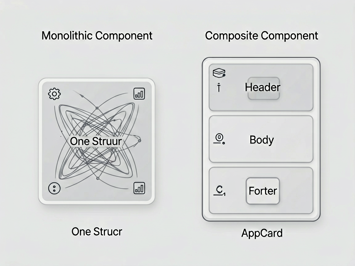
这么干的好处很明显:Card 组件不需要知道里面放的是商品还是用户信息,它只管外框、圆角、阴影、内边距这些"壳"的事。内容的复杂度完全交给使用方控制。
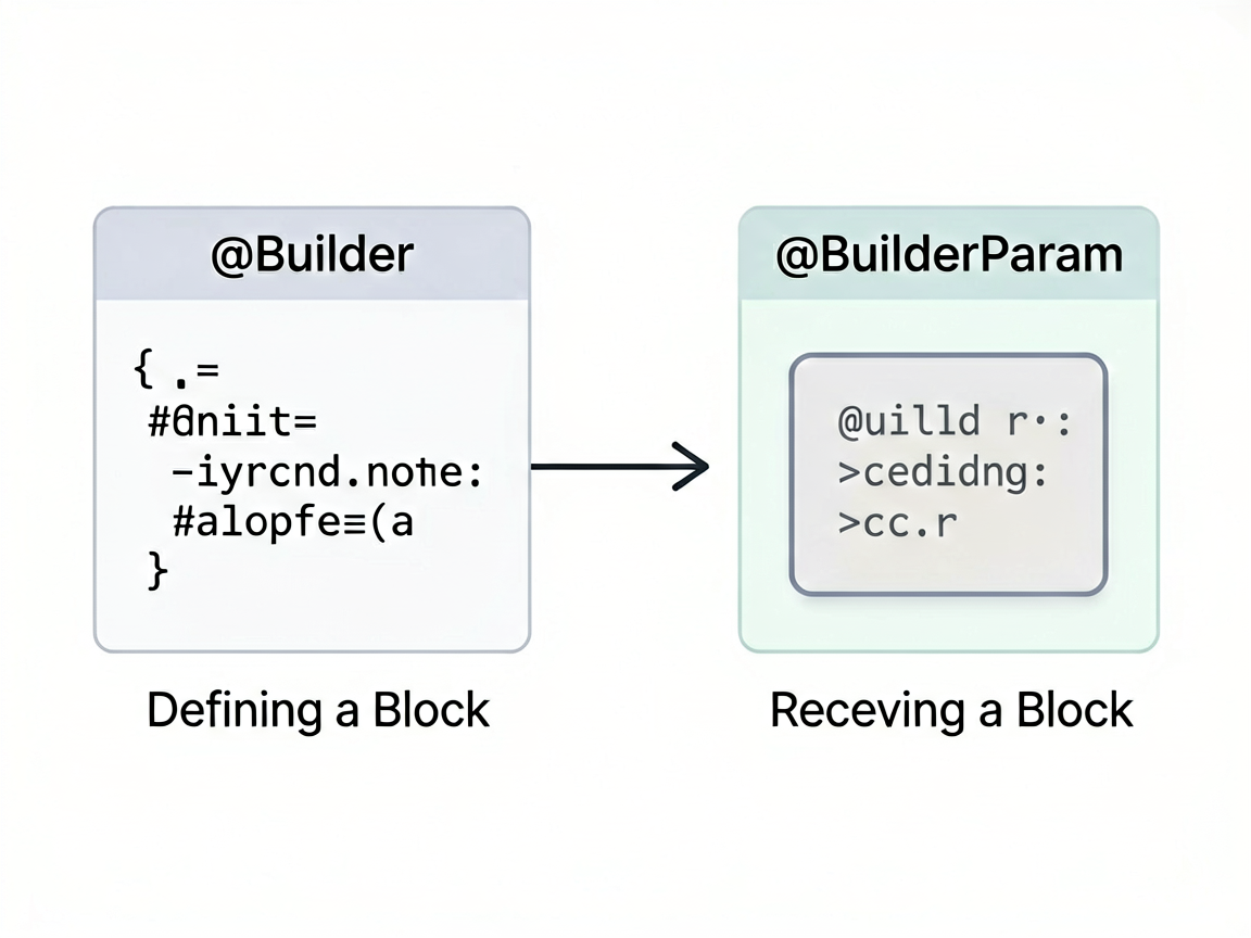
插槽模式与 @BuilderParam
ArkUI 里实现插槽靠的是 @BuilderParam。它允许你从外部传入一个构建函数,组件内部在特定位置调用这个函数来渲染内容。
简单理解:@Builder 是定义一块 UI,@BuilderParam 是接收一块 UI。
// 定义一个 @Builder
@Builder
function myContent() {
  Text('这是自定义内容')
}

// 传给组件的 @BuilderParam
MyComponent({ contentSlot: myContent })
来看实际怎么用在复合组件里。
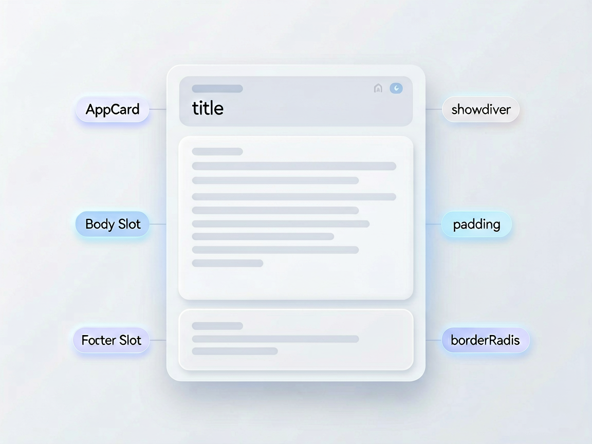
通用 Card 组件
Card 是最典型的复合组件。我设计它有三个插槽:header、body、footer,每个都可选。
// components/composite/AppCard.ets

@Component
export struct AppCard {
  @Prop title: string = ''
  @Prop showDivider: boolean = true      // header 和 body 之间是否显示分割线
  @Prop padding: number = 16
  @Prop borderRadius: number = 12
  @Prop bgColor: string = '#FFFFFF'
  @Prop elevation: number = 2            // 阴影级别
  @Prop clickable: boolean = false
  onClick?: () => void

  // 三个插槽
  @BuilderParam headerSlot: () => void = this.defaultHeader
  @BuilderParam bodySlot: () => void = this.defaultBody
  @BuilderParam footerSlot: () => void = this.defaultFooter

  // 记录插槽是否被外部覆盖
  @State private hasHeader: boolean = false
  @State private hasFooter: boolean = false

  @Builder
  defaultHeader() {
    // 默认 header:如果有 title 就显示
    if (this.title) {
      Text(this.title)
        .fontSize(16)
        .fontWeight(FontWeight.Bold)
        .fontColor('#212121')
    }
  }

  @Builder
  defaultBody() {
    // 默认 body 为空
  }

  @Builder
  defaultFooter() {
    // 默认 footer 为空
  }

  build() {
    Column() {
      // Header 区域
      Column() {
        this.headerSlot()
      }
      .width('100%')
      .padding({
        left: this.padding,
        right: this.padding,
        top: this.padding,
        bottom: this.showDivider ? 12 : this.padding
      })

      // 分割线
      if (this.showDivider && this.title) {
        Divider()
          .color('#EEEEEE')
          .strokeWidth(0.5)
          .margin({ left: this.padding, right: this.padding })
      }

      // Body 区域
      Column() {
        this.bodySlot()
      }
      .width('100%')
      .padding({
        left: this.padding,
        right: this.padding,
        top: this.showDivider && this.title ? 12 : 0,
        bottom: this.padding
      })

      // Footer 区域
      Column() {
        this.footerSlot()
      }
      .width('100%')
      .padding({
        left: this.padding,
        right: this.padding,
        bottom: this.padding
      })
    }
    .width('100%')
    .borderRadius(this.borderRadius)
    .backgroundColor(this.bgColor)
    .shadow({
      radius: this.elevation * 4,
      color: `#${Math.min(255, this.elevation * 20).toString(16).padStart(2, '0')}000000`,
      offsetX: 0,
      offsetY: this.elevation
    })
    .clip(true)
    .onClick(() => {
      if (this.clickable && this.onClick) {
        this.onClick()
      }
    })
  }
}
Card 的多种使用方式
最简用法——只传 body:
AppCard({
  title: '配送信息',
  bodySlot: () => {
    Column({ space: 8, align: HorizontalAlign.Start }) {
      Row() {
        Text('收货人:')
          .fontSize(14)
          .fontColor('#757575')
        Text('张三')
          .fontSize(14)
          .fontColor('#212121')
      }
      Row() {
        Text('手机号:')
          .fontSize(14)
          .fontColor('#757575')
        Text('138****8888')
          .fontSize(14)
          .fontColor('#212121')
      }
      Row() {
        Text('地址:')
          .fontSize(14)
          .fontColor('#757575')
        Text('北京市朝阳区xxx街道xxx号')
          .fontSize(14)
          .fontColor('#212121')
          .layoutWeight(1)
      }
    }
    .width('100%')
  }
})
完整用法——header、body、footer 全自定义:
AppCard({
  showDivider: true,
  clickable: true,
  headerSlot: () => {
    Row() {
      AppAvatar({
        src: 'https://example.com/shop.jpg',
        size: AvatarSize.SM
      })
      Column({ align: HorizontalAlign.Start }) {
        Text('华为官方旗舰店')
          .fontSize(15)
          .fontWeight(FontWeight.Medium)
          .fontColor('#212121')
        Text('官方认证 · 正品保障')
          .fontSize(12)
          .fontColor('#757575')
      }
      .margin({ left: 10 })
      .layoutWeight(1)
      Image($r('app.media.ic_arrow_right'))
        .width(16)
        .height(16)
        .fillColor('#BDBDBD')
    }
    .width('100%')
  },
  bodySlot: () => {
    Row({ space: 8 }) {
      Image('https://example.com/product.jpg')
        .width(80)
        .height(80)
        .borderRadius(8)
        .objectFit(ImageFit.Cover)
      Column({ align: HorizontalAlign.Start, space: 4 }) {
        Text('HUAWEI Mate 70 Pro')
          .fontSize(15)
          .fontColor('#212121')
          .maxLines(2)
          .textOverflow({ overflow: TextOverflow.Ellipsis })
        Text('鸿蒙 AI | 麒麟芯片')
          .fontSize(12)
          .fontColor('#757575')
        Text('¥6999')
          .fontSize(18)
          .fontWeight(FontWeight.Bold)
          .fontColor('#FF3B30')
      }
      .layoutWeight(1)
      .alignItems(HorizontalAlign.Start)
    }
    .width('100%')
  },
  footerSlot: () => {
    Row({ space: 8 }) {
      Blank()
      AppButton({
        label: '联系客服',
        variant: ButtonVariant.OUTLINED,
        size: ButtonSize.SM
      })
      AppButton({
        label: '立即购买',
        variant: ButtonVariant.FILLED,
        size: ButtonSize.SM
      })
    }
    .width('100%')
  }
})
同一套 Card 骨架,塞进去的内容完全不同,但外框、阴影、圆角完全一致——这就是复合组件的价值。
FormField:表单字段的组合式设计
表单是另一个复合组件的经典场景。一个 FormField 通常包含 label、输入控件、验证信息、帮助文本。我用插槽让输入控件部分可以灵活替换:
// components/composite/AppFormField.ets

@Component
export struct AppFormField {
  @Prop label: string = ''
  @Prop required: boolean = false
  @Prop helpText: string = ''
  @Prop errorMessage: string = ''

  // 插槽:输入控件
  @BuilderParam inputSlot: () => void = this.defaultInput

  @Builder
  defaultInput() {
    Text('请提供 inputSlot')
      .fontSize(14)
      .fontColor('#BDBDBD')
  }

  build() {
    Column({ space: 6, align: HorizontalAlign.Start }) {
      // Label 行
      Row({ space: 2 }) {
        if (this.required) {
          Text('*')
            .fontSize(14)
            .fontColor('#FF3B30')
        }
        Text(this.label)
          .fontSize(14)
          .fontWeight(FontWeight.Medium)
          .fontColor('#424242')
      }

      // 输入控件插槽
      Column() {
        this.inputSlot()
      }
      .width('100%')

      // 底部信息:错误提示 或 帮助文本
      if (this.errorMessage) {
        Text(this.errorMessage)
          .fontSize(12)
          .fontColor('#FF3B30')
      } else if (this.helpText) {
        Text(this.helpText)
          .fontSize(12)
          .fontColor('#BDBDBD')
      }
    }
    .width('100%')
  }
}
再封装一个完整的 Form 容器,把多个 FormField 组合起来:
// components/composite/AppForm.ets

@Component
export struct AppForm {
  @Prop title: string = ''
  @Prop spacing: number = 20
  @BuilderParam formContent: () => void = this.defaultContent
  @BuilderParam formFooter: () => void = this.defaultFooter

  @Builder
  defaultContent() {}

  @Builder
  defaultFooter() {}

  build() {
    Column({ space: this.spacing, align: HorizontalAlign.Start }) {
      if (this.title) {
        Text(this.title)
          .fontSize(20)
          .fontWeight(FontWeight.Bold)
          .fontColor('#212121')
          .margin({ bottom: 4 })
      }

      // 表单字段区域
      Column({ space: this.spacing }) {
        this.formContent()
      }
      .width('100%')

      // 底部按钮区域
      Column() {
        this.formFooter()
      }
      .width('100%')
      .margin({ top: 8 })
    }
    .width('100%')
    .padding(24)
  }
}
完整的表单页面
把上面的组件组合起来,做一个用户注册表单:
@Entry
@Component
struct RegisterPage {
  @State username: string = ''
  @State email: string = ''
  @State password: string = ''
  @State agreeTerms: boolean = false

  @State usernameError: string = ''
  @State emailError: string = ''
  @State passwordError: string = ''

  build() {
    Scroll() {
      AppForm({
        title: '注册账号',
        formContent: () => {
          // 用户名
          AppFormField({
            label: '用户名',
            required: true,
            errorMessage: this.usernameError,
            helpText: '4-16个字符,支持字母和数字',
            inputSlot: () => {
              AppTextInput({
                placeholder: '请输入用户名',
                maxLength: 16,
                value: this.username,
                onValidate: (val: string): ValidationResult => {
                  if (val.length < 4) {
                    return { valid: false, message: '用户名至少4个字符' }
                  }
                  return { valid: true, message: '' }
                },
                onChange: (val: string) => {
                  this.username = val
                  this.usernameError = ''
                }
              })
            }
          })

          // 邮箱
          AppFormField({
            label: '邮箱',
            required: true,
            errorMessage: this.emailError,
            inputSlot: () => {
              AppTextInput({
                placeholder: '请输入邮箱地址',
                inputType: InputType.EMAIL,
                value: this.email,
                onValidate: (val: string): ValidationResult => {
                  if (!/^[^\s@]+@[^\s@]+\.[^\s@]+$/.test(val)) {
                    return { valid: false, message: '邮箱格式不正确' }
                  }
                  return { valid: true, message: '' }
                },
                onChange: (val: string) => {
                  this.email = val
                  this.emailError = ''
                }
              })
            }
          })

          // 密码
          AppFormField({
            label: '密码',
            required: true,
            errorMessage: this.passwordError,
            helpText: '至少8个字符,需包含字母和数字',
            inputSlot: () => {
              AppTextInput({
                placeholder: '请输入密码',
                inputType: InputType.PASSWORD,
                value: this.password,
                onValidate: (val: string): ValidationResult => {
                  if (val.length < 8) {
                    return { valid: false, message: '密码至少8个字符' }
                  }
                  if (!/(?=.*[a-zA-Z])(?=.*\d)/.test(val)) {
                    return { valid: false, message: '需包含字母和数字' }
                  }
                  return { valid: true, message: '' }
                },
                onChange: (val: string) => {
                  this.password = val
                  this.passwordError = ''
                }
              })
            }
          })

          // 协议勾选
          Row({ space: 8 }) {
            Checkbox()
              .select(this.agreeTerms)
              .selectedColor('#0A59F7')
              .width(18)
              .height(18)
              .onChange((checked: boolean) => {
                this.agreeTerms = checked
              })
            Text() {
              Span('我已阅读并同意')
                .fontColor('#757575')
                .fontSize(13)
              Span('《用户协议》')
                .fontColor('#0A59F7')
                .fontSize(13)
              Span('和')
                .fontColor('#757575')
                .fontSize(13)
              Span('《隐私政策》')
                .fontColor('#0A59F7')
                .fontSize(13)
            }
          }
          .width('100%')
        },
        formFooter: () => {
          AppButton({
            label: '注册',
            size: ButtonSize.LG,
            block: true,
            disabled: !this.username || !this.email || !this.password || !this.agreeTerms,
            onClick: () => {
              // 提交注册
            }
          })
        }
      })
    }
    .width('100%')
    .height('100%')
    .backgroundColor('#FAFAFA')
  }
}
整个页面没有一行跟布局相关的重复代码。Card 管卡片样式,FormField 管表单字段结构,AppForm 管整体布局,TextInput 管输入交互,Button 管提交。每个组件只做一件事,通过插槽组合起来就能搭出完整页面。
关于 @BuilderParam 的一些细节
使用 @BuilderParam 有几个容易踩的坑:
默认值必须有。不给默认值的话,使用方如果不传这个插槽就会报错。所以一定要写一个 defaultXxx 的空 Builder 兜底。
this 指向问题。在 @BuilderParam 的回调函数里,this 指向的是使用方的组件实例,不是 AppCard 的实例。所以别在插槽回调里访问 AppCard 的内部状态——你访问不到。需要共享数据的话,通过 @Prop 传。
嵌套层级。插槽里的组件如果也需要插槽,可以嵌套使用,但别超过三层,否则代码可读性会急剧下降。超过三层的组合,建议拆成独立的组件。
组合式设计是组件库从"能用"到"好用"的分水岭。原子组件提供基础能力,复合组件提供布局骨架,两者配合起来,业务页面写起来就像搭积木一样顺畅。我个人最推荐的起步组合是 Card + List + Form 三件套——把这三个做好了,App 里 80% 的页面都能快速拼出来。

讨论HarmonyOS开发技术,专注于API与组件、DevEco Studio、测试、元服务和应用上架分发等。
更多推荐

 25
25 0
0- 0


 已为社区贡献358条内容

所有评论(0)