零基础学 ArkUI 布局(专题四):一张图搞懂七大布局
·
📐 零基础学 ArkUI 布局(专题四):一张图搞懂七大布局
博主说: 很多新手写 ArkUI 布局时只会无脑用
Column+Row,做出来的界面要么撑不开、要么挤成一团。其实 ArkUI 提供了 7 种布局容器,每种都有独特的使用场景。今天这篇专题带你一次性搞懂全部布局,并给出「什么场景用什么布局」的实用决策树。
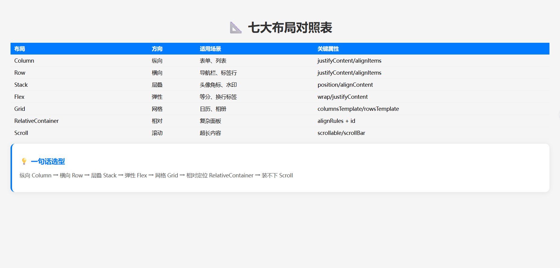
📊 七大布局总览
| 布局 | 核心思想 | 一句话记忆 |
|---|---|---|
| Column | 纵向排列 | 从上往下堆 |
| Row | 横向排列 | 从左往右排 |
| Stack | 层叠覆盖 | 叠罗汉 |
| Flex | 弹性伸缩 | 能伸能缩 |
| Grid | 网格表格 | 像 Excel |
| RelativeContainer | 相对定位 | A 在 B 右边 |
| Scroll | 滚动容器 | 装不下就滚 |
⚙️ 运行环境
| 项目 | 要求 |
|---|---|
| DevEco Studio | 5.0.3.800+ |
| HarmonyOS SDK | API 12+ |
🛠️ 7 种布局实战代码
🎯 布局 1:Column —— 纵向排列
Column() {
  Text('标题').fontSize(24)
  Text('副标题').fontSize(18).fontColor('#888')
  Button('确认').width(200)
}
.width('100%')
.justifyContent(FlexAlign.Center)  // 主轴居中
.alignItems(HorizontalAlign.Center) // 交叉轴居中
关键属性:
justifyContent:主轴对齐(start/center/end/spaceBetween/spaceAround)alignItems:交叉轴对齐(start/center/end/stretch)
🎯 布局 2:Row —— 横向排列
Row() {
  Image($r('app.media.avatar')).width(48).height(48).borderRadius(24)
  Column() {
    Text('用户名').fontSize(16).fontWeight(FontWeight.Bold)
    Text('在线').fontSize(13).fontColor('#34C759')
  }.margin({ left: 12 }).alignItems(HorizontalAlign.Start)
  Text('...').fontSize(20).fontColor('#999')
}
.width('100%').padding(16)
.justifyContent(FlexAlign.SpaceBetween)
.alignItems(VerticalAlign.Center)
🎯 布局 3:Stack —— 层叠布局(叠罗汉)
场景: 头像上的在线圆点、图片上的文字水印、卡片上的角标。
Stack() {
  // 底层:头像
  Image($r('app.media.avatar')).width(80).height(80).borderRadius(40)

  // 顶层:在线状态圆点
  Circle().width(20).height(20).fill('#34C759')
    .stroke(Color.White).strokeWidth(3)
    .position({ x: 60, y: 60 }) // 相对于 Stack 的坐标
}
.width(80).height(80)
对齐方式: alignContent(Alignment.TopStart/TopCenter/TopEnd/...Center/BottomEnd)
🎯 布局 4:Flex —— 弹性布局
场景: 按钮等分、标签流式换行。
// 等分三列
Flex({ justifyContent: FlexAlign.SpaceEvenly, wrap: FlexWrap.Wrap }) {
  ForEach(['标签1', '标签2', '标签3', '标签4', '标签5'], (item: string) => {
    Text(item)
      .padding({ left: 16, right: 16, top: 6, bottom: 6 })
      .backgroundColor('#F0F4FF')
      .borderRadius(16)
      .margin(4)
  })
}
.width('100%')
Flex 核心参数:
| 参数 | 作用 | 取值 |
|---|---|---|
direction | 主轴方向 | Row / RowReverse / Column / ColumnReverse |
wrap | 是否换行 | NoWrap / Wrap / WrapReverse |
justifyContent | 主轴对齐 | Start / Center / End / SpaceBetween / SpaceAround / SpaceEvenly |
alignItems | 交叉轴对齐 | Start / Center / End / Stretch / Baseline |
🎯 布局 5:Grid —— 网格布局
场景: 日历、相册、商品网格。
Grid() {
  ForEach(Array.from({ length: 12 }, (_, i) => i + 1), (item: number) => {
    GridItem() {
      Text(item.toString())
        .fontSize(24).fontWeight(FontWeight.Bold)
        .fontColor('#007AFF')
    }
    .backgroundColor('#F0F4FF')
    .borderRadius(8)
    .height(80)
  })
}
.columnsTemplate('1fr 1fr 1fr')  // 3列等宽
.rowsTemplate('1fr 1fr 1fr 1fr') // 4行等高
.width('96%')
columnsTemplate 语法: '1fr 1fr 1fr' = 三等分;'100px 1fr 2fr' = 固定 + 比例
🎯 布局 6:RelativeContainer —— 相对定位
场景: 复杂的仪表盘、面板布局(A 的右边缘对齐 B 的左边缘)。
RelativeContainer() {
  // 基础按钮
  Button('确定')
    .id('btn_confirm')
    .width(120).height(44)
    .alignRules({
      center: { anchor: '__container__', align: HorizontalAlign.Center },
      middle: { anchor: '__container__', align: VerticalAlign.Center }
    })

  // 取消按钮在确定按钮的右边 16px
  Button('取消')
    .id('btn_cancel')
    .width(120).height(44)
    .alignRules({
      left: { anchor: 'btn_confirm', align: HorizontalAlign.End, offset: 16 },
      top: { anchor: 'btn_confirm', align: VerticalAlign.Top }
    })
}
.width('100%').height(200)
🎯 布局 7:Scroll —— 滚动容器
场景: 内容超出屏幕高度时需要滚动。
Scroll() {
  Column() {
    ForEach(Array.from({ length: 30 }, (_, i) => i + 1), (i: number) => {
      Text(`第 ${i} 行`)
        .width('100%').padding(16)
        .backgroundColor(i % 2 === 0 ? '#F8F8F8' : '#FFF')
    })
  }
  .width('100%')
}
.scrollable(ScrollDirection.Vertical) // 纵向滚动
.scrollBar(BarState.Auto)            // 滚动条自动显示
📊 布局选型决策树
需要放什么内容?
├── 上下排列的文字/按钮? → Column
├── 左右排列的元素? → Row
├── 元素需要层叠覆盖? → Stack
├── 需要等分或换行? → Flex
├── 表格/相册风格? → Grid
├── 需要精确相对定位? → RelativeContainer
└── 内容可能超出屏幕? → Scroll
⚠️ 避坑指南
| 坑 | 原因 | 正确做法 |
|---|---|---|
| 元素不显示 | 没给父容器设宽高 | Column/Row 默认宽度包裹内容 |
| 文字溢出 | 没加 maxLines / textOverflow | .maxLines(2).textOverflow({overflow:TextOverflow.Ellipsis}) |
| Grid 格子大小不一致 | 没设 rowsTemplate | 显式设置行高模板 |
| Stack 子项定位不准 | 忘了用 .position() | Stack 内的自由定位用 .position() |
| Scroll 不滚动 | 内容没超过容器高度 | Scroll 需要父容器固定高度 + layoutWeight(1) |
| Flex 换行无效 | 忘了设 wrap: FlexWrap.Wrap | 默认不换行 |
🔥 最佳实践
- 优先 Column/Row:80% 的布局用这两个就能解决
- layoutWeight 等比缩放:比写死
width('33%')更灵活 - 嵌套不超过 5 层:太深的嵌套影响性能,用
@Builder拆解 - Flex 替代 Row:需要换行或等分时直接用 Flex
- Grid 替代多层 Column/Row 嵌套:表格类布局用 Grid 性能更好
- RelativeContainer 替代绝对定位:比 position 更灵活(支持相对其他组件)
🚀 扩展挑战
- 自适应布局:用
breakpoint监听屏幕宽度,大屏/小屏不同布局 - 折叠屏适配:监听
display.getAvailableDisplayInfo()屏幕折叠状态 - 自定义布局:通过
onLayout回调实现完全自定义的排列算法
📄
官方文档: HarmonyOS 应用开发文档
- 开发者社区: 华为开发者论坛
- 欢迎加入开源鸿蒙跨平台社区: https://openharmonycrossplatform.csdn.net/

讨论HarmonyOS开发技术,专注于API与组件、DevEco Studio、测试、元服务和应用上架分发等。
更多推荐


 3
3 0
0- 0


 已为社区贡献56条内容

所有评论(0)