《Navigation实现闪屏页》三、沉浸式极光闪屏页实战指南
HarmonyOS 沉浸式光感闪屏页实战:基于Navigation + 状态管理V2打造炫酷极光启动页
本文基于 HarmonyOS NEXT(API 23+)开发环境,使用 Navigation 组件和状态管理V2(@ComponentV2),从零打造一个与众不同的沉浸式极光光感闪屏页。全程代码讲解,可直接运行。
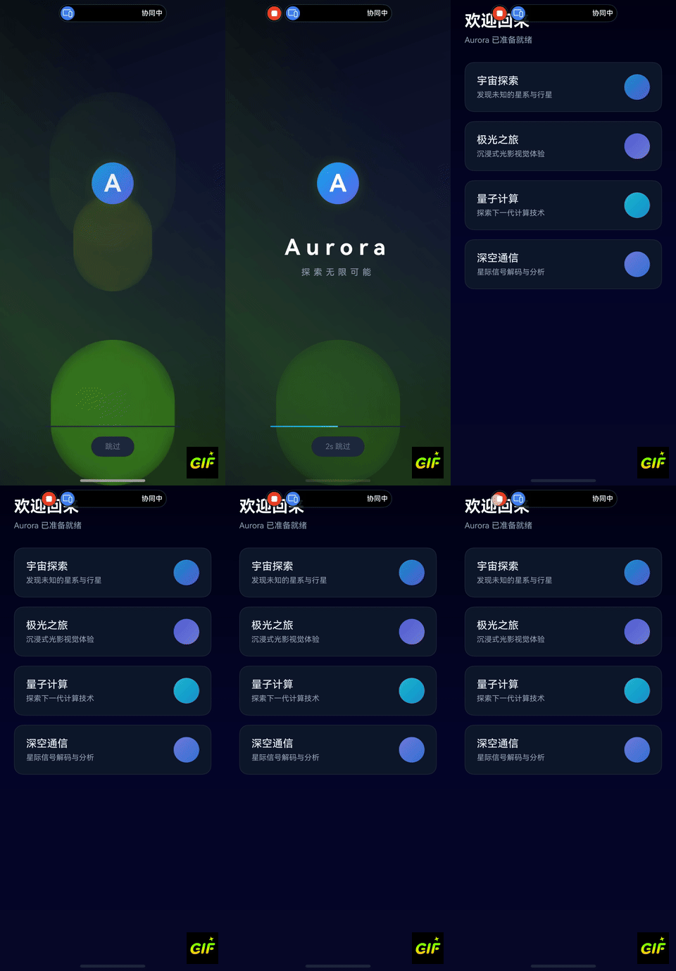
效果
一、前言
闪屏页是用户打开应用后看到的第一屏,直接影响用户的第一印象。一个精心设计的闪屏页不仅能提升品牌辨识度,还能创造愉悦的视觉体验。
本文将带你使用 HarmonyOS ArkUI 的 Navigation 组件和状态管理V2,打造一个以「极光」为灵感的沉浸式光感闪屏页。
设计效果
- 深邃的宇宙渐变背景
- 多层脉冲光环,模拟极光流动
- 旋转极光光束,营造空间感
- 中心发光Logo + 渐显品牌文字
- 带进度条的倒计时跳过按钮
- 自动/手动跳转至主页
技术栈
| 技术 | 说明 |
|---|---|
| Navigation + NavPathStack | 页面导航管理 |
| @ComponentV2 + @Local | 状态管理V2 |
| @Monitor | 属性变化监听 |
| linearGradient / radialGradient | 渐变背景 |
| blur + shadow | 光感模糊效果 |
| animation (iterations: -1) | 无限循环动画 |
二、项目搭建
2.1 创建项目
使用 DevEco Studio 创建一个空的 HarmonyOS 项目,选择 Empty Ability 模板。
2.2 配置路由表
在 src/main/resources/base/profile/ 下创建 route_map.json:
{
  "routerMap": [
    {
      "name": "AuroraSplash",
      "pageSourceFile": "src/main/ets/pages/AuroraSplashPage.ets",
      "buildFunction": "AuroraSplashBuilder",
      "data": {
        "description": "极光沉浸式闪屏页"
      }
    },
    {
      "name": "AuroraHome",
      "pageSourceFile": "src/main/ets/pages/AuroraHomePage.ets",
      "buildFunction": "AuroraHomeBuilder",
      "data": {
        "description": "极光主页"
      }
    }
  ]
}
2.3 注册路由表
在 src/main/module.json5 中添加 routerMap 配置:
{
  "module": {
    "name": "entry",
    "type": "entry",
    "pages": "$profile:main_pages",
    "routerMap": "$profile:route_map",
    // ...其他配置
  }
}
2.4 配置页面路由
在 src/main/resources/base/profile/main_pages.json 中注册页面:
{
  "src": [
    "pages/AuroraSplashPage",
    "pages/AuroraHomePage"
  ]
}
三、全屏沉浸式窗口配置
在 EntryAbility.ets 中设置全屏模式和安全区域:
import { AbilityConstant, UIAbility, Want } from '@kit.AbilityKit';
import { window } from '@kit.ArkUI';

export default class EntryAbility extends UIAbility {
  onWindowStageCreate(windowStage: window.WindowStage): void {
    windowStage.loadContent('pages/AuroraSplashPage', (err) => {
      if (err.code) { return; }

      let windowClass: window.Window = windowStage.getMainWindowSync();

      // 1. 设置窗口全屏 —— 沉浸式的关键
      windowClass.setWindowLayoutFullScreen(true);

      // 2. 获取安全区域
      let navArea = windowClass.getWindowAvoidArea(
        window.AvoidAreaType.TYPE_NAVIGATION_INDICATOR
      );
      AppStorage.setOrCreate('bottomRectHeight', navArea.bottomRect.height);

      let sysArea = windowClass.getWindowAvoidArea(
        window.AvoidAreaType.TYPE_SYSTEM
      );
      AppStorage.setOrCreate('topRectHeight', sysArea.topRect.height);

      // 3. 监听安全区域变化
      windowClass.on('avoidAreaChange', (data) => {
        if (data.type === window.AvoidAreaType.TYPE_SYSTEM) {
          AppStorage.setOrCreate('topRectHeight', data.area.topRect.height);
        } else if (data.type === window.AvoidAreaType.TYPE_NAVIGATION_INDICATOR) {
          AppStorage.setOrCreate('bottomRectHeight', data.area.bottomRect.height);
        }
      });

      // 4. 设置状态栏透明(注意:SystemBarProperties 不包含 statusBarBackgroundColor)
      windowClass.setWindowSystemBarProperties({
        statusBarContentColor: '#00000000'
      });
    });
  }
}
要点解析:
setWindowLayoutFullScreen(true)让内容延伸到状态栏和导航条区域getWindowAvoidArea获取系统遮挡区域高度,存储到 AppStorage 供页面使用- 状态栏设置为透明,确保闪屏页背景色延伸到状态栏下方
- 重要提醒:
SystemBarProperties类型不包含statusBarBackgroundColor属性,只设置statusBarContentColor即可
四、核心:沉浸式闪屏内容组件(状态管理V2)
这是闪屏页的视觉核心,使用 @ComponentV2 和 V2 状态管理实现。
4.1 组件结构设计
Stack(层叠布局)
├── 第1层:深邃渐变背景(linearGradient)
├── 第2层:旋转极光光束(linearGradient + rotate)
├── 第3层:上方脉冲光环(radialGradient + blur + 无限动画)
├── 第4层:下方辅助光环(radialGradient + blur + 延迟动画)
├── 第5层:中心核心光球(radialGradient + blur)
└── 第6层:内容区域
    ├── Logo 圆形光球
    ├── 品牌名称(渐显动画)
    ├── 副标题(延迟渐显)
    └── 底部倒计时 + 进度条
4.2 完整代码
创建 AuroraSplashContent.ets:
@ComponentV2
export struct AuroraSplashContent {
  // ===== V2 状态管理 =====
  @Local isAnimated: boolean = false;
  @Local logoOpacity: number = 0;
  @Local textOpacity: number = 0;
  @Local countdownText: string = '跳过';
  @Local countdownSeconds: number = 4;
  @Local progressWidth: number = 0;
  @Local orbOpacity: number = 0;
  @Event onSkip: () => void;  // 回调必须用 @Event,不能用普通属性
  private timerId: number = -1;
  private countdownTimerId: number = -1;

  aboutToAppear(): void {
    // 延迟启动入场动画
    this.timerId = setTimeout(() => {
      this.isAnimated = true;
      this.logoOpacity = 1;
      this.orbOpacity = 1;
    }, 200);
    this.startCountdown();
  }

  aboutToDisappear(): void {
    this.clearAllTimers();
  }

  private clearAllTimers(): void {
    if (this.timerId !== -1) {
      clearTimeout(this.timerId);
      this.timerId = -1;
    }
    if (this.countdownTimerId !== -1) {
      clearInterval(this.countdownTimerId);
      this.countdownTimerId = -1;
    }
  }

  private startCountdown(): void {
    this.countdownTimerId = setInterval(() => {
      this.countdownSeconds--;
      if (this.countdownSeconds > 0) {
        this.countdownText = `${this.countdownSeconds}s 跳过`;
        this.progressWidth = ((4 - this.countdownSeconds) / 4) * 100;
      } else {
        this.clearAllTimers();
        this.progressWidth = 100;
        this.onSkip();
      }
    }, 1000);
  }

  build() {
    Stack() {
      // === 背景层 + 光效层(详见下文) ===
      // === 内容层(详见下文) ===
    }
    .width('100%')
    .height('100%')
  }
}
4.3 关键代码讲解:渐变背景与光效
深邃渐变背景(深海月光配色):
// 第1层:深邃渐变背景
Column()
  .width('100%')
  .height('100%')
  .linearGradient({
    angle: 160,
    colors: [
      ['#020215', 0.0],   // 深空黑
      ['#06062a', 0.25],  // 暗蓝
      ['#0a0a35', 0.5],   // 深蓝
      ['#081030', 0.75],  // 深青
      ['#020215', 1.0]    // 深空黑
    ]
  })
使用 linearGradient 创建160度角的多色渐变,从深空黑过渡到暗蓝和深青,营造宇宙空间感。
脉冲光环动画:
// 第3层:上方脉冲光环
Column()
  .width('70%')
  .height('40%')
  .borderRadius('50%')
  .radialGradient({
    center: ['50%', '50%'],
    radius: '60%',
    colors: [
      ['#0ea5e940', 0.0],   // 中心:半透明天青
      ['#0ea5e918', 0.4],
      ['#0ea5e900', 1.0]    // 边缘:完全透明
    ]
  })
  .blur(50)               // 高斯模糊,营造光晕感
  .opacity(this.orbOpacity)
  .scale({ x: this.pulseScale, y: this.pulseScale })
  .offset({ y: '-15%' })
  .animation({
    duration: 2500,
    curve: Curve.EaseInOut,
    iterations: -1,                  // 无限循环
    playMode: PlayMode.AlternateReverse  // 来回播放
  })
核心技巧:
radialGradient创建从中心向边缘衰减的径向渐变blur(50)高斯模糊让光环边缘柔和,模拟真实光晕iterations: -1+PlayMode.AlternateReverse实现呼吸般的脉冲效果- 多个光环使用不同的
duration和delay错开节奏
Logo 发光效果:
// Logo 圆形光球
Stack() {
  // 外层光晕
  Column()
    .width(120)
    .height(120)
    .borderRadius('50%')
    .radialGradient({
      center: ['50%', '50%'],
      radius: '50%',
      colors: [['#22d3ee30', 0.0], ['#0ea5e918', 0.6], ['#00000000', 1.0]]
    })
    .blur(15);

  // 内层核心
  Column() {
    Text('A')
      .fontSize(42)
      .fontWeight(FontWeight.Bold)
      .fontColor('#ffffff')
  }
  .width(72)
  .height(72)
  .borderRadius('50%')
  .linearGradient({
    angle: 135,
    colors: [['#0ea5e9', 0.0], ['#6366f1', 1.0]]
  })
  .shadow({
    radius: 30,
    color: '#0ea5e950',
    offsetX: 0,
    offsetY: 0
  })
}
Logo 由两层组成:外层是模糊的径向渐变光晕(天青色),内层是带阴影的渐变实心圆(天青→韶青),两者叠加产生发光效果。
4.4 关键代码讲解:进度条与倒计时
// 进度条
Stack({ alignContent: Alignment.Start }) {
  // 轨道背景
  Row()
    .width('100%')
    .height(2)
    .borderRadius(1)
    .backgroundColor('#1e293b');  // 使用6位hex,避免8位hex解析问题

  // 进度填充
  Row()
    .width(`${this.progressWidth}%`)
    .height(2)
    .borderRadius(1)
    .linearGradient({
      angle: 90,
      colors: [['#0ea5e9', 0.0], ['#22d3ee', 1.0]]
    })
}
进度条使用 Stack 叠加轨道和填充条,填充宽度由 @Local progressWidth 驱动,每秒更新一次。注意:轨道背景使用 #1e293b(6位hex)而非 #ffffff15(8位hex),因为 ArkUI 中8位hex颜色的 alpha 通道可能解析异常。
五、闪屏页入口(Navigation容器)
创建 AuroraSplashPage.ets,作为 Navigation 的根容器:
import { AuroraSplashContent } from './AuroraSplashContent';
import { AuroraHomePage } from './AuroraHomePage';

@Builder
export function AuroraSplashBuilder(name: string, param: Object) {
  AuroraSplashPage();
}

@Entry
@Component
struct AuroraSplashPage {
  pageInfos: NavPathStack = new NavPathStack();
  @State isHideNavBar: boolean = false;
  private timeOutId: number = -1;

  aboutToAppear(): void {
    // 4秒后自动跳转(与倒计时同步)
    this.timeOutId = setTimeout(() => {
      this.isHideNavBar = true;
      this.pageInfos.pushPathByName('AuroraHome', null, false);
    }, 4000);
  }

  skipToHome(): void {
    if (this.timeOutId !== -1) {
      clearTimeout(this.timeOutId);
      this.timeOutId = -1;
    }
    this.isHideNavBar = true;
    this.pageInfos.pushPathByName('AuroraHome', null, false);
  }

  // navDestination 构建器:路由双重保障
  @Builder
  PageMap(name: string, param: Object) {
    if (name === 'AuroraHome') {
      AuroraHomePage()
    }
  }

  build() {
    Navigation(this.pageInfos) {
      AuroraSplashContent({
        onSkip: () => {
          this.skipToHome();
        }
      })
    }
    .hideToolBar(true)
    .hideNavBar(this.isHideNavBar)
    .backgroundColor('#020215')
    .navDestination(this.PageMap)
  }
}
关键设计:
- Navigation 包裹闪屏内容,作为页面栈的根容器
hideToolBar(true)隐藏底部工具栏hideNavBar(this.isHideNavBar)初始隐藏导航栏内容,跳转时设为 truepushPathByName('AuroraHome', null, false)第三个参数false关闭转场动画- 手动跳过时先清除定时器再跳转,防止重复跳转
navDestination构建器:同时配置 route_map.json 和 navDestination,实现路由双重保障backgroundColor('#020215'):Navigation 设置深色背景,防止系统默认背景色透出export struct AuroraHomePage:主页必须导出,才能被直接导入使用
六、主页实现
创建 AuroraHomePage.ets:
@Builder
export function AuroraHomeBuilder(name: string, param: Object) {
  AuroraHomePage();
}

@Entry
@Component
export struct AuroraHomePage {
  build() {
    NavDestination() {
      Column() {
        // 顶部标题区域
        Column() {
          Text('欢迎回来')
            .fontSize(28)
            .fontWeight(FontWeight.Bold)
            .fontColor('#ffffff');

          Text('Aurora 已准备就绪')
            .fontSize(14)
            .fontColor('#94a3b8')
            .margin({ top: 8 });
        }
        .width('100%')
        .alignItems(HorizontalAlign.Start)
        .padding({ left: 24, top: 20 });

        // 功能卡片列表
        Column({ space: 16 }) {
          this.FeatureCard('宇宙探索', '发现未知的星系与行星', '#0ea5e9', '#6366f1')
          this.FeatureCard('极光之旅', '沉浸式光影视觉体验', '#6366f1', '#818cf8')
          this.FeatureCard('量子计算', '探索下一代计算技术', '#22d3ee', '#0ea5e9')
          this.FeatureCard('深空通信', '星际信号解码与分析', '#818cf8', '#3b82f6')
        }
        .width('100%')
        .padding({ left: 24, right: 24, top: 30 })
        .layoutWeight(1);
      }
      .width('100%')
      .height('100%')
      .linearGradient({
        angle: 180,
        colors: [['#020215', 0.0], ['#06062a', 0.5], ['#080828', 1.0]]
      })
    }
    .backgroundColor('#020215')
    .hideTitleBar(true)
  }

  @Builder
  FeatureCard(title: string, desc: string, startColor: string, endColor: string) {
    Row() {
      Column() {
        Text(title)
          .fontSize(18)
          .fontWeight(FontWeight.Medium)
          .fontColor('#e2e8f0');

        Text(desc)
          .fontSize(13)
          .fontColor('#94a3b8')
          .margin({ top: 6 });
      }
      .alignItems(HorizontalAlign.Start)
      .layoutWeight(1);

      // 右侧装饰圆点
      Column()
        .width(44)
        .height(44)
        .borderRadius('50%')
        .linearGradient({
          angle: 135,
          colors: [[startColor, 0.0], [endColor, 1.0]]
        })
        .opacity(0.85);
    }
    .width('100%')
    .padding(20)
    .borderRadius(16)
    .backgroundColor('#0f172a')
    .border({ width: 1, color: '#1e293b' })
  }
}
主页使用 NavDestination 容器,保持与闪屏页一致的深色主题风格。
设计要点:
NavDestination设置.backgroundColor('#020215')覆盖系统默认黄色背景- 功能卡片使用
.backgroundColor('#0f172a')深石板蓝,而非半透明白色 - 卡片边框使用
.border({ width: 1, color: '#1e293b' })微妙的深蓝灰 - 标题文字使用
#e2e8f0柔和浅灰,而非纯白 - struct 必须加
export关键字,才能被闪屏页的 navDestination 构建器导入
七、状态管理V2 核心知识点
本案例使用的 V2 状态管理装饰器:
| 装饰器 | 用途 | 对应V1 |
|---|---|---|
@ComponentV2 | V2组件声明 | @Component |
@Local | 组件自身响应式状态 | @State |
@Event | 组件外部传入的回调函数 | 无(V1用普通属性) |
aboutToAppear() | 组件创建后回调 | 同 |
aboutToDisappear() | 组件销毁前回调 | 同 |
V2 vs V1 对比:
// V1 写法
@Component
struct OldSplash {
  @State opacity: number = 0;
  @State countdown: number = 4;
}

// V2 写法(本案例使用)
@ComponentV2
struct NewSplash {
  @Local opacity: number = 0;
  @Local countdown: number = 4;
}
V2 的 @Local 替代了 V1 的 @State,语义更清晰。@Event 用于声明外部传入的回调函数,不能用普通属性替代,否则会报编译错误。V2 还支持更多高级特性如 @Monitor、@Computed、@Provider/@Consumer 等。
八、光效设计思路总结
本案例的「极光」光感效果,核心依赖以下 4 个 ArkUI 能力的组合运用:
| 能力 | 作用 | 使用场景 |
|---|---|---|
linearGradient | 线性渐变 | 背景底色、光束、进度条 |
radialGradient | 径向渐变 | 脉冲光环、Logo光晕 |
blur | 高斯模糊 | 光环边缘柔化、光晕扩散 |
animation (iterations: -1) | 无限动画 | 呼吸脉冲、光束旋转 |
设计原则:
- 多层叠加:6层Stack结构,每层负责不同视觉效果
- 节奏错开:各光环使用不同的 duration(2000~3200ms)和 delay,避免同步运动
- 颜色冷色调:采用深海月光配色(天青 #0ea5e9、韶青 #6366f1、柔青 #22d3ee),视觉舒适不刺眼
- 由内到外:中心光球 → 光环 → 光束 → 背景,视觉重心始终在中心
- 使用6位hex色值:避免8位hex颜色(如
#ffffff08)在 ArkUI 中 alpha 解析异常
九、文件结构总览
entry/src/main/
├── ets/
│   ├── entryability/
│   │   └── EntryAbility.ets          # 全屏窗口配置
│   └── pages/
│       ├── AuroraSplashContent.ets   # 闪屏内容组件(V2)
│       ├── AuroraSplashPage.ets      # 闪屏入口页(Navigation)
│       └── AuroraHomePage.ets        # 主页(NavDestination)
├── resources/
│   └── base/profile/
│       ├── main_pages.json           # 页面路由
│       └── route_map.json            # 路由表配置
└── module.json5                      # 模块配置
十、常见问题
Q:为什么用 Navigation 而不是 router?
A:router 模块已被官方标记为废弃,新项目推荐使用 Navigation。Navigation 提供更强大的页面栈管理、生命周期回调和转场动画控制。
Q:@ComponentV2 和 @Component 可以混用吗?
A:可以。在本案例中,@Entry 入口页使用 @Component(Navigation根容器),内部内容组件使用 @ComponentV2。两者可以在同一项目中混合使用。
Q:如何实现状态栏透明延伸?
A:在 EntryAbility 中调用 setWindowLayoutFullScreen(true) 设置全屏,然后 setWindowSystemBarProperties 将状态栏背景设为透明。
Q:为什么动画需要延迟启动?
A:组件在 aboutToAppear 时尚未完成首次渲染,此时修改动画状态不会触发过渡动画。通过 setTimeout(200ms) 延迟,确保组件已渲染完毕再启动动画。
Q:@ComponentV2 中回调属性为什么必须用 @Event?
A:ArkTS 规范禁止在 @ComponentV2 中初始化普通属性(forbidden to specify)。回调函数必须用 @Event 装饰器声明,否则编译器会报错。
Q:为什么 8 位 hex 颜色值显示为亮黄色?
A:ArkUI 中8位hex颜色(如 #ffffff08)的 alpha 通道解析可能与预期不同。建议使用6位hex纯色值(如 #0f172a),或使用 Color 枚举 + .opacity() 实现透明效果。
Q:NavDestination 默认背景是黄色的?
A:NavDestination 和 Navigation 默认背景色可能是系统主题色(偏黄)。必须显式设置 .backgroundColor('#020215') 覆盖默认背景。
Q:pushPathByName 跳转不生效?
A:同时配置 route_map.json 和 navDestination 构建器实现双重路由保障。新建的路由文件可能需要 Clean Build 才能被构建系统加载。
Q:SystemBarProperties 不包含 statusBarBackgroundColor?
A:是的,SystemBarProperties 类型只有 statusBarContentColor 和 statusBarBackgroundColor 已不存在。只需设置 statusBarContentColor 即可。
十一、总结
本文通过一个完整的实战案例,展示了如何使用 Navigation + 状态管理V2 打造沉浸式极光闪屏页。核心技术点包括:
- Navigation 架构:Navigation + NavPathStack + NavDestination 三层导航 + navDestination 双重路由
- 全屏沉浸:setWindowLayoutFullScreen + 安全区域适配 + avoidAreaChange 监听
- 光感设计:linearGradient + radialGradient + blur + 无限动画组合
- V2 状态管理:@ComponentV2 + @Local + @Event 驱动倒计时和动画状态
- 深海月光配色:#020215 深空黑 + #0ea5e9 天青 + #6366f1 韶青 + #22d3ee 柔青
闪屏页是应用的门面,希望本案例能激发你的创意灵感,打造出独一无二的启动体验!
Build 才能被构建系统加载。
Q:SystemBarProperties 不包含 statusBarBackgroundColor?
A:是的,SystemBarProperties 类型只有 statusBarContentColor 和 statusBarBackgroundColor 已不存在。只需设置 statusBarContentColor 即可。
十一、总结
本文通过一个完整的实战案例,展示了如何使用 Navigation + 状态管理V2 打造沉浸式极光闪屏页。核心技术点包括:
- Navigation 架构:Navigation + NavPathStack + NavDestination 三层导航 + navDestination 双重路由
- 全屏沉浸:setWindowLayoutFullScreen + 安全区域适配 + avoidAreaChange 监听
- 光感设计:linearGradient + radialGradient + blur + 无限动画组合
- V2 状态管理:@ComponentV2 + @Local + @Event 驱动倒计时和动画状态
- 深海月光配色:#020215 深空黑 + #0ea5e9 天青 + #6366f1 韶青 + #22d3ee 柔青
闪屏页是应用的门面,希望本案例能激发你的创意灵感,打造出独一无二的启动体验!

讨论HarmonyOS开发技术,专注于API与组件、DevEco Studio、测试、元服务和应用上架分发等。
更多推荐
 14
14 0
0- 0


 已为社区贡献73条内容

所有评论(0)