鸿蒙原生ArkTS布局方式之Stack左层叠布局深度解析
项目演示
目录
- 鸿蒙布局体系概述与Stack定位
- Stack容器API详解
- 层叠原理深入剖析
- Alignment枚举全表详解
- 实战案例:左层叠布局典型场景
- Stack与其他布局容器对比选型
- 常见踩坑与最佳实践
- 性能优化与进阶技巧
1. 鸿蒙布局体系概述与Stack定位
1.1 鸿蒙ArkUI布局体系架构
鸿蒙HarmonyOS的ArkUI框架提供了一套完整的声明式布局体系,以容器组件为核心,通过属性链式调用来描述UI结构。整个布局体系可以分为三个层次:
基础容器层:提供最基础的布局能力,包括Stack、Row、Column等单一布局容器。这些容器是构建复杂UI的基石,每个容器专注于一种布局方式。
复合容器层:提供更复杂的布局能力,包括RelativeContainer、Flex等组合布局容器。这些容器可以实现更灵活的布局需求,支持多种布局方式的组合。
高级容器层:提供特定场景的布局能力,包括List、Grid、Scroll等功能型容器。这些容器针对列表、网格、滚动等特定场景进行了优化。
1.2 Stack布局在体系中的定位
Stack容器是鸿蒙布局体系中最基础也是最重要的层叠布局容器。它的核心价值在于实现子组件的层叠排列,使多个组件能够在同一空间内重叠显示。
核心特性:
- 层叠排列:子组件按照添加顺序依次层叠
- 对齐控制:通过alignContent属性控制子组件的对齐方式
- Z序管理:后添加的组件位于上层,先添加的组件位于下层
- 尺寸独立:每个子组件的尺寸独立计算,互不影响
应用场景:
- 图片水印叠加:在图片上叠加半透明水印文字
- 用户头像角标:在头像右上角显示未读消息数量
- 卡片叠放效果:实现类似照片堆叠的卡片层叠
- 地图标注层叠:在地图上叠加多个标注点
- 弹窗遮罩层:在内容上方显示半透明遮罩
- 进度条叠加:显示多层进度信息
1.3 Stack左层叠布局的设计理念
左层叠布局指的是使用Stack({ alignContent: Alignment.Start })实现的布局方式。其核心设计理念包括:
左中对齐:水平方向靠左,垂直方向居中,使子组件在左侧形成层叠效果。
层叠展示:子组件按添加顺序依次层叠,后添加的组件在上层,形成视觉层次。
视觉深度:通过尺寸递减和透明度变化,创造出具有深度感的视觉效果。
信息层级:重要信息放置在上层,次要信息放置在下层,符合用户的视觉浏览习惯。
2. Stack容器API详解
2.1 Stack构造函数签名
在HarmonyOS NEXT(API 12)中,Stack容器的构造函数签名如下:
Stack(value?: { alignContent?: Alignment })
参数说明:
| 参数名 | 类型 | 必填 | 默认值 | 说明 |
|---|---|---|---|---|
| alignContent | Alignment | 否 | Alignment.Center | 子组件在Stack容器中的对齐方式 |
2.2 Stack属性列表
Stack容器支持以下属性:
| 属性名 | 类型 | 说明 |
|---|---|---|
| alignContent | Alignment | 设置子组件的对齐方式 |
| width | Length | 设置Stack容器的宽度 |
| height | Length | 设置Stack容器的高度 |
| backgroundColor | ResourceColor | 设置Stack容器的背景色 |
| opacity | number | 设置Stack容器的透明度(0-1) |
| borderRadius | Length | 设置Stack容器的圆角半径 |
| padding | Padding | 设置Stack容器的内边距 |
| margin | Margin | 设置Stack容器的外边距 |
| overflow | Overflow | 设置子组件溢出时的处理方式 |
2.3 alignContent属性详解
alignContent是Stack容器的核心属性,决定了所有子组件在Stack中的对齐方式。其类型为Alignment枚举,包含9个预定义值。
使用方式:
// 方式一:在构造函数中设置
Stack({ alignContent: Alignment.Start }) {
  // 子组件
}

// 方式二:通过属性链式调用设置
Stack() {
  // 子组件
}
.alignContent(Alignment.Start)
2.4 完整属性设置示例
@Entry
@Component
struct StackAttributesExample {
  build() {
    Stack({ alignContent: Alignment.Start }) {
      Column() {
        Text('底层组件')
      }
      .width(200)
      .height(200)
      .backgroundColor('#FF6B6B')

      Column() {
        Text('上层组件')
      }
      .width(100)
      .height(100)
      .backgroundColor('#4ECDC4')
    }
    .width('100%')
    .height(300)
    .backgroundColor('#F5F5F5')
    .borderRadius(16)
    .padding(20)
    .margin({ top: 20, left: 20, right: 20 })
    .overflow(Overflow.Hidden)
  }
}
3. 层叠原理深入剖析
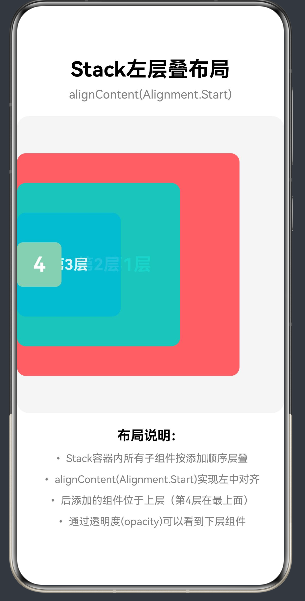
3.1 Z序(Z-Order)规则
Stack容器的层叠顺序遵循"后添加的组件在上层"的基本原则。这意味着,在Stack中先添加的子组件位于底层,后添加的子组件位于上层。
Stack({ alignContent: Alignment.Start }) {
  // 第1个子组件 - 最底层(Z=1)
  Column().width(300).height(300).backgroundColor('#FF6B6B')

  // 第2个子组件 - 中间层(Z=2)
  Column().width(200).height(200).backgroundColor('#4ECDC4')

  // 第3个子组件 - 最上层(Z=3)
  Column().width(100).height(100).backgroundColor('#45B7D1')
}
Z序示意图:
┌─────────────────────────────────────────┐
│                                         │
│    ┌─────────────────────────────┐      │
│    │     第3层 (Z=3)              │      │
│    │     #45B7D1                  │      │
│    │     100x100                  │      │
│    │   ┌─────────────────────┐    │      │
│    │   │   第2层 (Z=2)        │    │      │
│    │   │   #4ECDC4            │    │      │
│    │   │   200x200            │    │      │
│    │   │ ┌─────────────────┐  │    │      │
│    │   │ │ 第1层 (Z=1)      │  │    │      │
│    │   │ │ #FF6B6B          │  │    │      │
│    │   │ │ 300x300          │  │    │      │
│    │   │ └─────────────────┘  │    │      │
│    │   └─────────────────────┘    │      │
│    └─────────────────────────────┘      │
│                                         │
└─────────────────────────────────────────┘
3.2 尺寸计算规则
Stack容器的尺寸计算遵循以下规则:
规则一:容器尺寸决定子组件可用空间
Stack容器的尺寸决定了子组件的最大可用空间。子组件可以使用百分比或具体数值来设置尺寸。
Stack({ alignContent: Alignment.Start }) {
  // 子组件的最大可用空间 = Stack容器的尺寸
  Column().width('100%').height('100%')  // 填满整个Stack
}
.width(300)
.height(400)
规则二:子组件尺寸独立计算
每个子组件的尺寸是独立计算的,不会影响其他子组件的尺寸。
Stack({ alignContent: Alignment.Start }) {
  // 子组件1:300x300
  Column().width(300).height(300)

  // 子组件2:200x200(与子组件1无关)
  Column().width(200).height(200)
}
规则三:子组件尺寸可以超出容器
子组件的尺寸可以大于Stack容器的尺寸,超出部分根据overflow属性处理。
Stack({ alignContent: Alignment.Start }) {
  // 子组件尺寸超出容器
  Column().width(400).height(400)
}
.width(300)
.height(300)
.overflow(Overflow.Hidden)  // 裁剪超出部分
3.3 溢出裁剪机制
overflow属性控制子组件超出Stack容器边界时的处理方式:
| 值 | 说明 |
|---|---|
| Overflow.Hidden | 裁剪超出部分,只显示容器内部的内容 |
| Overflow.Visible | 不裁剪,超出部分正常显示 |
| Overflow.Scroll | 允许滚动查看超出部分(Stack不常用) |
3.4 透明度与层叠穿透
通过设置opacity属性,可以实现层叠穿透效果,让下层组件的内容能够被看到。
Stack({ alignContent: Alignment.Start }) {
  // 底层:完全不透明
  Column().width(300).height(300).backgroundColor('#FF6B6B').opacity(1)

  // 中层:90%不透明,可以看到底层
  Column().width(200).height(200).backgroundColor('#4ECDC4').opacity(0.9)

  // 上层:80%不透明,可以看到中层和底层
  Column().width(100).height(100).backgroundColor('#45B7D1').opacity(0.8)
}
4. Alignment枚举全表详解
4.1 Alignment枚举定义
Alignment枚举定义了9种对齐方式,每种对齐方式由水平对齐和垂直对齐组合而成:
enum Alignment {
  TopStart,      // 左上对齐
  TopCenter,     // 上中对齐
  TopEnd,        // 右上对齐
  CenterStart,   // 左中对齐(Alignment.Start 的别名)
  Center,        // 居中对齐
  CenterEnd,     // 右中对齐
  BottomStart,   // 左下对齐
  BottomCenter,  // 下中对齐
  BottomEnd      // 右下对齐
}
4.2 Alignment.Start 的特殊性
在HarmonyOS NEXT中,Alignment.Start是Alignment.CenterStart的别名,表示左中对齐:
// 以下两种写法等效
Stack({ alignContent: Alignment.Start })      // 推荐写法
Stack({ alignContent: Alignment.CenterStart }) // 完整写法
Alignment.Start 的对齐效果:
- 水平方向:靠左对齐
- 垂直方向:居中对齐
4.3 九种对齐方式完整说明
4.3.1 TopStart(左上对齐)
子组件位于容器左上角。
Stack({ alignContent: Alignment.TopStart }) {
  Column().width(100).height(100).backgroundColor('#FF6B6B')
}
.width(300)
.height(300)
4.3.2 TopCenter(上中对齐)
子组件位于容器顶部中央。
Stack({ alignContent: Alignment.TopCenter }) {
  Column().width(100).height(100).backgroundColor('#FF6B6B')
}
.width(300)
.height(300)
4.3.3 TopEnd(右上对齐)
子组件位于容器右上角。
Stack({ alignContent: Alignment.TopEnd }) {
  Column().width(100).height(100).backgroundColor('#FF6B6B')
}
.width(300)
.height(300)
4.3.4 CenterStart(左中对齐)
子组件位于容器左侧中央,即左层叠布局。
Stack({ alignContent: Alignment.CenterStart }) {
  Column().width(100).height(100).backgroundColor('#FF6B6B')
}
.width(300)
.height(300)
4.3.5 Center(居中对齐)
子组件位于容器正中央。
Stack({ alignContent: Alignment.Center }) {
  Column().width(100).height(100).backgroundColor('#FF6B6B')
}
.width(300)
.height(300)
4.3.6 CenterEnd(右中对齐)
子组件位于容器右侧中央。
Stack({ alignContent: Alignment.CenterEnd }) {
  Column().width(100).height(100).backgroundColor('#FF6B6B')
}
.width(300)
.height(300)
4.3.7 BottomStart(左下对齐)
子组件位于容器左下角。
Stack({ alignContent: Alignment.BottomStart }) {
  Column().width(100).height(100).backgroundColor('#FF6B6B')
}
.width(300)
.height(300)
4.3.8 BottomCenter(下中对齐)
子组件位于容器底部中央。
Stack({ alignContent: Alignment.BottomCenter }) {
  Column().width(100).height(100).backgroundColor('#FF6B6B')
}
.width(300)
.height(300)
4.3.9 BottomEnd(右下对齐)
子组件位于容器右下角。
Stack({ alignContent: Alignment.BottomEnd }) {
  Column().width(100).height(100).backgroundColor('#FF6B6B')
}
.width(300)
.height(300)
4.4 对齐方式选择指南
| 场景 | 推荐对齐方式 |
|---|---|
| 左层叠布局 | Alignment.Start / Alignment.CenterStart |
| 右层叠布局 | Alignment.CenterEnd |
| 顶部层叠布局 | Alignment.TopStart / Alignment.TopCenter / Alignment.TopEnd |
| 底部层叠布局 | Alignment.BottomStart / Alignment.BottomCenter / Alignment.BottomEnd |
| 居中层叠布局 | Alignment.Center |
5. 实战案例:左层叠布局典型场景
5.1 案例一:用户头像角标
场景描述:在用户头像右上角显示未读消息数量角标。
实现思路:
- 使用Stack容器实现头像和角标的层叠
- 设置alignContent为Alignment.Start实现左中对齐
- 头像作为底层组件,角标作为上层组件
- 通过margin调整角标位置到头像右上角
完整代码:
@Entry
@Component
struct AvatarBadgeExample {
  @State unreadCount: number = 99;
  @State avatarUrl: string = 'https://example.com/avatar.jpg';

  build() {
    Column({ space: 20 }) {
      Text('用户头像角标')
        .fontSize(28)
        .fontWeight(FontWeight.Bold)
        .fontColor(Color.Black)

      Stack({ alignContent: Alignment.Start }) {
        Image(this.avatarUrl)
          .width(100)
          .height(100)
          .borderRadius(50)
          .backgroundColor('#E8E8E8')

        Column() {
          Text(this.unreadCount > 99 ? '99+' : `${this.unreadCount}`)
            .fontSize(14)
            .fontWeight(FontWeight.Bold)
            .fontColor(Color.White)
        }
        .width(32)
        .height(32)
        .backgroundColor('#FF4D4F')
        .borderRadius(16)
        .justifyContent(FlexAlign.Center)
        .margin({ left: 68, top: 0 })
      }
      .width(100)
      .height(100)

      Row({ space: 10 }) {
        Button('增加消息')
          .width(120)
          .height(40)
          .backgroundColor('#4ECDC4')
          .fontColor(Color.White)
          .onClick(() => {
            if (this.unreadCount < 99) {
              this.unreadCount++;
            }
          })

        Button('清空消息')
          .width(120)
          .height(40)
          .backgroundColor('#FF6B6B')
          .fontColor(Color.White)
          .onClick(() => {
            this.unreadCount = 0;
          })
      }

      Column({ space: 8 }) {
        Text('布局要点:')
          .fontSize(18)
          .fontWeight(FontWeight.Bold)

        Text('• Stack容器实现头像与角标的层叠')
          .fontSize(14)
          .fontColor(Color.Grey)

        Text('• alignContent(Alignment.Start)实现左中对齐')
          .fontSize(14)
          .fontColor(Color.Grey)

        Text('• 通过margin调整角标到头像右上角')
          .fontSize(14)
          .fontColor(Color.Grey)
      }
    }
    .width('100%')
    .height('100%')
    .backgroundColor('#FFFFFF')
    .justifyContent(FlexAlign.Center)
  }
}
5.2 案例二:卡片叠放效果
场景描述:实现类似iOS照片堆叠的卡片叠放效果,多张卡片向左层叠展示。
实现思路:
- 使用Stack容器实现多张卡片的层叠
- 设置alignContent为Alignment.Start实现左中对齐
- 每张卡片尺寸递减,创造层叠视觉效果
- 通过margin-left偏移,使卡片产生错开效果
完整代码:
@Entry
@Component
struct CardStackExample {
  @State cardCount: number = 5;

  private cards = [
    { id: 1, title: '卡片1', color: '#FF6B6B', desc: '第一张卡片内容' },
    { id: 2, title: '卡片2', color: '#4ECDC4', desc: '第二张卡片内容' },
    { id: 3, title: '卡片3', color: '#45B7D1', desc: '第三张卡片内容' },
    { id: 4, title: '卡片4', color: '#96CEB4', desc: '第四张卡片内容' },
    { id: 5, title: '卡片5', color: '#FFEAA7', desc: '第五张卡片内容' },
  ];

  build() {
    Column({ space: 20 }) {
      Text('卡片叠放效果')
        .fontSize(28)
        .fontWeight(FontWeight.Bold)
        .fontColor(Color.Black)

      Stack({ alignContent: Alignment.Start }) {
        ForEach(this.cards.slice(0, this.cardCount), (card, index) => {
          Column() {
            Text(card.title)
              .fontSize(20)
              .fontWeight(FontWeight.Bold)
              .fontColor(Color.White)

            Text(card.desc)
              .fontSize(14)
              .fontColor(Color.White)
              .opacity(0.8)
          }
          .width(280 - index * 20)
          .height(160 - index * 10)
          .backgroundColor(card.color)
          .borderRadius(12)
          .padding(16)
          .justifyContent(FlexAlign.Center)
          .margin({ left: index * 25 })
        }, (card) => card.id.toString())
      }
      .width('100%')
      .height(200)
      .backgroundColor('#F5F5F5')
      .borderRadius(16)
      .padding({ left: 30 })

      Row({ space: 10 }) {
        Button('减少卡片')
          .width(120)
          .height(40)
          .backgroundColor('#FF6B6B')
          .fontColor(Color.White)
          .enabled(this.cardCount > 1)
          .onClick(() => {
            if (this.cardCount > 1) {
              this.cardCount--;
            }
          })

        Button('增加卡片')
          .width(120)
          .height(40)
          .backgroundColor('#4ECDC4')
          .fontColor(Color.White)
          .enabled(this.cardCount < 5)
          .onClick(() => {
            if (this.cardCount < 5) {
              this.cardCount++;
            }
          })
      }

      Text(`当前卡片数量:${this.cardCount}`)
        .fontSize(16)
        .fontColor(Color.Grey)

      Column({ space: 8 }) {
        Text('布局要点:')
          .fontSize(18)
          .fontWeight(FontWeight.Bold)

        Text('• Stack容器实现多张卡片的层叠')
          .fontSize(14)
          .fontColor(Color.Grey)

        Text('• alignContent(Alignment.Start)实现左中对齐')
          .fontSize(14)
          .fontColor(Color.Grey)

        Text('• 通过index动态调整卡片尺寸和margin偏移')
          .fontSize(14)
          .fontColor(Color.Grey)

        Text('• ForEach实现动态列表渲染')
          .fontSize(14)
          .fontColor(Color.Grey)
      }
    }
    .width('100%')
    .height('100%')
    .backgroundColor('#FFFFFF')
    .padding(20)
  }
}
5.3 案例三:地图标注层叠
场景描述:在地图上叠加多个标注点,实现层级显示效果。
实现思路:
- 使用Stack容器实现地图和标注的层叠
- 设置alignContent为Alignment.Start实现左中对齐
- 地图作为底层组件,标注点作为上层组件
- 通过绝对定位(position)控制标注点位置
完整代码:
@Entry
@Component
struct MapMarkerExample {
  @State markers = [
    { id: 1, name: '位置A', x: 100, y: 80, color: '#FF4D4F' },
    { id: 2, name: '位置B', x: 200, y: 150, color: '#4ECDC4' },
    { id: 3, name: '位置C', x: 150, y: 220, color: '#45B7D1' },
    { id: 4, name: '位置D', x: 280, y: 180, color: '#96CEB4' },
  ];

  build() {
    Column({ space: 20 }) {
      Text('地图标注层叠')
        .fontSize(28)
        .fontWeight(FontWeight.Bold)
        .fontColor(Color.Black)

      Stack({ alignContent: Alignment.Start }) {
        Column() {
          Text('地图区域')
            .fontSize(18)
            .fontColor(Color.Grey)
        }
        .width('100%')
        .height(300)
        .backgroundColor('#E8F4FD')
        .justifyContent(FlexAlign.Center)

        ForEach(this.markers, (marker) => {
          Column() {
            Column()
              .width(24)
              .height(24)
              .backgroundColor(marker.color)
              .borderRadius(12)
              .borderWidth(2)
              .borderColor(Color.White)

            Text(marker.name)
              .fontSize(12)
              .fontColor(Color.Black)
              .backgroundColor(Color.White)
              .padding({ left: 4, right: 4, top: 2, bottom: 2 })
              .borderRadius(4)
          }
          .position({ x: marker.x, y: marker.y })
          .alignItems(FlexAlign.Center)
        }, (marker) => marker.id.toString())
      }
      .width('100%')
      .height(300)
      .backgroundColor('#F5F5F5')
      .borderRadius(16)
      .margin({ left: 20, right: 20 })

      Column({ space: 10 }) {
        Text('标注列表:')
          .fontSize(18)
          .fontWeight(FontWeight.Bold)

        ForEach(this.markers, (marker) => {
          Row({ space: 10 }) {
            Column()
              .width(16)
              .height(16)
              .backgroundColor(marker.color)
              .borderRadius(8)

            Text(marker.name)
              .fontSize(14)
              .fontColor(Color.Black)

            Text(`(${marker.x}, ${marker.y})`)
              .fontSize(12)
              .fontColor(Color.Grey)
          }
        }, (marker) => marker.id.toString())
      }
      .padding({ left: 20, right: 20 })

      Column({ space: 8 }) {
        Text('布局要点:')
          .fontSize(18)
          .fontWeight(FontWeight.Bold)

        Text('• Stack容器实现地图与标注的层叠')
          .fontSize(14)
          .fontColor(Color.Grey)

        Text('• alignContent(Alignment.Start)实现左中对齐')
          .fontSize(14)
          .fontColor(Color.Grey)

        Text('• 通过position属性实现标注点的绝对定位')
          .fontSize(14)
          .fontColor(Color.Grey)

        Text('• ForEach动态渲染多个标注点')
          .fontSize(14)
          .fontColor(Color.Grey)
      }
      .padding({ left: 20, right: 20 })
    }
    .width('100%')
    .height('100%')
    .backgroundColor('#FFFFFF')
    .padding({ top: 30 })
  }
}
5.4 案例四:图片水印叠加
场景描述:在图片上叠加半透明水印文字。
实现思路:
- 使用Stack容器实现图片和水印的层叠
- 设置alignContent为Alignment.Start实现左中对齐
- 图片作为底层组件,水印作为上层组件
- 通过opacity设置水印透明度
完整代码:
@Entry
@Component
struct ImageWatermarkExample {
  @State watermarkText: string = '版权所有 © 2024';
  @State watermarkOpacity: number = 0.6;

  build() {
    Column({ space: 20 }) {
      Text('图片水印叠加')
        .fontSize(28)
        .fontWeight(FontWeight.Bold)
        .fontColor(Color.Black)

      Stack({ alignContent: Alignment.Start }) {
        Image('https://trae-api-cn.mchost.guru/api/ide/v1/text_to_image?prompt=beautiful%20landscape%20scenery%20nature&image_size=landscape_16_9')
          .width('100%')
          .height(250)
          .objectFit(ImageFit.Cover)

        Column() {
          Text(this.watermarkText)
            .fontSize(16)
            .fontWeight(FontWeight.Bold)
            .fontColor(Color.White)
            .textAlign(TextAlign.Center)
        }
        .width('100%')
        .height(40)
        .backgroundColor(Color.Black)
        .opacity(this.watermarkOpacity)
        .justifyContent(FlexAlign.Center)
        .margin({ top: 210 })
      }
      .width('100%')
      .height(250)
      .backgroundColor('#F5F5F5')
      .borderRadius(16)
      .margin({ left: 20, right: 20 })
      .overflow(Overflow.Hidden)

      Column({ space: 15 }) {
        Row({ space: 10 }) {
          Text('水印文字:')
            .fontSize(14)
            .fontColor(Color.Black)

          TextInput({ placeholder: '请输入水印文字', text: this.watermarkText })
            .width(200)
            .height(40)
            .backgroundColor('#F5F5F5')
            .borderRadius(8)
            .padding({ left: 10 })
            .onChange((value: string) => {
              this.watermarkText = value;
            })
        }

        Row({ space: 10 }) {
          Text('透明度:')
            .fontSize(14)
            .fontColor(Color.Black)

          Slider({
            value: this.watermarkOpacity * 100,
            min: 10,
            max: 100,
            style: SliderStyle.OutSet
          })
            .width(200)
            .onChange((value: number) => {
              this.watermarkOpacity = value / 100;
            })

          Text(`${Math.round(this.watermarkOpacity * 100)}%`)
            .fontSize(14)
            .fontColor(Color.Grey)
        }
      }
      .padding({ left: 20, right: 20 })

      Column({ space: 8 }) {
        Text('布局要点:')
          .fontSize(18)
          .fontWeight(FontWeight.Bold)

        Text('• Stack容器实现图片与水印的层叠')
          .fontSize(14)
          .fontColor(Color.Grey)

        Text('• alignContent(Alignment.Start)实现左中对齐')
          .fontSize(14)
          .fontColor(Color.Grey)

        Text('• 通过opacity设置水印透明度')
          .fontSize(14)
          .fontColor(Color.Grey)

        Text('• 通过margin调整水印位置到图片底部')
          .fontSize(14)
          .fontColor(Color.Grey)
      }
      .padding({ left: 20, right: 20 })
    }
    .width('100%')
    .height('100%')
    .backgroundColor('#FFFFFF')
    .padding({ top: 30 })
  }
}
5.5 案例五:进度条叠加显示
场景描述:实现多层进度条的叠加显示,如下载进度和上传进度同时显示。
实现思路:
- 使用Stack容器实现多层进度条的层叠
- 设置alignContent为Alignment.Start实现左中对齐
- 每层进度条使用不同颜色区分
- 通过width百分比控制进度
完整代码:
@Entry
@Component
struct ProgressStackExample {
  @State downloadProgress: number = 65;
  @State uploadProgress: number = 45;

  build() {
    Column({ space: 20 }) {
      Text('进度条叠加显示')
        .fontSize(28)
        .fontWeight(FontWeight.Bold)
        .fontColor(Color.Black)

      Stack({ alignContent: Alignment.Start }) {
        Column()
          .width('100%')
          .height(24)
          .backgroundColor('#E8E8E8')
          .borderRadius(12)

        Column()
          .width(`${this.downloadProgress}%`)
          .height(24)
          .backgroundColor('#45B7D1')
          .borderRadius(12)
          .opacity(0.8)

        Column()
          .width(`${this.uploadProgress}%`)
          .height(16)
          .backgroundColor('#4ECDC4')
          .borderRadius(8)
          .margin({ top: 4 })
      }
      .width('100%')
      .height(24)
      .backgroundColor('#F5F5F5')
      .borderRadius(12)
      .margin({ left: 20, right: 20 })

      Row({ space: 20 }) {
        Column({ space: 4 }) {
          Text('下载进度')
            .fontSize(14)
            .fontColor(Color.Grey)

          Text(`${this.downloadProgress}%`)
            .fontSize(18)
            .fontWeight(FontWeight.Bold)
            .fontColor('#45B7D1')
        }
        .flexGrow(1)
        .alignItems(FlexAlign.Center)

        Column({ space: 4 }) {
          Text('上传进度')
            .fontSize(14)
            .fontColor(Color.Grey)

          Text(`${this.uploadProgress}%`)
            .fontSize(18)
            .fontWeight(FontWeight.Bold)
            .fontColor('#4ECDC4')
        }
        .flexGrow(1)
        .alignItems(FlexAlign.Center)
      }

      Column({ space: 15 }) {
        Row({ space: 10 }) {
          Text('下载进度:')
            .fontSize(14)
            .fontColor(Color.Black)

          Slider({
            value: this.downloadProgress,
            min: 0,
            max: 100,
            style: SliderStyle.OutSet
          })
            .width(200)
            .onChange((value: number) => {
              this.downloadProgress = value;
            })
        }

        Row({ space: 10 }) {
          Text('上传进度:')
            .fontSize(14)
            .fontColor(Color.Black)

          Slider({
            value: this.uploadProgress,
            min: 0,
            max: 100,
            style: SliderStyle.OutSet
          })
            .width(200)
            .onChange((value: number) => {
              this.uploadProgress = value;
            })
        }
      }
      .padding({ left: 20, right: 20 })

      Column({ space: 8 }) {
        Text('布局要点:')
          .fontSize(18)
          .fontWeight(FontWeight.Bold)

        Text('• Stack容器实现多层进度条的层叠')
          .fontSize(14)
          .fontColor(Color.Grey)

        Text('• alignContent(Alignment.Start)实现左对齐')
          .fontSize(14)
          .fontColor(Color.Grey)

        Text('• 通过width百分比控制进度条宽度')
          .fontSize(14)
          .fontColor(Color.Grey)

        Text('• 通过opacity和尺寸差异创造层次感')
          .fontSize(14)
          .fontColor(Color.Grey)
      }
      .padding({ left: 20, right: 20 })
    }
    .width('100%')
    .height('100%')
    .backgroundColor('#FFFFFF')
    .padding({ top: 30 })
  }
}
6. Stack与其他布局容器对比选型
6.1 Stack vs Row/Column
| 特性 | Stack | Row | Column |
|---|---|---|---|
| 布局方向 | 层叠(Z轴) | 水平(X轴) | 垂直(Y轴) |
| 子组件排列 | 重叠 | 并排 | 上下 |
| 对齐方式 | alignContent | justifyContent + alignItems | justifyContent + alignItems |
| 适用场景 | 层叠展示、角标、水印 | 水平排列元素 | 垂直排列元素 |
选择建议:
- 需要层叠效果时使用Stack
- 需要水平排列时使用Row
- 需要垂直排列时使用Column
6.2 Stack vs Flex
| 特性 | Stack | Flex |
|---|---|---|
| 布局模型 | 绝对层叠 | 弹性布局 |
| 对齐方式 | alignContent | justifyContent + alignItems + alignSelf |
| 子组件尺寸 | 独立计算 | 受flexGrow/flexShrink影响 |
| 换行支持 | 不支持 | 支持(wrap) |
选择建议:
- 需要精确控制层叠顺序时使用Stack
- 需要响应式布局和弹性空间分配时使用Flex
6.3 Stack vs RelativeContainer
| 特性 | Stack | RelativeContainer |
|---|---|---|
| 布局方式 | 层叠 + 对齐 | 相对定位 |
| 定位方式 | 基于容器对齐 | 基于其他组件定位 |
| 子组件关系 | 无直接关系 | 可相互依赖 |
| 对齐规则 | alignContent | alignRules |
选择建议:
- 子组件不需要相互依赖时使用Stack
- 子组件需要相对定位时使用RelativeContainer
7. 常见踩坑与最佳实践
7.1 常见踩坑
7.1.1 错误导入全局枚举
问题:尝试从@kit.ArkUI或@kit.BasicServicesKit导入Alignment、Color、FontWeight等全局枚举。
错误代码:
import { Alignment, Color, FontWeight } from '@kit.BasicServicesKit';
正确代码:
Stack({ alignContent: Alignment.Start }) {
  Text('Hello').fontColor(Color.White).fontWeight(FontWeight.Bold)
}
7.1.2 混淆Alignment枚举值
问题:使用不存在的Alignment枚举值,如Alignment.CenterStart在某些版本中可能不可用。
错误代码:
Stack({ alignContent: Alignment.CenterStart })
正确代码:
Stack({ alignContent: Alignment.Start })
7.1.3 子组件尺寸超出容器未处理
问题:子组件尺寸大于Stack容器,但未设置overflow属性,导致布局异常。
错误代码:
Stack({ alignContent: Alignment.Start }) {
  Column().width(400).height(400)
}
.width(300)
.height(300)
正确代码:
Stack({ alignContent: Alignment.Start }) {
  Column().width(400).height(400)
}
.width(300)
.height(300)
.overflow(Overflow.Hidden)
7.1.4 层叠顺序错误
问题:子组件添加顺序错误,导致预期在上层的组件反而在下层。
错误代码:
Stack({ alignContent: Alignment.Start }) {
  Column().width(32).height(32).backgroundColor('#FF4D4F')
  Image().width(100).height(100)
}
正确代码:
Stack({ alignContent: Alignment.Start }) {
  Image().width(100).height(100)
  Column().width(32).height(32).backgroundColor('#FF4D4F')
}
7.2 最佳实践
7.2.1 统一对齐方式
在同一Stack容器中,所有子组件使用统一的对齐方式。
7.2.2 合理使用透明度
通过透明度变化创造视觉层次,但不要过度使用透明度影响可读性。
7.2.3 使用margin调整位置
通过margin属性微调子组件位置,实现精确布局。
7.2.4 控制子组件数量
不要在Stack中放置过多子组件,影响性能和可读性。
7.2.5 使用状态管理动态控制
使用@State等状态管理装饰器,实现动态控制层叠效果。
8. 性能优化与进阶技巧
8.1 性能优化
8.1.1 避免不必要的层叠
只在必要时使用Stack层叠,避免过度使用。
8.1.2 使用条件渲染
通过条件渲染减少子组件数量,提升性能。
8.1.3 控制子组件复杂度
避免在Stack中放置过于复杂的子组件,拆分组件结构。
8.2 进阶技巧
8.2.1 Stack嵌套使用
通过Stack嵌套实现复杂的层叠布局。
Stack({ alignContent: Alignment.Start }) {
  Column().width(300).height(300).backgroundColor('#FF6B6B')

  Stack({ alignContent: Alignment.Center }) {
    Column().width(100).height(100).backgroundColor('#4ECDC4')
    Text('嵌套层')
      .fontSize(16)
      .fontColor(Color.White)
  }
  .width(150)
  .height(150)
}
8.2.2 动态切换对齐方式
使用状态管理动态切换对齐方式,实现交互式布局。
@Entry
@Component
struct DynamicAlignExample {
  @State currentAlign: Alignment = Alignment.Start;

  private alignments = [
    { label: '左中', value: Alignment.Start },
    { label: '居中', value: Alignment.Center },
    { label: '右中', value: Alignment.CenterEnd },
  ];

  build() {
    Column({ space: 20 }) {
      Stack({ alignContent: this.currentAlign }) {
        Column().width(200).height(200).backgroundColor('#FF6B6B')
        Column().width(100).height(100).backgroundColor('#4ECDC4')
      }
      .width('100%')
      .height(250)
      .backgroundColor('#F5F5F5')
      .borderRadius(16)

      Row({ space: 10 }) {
        ForEach(this.alignments, (item) => {
          Button(item.label)
            .width(80)
            .height(40)
            .backgroundColor(this.currentAlign === item.value ? '#4ECDC4' : '#E8E8E8')
            .fontColor(this.currentAlign === item.value ? Color.White : Color.Black)
            .onClick(() => {
              this.currentAlign = item.value;
            })
        }, (item) => item.label)
      }
    }
    .width('100%')
    .height('100%')
    .backgroundColor('#FFFFFF')
    .padding(20)
  }
}
8.2.3 结合动画效果
结合动画效果实现流畅的层叠过渡。
@Entry
@Component
struct AnimatedStackExample {
  @State scale: number = 1;
  @State opacity: number = 1;

  build() {
    Column({ space: 20 }) {
      Stack({ alignContent: Alignment.Start }) {
        Column() {
          Text('动画层')
            .fontSize(24)
            .fontColor(Color.White)
        }
        .width(200)
        .height(200)
        .backgroundColor('#FF6B6B')
        .borderRadius(12)
        .justifyContent(FlexAlign.Center)
        .scale({ x: this.scale, y: this.scale })
        .opacity(this.opacity)
      }
      .width('100%')
      .height(250)
      .backgroundColor('#F5F5F5')
      .borderRadius(16)

      Row({ space: 10 }) {
        Button('放大')
          .width(100)
          .height(40)
          .backgroundColor('#4ECDC4')
          .fontColor(Color.White)
          .onClick(() => {
            animateTo({ duration: 300 }, () => {
              this.scale = 1.2;
              this.opacity = 0.8;
            });
          })

        Button('恢复')
          .width(100)
          .height(40)
          .backgroundColor('#FF6B6B')
          .fontColor(Color.White)
          .onClick(() => {
            animateTo({ duration: 300 }, () => {
              this.scale = 1;
              this.opacity = 1;
            });
          })
      }
    }
    .width('100%')
    .height('100%')
    .backgroundColor('#FFFFFF')
    .padding(20)
  }
}
8.2.4 结合手势交互
结合手势交互实现可拖拽的层叠组件。
@Entry
@Component
struct GestureStackExample {
  @State offsetX: number = 0;
  @State offsetY: number = 0;

  build() {
    Column({ space: 20 }) {
      Stack({ alignContent: Alignment.Start }) {
        Column().width('100%').height(300).backgroundColor('#F5F5F5')

        Column() {
          Text('拖拽我')
            .fontSize(20)
            .fontColor(Color.White)
        }
        .width(120)
        .height(120)
        .backgroundColor('#4ECDC4')
        .borderRadius(12)
        .justifyContent(FlexAlign.Center)
        .translate({ x: this.offsetX, y: this.offsetY })
        .gesture(
          PanGesture({})
            .onActionStart(() => {})
            .onActionUpdate((event: GestureEvent) => {
              this.offsetX += event.offsetX;
              this.offsetY += event.offsetY;
            })
            .onActionEnd(() => {})
        )
      }
      .width('100%')
      .height(300)
      .borderRadius(16)

      Text(`当前位置:(${Math.round(this.offsetX)}, ${Math.round(this.offsetY)})`)
        .fontSize(14)
        .fontColor(Color.Grey)

      Button('重置位置')
        .width(120)
        .height(40)
        .backgroundColor('#FF6B6B')
        .fontColor(Color.White)
        .onClick(() => {
          this.offsetX = 0;
          this.offsetY = 0;
        })
    }
    .width('100%')
    .height('100%')
    .backgroundColor('#FFFFFF')
    .padding(20)
  }
}
附录
A. Alignment枚举值对照表
| 枚举值 | 水平对齐 | 垂直对齐 | 效果描述 |
|---|---|---|---|
| Alignment.TopStart | Start | Top | 左上对齐 |
| Alignment.TopCenter | Center | Top | 上中对齐 |
| Alignment.TopEnd | End | Top | 右上对齐 |
| Alignment.Start / CenterStart | Start | Center | 左中对齐 |
| Alignment.Center | Center | Center | 居中对齐 |
| Alignment.CenterEnd | End | Center | 右中对齐 |
| Alignment.BottomStart | Start | Bottom | 左下对齐 |
| Alignment.BottomCenter | Center | Bottom | 下中对齐 |
| Alignment.BottomEnd | End | Bottom | 右下对齐 |
B. Stack常用属性速查
| 属性 | 类型 | 默认值 | 说明 |
|---|---|---|---|
| alignContent | Alignment | Center | 子组件对齐方式 |
| width | Length | - | 容器宽度 |
| height | Length | - | 容器高度 |
| backgroundColor | ResourceColor | - | 背景色 |
| opacity | number | 1 | 透明度 |
| borderRadius | Length | - | 圆角半径 |
| padding | Padding | 0 | 内边距 |
| margin | Margin | 0 | 外边距 |
| overflow | Overflow | Visible | 溢出处理 |
C. 常用颜色值速查
| 颜色名称 | Hex值 | RGB值 |
|---|---|---|
| 红色 | #FF6B6B | rgb(255, 107, 107) |
| 青色 | #4ECDC4 | rgb(78, 205, 196) |
| 蓝色 | #45B7D1 | rgb(69, 183, 209) |
| 绿色 | #96CEB4 | rgb(150, 206, 180) |
| 黄色 | #FFEAA7 | rgb(255, 234, 167) |
总结
本文深入探讨了鸿蒙ArkTS中Stack左层叠布局的核心机制,重点讲解了alignContent(Alignment.Start)实现左中对齐的原理。通过五个实战案例,展示了Stack左层叠布局在用户头像角标、卡片叠放、地图标注、图片水印和进度条叠加等场景中的应用。同时,对比了Stack与其他布局容器的差异,提供了常见踩坑和最佳实践,以及性能优化和进阶技巧。
掌握Stack左层叠布局,能够帮助开发者高效实现各种层叠展示效果,提升应用的视觉表现力和用户体验。

讨论HarmonyOS开发技术,专注于API与组件、DevEco Studio、测试、元服务和应用上架分发等。
更多推荐


 1
1 0
0- 0


 已为社区贡献16条内容

所有评论(0)