【共创季稿事节】鸿蒙原生 ArkTS 布局方式之 Column + Flex 弹性布局:混合方向排列
一、引言
1.1 为什么需要 Flex?
在前面的文章中,我们学习了 Column(垂直排列)和 Row(水平排列)。这两个容器可以覆盖大部分布局场景——只要你知道方向是固定的。
但现实中的 UI 布局往往更复杂:
一个典型的 App 页面
├── 用户信息(头像 + 文字 → Row 横向)
├── 标签列表(可换行 → 需要 Wrap)
├── 统计数据(横向等分布 → Row + SpaceEvenly)
├── 评论区(纵向排列 → Column)
└── 操作按钮(横向排列 → Row)
关键问题:Column 只能垂直,Row 只能水平。如果我想"横向排列但是会自动换行"?如果我想"在 Column 内部同时放一个横向行和一个换行区域"?
答案是 Flex——一个比 Column/Row 更强大的弹性布局容器。
1.2 本文核心内容
知识点 说明
Flex 容器 比 Column/Row 更灵活的弹性布局容器
FlexDirection 4 种主轴方向(Row / Column / RowReverse / ColumnReverse)
FlexWrap 2 种换行模式(NoWrap / Wrap)
ItemAlign Flex 的交叉轴对齐(Start / Center / End / Stretch)
Column + Flex 嵌套 Column 做骨架,Flex 做灵活排列
混合布局实战 横向 + 纵向 + 换行 + 对齐组合
1.3 Column vs Row vs Flex 的关系
Column → 固定垂直方向,主轴 = 垂直
Row → 固定水平方向,主轴 = 水平
Flex → 方向可配置,通过 FlexDirection 参数控制
Flex({ direction: FlexDirection.Row }) ≈ Row
Flex({ direction: FlexDirection.Column }) ≈ Column
Flex({ direction: …, wrap: Wrap }) → 换行版 Row/Column
所以 Column 和 Row 本质上就是 Flex 的 语法糖——它们固定了 direction 参数,API 更简洁但灵活性不如 Flex。
二、Flex 核心 API 详解
2.1 构造器
Flex(options?: FlexOptions): FlexAttribute
参数 FlexOptions 是一个对象,包含所有配置:
declare interface FlexOptions {
direction?: FlexDirection; // 主轴方向,默认 Row
wrap?: FlexWrap; // 换行模式,默认 NoWrap
justifyContent?: FlexAlign; // 主轴对齐,默认 Start
alignItems?: ItemAlign; // 交叉轴对齐,默认 Start(注意是 ItemAlign 不是 HorizontalAlign)
alignContent?: FlexAlign; // 多行对齐(仅 wrap 时有效)
}
2.2 FlexDirection — 主轴方向(4 种)
枚举值 主轴方向 表现
FlexDirection.Row 水平 → 子元素从左到右排列(同 Row)
FlexDirection.Column 垂直 ↓ 子元素从上到下排列(同 Column)
FlexDirection.RowReverse 水平 ← 子元素从右到左排列
FlexDirection.ColumnReverse 垂直 ↑ 子元素从下到上排列
2.3 FlexWrap — 换行模式(2 种)
枚举值 表现
FlexWrap.NoWrap 不换行:子元素在一行/一列内排列,超出部分被截断或溢出
FlexWrap.Wrap 自动换行:子元素超出容器宽度时自动换到下一行
Wrap 是 Flex 相比于 Row/Column 最重要的增强功能。 当你不确定有多少个子元素、每个多宽时,Wrap 可以自动处理换行。
2.4 ItemAlign — 交叉轴对齐(注意与 Column/Row 的区别)
在 Flex 中,交叉轴对齐使用 ItemAlign 枚举,而非 HorizontalAlign 或 VerticalAlign:
ItemAlign 值 效果
ItemAlign.Start 起点对齐
ItemAlign.Center 居中对齐
ItemAlign.End 终点对齐
ItemAlign.Stretch 拉伸填满(默认值,Column/Row 中无此选项)
与 Column/Row 的对照:
容器 交叉轴对齐属性 枚举类型
Column .alignItems(HorizontalAlign) HorizontalAlign
Row .alignItems(VerticalAlign) VerticalAlign
Flex alignItems: ItemAlign ItemAlign
2.5 Flex 的双坐标系
主轴方向 = FlexDirection
若 direction = Row:
主轴 → 水平方向(左→右)
交叉轴 → 垂直方向
justifyContent → 水平分布
alignItems → 垂直对齐
若 direction = Column:
主轴 → 垂直方向(上→下)
交叉轴 → 水平方向
justifyContent → 垂直分布
alignItems → 水平对齐
参数 Row 时 Column 时
主轴 水平 垂直
交叉轴 垂直 水平
justifyContent 控制 水平分布 垂直分布
alignItems 控制 垂直对齐 水平对齐
三、Demo 代码逐层剖析
3.1 项目结构与路由
{
“src”: [“pages/ColumnFlexDemo”]
}
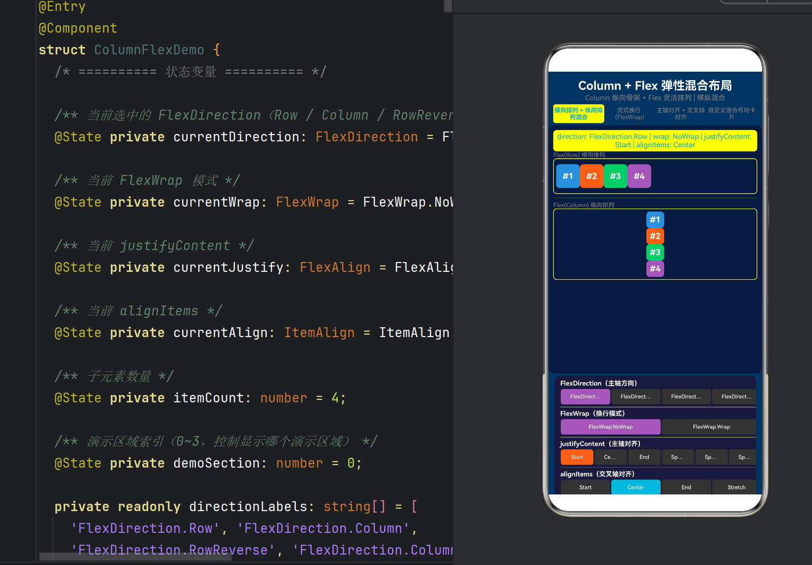
ColumnFlexDemo.ets 共 567 行,结构如下:
ColumnFlexDemo.ets (567行)
├── @Component ColumnFlexDemo
│ ├── @State 变量(6个) ← direction / wrap / justify / align / itemCount / section
│ ├── 常量数组(5组) ← directionLabels / wrapLabels / justifyLabels / alignLabels / colors
│ ├── build()
│ │ ├── 标题区
│ │ ├── 选项卡栏(4个tab) ← 切换演示区块
│ │ ├── 主演示区 (Column外骨架)
│ │ │ ├── 状态文字
│ │ │ ├── if(section 0) → sectionMixedLayout()
│ │ │ ├── if(section 1) → sectionWrapLayout()
│ │ │ ├── if(section 2) → sectionAlignmentLayout()
│ │ │ └── if(section 3) → sectionCustomCardLayout()
│ │ └── 控制面板 (Scroll+Column)
│ │ ├── FlexDirection 按钮组
│ │ ├── FlexWrap 按钮组
│ │ ├── justifyContent 按钮组(6个)
│ │ ├── alignItems 按钮组(4个)
│ │ └── 子元素数量 +/- 控制
│ ├── @Builder 方法(6个)
│ │ ├── sectionMixedLayout() ← 横纵混合
│ │ ├── sectionWrapLayout() ← 流式换行
│ │ ├── sectionAlignmentLayout() ← 对齐组合
│ │ ├── sectionCustomCardLayout() ← 真实场景
│ │ ├── flexItem / flexItemWithSize / tagItem / statItem
│ │ └── controlGroup()
│ └── 私有方法
│ ├── getItems() / getItemWidth() / getItemHeight()
│ ├── getStatusText()
│ └── isSelected()
3.2 六个 @State 变量的设计
@State private currentDirection: FlexDirection = FlexDirection.Row;
@State private currentWrap: FlexWrap = FlexWrap.NoWrap;
@State private currentJustify: FlexAlign = FlexAlign.Start;
@State private currentAlign: ItemAlign = ItemAlign.Center;
@State private itemCount: number = 4;
@State private demoSection: number = 0;
这六个变量分为两组:
分组 变量 控制对象
Flex 配置 direction, wrap, justify, align 传递给 FlexOptions 对象
UI 控制 itemCount, demoSection 子元素数量、演示区切换
每次用户点击控制面板中的按钮,对应的 @State 变量更新 → Flex 组件的 FlexOptions 变化 → 子元素重新排列。
3.3 选项卡式演示切换
Row() {
ForEach(this.sectionTitles, (title: string, idx: number) => {
Text(title)
.fontColor(this.demoSection === idx ? ‘#00B4D8’ : Color.Gray)
.backgroundColor(this.demoSection === idx ? ‘#ffffff15’ : ‘transparent’)
.gesture(TapGesture().onAction(() => {
this.demoSection = idx;
if (idx === 1) { this.currentWrap = FlexWrap.Wrap; this.itemCount = 8; }
else if (idx === 0) { this.currentDirection = FlexDirection.Row; this.currentWrap = FlexWrap.NoWrap; this.itemCount = 4; }
}))
})
}
四个选项卡分别对应:
索引 标题 焦点
0 横向排列 + 纵向排列混合 FlexDirection 切换
1 流式换行 (FlexWrap) FlexWrap.Wrap 效果
2 主轴对齐 + 交叉轴对齐 justifyContent + alignItems 组合
3 自定义混合布局卡片 真实 UI 场景
3.4 状态文字栏
Text(this.getStatusText())
.fontSize(12)
.fontColor(‘#00B4D8’)
实时显示四个 Flex 参数的当前值:
direction: FlexDirection.Row | wrap: NoWrap | justifyContent: Center | alignItems: Center
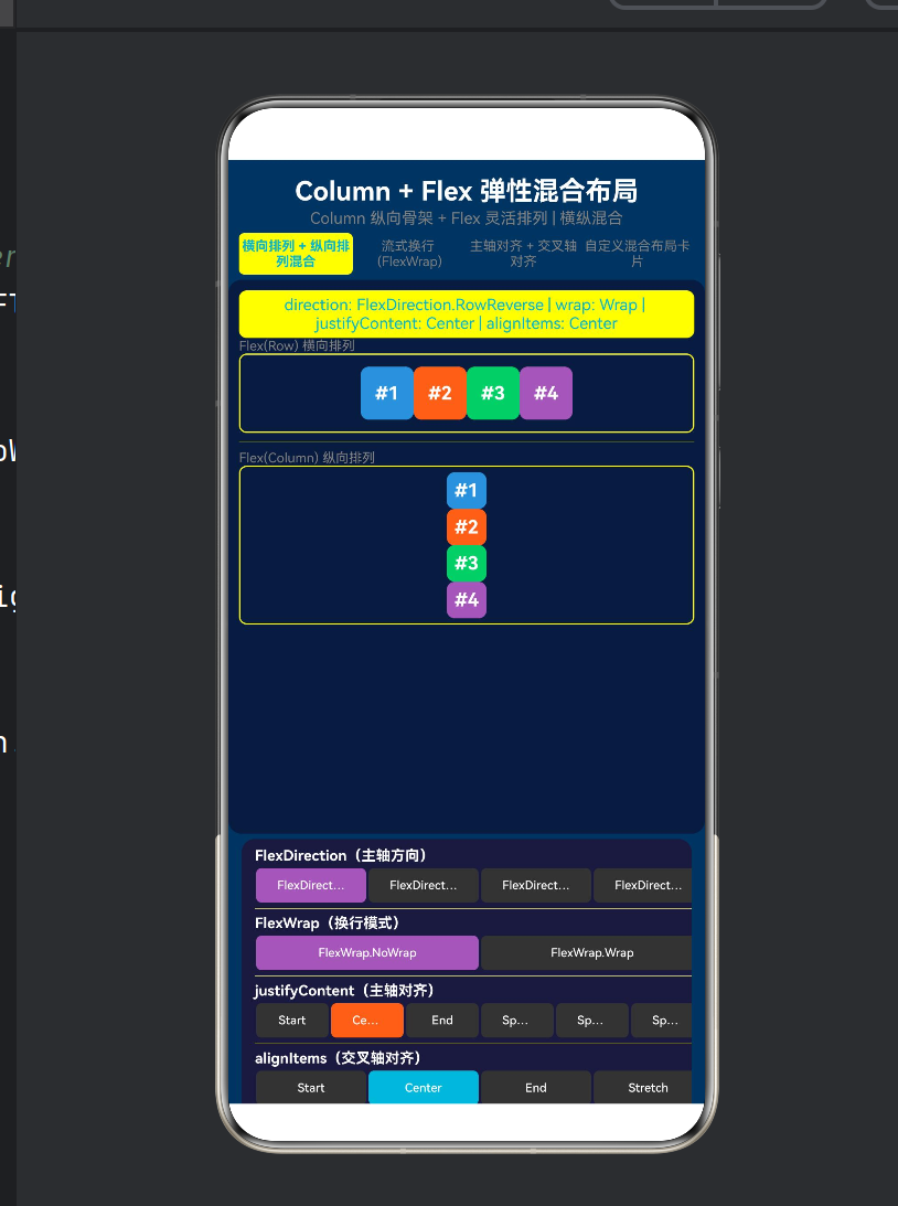
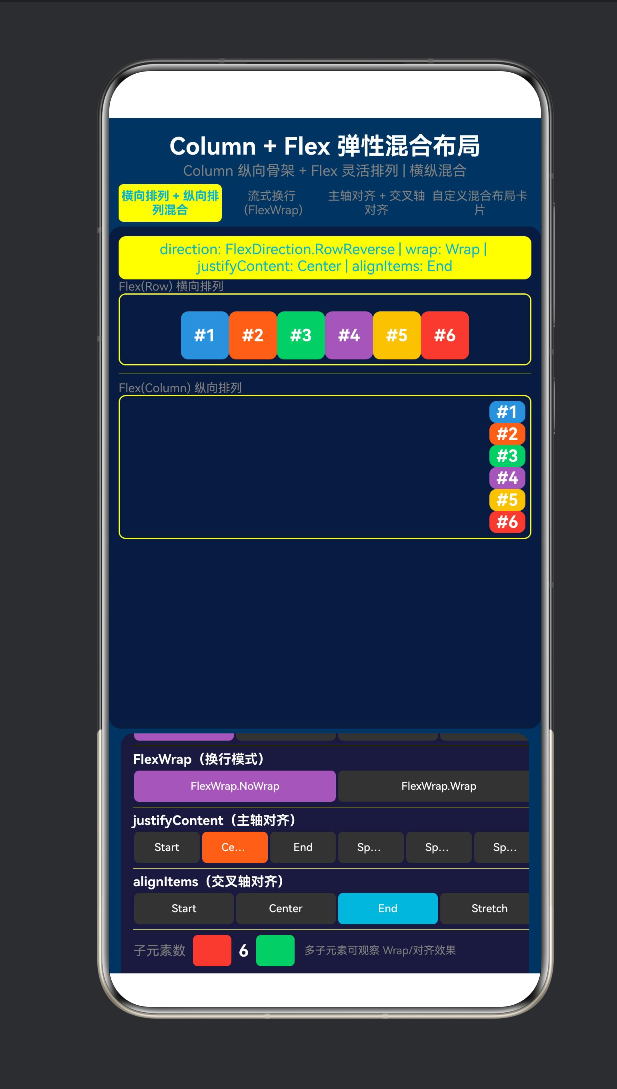
3.5 区块 1:横向 + 纵向混合排列
这是 Column + Flex 的核心演示——Column 做骨架,内部嵌套不同方向的 Flex:
// === Column 外骨架 ===
Column() {
// — 第 1 行:Flex(Row) 横向排列 —
Text(‘Flex(Row) 横向排列’)
Flex({ direction: FlexDirection.Row, /* … */ }) {
// 子元素横向排列(#1 #2 #3 #4)
ForEach(this.getItems(), (item) => this.flexItem(item, 40))
}
Divider() // 分割线
// — 第 2 行:Flex(Column) 纵向排列 —
Text(‘Flex(Column) 纵向排列’)
Flex({ direction: FlexDirection.Column, /* … */ }) {
// 子元素纵向排列(#1 #2 #3 #4 从上到下)
ForEach(this.getItems(), (item) => this.flexItem(item, 30))
}
}
关键洞察:Column 外骨架将页面从上到下划分为"横向区域→分割线→纵向区域"。而每个区域内部的 Flex 又可以独立设置 direction/justifyContent/alignItems。
控制面板中的参数变化会同时影响这两个 Flex 区域——因为它们共享同一个 currentJustify 和 currentAlign。
3.6 区块 2:流式换行 (FlexWrap)
Flex({
direction: FlexDirection.Row,
wrap: FlexWrap.Wrap, // ← 关键:开启换行
justifyContent: this.currentJustify,
alignItems: this.currentAlign
}) {
ForEach(this.getItems(), (item) => {
this.flexItemWithSize(item, this.getItemWidth(item), 28)
// 每个子元素宽度不同:[60, 80, 50, 70, 90, 55, 75, 65, 85, 50]
})
}
换行布局的视觉特点:
8 个子元素,宽度各不相同:
┌──────┬────────┬──────┬────────┐
│ #1 │ #2 │ #3 │ #4 │ ← 第一行
│ 60px │ 80px │ 50px │ 70px │
├──────┼────────┼──────┼────────┤
│ #5 │ #6 │ #7 │ #8 │ ← 自动换行到第二行
│ 90px │ 55px │ 75px │ 65px │
└──────┴────────┴──────┴────────┘
切换 justifyContent 时,每行内部的分布会变化:
Start → 左对齐
Center → 居中
SpaceBetween → 每行两端对齐
3.7 区块 3:主轴与交叉轴对齐组合
Flex({
direction: this.currentDirection, // 动态切换方向
wrap: this.currentWrap,
justifyContent: this.currentJustify, // 主轴对齐
alignItems: this.currentAlign // 交叉轴对齐(使用 ItemAlign)
}) {
ForEach(this.getItems(), (item) => {
this.flexItemWithSize(item, 50, this.getItemHeight(item))
// 高度各不相同:[30, 46, 22, 38, 50, 28, 42, 34, 44, 26]
})
}
为什么子元素要设置不同高度?——为了让 alignItems 的对齐效果可见。
direction: Row + 不同高度 → alignItems 控制垂直对齐
direction: Column + 不同宽度 → alignItems 控制水平对齐
四种 ItemAlign 的可视化效果(direction: Row 时):
ItemAlign.Start → ItemAlign.Center → ItemAlign.End →
┌──────────┐ ┌──────────┐ ┌──────────┐
│ ┌──┐ │ │ │ │ │
│ │#1│ │ │ ┌──┐ │ │ │
│ ├──┤ │ │ │#1│ │ │ ┌──┐ │
│ │#2│ │ │ ├──┤ │ │ │#1│ │
│ └──┘ │ │ │#2│ │ │ ├──┤ │
└──────────┘ │ └──┘ │ │ │#2│ │
└──────────┘ └──────────┘
3.8 区块 4:真实场景混合布局
这个区块模拟了一个典型的 App 个人资料页面:
┌────────────────────────┐
│ 👤 用户信息卡片 │
│ ┌──────── ──────────┐ │ ← Flex(Row)
│ │ 👨💻 张三 │ │ 头像 + 文字横向
│ │ 高级工程师 │ │
│ └──────── ──────────┘ │
├────────────────────────┤
│ 🏷️ 技能标签 │
│ [ArkTS] [HarmonyOS] │ │ ← Flex(Row, Wrap)
│ [ArkUI] [TypeScript] │ │ 标签流式换行
│ [DevEco] [OpenHarmony]│
├────────────────────────┤
│ 📊 统计数据 │
│ 12 256 1.2k Top│ │ ← Flex(Row, SpaceEvenly)
│ 项目 Star 贡献 排名│
└────────────────────────┘
三层混合布局的实现:
// 外骨架 Column
Column() {
// 第一层:Flex Row(头像 + 文字)
Flex({ direction: FlexDirection.Row, alignItems: ItemAlign.Center }) {
Text(‘👨💻’) // 头像
Column() { // 文字区域(内部又是 Column)
Text(‘张三’)
Text(‘高级工程师 · 鸿蒙团队’)
}
}
Divider()
// 第二层:Flex Row Wrap(标签流式)
Flex({ direction: FlexDirection.Row, wrap: FlexWrap.Wrap }) {
this.tagItem(‘ArkTS’, ‘#4A90D9’)
this.tagItem(‘HarmonyOS’, ‘#FF6B35’)
// …
}
// 第三层:Flex Row SpaceEvenly(统计数据)
Flex({ direction: FlexDirection.Row, justifyContent: FlexAlign.SpaceEvenly }) {
this.statItem(‘项目’, ‘12’)
this.statItem(‘Star’, ‘256’)
// …
}
}
这个区块展示了 flex 的五种不同用法:
层 Flex 配置 用途
用户信息 Row, Center 横向排列 + 垂直居中
文字区域 Column(内嵌) 纵向排列姓名和职位
技能标签 Row, Wrap, Center 流式换行
统计 Row, SpaceEvenly 水平等分
整体 Column(外骨架) 纵向分块
3.9 控制面板设计
控制面板位于屏幕下半部分,放在 Scroll 中(内容较多时可滚动查看):
┌─────────────────────────────────┐
│ FlexDirection(主轴方向) │
│ [Row] [Column] [RowRev] [ColRev] │
├─────────────────────────────────┤
│ FlexWrap(换行模式) │
│ [NoWrap] [Wrap] │
├─────────────────────────────────┤
│ justifyContent(主轴对齐) │
│ [Start] [Center] [End] [Btwn] …│
├─────────────────────────────────┤
│ alignItems(交叉轴对齐) │
│ [Start] [Center] [End] [Stretch]│
├─────────────────────────────────┤
│ 子元素数 [-] 4 [+] 多子元素观察…│
└─────────────────────────────────┘
所有的控制按钮都使用 @Builder 模式生成,减少重复代码:
@Builder
controlGroup(title: string, labels: string[], currentValue, onChange) {
Column() {
Text(title)
Row() {
ForEach(labels, (label, idx) => {
Button(label)
.backgroundColor(isSelected ? activeColor : ‘#333’)
.gesture(TapGesture().onAction(() => onChange(idx)))
})
}
}
}
四、FlexDirection 四种方向的可视化对比
4.1 Row(默认)
Flex({ direction: FlexDirection.Row })
主轴:→ 水平
┌──────────────────────────────┐
│ ┌──┐ ┌──┐ ┌──┐ ┌──┐ │
│ │#1│ │#2│ │#3│ │#4│ │
│ └──┘ └──┘ └──┘ └──┘ │
│ justifyContent → 水平分布 │
│ alignItems → 垂直对齐 │
└──────────────────────────────┘
相当于 Row()(Row 就是 Flex(Row) 的语法糖)。
4.2 Column
Flex({ direction: FlexDirection.Column })
主轴:↓ 垂直
┌──────────┐
│ ┌──┐ │
│ │#1│ │
│ ├──┤ │
│ │#2│ │
│ ├──┤ │
│ │#3│ │
│ ├──┤ │
│ │#4│ │
│ └──┘ │
└──────────┘
相当于 Column()。
4.3 RowReverse
Flex({ direction: FlexDirection.RowReverse })
主轴:← 水平反向
┌──────────────────────────────┐
│ ┌──┐ ┌──┐ ┌──┐ ┌──┐ │
│ │#4│ │#3│ │#2│ │#1│ │
│ └──┘ └──┘ └──┘ └──┘ │
└──────────────────────────────┘
4.4 ColumnReverse
Flex({ direction: FlexDirection.ColumnReverse })
主轴:↑ 垂直反向
┌──────────┐
│ ┌──┐ │
│ │#4│ │
│ ├──┤ │
│ │#3│ │
│ ├──┤ │
│ │#2│ │
│ ├──┤ │
│ │#1│ │
│ └──┘ │
└──────────┘
五、FlexWrap 的可视化对比
5.1 NoWrap(不换行)
Flex({ direction: Row, wrap: NoWrap, 8 items })
所有子元素挤在一行:
┌──────────────────────────────────────┐
│ #1 #2 #3 #4 #5 #6 #7 #8 │
│ ← 超出部分被截断或压缩 → │
└──────────────────────────────────────┘
5.2 Wrap(自动换行)
Flex({ direction: Row, wrap: Wrap, 8 items })
子元素自动换到下一行:
┌──────────────────────────────────┐
│ #1 #2 #3 #4 │ ← 第一行
├──────────────────────────────────┤
│ #5 #6 #7 #8 │ ← 自动换行到第二行
└──────────────────────────────────┘
Wrap + 不同宽度的效果更明显(每个标签长度不同,换行位置随机)。
六、常见问题与坑点
6.1 Flex 与 Column/Row 的选择
场景 推荐
只需要纵向排列 Column()(更简洁)
只需要横向排列 Row()(更简洁)
需要换行 Flex({ wrap: Wrap })
需要动态切换方向 Flex({ direction: … })
需要 Stretch 对齐 Flex({ alignItems: Stretch })
需要交叉轴对齐参数动态变化 Flex()
最佳实践:能用 Column/Row 的时候就用它们,需要额外功能时升级到 Flex。
6.2 Flex 的 alignItems 默认值是 Stretch
// ❌ 子元素没有设置高度 → 被拉伸填满
Flex({ direction: FlexDirection.Row }) {
Text(‘A’) // 如果没设高度,会被拉伸到 Flex 容器高度
}
// ↑ alignItems 默认 ItemAlign.Stretch
// ✅ 明确设置子元素高度
Flex({ direction: FlexDirection.Row, alignItems: ItemAlign.Center }) {
Text(‘A’).height(30)
}
经验:大多数时候你会希望设置 alignItems: ItemAlign.Center,让子元素在交叉轴居中对齐而不是被拉伸。
6.3 嵌套 Flex 时的 justifyContent 继承
// ❌ 外部 Flex 的 justifyContent 不影响内部的 Column
Flex({ direction: Row, justifyContent: Center }) {
Column() { // Column 有自己的排列规则
Text(‘A’)
Text(‘B’)
}
}
// SpaceBetween 会把 Column 推向两边,但 Column 内部的 A 和 B
// 仍然按 Column 的默认规则排列
// ✅ 各层各自控制
Flex({ direction: Row, justifyContent: SpaceBetween }) {
Column() { Text(‘A’); Text(‘B’) }
.alignItems(HorizontalAlign.Center) // Column 内部居中对齐
}
6.4 FlexWrap 不生效
// ❌ wrap 不生效:因为没有设置 Flex 容器宽度
Flex({ direction: Row, wrap: Wrap }) {
// 10 items
}
// Flex 默认宽度由内容撑满,不需要换行
// ✅ 设置宽度后,超出部分才会换行
Flex({ direction: Row, wrap: Wrap }) {
// 10 items
}
.width(‘100%’) // ← 关键:固定宽度
Wrap 生效条件:Flex 容器必须有明确的宽度(或父容器有限宽),子元素总宽度 > 容器宽度时才会换行。
6.5 Column 和 Flex(Column) 的 alignItems 类型不同
这是一个容易混淆的点:
容器 alignItems 类型 示例
Column() HorizontalAlign .alignItems(HorizontalAlign.Center)
Flex({ direction: Column }) ItemAlign { alignItems: ItemAlign.Center }
两种写法效果类似但类型不同,不能混用。
七、最佳实践清单
7.1 布局选择策略
UI 布局需求
├── 只有垂直排列 → Column
├── 只有水平排列 → Row
├── 需要换行 → Flex + Wrap
├── 需要动态切换方向 → Flex
├── 需要 Stretch → Flex + ItemAlign.Stretch
├── 需要混合方向 → Column + 内部 Flex(Row/Wrap)
└── 需要嵌套结构 → Column 外骨架 + Flex 内部排列
7.2 Column + Flex 的标准混合模板
Column() {
// 区块 1:横向排列
Flex({ direction: FlexDirection.Row, alignItems: ItemAlign.Center }) {
// 横向内容
}
.width(‘100%’)
// 区块 2:换行排列
Flex({ direction: FlexDirection.Row, wrap: FlexWrap.Wrap }) {
// 流式内容
}
.width(‘100%’)
// 区块 3:纵向排列
Flex({ direction: FlexDirection.Column }) {
// 纵向内容
}
}
.width(‘100%’)
.height(‘100%’)
7.3 参数常量化
// layoutConfig.ets
export const FLEX_ROW_CENTER = {
direction: FlexDirection.Row,
justifyContent: FlexAlign.Center,
alignItems: ItemAlign.Center
} as const;
export const FLEX_WRAP_TAGS = {
direction: FlexDirection.Row,
wrap: FlexWrap.Wrap,
alignItems: ItemAlign.Center
} as const;
export const FLEX_COLUMN = {
direction: FlexDirection.Column
} as const;
7.4 动态 FlexDirection 实现方向切换
@State private isHorizontal: boolean = true;
build() {
Flex({
direction: this.isHorizontal ? FlexDirection.Row : FlexDirection.Column,
alignItems: ItemAlign.Center
}) {
// 子元素可以横向也可以纵向
}
}
7.5 配合 layoutWeight 实现弹性比例
Flex({ direction: FlexDirection.Row }) {
Text(‘左’).layoutWeight(1)
Text(‘中’).layoutWeight(2) // 宽度是左侧的 2 倍
Text(‘右’).layoutWeight(1)
}
.width(‘100%’)
八、与其他框架的 Flex 对比
概念 ArkUI (Flex) CSS Flexbox SwiftUI (HStack/VStack)
弹性容器 Flex({}) display: flex HStack / VStack
主轴方向 direction: Row/Column flex-direction: row/column 容器自动决定
换行 wrap: Wrap/NoWrap flex-wrap: wrap LazyVGrid 实现
主轴对齐 justifyContent justify-content spacing 参数
交叉轴对齐 alignItems: ItemAlign align-items alignment 参数
Stretch ✅ ItemAlign.Stretch ✅ stretch ❌ 需 frame 配合
反向排列 ✅ RowReverse/ColumnReverse ✅ row-reverse/column-reverse ❌ 需自定义
核心差异:ArkUI 通过 FlexOptions 对象统一配置所有参数,CSS Flexbox 使用独立的属性声明,SwiftUI 使用不同的容器构造函数。
九、结语
9.1 核心回顾
Column 是骨架,Flex 是关节。
一个"横纵混合"的布局 = Column 外骨架 + 内部多个不同方向的 Flex
Column(纵向分块)
├── Flex(Row) ← 横向排列
├── Flex(Row, Wrap) ← 流式换行
└── Flex(Column) ← 纵向排列
9.2 从 Column 到 Flex 的认知升级
Column(固定垂直)→ Row(固定水平)
↓
Flex(可配置方向 + 可换行 + 可伸缩)
↓
FlexOptions(方向/换行/主轴对齐/交叉轴对齐 统一配置)
↓
Column + Flex 嵌套(混合方向布局)
9.3 下一步探索
Grid 网格布局:二维布局,适合相册/商品展示
RelativeContainer 相对布局:通过锚点定位子元素
Stack 层叠布局:层叠覆盖,适合悬浮元素
Flex 的 space 属性:FlexSpaceOptions 控制主轴/交叉轴的间距
自适应布局:结合 @State 和 FlexDirection 实现横竖屏自适应切换
附录 A:完整 Demo 代码
/*
- ColumnFlexDemo.ets —— Column + Flex 弹性布局:混合方向排列
- ===== 核心技术 =====
-
- Column() —— 外层垂直容器,整体页面骨架
-
- Flex() —— 弹性容器,支持 direction/wrap/justifyContent/alignItems
-
- FlexDirection —— 主轴方向(Row / Column / RowReverse / ColumnReverse)
- ===== 混合布局要点 =====
-
- Column 负责整体纵向布局(类似页面骨架)
-
- Flex 内部可以横向 (Row)、纵向 (Column)、换行 (Wrap)
-
- 通过 Column 嵌套不同方向的 Flex,实现"横+纵"混合排列
-
- 使用 FlexOptions 统一配置 direction/wrap/justifyContent/alignItems
-
- 相比 Row/Column 固定方向,Flex 可通过参数动态切换方向
*/
- 相比 Row/Column 固定方向,Flex 可通过参数动态切换方向
@Entry
@Component
struct ColumnFlexDemo {
@State private currentDirection: FlexDirection = FlexDirection.Row;
@State private currentWrap: FlexWrap = FlexWrap.NoWrap;
@State private currentJustify: FlexAlign = FlexAlign.Start;
@State private currentAlign: ItemAlign = ItemAlign.Center;
@State private itemCount: number = 4;
@State private demoSection: number = 0;
private readonly sectionTitles: string[] = [
‘横向+纵向混合’, ‘流式换行’, ‘对齐组合’, ‘真实卡片’
];
build() {
Column() {
Text(‘Column + Flex 弹性混合布局’).fontSize(20)
.fontWeight(FontWeight.Bold).fontColor(Color.White)
.textAlign(TextAlign.Center).width(‘100%’).padding({ top: 12, bottom: 2 })
Text(‘Column 纵向骨架 + Flex 灵活排列’).fontSize(12).fontColor(Color.Gray)
.textAlign(TextAlign.Center).width(‘100%’).padding({ bottom: 4 })
  // 选项卡
  Row() {
    ForEach(this.sectionTitles, (title, idx) => {
      Text(title).fontSize(10)
        .fontColor(this.demoSection === idx ? '#00B4D8' : Color.Gray)
        .fontWeight(this.demoSection === idx ? FontWeight.Bold : FontWeight.Normal)
        .layoutWeight(1).textAlign(TextAlign.Center)
        .padding({ top: 4, bottom: 4 })
        .backgroundColor(this.demoSection === idx ? '#ffffff15' : 'transparent')
        .borderRadius(4)
        .gesture(TapGesture().onAction(() => { this.demoSection = idx; }))
    })
  }.width('100%').padding({ left: 8, right: 8, bottom: 4 })

  // 主演示区
  Column() {
    Text(this.getStatusText()).fontSize(12).fontColor('#00B4D8')
      .width('100%').textAlign(TextAlign.Center)
      .padding({ top: 4, bottom: 4 }).backgroundColor('#ffffff08').borderRadius(6)
    // 四个演示区块
    if (this.demoSection === 0) {
      this.sectionMixedLayout()
    } else if (this.demoSection === 1) {
      this.sectionWrapLayout()
    } else if (this.demoSection === 2) {
      this.sectionAlignmentLayout()
    } else {
      this.sectionCustomCardLayout()
    }
  }.width('100%').layoutWeight(1).padding(8)
   .backgroundColor('#0d1b3e').borderRadius(10).margin({ left: 10, right: 10 })

  // 控制面板(可滚动)
  Scroll() {
    Column() {
      this.controlGroup('FlexDirection', ['Row','Column','RowRev','ColRev'],
        this.currentDirection, (idx) => { this.currentDirection = [Row,Column,RowReverse,ColumnReverse][idx]; })
      Divider().height(1).color('#ffffff11').margin({ top: 4, bottom: 4 })
      this.controlGroup('FlexWrap', ['NoWrap','Wrap'],
        this.currentWrap, (idx) => { this.currentWrap = [NoWrap,Wrap][idx]; })
      Divider().height(1).color('#ffffff11').margin({ top: 4, bottom: 4 })
      // justifyContent + alignItems 按钮组...
    }.width('100%').padding({ left: 10, right: 10, top: 6, bottom: 6 })
  }.height(180).width('100%').backgroundColor('#1a1a3e')
   .borderRadius({ topLeft: 10, topRight: 10 }).margin({ left: 10, right: 10, top: 4 })
}.width('100%').height('100%').backgroundColor('#0f3460')
}
// — 四个 @Builder 区块(详见附录完整源码)—
@Builder sectionMixedLayout() { /* Column + Flex(Row) + Flex(Column) / }
@Builder sectionWrapLayout() { / Flex(Row, Wrap) / }
@Builder sectionAlignmentLayout() { / justifyContent + alignItems 组合 / }
@Builder sectionCustomCardLayout() { / 用户信息 + 标签 + 统计 */ }
@Builder controlGroup(title, labels, currentValue, onChange) { /* 按钮组模板 / }
@Builder flexItem(index, size) { / 方形子元素 / }
@Builder flexItemWithSize(index, w, h) { / 可变尺寸子元素 / }
@Builder tagItem(label, color) { / 标签 / }
@Builder statItem(label, value) { / 统计数据项 */ }
private getItems(): number[] { /* 生成数组 / }
private getItemWidth(index): number { / 不同宽度 / }
private getItemHeight(index): number { / 不同高度 / }
private getStatusText(): string { / 状态文字 */ }
}
附录 B:参考资料
HarmonyOS NEXT 开发者文档 — Flex 容器
HarmonyOS NEXT 开发者文档 — FlexDirection
HarmonyOS NEXT 开发者文档 — ItemAlign
HarmonyOS NEXT 开发者文档 — FlexWrap
版权声明:本文为 HarmonyOS NEXT 技术分享系列的第六篇,遵循 CC BY-NC 4.0 协议。欢迎转载,但请注明出处。
系列文章:
第一篇:TapGesture 点击手势布局
第二篇:PanGesture 拖拽手势布局
第三篇:GestureGroup 组合手势布局
第四篇:Column 垂直排列入门
第五篇:Column + Scroll 可滚动列表
第六篇:Column + Flex 弹性混合布局(本文)

讨论HarmonyOS开发技术,专注于API与组件、DevEco Studio、测试、元服务和应用上架分发等。
更多推荐


 1
1 0
0- 0


 已为社区贡献33条内容

所有评论(0)