【共创季稿事节】鸿蒙原生 ArkTS 布局方式之 Column 与 Scroll 联动:可滚动的纵向列表
一、引言
1.1 为什么 Column 需要 Scroll?
在上一篇文章中,我们深入学习了 Column 的垂直排列布局。但 Column 有一个重要的限制:它本身不可滚动。
Column(无 Scroll)
┌──────────────┐
│ 第 1 项 │
│ 第 2 项 │
│ 第 3 项 │
│ … │
│ 第 30 项 │ ← 超出屏幕,看不到!
└──────────────┘
Scroll + Column
┌──────────────┐ ← 视口可见区域
│ 第 1 项 │
│ 第 2 项 │
│ 第 3 项 │
├──────────────┤ ← 手指向上滑动
│ 第 4 项 │
│ 第 5 项 │
│ … │
└──────────────┘
当列表数据超过屏幕高度时,没有 Scroll 包裹的 Column 会把超出的部分直接截断(或被父容器的 clip 属性裁切)。Scroll + Column 的组合正是为了解决这个问题——Column 负责"排列",Scroll 负责"滚动"。
1.2 本文核心内容
知识点 说明
Scroll 容器 可滚动容器的构造与配置
Scroller 控制器 编程式滚动(滚动到顶部/底部/指定位置)
scrollable 方向 设置滚动方向(垂直/水平/自由)
onScroll 监听 实时获取滚动偏移量
数据驱动列表 ForEach + Scroll 的动态列表渲染
编程式滚动 按钮控制 + 自动演示滚动
二、ArkUI 可滚动容器体系
2.1 四种可滚动容器
ArkUI 提供了多种可滚动容器,每种适用于不同的场景:
容器 特点 适用场景
Scroll 通用可滚动容器,内部可放任意布局(Column/Row/Flex) 自定义布局列表、表单
List 高性能列表,支持懒加载、复用、粘性标题 长列表、聊天记录、Feed 流
Grid 二维网格滚动 相册、商品展示
WaterFlow 瀑布流布局 图片墙、卡片流
其中 Scroll 是最灵活的基础容器——它不限制内部布局,可以包裹 Column、Row、Flex 甚至 Stack。
2.2 Scroll 的「三层结构」
Scroll (可滚动容器)
└── Column / Row (布局容器)
├── 子元素 1
├── 子元素 2
├── 子元素 3
└── …
第一层:Scroll — 提供滚动能力(手势识别、滚动条、边缘效果)
第二层:Column / Row — 提供排列规则(主轴方向、交叉轴对齐)
第三层:子元素 — 具体内容
这种"能力与布局分离"的设计,让开发者可以自由组合不同的布局和滚动方式:
Scroll 方向 内部布局 效果
ScrollDirection.Vertical Column 垂直滚动列表
ScrollDirection.Horizontal Row 水平滚动列表
ScrollDirection.Vertical Flex(wrap) 垂直滚动的流式布局
ScrollDirection.Free 自定义布局 双向滚动
三、Scroll 核心 API 详解
3.1 构造器
Scroll(scroller?: Scroller): ScrollAttribute
参数 类型 说明
scroller Scroller(可选) 控制器对象,用于编程式滚动
3.2 滚动方向控制
.scrollable(value: ScrollDirection): ScrollAttribute
ScrollDirection 枚举:
枚举值 含义
ScrollDirection.Vertical 仅垂直滚动(默认)
ScrollDirection.Horizontal 仅水平滚动
ScrollDirection.Free 垂直和水平双向滚动
ScrollDirection.None 禁止滚动
注意:ScrollDirection.None 不是禁用滚动容器,而是禁用滚动交互——内容仍然可能超出。
3.3 Scroller 控制器
Scroller 是一个独立的控制器类,用于编程式控制滚动位置:
declare class Scroller {
constructor();
// 滚动到指定位置
scrollTo(options: ScrollOptions): void;

// 滚动到边缘(顶部/底部/左/右)
scrollEdge(value: Edge, options?: ScrollEdgeOptions): void;

// 滚动到下一页
scrollPage(options: ScrollPageOptions): void;

// 滚动到指定索引(配合 List/Grid 使用)
scrollToIndex(index: number, options?: ScrollToIndexOptions): void;

// 获取当前滚动偏移
currentOffset(): OffsetResult;

// 判断是否在指定边缘
isAtEnd(): boolean;
isAtTop(): boolean;
}
ScrollOptions:
interface ScrollOptions {
xOffset: number | string; // 水平目标偏移
yOffset: number | string; // 垂直目标偏移
}
注意:scrollTo 默认是即时跳转(无动画)。要实现平滑滚动,需要结合 animateTo 或使用 scrollEdge 的重载版本。
3.4 滚动事件监听
.onScroll((xOffset: number, yOffset: number) => void): ScrollAttribute
.onWillScroll((xOffset: number, yOffset: number) => void): ScrollAttribute
.onDidScroll(callback): ScrollAttribute
.onScrollEnd(callback): ScrollAttribute
回调 触发时机 用途
onScroll 滚动中持续触发 更新 UI、懒加载判断
onWillScroll 滚动前预判 预加载数据、拦截滚动
onDidScroll 滚动结束后 统计上报、状态同步
onScrollEnd 滚动动画结束 惯性滚动结束后的处理
3.5 其他常用属性
// 滚动条状态
.scrollBar(BarState): ScrollAttribute
// BarState.On — 常显滚动条
// BarState.Off — 隐藏滚动条
// BarState.Auto — 自动显隐(默认)
// 边缘回弹效果
.edgeEffect(EdgeEffect): ScrollAttribute
// EdgeEffect.Spring — 弹性回弹(默认)
// EdgeEffect.None — 无回弹
// 嵌套滚动配置
.nestedScroll(NestedScrollOptions): ScrollAttribute
四、Demo 代码逐层剖析
4.1 项目结构与路由
{
“src”: [“pages/ScrollColumnDemo”]
}
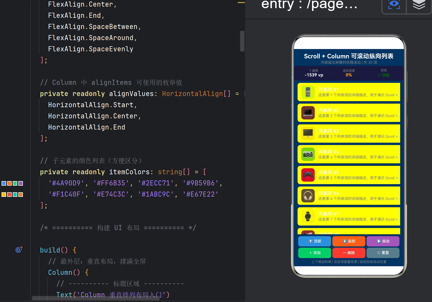
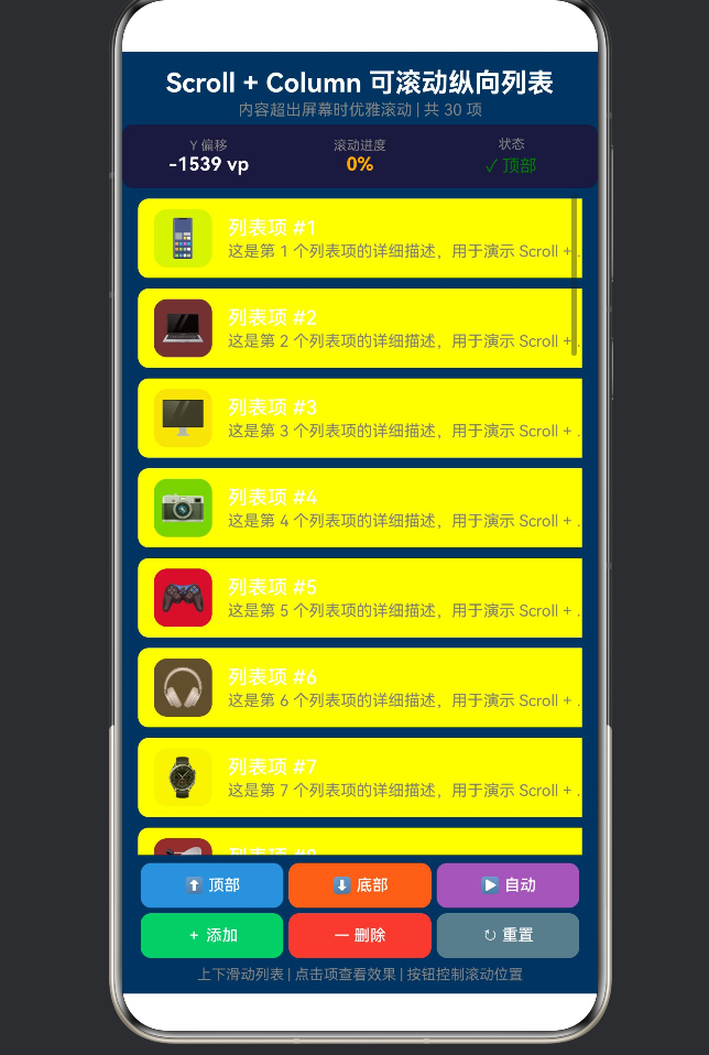
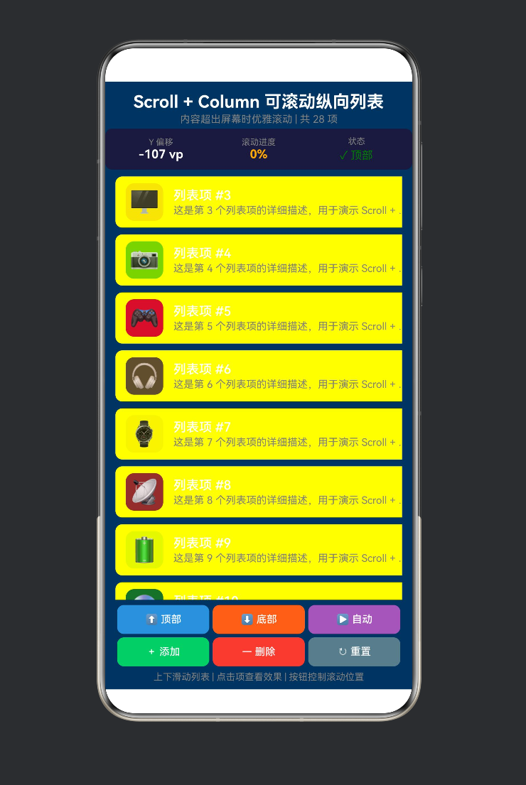
ScrollColumnDemo.ets 共 451 行,结构如下:
ScrollColumnDemo.ets (451行)
├── interface DataItem ← 列表数据类型
├── @Component ScrollColumnDemo
│ ├── @State 变量(6个) ← scrollY / isAtTop / isAtBottom / items / isAutoScrolling / scrollProgress
│ ├── 不可变数据 ← iconMap(30个Emoji) / colorMap(20色)
│ ├── Scroller 控制器 ← 编程滚动
│ ├── aboutToAppear() ← 初始化 30 条数据
│ ├── build()
│ │ ├── 标题 + 副标题
│ │ ├── 滚动信息面板 (Row×3) ← Y偏移 / 进度 / 状态
│ │ ├── Scroll + Column ← 核心布局
│ │ │ └── ForEach → 列表项卡片 (60vp高度)
│ │ ├── 底部控制栏 (2行×3按钮) ← 顶部/底部/自动 + 添加/删除/重置
│ │ └── 底部提示
│ └── 私有方法
│ ├── generateItems() ← 数据生成
│ ├── updateScrollProgress() ← 进度计算
│ ├── scrollToTop/Bottom() ← 编程滚动
│ ├── toggleAutoScroll() ← 自动演示
│ ├── addItem/removeItem/resetList ← 数据操作
│ └── showItemToast() ← 点击反馈
│ └── @Builder ctrlButton ← 按钮模板
4.2 六个 @State 变量的设计
@State private scrollY: number = 0; // 滚动偏移,驱动信息面板
@State private isAtTop: boolean = true; // 是否在顶部
@State private isAtBottom: boolean = false; // 是否在底部
@State private items: DataItem[] = []; // 列表数据源
@State private isAutoScrolling: boolean = false; // 自动滚动状态
@State private scrollProgress: number = 0; // 滚动进度 0~1
变量分组:
分组 变量 更新者
滚动状态 scrollY, isAtTop, isAtBottom, scrollProgress onScroll 回调
数据 items addItem / removeItem / generateItems
自动控制 isAutoScrolling toggleAutoScroll / startAutoScroll
4.3 列表项的数据结构
interface DataItem {
id: number; // 唯一标识(用作 ForEach 的 key)
title: string; // 标题
desc: string; // 描述
color: string; // 图标背景色
icon: string; // Emoji 图标
}
30 个列表项,每项用不同的 Emoji 和颜色区分:
📱 #1 | 💻 #2 | 🖥️ #3 | 📷 #4 | 🎮 #5
🎧 #6 | ⌚ #7 | 📡 #8 | 🔋 #9 | 💿 #10
…
4.4 核心布局:Scroll + Column
// ===== 核心一:Scroll(scroller) 构造可滚动容器 =====
Scroll(this.scroller) {
// ===== 核心二:Column 在内部提供垂直排列 =====
Column() {
ForEach(this.items, (item: DataItem) => {
// 每个列表项是一个 Row(横向布局)
Row() {
Text(item.icon) // Emoji 图标
.fontSize(28)
.backgroundColor(item.color + ‘33’) // 半透明底色
    Column() {       // 文字区域
      Text(item.title)
      Text(item.desc)
        .maxLines(1)
        .textOverflow({ overflow: TextOverflow.Ellipsis })
    }
  }
  .height(60)
  .gesture(TapGesture().onAction(() => {
    this.showItemToast(item);
  }))
}, (item: DataItem) => item.id.toString())
}
.width(‘100%’)
}
// ===== 核心三:设置滚动方向 =====
.scrollable(ScrollDirection.Vertical)
// ===== 核心四:监听滚动事件 =====
.onScroll((xOffset: number, yOffset: number) => {
this.scrollY = yOffset;
this.isAtTop = yOffset <= 0;
this.updateScrollProgress();
})
.layoutWeight(1)
关键设计细节:
内容宽度:Column 设置 .width(‘100%’) 撑满 Scroll 宽度
列表项高度:每项固定 60vp,30 项总计约 1800vp
文字溢出:maxLines(1) + textOverflow(Ellipsis) 确保单行截断
点击反馈:TapGesture 绑定,点击后更新该项的 desc 文字
4.5 滚动信息面板
信息面板位于列表上方,实时显示三个维度的数据:
┌─────────────────────────────────┐
│ Y 偏移 滚动进度 状态 │
│ 256 vp 42% ↕ 滚动中 │
└─────────────────────────────────┘
实现:三个 Column 在 Row 中均分权重
Row() {
Column() { Text(‘Y 偏移’); Text(${this.scrollY.toFixed(0)} vp) }.layoutWeight(1)
Column() { Text(‘滚动进度’); Text(${(scrollProgress*100).toFixed(0)}%) }.layoutWeight(1)
Column() { Text(‘状态’); Text(isAtTop ? ‘顶部’ : isAtBottom ? ‘底部’ : ‘滚动中’) }.layoutWeight(1)
}
.height(48)
状态颜色编码:
顶部 → Color.Green(绿色)
底部 → Color.Orange(橙色)
滚动中 → ‘#00B4D8’(青色)
4.6 进度计算
private updateScrollProgress(): void {
// 估算总内容高度:每项约 68vp(含 margin)
const estimatedTotalHeight: number = this.items.length * 68;
const viewportHeight: number = 600; // 估算视口高度
const maxScroll: number = Math.max(estimatedTotalHeight - viewportHeight, 1);
this.scrollProgress = Math.min(Math.max(this.scrollY / maxScroll, 0), 1);
// 底部判定(距离底部 5vp 以内)
this.isAtBottom = this.scrollY >= maxScroll - 5;
}
这是一个估算值,因为:
无法从 Scroller 直接获取内容总高度
每项的实际高度 = 60vp(卡片) + 4vp×2(margin) = 68vp
视口高度取近似值 600vp
4.7 编程式滚动控制
滚动到顶部:
private scrollToTop(): void {
this.scroller.scrollTo({ xOffset: 0, yOffset: 0 });
}
滚动到底部:
private scrollToBottom(): void {
this.scroller.scrollTo({ xOffset: 0, yOffset: 99999 });
// 传入很大的 yOffset,Scroller 会自动限制在最大位置
}
自动滚动演示:
private startAutoScroll(): void {
this.scroller.scrollTo({ xOffset: 0, yOffset: 99999 }); // 先到底部
setTimeout(() => {
this.scroller.scrollTo({ xOffset: 0, yOffset: 0 }); // 2秒后回顶部
}, 2000);
}
注意:scrollTo 是即时跳转(无动画),因为 ScrollOptions 接口只有 xOffset 和 yOffset,不包含 duration 参数。如果需要动画滚动,可以使用 animateTo 结合 Scroller 控制器,或使用支持动画的 scrollEdge。
4.8 动态数据操作
添加一项(在第 3 项之后插入):
private addItem(): void {
const newItem: DataItem = { id: newId, title: ✨ 新列表项 #${newId}, … };
// ArkTS 不允许数组 spread 运算符,使用 slice + concat
const before: DataItem[] = this.items.slice(0, 3);
const after: DataItem[] = this.items.slice(3);
this.items = before.concat([newItem], after);
}
删除第一项:
private removeItem(): void {
if (this.items.length <= 3) return; // 保留至少 3 项
this.items = this.items.slice(1);
}
重置为 30 项:
private resetList(): void {
this.items = this.generateItems(30);
setTimeout(() => { this.scrollToTop(); }, 50); // 延迟确保数据已更新
}
4.9 列表项点击反馈
private showItemToast(item: DataItem): void {
const updatedItems: DataItem[] = this.items.map((it: DataItem) => {
if (it.id === item.id) {
// ArkTS 不允许对象 spread 运算符,使用完整对象字面量
return {
id: it.id,
title: it.title,
desc: ✓ 已选中 #${item.id} (${new Date().getSeconds()}s),
color: it.color,
icon: it.icon
};
}
return it;
});
this.items = updatedItems;
}
当用户点击某一列表项时,该项的描述文字会更新为"已选中"和当前秒数。这是通过修改 @State items 数组中的对应项来实现的——ArkUI 的响应式系统会自动检测到数组变化,只重新渲染被点击的那一项。
五、Scroll + Column 与 List 的选择
在实际开发中,很多人会问:什么时候用 Scroll+Column,什么时候用 List?
对比维度 Scroll + Column List
渲染策略 全部渲染(无论是否可见) 只渲染可见项 + 回收离屏项
适用数据量 几 ~ 几十项 几十 ~ 数万项
布局灵活性 极高(任意嵌套布局) 较高(ListItem 内可自定义)
粘性标题 ❌ 需手动实现 ✅ 原生支持
滑动删除 ❌ 需手势组合 ✅ 原生支持
拖拽排序 ❌ 需手势组合 ✅ 原生支持
懒加载 ❌ 需手动实现 ✅ LazyForEach
性能消耗 低(少量数据) 低(大量数据通过复用)
选择建议:
数据量 < 30 项 且 布局复杂 → Scroll + Column
数据量 > 100 项 → List + LazyForEach
需要粘性标题/滑动删除 → List
布局极其灵活(各卡片高度差异大)→ Scroll + Column
六、常见问题与坑点
6.1 Scroll 不生效(Column 不滚动)
// ❌ 正确写法
Scroll() {
Column() {
// 子元素
}
}
// ❌ 错误写法:Column 不在 Scroll 内部
Column() {
Scroll() {
// 子元素
}
}
// Scroll 必须在外层,Column 在内部
根本原因:Scroll 需要直接容纳可滚动内容。如果 Column 在外层撑满,Scroll 夹在中间,内容可能不会正确滚动。
6.2 Scroll 高度未限定
// ❌ Scroll 高度不明确,可能撑满全部内容,没有"溢出"就不会滚动
Column() {
Scroll() {
Column() { /* 30 items */ }
}
// 没有限定高度
}
// ✅ Scroll 高度 = 父容器剩余高度
Column() {
Text(‘标题’)
Scroll() {
Column() { /* 30 items */ }
}
.layoutWeight(1) // ← 撑满剩余空间
}
Scroll 必须有明确的视口高度,内容超出这个高度才会触发滚动。
6.3 onScroll 参数的含义
.onScroll((xOffset: number, yOffset: number) => {
// xOffset: 水平方向已滚动的距离(单位 vp)
// yOffset: 垂直方向已滚动的距离(单位 vp)
// 注意:这些是"已滚动距离",不是"当前可见区域的位置"
})
对于垂直滚动的 Scroll,yOffset 从 0(顶部)开始,手指上滑后逐渐增大。
6.4 scrollTo 为什么没有动画
Scroller.scrollTo() 接受的是 ScrollOptions,该接口只有 xOffset 和 yOffset,不包含动画参数。
需要平滑滚动时,有以下方案:
方案一:结合 animateTo
// 用 animateTo 包裹状态更新实现过渡动画
this.getUIContext()?.animateTo({ duration: 300 }, () => {
this.scroller.scrollTo({ xOffset: 0, yOffset: 500 });
});
方案二:使用 scrollEdge(有动画重载)
this.scroller.scrollEdge(Edge.Top, { velocity: 800 });
6.5 数据变化后滚动位置重置
当 @State items 数组变化时,Scroll 的滚动位置可能会重置到顶部。这是因为 ArkUI 的 diff 算法在对比新旧 UI 树时,可能认为需要重新挂载 Scroll 组件。
解决方案:在数据变化后主动恢复滚动位置:
private resetList(): void {
this.items = this.generateItems(30);
setTimeout(() => { this.scrollToTop(); }, 50);
}
6.6 ForEach 的 key 必须唯一
// ✅ 正确:使用唯一 id 作为 key
ForEach(this.items, (item) => { /* … */ },
(item: DataItem) => item.id.toString())
// ❌ 错误:使用索引作为 key(插入删除后索引变化)
ForEach(this.items, (item) => { /* … */ },
(item: DataItem, index: number) => index.toString())
不唯一的 key 会导致列表项动画异常、状态丢失。
七、最佳实践清单
7.1 Scroll + Column 的标准模板
build() {
Column() {
// 顶部固定区域
HeaderView()
// 可滚动内容区
Scroll() {
  Column() {
    ForEach(this.items, (item) => {
      ListItemView({ item: item })
    }, (item) => item.id.toString())
  }
  .width('100%')
}
.scrollable(ScrollDirection.Vertical)
.scrollBar(BarState.Auto)
.edgeEffect(EdgeEffect.Spring)
.layoutWeight(1)          // ← 关键:撑满剩余高度

// 底部固定区域
FooterView()
}
.height(‘100%’)
}
7.2 列表项组件的提取
// 将列表项提取为独立组件
@Component
struct ListItemView {
@Prop item: DataItem; // @Prop 接收父组件数据
build() {
Row() {
Text(item.icon)
Column() {
Text(item.title).fontSize(15).fontColor(Color.White)
Text(item.desc).fontSize(12).fontColor(Color.Gray)
}
}
.height(60).padding({ left: 12, right: 12 })
}
}
使用 @Prop 或 @ObjectLink 传递数据,避免整个列表重新渲染。
7.3 滚动到某个特定条目
// 根据 item.id 计算目标偏移量
private scrollToItem(targetId: number): void {
const index = this.items.findIndex(item => item.id === targetId);
if (index >= 0) {
const targetY = index * 68; // 每项高度 68vp
this.scroller.scrollTo({ xOffset: 0, yOffset: targetY });
}
}
7.4 下拉刷新 + 上拉加载
Scroll() {
Column() { /* 列表内容 */ }
}
.onWillScroll((xOffset, yOffset) => {
if (yOffset <= -50) {
// 下拉超过 50vp → 触发刷新
this.onRefresh();
}
if (this.isNearBottom(yOffset)) {
// 接近底部 → 触发加载更多
this.onLoadMore();
}
})
7.5 性能优化
列表项使用固定高度(方便 Scroller 计算滚动范围)
图片使用懒加载(Image().objectFit(ImageFit.Cover))
避免在 onScroll 中做耗时计算
使用 @ObjectLink 替代 @Prop 传递复杂对象
八、常见应用场景
8.1 聊天消息列表
Scroll(this.scroller) {
Column() {
ForEach(this.messages, (msg) => {
MessageBubble({ message: msg, isSelf: msg.sender === ‘me’ })
})
}
}
// 新消息时自动滚动到底部
.onDidScroll(() => {
if (this.shouldAutoScroll) {
this.scroller.scrollTo({ xOffset: 0, yOffset: 99999 });
}
})
8.2 表单页面
Scroll() {
Column() {
Text(‘个人信息’).fontSize(18)
TextInput({ placeholder: ‘姓名’ })
TextInput({ placeholder: ‘手机号’ })
DatePicker({ start: new Date(1900, 1, 1), end: new Date() })
Text(‘地址信息’).fontSize(18)
TextInput({ placeholder: ‘省份’ })
TextInput({ placeholder: ‘城市’ })
TextInput({ placeholder: ‘详细地址’ })
Button(‘提交’).width(‘100%’).margin({ top: 20 })
}
.padding(16)
}
.width(‘100%’)
8.3 文章详情页
Scroll() {
Column() {
Text(‘文章标题’).fontSize(24).fontWeight(FontWeight.Bold)
Text(‘作者 | 2025-07-01’).fontSize(12).fontColor(Color.Gray)
Image($r(‘app.media.cover’)).width(‘100%’).height(200)
Text(‘正文内容…’).fontSize(16).lineHeight(28)
// 更多段落…
Text(‘—— 全文完 ——’).fontSize(14).fontColor(Color.Gray)
}
.padding(16)
}
.width(‘100%’)
九、结语
9.1 核心回顾
Column + Scroll = 排列 + 滚动 = 可滚动的列表
这两者的组合是 ArkUI 中最常用的布局模式之一:
┌────────────────┐
│ Column │ ← 没有 Scroll → 内容被截断
│ (30 items) │
└────────────────┘
┌────────────────┐
│ Scroll │ ← 提供滚动能力
│ ┌──────────┐ │
│ │ Column │ │ ← 提供排列规则
│ │ (30项) │ │
│ │ … │ │
│ └──────────┘ │
└────────────────┘
9.2 本文的技术栈全景
Scroll + Column Demo
├── 布局层面
│ ├── Scroll 容器配置(方向、滚动条、边缘效果)
│ ├── Column 垂直排列
│ ├── Row 列表项(图标+文字)
│ └── layoutWeight 比例分配
├── 交互层面
│ ├── 手指滑动(Scroll 原生手势)
│ ├── 列表项点击(TapGesture)
│ └── 按钮控制(TapGesture)
├── 控制层面
│ ├── Scroller 控制器
│ └── onScroll 事件监听
└── 数据层面
├── @State 响应式数据
├── ForEach 列表渲染
└── slice/concat 数组操作
9.3 下一步探索
List 组件:高性能虚拟列表,适合超大数量列表
LazyForEach:懒加载数据源,按需渲染
Refresh 组件:下拉刷新容器
Grid 布局:网格滚动布局
WaterFlow:瀑布流布局
附录 A:完整 Demo 代码
/*
- ScrollColumnDemo.ets —— 鸿蒙原生 ArkTS 布局方式之 Column 与 Scroll 联动
- ===== 核心技术 =====
-
- Scroll + Column —— 当内容超出屏幕时,用 Scroll 包裹 Column 实现滚动
-
- .scrollable() —— 设置滚动方向(Vertical / Horizontal / Free / None)
-
- Scroller —— 编程式滚动控制器(滚动到指定位置)
- ===== 布局要点 =====
-
- Column 内部子元素总高度 > Scroll 容器高度 → 触发滚动
-
- Scroller 提供 scrollTo / scrollEdge / scrollPage 等编程控制
-
- onScroll 回调实时报告滚动偏移量
-
- 配合 edgeEffect 实现边缘回弹效果
-
- 默认纵向滚动,可通过 .scrollable() 修改方向
*/
- 默认纵向滚动,可通过 .scrollable() 修改方向
interface DataItem {
id: number;
title: string;
desc: string;
color: string;
icon: string;
}
@Entry
@Component
struct ScrollColumnDemo {
@State private scrollY: number = 0;
@State private isAtTop: boolean = true;
@State private isAtBottom: boolean = false;
@State private items: DataItem[] = [];
@State private isAutoScrolling: boolean = false;
@State private scrollProgress: number = 0;
private scroller: Scroller = new Scroller();
private readonly iconMap: string[] = [
‘📱’, ‘💻’, ‘🖥️’, ‘📷’, ‘🎮’, ‘🎧’, ‘⌚’, ‘📡’,
‘🔋’, ‘💿’, ‘🖨️’, ‘📠’, ‘📺’, ‘📻’, ‘🎙️’, ‘🔦’,
‘💡’, ‘🔑’, ‘🛠️’, ‘⚙️’, ‘🧰’, ‘📦’, ‘🎁’, ‘🏆’,
‘🌟’, ‘🔥’, ‘💎’, ‘🚀’, ‘🌈’, ‘🎯’
];
private readonly colorMap: string[] = [
‘#4A90D9’, ‘#FF6B35’, ‘#2ECC71’, ‘#9B59B6’,
‘#F1C40F’, ‘#E74C3C’, ‘#1ABC9C’, ‘#E67E22’,
‘#3498DB’, ‘#E91E63’, ‘#00BCD4’, ‘#8BC34A’,
‘#FF5722’, ‘#607D8B’, ‘#795548’, ‘#9C27B0’,
‘#3F51B5’, ‘#009688’, ‘#FF9800’, ‘#CDDC39’
];
aboutToAppear(): void { this.generateItems(30); }
build() {
Column() {
// 标题
Text(‘Scroll + Column 可滚动纵向列表’).fontSize(20)
.fontWeight(FontWeight.Bold).fontColor(Color.White)
.textAlign(TextAlign.Center).width(‘100%’).padding({ top: 12, bottom: 2 })
Text(‘内容超出屏幕时优雅滚动 | 共 ’ + this.items.length + ’ 项’)
.fontSize(12).fontColor(Color.Gray).textAlign(TextAlign.Center)
.width(‘100%’).padding({ bottom: 4 })
  // 信息面板
  Row() {
    Column() { Text('Y 偏移').fontSize(10).fontColor(Color.Gray)
      Text(`${this.scrollY.toFixed(0)} vp`).fontSize(14).fontColor(Color.White)
        .fontWeight(FontWeight.Bold)
    }.layoutWeight(1).alignItems(HorizontalAlign.Center)
    Column() { Text('滚动进度').fontSize(10).fontColor(Color.Gray)
      Text(`${(this.scrollProgress * 100).toFixed(0)}%`).fontSize(14)
        .fontColor(Color.Orange).fontWeight(FontWeight.Bold)
    }.layoutWeight(1).alignItems(HorizontalAlign.Center)
    Column() { Text('状态').fontSize(10).fontColor(Color.Gray)
      Text(this.isAtTop ? '✓ 顶部' : this.isAtBottom ? '✓ 底部' : '↕ 滚动中')
        .fontSize(13).fontColor(this.isAtTop ? Color.Green :
           this.isAtBottom ? Color.Orange : '#00B4D8')
    }.layoutWeight(1).alignItems(HorizontalAlign.Center)
  }.width('100%').height(48).backgroundColor('#1a1a3e')
   .padding({ left: 8, right: 8 }).margin({ left: 12, right: 12, bottom: 4 })
   .borderRadius(8)

  // ===== 核心:Scroll + Column =====
  Scroll(this.scroller) {
    Column() {
      ForEach(this.items, (item: DataItem) => {
        Row() {
          Text(item.icon).fontSize(28).width(44).height(44)
            .textAlign(TextAlign.Center)
            .backgroundColor(item.color + '33').borderRadius(10)
            .margin({ right: 12 })
          Column() {
            Text(item.title).fontSize(15).fontColor(Color.White)
              .fontWeight(FontWeight.Medium).width('100%')
            Text(item.desc).fontSize(12).fontColor(Color.Gray)
              .width('100%').margin({ top: 2 }).maxLines(1)
              .textOverflow({ overflow: TextOverflow.Ellipsis })
          }.layoutWeight(1).alignItems(HorizontalAlign.Start)
           .height(44).justifyContent(FlexAlign.Center)
        }
        .width('100%').height(60).padding({ left: 12, right: 12 })
        .backgroundColor('#ffffff08').borderRadius(8)
        .margin({ top: 4, bottom: 4 })
        .gesture(TapGesture().onAction(() => this.showItemToast(item)))
      }, (item: DataItem) => item.id.toString())
    }.width('100%')
  }
  .scrollable(ScrollDirection.Vertical)
  .onScroll((xOffset: number, yOffset: number) => {
    this.scrollY = yOffset;
    this.isAtTop = yOffset <= 0;
    this.updateScrollProgress();
  })
  .layoutWeight(1).width('100%').margin({ left: 12, right: 12 })

  // 控制栏
  Column() {
    Row() {
      this.ctrlButton('⬆ 顶部', '#4A90D9', () => this.scrollToTop())
      this.ctrlButton('⬇ 底部', '#FF6B35', () => this.scrollToBottom())
      this.ctrlButton(this.isAutoScrolling ? '⏹ 停止' : '▶ 自动', '#9B59B6',
        () => this.toggleAutoScroll())
    }.width('100%')
    Row() {
      this.ctrlButton('+ 添加', '#2ECC71', () => this.addItem())
      this.ctrlButton('- 删除', '#E74C3C', () => this.removeItem())
      this.ctrlButton('↻ 重置', '#607D8B', () => this.resetList())
    }.width('100%').margin({ top: 4 })
  }.width('100%').padding({ left: 12, right: 12, top: 6, bottom: 6 })

  Text('上下滑动列表 | 点击项查看效果 | 按钮控制滚动位置')
    .fontSize(11).fontColor(Color.Gray).textAlign(TextAlign.Center)
    .width('100%').padding({ bottom: 8 })
}
.width('100%').height('100%').backgroundColor('#0f3460')
}
// — 私有方法 —
private generateItems(count: number, startId: number = 1): DataItem[] {
const result: DataItem[] = [];
for (let i = 0; i < count; i++) {
const id = startId + i;
result.push({
id, title: 列表项 #${id},
desc: 这是第 ${id} 个列表项的详细描述。,
color: this.colorMap[i % this.colorMap.length],
icon: this.iconMap[i % this.iconMap.length]
});
}
return result;
}
private updateScrollProgress(): void {
const totalH = this.items.length * 68;
const maxScroll = Math.max(totalH - 600, 1);
this.scrollProgress = Math.min(Math.max(this.scrollY / maxScroll, 0), 1);
this.isAtBottom = this.scrollY >= maxScroll - 5;
}
private scrollToTop(): void {
this.isAutoScrolling = false;
this.scroller.scrollTo({ xOffset: 0, yOffset: 0 });
}
private scrollToBottom(): void {
this.isAutoScrolling = false;
this.scroller.scrollTo({ xOffset: 0, yOffset: 99999 });
}
private toggleAutoScroll(): void {
this.isAutoScrolling = !this.isAutoScrolling;
if (this.isAutoScrolling) {
this.scroller.scrollTo({ xOffset: 0, yOffset: 99999 });
setTimeout(() => {
if (!this.isAutoScrolling) return;
this.scroller.scrollTo({ xOffset: 0, yOffset: 0 });
}, 2000);
}
}
private addItem(): void {
const newId = this.items.length + 1;
const newItem: DataItem = {
id: newId, title: ✨ 新列表项 #${newId},
desc: 这是动态添加的第 ${newId} 项。,
color: ‘#FFD700’, icon: ‘✨’
};
const before = this.items.slice(0, 3);
const after = this.items.slice(3);
this.items = before.concat([newItem], after);
}
private removeItem(): void {
if (this.items.length <= 3) return;
this.items = this.items.slice(1);
}
private resetList(): void {
this.isAutoScrolling = false;
this.items = this.generateItems(30);
setTimeout(() => this.scrollToTop(), 50);
}
private showItemToast(item: DataItem): void {
this.items = this.items.map((it: DataItem) => {
if (it.id !== item.id) return it;
return {
id: it.id, title: it.title,
desc: ✓ 已选中 #${item.id} (${new Date().getSeconds()}s),
color: it.color, icon: it.icon
};
});
}
@Builder
ctrlButton(label: string, color: string, action: () => void) {
Button(label).height(34).fontSize(12).backgroundColor(color)
.fontColor(Color.White).borderRadius(8).layoutWeight(1)
.margin({ left: 2, right: 2 })
.gesture(TapGesture().onAction(() => action()))
}
}
附录 B:参考资料
HarmonyOS NEXT 开发者文档 — Scroll 容器
HarmonyOS NEXT 开发者文档 — Scroller 控制器
HarmonyOS NEXT 开发者文档 — ScrollDirection
HarmonyOS NEXT 开发者文档 — ForEach 使用说明
版权声明:本文为 HarmonyOS NEXT 技术分享系列的第五篇,遵循 CC BY-NC 4.0 协议。欢迎转载,但请注明出处。
系列文章:
第一篇:TapGesture 点击手势布局
第二篇:PanGesture 拖拽手势布局
第三篇:GestureGroup 组合手势布局
第四篇:Column 垂直排列入门
第五篇:Column + Scroll 可滚动列表(本文)

讨论HarmonyOS开发技术,专注于API与组件、DevEco Studio、测试、元服务和应用上架分发等。
更多推荐


 2
2 0
0- 0


 已为社区贡献33条内容

所有评论(0)