鸿蒙原生 ArkTS 布局深度解析:TabBar 底部导航栏的多种样式控制与实战
鸿蒙原生 ArkTS 布局深度解析:TabBar 底部导航栏的多种样式控制与实战
一、引言
底部导航栏是移动应用核心的导航模式,超过 70% 的应用采用此方案。其价值在于将功能入口放在拇指最容易触及的区域。
在鸿蒙生态中,Tabs + TabContent 是构建底部导航栏的标准方案,但选中态与未选中态的差异化样式控制常是初学者的第一道门槛。本文从实战出发,拆解其实现原理与 API 24 严格模式下的编译注意事项。
二、ArkTS 布局概览
2.1 声明式 UI 三要素
ArkTS 采用声明式 UI 范式,与 SwiftUI、Jetpack Compose 一致:
- @State:标记响应式状态,值变化时关联 UI 自动刷新
- @Builder:将方法标记为 UI 构建器,封装可复用的组件片段
- 链式调用:每个组件通过链式方法配置属性
2.2 Tabs 组件体系
Tabs 是 ArkUI 中实现页签导航的核心容器组件:
| 组件 | 角色 |
|---|---|
Tabs |
容器,管理页签切换逻辑和动画 |
TabContent |
子项,每个对应一个独立页面 |
每个 TabContent 的 .tabBar() 方法定义底部导航项样式。这种内容与标签分离的设计提高了组件复用性。
barPosition 决定标签栏位置。移动端常用 BarPosition.End(底部),此外还有 Start(顶部)、Left/Right(侧边)。注意:它控制整条标签栏的方位,而非标签对齐方式。
三、项目架构与技术选型
3.1 环境配置
- 操作系统:HarmonyOS NEXT 5.0
- SDK 版本:6.1.0 (API 24)
- 开发框架:ArkTS + ArkUI,Stage 模型
- 编译模式:严格模式(strictMode)
Tabs {无括号语法、箭头函数作为 CustomBuilder 等在 API 24 中会被拒绝。本文代码已通过严格模式编译验证。
3.2 应用场景
示例应用包含 4 个底部导航项:首页、分类、发现、我的。核心需求如下:
- 每个导航项包含图标和文字
- 选中态显示品牌橙色(#FF7A1E),未选中态显示灰色(#999999)
- 选中态使用彩色图标,未选中态使用灰色图标
- 点击切换时页面内容同步变化
- 适配全面屏底部安全区
3.3 技术路线
需求分析
  └→ 组件选型:Tabs + TabContent + @Builder
       └→ 状态设计:@State currentIndex
            └→ Builder 设计:每个 Tab 独立 @Builder
                 └→ 样式绑定:三元表达式判断选中态
                      └→ 安全区适配:expandSafeArea
四、核心代码拆解
4.1 状态管理
@State currentIndex: number = 0;
@State 是响应式 UI 的起点。用户点击 Tab 时 .onChange() 更新 currentIndex,框架执行脏检查,仅重新渲染变化部分。无需手动操作 DOM,框架自动完成最小粒度 UI 更新。
4.2 @Builder:自定义 TabBar
每个 Tab 需要独立的 @Builder,因为图标和文字不同且选中态与各自索引绑定。以「首页」为例:
@Builder
TabItemHome() {
  Column() {
    Text(this.currentIndex === 0 ? '🏠' : '🏡').fontSize(22)
      .fontColor(this.currentIndex === 0 ? '#FF7A1E' : '#999999')
    Text('首页').fontSize(11)
      .fontColor(this.currentIndex === 0 ? '#FF7A1E' : '#999999')
      .margin({ top: 4 })
  }
  .width('100%').height(50)
  .justifyContent(FlexAlign.Center).alignItems(HorizontalAlign.Center)
  .padding({ bottom: 4 })
}
为什么用三元表达式? @Builder 方法体直接生成 UI 节点,三元表达式在此处最高效:一行完成条件判断与值选择。
为什么每个 Tab 独立 Builder? API 24 严格模式下,参数化 Builder(@Builder TabBuilder(index, isActive))无法通过 tabBar(this.TabBuilder(...)) 调用,编译器要求 tabBar() 参数必须是 Builder 引用。
4.3 Tabs 属性配置
Tabs() { /* TabContent 节点 */ }
.barHeight(70).barMode(BarMode.Fixed)
.barPosition(BarPosition.End)
.vertical(false).scrollable(false)
.width('100%').height('100%')
.backgroundColor('#F8F8F8')
barHeight(70):70vp 是经过验证的舒适高度。过小则拥挤,过大挤占内容区。
barMode(BarMode.Fixed):3~5 个 Tab 时 Fixed 最优。多于 5 个改用 Scrollable。
scrollable(false):禁止手势滑动,用户必须点击切换。
expandSafeArea:适配全面屏底部安全区。
4.4 TabContent 页面内容
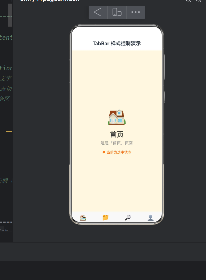
TabContent() {
  Column() {
    Text('🏠').fontSize(64).margin({ bottom: 16 })
    Text('首页').fontSize(28).fontWeight(FontWeight.Medium)
    Text('这是「首页」页面').fontSize(16).fontColor('#999999')
    if (this.currentIndex === 0) {
      Text('● 当前为选中状态').fontSize(14).fontColor('#FF7A1E')
    }
  }
  .backgroundColor('#FFF8E1')
}
这里体现了条件渲染的标准模式。ArkTS 编译器将 if 编译为条件渲染节点——条件不满足时 UI 节点不创建。在低频切换场景下,条件 if 优于 visibility: hidden。
五、API 24 严格模式深度适配
在迁移到 API 24 的过程中,我遇到 6 类编译错误,每类对应严格模式一项规则。
5.1 Tabs 无括号语法
Error: Object literal must correspond to some explicitly declared class or interface
(arkts-no-untyped-obj-literals)
Tabs { 中的 { 与对象字面量 { 在词法上难以区分。必须使用 Tabs():
// ❌ Tabs { ... }  → 被解析为对象字面量
// ✅ Tabs() { ... }
5.2 箭头函数不作为 CustomBuilder
Error: ';' expected | Declaration or statement expected
() => { Column() { ... } } 的 { 被解析为对象字面量。改用 Builder 引用:
// ❌ .tabBar(() => { Column() { ... } })
// ✅ .tabBar(this.MyBuilder)
5.3 @Builder 不间接构建 Tabs 子元素
Error: Property 'barHeight' does not exist on type 'ColumnAttribute'
Builder 返回构建指令而非组件实例。所有 TabContent 必须直接写在 Tabs() 内:
// ❌ Tabs() { this.buildTab(0) }
// ✅ Tabs() { TabContent() { ... }.tabBar(...) }
5.4 嵌套深度导致括号匹配失败
Error: Function implementation is missing
嵌套超 5 层且含多个闭包时,编译器可能误匹配括号。应保持紧凑调用或用 Builder 抽离。
5.5 对象字面量缺显式类型
Error: Use explicit types instead of "any", "unknown" (arkts-no-any-unknown)
// ❌ private titles = ['首页']
// ✅ private titles: string[] = ['首页']
5.6 expandSafeArea 调用位置
必须在 Tabs 属性链末尾正确闭合:尺寸属性 → 事件 → 安全区。
六、设计决策与最佳实践
6.1 Emoji 图标 vs 图片资源
Emoji:零资源依赖,适合原型快速验证。局限是不同设备渲染可能有差异,且不支持多色渐变。
图片资源:使用 $r('app.media.xxx') 引用 SVG/PNG,适合生产环境。代码上 Text 替换为 Image:
Image(this.currentIndex === 0 ?
  $r('app.media.icon_home_selected') :
  $r('app.media.icon_home_normal'))
  .width(22).height(22)
6.2 品牌色管理
建议在 color.json 中定义品牌色,通过 $r('app.color.xxx') 引用。品牌色迭代时仅需修改一个文件。
6.3 Tab 数量建议
BarMode.Fixed 适合 3~5 个 Tab。多于 5 个改用 Scrollable 或折叠到「更多」中。
6.4 条件渲染的高效使用
ArkTS 对条件 if 做了特殊优化:条件为 false 时 UI 节点不创建、不占用内存;切换时动态创建/销毁。在底部导航这种低频切换场景下,条件 if 是绝对更优的选择。
七、完整可运行代码
以下代码已通过 API 24 严格模式编译验证,可直接放入 entry/src/main/ets/pages/Index.ets 运行。
@Entry
@Component
struct Index {
@State currentIndex: number = 0;
@Builder
TabItemHome() {
Column() {
Text(this.currentIndex === 0 ? '🏠' : '🏡')
.fontSize(22)
.fontColor(this.currentIndex === 0 ? '#FF7A1E' : '#999999')
Text('首页')
.fontSize(11)
.fontColor(this.currentIndex === 0 ? '#FF7A1E' : '#999999')
.margin({ top: 4 })
}
.width('100%').height(50)
.justifyContent(FlexAlign.Center)
.alignItems(HorizontalAlign.Center)
.padding({ bottom: 4 })
}
@Builder
TabItemCategory() {
Column() {
Text(this.currentIndex === 1 ? '📂' : '📁')
.fontSize(22)
.fontColor(this.currentIndex === 1 ? '#FF7A1E' : '#999999')
Text('分类')
.fontSize(11)
.fontColor(this.currentIndex === 1 ? '#FF7A1E' : '#999999')
.margin({ top: 4 })
}
.width('100%').height(50)
.justifyContent(FlexAlign.Center)
.alignItems(HorizontalAlign.Center)
.padding({ bottom: 4 })
}
@Builder
TabItemDiscover() {
Column() {
Text(this.currentIndex === 2 ? '🔍' : '🔎')
.fontSize(22)
.fontColor(this.currentIndex === 2 ? '#FF7A1E' : '#999999')
Text('发现')
.fontSize(11)
.fontColor(this.currentIndex === 2 ? '#FF7A1E' : '#999999')
.margin({ top: 4 })
}
.width('100%').height(50)
.justifyContent(FlexAlign.Center)
.alignItems(HorizontalAlign.Center)
.padding({ bottom: 4 })
}
@Builder
TabItemMine() {
Column() {
Text('👤')
.fontSize(22)
.fontColor(this.currentIndex === 3 ? '#FF7A1E' : '#999999')
Text('我的')
.fontSize(11)
.fontColor(this.currentIndex === 3 ? '#FF7A1E' : '#999999')
.margin({ top: 4 })
}
.width('100%').height(50)
.justifyContent(FlexAlign.Center)
.alignItems(HorizontalAlign.Center)
.padding({ bottom: 4 })
}
build() {
Column() {
Text('TabBar 样式控制演示')
.fontSize(20).fontWeight(FontWeight.Bold)
.width('100%').height(56)
.backgroundColor('#FFFFFF')
.textAlign(TextAlign.Center).align(Alignment.Center)
Tabs() {
TabContent() {
Column() {
Text('🏠').fontSize(64).margin({ bottom: 16 })
Text('首页').fontSize(28)
.fontWeight(FontWeight.Medium).fontColor('#333333')
Text('这是「首页」页面').fontSize(16)
.fontColor('#999999').margin({ top: 8 })
if (this.currentIndex === 0) {
Text('● 当前为选中状态').fontSize(14)
.fontColor('#FF7A1E').margin({ top: 20 })
}
}
.width('100%').height('100%')
.justifyContent(FlexAlign.Center)
.alignItems(HorizontalAlign.Center)
.backgroundColor('#FFF8E1')
}
.tabBar(this.TabItemHome)
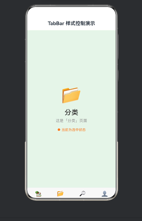
TabContent() {
Column() {
Text('📂').fontSize(64).margin({ bottom: 16 })
Text('分类').fontSize(28)
.fontWeight(FontWeight.Medium).fontColor('#333333')
Text('这是「分类」页面').fontSize(16)
.fontColor('#999999').margin({ top: 8 })
if (this.currentIndex === 1) {
Text('● 当前为选中状态').fontSize(14)
.fontColor('#FF7A1E').margin({ top: 20 })
}
}
.width('100%').height('100%')
.justifyContent(FlexAlign.Center)
.alignItems(HorizontalAlign.Center)
.backgroundColor('#E8F5E9')
}
.tabBar(this.TabItemCategory)
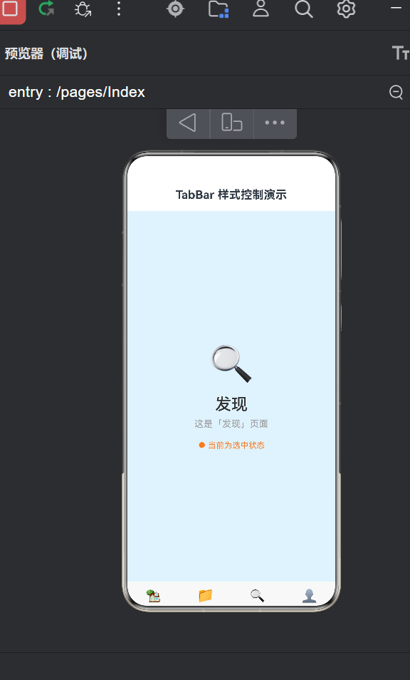
TabContent() {
Column() {
Text('🔍').fontSize(64).margin({ bottom: 16 })
Text('发现').fontSize(28)
.fontWeight(FontWeight.Medium).fontColor('#333333')
Text('这是「发现」页面').fontSize(16)
.fontColor('#999999').margin({ top: 8 })
if (this.currentIndex === 2) {
Text('● 当前为选中状态').fontSize(14)
.fontColor('#FF7A1E').margin({ top: 20 })
}
}
.width('100%').height('100%')
.justifyContent(FlexAlign.Center)
.alignItems(HorizontalAlign.Center)
.backgroundColor('#E3F2FD')
}
.tabBar(this.TabItemDiscover)
TabContent() {
Column() {
Text('👤').fontSize(64).margin({ bottom: 16 })
Text('我的').fontSize(28)
.fontWeight(FontWeight.Medium).fontColor('#333333')
Text('这是「我的」页面').fontSize(16)
.fontColor('#999999').margin({ top: 8 })
if (this.currentIndex === 3) {
Text('● 当前为选中状态').fontSize(14)
.fontColor('#FF7A1E').margin({ top: 20 })
}
}
.width('100%').height('100%')
.justifyContent(FlexAlign.Center)
.alignItems(HorizontalAlign.Center)
.backgroundColor('#FBE9E7')
}
.tabBar(this.TabItemMine)
}
.barHeight(70)
.barMode(BarMode.Fixed)
.barPosition(BarPosition.End)
.vertical(false).scrollable(false)
.width('100%').height('100%')
.backgroundColor('#F8F8F8')
.onChange((index: number): void => {
this.currentIndex = index
})
.expandSafeArea([SafeAreaType.SYSTEM], [SafeAreaEdge.BOTTOM])
}
.width('100%').height('100%')
.backgroundColor('#F0F0F0')
}
}
八、进阶延伸
8.1 角标(Badge)
使用 Badge 组件显示未读数:
Badge({ value: '99+', position: BadgePosition.RightTop,
  style: { fontSize: 10, badgeColor: '#FF3B30' } }) {
  Text('🏠').fontSize(22)
}
8.2 中间大按钮
用自定义 Row 布局替代 Tabs,中间放置突出按钮:
Row() {
  this.NavItem('首页', 0)
  this.NavItem('分类', 1)
  Button('发布').width(48).height(48)
    .backgroundColor('#FF7A1E').clip(new Circle())
  this.NavItem('发现', 2)
  this.NavItem('我的', 3)
}
8.3 动画定制
Tabs() { ... }
.animationDuration(300)
.animationCurve(Curve.EaseInOut)
九、总结
回顾核心要点:
- 架构:
Tabs管理切换,TabContent承载内容,.tabBar()定义样式 - 状态驱动:
@State currentIndex驱动 UI 自动刷新 - 样式封装:
@Builder方法引用实现灵活配置 - 严格模式:API 24 禁止无括号语法、箭头函数 CustomBuilder、Builder 间接构建
- 安全区:
.expandSafeArea()是全面屏必备
建议搭建项目架构之初就将严格模式规则纳入考虑,而非编译失败时逐一修复。
十、参考资源

讨论HarmonyOS开发技术,专注于API与组件、DevEco Studio、测试、元服务和应用上架分发等。
更多推荐


 5
5 0
0- 0


 已为社区贡献58条内容

所有评论(0)