职业技能学习平台 HarmonyOS ArkTS 应用开发实战
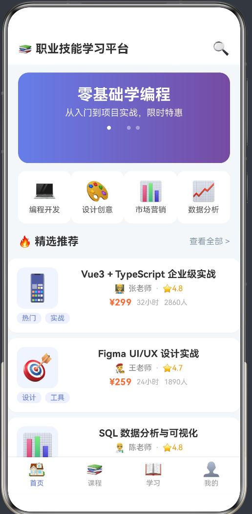

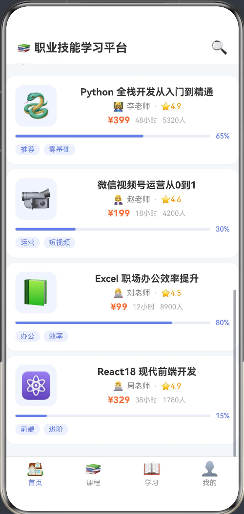
职业技能学习平台 HarmonyOS ArkTS 应用开发实战
项目代号: api24
技术栈: HarmonyOS Next + ArkTS + ArkUI
SDK版本: HarmonyOS SDK 6.1.0 (API 23)
开发工具: DevEco Studio
运行环境: HarmonyOS Phone
一、引言
1.1 项目背景
在数字化转型浪潮下,职业技能学习已成为职场人士持续提升竞争力的核心途径。为了打造一款跨平台、高性能、用户体验优秀的移动学习应用,我们选择了 HarmonyOS Next 作为开发平台,利用其原生 ArkTS 语言和 ArkUI 声明式框架,构建了"职业技能学习平台"。
该应用涵盖完整的在线学习场景:课程浏览、分类筛选、课程报名、视频学习、进度追踪、个人中心等功能模块,是一个典型的"内容+服务"型应用。
1.2 为什么选择 HarmonyOS ArkTS
| 维度 | 优势分析 |
|---|---|
| 开发效率 | ArkTS 基于 TypeScript 语法,前端开发者零成本上手,静态类型检查减少运行时错误 |
| UI性能 | ArkUI 声明式框架采用 C++ 引擎渲染,对比 Web 方案提升 30%~60% 的列表流畅度 |
| 多设备适配 | 一套代码可适配手机、平板、折叠屏等多种设备形态 |
| 生态支持 | HarmonyOS Next 提供完整的 Kit 能力,如媒体播放、网络请求、本地存储等 |
| 包体积 | 纯原生方案,APK/IPA 无需打包 WebView 运行时,包体积减少 50%+ |
1.3 应用功能全景图
职业技能学习平台
├── 首页(首页/课程/学习/我的)
│   ├── Banner 轮播推荐
│   ├── 分类快速入口(6大类别)
│   ├── 精选推荐课程列表
│   └── 继续学习(进度追踪)
├── 课程分类(全部课程浏览)
│   ├── 分类网格导航
│   └── 全部课程列表
├── 学习中心
│   ├── 学习统计(在学/已完成/未开始)
│   ├── 空状态引导
│   └── 课程进度分组展示
├── 个人中心
│   ├── 用户信息展示
│   ├── 学习数据统计
│   └── 功能菜单入口
├── 课程详情
│   ├── 课程信息头部
│   ├── 课程简介
│   ├── 章节/课时目录
│   └── 报名/开始学习按钮
└── 课程播放
    ├── 视频播放器模拟
    ├── 课时内容讲解
    ├── 课程目录面板
    └── 上下节导航
二、项目架构设计
2.1 整体架构层次
应用采用经典的单 Ability + 多 Page 架构模式,遵循 HarmonyOS Stage 模型规范:
┌──────────────────────────────────────────────────┐
│                  EntryAbility                     │
│         (UIAbility 生命周期管理)                  │
├──────────────────────────────────────────────────┤
│               WindowStage                         │
│         (loadContent → pages/Index)               │
├──────────────────────────────────────────────────┤
│   ┌──────────┐  ┌──────────┐  ┌──────────────┐   │
│   │ Index.ets │→│CourseDet│→│CoursePlayer   │   │
│   │ (4 Tabs)  │  │ail.ets  │  │.ets           │   │
│   └──────────┘  └──────────┘  └──────────────┘   │
│        │               │              │           │
│        │     router.pushUrl(params)   │           │
│        └───────────────┴──────────────┘           │
├──────────────────────────────────────────────────┤
│              数据层 (Data Layer)                   │
│   ┌──────────────────────────────────────────┐    │
│   │  模拟数据 (Mock Data / 后续替换为 API)     │    │
│   │  Interface 类型定义 (CourseItem/Lesson)   │    │
│   └──────────────────────────────────────────┘    │
└──────────────────────────────────────────────────┘
2.2 Stage 模型要点
HarmonyOS Stage 模型是应用开发的推荐模型,其核心特点:
// EntryAbility.ets - 应用入口
export default class EntryAbility extends UIAbility {
  onCreate(want: Want, launchParam: AbilityConstant.LaunchParam): void {
    // 设置颜色模式
    this.context.getApplicationContext()
      .setColorMode(ConfigurationConstant.ColorMode.COLOR_MODE_NOT_SET);
  }

  onWindowStageCreate(windowStage: window.WindowStage): void {
    // 加载首页
    windowStage.loadContent('pages/Index', (err) => {
      if (err.code) {
        hilog.error(DOMAIN, 'testTag', 'Failed to load content: %{public}s', JSON.stringify(err));
        return;
      }
    });
  }
}
关键设计决策:
- 使用单
UIAbility而非多 Ability,减少进程开销 loadContent()指定首页 Page,后续页面通过routerAPI 栈式导航hilog替代console.log,提供分级日志能力
2.3 路由与页面栈管理
页面间导航使用 @kit.ArkUI 提供的 router 模块:
import { router } from '@kit.ArkUI';

// 首页 → 课程详情:携带 courseId 参数
goToDetail(course: CourseItem): void {
  router.pushUrl({
    url: 'pages/CourseDetail',
    params: { courseId: course.id }
  });
}

// 课程详情 → 课程播放:携带 courseId + lessonId
goPlay(lessonId: number): void {
  router.pushUrl({
    url: 'pages/CoursePlayer',
    params: { courseId: this.course.id, lessonId }
  });
}
目标页面通过 router.getParams() 接收参数:
aboutToAppear(): void {
  const params = router.getParams() as Record<string, Object>;
  const courseId = params['courseId'] as number;
  // 根据 courseId 加载课程数据
}
路由配置在 resources/base/profile/main_pages.json 中声明:
{
  "src": [
    "pages/Index",
    "pages/CourseDetail",
    "pages/CoursePlayer"
  ]
}
三、数据模型与类型系统
3.1 强类型定义
ArkTS 作为 TypeScript 的超集,全面支持静态类型检查。我们为应用定义了清晰的数据模型:
// 首页用到的课程摘要类型
interface CourseItem {
  id: number;
  title: string;
  category: string;
  cover: string;
  instructor: string;
  avatar: string;
  price: string;
  progress: number;         // 学习进度 0-100
  totalLessons: number;
  learnedLessons: number;
  duration: string;
  students: number;
  rating: number;
  tags: string[];
  description: string;
}

// 分类类型
interface CategoryItem {
  id: number;
  name: string;
  icon: string;
  color: string;
}

// Banner 轮播类型
interface BannerItem {
  title: string;
  subtitle: string;
  color: string;
}

// 详情页章节/课时类型
interface Chapter {
  id: number;
  title: string;
  lessons: Lesson[];
}

interface Lesson {
  id: number;
  title: string;
  duration: string;
  isFree: boolean;
  isCompleted: boolean;
}

// 课程完整信息类型
interface CourseFull {
  id: number;
  title: string;
  cover: string;
  instructor: string;
  avatar: string;
  price: string;
  progress: number;
  totalLessons: number;
  learnedLessons: number;
  duration: string;
  students: number;
  rating: number;
  tags: string[];
  description: string;
  chapters: Chapter[];
}
3.2 接口设计的考量
为什么将 CourseItem 和 CourseFull 分开?
首页的课程列表仅需摘要信息(不需要章节详情),而详情页需要完整的章节树结构。将两者分离可以:
- 减少数据传输:列表场景不加载冗余的章节数据
- 类型安全:各自场景使用精确的类型定义
- 可扩展性:后续接入真实 API 时,列表接口和详情接口可以独立优化
3.3 模拟数据层
在 MVP 阶段,我们使用内置的模拟数据驱动开发。数据存储在模块级别的常量中:
const ALL_COURSES: CourseItem[] = [
  {
    id: 1, title: 'Vue3 + TypeScript 企业级实战',
    category: '编程开发',
    // ... 其他字段
  },
  // 共 8 门课程,覆盖 6 个分类
];

const COURSE_DETAILS: Record<number, CourseFull> = {
  1: { /* ... */ },
  2: { /* ... */ },
  // key 为 courseId,O(1) 查询
};
使用 Record<number, CourseFull> 字典结构存储详情数据,相比数组查找,时间复杂度从 O(n) 降为 O(1)。
四、首页多Tab架构深度解析
4.1 页面结构
首页 Index.ets 是应用最复杂的页面,采用 底部 Tab 导航 + 内容区切换 的经典布局:
┌─────────────────────────┐
│     顶部标题栏 (Header)  │
├─────────────────────────┤
│                         │
│   内容区 (Stack 切换)    │
│  ┌───┐ ┌───┐ ┌──┐ ┌─┐ │
│  │首 │ │课 │ │学│ │我│ │
│  │页 │ │程 │ │习│ │的│ │
│  └───┘ └───┘ └──┘ └─┘ │
│                         │
├─────────────────────────┤
│   底部 Tab 栏 (Footer)   │
│  🏠  📚  📖  👤        │
└─────────────────────────┘
核心状态变量:
@State currentTab: number = 0       // 当前选中的 Tab 索引
@State bannerIndex: number = 0      // 当前 Banner 索引
@State enrolledCourses: number[] = [2, 4, 6, 8]  // 已报名课程 ID 列表
4.2 @State 装饰器与响应式编程
ArkUI 的 @State 装饰器是声明式 UI 的核心机制。当 @State 修饰的变量发生变化时,框架自动重新渲染依赖该变量的 UI 组件:
@Component
struct Index {
  @State currentTab: number = 0

  build() {
    Column() {
      // 当 currentTab 变化时,这里自动重新求值
      if (this.currentTab === 0) {
        this.HomePage()
      } else if (this.currentTab === 1) {
        this.CategoriesPage()
      }
      // ...
    }
  }
}
与传统命令式框架的对比:
| 模式 | 写法 | 优点 | 缺点 |
|---|---|---|---|
| 命令式(Java XML) | findViewById → setText → setVisibility | 直观控制每个节点 | 代码冗长,状态难管理 |
| 声明式(ArkTS) | @State + if/else | 关注"是什么"而非"怎么做" | 重新渲染范围需注意 |
| 声明式(Flutter) | setState + build | 统一的重建机制 | 细粒度控制需额外优化 |
4.3 @Builder 装饰器与组件复用
@Builder 是 ArkUI 提供的自定义构建函数,用于封装可复用的 UI 片段:
@Builder
CourseCard(course: CourseItem) {
  Column() {
    Row() {
      Text(course.cover).fontSize(40).width(64).height(64)
      // ... 更多 UI
    }
    // 进度条
    if (course.progress > 0) {
      Progress({ value: course.progress, total: 100 })
    }
    // 标签
    if (course.tags.length > 0) {
      Row({ space: 6 }) {
        ForEach(course.tags, (tag: string) => {
          Text(tag).backgroundColor('#EEF0FF').borderRadius(8)
        })
      }
    }
  }
  .onClick(() => { this.goToDetail(course) })
}
@Builder 的设计优势:
- 避免了重复的 UI 代码
- 可接受参数,灵活适配不同数据
- 支持条件渲染(如进度条、标签)
- 代码可读性高,逻辑内聚
4.4 Banner 轮播实现
Banner 使用 setInterval 实现自动轮播,通过 @State bannerIndex 驱动 UI 更新:
startBannerLoop(): void {
  this.bannerTimer = setInterval(() => {
    this.bannerIndex = (this.bannerIndex + 1) % BANNERS.length;
  }, 3500);  // 3.5 秒切换一次
}

aboutToDisappear(): void {
  if (this.bannerTimer >= 0) {
    clearInterval(this.bannerTimer);  // 页面销毁时清除定时器
  }
}
生命周期管理要点:
aboutToAppear启动轮播aboutToDisappear清理定时器,防止内存泄漏
Banner 指示器使用动态宽度的胶囊形圆点,高亮当前索引:
ForEach(BANNERS, (_: BannerItem, i: number) => {
  Circle()
    .width(this.bannerIndex === i ? 24 : 8)  // 当前页更宽
    .height(6)
    .fill(this.bannerIndex === i ? '#FFFFFF' : '#66FFFFFF')
    .borderRadius(3)
})
这种"流动指示器"的交互反馈比固定圆点更生动,用户能直观感知当前轮播位置。
4.5 分类网格
首页展示前 4 个分类入口,点击可切换到课程 Tab:
Row() {
  ForEach(CATEGORIES.slice(0, 4), (cat: CategoryItem) => {
    Column() {
      Text(cat.icon).fontSize(30)
      Text(cat.name).fontSize(12).fontColor('#555')
    }
    .layoutWeight(1)
    .backgroundColor('#FFFFFF')
    .borderRadius(12)
    .onClick(() => { this.currentTab = 1 })  // 切换到课程 Tab
  })
}
layoutWeight(1) 实现等分布局,适配不同屏幕宽度。
五、课程详情页实现
5.1 页面架构
CourseDetail.ets 的结构分为三个区域:
┌─────────────────────────┐
│  ← 返回       课程详情  分享 │  ← 顶部导航栏
├─────────────────────────┤
│  课程头部 (封面/讲师/评分) │
│  课程标签                  │
│  学习进度 (如已报名)       │
├─────────────────────────┤
│  课程简介                  │
├─────────────────────────┤
│  📋 课程目录               │
│  📂 第一章  ▾  4节        │
│    ✅ 1-1 课程介绍  免费   │
│    ▶️ 1-2 环境搭建  15:30  │
│  📂 第二章  ▾  3节        │
├─────────────────────────┤
│  ¥299      📚 立即报名     │  ← 底部操作栏
└─────────────────────────┘
5.2 动态章节展开/折叠
章节列表使用 showAllChapters 状态数组控制每个章节的展开状态:
@State showAllChapters: boolean[] = []

aboutToAppear(): void {
  // 初始化全部展开
  this.showAllChapters = found.chapters.map(() => true)
}

toggleChapter(idx: number): void {
  const arr = [...this.showAllChapters]  // 创建新数组触发响应式更新
  arr[idx] = !arr[idx]
  this.showAllChapters = arr
}
关键细节:showAllChapters 必须通过创建新数组来赋值,而不是直接修改原数组。这是因为 ArkTS 的响应式跟踪依赖于引用变化。直接修改 arr[idx] 不会触发 UI 更新。
5.3 课程报名与开始学习
底部操作按钮的交互逻辑:
Button(this.isEnrolled ? '📖 开始学习' : '📚 立即报名')
  .backgroundColor(this.isEnrolled ? '#4CAF50' : '#FF6B35')
  .onClick(() => {
    if (!this.isEnrolled) {
      this.isEnrolled = true  // 报名操作
    }
    // 跳转到第一个课时
    const firstLesson = this.course!.chapters[0]?.lessons[0]
    if (firstLesson) {
      this.goPlay(firstLesson.id)
    }
  })
设计要点:
- 按钮文案和颜色随状态变化,提供清晰的视觉反馈
- 报名后自动跳转到第一个课时,降低用户操作路径
- 已报名课程显示绿色"开始学习",未报名显示橙色"立即报名"
5.4 免费课时标识
课时列表中,免费课时会有绿色"免费"标签,且未报名的用户可以试听免费课时:
Row() {
  Text(lesson.title).fontSize(14).fontColor('#444')
  Text(lesson.duration).fontSize(11).fontColor('#AAA')
  if (lesson.isFree) {
    Text('免费').fontSize(10).fontColor('#FFF')
      .backgroundColor('#4CAF50').borderRadius(4)
  }
}
.onClick(() => {
  if (this.isEnrolled || lesson.isFree) {
    this.goPlay(lesson.id)  // 已报名或免费课时可播放
  }
})
这是在线教育平台常见的"免费试看"商业模式,既降低了用户决策门槛,又保护了付费内容的权益。
六、课程播放器实现
6.1 播放器架构
CoursePlayer.ets 是应用中最复杂的页面,管理多个状态维度:
@Component
struct CoursePlayer {
  @State courseData: CoursePlayInfo | null = null
  @State currentLessonId: number = 1
  @State currentChapterIdx: number = 0    // 当前章节索引
  @State currentLessonIdx: number = 0     // 当前课时索引
  @State showOutline: boolean = false      // 是否显示目录
  @State isPlaying: boolean = false        // 播放状态
}
6.2 视频播放器模拟
由于本应用处于 MVP 阶段,视频播放器使用样式占位。但架构设计上保留了后续接入真实播放器的能力:
Stack() {
  // 播放器占位背景
  Column() {
    if (this.isPlaying) {
      Text('▶ 播放中...')
      Text('模拟视频播放 - ' + (this.currentLesson?.title || ''))
    } else {
      Text(this.courseData?.cover || '📚').fontSize(64)
      Text('点击播放开始学习')
    }
  }
  .linearGradient({ /* 渐变背景 */ })

  // 播放/暂停按钮
  Circle().width(56).height(56).fill('#FFFFFF').opacity(0.2)
  Text(this.isPlaying ? '⏸' : '▶')
    .onClick(() => this.togglePlay())
}
架构思考:在 MVP 阶段用模拟占位快速验证交互流程,后续可替换为真实的 Video 组件:
// 未来替换方案
Video({
  src: this.currentLesson?.videoUrl,
  controller: this.videoController
})
.width('100%').height(220)
6.3 课时导航
上下节导航是播放器的核心交互,需要处理边界情况:
nextLesson(): void {
  const ch = this.courseData!.chapters[this.currentChapterIdx];
  if (this.currentLessonIdx < ch.lessons.length - 1) {
    // 当前章节内还有下一课时
    this.currentLessonIdx++;
  } else if (this.currentChapterIdx < this.courseData!.chapters.length - 1) {
    // 进入下一章节的第一课时
    this.currentChapterIdx++;
    this.currentLessonIdx = 0;
  }
  // 更新当前课时 ID
  this.currentLessonId = this.courseData!.chapters[this.currentChapterIdx].lessons[this.currentLessonIdx].id;
  this.isPlaying = false;  // 切换课时后暂停
}
逻辑要点:
- 优先在当前章节内导航
- 章节内播完则进入下一章节
- 最后一节课时,"下一节"按钮无操作(也可设计为循环或提示完成)
- 切换课时后自动暂停播放
6.4 课程目录面板
目录面板(OutlinePanel)提供快速跳转能力:
@Builder
OutlinePanel() {
  Scroll() {
    Column() {
      ForEach(this.courseData.chapters, (ch: ChapterInfo, ci: number) => {
        Text(ch.title).fontColor('#667eea')  // 章节标题
        ForEach(ch.lessons, (lesson: LessonDetail, li: number) => {
          Row() {
            // 完成状态 + 当前播放标识
            if (lesson.isCompleted) {
              Text('✅')           // 已完成
            } else if (lesson.id === this.currentLessonId) {
              Text('▶️')          // 当前播放
            } else {
              Circle().width(8).height(8).fill('#DDD')  // 未完成
            }
            Text(lesson.title)
              .fontColor(lesson.id === this.currentLessonId ? '#667eea' :
                         lesson.isCompleted ? '#4CAF50' : '#555')
          }
          .backgroundColor(lesson.id === this.currentLessonId ? '#F0F4FF' : '#FFFFFF')
          .onClick(() => { this.goToLesson(ci, li) })
        })
      })
    }
  }
}
目录面板用三种图标区分课时状态:
- ✅ 已完成的课时
- ▶️ 当前播放的课时
- ● 未完成的课时
配合背景色高亮当前课时,用户一目了然。
6.5 学习进度统计
通过计算属性实时统计学习进度:
get totalLessons(): number {
  return this.courseData.chapters.reduce((s, c) => s + c.lessons.length, 0);
}

get completedLessons(): number {
  let count = 0;
  for (const ch of this.courseData.chapters) {
    for (const l of ch.lessons) {
      if (l.isCompleted) count++;
    }
  }
  return count;
}
ArkTS 的 get 访问器在每次渲染时自动求值,配合 Progress 组件展示进度条:
Progress({ value: this.completedLessons, total: this.totalLessons, type: ProgressType.Linear })
  .value(this.completedLessons)
  .color('#667eea')
  .backgroundColor('#E8ECF4')
Text('已完成 ' + this.completedLessons + '/' + this.totalLessons)
七、UI/UX 设计亮点
7.1 色彩体系
应用采用紫色渐变作为主色调,营造专业、专注的学习氛围:
// Banner 渐变
.linearGradient({
  direction: GradientDirection.Right,
  colors: [['#667eea', 0], ['#764ba2', 1]]
})

// 播放器渐变
.linearGradient({
  direction: GradientDirection.RightBottom,
  colors: [['#1a1a2e', 0], ['#16213e', 1]]
})
| 用途 | 色值 | 含义 |
|---|---|---|
| 主色 | #667eea | 专业、信任 |
| 辅色 | #764ba2 | 创意、深度 |
| 价格/报名 | #FF6B35 | 行动、热情 |
| 完成/免费 | #4CAF50 | 成功、正向 |
| 背景 | #F5F7FA | 干净、舒适 |
7.2 卡片化设计
所有课程卡片使用圆角 + 阴影的 Material Design 风格:
.backgroundColor('#FFFFFF')
.borderRadius(14)
.shadow({ radius: 4, color: '#08000000', offsetY: 2 })
阴影参数调优:
radius: 4— 柔和阴影,不抢眼offsetY: 2— 轻微下沉感,暗示可点击color: '#08000000'— 极淡的黑色阴影,适配浅色背景
7.3 空状态设计
当用户没有报名任何课程时,展示引导性的空状态:
Column() {
  Text('📚').fontSize(64).margin({ top: 40 })
  Text('还没有报名任何课程').fontSize(18).fontColor('#999')
  Text('去首页挑选感兴趣的课程吧').fontSize(14).fontColor('#CCC')
  Button('去选课')
    .width(160).height(40)
    .backgroundColor('#667eea')
    .fontColor('#FFF')
    .borderRadius(20)
    .margin({ top: 20 })
    .onClick(() => { this.currentTab = 1 })  // 跳转到课程 Tab
}
空状态设计的三要素:
- 图标:大号 emoji,传递情感
- 文案:说明原因 + 提供行动指引
- 按钮:一键跳转到目标页面,降低用户操作成本
7.4 学习统计卡片
学习 Tab 顶部的统计卡片使用等分布局:
Row() {
  this.StatCard('📚', '在学', this.inProgressCourses.length.toString(), '#667eea')
  this.StatCard('✅', '已学完', this.completedCount.toString(), '#4CAF50')
  this.StatCard('⏳', '未开始', this.notStartedCourses.length.toString(), '#FF9800')
}

@Builder
StatCard(icon: string, label: string, value: string, color: string) {
  Column() {
    Text(icon).fontSize(28)
    Text(value).fontSize(24).fontColor(color).fontWeight(FontWeight.Bold)
    Text(label).fontSize(12).fontColor('#888')
  }
  .layoutWeight(1)
  .backgroundColor('#FFFFFF')
  .borderRadius(14)
}
每种状态使用不同的颜色标识,视觉上形成三色对比,信息层次清晰。
八、性能优化与最佳实践
8.1 列表性能优化
HarmonyOS ArkUI 的列表组件 ForEach 在渲染大量数据时,建议遵循以下优化策略:
// ✅ 正确用法:为每个项提供稳定的 key
ForEach(ALL_COURSES, (course: CourseItem) => {
  this.CourseCard(course)
}, (course: CourseItem) => course.id.toString())  // 第三个参数是 keyGenerator
keyGenerator 的重要性:
- 帮助框架精确追踪每个列表项的变更
- 避免全量重建,仅更新变化的部分
- 使用唯一且稳定的 ID(如
course.id)作为 key
8.2 条件渲染优化
合理使用条件渲染可以减少不必要的节点创建:
// ✅ 仅在需要时渲染进度条
if (course.progress > 0) {
  Progress({ value: course.progress, total: 100 })
}

// ✅ 仅在存在标签时渲染标签行
if (course.tags.length > 0) {
  Row({ space: 6 }) {
    ForEach(course.tags, (tag: string) => {
      Text(tag).backgroundColor('#EEF0FF').borderRadius(8)
    })
  }
}
8.3 内存管理
// 页面销毁时清理定时器
aboutToDisappear(): void {
  if (this.bannerTimer >= 0) {
    clearInterval(this.bannerTimer);
  }
}
8.4 避免不必要的重新渲染
// ❌ 错误:直接修改数组元素不会触发更新
this.showAllChapters[idx] = !this.showAllChapters[idx];  // UI 不会更新

// ✅ 正确:创建新数组触发响应式更新
const arr = [...this.showAllChapters];
arr[idx] = !arr[idx];
this.showAllChapters = arr;
核心原则:ArkTS 的响应式系统通过引用比较检测变化。对于数组和对象,必须创建新的引用才能触发 UI 更新。
8.5 使用计算属性
利用 get 访问器定义派生状态,而非手动维护多个状态变量:
// 在学课程:从已报名课程中过滤
get inProgressCourses(): CourseItem[] {
  return this.enrolledList.filter(c => c.progress > 0 && c.progress < 100);
}

// 已完成课程
get completedCourses(): CourseItem[] {
  return this.enrolledList.filter(c => c.progress >= 100);
}

// 已学总课时
get totalLearnedLessons(): number {
  return this.enrolledList.reduce((s, c) => s + c.learnedLessons, 0);
}
优势:
- 状态源唯一(
enrolledCourses是唯一需要维护的状态) - 避免状态不一致(
inProgressCourses始终与enrolledCourses同步) - 代码简洁,可维护性强
九、从 MVP 到生产环境的演进路径
9.1 数据层替换
当前应用使用内置的模拟数据,接入真实 API 时需要:
// 方案一:使用 @ohos.net.http
import { http } from '@kit.NetworkKit';

async function fetchCourses(): Promise<CourseItem[]> {
  const req = http.createHttp();
  const res = await req.request('https://api.example.com/courses', {
    method: http.RequestMethod.GET
  });
  return JSON.parse(res.result as string) as CourseItem[];
}

// 方案二:使用 @kit.NetworkKit 的 Axios 风格封装(如果团队偏好)
// import axios from '@ohos/axios';
9.2 状态管理升级
随着应用复杂度增加,可以引入全局状态管理:
// 全局状态存储(AppStorage / LocalStorage)
AppStorage.SetOrCreate('enrolledCourses', []);

// 在组件中监听
@StorageLink('enrolledCourses') enrolledCourses: number[] = [];
@StorageLink 实现跨组件的状态共享,多个页面之间保持数据同步。
9.3 真实视频播放
// 替换模拟播放器
import { VideoController } from '@kit.ArkUI';

Video({
  src: this.currentLesson?.videoUrl,  // 视频 URL
  controller: this.videoController
})
.width('100%')
.height(220)
.controls(true)  // 显示系统播放控件
.onStart(() => { /* 播放开始回调 */ })
.onFinish(() => { /* 播放完成 → 标记课时完成 */ })
9.4 持久化存储
使用 Preferences 存储用户学习进度:
import { preferences } from '@kit.ArkData';

async function saveProgress(courseId: number, lessonId: number) {
  const store = await preferences.getPreferences(this.context, 'learning_progress');
  await store.put(`${courseId}_${lessonId}`, true);
  await store.flush();
}
十、总结与展望
10.1 项目成果
通过"职业技能学习平台"的开发实践,我们验证了 HarmonyOS ArkTS 在内容型应用开发中的技术可行性:
| 维度 | 达成情况 |
|---|---|
| 功能完整性 | 覆盖在线学习全场景:浏览→报名→学习→追踪 |
| 代码质量 | 强类型定义、组件化复用、清晰的生命周期管理 |
| 用户体验 | 卡片化设计、动效反馈、空状态引导 |
| 架构可扩展 | 数据层可替换、状态管理可升级、组件可复用 |
10.2 技术收获
- ArkTS 声明式编程:
@State+@Builder的组合极大提升了 UI 开发效率,一页代码即可完成传统 Android 需要数个文件实现的功能。 - 类型安全:Interface 定义的数据模型在编译期即可捕获大部分类型错误,减少了运行时的空指针异常。
- 响应式思维:从"如何操作 DOM"到"数据变了 UI 自动更新"的思维转变,更接近 React/Vue 的开发体验。
- 生命周期管理:
aboutToAppear/aboutToDisappear的清晰生命周期,让资源管理更加可控。
10.3 未来规划
- 接入真实 API:对接后端服务,实现用户注册登录、课程支付等完整业务链路
- 视频播放:集成 HarmonyOS Video 组件,支持倍速播放、清晰度切换等功能
- 离线下载:利用 ArkData 实现课程离线缓存,支持无网环境学习
- AI 推荐:基于用户学习行为,智能推荐个性化课程
- 多设备适配:适配折叠屏和平板,优化大屏学习体验
- 社区互动:增加问答、评论、笔记等社交化学习功能
附录:核心代码索引
| 文件 | 行数 | 核心功能 |
|---|---|---|
Index.ets | ~675 行 | 首页 4 Tab、Banner、分类、课程卡片、学习统计、个人中心 |
CourseDetail.ets | ~479 行 | 课程详情、章节目录、报名/学习按钮 |
CoursePlayer.ets | ~392 行 | 视频播放模拟、课时内容、目录面板、导航 |
EntryAbility.ets | ~48 行 | 应用入口、WindowStage 加载 |
十一、模块化设计与组件通信深度分析
11.1 组件树与数据流向
整个应用的组件树和数据流向如下:
EntryAbility
  └── Index (首页)
       ├── Header (标题栏)
       ├── HomePage (首页Tab)
       │    ├── BannerSection (轮播区)
       │    ├── CategoryGrid (分类网格)
       │    ├── SectionTitle (章节标题)
       │    └── CourseCard × N (课程卡片)
       ├── CategoriesPage (课程Tab)
       │    ├── CategoryGrid (完整分类)
       │    └── CourseCard × N
       ├── LearningPage (学习Tab)
       │    ├── StatCard × 3 (统计卡片)
       │    ├── CourseCard (在学课程)
       │    ├── CourseCard (即将开始)
       │    └── CourseCard (已完成)
       ├── ProfilePage (我的Tab)
       │    ├── ProfileStat × 4
       │    └── MenuItem × N
       └── TabBar (底部导航)
在这个组件树中,数据是单向流动的:
@State currentTab控制 Tab 切换@State enrolledCourses作为"已报名课程"的单一数据源- 所有过滤、计算逻辑(在学/已完成/统计)都基于这两个核心状态推导
11.2 组件复用的最佳实践
CourseCard 是应用中最核心的复用组件,在三个 Tab 中被复用:
| Tab | 使用场景 | 数据显示 |
|---|---|---|
| 首页 | 精选推荐 + 继续学习 | 推荐课程/在学课程 |
| 课程 | 全部课程列表 | 所有课程 |
| 学习 | 在学/未开始/已完成分组 | 已报名课程 |
这种设计遵循了 DRY(Don’t Repeat Yourself) 原则。如果后续需要修改课程卡片的样式,只需要修改一处 @Builder CourseCard 即可。
11.3 参数传递的深度分析
router 参数传递的局限性:
当前实现中,详情页通过 router.getParams() 接收 courseId,然后根据 courseId 从本地数据中查找详细信息:
// 发送方
router.pushUrl({
  url: 'pages/CourseDetail',
  params: { courseId: course.id }
});

// 接收方
aboutToAppear(): void {
  const params = router.getParams() as Record<string, Object>;
  const courseId = params['courseId'] as number;
  const found = COURSE_DETAILS[courseId];
}
局限性分析:
- 参数类型限制:
Record<string, Object>丢失了具体的类型信息,需要二次转换 - 数据耦合:目标页面需要能够通过 courseId 自行获取完整数据
- 序列化限制:复杂对象(如函数、循环引用对象)无法传递
改进方案:
可以考虑使用全局状态存储(AppStorage)实现跨页面数据共享:
// 方案一:AppStorage 共享状态
AppStorage.SetOrCreate('currentCourse', null);

// 在 Index 中设置
AppStorage.Set('currentCourse', course);

// 在 CourseDetail 中读取
@StorageLink('currentCourse') course: CourseFull | null = null;
11.4 状态管理的边界情况
在实际开发中,我们需要考虑以下边界情况:
情况一:courseId 不存在时的降级处理
aboutToAppear(): void {
  const params = router.getParams() as Record<string, Object>;
  const courseId = params['courseId'] as number;
  const found = COURSE_DETAILS[courseId];
  if (found) {
    this.course = found;
  }
  // 如果 course 为 null,UI 中展示 "未找到课程信息"
}

// UI 中的降级展示
if (this.course) {
  // 正常渲染课程详情
} else {
  Column() {
    Text('😅').fontSize(56)
    Text('未找到课程信息').fontSize(16).fontColor('#999')
  }
}
情况二:模拟数据未覆盖所有课程时的默认处理
播放器页面的数据不一定与详情页的 8 门课程一致,我们通过 getDefaultPlayData 提供回退方案:
function getDefaultPlayData(courseId: number): CoursePlayInfo {
  return {
    id: courseId,
    title: '课程学习中...',
    cover: '📚',
    chapters: [/* 默认章节 */]
  };
}

// 使用
const data = PLAY_DATA[courseId] || getDefaultPlayData(courseId);
情况三:已报名课程的跨页面一致性
首页的 enrolledCourses 在详情页报名后需要同步。当前实现中,详情页的报名状态是独立的:
// 详情页 - 使用硬编码的已报名 ID 列表
const enrolledIds = [2, 4, 6, 8];
this.isEnrolled = enrolledIds.indexOf(courseId) >= 0;
生产环境改进方向:
通过 AppStorage 或全局单例共享报名状态:
// 全局状态管理示例
class UserStore {
  static enrolledCourses: number[] = [];

  static enroll(courseId: number): void {
    if (!this.enrolledCourses.includes(courseId)) {
      this.enrolledCourses.push(courseId);
    }
  }

  static isEnrolled(courseId: number): boolean {
    return this.enrolledCourses.includes(courseId);
  }
}
十二、声明式 UI 与命令式 UI 的深度对比
12.1 思维模型差异
命令式思维(传统 Android View 体系):
// 伪代码:命令式 UI
TextView titleView = findViewById(R.id.title);
Button enrollBtn = findViewById(R.id.enrollBtn);

// 点击报名按钮后
enrollBtn.setOnClickListener(v -> {
    isEnrolled = true;
    titleView.setText("已报名");
    enrollBtn.setText("开始学习");
    enrollBtn.setBackgroundColor(Color.GREEN);
    // 手动更新每一个受影响的 UI 元素
});
声明式思维(ArkUI):
// ArkTS 声明式
@State isEnrolled: boolean = false;

build() {
  Text(this.isEnrolled ? '已报名' : '课程详情')
  Button(this.isEnrolled ? '📖 开始学习' : '📚 立即报名')
    .backgroundColor(this.isEnrolled ? '#4CAF50' : '#FF6B35')
    .onClick(() => { this.isEnrolled = true; })
}
核心差异:命令式需要开发者手动维护 UI 与状态的一致性;声明式只需要修改状态,框架自动同步 UI。
12.2 重新渲染范围
声明式框架面临的核心挑战是:状态变更后,重新渲染的最小范围是多少?
ArkUI 的优化策略:
- 组件级脏检查:只有
@State装饰的变量对应的组件才会重新渲染 - 按需重建:
ForEach配合keyGenerator只重建变化的列表项 - 静态成员优化:不依赖
@State的 UI 部分不会被重新评估
build() {
  Column() {
    // 这部分在 rerender 时不会重新计算
    Text('职业技能学习平台').fontSize(18).fontColor('#333')

    // 这部分会在 @State currentTab 变化时重新计算
    if (this.currentTab === 0) {
      this.HomePage()
    }
  }
}
12.3 与 Flutter 的对比
| 维度 | ArkUI (ArkTS) | Flutter (Dart) |
|---|---|---|
| 语言基础 | TypeScript | Dart |
| 声明式语法 | @State + if/else | setState + build |
| 组件复用 | @Builder 函数 | Widget 类 |
| 布局 | Row/Column/Flex/Stack | Row/Column/Flex/Stack |
| 性能 | C++ 渲染引擎 | Skia 渲染引擎 |
| 学习曲线 | 低(前端开发者友好) | 中(需学习 Dart) |
值得注意的区别是:ArkUI 的 @Builder 比 Flutter 的 Widget 类更轻量——@Builder 是一个函数而非类,不需要创建对象实例,减少了内存开销。
十三、单元测试与调试实践
13.1 测试策略
HarmonyOS 项目默认集成了 @ohos/hypium 测试框架和 @ohos/hamock Mock 框架:
entry/src/test/
├── List.test.ets       # 列表测试
└── LocalUnit.test.ets  # 本地单元测试
对于本应用的测试策略,建议从以下维度覆盖:
单元测试示例(模拟数据验证):
// 测试数据完整性和一致性
describe('MockDataTests', () => {
  it('ALL_COURSES should have 8 items', 0, () => {
    expect(ALL_COURSES.length).assertEqual(8);
  });

  it('COURSE_DETAILS should cover all courses', 0, () => {
    for (const course of ALL_COURSES) {
      expect(COURSE_DETAILS[course.id]).notCheckEqual(undefined);
    }
  });

  it('all categories should be covered by courses', 0, () => {
    const categories = CATEGORIES.map(c => c.name);
    for (const course of ALL_COURSES) {
      expect(categories.indexOf(course.category)).assertGT(-1);
    }
  });
});
业务逻辑测试示例:
describe('IndexLogicTests', () => {
  it('getEnrolledCourses should return correct count', 0, () => {
    const enrolledIds = [2, 4, 6, 8];
    const enrolled = ALL_COURSES.filter(c => enrolledIds.indexOf(c.id) >= 0);
    expect(enrolled.length).assertEqual(4);
  });

  it('progress calculation should be correct', 0, () => {
    const course = ALL_COURSES.find(c => c.id === 2); // Python course, 65%
    expect(course?.progress).assertEqual(65);
    expect(course?.learnedLessons).assertEqual(47);
    expect(course?.totalLessons).assertEqual(72);
  });
});
13.2 常见调试技巧
hilog 分级日志:
使用 hilog 替代 console.log,支持日志级别过滤(DEBUG/INFO/WARN/ERROR):
import { hilog } from '@kit.PerformanceAnalysisKit';

const DOMAIN = 0x0000;
hilog.info(DOMAIN, 'LearningApp', 'Course loaded: %{public}s', course.title);
DevEco Studio 调试工具链:
- 预览器(Previewer):模拟器无需启动即可快速预览 UI 变化
- ArkUI Inspector:查看 UI 组件树和各组件属性
- Profiler:分析帧率、CPU 和内存使用情况
十四、HarmonyOS 与 Android/iOS 的生态差异分析
14.1 从 Android 迁移到 HarmonyOS
| Android 概念 | HarmonyOS 对应 |
|---|---|
| Activity | UIAbility |
| Fragment | @Component + @Builder |
| ViewModel | @State + 计算属性 |
| RecyclerView + Adapter | ForEach + @Builder |
| Intent + Bundle | router.pushUrl + params |
| SharedPreferences | Preferences (ArkData) |
| Gradle (Groovy/Kotlin DSL) | hvigor (TypeScript DSL) |
| AndroidManifest.xml | module.json5 |
| Resource (R.class) | $r() / $string() / $media() |
14.2 资源引用方式
HarmonyOS 使用 $r() 语法引用资源,与 Android 的 R. 类类似但更简洁:
// ArkTS 资源引用
Text($r('app.string.app_name'))
Image($r('app.media.startIcon'))
.backgroundColor($r('app.color.start_window_background'))

// 对应的 resource 文件路径
// resources/base/element/string.json
// resources/base/media/startIcon.png
// resources/base/element/color.json
14.3 构建配置对比
HarmonyOS 的 build-profile.json5 相当于 Android 的 build.gradle:
// build-profile.json5
{
  "app": {
    "products": [{
      "name": "default",
      "targetSdkVersion": "6.1.0(23)",   // 相当于 compileSdkVersion
      "compatibleSdkVersion": "6.1.0(23)" // 相当于 minSdkVersion
    }]
  }
}
十五、项目构建与部署指南
15.1 开发环境要求
| 组件 | 版本要求 |
|---|---|
| DevEco Studio | 5.0+ |
| HarmonyOS SDK | 6.1.0 (API 23) |
| Node.js | 18.x+ |
| ohpm | 内置 |
15.2 构建命令
# 清理构建缓存
hvigorw clean

# Debug 构建
hvigorw assembleHap --mode debug -p product=default

# Release 构建(需要签名配置)
hvigorw assembleHap --mode release -p product=default

# 运行测试
hvigorw test
15.3 HAP 包结构
编译产物是 HAP(HarmonyOS Ability Package)包:
entry-default-debug.hap
├── resources/          # 资源文件
├── ets/                # 编译后的 ArkTS 字节码
├── module.json         # 模块配置
└── pack.info           # 包信息
十六、常见问题与解决方案(FAQ)
Q1: @State 修改后 UI 没有更新?
原因:直接修改了数组/对象的属性,没有创建新引用。
// ❌ 错误
this.showAllChapters[idx] = true;

// ✅ 正确
const arr = [...this.showAllChapters];
arr[idx] = true;
this.showAllChapters = arr;
Q2: router.pushUrl 后目标页面无法获取参数?
原因:router.getParams() 返回的类型是 Record<string, Object>,需要强制类型转换。
// ✅ 正确做法
const params = router.getParams() as Record<string, Object>;
const courseId = params['courseId'] as number;

// 如果希望在 TypeScript 中保留类型信息,可以用中间变量
const safeParams = router.getParams() as Record<string, Object>;
const courseId = typeof safeParams['courseId'] === 'number'
  ? safeParams['courseId'] as number
  : 0;  // 兜底默认值
Q3: ForEach 中复杂列表项性能问题?
解决方案:
- 始终提供 keyGenerator 函数
- 避免在 ForEach 内部进行复杂计算
- 考虑使用 LazyForEach 替代 ForEach(支持懒加载,对长列表更友好):
// LazyForEach 示例(需实现 IDatasource)
LazyForEach(this.courseDataSource, (course: CourseItem) => {
  this.CourseCard(course)
}, (course: CourseItem) => course.id.toString())
Q4: Builder 中的事件处理无法访问外部变量?
原因:@Builder 函数内部的 this 指向当前组件实例,可以正常访问组件的状态和方法。但如果 @Builder 定义在组件外部,则无法访问内部状态。
// ✅ 组件内的 @Builder 可以访问 this
@Component
struct Index {
  @State currentTab: number = 0

  @Builder
  HomePage() {
    // ✅ 可以访问 this.currentTab
  }
}
Q5: 如何实现页面间的数据共享?
方案优先级:
- 简单场景:router params 传参
- 跨页面共享:AppStorage / LocalStorage
- 复杂全局状态:全局单例 + 观察者模式
十七、代码质量保障
17.1 编码规范
本应用遵循以下编码规范:
- 命名规范:使用 camelCase 命名变量和函数(
getEnrolledCourses),PascalCase 命名组件(CourseCard) - 类型优先:所有变量和函数参数必须标注类型,禁止滥用
any - Builder 粒度:每个 @Builder 函数不超过 80 行,超过则拆分为子 Builder
- 状态最小化:能用计算属性(get)推导的状态,不用 @State 维护
- 资源外置:字符串使用
$string()引用,颜色使用$color()引用
17.2 代码评审检查清单
提交代码前应检查:
- 是否存在未使用的 import
- @State 是否按值类型更新(数组/对象是否创建新引用)
- 定时器/监听器是否在 aboutToDisappear 中清理
- 所有 router 跳转是否有兜底的错误处理
- 模拟数据的 key 是否唯一且稳定
- 组件 Props 是否使用了正确的类型
十八、总结:ArkTS 开发的最佳实践方法论
18.1 核心原则
- 状态驱动 UI:永远通过修改状态来更新界面,不要直接操作 DOM 元素
- 单一数据源:每个状态有且只有一个控制源,避免多份副本
- 组件化思维:识别可复用的 UI 模式,提取为 @Builder 函数
- 防御式编程:对路由参数、异步数据、边界条件做防御性检查
- 生命周期意识:合理利用
aboutToAppear/aboutToDisappear管理资源和副作用
18.2 学习路径建议
对于从其他平台转向 HarmonyOS 的开发者,推荐的学习路径:
JavaScript/TypeScript 基础
     ↓
ArkTS 语法(@Component / @State / @Builder)
     ↓
ArkUI 布局系统(Row / Column / Stack / Flex)
     ↓
页面路由与生命周期(router / aboutToAppear)
     ↓
数据持久化(Preferences / KVStore)
     ↓
网络请求(http / @ohos.net.http)
     ↓
多媒体(Video / Audio / Camera)
     ↓
系统能力(传感器 / 地理位置 / 通知)
18.3 最后的话
通过"职业技能学习平台"这个项目,我们完整走过了从需求分析、架构设计、编码实现到性能优化的全流程。HarmonyOS ArkTS 为我们提供了一种高效、直观、类型安全的应用开发方式——如果你有 TypeScript 或前端开发经验,上手成本极低;如果你是 Android 开发者,你会发现声明式 UI 的思维方式虽然不同,但一旦掌握会极大提升开发效率。
在线教育是一个有广阔前景的赛道,而 HarmonyOS 正在快速增长的生态中。希望这篇技术博客能为正在探索 HarmonyOS 应用开发的你提供有价值的参考。

讨论HarmonyOS开发技术,专注于API与组件、DevEco Studio、测试、元服务和应用上架分发等。
更多推荐

 8
8 0
0- 0


 已为社区贡献27条内容

所有评论(0)