鸿蒙 ArkTS 实战:打造沉浸式光感的毛玻璃(Glass Morphism)UI
文章目录
前言
在上一期的实战中,我们掌握了电影级质感的详情页交错入场动画。今天,我们将迎来视觉设计的巅峰挑战——沉浸式毛玻璃(Glass Morphism)UI。
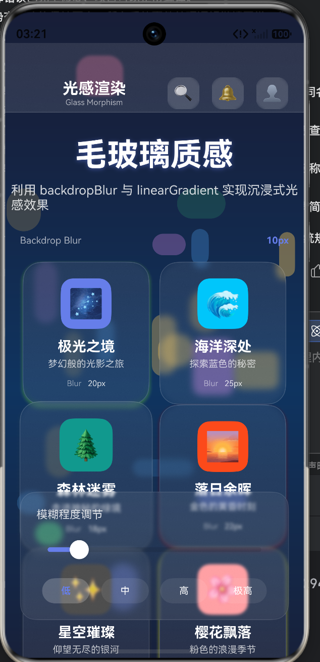
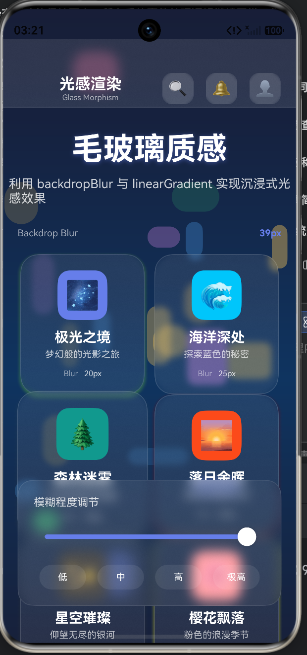
近年来,以 macOS Big Sur 和 iOS 为代表的系统界面,大量使用了“毛玻璃”材质。这种效果通过背景模糊、半透明底色和细腻的边框高光,营造出一种“悬浮在内容之上”的通透质感。在鸿蒙 ArkUI 中,我们可以利用强大的 backdropBlur 属性轻松实现这一高级视觉效果。
这个实战案例不仅颜值极高,还完美融合了 ArkTS 的交互与渲染能力,涵盖了以下核心知识点:
- BackdropBlur 核心应用:使用
backdropBlur实现实时的背景高斯模糊。 - 动态状态联动:通过
@State变量控制全局模糊度,实现组件间的实时交互。 - 程序化背景生成:利用随机算法生成动态的背景色块,为毛玻璃提供丰富的透光层次。
- 沉浸式光感设计:结合线性渐变、阴影与半透明边框,打造极致的 UI 细节。
下面,我们就对这段实现沉浸式光感的代码进行一次深度解析。
完整代码结构预览
首先,让我们从整体上把握代码结构。它定义了一个 GlassMorphismPage 入口组件,核心是背景层的渲染、毛玻璃卡片网格的构建以及控制面板的交互。
interface GlassCard { ... }
interface BackgroundItem { ... }

@Entry
@Component
struct GlassMorphismPage {
  // 1. 全局模糊度状态与卡片数据
  @State activeCard: string = ''
  @State blurRadius: number = 20
  private cards: GlassCard[] = [...]

  // 2. 页面主体与自定义构建
  build() { ... }
  @Builder BackgroundLayer() { ... }
  @Builder GlassNavbar() { ... }
  @Builder GlassCardItem(card: GlassCard) { ... }
  @Builder GlassControlPanel() { ... }
}
第一部分:程序化动态背景层 (BackgroundLayer)
毛玻璃效果的核心在于“背后要有东西可透”。如果背景是纯色的,模糊效果将无从体现。因此,我们首先构建了一个富有层次感的动态背景。
@Builder BackgroundLayer() {
  Stack({ alignContent: Alignment.Center }) {
    // 1. 深色渐变底色
    Column()
      .width('150%').height('150%')
      .linearGradient({
        direction: 135,
        colors: [['#1A1A2E', 0.0], ['#16213E', 0.3], ['#0F3460', 0.6], ['#1A1A2E', 1.0]]
      })
      .translate({ x: -50, y: -50 })

    // 2. 随机生成的彩色光斑
    ForEach(this.generateBackgroundItems(), (item: BackgroundItem) => {
      Column()
        .width(item.width).height(item.height)
        .backgroundColor(item.color).opacity(item.opacity)
        .position({ x: item.x, y: item.y })
    })
  }
}
- 渐变底色:使用
linearGradient创建一个深邃的蓝紫色渐变,奠定了沉浸式的暗色基调。 - 随机光斑:通过
generateBackgroundItems()方法,程序化地生成了 20 个大小、颜色、位置、透明度各不相同的圆角矩形。这些随机分布的色块,为上方的毛玻璃组件提供了绝佳的模糊素材。
🧊 第二部分:毛玻璃核心三要素 (Glass Navbar & Card)
在 ArkUI 中,实现一个完美的毛玻璃组件,通常需要同时满足三个条件:背景模糊、半透明底色、细腻边框。我们以导航栏和卡片为例进行拆解。
1. 顶部导航栏 (GlassNavbar)
@Builder GlassNavbar() {
  Row() { ... }
  .width('100%').height(88)
  .backdropBlur(this.blurRadius)          // ① 核心:背景模糊
  .backgroundColor('rgba(255,255,255,0.1)') // ② 半透明底色
  .borderWidth({ bottom: 1 })
  .borderColor('rgba(255,255,255,0.1)')   // ③ 半透明边框(模拟玻璃边缘高光)
}
2. 毛玻璃卡片 (GlassCardItem)
@Builder GlassCardItem(card: GlassCard) {
  Column({ space: 12 }) { ... }
  .width(160).padding(20)
  .backdropBlur(card.blurLevel)          // 每张卡片拥有独立的模糊度
  .backgroundColor('rgba(255,255,255,0.08)') // 极低的透明度,保持轻盈感
  .borderWidth(1)
  .borderColor('rgba(255,255,255,0.15)')
  .borderRadius(24)
  .shadow({ radius: 20, color: card.gradientColors[0] + '30', offsetX: 0, offsetY: 8 })
}
backdropBlur:这是实现毛玻璃的灵魂属性。它会对组件背后的内容进行实时高斯模糊处理。backgroundColor:必须使用带 Alpha 通道(透明度)的颜色。如果底色完全不透明,背后的模糊效果将被完全遮挡。borderColor:使用半透明的白色边框,可以完美模拟出真实玻璃在光照下产生的边缘高光,极大地增强了立体感。
️ 第三部分:全局状态联动与交互 (State & ControlPanel)
本案例最精妙的设计在于“交互反馈”。页面底部提供了一个控制面板,用户可以实时调节全局的模糊程度。
@State blurRadius: number = 20 // 全局模糊度状态

@Builder GlassControlPanel() {
  Column({ space: 16 }) {
    Slider({
      value: this.blurRadius, min: 5, max: 40, style: SliderStyle.OutSet
    })
    .onChange((value: number) => {
      this.blurRadius = value // 拖动滑块,实时更新全局状态
    })

    Row({ space: 8 }) {
      this.BlurPreset('低', 10)
      this.BlurPreset('中', 20)
      // ... 其他预设按钮
    }
  }
  .backdropBlur(this.blurRadius) // 控制面板本身也受全局状态控制
}
当用户拖动滑块或点击预设按钮时,blurRadius 状态发生改变。由于导航栏、卡片和控制面板都绑定了这个状态(或受其影响的独立状态),整个页面的毛玻璃质感会随之实时平滑变化。这种“所见即所得”的交互,极大地提升了应用的趣味性。
第四部分:卡片微交互与悬停效果
为了让界面更加灵动,我们在卡片上添加了悬停(Hover)缩放效果。
@Builder GlassCardItem(card: GlassCard) {
  Column({ space: 12 }) { ... }
  .scale({ x: this.activeCard === card.id ? 1.05 : 1, y: ... })
  .onHover(() => {
    this.activeCard = card.id // 鼠标悬停时,记录当前卡片ID
  })
  .onClick(() => {
    this.blurRadius = card.blurLevel // 点击卡片,将该卡片的模糊度设为全局值
  })
}
onHover:当鼠标悬停在某张卡片上时,更新activeCard状态。通过三元运算符动态改变scale,实现卡片轻微放大的微交互。- 点击联动:点击卡片时,不仅会有缩放反馈,还会将该卡片预设的
blurLevel赋值给全局的blurRadius,实现了内容与全局控制的深度联动。
完整代码
interface GlassCard {
id: string
title: string
subtitle: string
icon: string
gradientColors: string[]
blurLevel: number
}
interface BackgroundItem {
width: number
height: number
radius: number
color: string
opacity: number
x: number
y: number
}
struct GlassMorphismPage {
activeCard: string = ''
blurRadius: number = 20
private cards: GlassCard[] = [
{ id: '1', title: '极光之境', subtitle: '梦幻般的光影之旅', icon: '🌌', gradientColors: ['#667EEA', '#764BA2'], blurLevel: 20 },
{ id: '2', title: '海洋深处', subtitle: '探索蓝色的秘密', icon: '🌊', gradientColors: ['#00C6FB', '#005BEA'], blurLevel: 25 },
{ id: '3', title: '森林迷雾', subtitle: '走进神秘的绿境', icon: '🌲', gradientColors: ['#11998E', '#38EF7D'], blurLevel: 18 },
{ id: '4', title: '落日余晖', subtitle: '金色的黄昏时刻', icon: '🌅', gradientColors: ['#FC4A1A', '#F7B733'], blurLevel: 22 },
{ id: '5', title: '星空璀璨', subtitle: '仰望无尽的银河', icon: '✨', gradientColors: ['#434343', '#000000'], blurLevel: 30 },
{ id: '6', title: '樱花飘落', subtitle: '粉色的浪漫季节', icon: '🌸', gradientColors: ['#FF9A9E', '#FECFEF'], blurLevel: 15 }
]
build() {
Stack({ alignContent: Alignment.Center }) {
this.BackgroundLayer()
Column() {
this.GlassNavbar()
this.GlassHeader()
this.GlassCardGrid()
this.GlassControlPanel()
}
.width('100%')
.height('100%')
}
.width('100%')
.height('100%')
}
BackgroundLayer() {
Stack({ alignContent: Alignment.Center }) {
Column()
.width('150%')
.height('150%')
.linearGradient({
direction: 135,
colors: [['#1A1A2E', 0.0], ['#16213E', 0.3], ['#0F3460', 0.6], ['#1A1A2E', 1.0]]
})
.translate({ x: -50, y: -50 })
ForEach(this.generateBackgroundItems(), (item: BackgroundItem) => {
Column()
.width(item.width)
.height(item.height)
.borderRadius(item.radius)
.backgroundColor(item.color)
.opacity(item.opacity)
.position({ x: item.x, y: item.y })
})
}
.width('100%')
.height('100%')
}
private getRandomColor(): string {
const colors = ['#667EEA', '#F093FB', '#4FACFE', '#43E97B', '#FA709A', '#FECA57']
return colors[Math.floor(Math.random() * colors.length)]
}
private generateBackgroundItems(): BackgroundItem[] {
const items: BackgroundItem[] = []
for (let i = 0; i < 20; i++) {
items.push({
width: Math.floor(Math.random() * 60 + 20),
height: Math.floor(Math.random() * 60 + 20),
radius: Math.floor(Math.random() * 30 + 10),
color: this.getRandomColor(),
opacity: Math.random() * 0.3 + 0.1,
x: Math.floor(Math.random() * 400),
y: Math.floor(Math.random() * 800)
})
}
return items
}
GlassNavbar() {
Row() {
Column() {
Text('光感渲染')
.fontSize(20)
.fontWeight(FontWeight.Bold)
.fontColor('#FFFFFF')
Text('Glass Morphism')
.fontSize(10)
.fontColor('#FFFFFF')
.opacity(0.6)
}
.layoutWeight(1)
Row({ space: 16 }) {
this.GlassIconButton('🔍')
this.GlassIconButton('🔔')
this.GlassIconButton('👤')
}
}
.width('100%')
.height(88)
.padding({ left: 20, right: 20, top: 40 })
.backdropBlur(this.blurRadius)
.backgroundColor('rgba(255,255,255,0.1)')
.borderWidth({ bottom: 1 })
.borderColor('rgba(255,255,255,0.1)')
}
GlassIconButton(icon: string) {
Column() {
Text(icon)
.fontSize(20)
}
.width(40)
.height(40)
.justifyContent(FlexAlign.Center)
.alignItems(HorizontalAlign.Center)
.backdropBlur(10)
.backgroundColor('rgba(255,255,255,0.15)')
.borderRadius(12)
.onClick(() => {})
}
GlassHeader() {
Column({ space: 12 }) {
Text('毛玻璃质感')
.fontSize(40)
.fontWeight(FontWeight.Bold)
.fontColor('#FFFFFF')
.textShadow({ radius: 10, color: 'rgba(102,126,234,0.5)', offsetX: 0, offsetY: 4 })
Text('利用 backdropBlur 与 linearGradient 实现沉浸式光感效果')
.fontSize(16)
.fontColor('#FFFFFF')
.opacity(0.8)
Row() {
Text('Backdrop Blur')
.fontSize(12)
.fontColor('#FFFFFF')
.opacity(0.6)
Blank()
Text(`${this.blurRadius}px`)
.fontSize(12)
.fontColor('#667EEA')
.fontWeight(FontWeight.Bold)
}
.width('90%')
.padding({ top: 16 })
}
.width('100%')
.padding({ top: 30, bottom: 20 })
.alignItems(HorizontalAlign.Center)
}
GlassCardGrid() {
Flex({ wrap: FlexWrap.Wrap, justifyContent: FlexAlign.SpaceAround }) {
ForEach(this.cards, (card: GlassCard) => {
this.GlassCardItem(card)
})
}
.width('100%')
.layoutWeight(1)
.padding({ left: 16, right: 16 })
}
GlassCardItem(card: GlassCard) {
Column({ space: 12 }) {
Row() {
Text(card.icon)
.fontSize(36)
}
.width(64)
.height(64)
.justifyContent(FlexAlign.Center)
.alignItems(VerticalAlign.Center)
.linearGradient({
direction: 135,
colors: [[card.gradientColors[0], 1.0], [card.gradientColors[1], 1.0]]
})
.borderRadius(16)
Column({ space: 4 }) {
Text(card.title)
.fontSize(18)
.fontWeight(FontWeight.Bold)
.fontColor('#FFFFFF')
Text(card.subtitle)
.fontSize(12)
.fontColor('#FFFFFF')
.opacity(0.7)
}
.alignItems(HorizontalAlign.Center)
Row({ space: 8 }) {
Text('Blur')
.fontSize(10)
.fontColor('#FFFFFF')
.opacity(0.5)
Text(`${card.blurLevel}px`)
.fontSize(10)
.fontColor('#FFFFFF')
.opacity(0.8)
}
}
.width(160)
.padding(20)
.backdropBlur(card.blurLevel)
.backgroundColor('rgba(255,255,255,0.08)')
.borderWidth(1)
.borderColor('rgba(255,255,255,0.15)')
.borderRadius(24)
.shadow({
radius: 20,
color: card.gradientColors[0] + '30',
offsetX: 0,
offsetY: 8
})
.scale({ x: this.activeCard === card.id ? 1.05 : 1, y: this.activeCard === card.id ? 1.05 : 1 })
.onHover(() => {
this.activeCard = card.id
})
.onClick(() => {
this.blurRadius = card.blurLevel
})
}
GlassControlPanel() {
Column({ space: 16 }) {
Row() {
Text('模糊程度调节')
.fontSize(14)
.fontColor('#FFFFFF')
.opacity(0.8)
}
.width('100%')
Row() {
Slider({
value: this.blurRadius,
min: 5,
max: 40,
style: SliderStyle.OutSet
})
.layoutWeight(1)
.trackThickness(6)
.selectedColor('#667EEA')
.blockColor('#FFFFFF')
.onChange((value: number) => {
this.blurRadius = value
})
}
.width('100%')
Row({ space: 8 }) {
this.BlurPreset('低', 10)
this.BlurPreset('中', 20)
this.BlurPreset('高', 30)
this.BlurPreset('极高', 40)
}
.width('100%')
.justifyContent(FlexAlign.SpaceAround)
}
.width('90%')
.padding(20)
.backdropBlur(this.blurRadius)
.backgroundColor('rgba(255,255,255,0.06)')
.borderWidth(1)
.borderColor('rgba(255,255,255,0.1)')
.borderRadius(20)
.margin({ bottom: 20 })
}
BlurPreset(label: string, value: number) {
Button() {
Text(label)
.fontSize(12)
.fontColor(this.blurRadius === value ? '#667EEA' : '#FFFFFF')
.fontWeight(this.blurRadius === value ? FontWeight.Bold : FontWeight.Normal)
}
.width(60)
.height(32)
.backgroundColor(this.blurRadius === value ? 'rgba(255,255,255,0.2)' : 'rgba(255,255,255,0.08)')
.borderRadius(16)
.onClick(() => {
this.blurRadius = value
})
}
}
总结与实战建议
通过这个沉浸式光感 UI 的实战,我们掌握了以下 ArkTS 高阶视觉技巧:
- BackdropBlur 的正确打开方式:深刻理解了
backdropBlur必须配合半透明背景色(rgba)和半透明边框才能发挥最佳效果。 - 背景层次的重要性:毛玻璃不是孤立存在的,必须为其提供色彩丰富、层次分明的底层背景(如渐变+随机色块),才能透出迷人的光影。
- 状态驱动的实时渲染:利用
@State将 UI 样式(如模糊半径)与用户交互(滑块、点击)绑定,实现了高度动态的沉浸式体验。 - 细节决定质感:在深色模式下,使用极低透明度的白色底色(如
0.08)和边框(如0.15),配合柔和的彩色阴影,是打造高级感的关键。
希望这篇详细的代码解析能帮你彻底掌握鸿蒙 ArkTS 的毛玻璃 UI 设计技巧!如果你觉得有用,欢迎点赞、收藏,我们下期再见!

讨论HarmonyOS开发技术,专注于API与组件、DevEco Studio、测试、元服务和应用上架分发等。
更多推荐

 1
1 0
0- 0


 已为社区贡献87条内容

所有评论(0)