HarmonyOS 3D 拆解分析 UI 重构:从能用到好看的迭代过程
同样的功能,换一种布局和细节处理,质感完全不一样。
前言
3D 拆解分析的核心功能实现——网格切分、爆炸视图、部件清单。但当时 UI 比较粗糙,首页就是几个按钮和芯片,分析页面也just能用。
最近花了一段时间对两个页面做了一轮 UI 美化。功能没变,但视觉效果提升了不少。这篇文章记录这次美化过程中的设计决策和代码实现。
首页:从按钮堆砌到层次分明
旧版 vs 新版
旧版首页的结构是:标题 → Hero Card → 三个快捷按钮 → 四个芯片 → 三步说明。所有元素平铺,没有明显的视觉层次。
新版的结构变成了:问候语 → Hero Card(带装饰元素) → 快捷操作 → 精度预设(2×2 卡片网格) → 三步拆解 → 底部 CTA 按钮。加了滚动弹簧效果,底部有毛玻璃质感的操作栏。
问候语区域:加一个小图标
Row() {
  Column() {
    Text('3D 拆解分析')
      .fontSize(28).fontWeight(FontWeight.Bold).fontColor(T1)
      .margin({ bottom: 4 })
    Text('拍摄物品照片,自动生成爆炸结构图')
      .fontSize(13).fontColor(T2)
  }
  .alignItems(HorizontalAlign.Start).layoutWeight(1)

  Stack() {
    Column() {}
      .width(44).height(44).borderRadius(22)
      .linearGradient({
        angle: 135, colors: [[A, 0], ['#A78BFA', 1]]
      })
    Text('🔧').fontSize(20)
  }
}
.width('100%').margin({ bottom: 22 })
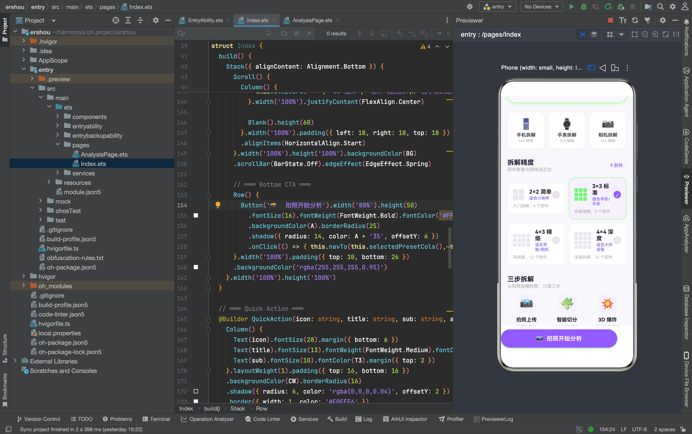
右边的图标用了 Stack 叠加——底层是渐变圆形,上层是 emoji 文字。比直接放一个 emoji 有质感,因为渐变背景给图标加了一层"容器感"。
Hero Card:装饰性元素提升精致度
Stack({ alignContent: Alignment.Center }) {
  // 装饰性半透明圆
  Circle({ width: 120, height: 120 })
    .fill('rgba(255,255,255,0.06)')
    .position({ x: '70%', y: 10 })
  Circle({ width: 70, height: 70 })
    .fill('rgba(255,255,255,0.08)')
    .position({ x: '10%', y: 80 })

  // 渐变背景
  Column() {}
    .width('100%').height(180).borderRadius(22)
    .linearGradient({ angle: 150, colors: [[A,0],['#9B7CF4',0.4],['#C4B5FD',1]] })

  // 文字内容 + CTA 按钮
  Column() {
    Text('📸').fontSize(48).margin({ bottom: 10 })
    Text('拍照分析物品').fontSize(22).fontWeight(FontWeight.Bold).fontColor('#FFFFFF')
    Text('支持手机 · 手表 · 相机 · 家电等').fontSize(12)
      .fontColor('rgba(255,255,255,0.6)').margin({ top: 6 })

    Row() {
      Text('开始分析').fontSize(13).fontWeight(FontWeight.Medium).fontColor(A)
      SymbolGlyph($r('sys.symbol.chevron_right')).fontSize(14).fontColor([A])
    }
    .padding({ left: 16, right: 16, top: 8, bottom: 8 })
    .backgroundColor('rgba(255,255,255,0.92)').borderRadius(18)
    .margin({ top: 14 })
  }
  .width('100%').height('100%')
  .justifyContent(FlexAlign.Center).alignItems(HorizontalAlign.Center)
}
.width('100%').borderRadius(22)
.shadow({ radius: 20, color: A + '28', offsetY: 8 })
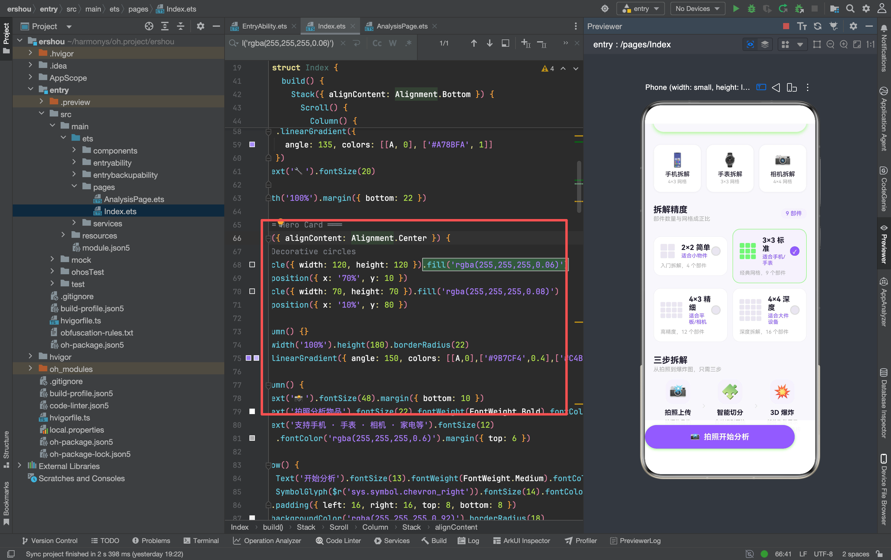
两个关键改进:
-
装饰性半透明圆:用
Circle组件 +position定位,在渐变背景上叠加微妙的纹理。圆的填充色是rgba(255,255,255,0.06)——几乎看不到,但潜意识里会觉得画面更丰富。 -
CTA 按钮:白色半透明背景 + 紫色文字 + 右箭头图标。比旧版的纯文字链接更像一个真正的按钮,引导用户点击。
快捷操作:卡片化
旧版的快捷操作是三个简单的图标+文字。新版加了阴影和边框:
@Builder QuickAction(icon: string, title: string, sub: string, action: () => void) {
  Column() {
    Text(icon).fontSize(28).margin({ bottom: 6 })
    Text(title).fontSize(13).fontWeight(FontWeight.Medium).fontColor(T1)
    Text(sub).fontSize(10).fontColor(T3).margin({ top: 2 })
  }
  .layoutWeight(1).padding({ top: 16, bottom: 16 })
  .backgroundColor(CW).borderRadius(16)
  .shadow({ radius: 6, color: 'rgba(0,0,0,0.04)', offsetY: 2 })
  .border({ width: 1, color: '#F0EEF6' })
  .onClick(action)
}
阴影很淡(0.04 透明度),边框也很淡(#F0EEF6),但组合在一起让卡片有了"浮在背景上"的感觉。比旧版的纯平面设计更有层次。
精度预设:从芯片到卡片网格
这是最大的改动。旧版用一排四个小芯片(PresetChip),新版改成 2×2 的卡片网格(PresetCard),每个卡片包含:
- 迷你网格缩略图
- 标签(如"3×3 标准")
- 适用场景(如"适合手机/手表")
- 描述(如"经典网格,9 个部件")
- 选中态单选按钮
@Builder PresetCard(idx: number, label: string, cols: number, rows: number, scene: string, desc: string) {
  Column() {
    Row() {
      // 迷你网格缩略图
      Column({ space: 2 }) {
        ForEach(this.getThumb(cols, rows), (row: string[], _r: number) => {
          Row({ space: 2 }) {
            ForEach(row, (_c: string, _cc: number) => {
              Row() {}
                .width(cols <= 2 ? 14 : 10).height(rows <= 2 ? 14 : 10).borderRadius(2)
                .backgroundColor(this.selectedPreset === idx ? A + '30' : '#E8E5F0')
            })
          }
        })
      }.margin({ right: 14 })

      Column() {
        Text(label).fontSize(15).fontWeight(FontWeight.Bold).fontColor(T1)
        Text(scene).fontSize(11).fontColor(A).fontWeight(FontWeight.Medium).margin({ top: 2 })
      }.alignItems(HorizontalAlign.Start).layoutWeight(1)

      // 单选按钮
      Column() {
        Row() {}
          .width(20).height(20).borderRadius(10)
          .backgroundColor(this.selectedPreset === idx ? A : '#E8E5F0')
          .border({ width: 2, color: this.selectedPreset === idx ? A : '#DDD' })
        if (this.selectedPreset === idx) {
          Text('✓').fontSize(11).fontColor('#FFFFFF').fontWeight(FontWeight.Bold)
            .position({ x: 6, y: 3 })
        }
      }
    }

    Text(desc).fontSize(11).fontColor(T3).width('100%')
  }
  .width('100%').padding(14)
  .backgroundColor(this.selectedPreset === idx ? AL : CW)
  .borderRadius(16)
  .border({ width: this.selectedPreset === idx ? 1.5 : 1,
    color: this.selectedPreset === idx ? A + '40' : '#F0EEF6' })
  .onClick(() => { this.selectedPreset = idx })
}
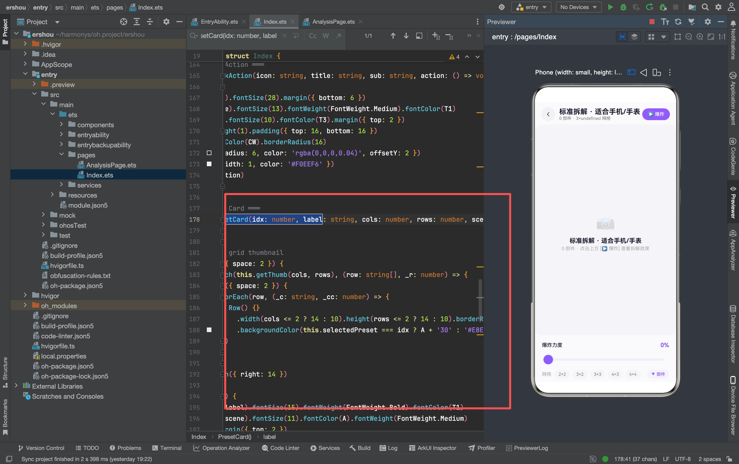
选中态的变化:
- 背景色从白色变成浅紫
#F4F1FC - 边框从淡灰变成半透明紫
A + '40' - 边框宽度从 1px 变成 1.5px
- 单选按钮从灰色变成紫色,显示 ✓
这种多维度的视觉反馈(颜色 + 边框 + 图标)让用户一眼就能看出哪个是选中态。
底部 CTA:毛玻璃效果
Row() {
  Button('📸 拍照开始分析').width('88%').height(50)
    .fontSize(16).fontWeight(FontWeight.Bold).fontColor('#FFFFFF')
    .backgroundColor(A).borderRadius(25)
    .shadow({ radius: 14, color: A + '35', offsetY: 6 })
    .onClick(() => { this.navTo(this.selectedPresetCols(), this.selectedPresetRows(), '') })
}
.width('100%').padding({ top: 10, bottom: 26 })
.backgroundColor('rgba(255,255,255,0.95)')
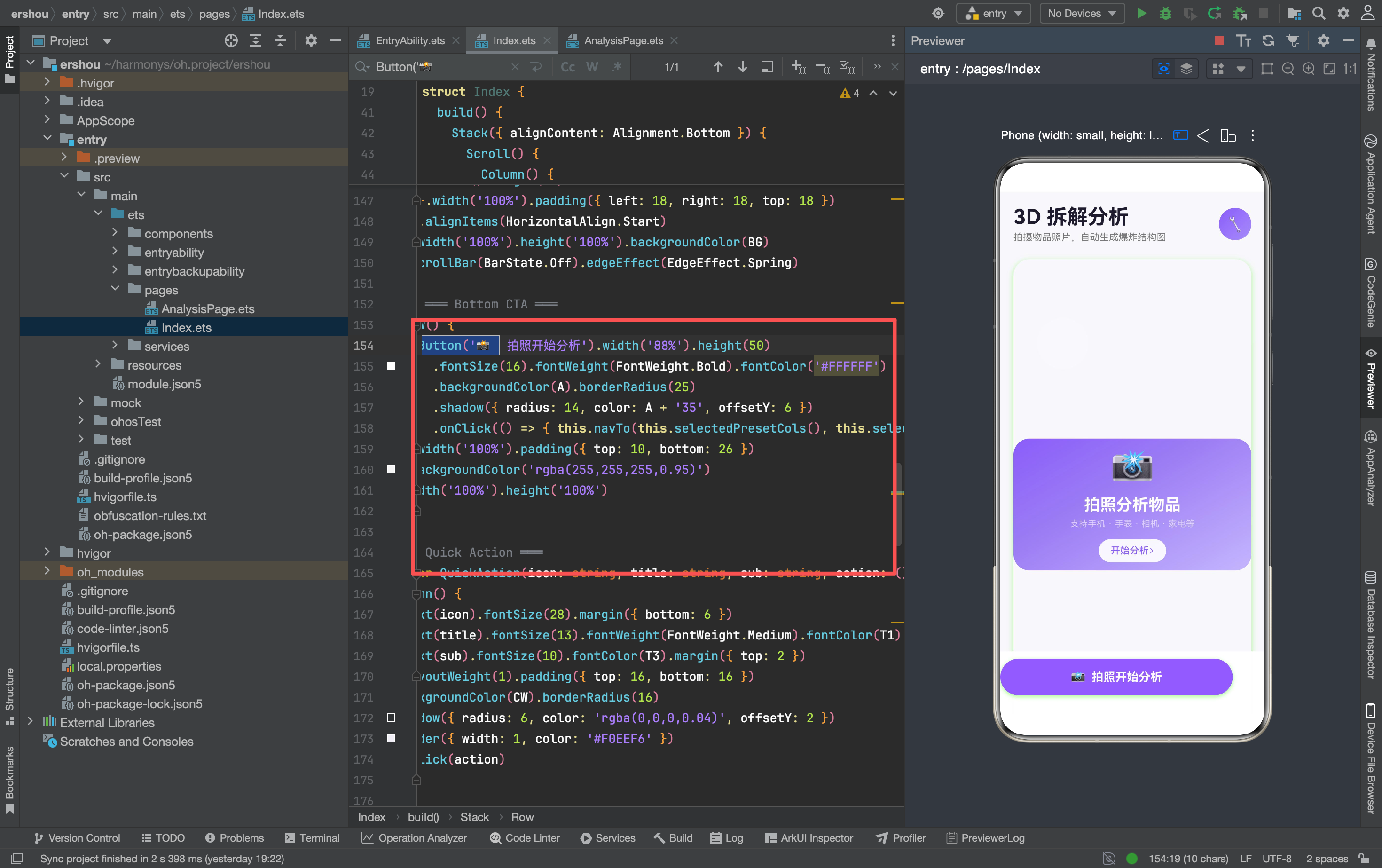
底部操作栏用 Stack({ alignContent: Alignment.Bottom }) 固定在屏幕底部,背景色 rgba(255,255,255,0.95) 接近纯白但有微弱透明度,滚动内容时能隐约看到下面的内容——类似毛玻璃效果。
按钮本身有紫色阴影(A + '35'),和渐变 Hero Card 呼应。
滚动弹簧效果
Scroll() {
  Column() { ... }
}
.width('100%').height('100%')
.scrollBar(BarState.Off)
.edgeEffect(EdgeEffect.Spring)
.edgeEffect(EdgeEffect.Spring) 让滚动到边缘时有弹簧回弹效果,比默认的边缘发光效果更自然。这个属性在 ArkUI 中很容易加,但很多人不知道。
分析工作台:更清晰的信息层级
头部:播放按钮的文案变化
旧版的播放按钮只显示图标(▶ / ⏸),新版加了文字:
Row() {
  Text(this.playing ? '⏸ 收起' : '▶ 爆炸').fontSize(12)
    .fontWeight(FontWeight.Medium).fontColor('#FFFFFF')
}
.padding({ left: 14, right: 14, top: 8, bottom: 8 })
.borderRadius(18).backgroundColor(this.playing ? '#FF6B6B' : A)
按钮文案从"▶"变成"▶ 爆炸",从"⏸"变成"⏸ 收起"——告诉用户这个按钮是干什么的。颜色也从单一的紫色变成播放时红色、暂停时紫色,区分"危险操作"(爆炸)和"安全操作"(收起)。
工作区:网格预览
没有图片时的占位区域加了网格预览:
Column({ space: 2 }) {
  ForEach(this.gridData, (row: PRow, _r: number) => {
    Row({ space: 2 }) {
      ForEach(row.cells, (_c: string, _cc: number) => {
        Row() {}.width(28).height(28).borderRadius(6)
          .backgroundColor(A + '12').border({ width: 0.5, color: A + '20' })
      })
    }
  })
}
用户还没拍照时,能看到当前选择的网格长什么样——2×2 是 4 个大方块,4×4 是 16 个小方块。这比旧版只显示文字信息更直观。
爆炸力度徽章
if (this.playing) {
  Row() {
    Text('💥 ' + Math.round(this.intensity * 100) + '%')
      .fontSize(11).fontWeight(FontWeight.Medium).fontColor(A)
  }
  .padding({ left: 10, right: 10, top: 5, bottom: 5 })
  .backgroundColor('rgba(255,255,255,0.9)').borderRadius(10)
  .shadow({ radius: 4, color: 'rgba(0,0,0,0.06)', offsetY: 1 })
  .position({ x: 10, y: 10 })
}
爆炸进行时,左上角显示一个半透明白色徽章,实时显示爆炸百分比。用户不需要看滑块就能知道当前力度。
网格选择器:集成部件列表开关
旧版的网格选择和部件列表是两个独立区域。新版把部件列表开关集成到网格选择器右侧:
Row() {
  Text('网格').fontSize(12).fontColor(T3).margin({ right: 8 })
  ForEach(this.presets, (p: GridPreset) => {
    Text(p.label).fontSize(11)
      .fontWeight(p.cols === this.cols && p.rows === this.rows ? FontWeight.Bold : FontWeight.Regular)
      .fontColor(p.cols === this.cols && p.rows === this.rows ? '#FFFFFF' : T2)
      .padding({ left: 10, right: 10, top: 5, bottom: 5 })
      .borderRadius(12)
      .backgroundColor(p.cols === this.cols && p.rows === this.rows ? A : '#F5F5F7')
      .margin({ right: 6 })
      .onClick(() => { this.changeGrid(p.cols, p.rows) })
  })
  Blank()
  Row() {
    Text(this.showList ? '▲ 部件' : '▼ 部件').fontSize(11)
      .fontWeight(FontWeight.Medium).fontColor(A)
  }
  .padding({ left: 10, right: 10, top: 5, bottom: 5 })
  .backgroundColor(AL).borderRadius(12)
  .onClick(() => { this.showList = !this.showList })
}
Blank() 把网格选项推到左边,部件开关推到右边。部件开关用上下箭头(▲/▼)表示展开/收起状态,视觉上很直觉。
部件清单:深度条前置
旧版的部件卡片是:编号圆圈 → 名称 → 深度条。新版改成:深度条 → 名称 → 位置信息。
ForEach(this.partCards, (c: PartCard) => {
  Row() {
    Row() {}.width(c.d * 42).height(5).borderRadius(3)
      .backgroundColor(A + '55').margin({ right: 10 })
    Column() {
      Text(c.n).fontSize(13).fontWeight(FontWeight.Medium).fontColor(T1)
      Text(c.sub).fontSize(10).fontColor(T3)
    }.alignItems(HorizontalAlign.Start).layoutWeight(1)
  }
  .width('100%').padding(8)
  .backgroundColor('#FCFCFE').borderRadius(10)
  .border({ width: 0.5, color: '#F0EEF4' })
})
深度条放在最左边,宽度和深度值成正比(c.d * 42)。用户扫一眼就能看出哪些部件深度大、哪些深度小,不需要逐个读数字。
设计决策:为什么这样改
1. 预设从芯片改成卡片
芯片适合选项少(3-5 个)、信息量小的场景。但我们的预设每个都有标签、场景、描述三个维度的信息,芯片放不下。
卡片网格能展示更多信息,2×2 布局也和网格选择的"2×2/3×3/4×3/4×4"形成视觉呼应。
2. 加装饰性元素
Hero Card 上的半透明圆、底部的毛玻璃效果,这些东西不影响功能,但能让界面看起来更精致。移动端用户对视觉细节很敏感——一个有阴影的卡片和一个没阴影的卡片,用户的感知质量差距很大。
3. 深度条前置
部件清单的核心信息是"这个部件有多深"——深度决定了爆炸时的偏移距离。把深度条放在最左边,用户扫一眼就能建立"深度=位置"的心理模型。
4. 播放按钮加文字
纯图标按钮需要用户猜测功能。加了"爆炸""收起"文字后,按钮的意图一目了然。对于不常使用的功能,文字比图标更友好。
踩坑记录
1. 位置属性在 Stack 中的定位
Stack({ alignContent: Alignment.Center }) {
  Circle({ width: 120, height: 120 })
    .fill('rgba(255,255,255,0.06)')
    .position({ x: '70%', y: 10 })
}
position 在 Stack 中的坐标是相对于 Stack 容器的,不是相对于父组件。百分比值(如 '70%')是相对于 Stack 宽度的百分比。
2. ForEach 中的条件渲染
if (this.selectedPreset === idx) {
  Text('✓').fontSize(11).fontColor('#FFFFFF').fontWeight(FontWeight.Bold)
    .position({ x: 6, y: 3 })
}
在 ForEach 内部用 if 条件渲染是允许的,但要注意 ForEach 的第三个参数(keyGenerator)应该返回稳定的 key。这里没显式指定 keyGenerator,ArkTS 会用默认的数组索引作为 key——对于静态列表没问题,动态列表建议显式指定。
3. Button 的 shadow 和 borderRadius
Button('📸 拍照开始分析')
  .borderRadius(25)
  .shadow({ radius: 14, color: A + '35', offsetY: 6 })
Button 组件的 shadow 需要在 borderRadius 之后设置,否则阴影不会跟随圆角裁剪。这是 ArkUI 的渲染顺序导致的。
4. Stack 的 alignContent 和 alignItems
Stack({ alignContent: Alignment.Bottom }) {
  Scroll() { ... }
  this.BottomNavigation()
}
alignContent 控制子组件在 Stack 中的对齐方式。Alignment.Bottom 让 BottomNavigation 固定在底部,Scroll 从顶部开始。
如果用 Alignment.Center,两个子组件都会居中叠在一起——这不是我们想要的效果。
写在最后
这次 UI 美化没有改任何功能逻辑,只是调整了布局、颜色、阴影、间距。但最终效果差距很大——从"能用的 demo"变成了"像样的产品"。
移动端 UI 的一个重要原则是:细节决定质感。一个 1px 的淡边框、一个 0.04 透明度的阴影、一个弹簧滚动效果,单看都不起眼,但组合在一起就让整个应用精致了很多。
下次做 UI 的时候,可以先问自己:这个元素有没有阴影?边框颜色和背景色搭配吗?选中态有没有多维度的视觉反馈?这些小问题往往能带来大的提升。

讨论HarmonyOS开发技术,专注于API与组件、DevEco Studio、测试、元服务和应用上架分发等。
更多推荐

 10
10 0
0- 0


 已为社区贡献31条内容

所有评论(0)