HarmonyOS ArkTS 针对九宫布局的UI布局与样式设计技巧
一、概述
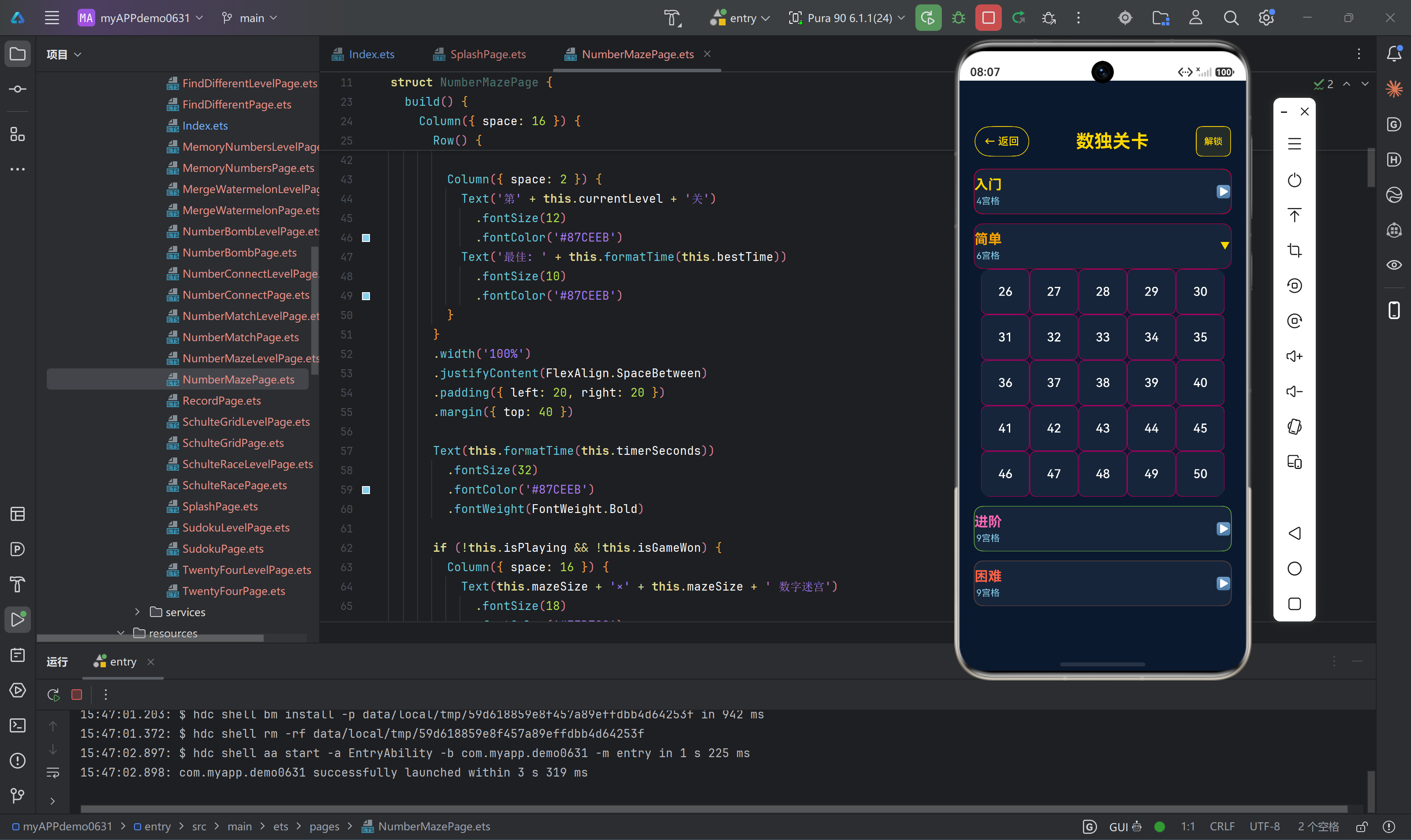
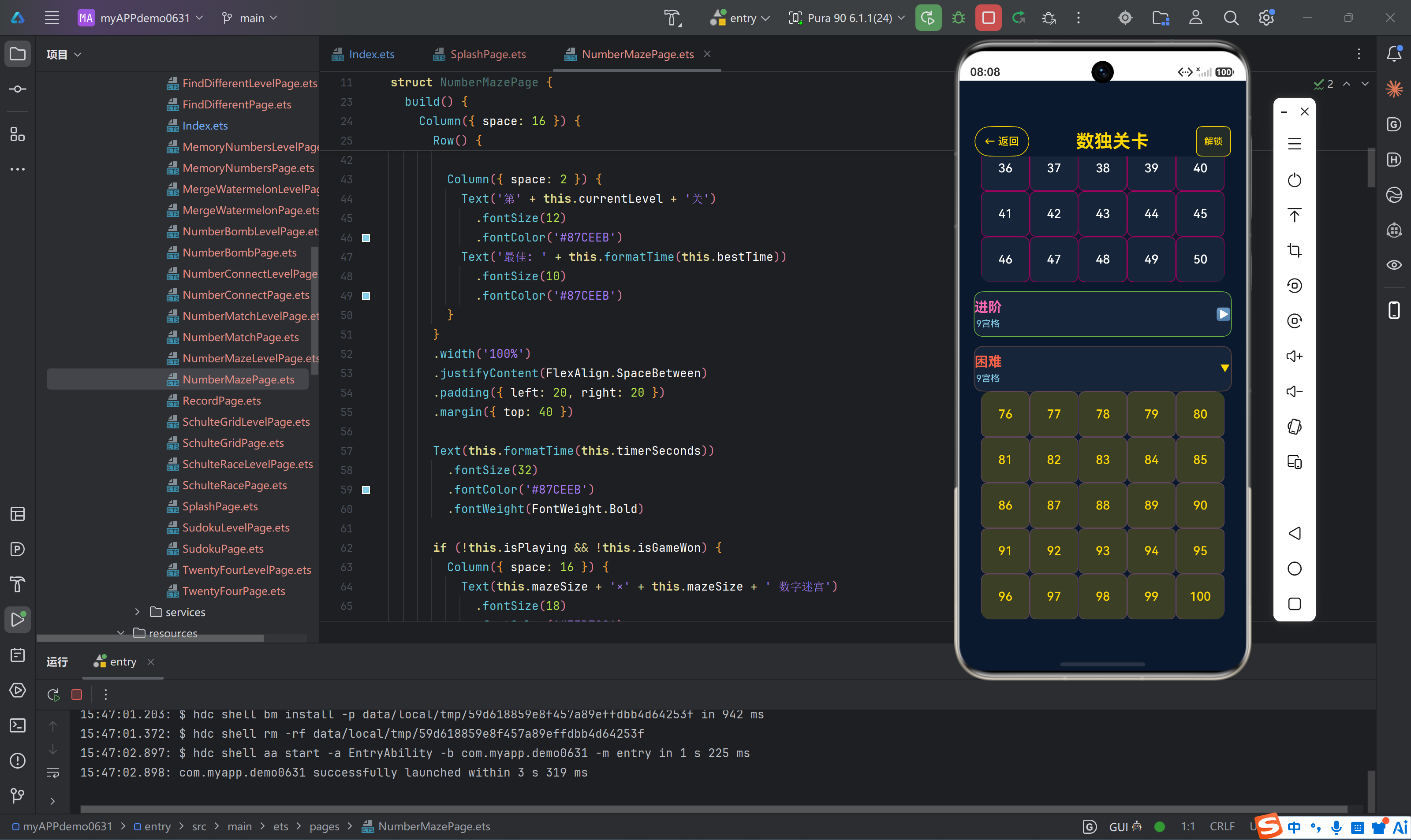
在HarmonyOS应用开发中,UI布局与样式设计是构建优秀用户体验的核心环节。本项目基于ArkTS技术栈,采用深蓝色背景配金色主题的视觉风格,通过精心设计的布局结构和样式系统,打造了一套统一、美观、交互流畅的游戏界面。
本文将深入探讨项目中使用的UI布局与样式设计技巧,包括主题配色方案、布局组件使用、响应式设计、组件复用、视觉效果等方面的实践经验。
1.1 设计原则
本项目的UI设计遵循以下核心原则:
- 一致性:所有页面采用统一的配色方案、字体风格和交互模式
- 清晰性:信息层次分明,操作路径简洁明了
- 美观性:深蓝色背景配金色主题,营造专业、高端的视觉感受
- 可用性:按钮尺寸适中,点击区域合理,操作反馈及时
- 响应式:适配不同屏幕尺寸和网格大小
1.2 技术栈
- 框架:HarmonyOS ArkUI(声明式UI)
- 语言:ArkTS(TypeScript方言)
- 布局:Flexbox布局系统(Column、Row)
- 网格:Grid组件
- 状态管理:@State、@Prop、@Link等状态装饰器
二、主题配色方案
2.1 核心配色
本项目采用深蓝色背景配金色主题的经典配色方案:
┌─────────────────────────────────────────────────────────────┐
│                     主题配色方案                             │
├─────────────────────────────────────────────────────────────┤
│                                                             │
│  背景色:  #0A192F (深蓝色)                                  │
│  主题色:  #FFD700 (金色)                                    │
│  辅助色:  #87CEEB (天蓝色)                                  │
│  成功色:  #32CD32 (绿色)                                    │
│  警告色:  #FF6B6B (红色)                                    │
│  文字色:  #FFFFFF (白色)                                    │
│  边框色:  rgba(255, 215, 0, 0.3) (金色半透明)               │
│                                                             │
└─────────────────────────────────────────────────────────────┘
2.2 配色应用场景
| 颜色 | 用途 | 示例 |
|---|---|---|
#0A192F |
页面背景、容器背景 | 所有页面的背景色 |
#FFD700 |
标题、按钮、高亮元素 | 页面标题、功能按钮、通关提示 |
#87CEEB |
提示文字、次要信息 | 游戏说明、计时、分数显示 |
#32CD32 |
成功状态、正确答案 | 24点正确结果、数字输入确认 |
#FF6B6B |
错误状态、警告提示 | 错误数字标记、擦除按钮 |
#FFFFFF |
主要文字、数字显示 | 游戏中的数字、普通文本 |
2.3 配色代码示例
// 页面背景
.backgroundColor('#0A192F')

// 金色标题
Text('游戏标题')
  .fontColor('#FFD700')
  .fontWeight(FontWeight.Bold)

// 天蓝色辅助文字
Text('提示信息')
  .fontColor('#87CEEB')

// 金色按钮
Button('开始游戏')
  .backgroundColor('#FFD700')
  .fontColor('#0A192F')

// 金色边框
.borderColor('#FFD700')
.borderWidth(1)
2.4 透明度应用
项目中大量使用透明度来创建层次感:
// 金色半透明背景
.backgroundColor('rgba(255, 215, 0, 0.1)')

// 白色半透明背景
.backgroundColor('rgba(255, 255, 255, 0.05)')

// 选中状态高亮
.backgroundColor('rgba(255, 215, 0, 0.25)')
透明度设计原理:
- 低透明度(0.05-0.1):用于背景元素,增加层次感但不干扰主要内容
- 中等透明度(0.2-0.3):用于选中状态、悬停效果,提供视觉反馈
- 高透明度(0.5以上):用于覆盖层、弹窗背景,突出前景内容
三、布局组件使用技巧
3.1 Column布局
Column组件用于垂直方向的元素排列,是页面布局的基础组件:
build() {
  Column({ space: 16 }) {
    // 顶部标题区域
    Row() {
      Text('游戏标题')
        .fontSize(24)
        .fontColor('#FFD700')
    }
    .width('100%')
    .padding({ top: 40 })

    // 游戏内容区域
    Column() {
      // 游戏主体内容
    }
    .flexGrow(1)

    // 底部按钮区域
    Row() {
      Button('按钮1')
      Button('按钮2')
    }
    .width('100%')
    .padding({ bottom: 60 })
  }
  .width('100%')
  .height('100%')
  .backgroundColor('#0A192F')
}
Column布局要点:
- space属性:设置子元素之间的间距
- flexGrow:设置子元素的弹性增长系数
- width/height:设置容器尺寸,通常设置为’100%'占满父容器
- padding:设置内边距,避免内容贴边
3.2 Row布局
Row组件用于水平方向的元素排列:
Row({ space: 12 }) {
  // 返回按钮
  Button('← 返回')
    .fontSize(14)
    .fontColor('#FFD700')
    .backgroundColor('transparent')
    .borderColor('#FFD700')
    .borderWidth(1)

  // 标题
  Text('游戏标题')
    .fontSize(20)
    .fontWeight(FontWeight.Bold)
    .fontColor('#FFD700')

  // 右侧信息
  Text('分数: 100')
    .fontSize(12)
    .fontColor('#87CEEB')
}
.width('100%')
.justifyContent(FlexAlign.SpaceBetween)
.padding({ left: 20, right: 20 })
Row布局要点:
-
justifyContent:设置水平对齐方式
FlexAlign.Start:左对齐FlexAlign.Center:居中对齐FlexAlign.End:右对齐FlexAlign.SpaceBetween:两端对齐FlexAlign.SpaceAround:均匀分布
-
alignItems:设置垂直对齐方式
HorizontalAlign.Start:顶部对齐HorizontalAlign.Center:垂直居中HorizontalAlign.End:底部对齐
3.3 Grid布局
Grid组件用于网格布局,是游戏界面中最常用的布局组件:
Grid() {
  ForEach(this.gridData, (item: number, index: number) => {
    GridItem() {
      Text(item.toString())
        .fontSize(20)
        .fontColor('#FFFFFF')
    }
    .backgroundColor('rgba(255, 215, 0, 0.1)')
    .borderColor('#FFD700')
    .borderWidth(1)
    .borderRadius(8)
    .justifyContent(FlexAlign.Center)
    .alignItems(HorizontalAlign.Center)
  })
}
.width('90%')
.height(300)
.columnsTemplate('1fr 1fr 1fr 1fr')
.rowsTemplate('1fr 1fr 1fr 1fr')
Grid布局要点:
- columnsTemplate:设置列模板,使用
fr单位表示等分 - rowsTemplate:设置行模板
- GridItem:网格项组件
- aspectRatio:设置宽高比,保持网格正方形
3.4 Scroll布局
Scroll组件用于可滚动区域,适用于内容超出屏幕的情况:
Scroll() {
  Column({ space: 16 }) {
    ForEach(this.items, (item: any) => {
      // 列表项
    })
  }
  .padding({ top: 16, bottom: 200 })
}
.width('100%')
.flexGrow(1)
.backgroundColor('#0A192F')
Scroll布局要点:
- flexGrow:设置为1,占满剩余空间
- bottom padding:设置较大的底部内边距,避免内容被导航栏遮挡
- 背景色:通常与外层容器一致
3.5 布局嵌套技巧
复杂页面需要多层布局嵌套,以下是常见的嵌套模式:
// 三层嵌套:Column → Row → Column
Column() {
  Row() {
    Column() {
      Text('图标')
      Text('名称')
    }
    .flexGrow(1)

    Text('箭头')
  }
  .width('100%')
}
嵌套原则:
- 避免过深嵌套:尽量控制在3-4层以内
- 语义化布局:根据内容语义选择合适的布局组件
- 合理使用flexGrow:控制子元素的空间分配
- 保持一致性:同类页面使用相同的布局结构
四、响应式设计技巧
4.1 动态字体大小
根据网格尺寸调整字体大小,确保数字在不同网格中都能清晰显示:
Text(value.toString())
  .fontSize(this.boardSize === 4 ? 28 : (this.boardSize === 6 ? 22 : 18))
字体大小策略:
| 网格尺寸 | 字体大小 | 说明 |
|---|---|---|
| 4×4 | 28sp | 格子较大,可使用较大字体 |
| 6×6 | 22sp | 格子适中,中等字体 |
| 9×9 | 18sp | 格子较小,使用较小字体 |
4.2 动态网格高度
根据网格尺寸调整数字键盘的高度:
.height(this.boardSize === 9 ? 160 : 100)
高度策略:
- 9×9网格需要更多空间显示数字键盘,设置为160px
- 4×4和6×6网格使用较小的键盘高度100px
4.3 动态列数
根据网格尺寸调整数字键盘的列数:
.columnsTemplate(this.boardSize === 4 ? '1fr 1fr' : '1fr 1fr 1fr')
列数策略:
- 4×4网格:2列×2行布局
- 6×6网格:3列×2行布局
- 9×9网格:3列×3行布局
4.4 动态边框计算
数独游戏中根据宫格边界动态计算边框宽度和颜色:
private getBorderWidth(index: number): BorderWidth {
  let col: number = index % this.boardSize;
  let row: number = Math.floor(index / this.boardSize);
  let boxRowSize: number = this.getBoxRowSize();
  let boxColSize: number = this.getBoxColSize();
  let right: number = (col % boxColSize === boxColSize - 1) ? 2 : 1;
  let bottom: number = (row % boxRowSize === boxRowSize - 1) ? 2 : 1;
  return new BorderWidth(1, 1, right, bottom);
}
动态边框原理:
- 使用取模运算判断格子是否位于宫格边界
- 宫格边界使用较粗的边框(2px)
- 普通格子边界使用较细的边框(1px)
五、组件设计技巧
5.1 按钮设计
按钮是游戏中最常用的交互组件,本项目采用统一的按钮设计风格:
// 主要按钮(金色背景)
Button('开始游戏')
  .fontSize(18)
  .fontColor('#0A192F')
  .backgroundColor('#FFD700')
  .borderRadius(12)
  .padding({ left: 40, right: 40, top: 12, bottom: 12 })

// 次要按钮(透明背景+金色边框)
Button('← 返回')
  .fontSize(14)
  .fontColor('#FFD700')
  .backgroundColor('transparent')
  .borderColor('#FFD700')
  .borderWidth(1)

// 危险按钮(红色主题)
Button('❌ 擦除')
  .fontSize(14)
  .fontColor('#FF6B6B')
  .backgroundColor('rgba(255, 107, 107, 0.2)')
  .borderColor('#FF6B6B')
  .borderWidth(1)
按钮设计规范:
| 类型 | 背景色 | 文字色 | 边框 | 圆角 |
|---|---|---|---|---|
| 主要按钮 | #FFD700 |
#0A192F |
无 | 12px |
| 次要按钮 | 透明 | #FFD700 |
金色1px | 8px |
| 危险按钮 | 红色透明 | #FF6B6B |
红色1px | 8px |
5.2 卡片设计
卡片组件用于展示游戏列表、关卡信息等内容:
Button() {
  Row({ space: 16 }) {
    // 图标区域
    Column() {
      Text(category.icon)
        .fontSize(32)
    }
    .width(60)
    .height(60)
    .backgroundColor('rgba(255, 215, 0, 0.1)')
    .borderColor(category.color)
    .borderWidth(1)
    .borderRadius(12)
    .justifyContent(FlexAlign.Center)
    .alignItems(HorizontalAlign.Center)

    // 内容区域
    Column({ space: 4 }) {
      Row({ space: 8 }) {
        Text(category.name)
          .fontSize(18)
          .fontWeight(FontWeight.Medium)
          .fontColor('#FFFFFF')
        Text('入门')
          .fontSize(10)
          .fontColor('#32CD32')
          .backgroundColor('rgba(255, 255, 255, 0.1)')
          .borderRadius(10)
          .padding({ left: 6, right: 6 })
      }
      Text(category.description)
        .fontSize(12)
        .fontColor('#87CEEB')
    }
    .flexGrow(1)
  }
  .width('100%')
}
.width('90%')
.height(90)
.padding({ left: 8, right: 8 })
.backgroundColor('rgba(255, 255, 255, 0.05)')
.borderColor('rgba(255, 215, 0, 0.3)')
.borderWidth(1)
.borderRadius(16)
卡片设计规范:
- 背景色:
rgba(255, 255, 255, 0.05)(白色极淡透明) - 边框:金色半透明1px
- 圆角:16px
- 内边距:左右8px
- 高度:90px
5.3 数字键盘设计
数字键盘组件用于数独、数字炸弹等游戏的数字输入:
Grid() {
  ForEach(this.getNumberList(), (num: number) => {
    GridItem() {
      Button(num.toString())
        .fontSize(this.boardSize === 4 ? 24 : (this.boardSize === 6 ? 20 : 16))
        .fontColor('#FFD700')
        .backgroundColor('rgba(255, 215, 0, 0.1)')
        .borderColor('#FFD700')
        .borderWidth(1)
        .borderRadius(8)
        .width('100%')
        .height('100%')
        .onClick(() => this.inputNumber(num))
    }
  })
}
.width('90%')
.height(this.boardSize === 9 ? 160 : 100)
.columnsTemplate(this.boardSize === 4 ? '1fr 1fr' : '1fr 1fr 1fr')
.rowsTemplate(this.boardSize === 4 ? '1fr 1fr' : (this.boardSize === 6 ? '1fr 1fr' : '1fr 1fr 1fr'))
数字键盘设计要点:
- 动态字体大小:根据网格尺寸调整
- 金色主题:金色文字和边框
- 圆角设计:8px圆角
- 响应式布局:根据数字数量调整行列数
5.4 功能按钮组设计
功能按钮组用于组织游戏中的操作按钮:
Row({ space: 16 }) {
  Button('❌ 擦除')
    .fontSize(14)
    .fontColor('#FF6B6B')
    .backgroundColor('rgba(255, 107, 107, 0.2)')
    .borderColor('#FF6B6B')
    .borderWidth(1)
    .borderRadius(8)
    .flexGrow(1)
    .height(40)

  Button('↪ 重做')
    .fontSize(14)
    .fontColor('#FFD700')
    .backgroundColor('transparent')
    .borderColor('#FFD700')
    .borderWidth(1)
    .borderRadius(8)
    .flexGrow(1)
    .height(40)
}
.width('90%')
.padding({ top: 8 })
功能按钮组设计要点:
- flexGrow:按钮均分宽度
- 固定高度:40px
- 间距:16px
- 图标+文字:使用emoji图标增强视觉识别
六、视觉效果设计
6.1 边框设计
边框是UI设计中重要的视觉元素,本项目使用多种边框样式:
// 普通边框
.borderColor('#FFD700')
.borderWidth(1)

// 宫格边框(较粗)
.borderWidth(2)
.borderColor('#FFD700')

// 半透明边框
.borderColor('rgba(255, 215, 0, 0.3)')
.borderWidth(1)

// 错误边框
.borderColor('#FF6B6B')
.borderWidth(1)
边框设计原则:
- 统一颜色:主要使用金色边框
- 粗细对比:重要边界使用较粗边框(2px),普通边界使用较细边框(1px)
- 透明度:非关键边框使用半透明效果
6.2 圆角设计
圆角设计使界面更加柔和、现代:
// 大圆角(卡片、按钮)
.borderRadius(16)

// 中等圆角(数字键盘、功能按钮)
.borderRadius(12)

// 小圆角(单元格)
.borderRadius(8)

// 圆形(头像、图标)
.borderRadius(50)
圆角设计规范:
| 组件类型 | 圆角大小 | 说明 |
|---|---|---|
| 卡片 | 16px | 较大圆角,柔和感强 |
| 主要按钮 | 12px | 中等圆角,现代感 |
| 功能按钮 | 8px | 小圆角,精致感 |
| 单元格 | 8px | 小圆角,统一风格 |
6.3 阴影设计
阴影用于增加层次感和深度:
.shadow({ radius: 2, color: '#00000008', offsetY: 1 })
阴影参数说明:
radius:阴影模糊半径color:阴影颜色(带透明度)offsetX:水平偏移offsetY:垂直偏移
阴影使用场景:
- 卡片悬浮效果:轻微阴影增加层次感
- 按钮点击效果:按下时阴影加深
- 弹窗效果:较深阴影突出弹窗
6.4 渐变背景
虽然本项目主要使用纯色背景,但渐变背景也是常见的视觉效果:
// 线性渐变
.linearGradient({
  direction: GradientDirection.Bottom,
  colors: ['#0A192F', '#112240']
})

// 径向渐变
.radialGradient({
  center: { x: 0.5, y: 0.5 },
  radius: 1,
  colors: ['#FFD700', '#0A192F']
})
注意事项:
- 当前SDK版本中
LinearGradient存在枚举值兼容性问题 - 建议使用纯色背景替代渐变,或确保SDK版本支持
七、状态驱动的UI更新
7.1 @State装饰器
@State用于组件内部状态管理,状态变化会自动触发UI更新:
@State isPlaying: boolean = false;
@State score: number = 0;
@State timerSeconds: number = 0;
@State使用要点:
- 声明位置:在组件类中声明
- 初始值:必须提供初始值
- 响应式更新:状态变化自动触发UI重渲染
7.2 数组状态更新
ArkTS中数组的直接修改不会触发UI更新,必须创建新数组引用:
// 错误方式:直接修改数组元素
this.cellValues[index] = num;

// 正确方式:创建新数组触发更新
this.cellValues[index] = num;
this.cellValues = this.cellValues.slice();

// 或者使用push后重新赋值
completedLevels.push(this.currentLevel);
appState.completedLevels = completedLevels;
数组更新策略:
- slice()方法:创建数组副本,触发响应式更新
- 重新赋值:将修改后的数组重新赋值给状态变量
- 避免直接修改:不要直接修改数组元素而不重新赋值
7.3 条件渲染
根据状态条件显示不同的UI内容:
if (!this.isPlaying && !this.isGameWon) {
  // 未开始游戏状态
  Button('开始游戏')
    .onClick(() => this.startGame())
} else if (this.isGameWon) {
  // 通关状态
  Column() {
    Text('🎉 恭喜通关!')
      .fontSize(24)
      .fontColor('#FFD700')
    Button('下一关')
      .onClick(() => router.back())
  }
} else {
  // 游戏进行中状态
  Column() {
    // 游戏内容
  }
}
条件渲染要点:
- 状态判断:使用
if-else进行状态判断 - 互斥状态:确保状态之间互斥,避免同时显示多个状态的UI
- 性能优化:条件渲染避免不必要的组件渲染
7.4 ForEach循环渲染
ForEach用于动态渲染列表数据:
ForEach(this.categories, (category: Category) => {
  Button() {
    Text(category.name)
      .fontColor('#FFFFFF')
  }
  .backgroundColor('rgba(255, 255, 255, 0.05)')
  .onClick(() => this.startGame(category))
})
ForEach使用要点:
- 数据源:第一个参数是数组数据源
- 迭代器:第二个参数是迭代函数,返回单个元素的UI
- key参数:可选的第三个参数用于指定唯一标识,优化渲染性能
八、布局性能优化
8.1 避免过度渲染
过度渲染会导致页面卡顿,以下是一些优化技巧:
// 避免:在循环中创建复杂组件
ForEach(items, (item) => {
  Column() {
    // 复杂的嵌套组件
  }
})

// 优化:提取为独立组件
ForEach(items, (item) => {
  MyItemComponent({ data: item })
})
优化策略:
- 组件拆分:将复杂的列表项提取为独立组件
- 条件渲染:只渲染当前需要的内容
- 懒加载:对于大量数据,采用分页或懒加载
8.2 合理使用flexGrow
flexGrow控制子元素的空间分配,合理使用可以避免布局溢出:
Column() {
  Row() {
    // 固定高度的导航栏
  }
  .height(60)

  Scroll() {
    // 可滚动内容区域
  }
  .flexGrow(1)  // 占满剩余空间

  Row() {
    // 固定高度的底部按钮
  }
  .height(80)
}
.height('100%')
flexGrow使用原则:
- 唯一flexGrow:在垂直布局中,通常只有一个元素设置flexGrow为1
- 固定高度:顶部和底部元素设置固定高度
- 避免多重flexGrow:多个元素设置flexGrow会导致空间分配复杂
8.3 Grid组件优化
Grid组件在处理大量数据时需要注意性能:
// 避免:Grid没有设置固定高度
Grid() {
  ForEach(largeData, (item) => {
    GridItem() { /* ... */ }
  })
}
.width('100%')  // 没有设置高度

// 优化:设置固定高度或使用aspectRatio
Grid() {
  ForEach(largeData, (item) => {
    GridItem() { /* ... */ }
  })
}
.width('100%')
.aspectRatio(1)  // 保持正方形
Grid优化策略:
- 设置高度:使用固定高度或aspectRatio
- 限制数据量:避免一次渲染过多数据
- 使用虚拟化:如果支持,使用虚拟化列表
8.4 避免布局抖动
布局抖动是指频繁的布局计算导致的性能问题:
// 避免:频繁修改布局属性
Button('点击')
  .onClick(() => {
    this.width = this.width + 10;
    this.height = this.height + 10;
  })

// 优化:使用transform代替布局属性修改
Button('点击')
  .onClick(() => {
    this.scale = this.scale + 0.1;
  })
布局抖动优化:
- 使用transform:缩放、旋转使用transform属性
- 批量更新:合并多个布局属性的修改
- 避免动画中修改布局:动画过程中避免修改width、height等属性
九、跨页面样式统一
9.1 全局样式定义
虽然ArkTS没有CSS全局样式,但可以通过以下方式实现样式统一:
// 定义样式常量
const PRIMARY_COLOR = '#FFD700';
const BACKGROUND_COLOR = '#0A192F';
const ACCENT_COLOR = '#87CEEB';

// 使用常量
.backgroundColor(BACKGROUND_COLOR)
.fontColor(PRIMARY_COLOR)
样式常量管理:
- 集中定义:在单独的文件中定义所有样式常量
- 统一引用:所有组件引用同一个常量文件
- 易于维护:修改样式只需更新常量文件
9.2 页面布局模板
所有游戏页面使用统一的布局模板:
build() {
  Column() {
    // 顶部导航栏
    Row() {
      Button('← 返回')
      Text('游戏标题')
      Text('分数/时间')
    }
    .width('100%')
    .padding({ left: 20, right: 20 })
    .margin({ top: 40 })

    // 游戏内容区域
    Column() {
      // 具体游戏内容
    }
    .flexGrow(1)

    // 底部功能区
    Column() {
      // 功能按钮、键盘等
    }
  }
  .width('100%')
  .height('100%')
  .backgroundColor('#0A192F')
  .padding({ bottom: 60 })
}
布局模板特点:
- 统一结构:所有页面使用相同的三层结构
- 标准化导航:顶部导航栏包含返回按钮、标题、信息显示
- 固定底部:底部保留60px内边距,避免内容被遮挡
9.3 组件复用
提取通用组件,避免重复代码:
// 通用计时器组件
@Component
struct Timer {
  @State seconds: number = 0;

  build() {
    Text(this.formatTime(this.seconds))
      .fontSize(24)
      .fontColor('#87CEEB')
  }

  private formatTime(seconds: number): string {
    let mins = Math.floor(seconds / 60);
    let secs = seconds % 60;
    return `${mins.toString().padStart(2, '0')}:${secs.toString().padStart(2, '0')}`;
  }
}

// 在多个页面中复用
Timer()
组件复用策略:
- 提取通用功能:计时器、数字键盘、按钮组等
- 使用@Prop/@Link:通过属性传递数据
- 统一接口:相同类型的组件使用一致的接口
十、无障碍设计考虑
10.1 文字对比度
确保文字与背景有足够的对比度:
// 良好的对比度
Text('游戏标题')
  .fontColor('#FFD700')  // 金色
.backgroundColor('#0A192F')  // 深蓝色

// 良好的对比度
Text('提示信息')
  .fontColor('#87CEEB')  // 天蓝色
.backgroundColor('#0A192F')  // 深蓝色

// 避免:低对比度组合
Text('文字')
  .fontColor('#888888')  // 灰色
.backgroundColor('#999999')  // 浅灰色
对比度标准:
- 正常文字:至少4.5:1的对比度
- 大文字(18pt以上):至少3:1的对比度
10.2 按钮尺寸
确保按钮有足够的点击区域:
// 推荐的按钮尺寸
Button('按钮')
  .width(80)
  .height(40)  // 最小40px高度

// 游戏功能按钮
Button('❌ 擦除')
  .flexGrow(1)
  .height(40)  // 固定40px高度
按钮尺寸规范:
- 最小触摸目标:48×48px
- 功能按钮:至少40px高度
- 间距:按钮之间至少8px间距
10.3 焦点管理
确保键盘导航和屏幕阅读器可以正确访问所有元素:
Button('开始游戏')
  .focusable(true)
  .tabIndex(1)

Button('设置')
  .focusable(true)
  .tabIndex(2)
焦点管理要点:
- focusable:设置为true使元素可聚焦
- tabIndex:设置Tab键导航顺序
- 焦点样式:为聚焦状态设置明显的视觉反馈
十一、调试技巧
11.1 使用预览工具
HarmonyOS Studio提供了预览工具,可以实时查看布局效果:
- 实时预览:修改代码后立即查看效果
- 多设备预览:查看不同屏幕尺寸的效果
- 布局检查:检查组件的尺寸和位置
11.2 添加调试日志
在关键位置添加日志,帮助调试布局问题:
build() {
  Column() {
    console.log('Column build called');
    // ...
  }
}
日志调试要点:
- 生命周期方法:在build、aboutToAppear、aboutToDisappear中添加日志
- 状态变化:在状态变化的地方添加日志
- 性能监控:记录渲染时间和状态更新次数
11.3 使用LayoutInspector
LayoutInspector是HarmonyOS提供的布局检查工具:
- 查看组件树:查看页面的组件层次结构
- 检查属性:查看组件的尺寸、位置、样式属性
- 性能分析:分析渲染性能和布局计算时间
十二、实战案例:游戏页面布局
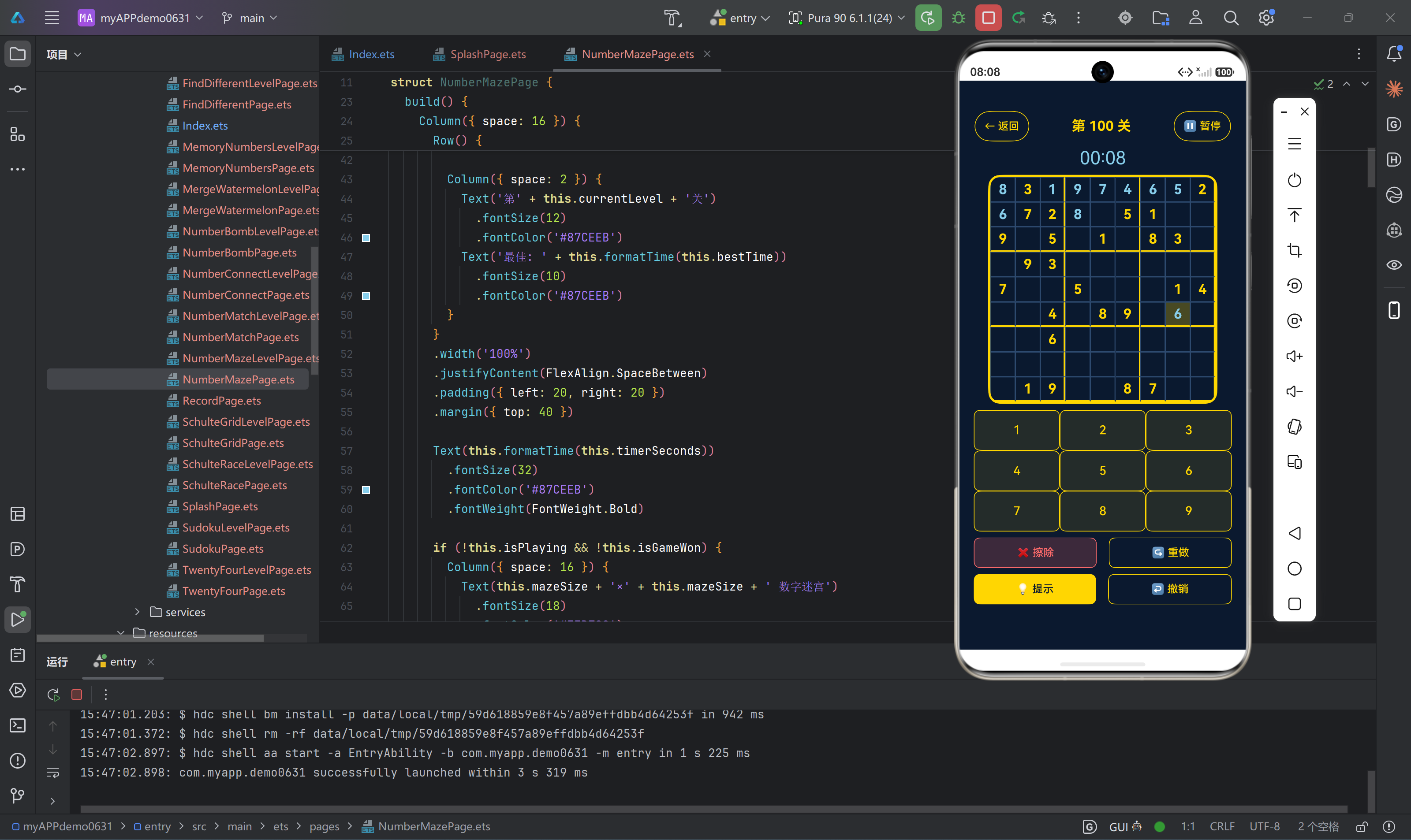
12.1 数独游戏页面布局
数独游戏页面是本项目中布局最复杂的页面之一:
build() {
  Column({ space: 8 }) {
    // 顶部导航栏
    Row() {
      Button('← 返回')
        .fontSize(14)
        .fontColor('#FFD700')
        .backgroundColor('transparent')
        .borderColor('#FFD700')
        .borderWidth(1)
        .padding({ left: 12, right: 12 })
        .onClick(() => {
          this.stopTimer();
          router.back();
        })

      Text('第 ' + this.currentLevel + ' 关')
        .fontSize(18)
        .fontWeight(FontWeight.Bold)
        .fontColor('#FFD700')

      Button('⏸ 暂停')
        .fontSize(14)
        .fontColor('#FFD700')
        .backgroundColor('transparent')
        .borderColor('#FFD700')
        .borderWidth(1)
        .padding({ left: 12, right: 12 })
        .onClick(() => this.togglePause())
    }
    .width('100%')
    .justifyContent(FlexAlign.SpaceBetween)
    .padding({ left: 20, right: 20 })
    .margin({ top: 40 })

    // 计时器
    Text(this.formatTime(this.timerSeconds))
      .fontSize(24)
      .fontColor('#87CEEB')

    // 数独网格
    Column() {
      Grid() {
        ForEach(this.cellValues, (value: number, index: number) => {
          GridItem() {
            Column() {
              if (value !== 0) {
                Text(value.toString())
                  .fontSize(this.boardSize === 4 ? 28 : (this.boardSize === 6 ? 22 : 18))
                  .fontWeight(FontWeight.Bold)
                  .fontColor(this.cellIsError[index] ? '#FF6B6B' : (this.cellIsOriginal[index] ? '#FFD700' : '#87CEEB'))
              }
            }
            .width('100%')
            .height('100%')
            .backgroundColor(this.cellIsSelected[index] ? 'rgba(255, 215, 0, 0.25)' : 'rgba(10, 25, 47, 0.9)')
            .borderWidth(this.getBorderWidth(index))
            .borderColor(this.getBorderColor(index))
            .justifyContent(FlexAlign.Center)
            .alignItems(HorizontalAlign.Center)
            .onClick(() => this.selectCell(index))
          }
        })
      }
      .width('80%')
      .aspectRatio(1)
      .backgroundColor('#0A192F')
      .borderWidth(3)
      .borderColor('#FFD700')
      .borderRadius(16)
      .columnsTemplate(this.getColumnsTemplate())
      .rowsTemplate(this.getRowsTemplate())
    }

    // 数字键盘和功能按钮
    Column() {
      Grid() {
        ForEach(this.getNumberList(), (num: number) => {
          GridItem() {
            Button(num.toString())
              .fontSize(this.boardSize === 4 ? 24 : (this.boardSize === 6 ? 20 : 16))
              .fontColor('#FFD700')
              .backgroundColor('rgba(255, 215, 0, 0.1)')
              .borderColor('#FFD700')
              .borderWidth(1)
              .borderRadius(8)
              .width('100%')
              .height('100%')
              .onClick(() => this.inputNumber(num))
          }
        })
      }
      .width('90%')
      .height(this.boardSize === 9 ? 160 : 100)
      .columnsTemplate(this.boardSize === 4 ? '1fr 1fr' : '1fr 1fr 1fr')
      .rowsTemplate(this.boardSize === 4 ? '1fr 1fr' : (this.boardSize === 6 ? '1fr 1fr' : '1fr 1fr 1fr'))

      Row({ space: 16 }) {
        Button('❌ 擦除')
          .fontSize(14)
          .fontColor('#FF6B6B')
          .backgroundColor('rgba(255, 107, 107, 0.2)')
          .borderColor('#FF6B6B')
          .borderWidth(1)
          .borderRadius(8)
          .flexGrow(1)
          .height(40)
          .onClick(() => this.clearCell())

        Button('↪ 重做')
          .fontSize(14)
          .fontColor('#FFD700')
          .backgroundColor('transparent')
          .borderColor('#FFD700')
          .borderWidth(1)
          .borderRadius(8)
          .flexGrow(1)
          .height(40)
          .onClick(() => this.redo())
      }
      .width('90%')
      .padding({ top: 8 })

      Row({ space: 16 }) {
        Button('💡 提示')
          .fontSize(14)
          .fontColor('#0A192F')
          .backgroundColor('#FFD700')
          .borderRadius(8)
          .flexGrow(1)
          .height(40)
          .onClick(() => this.showHint())

        Button('↩ 撤销')
          .fontSize(14)
          .fontColor('#FFD700')
          .backgroundColor('transparent')
          .borderColor('#FFD700')
          .borderWidth(1)
          .borderRadius(8)
          .flexGrow(1)
          .height(40)
          .onClick(() => this.undo())
      }
      .width('90%')
      .padding({ top: 8 })
    }
  }
  .width('100%')
  .height('100%')
  .backgroundColor('#0A192F')
  .padding({ bottom: 80 })
}
布局结构分析:
- 顶部导航栏:返回按钮、关卡信息、暂停按钮
- 计时器:大号天蓝色字体显示
- 数独网格:使用Grid组件,动态边框,响应式字体大小
- 数字键盘:根据网格尺寸调整布局
- 功能按钮:两行按钮组,分别为擦除/重做和提示/撤销
12.2 游戏列表页面布局
游戏列表页面展示11个游戏的入口:
build() {
  Column() {
    Column({ space: 8 }) {
      Text('九宫数独')
        .fontSize(36)
        .fontWeight(FontWeight.Bold)
        .fontColor('#FFD700')
      Text('10款数字能力训练 + 九宫数独终极挑战')
        .fontSize(16)
        .fontColor('#87CEEB')
    }
    .padding({ top: 80, bottom: 20 })

    Scroll() {
      Column({ space: 16 }) {
        ForEach(this.categories, (category: GameCategory) => {
          Button() {
            Row({ space: 16 }) {
              Column() {
                Text(category.icon)
                  .fontSize(32)
              }
              .width(60)
              .height(60)
              .backgroundColor('rgba(255, 215, 0, 0.1)')
              .borderColor(category.color)
              .borderWidth(1)
              .borderRadius(12)
              .justifyContent(FlexAlign.Center)
              .alignItems(HorizontalAlign.Center)

              Column({ space: 4 }) {
                Row({ space: 8 }) {
                  Text(category.name)
                    .fontSize(18)
                    .fontWeight(FontWeight.Medium)
                    .fontColor('#FFFFFF')
                  Text(this.getDifficultyLabel(category.difficulty))
                    .fontSize(10)
                    .fontColor(this.getDifficultyColor(category.difficulty))
                    .backgroundColor('rgba(255, 255, 255, 0.1)')
                    .borderRadius(10)
                    .padding({ left: 6, right: 6 })
                }
                Text(category.description)
                  .fontSize(12)
                  .fontColor('#87CEEB')
                Text(category.abilities)
                  .fontSize(10)
                  .fontColor('#A0A0A0')
                  .maxLines(1)
              }
              .flexGrow(1)
            }
            .width('100%')
          }
          .width('90%')
          .height(90)
          .padding({ left: 8, right: 8 })
          .backgroundColor('rgba(255, 255, 255, 0.05)')
          .borderColor('rgba(255, 215, 0, 0.3)')
          .borderWidth(1)
          .borderRadius(16)
          .onClick(() => {
            this.showGameDialog(category);
          })
        })
      }
      .padding({ top: 16, bottom: 280 })
    }
    .width('100%')
    .flexGrow(1)
    .backgroundColor('#0A192F')
  }
  .width('100%')
  .height('100%')
  .backgroundColor('#0A192F')
  .padding({ bottom: 60 })
}
布局结构分析:
- 标题区域:大号金色标题 + 天蓝色副标题
- 滚动列表:可滚动的游戏卡片列表
- 游戏卡片:图标 + 名称/难度标签 + 描述 + 能力标签
- 卡片样式:半透明背景、金色边框、圆角设计
十三、常见问题与解决方案
13.1 Grid组件不显示
问题:Grid组件设置了columnsTemplate但内容不显示
解决方案:
// 错误:没有设置高度
Grid() {
  ForEach(data, (item) => {
    GridItem() { /* ... */ }
  })
}
.columnsTemplate('1fr 1fr')

// 正确:设置固定高度或aspectRatio
Grid() {
  ForEach(data, (item) => {
    GridItem() { /* ... */ }
  })
}
.width('100%')
.height(300)  // 设置固定高度
.columnsTemplate('1fr 1fr')

// 或者使用aspectRatio
Grid() { /* ... */ }
.width('100%')
.aspectRatio(1)  // 保持正方形
13.2 数组更新不触发UI刷新
问题:修改数组元素后UI没有更新
解决方案:
// 错误:直接修改数组元素
this.grid[index] = value;

// 正确:创建新数组引用
this.grid[index] = value;
this.grid = this.grid.slice();

// 或者使用push后重新赋值
this.items.push(newItem);
this.items = this.items.slice();
13.3 页面内容溢出
问题:页面内容超出屏幕边界
解决方案:
// 错误:没有使用Scroll包裹内容
Column() {
  // 大量内容
}
.height('100%')

// 正确:使用Scroll包裹可滚动内容
Column() {
  Scroll() {
    Column() {
      // 大量内容
    }
  }
  .flexGrow(1)
}
.height('100%')
13.4 按钮点击不响应
问题:按钮点击没有触发事件
解决方案:
// 错误:Button嵌套在不可点击的组件中
Column() {
  Button('点击')
    .onClick(() => { /* ... */ })
}
// Column没有设置onClick,但Button应该可以点击

// 检查点:
// 1. Button是否被其他组件覆盖
// 2. 是否有条件渲染导致Button不可见
// 3. onClick函数是否正确绑定
13.5 字体大小不适应不同屏幕
问题:字体在小屏幕上太大,大屏幕上太小
解决方案:
// 使用sp单位(可缩放像素)
Text('文字')
  .fontSize(18)  // 默认使用sp单位

// 根据屏幕尺寸动态调整
Text('文字')
  .fontSize(this.screenWidth < 360 ? 14 : 18)

// 使用百分比
Text('文字')
  .fontSize('5%')  // 相对于父容器
十四、总结
UI布局与样式设计是HarmonyOS应用开发的核心环节,本项目通过以下实践打造了优秀的用户体验:
- 统一主题配色:深蓝色背景配金色主题,营造专业、高端的视觉感受
- 响应式布局:根据网格尺寸动态调整字体大小、键盘高度和列数
- 组件复用:提取通用组件,避免重复代码,提高开发效率
- 状态驱动UI:使用@State装饰器实现响应式更新,确保UI与数据同步
- 性能优化:合理使用flexGrow、避免过度渲染、优化数组更新
- 无障碍设计:确保文字对比度、按钮尺寸和焦点管理符合无障碍标准
通过本项目的实践,可以深入理解ArkUI的布局系统、状态管理机制和样式设计技巧。这些技术要点不仅适用于游戏应用,也可以应用于其他类型的HarmonyOS应用开发中。
在实际开发中,需要注意以下几点:
- 遵循设计规范:保持页面布局的一致性和规范性
- 测试不同设备:确保在不同屏幕尺寸和分辨率下都能正常显示
- 优化性能:避免布局抖动和过度渲染
- 关注用户体验:按钮尺寸、间距、颜色对比度等都直接影响用户体验
希望本文的内容能够帮助开发者更好地掌握HarmonyOS ArkTS的UI布局与样式设计技巧,打造出更加优秀的应用界面。

讨论HarmonyOS开发技术,专注于API与组件、DevEco Studio、测试、元服务和应用上架分发等。
更多推荐
 0
0 0
0- 0


 已为社区贡献419条内容

所有评论(0)