HarmonyOS 购物商城:分类页面重构
前言
上一篇写商品列表页时,页面还很基础——只有排序和商品卡片。这次重构加了不少东西:分类 Chip 横向滚动筛选、网格/列表双视图切换、折扣百分比显示、评分和销量、加购按钮。功能密度上了一个台阶。
与上一版的核心差异
| 维度 | 上一版 | 本版 |
|---|---|---|
| 分类筛选 | 无 | 横向滚动 Chip,7 个分类 |
| 视图模式 | 仅列表 | 列表 + 网格双视图 |
| 排序交互 | 文字按钮 | 带背景色的 SortChip |
| 商品卡片 | 基础信息 | 标签 + 评分 + 折扣 + 加购 |
| 背景 | 纯色 #F8F7FC | 三色渐变 |
| 数据处理 | 简单筛选 | 分类筛选 + 选择排序 |
| 完整效果 | ||
 |
状态管理
@State products: Product[] = []      // 当前显示的商品
@State allProducts: Product[] = []   // 筛选前的全量数据
@State title: string = '全部商品'
@State sortBy: number = 0            // 0=综合 1=价格↑ 2=价格↓ 3=销量
@State viewGrid: boolean = false     // false=列表 true=网格
@State activeCat: string = '全部'    // 当前选中的分类
@State catList: string[] = ['全部','手机数码','电脑办公','家电家居','服饰美妆','食品生鲜','运动户外']
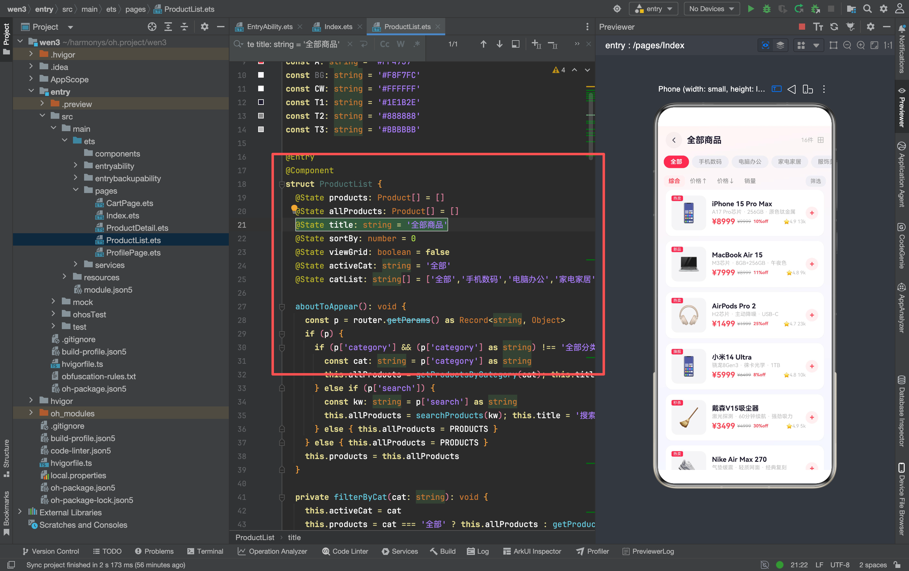
为什么需要两个数组 products 和 allProducts?
分类筛选和排序是两个独立的操作。用户可能先选了"手机数码",再按价格排序。如果只用一个数组,排序后就丢失了分类信息,切换排序方式时需要重新筛选。
allProducts 保存筛选后的数据,products 保存排序后的数据。分类切换时更新 allProducts,排序时只操作 products。
路由参数处理
aboutToAppear(): void {
  const p = router.getParams() as Record<string, Object>
  if (p) {
    if (p['category'] && (p['category'] as string) !== '全部分类') {
      const cat: string = p['category'] as string
      this.allProducts = getProductsByCategory(cat)
      this.title = cat
      this.activeCat = cat
    } else if (p['search']) {
      const kw: string = p['search'] as string
      this.allProducts = searchProducts(kw)
      this.title = '搜索: ' + kw
    } else {
      this.allProducts = PRODUCTS
    }
  } else {
    this.allProducts = PRODUCTS
  }
  this.products = this.allProducts
}
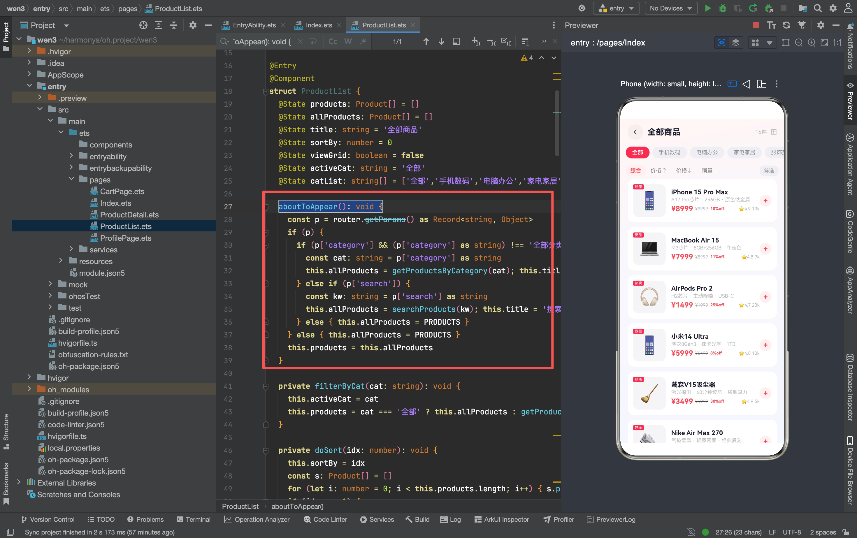
三种入口:
- 分类跳转:
category != '全部分类'→ 按分类筛选,标题设为分类名,activeCat同步 - 搜索跳转:有
search参数 → 关键词搜索,标题设为"搜索: xxx" - 默认进入:无参数 → 显示全部商品
为什么 category === '全部分类' 要特殊处理?
首页底部导航的"分类"按钮传的是 '全部分类'——这个值是占位符,不是真正的分类名。如果不过滤,getProductsByCategory('全部分类') 可能返回空数组。
分类 Chip 横向滚动
Scroll() {
  Row({ space: 6 }) {
    ForEach(this.catList, (cat: string) => {
      Text(cat).fontSize(12)
        .fontWeight(this.activeCat === cat ? FontWeight.Bold : FontWeight.Regular)
        .fontColor(this.activeCat === cat ? '#FFFFFF' : T2)
        .padding({ left: 14, right: 14, top: 6, bottom: 6 })
        .borderRadius(16)
        .backgroundColor(this.activeCat === cat ? A : '#F0EEF4')
        .onClick(() => { this.filterByCat(cat) })
    })
  }.width('100%').padding({ left: 12, right: 12 })
}.width('100%').height(40).scrollBar(BarState.Off)
 .scrollable(ScrollDirection.Horizontal)
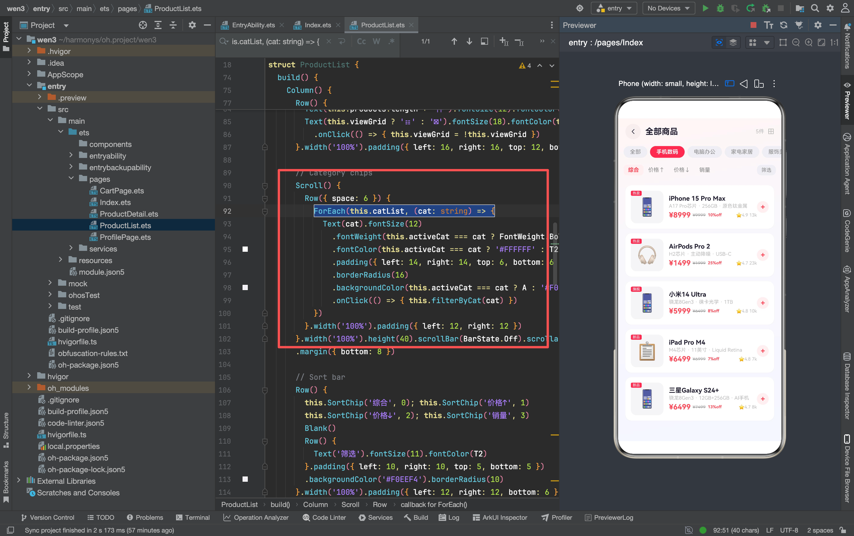
分类列表比可视区域宽——7 个分类名 + 间距会超出屏幕。用 Scroll + ScrollDirection.Horizontal 实现横向滚动。
选中状态的视觉区分:
- 选中:白色文字 + 红色背景(#FF4757)
- 未选中:灰色文字 + 浅灰背景(#F0EEF4)
filterByCat
private filterByCat(cat: string): void {
  this.activeCat = cat
  this.products = cat === '全部' ? this.allProducts : getProductsByCategory(cat)
}
点击分类 Chip 时调用。选"全部"时恢复 allProducts,否则按分类重新筛选。
注意: 这里直接赋值 this.products = ...,ArkTS 检测到引用变化会触发 UI 更新。不需要 [...list] 复制——因为 getProductsByCategory 返回的是新数组。
排序:选择排序实现
private doSort(idx: number): void {
  this.sortBy = idx
  const s: Product[] = []
  for (let i: number = 0; i < this.products.length; i++) {
    s.push(this.products[i])
  }
  if (idx === 1) {  // 价格升序
    for (let i = 0; i < s.length; i++) {
      for (let j = i + 1; j < s.length; j++) {
        if (s[j].price < s[i].price) {
          const t: Product = s[i]; s[i] = s[j]; s[j] = t
        }
      }
    }
  }
  // ... 价格降序、销量降序类似
  this.products = s
}
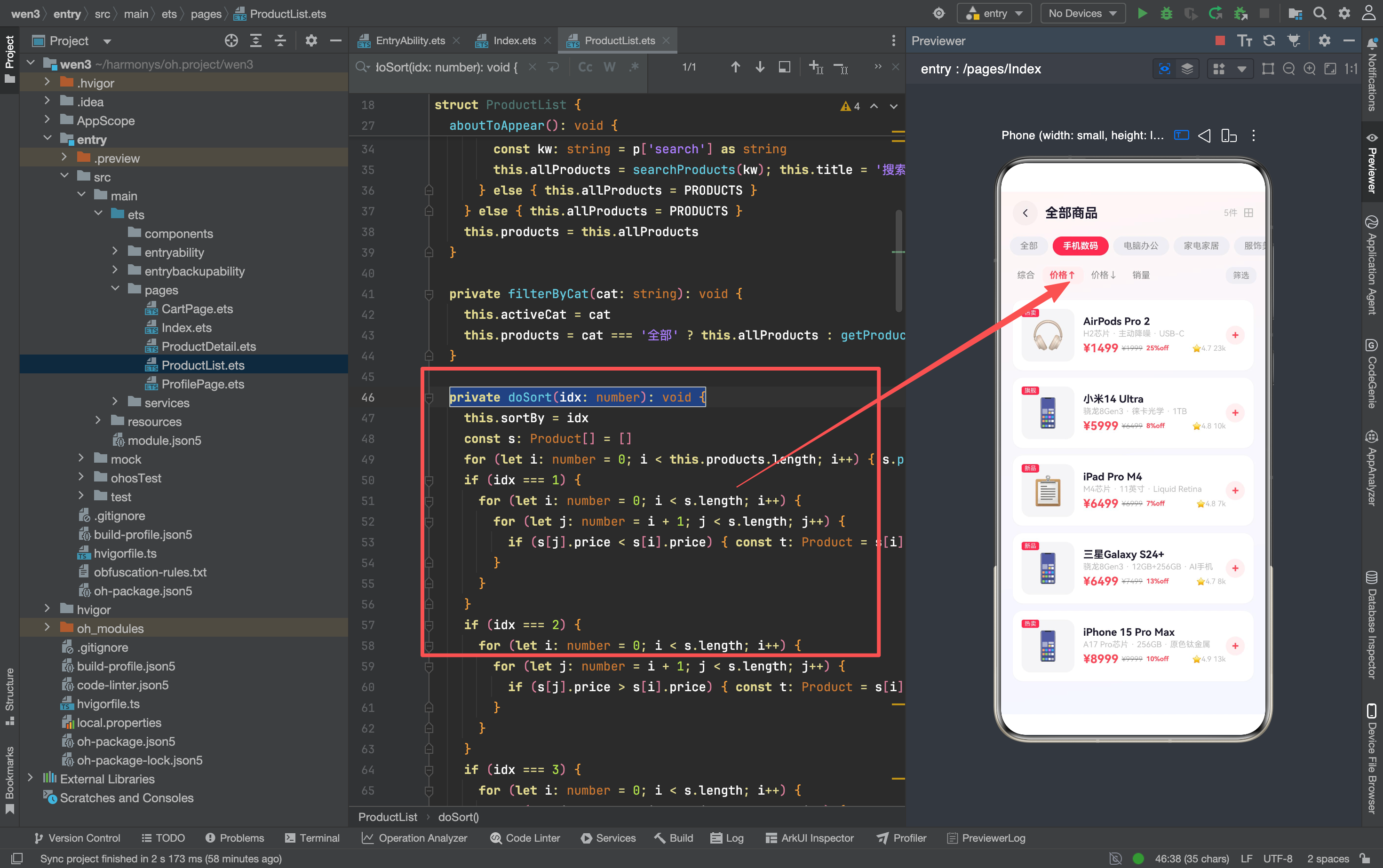
为什么用选择排序而不是 .sort()?
ArkTS 的 Array.sort() 在某些版本有类型兼容问题——回调函数的参数类型推断可能报错。手写选择排序虽然效率低(O(n²)),但类型安全,商品数量少(<100)时性能没有差别。
为什么要先复制到 s?
直接排序 this.products 会修改 @State 数组的内部结构——ArkTS 不会检测到原地修改,UI 不会更新。复制到新数组再排序,最后赋值 this.products = s,ArkTS 检测到引用变化才会触发重渲染。
双视图切换
// Header 中的切换按钮
Text(this.viewGrid ? '☷' : '⊞').fontSize(18).fontColor(this.viewGrid ? A : T3)
  .onClick(() => { this.viewGrid = !this.viewGrid })

// 内容区条件渲染
if (this.viewGrid) {
  // 网格视图
  Scroll() {
    Column() {
      Grid() {
        ForEach(this.products, (p: Product) => {
          GridItem() { this.GridCard(p) }
        })
      }.columnsTemplate('1fr 1fr').columnsGap(8).rowsGap(8)
      Blank().height(20)
    }.width('100%').padding({ left: 16, right: 16 })
  }.width('100%').layoutWeight(1).scrollBar(BarState.Off)
} else {
  // 列表视图
  Scroll() {
    Column({ space: 10 }) {
      ForEach(this.products, (p: Product) => { this.ListCard(p) })
      Blank().height(20)
    }.width('100%').padding({ left: 16, right: 16 })
  }.width('100%').layoutWeight(1).scrollBar(BarState.Off)
}
为什么用 if 而不是同时渲染两个再控制显隐?
网格和列表的布局结构完全不同——Grid 用 columnsTemplate,列表用 Column({ space: 10 })。同时渲染两套 UI 会浪费内存,而且 Grid 和列表的滚动状态需要独立维护。
if 条件渲染只保留当前视图,切换时销毁旧视图、创建新视图。虽然有重建开销,但商品数量少时感知不到。
ListCard:增强版商品卡片
@Builder ListCard(p: Product) {
  Row() {
    // 左侧:图片 + 标签
    Stack({ alignContent: Alignment.TopStart }) {
      Column() {
        Text(p.image).fontSize(38)
      }.width(72).height(72).borderRadius(12).backgroundColor('#F5F5F7')
        .justifyContent(FlexAlign.Center).alignItems(HorizontalAlign.Center)
      if (p.tags.length > 0) {
        Text(p.tags[0]).fontSize(8).fontColor(Color.White)
          .padding({ left: 4, right: 4, top: 1, bottom: 1 })
          .backgroundColor(A).borderRadius(3)
      }
    }

    // 中间:信息
    Column() {
      Text(p.name).fontSize(14).fontWeight(FontWeight.Bold).fontColor(T1)
        .maxLines(1).textOverflow({ overflow: TextOverflow.Ellipsis })
      Text(p.desc).fontSize(11).fontColor(T3).maxLines(1)
        .textOverflow({ overflow: TextOverflow.Ellipsis }).margin({ top: 2 })
      Row() {
        Text('¥' + p.price.toString()).fontSize(16).fontWeight(FontWeight.Bold).fontColor(A)
        if (p.originalPrice > p.price) {
          Text('¥' + p.originalPrice.toString()).fontSize(10).fontColor(T3)
            .decoration({ type: TextDecorationType.LineThrough }).margin({ left: 4 })
        }
        if (p.originalPrice > p.price) {
          Text(' ' + Math.round((1-p.price/p.originalPrice)*100) + '%off').fontSize(9)
            .fontColor(A).fontWeight(FontWeight.Bold)
        }
        Blank()
        Text('⭐' + p.rating.toString()).fontSize(10).fontColor(T3)
        Text(' ' + (p.sales/1000).toFixed(0) + 'k').fontSize(10).fontColor(T3)
      }.width('100%').margin({ top: 4 })
    }.alignItems(HorizontalAlign.Start).margin({ left: 12 }).layoutWeight(1)

    // 右侧:加购按钮
    Row() {
      Text('+').fontSize(16).fontWeight(FontWeight.Bold).fontColor(A)
    }.width(26).height(26).borderRadius(13).backgroundColor('#FFF0F0')
      .justifyContent(FlexAlign.Center).alignItems(VerticalAlign.Center)
      .onClick(() => { addToCart(p) })
  }
}
和上一版的 ListCard 相比,新增了:
- 标签:左上角红色角标(
p.tags[0]) - 折扣百分比:
Math.round((1-p.price/p.originalPrice)*100) + '%off' - 评分:
⭐+ rating - 加购按钮:右侧圆形红色
+按钮
折扣计算
Math.round((1 - p.price / p.originalPrice) * 100)
比如原价 100、现价 75:(1 - 75/100) * 100 = 25,显示"25%off"。
为什么用 Math.round?
不四舍五入的话,可能出现"33.333333333333336%off"这种丑陋的数字。
加购按钮的事件冲突
// 外层 Row
.onClick(() => { router.pushUrl({ url: 'pages/ProductDetail', ... }) })

// 加购按钮
.onClick(() => { addToCart(p) })
外层卡片点击跳转详情页,加购按钮点击加入购物车。两个 onClick 嵌套——ArkTS 的事件冒泡机制会先触发加购,再触发外层跳转。
这意味着点加购按钮会同时加购和跳转详情页。 如果只想加购不跳转,需要在加购按钮的 onClick 里调用 onClick: (event) => event.stopPropagation()(ArkTS 支持的话)。
GridCard:网格视图
@Builder GridCard(p: Product) {
  Column() {
    Stack({ alignContent: Alignment.TopEnd }) {
      Text(p.image).fontSize(36).width('100%').height(80).textAlign(TextAlign.Center)
        .backgroundColor('#F5F5F7').borderRadius(10)
      if (p.tags.length > 0) {
        Text(p.tags[0]).fontSize(8).fontColor(Color.White)
          .padding({ left: 4, right: 4, top: 1, bottom: 1 })
          .backgroundColor(A).borderRadius(3)
          .position({ x: 4, y: 4 })
      }
    }
    Text(p.name).fontSize(12).fontWeight(FontWeight.Medium).fontColor(T1)
      .maxLines(1).textOverflow({ overflow: TextOverflow.Ellipsis }).margin({ top: 6 })
    Row() {
      Text('¥' + p.price.toString()).fontSize(14).fontWeight(FontWeight.Bold).fontColor(A)
      Blank()
      Text((p.sales/1000).toFixed(0) + 'k').fontSize(9).fontColor(T3)
    }.width('100%').margin({ top: 4 })
  }
}
网格卡片比列表卡片精简——只有图片、标签、名称、价格、销量。没有描述、没有评分、没有加购按钮。
为什么网格视图省略这么多信息?
网格视图的每个卡片宽度只有屏幕一半——放不下太多文字。如果硬塞,文字会挤压图片空间,视觉很乱。网格的核心是"快速浏览",用户先看图片和价格,感兴趣再点进详情页。
背景渐变
.linearGradient({ angle: 170, colors: [['#FFF5F5', 0], ['#F8F7FC', 0.4], ['#F5F7FF', 1]] })
从淡红(#FFF5F5)→ 淡紫(#F8F7FC)→ 淡蓝(#F5F7FF),170° 角度。和首页的纯色背景相比,渐变更有层次感,但不抢商品的视觉焦点。
SortChip
@Builder SortChip(label: string, idx: number) {
  Text(label).fontSize(12)
    .fontWeight(this.sortBy === idx ? FontWeight.Bold : FontWeight.Regular)
    .fontColor(this.sortBy === idx ? A : T2)
    .padding({ left: 10, right: 10, top: 5, bottom: 5 })
    .backgroundColor(this.sortBy === idx ? '#FFF0F0' : 'transparent')
    .borderRadius(8)
    .onClick(() => { this.doSort(idx) })
}
排序按钮的选中状态:红色文字 + 淡红背景。未选中:灰色文字 + 透明背景。
和分类 Chip 的视觉风格一致——都是"选中时红色高亮"。保持整个页面的视觉统一。
踩坑记录
1. 分类名和路由参数的对齐
catList 里的分类名(如"手机数码")必须和 ProductData.ts 里 CATEGORIES 的 name 字段完全一致。差一个字都会导致 getProductsByCategory() 返回空数组。
建议从 CATEGORIES 动态生成 catList:
catList: string[] = ['全部', ...CATEGORIES.map(c => c.name)]
2. 排序后分类筛选的交互
用户先按价格排序,再切换分类——此时 filterByCat 会用 getProductsByCategory() 的原始顺序(综合排序),覆盖掉之前的价格排序。
这是预期行为还是 bug?取决于产品需求。如果是 bug,需要在 filterByCat 里记住当前排序方式,筛选后重新排序。
3. 网格视图的滚动性能
Grid 里的 ForEach 一次性渲染所有商品。如果商品数量多(50+),初次渲染可能卡顿。可以用 LazyForEach 按需加载。
4. 加购按钮的样式一致性
列表视图的加购按钮是圆形红色背景 + + 号(26×26px)。网格视图没有加购按钮。两个视图的交互方式不一致——列表可以直接加购,网格必须点进详情页。
写在最后
这次重构的核心是"信息密度"和"操作效率"的平衡。
分类 Chip 让用户一键切换品类,不用每次重新搜索。双视图让用户根据场景选择——列表看详情,网格看图片。折扣百分比让用户不用心算就能知道"便宜了多少"。
加购按钮是列表视图的"快捷操作"——用户不需要进详情页就能加购。网格视图省略了这个按钮,因为网格卡片的空间有限,放不下。
讨论HarmonyOS开发技术,专注于API与组件、DevEco Studio、测试、元服务和应用上架分发等。
更多推荐
 10
10 0
0- 0


 已为社区贡献159条内容

所有评论(0)