HarmonyOS 购物商城:购物车页面实现
前言
购物车是电商 App 的"中转站"——用户把想买的东西先放在这里,最后统一结算。它的核心功能就三件事:选哪些、买几个、多少钱。
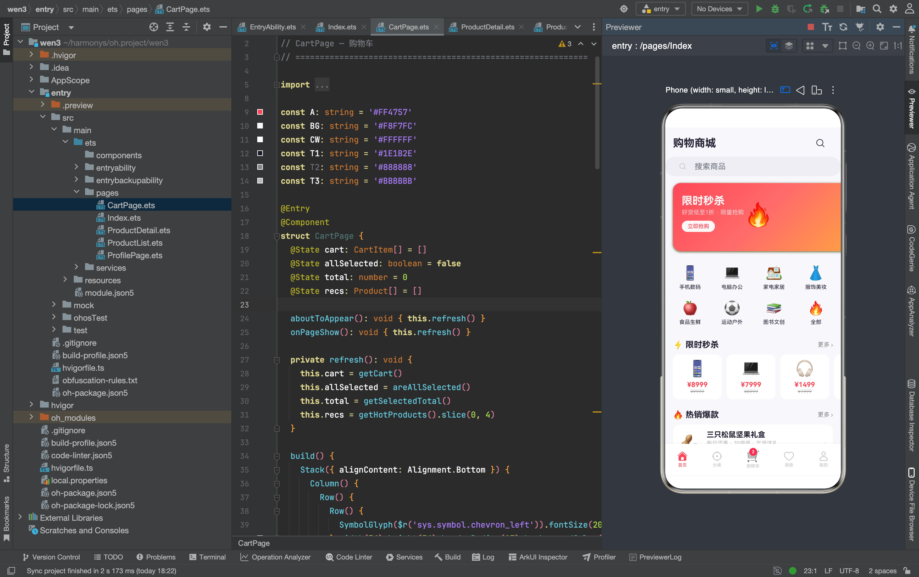
这篇文章拆解购物车页面的实现:从空状态推荐到购物车列表,从自定义复选框到底部结算栏。
完整效果
数据来源:CartService
import { CartItem, getCart, getSelectedTotal, getSelectedCount,
  removeFromCart, updateQuantity, toggleSelected, toggleAllSelected,
  areAllSelected } from '../services/CartService'
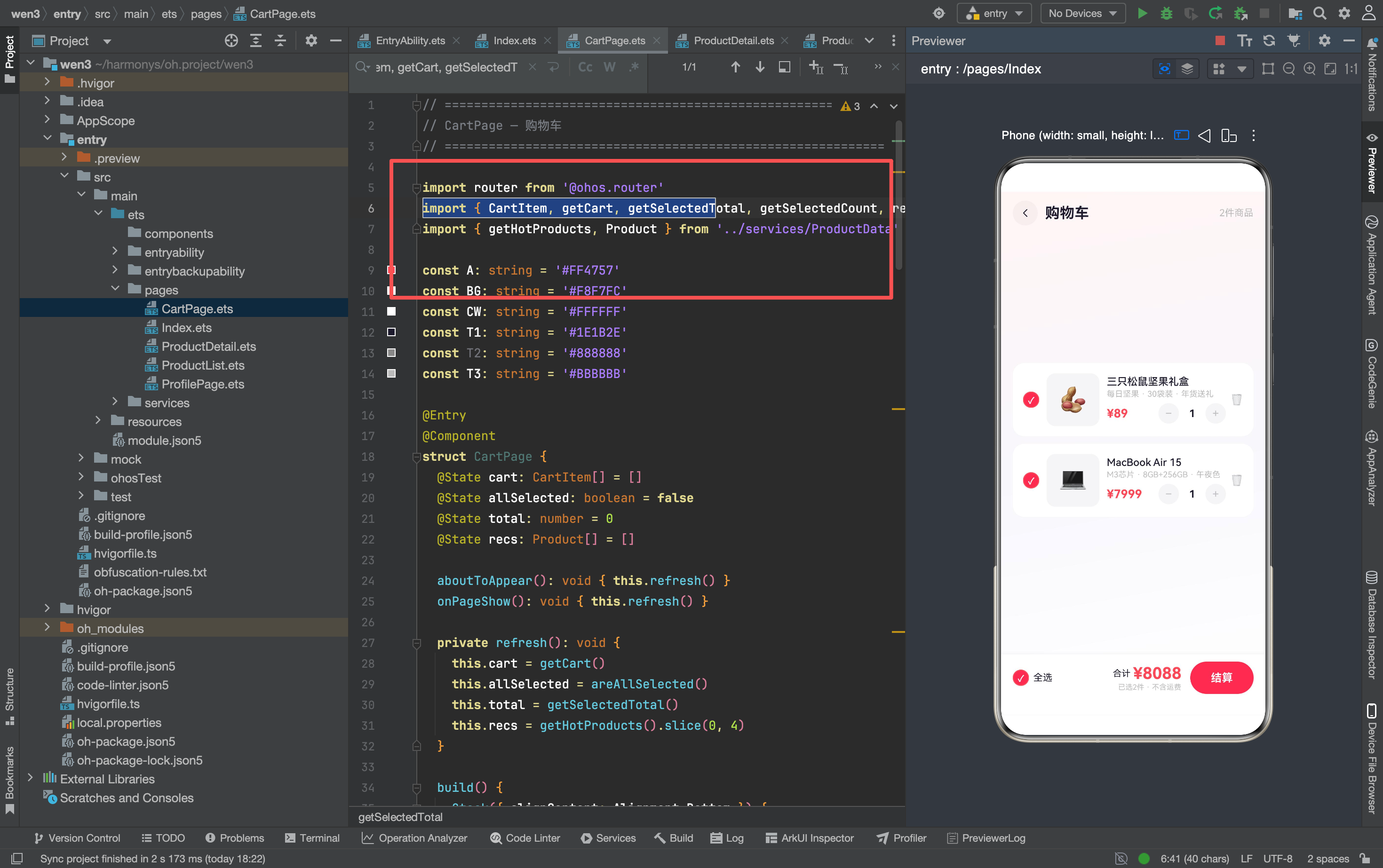
CartService 提供了完整的购物车操作:
getCart():获取购物车列表removeFromCart(id):删除商品updateQuantity(id, qty):修改数量toggleSelected(id):切换选中状态toggleAllSelected():全选/全不选areAllSelected():是否全选getSelectedTotal():选中商品总价getSelectedCount():选中商品数量
CartItem 数据结构
interface CartItem {
  product: Product
  quantity: number
  selected: boolean
}
每个购物车条目包含商品信息、数量、是否选中。
刷新机制
@State cart: CartItem[] = []
@State allSelected: boolean = false
@State total: number = 0
@State recs: Product[] = []

aboutToAppear(): void { this.refresh() }
onPageShow(): void { this.refresh() }

private refresh(): void {
  this.cart = getCart()
  this.allSelected = areAllSelected()
  this.total = getSelectedTotal()
  this.recs = getHotProducts().slice(0, 4)
}
为什么需要单独的 refresh() 方法?
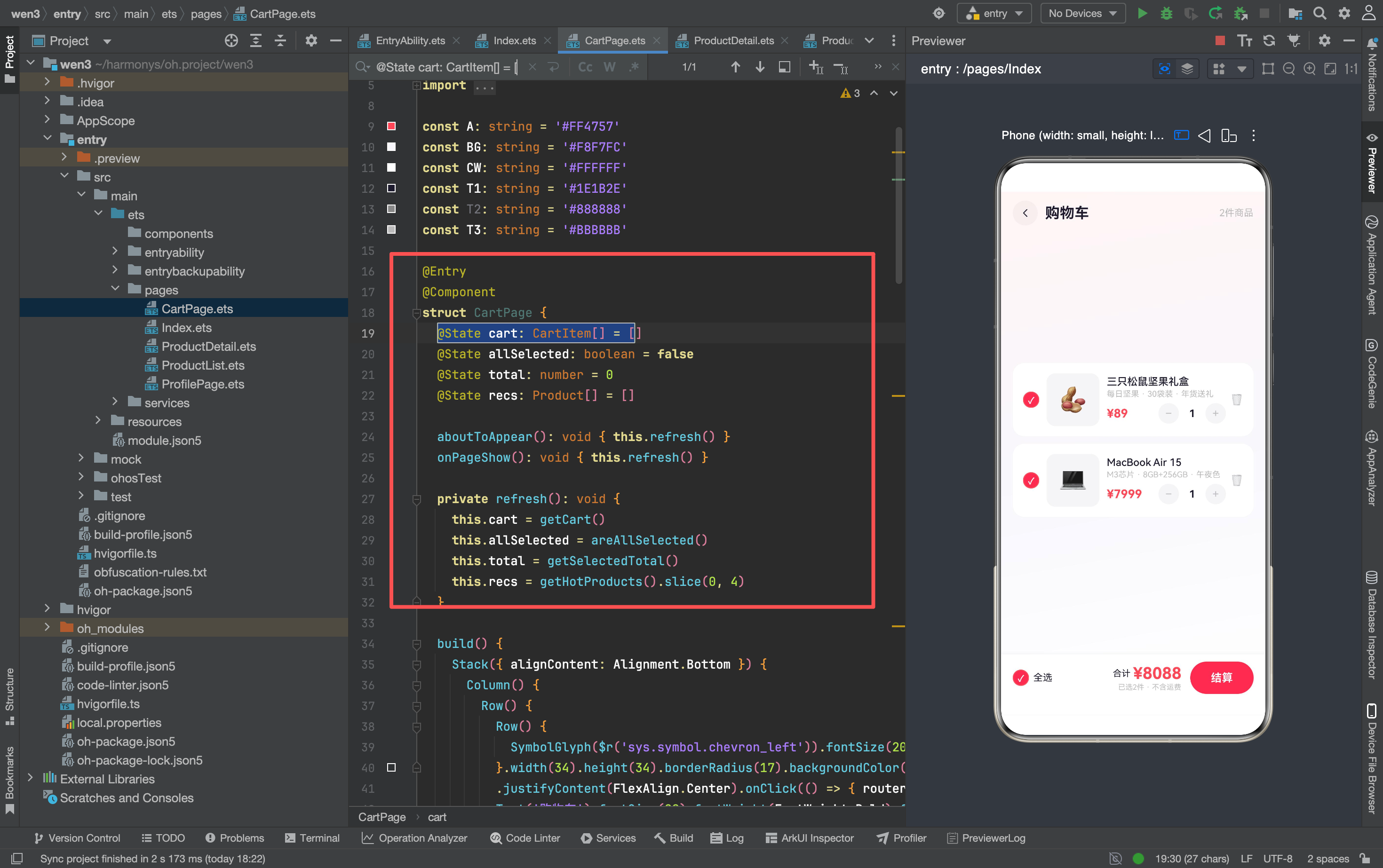
购物车有多个联动状态:列表、全选状态、总价、推荐商品。每次操作(删除、改数量、选中)都需要同时更新这四个状态。如果每个操作里分别更新,代码会重复四次。
refresh() 把所有状态刷新集中到一个方法里——每次操作后调一次就行。
aboutToAppear 和 onPageShow 都调用 refresh():
aboutToAppear:App 首次加载时刷新onPageShow:从其他页面返回时刷新(比如从详情页加购后回来)
空状态
if (this.cart.length === 0) {
  Column() {
    Column() {
      Text('🛒').fontSize(72).opacity(0.15).margin({ bottom: 16 })
      Text('购物车还是空的').fontSize(17).fontWeight(FontWeight.Medium).fontColor(T1)
      Text('去首页发现好货吧').fontSize(13).fontColor(T3).margin({ top: 6 })
      Row() {
        Text('去逛逛').fontSize(14).fontWeight(FontWeight.Bold).fontColor(Color.White)
      }.padding({ left: 30, right: 30 }).height(42).borderRadius(21)
        .backgroundColor(A).margin({ top: 20 }).onClick(() => { router.back() })
    }.width('100%').layoutWeight(1)
      .justifyContent(FlexAlign.Center).alignItems(HorizontalAlign.Center)

    // 推荐商品
    if (this.recs.length > 0) {
      Column() {
        Text('—— 为你推荐 ——').fontSize(12).fontColor(T3)
          .width('100%').textAlign(TextAlign.Center).margin({ bottom: 12 })
        Row({ space: 8 }) {
          ForEach(this.recs, (r: Product) => {
            Column() {
              Text(r.image).fontSize(26).width(72).height(72).borderRadius(14)
                .backgroundColor('#F5F5F7').textAlign(TextAlign.Center)
              Text('¥' + r.price.toString()).fontSize(11).fontWeight(FontWeight.Bold)
                .fontColor(A).margin({ top: 5 })
            }.width(72).onClick(() => {
              router.pushUrl({ url: 'pages/ProductDetail',
                params: { 'id': r.id } as Record<string,Object> })
            })
          })
        }.width('100%').justifyContent(FlexAlign.Center)
      }.width('100%').padding(18).backgroundColor(CW).borderRadius(16)
        .margin({ left: 16, right: 16, bottom: 20 })
    }
  }
}
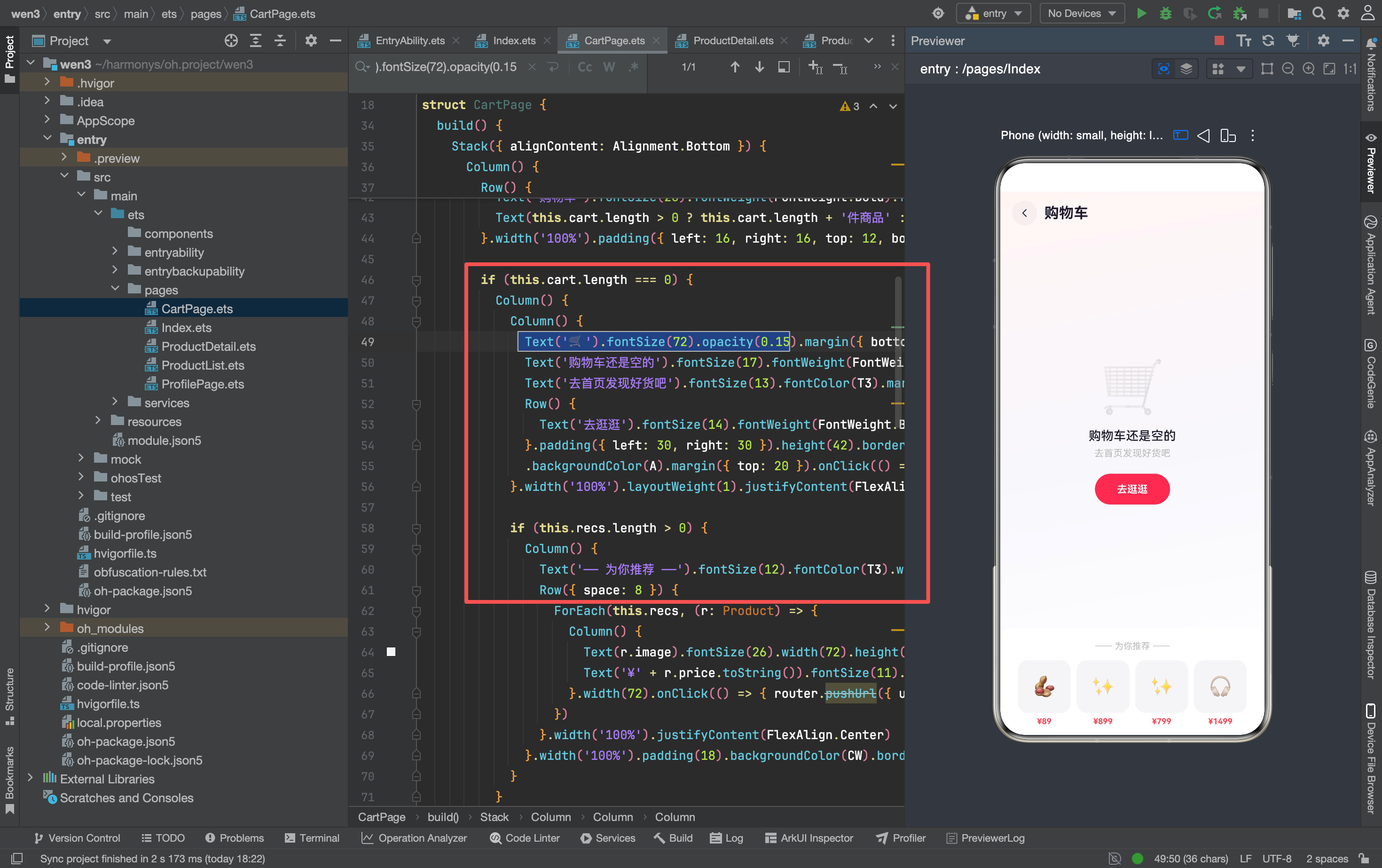
空状态不是简单的"空"——它做了两件事:
- 引导用户:显示"去逛逛"按钮,引导用户回到首页
- 推荐商品:底部显示 4 个热销商品,用户可能直接点击购买
推荐商品的点击:
.onClick(() => {
  router.pushUrl({ url: 'pages/ProductDetail',
    params: { 'id': r.id } as Record<string,Object> })
})
点击推荐商品跳转详情页——用户从"空车"变成"浏览商品",有可能加购。
购物车列表
ForEach(this.cart, (item: CartItem) => {
  Row() {
    // 复选框
    // 商品图片
    // 商品信息 + 价格 + 数量选择器
    // 删除按钮
  }.width('100%').padding(14).backgroundColor(CW).borderRadius(16)
    .shadow({ radius: 3, color: 'rgba(0,0,0,0.02)', offsetY: 1 })
    .onClick(() => { router.pushUrl({ url: 'pages/ProductDetail',
      params: { 'id': item.product.id } as Record<string,Object> }) })
})
每个购物车条目是一个 Row,从左到右:复选框 → 图片 → 信息+价格+数量 → 删除按钮。
整个条目可点击跳转详情页: 用户点条目任意位置都能进详情页,不需要专门找"查看详情"按钮。
自定义复选框
Stack({ alignContent: Alignment.Center }) {
  Row() {}.width(22).height(22).borderRadius(11)
    .backgroundColor(item.selected ? A : 'transparent')
    .border({ width: 1.5, color: item.selected ? A : '#D0CED8' })
  if (item.selected) {
    Text('✓').fontSize(12).fontWeight(FontWeight.Bold).fontColor(Color.White)
  }
}.margin({ right: 10 }).onClick(() => { toggleSelected(item.product.id); this.refresh() })
ArkTS 没有内置的 Checkbox 组件(或者样式不好定制),所以用 Stack 手动实现:
- 底层:22×22 圆形,选中时红色背景,未选中时透明 + 灰色边框
- 顶层:选中时显示白色 ✓
为什么用 Stack 而不是 Column?
✓ 需要叠在圆形背景上方居中——Stack 天然支持这种叠加。如果用 Column,✓ 会排在圆形下面。
数量选择器
Row() {
  Text('−').fontSize(16).fontColor('#C0BFC6').width(28).height(28)
    .textAlign(TextAlign.Center).backgroundColor('#F5F5F7').borderRadius(14)
    .onClick(() => { updateQuantity(item.product.id, item.quantity - 1); this.refresh() })
  Text(item.quantity.toString()).fontSize(14).fontWeight(FontWeight.Bold)
    .fontColor(T1).width(36).textAlign(TextAlign.Center)
  Text('+').fontSize(16).fontColor('#C0BFC6').width(28).height(28)
    .textAlign(TextAlign.Center).backgroundColor('#F5F5F7').borderRadius(14)
    .onClick(() => { updateQuantity(item.product.id, item.quantity + 1); this.refresh() })
}
和商品详情页的数量选择器一样的结构。区别是这里调用 updateQuantity(id, qty) 更新 CartService 数据,然后 refresh() 刷新页面。
删除按钮
Text('🗑').fontSize(14).opacity(0.4).margin({ left: 6 })
  .onClick(() => { removeFromCart(item.product.id); this.refresh() })
删除按钮是半透明的 🗑 emoji——视觉上不抢眼,但存在感足够。点击后调用 removeFromCart 再 refresh()。
底部结算栏
if (this.cart.length > 0) {
  Row() {
    // 全选
    Row() {
      Stack({ alignContent: Alignment.Center }) {
        Row() {}.width(22).height(22).borderRadius(11)
          .backgroundColor(this.allSelected ? A : 'transparent')
          .border({ width: 1.5, color: this.allSelected ? A : '#D0CED8' })
        if (this.allSelected) { Text('✓').fontSize(12).fontWeight(FontWeight.Bold).fontColor(Color.White) }
      }.margin({ right: 6 })
      Text('全选').fontSize(13).fontColor(T1)
    }.onClick(() => { toggleAllSelected(); this.refresh() })

    Blank()

    // 合计
    Column() {
      Row() {
        Text('合计 ').fontSize(12).fontColor(T1)
        Text('¥' + this.total.toString()).fontSize(22).fontWeight(FontWeight.Bold).fontColor(A)
      }
      Text('已选' + getSelectedCount() + '件 · 不含运费').fontSize(10).fontColor(T3)
    }.alignItems(HorizontalAlign.End).margin({ right: 12 })

    // 结算按钮
    Row() {
      Text('结算').fontSize(15).fontWeight(FontWeight.Bold).fontColor(Color.White)
    }.padding({ left: 28, right: 28 }).height(44).borderRadius(22)
      .backgroundColor(this.total > 0 ? A : '#C8C0DC')
  }.width('100%').padding({ left: 16, right: 16, top: 10, bottom: 28 })
    .backgroundColor(CW).shadow({ radius: 10, color: 'rgba(0,0,0,0.05)', offsetY: -2 })
}
底部结算栏从左到右:全选 → 合计金额 → 结算按钮
全选复选框
全选的复选框和购物车列表里的复选框样式完全一样——同样的 22×22 圆形 + ✓。保持视觉一致性。
合计金额
Text('¥' + this.total.toString()).fontSize(22).fontWeight(FontWeight.Bold).fontColor(A)
合计金额是整个页面最大的数字(22px 红色粗体)——用户最关心的信息。
结算按钮的状态
.backgroundColor(this.total > 0 ? A : '#C8C0DC')
当 total === 0(没有选中商品)时,结算按钮变成灰色(#C8C0DC)——视觉上告诉用户"现在不能结算"。
页面背景
.linearGradient({ angle: 170, colors: [['#FFF5F5', 0], [BG, 0.5], ['#FFFFFF', 1]] })
和商品列表页一样的三色渐变——保持整个 App 的视觉统一。
踩坑记录
1. refresh 的调用时机
每个操作(toggleSelected、updateQuantity、removeFromCart、toggleAllSelected)之后都要调 this.refresh()。漏调一次,页面状态就会和数据不同步。
这是一个常见的状态管理问题——如果用响应式框架(比如 Vue),数据变化会自动触发 UI 更新。ArkTS 的 @State 需要手动刷新。
2. 全选的联动逻辑
toggleAllSelected() // CartService 里实现
全选/全不选的逻辑在 CartService 里:遍历所有 cart[i].selected,设为统一值。但 refresh() 需要重新调用 areAllSelected() 来更新 allSelected 状态。
如果 toggleAllSelected 内部没有修改 selected 字段,refresh() 后 allSelected 不会变。确保 CartService 的实现正确。
3. 删除后的空状态切换
删除最后一个商品后,this.cart.length === 0,页面从列表视图切换到空状态视图。这个切换是自动的——if (this.cart.length === 0) 条件渲染。
但有一个细节:空状态的推荐商品是 getHotProducts().slice(0, 4)——每次 refresh() 都会重新获取。如果热销商品列表不变,推荐内容也不会变。
4. 结算按钮的 onClick
结算按钮目前没有 onClick 处理——点了没有反应。实际项目中需要跳转到订单确认页面。
5. 数量为 0 的边界
.onClick(() => { updateQuantity(item.product.id, item.quantity - 1); this.refresh() })
减号没有判断 quantity > 1——和商品详情页不同。如果 quantity 减到 0,CartService 应该自动删除该商品(否则会出现 0 件商品的购物车条目)。
写在最后
购物车页面的核心挑战是"状态同步"——选中、数量、总价、全选,四个状态互相联动。改一个,其他三个都要跟着变。
refresh() 方法是解法——每次操作后统一刷新所有状态。简单粗暴,但有效。商品数量少时(<50)性能没问题。
空状态的推荐商品是一个"钩子"——用户本来想清空购物车走人,看到推荐商品可能又想买了。电商的每个页面都在想方设法留住用户。
讨论HarmonyOS开发技术,专注于API与组件、DevEco Studio、测试、元服务和应用上架分发等。
更多推荐



 1
1 0
0- 0


 已为社区贡献159条内容

所有评论(0)