48 情绪折线图:EmotionTrendChart 完整实现
48 情绪折线图:EmotionTrendChart 完整实现
前言
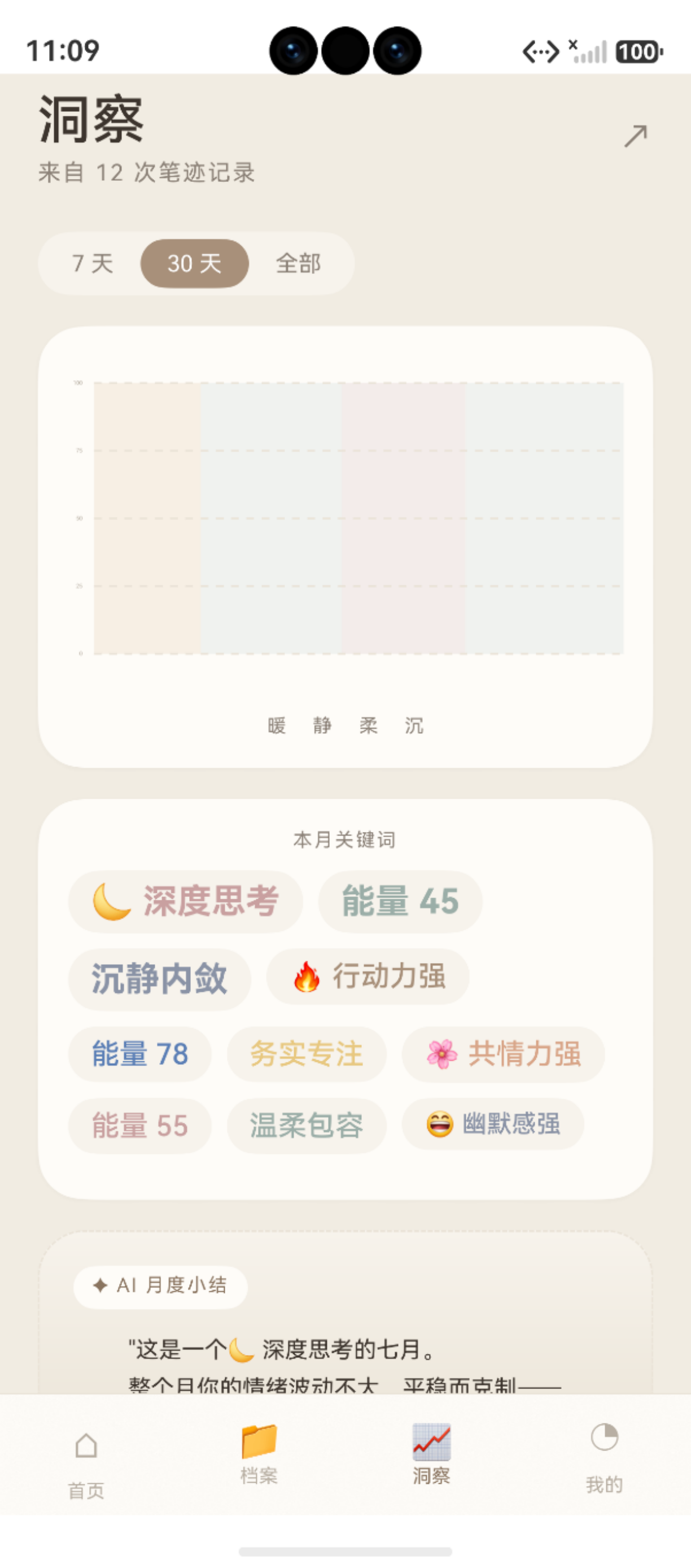
图:48 情绪折线图:EmotionTrendChart 完整实现 运行效果截图(HarmonyOS NEXT)
除了雷达图,情绪趋势折线图是 App 中另一个核心 Canvas 可视化组件。它在 TrendPage(趋势页)和 个人中心 中展示用户近 30 天的情绪能量变化。
本文以 [EmotionTrendChart.ets](file:///Users/fiona/Downloads/bijixinli/harmony-app/entry/src/main/ets/common/components/EmotionTrendChart.ets) 为例,完整解析 Canvas 折线图的实现——从坐标映射、渐变填充到逐段绘制动画。
鸿蒙官方·Canvas 渐变文档:developer.huawei.com
项目源码:[EmotionTrendChart.ets](file:///Users/fiona/Downloads/bijixinli/harmony-app/entry/src/main/ets/common/components/EmotionTrendChart.ets)
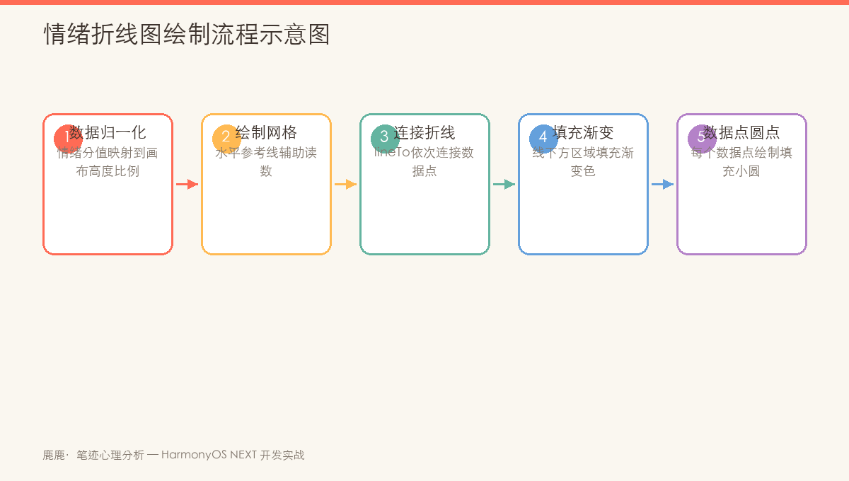
图:EmotionTrendChart 绘制流程——坐标映射 → 渐变填充区域 → 折线描边 → 数据点标记
一、图表整体结构
1.1 最终效果
   100 ──────────────────────────────
    75 ──────────╮──────────────────
    50 ─────╮────╯──────╮───────────
    25 ─────╯───────────╯───────────
     0 ──────────────────────────────
       6/01     6/15      6/30

   ┌──────┐ ┌──────┐ ┌──────┐ ┌────┐
   │ 暖色  │ │ 静色  │ │ 柔色  │ │ 静 │  ← 四色情绪区
   └──────┘ └──────┘ └──────┘ └────┘
1.2 数据接口
export interface TrendPoint {
  label: string   // 横轴标签,如 "6/01"
  value: number   // 0-100 的情绪能量值
}

// 实际数据示例
this.trendData = [
  { label: '6/01', value: 62 },
  { label: '6/03', value: 55 },
  { label: '6/05', value: 68 },
  // ...
  { label: '6/30', value: 72 }
]
二、布局与坐标系
2.1 内边距与绘图区
const W = this.chartWidth     // 画布宽度 320
const H = this.chartHeight    // 画布高度 180

// 四边留白
const padL = 28   // 左:纵轴刻度
const padR = 14   // 右:留白
const padT = 14   // 上:留白
const padB = 24   // 下:横轴标签

// 内部绘图区(实际绘图范围)
const innerW = W - padL - padR  // 320-28-14 = 278
const innerH = H - padT - padB  // 180-14-24 = 142
2.2 坐标映射
// 数据点坐标转换
const stepX = innerW / Math.max(1, this.data.length - 1)
// stepX:相邻数据点的水平间距

const allPoints: ChartPoint[] = this.data.map((p, i): ChartPoint => ({
  x: padL + stepX * i,              // X = 左边界 + 间距 × 索引
  y: padT + innerH * (1 - p.value / 100)  // Y = 顶部 + 高度 × (1-数值比例)
}))
Y 轴公式解释:
// 因为 Canvas Y 轴向下为正,所以:
// value=100 → 图表顶部(padT)
// value=0   → 图表底部(padT + innerH)
// 即:y = padT + innerH * (1 - value/100)
三、情绪色块背景
3.1 四色分区
图表背景被分为四个色块区域,对应情绪的四种状态:
private static readonly ZONES: Zone[] = [
  { w: 0.200, fill: '#F0E1D0' },   // 暖色
  { w: 0.267, fill: '#E1E8E5' },   // 静色
  { w: 0.233, fill: '#E8DCDC' },   // 柔色
  { w: 0.300, fill: '#E1E8E5' }    // 静色
]
3.2 绘制代码
// 绘制四色背景块
let zx = padL
this.zones.forEach(z => {
  const zw = Math.round(z.w * innerW)    // 色块宽度 = 绘图区宽度 × 比例
  ctx.fillStyle = z.fill
  ctx.globalAlpha = 0.5                  // 50% 透明度
  ctx.fillRect(zx, padT, zw, innerH)     // 填充矩形
  zx += zw                                // 移动到下一个色块起始位置
})
ctx.globalAlpha = 1                       // 恢复透明度
| 色块 | 比例 | 颜色 | 情绪含义 |
|---|---|---|---|
| 暖色 | 20.0% | #F0E1D0 | 积极/温暖 |
| 静色 | 26.7% | #E1E8E5 | 平静/中性 |
| 柔色 | 23.3% | #E8DCDC | 柔和/犹豫 |
| 静色 | 30.0% | #E1E8E5 | 平静/中性 |
四、参考线与纵轴刻度
4.1 虚线参考线
4 条水平虚线将图表 5 等分(0, 25, 50, 75, 100):
// 设置虚线样式
ctx.strokeStyle = AppColors.LINE
ctx.lineWidth = 1
ctx.setLineDash([4, 4])     // 实线 4px,间隔 4px

for (let i = 0; i <= 4; i++) {
  const y = padT + (innerH * i) / 4     // 等分 Y 坐标
  ctx.beginPath()
  ctx.moveTo(padL, y)                    // 从左边界开始
  ctx.lineTo(padL + innerW, y)           // 到右边界结束
  ctx.stroke()
}

ctx.setLineDash([])                      // 恢复实线
4.2 纵轴刻度标签
ctx.fillStyle = AppColors.TEXT_3
ctx.font = '10px HarmonyOS Sans SC'
ctx.textAlign = 'right'
ctx.textBaseline = 'middle'

const ticks = [100, 75, 50, 25, 0]       // 5 个刻度值
ticks.forEach((t, i) => {
  const y = padT + (innerH * i) / 4
  ctx.fillText(`${t}`, padL - 6, y)      // 刻度在参考线左侧 6px
})
五、折线主体绘制
5.1 从左到右逐段绘制
通过 drawProgress 控制可见数据点的数量,实现从左到右的"逐段绘制"动画:
// 计算当前可见点数
const visibleCount = Math.floor(this.drawProgress * this.data.length)
if (visibleCount === 0) return

// 截取可见点
const points = allPoints.slice(0, visibleCount)
const lastPoint = points[points.length - 1]
5.2 渐变填充
在折线下方创建渐变填充区域:
// 创建垂直渐变
const grad = ctx.createLinearGradient(0, padT, 0, padT + innerH)
grad.addColorStop(0, 'rgba(168,144,122,0.32)')    // 顶部较深
grad.addColorStop(1, 'rgba(168,144,122,0.02)')    // 底部几乎透明

// 构建填充路径(折线 + 底部闭合)
ctx.beginPath()
ctx.moveTo(allPoints[0].x, padT + innerH)          // 从左下角开始
points.forEach((p) => ctx.lineTo(p.x, p.y))        // 沿数据点向上
ctx.lineTo(lastPoint.x, padT + innerH)              // 回到底部
ctx.closePath()
ctx.fillStyle = grad
ctx.fill()
填充路径示意图:
  ╱╲    ╱╲
 ╱  ╲  ╱  ╲
╱    ╲╱    ╲____________________   ← 沿底部闭合
5.3 主轨迹线
ctx.beginPath()
points.forEach((p, i) => {
  if (i === 0) ctx.moveTo(p.x, p.y)
  else ctx.lineTo(p.x, p.y)
})
ctx.strokeStyle = AppColors.PRIMARY    // 品牌色 #A8907A
ctx.lineWidth = 2
ctx.stroke()
5.4 数据点
points.forEach((p, i) => {
  ctx.beginPath()
  // 最后一个数据点更大(highlight),且仅当动画完成时
  ctx.arc(
    p.x, p.y,
    i === allPoints.length - 1 && this.drawProgress >= 1 ? 4 : 2.5,
    0, Math.PI * 2
  )
  ctx.fillStyle = i === allPoints.length - 1 && this.drawProgress >= 1
    ? AppColors.PRIMARY_DEEP    // 最后一个点深色突出
    : AppColors.PRIMARY          // 普通点品牌色
  ctx.fill()
})
数据点大小规则:
| 条件 | 半径 | 颜色 |
|---|---|---|
| 普通点 | 2.5px | PRIMARY |
| 最后一个点(动画未完成) | 2.5px | PRIMARY |
| 最后一个点(动画已完成) | 4px | PRIMARY_DEEP |
六、横轴标签
6.1 仅显示首/中/末三个标签
为避免拥挤,只显示 3 个横轴标签:
// 只显示首、中、尾三个标签
const labelIdx = [0, Math.floor(this.data.length / 2), this.data.length - 1]

ctx.fillStyle = AppColors.TEXT_3
ctx.textAlign = 'center'
ctx.textBaseline = 'top'

labelIdx.forEach((i) => {
  // 只在可见范围内的标签才绘制
  if (this.data[i] && i < visibleCount) {
    ctx.fillText(this.data[i].label, allPoints[i].x, padT + innerH + 6)
  }
})
6.2 为什么只显示三个标签?
| 方案 | 效果 |
|---|---|
| 全部显示 | 30 天 × 每天一个标签 → 重叠无法阅读 ❌ |
| 指定间隔 | 如每隔 5 天显示 → 逻辑复杂 |
| 首/中/末三个 | 清晰、简洁、足够表达时间范围 ✅ |
七、完整的绘制流程
7.1 绘制顺序
第 1 层:四色情绪背景块(fillRect)
第 2 层:虚线参考线 × 4(setLineDash)
第 3 层:纵轴刻度 × 5(fillText)
第 4 层:渐变填充区域(createLinearGradient + fill)
第 5 层:主折线轨迹(lineWidth=2 + stroke)
第 6 层:数据点(arc + fill)
第 7 层:横轴标签(fillText × 3)
7.2 绘制函数完整结构
private draw(): void {
  // 1. 清空画布
  ctx.clearRect(0, 0, W, H)

  // 2. 四色背景区
  this.drawZones()

  // 3. 参考线 + 纵轴
  this.drawGridLines()
  this.drawYTicks()

  // 4. 数据折线(渐变填充 + 轨迹 + 数据点)
  if (this.data.length === 0) return
  this.drawLine()

  // 5. 横轴标签
  this.drawXLabels()
}
八、动画整合
8.1 从左到右的绘制动画
// aboutToAppear 触发动画
aboutToAppear(): void {
  animateTo({
    duration: AppAnimations.CHART_DRAW_DURATION,  // 1200ms
    curve: AppAnimations.CURVE_SMOOTH
  }, () => {
    this.drawProgress = 1
  })
}

// @Watch 监听
@State @Watch('onDrawProgressChange') drawProgress: number = 0

onDrawProgressChange(): void {
  this.draw()
}

// draw() 中使用 drawProgress
const visibleCount = Math.floor(this.drawProgress * this.data.length)
// visibleCount 从 0 逐渐增长到 data.length
// 从而实现从左到右逐段绘制
8.2 动画时序
T=0ms     drawProgress=0,    visibleCount=0    → 空画布
T=300ms   drawProgress=0.25, visibleCount=8    → 前 8 个数据点
T=600ms   drawProgress=0.5,  visibleCount=15   → 一半数据
T=900ms   drawProgress=0.75, visibleCount=23   → 大部分
T=1200ms  drawProgress=1,    visibleCount=30   → 完成,最后一个点放大
九、复用情况
EmotionTrendChart 在两个页面中复用:
9.1 TrendPage(趋势页)
// TrendPage.ets — 展示 30 天情绪趋势
EmotionTrendChart({
  data: this.trendData,
  chartWidth: 320,
  chartHeight: 180
})
9.2 个人中心(统计概览)
// MePage.ets — 最近 7 天概览(同组件,不同尺寸)
EmotionTrendChart({
  data: this.weeklyData,
  chartWidth: 260,
  chartHeight: 140
})
9.3 设计要点总结
| 特性 | 实现 | 说明 |
|---|---|---|
| 渐变填充 | createLinearGradient |
顶部 rgba(168,144,122,0.32) → 底部 0.02 |
| 虚线参考线 | setLineDash([4,4]) |
4 条水平线,5 等分 |
| 逐段动画 | drawProgress × data.length |
从左到右逐点显现 |
| 最后一个点高亮 | 半径 4px + 深色 | 指示"当前"位置 |
| 纵轴刻度 | 手动计算 5 个刻度 | 100/75/50/25/0 |
| 横轴标签 | 首/中/末三个 | 避免拥挤 |
总结
本文完整解析了 EmotionTrendChart 情绪折线图的实现:
- 布局系统:四边留白(padL/padR/padT/padB)+ 内部绘图区
- 色块背景:四色情绪分区(暖/静/柔/静),比例共 100%
- 参考系统:4 条虚线参考线 + 5 个纵轴刻度
- 折线绘制:渐变填充底部 + 主轨迹线 + 数据点
- 动画实现:
drawProgress控制可见点数 → 从左到右逐段绘制
下一篇文章将介绍 MatchRing 匹配度圆环绘制——双人合盘匹配度的环形进度图。
如果这篇文章对你有帮助,欢迎点赞👍、收藏⭐、关注🔔,你的支持是我持续创作的动力!
参考资源:
- createLinearGradient 渐变
- setLineDash 虚线设置
- arc 弧线绘制
- [EmotionTrendChart 组件源码](file:///Users/fiona/Downloads/bijixinli/harmony-app/entry/src/main/ets/common/components/EmotionTrendChart.ets)
- [TrendPage 趋势页源码](file:///Users/fiona/Downloads/bijixinli/harmony-app/entry/src/main/ets/pages/TrendPage.ets)
- [AppAnimations 动画常量](file:///Users/fiona/Downloads/bijixinli/harmony-app/entry/src/main/ets/common/theme/AppAnimations.ets)
- HarmonyOS 开发文档

讨论HarmonyOS开发技术,专注于API与组件、DevEco Studio、测试、元服务和应用上架分发等。
更多推荐

 1
1 0
0- 0


 已为社区贡献7条内容

所有评论(0)