HarmonyOS《柚兔学伴》项目实战07-首页 Tabs 与自定义 TabBar
07 首页 Tabs 与自定义 TabBar
首页是应用的核心入口,通常采用多 Tab 布局来组织不同功能模块。「柚兔学伴」的首页包含待办、字帖、口语、我的四个 Tab,使用 Tabs 组件承载内容区域,并通过自定义 CustomTabBar 替代原生 TabBar 以实现更灵活的样式和交互控制。本文将详细讲解实现细节。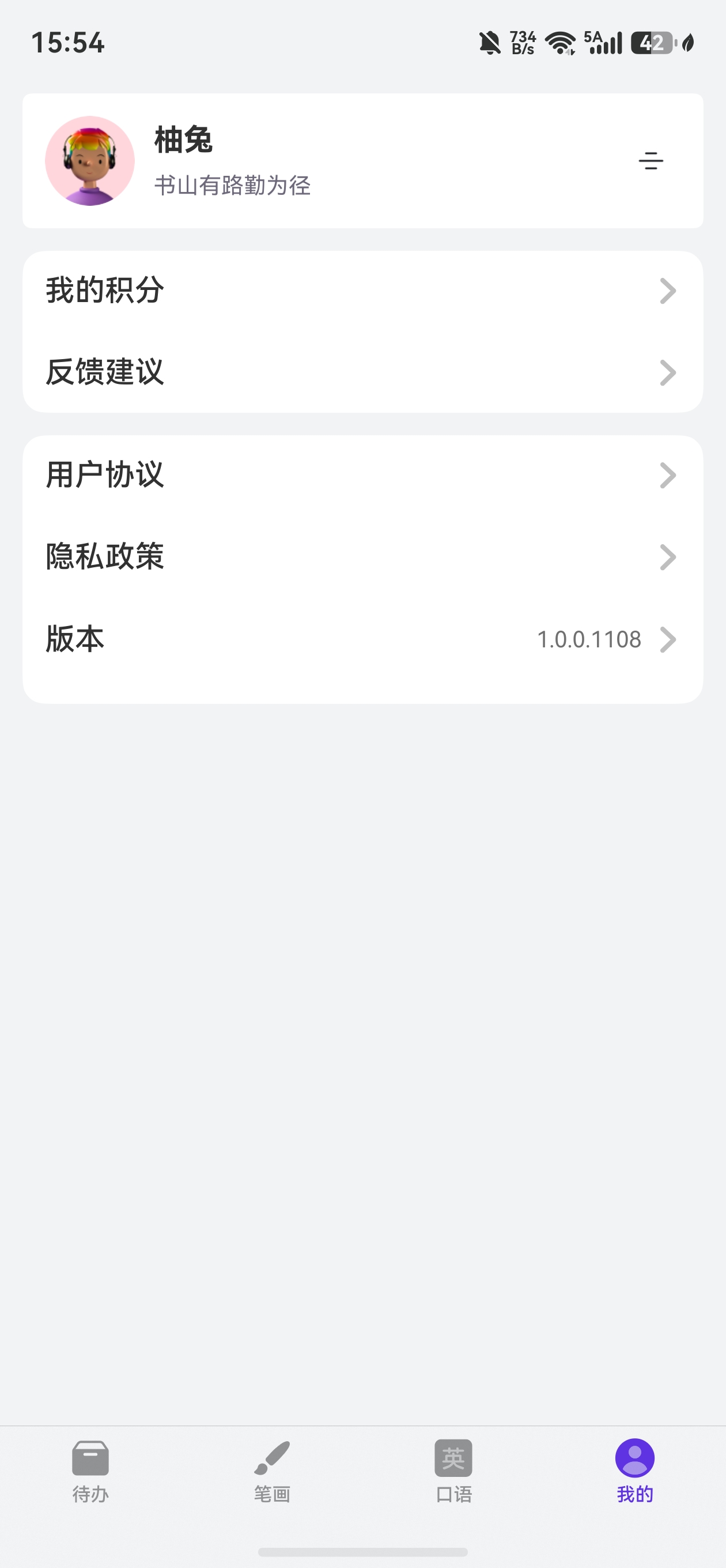
1. HomePage:V2 装饰器与 Tabs 结构
1.1 @ComponentV2 + @Local
@Entry
@ComponentV2
struct HomePage {
  private tabController: TabsController = new TabsController();
  @Local currentIndex: number = 0;
  private pageContext: PageContext = AppStorage.get('pageContext') as PageContext;
  private appPathInfo: NavPathStack = this.pageContext.navPathStack;
  // ...
}
本项目首页使用了 @ComponentV2 和 @Local 装饰器,这是 ArkUI V2 状态管理的新方案:
| V1 装饰器 | V2 装饰器 | 说明 |
|---|---|---|
@Component |
@ComponentV2 |
V2 组件声明,支持更高效的状态追踪 |
@State |
@Local |
组件内部状态,仅本组件可读写 |
@Prop |
@Param |
单向数据传递(父→子) |
@Link |
@Provider + @Consumer |
跨层级双向数据流 |
@Local 替代了 @State,语义更明确——表示该状态仅在组件本地使用,不会向子组件传递。
1.2 Tabs 与 TabsController
@Builder
TabComponent() {
  Tabs({ controller: this.tabController, index: this.currentIndex }) {
    TabContent() {
      TodoView()
    }.height('100%')

    TabContent() {
      StrokeView()
    }.height('100%')

    TabContent() {
      ChatView()
    }.height('100%')

    TabContent() {
      MineView()
    }.height('100%')
  }
  .onAnimationStart((index: number, targetIndex: number) => {
    this.currentIndex = targetIndex;
  })
  .animationMode(AnimationMode.NO_ANIMATION)
  .barWidth(0)
  .barHeight(0)
  .scrollable(false)
  .layoutWeight(1)
  .width('100%')
}
核心设计:
TabsController:控制器实例,可通过tabController.changeIndex()编程式切换 Tab。index: this.currentIndex:绑定当前选中索引,实现状态驱动的 Tab 切换。.barWidth(0).barHeight(0):隐藏原生 TabBar,因为我们要使用自定义 TabBar。.scrollable(false):禁止手势滑动切换,避免与自定义 TabBar 的点击切换冲突。.onAnimationStart:Tab 切换动画开始时回调,同步更新currentIndex。.animationMode(AnimationMode.NO_ANIMATION):禁用原生切换动画,切换更干脆。
1.3 整体布局
build() {
  Navigation(this.appPathInfo) {
    Column() {
      this.TabComponent()
      CustomTabBar({
        currentIndex: this.currentIndex,
        tabBarChange: (currentIndex: number) => {
          this.currentIndex = currentIndex;
        }
      })
    }
    .height('100%').width('100%')
    LoadingView()
  }
  .backgroundColor($r('app.color.color_background'))
  .hideTitleBar(true)
  .mode(NavigationMode.Stack)
  .height('100%')
  .width('100%')
}
Column 中先放 Tabs(通过 layoutWeight(1) 占满剩余空间),再放 CustomTabBar 固定在底部,形成经典的「内容区 + 底部导航栏」布局。
2. TabBarModel:数据模型定义
2.1 TabBarType 枚举
export enum TabBarType {
  TODO = 0,
  STROKE = 1,
  SPEAK = 2,
  MINE = 3,
}
枚举值与 Tabs 中 TabContent 的顺序一一对应,id 即为 Tab 索引。
2.2 TabBarData 接口
export interface TabBarData {
  id: TabBarType;
  title: ResourceStr;
  icon: Resource;
}
id:对应TabBarType枚举,用于标识 Tab 和匹配选中状态。title:Tab 标题,类型为ResourceStr,支持字符串或$r()资源引用。icon:Tab 图标,类型为Resource,引用系统 Symbol 图标资源。
2.3 TABS_LIST 数据源
export const TABS_LIST: TabBarData[] = [
  {
    id: TabBarType.TODO,
    icon: $r('sys.symbol.archivebox_fill'),
    title: $r('app.string.tab_todo'),
  },
  {
    id: TabBarType.STROKE,
    icon: $r('sys.symbol.paintbrush_fill'),
    title: $r('app.string.tab_stroke'),
  },
  {
    id: TabBarType.SPEAK,
    icon: $r('sys.symbol.English_square_fill'),
    title: $r('app.string.tab_speak'),
  },
  {
    id: TabBarType.MINE,
    icon: $r('sys.symbol.person_crop_circle_fill_1'),
    title: $r('app.string.tab_mine'),
  },
]
sys.symbol.*是 HarmonyOS 提供的系统 Symbol 图标库,包含 1500+ 矢量图标,无需额外引入图片资源,支持多色渲染和动画效果。
3. CustomTabBar:自定义底部导航栏
3.1 组件声明与状态
@Component
export struct CustomTabBar {
  @StorageProp('GlobalInfoModel') globalInfoModel: GlobalInfoModel = AppStorage.get('GlobalInfoModel')!;
  @StorageProp('BlurRenderGroup') blurRenderGroup: boolean = false;
  @Prop @Require currentIndex: number;
  @State isLoggedIn: boolean = false
  tabBarChange: (index: number) => void = (index: number) => {};
  // ...
}
@StorageProp('GlobalInfoModel'):单向绑定AppStorage中的全局信息模型,用于读取断点信息和设备参数。@Prop @Require currentIndex:@Prop表示从父组件单向传入,@Require表示该参数为必传项。tabBarChange:回调函数,当用户点击 Tab 时通知父组件更新currentIndex。
3.2 TabItemBuilder:单个 Tab 项
@Builder
TabItemBuilder(tabBar: TabBarData) {
  Column() {
    SymbolGlyph(tabBar.icon)
      .fontSize($r('sys.float.Title_M'))
      .fontColor(tabBar.id === this.currentIndex ? [$r('app.color.app_primary')] :
        [$r('sys.color.font_tertiary')])
      .renderingStrategy(SymbolRenderingStrategy.MULTIPLE_OPACITY)
      .symbolEffect(new BounceSymbolEffect(EffectScope.LAYER, EffectDirection.UP),
        tabBar.id === this.currentIndex)
    Text(tabBar.title)
      .fontSize($r('sys.float.Caption_M'))
      .margin({ top: $r('sys.float.padding_level1') })
      .fontWeight(FontWeight.Medium)
      .fontColor(tabBar.id === this.currentIndex ? $r('app.color.app_primary') : $r('sys.color.font_tertiary'))
  }
  .width('100%')
  .height(50)
  .onClick(() => {
    this.isLoggedIn = UserInfoManager.isLoggedIn();
    if (!this.isLoggedIn && tabBar.id !== 0) {
      this.login()
    } else {
      if (this.currentIndex !== tabBar.id) {
        this.tabBarChange(tabBar.id);
      }
    }
  })
  .alignItems(HorizontalAlign.Center)
  .justifyContent(FlexAlign.Center)
}
核心要点:
SymbolGlyph:HarmonyOS 系统图标组件,支持多色渲染策略和动画效果。BounceSymbolEffect:选中时的弹跳动画效果,EffectScope.LAYER表示按图层动画,EffectDirection.UP表示向上弹跳。- 颜色切换:选中状态使用
app_primary主题色,未选中使用font_tertiary系统三级文字色。 - 登录拦截:未登录用户点击非首页 Tab(
tabBar.id !== 0)时,触发登录流程而非切换 Tab。
3.3 响应式布局:BreakpointType
Flex({
  direction: new BreakpointType({
    sm: FlexDirection.ColumnReverse,
    md: FlexDirection.ColumnReverse,
    lg: FlexDirection.Row,
  }).getValue(this.globalInfoModel.currentBreakpoint),
  alignItems: ItemAlign.Center,
}) {
  // 内层 Flex:Tab 按钮区域
  Flex({
    direction: new BreakpointType({
      sm: FlexDirection.Row,
      md: FlexDirection.Row,
      lg: FlexDirection.Column,
    }).getValue(this.globalInfoModel.currentBreakpoint),
    justifyContent: FlexAlign.SpaceAround,
  }) {
    ForEach(TABS_LIST, (item: TabBarData) => {
      this.TabItemBuilder(item)
    }, (item: TabBarData) => JSON.stringify(item) + this.currentIndex)
  }
  // ...
}
.size(new BreakpointType<SizeOptions>({
  sm: { width: '100%', height: CommonConstants.TAB_BAR_HEIGHT + this.globalInfoModel.naviIndicatorHeight },
  md: { width: '100%', height: CommonConstants.TAB_BAR_HEIGHT + this.globalInfoModel.naviIndicatorHeight },
  lg: { width: CommonConstants.TAB_BAR_WIDTH, height: '100%' },
}).getValue(this.globalInfoModel.currentBreakpoint))
BreakpointType 是项目封装的响应式工具类,根据当前断点(sm/md/lg)返回不同的值:
| 断点 | 设备类型 | TabBar 方向 | TabBar 位置 |
|---|---|---|---|
| sm | 手机竖屏 | 水平排列 | 底部 |
| md | 平板竖屏 | 水平排列 | 底部 |
| lg | 平板横屏/折叠屏 | 垂直排列 | 侧边 |
- sm/md:TabBar 在底部,宽度铺满,高度 = TabBar高度 + 导航条高度。
- lg:TabBar 在左侧,宽度固定,高度铺满。
3.4 毛玻璃效果
.backgroundBlurStyle(BlurStyle.COMPONENT_THICK)
.renderGroup(this.blurRenderGroup)
backgroundBlurStyle:背景毛玻璃模糊效果,COMPONENT_THICK为厚模糊风格。renderGroup:控制是否开启渲染组合,用于优化模糊效果的性能。
4. Tab 切换的完整数据流
用户点击 CustomTabBar 的 TabItem
    ↓
tabBarChange(tabBar.id) 回调
    ↓
HomePage 中 this.currentIndex = currentIndex
    ↓
Tabs({ index: this.currentIndex }) 感知变化
    ↓
切换到对应 TabContent
关键:CustomTabBar 不直接控制 Tabs,而是通过回调将选中索引传回 HomePage,由 HomePage 统一管理状态。这种单向数据流确保了状态一致性。
5. 登录拦截机制
onClick(() => {
  this.isLoggedIn = UserInfoManager.isLoggedIn();
  if (!this.isLoggedIn && tabBar.id !== 0) {
    this.login()
  } else {
    if (this.currentIndex !== tabBar.id) {
      this.tabBarChange(tabBar.id);
    }
  }
})
逻辑说明:
- 首先检查用户登录状态。
- 如果未登录且点击的不是首页(
tabBar.id !== 0),则触发登录弹窗。 - 只有已登录或点击的是首页时,才执行 Tab 切换。
- 额外判断
this.currentIndex !== tabBar.id,避免重复触发相同 Tab 的切换。
这种设计保证首页(待办 Tab)对所有用户开放,而其他功能需要登录后才能使用。
6. 总结
| 知识点 | 说明 |
|---|---|
@ComponentV2 + @Local |
V2 状态管理,@Local 替代 @State |
Tabs + TabsController |
多 Tab 容器与编程式控制 |
.barWidth(0).barHeight(0) |
隐藏原生 TabBar |
SymbolGlyph |
系统矢量图标组件 |
BounceSymbolEffect |
选中弹跳动画 |
@StorageProp |
单向绑定 AppStorage 全局状态 |
@Prop @Require |
必传的单向数据传递 |
BreakpointType |
响应式断点工具类 |
tabBarChange 回调 |
子→父通信,单向数据流 |
| 登录拦截 | 未登录用户点击非首页 Tab 触发登录 |
自定义 TabBar 虽然需要编写更多代码,但带来了完全的样式控制权、响应式布局适配能力和业务逻辑注入点(如登录拦截),是中大型应用的常见做法。

讨论HarmonyOS开发技术,专注于API与组件、DevEco Studio、测试、元服务和应用上架分发等。
更多推荐

 8
8 0
0- 0


 已为社区贡献66条内容

所有评论(0)