HarmonyOS智能家居——五个页面的通用技术模式提炼
写完五个页面后发现,很多代码模式在不同页面里反复出现——导航栏结构、@State 刷新策略、Builder 的抽取方式、条件渲染的分支逻辑。这篇把这些共性模式提炼出来,每个模式都给出至少两个页面的代码对照,搞清楚"同一个模式在不同场景下怎么变体"。
完整效果
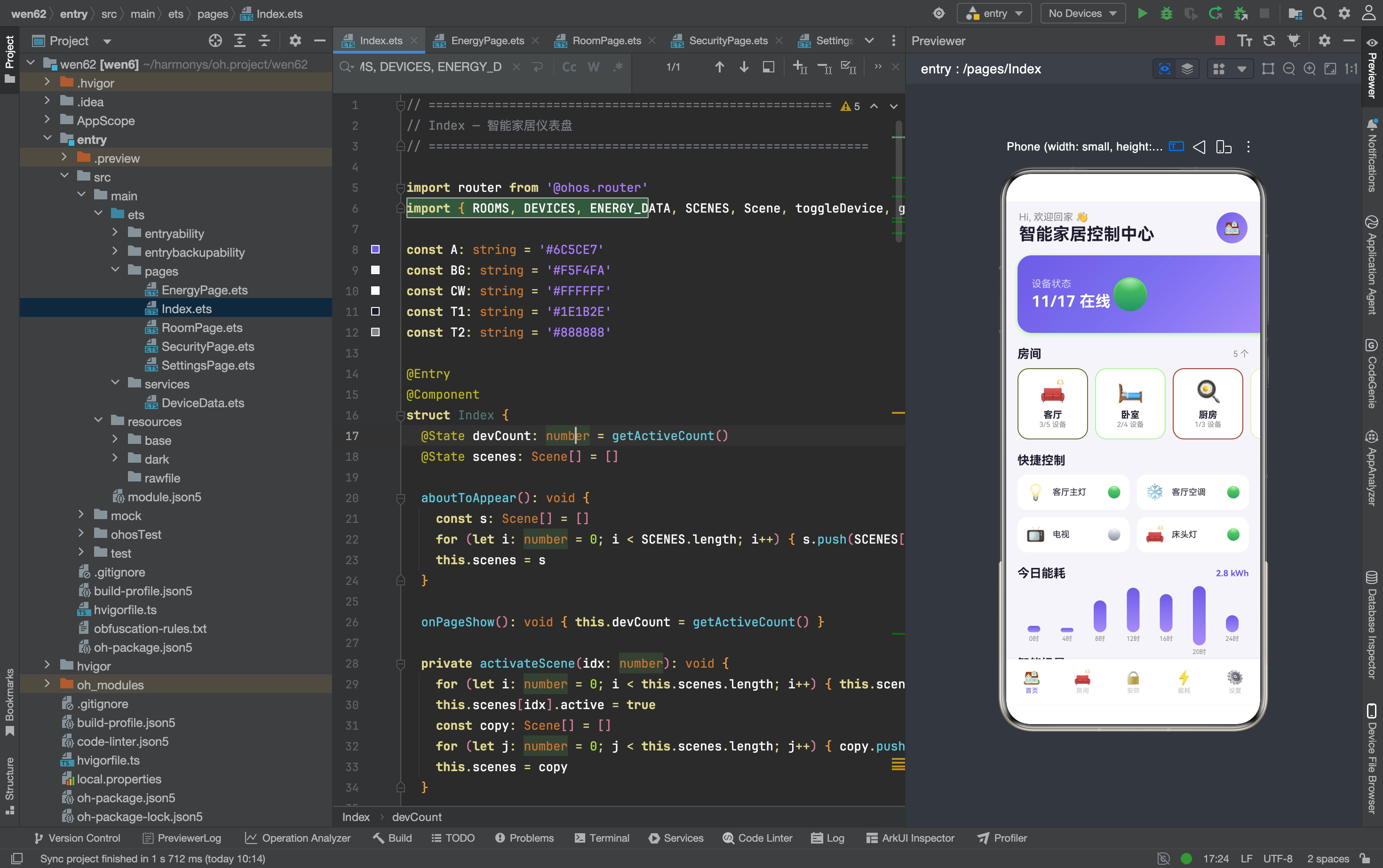
一、导航栏:四页面统一结构
四个非首页页面(RoomPage、SecurityPage、EnergyPage、SettingsPage)的导航栏结构完全一致:
// RoomPage
Row() {
  Row() { SymbolGlyph($r('sys.symbol.chevron_left')).fontSize(20).fontColor([T1]) }
  .width(34).height(34).borderRadius(17).backgroundColor('rgba(0,0,0,0.03)')
  .justifyContent(FlexAlign.Center).onClick(() => { router.back() })
  Text(this.room).fontSize(20).fontWeight(FontWeight.Bold).fontColor(T1).margin({ left: 10 }).layoutWeight(1)
  Text('✏️').fontSize(18)
}.width('100%').padding({ left: 16, right: 16, top: 12, bottom: 8 })

// SecurityPage
Row() {
  Row() { SymbolGlyph($r('sys.symbol.chevron_left')).fontSize(20).fontColor([T1]) }
  .width(34).height(34).borderRadius(17).backgroundColor('rgba(0,0,0,0.03)')
  .justifyContent(FlexAlign.Center).onClick(() => { router.back() })
  Text('安防中心').fontSize(20).fontWeight(FontWeight.Bold).fontColor(T1).margin({ left: 10 }).layoutWeight(1)
}.width('100%').padding({ left: 16, right: 16, top: 12, bottom: 8 })

// EnergyPage
Row() {
  Row() { SymbolGlyph($r('sys.symbol.chevron_left')).fontSize(20).fontColor([T1]) }
  .width(34).height(34).borderRadius(17).backgroundColor('rgba(0,0,0,0.03)')
  .justifyContent(FlexAlign.Center).onClick(() => { router.back() })
  Text('能耗监测').fontSize(20).fontWeight(FontWeight.Bold).fontColor(T1).margin({ left: 10 }).layoutWeight(1)
}.width('100%').padding({ left: 16, right: 16, top: 12, bottom: 8 })

// SettingsPage
Row() {
  Row() { SymbolGlyph($r('sys.symbol.chevron_left')).fontSize(20).fontColor([T1]) }
  .width(34).height(34).borderRadius(17).backgroundColor('rgba(0,0,0,0.03)')
  .justifyContent(FlexAlign.Center).onClick(() => { router.back() })
  Text('设置').fontSize(20).fontWeight(FontWeight.Bold).fontColor(T1).margin({ left: 10 }).layoutWeight(1)
}.width('100%').padding({ left: 16, right: 16, top: 12, bottom: 8 })
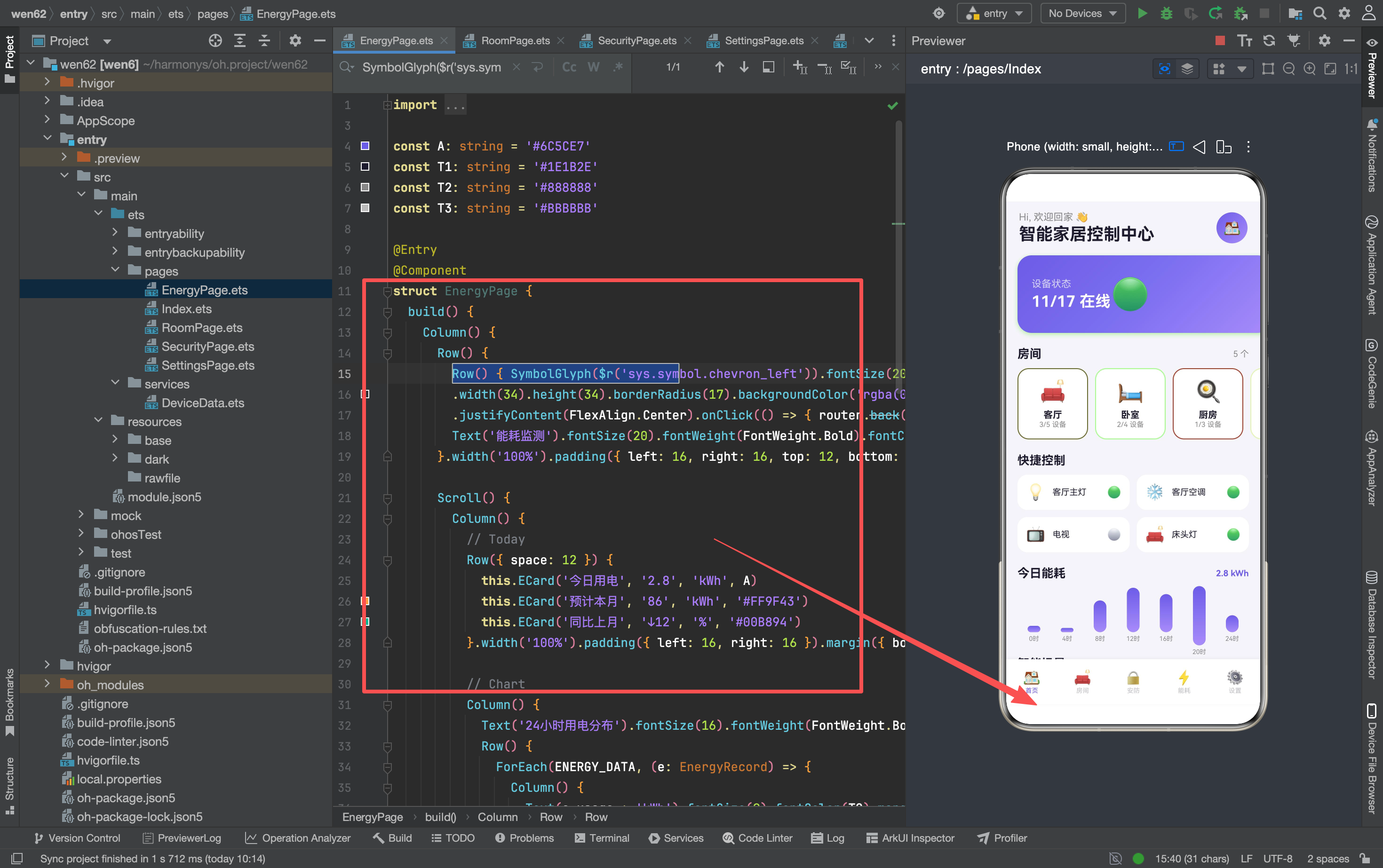
逐行拆解这个导航栏的每一层:
返回按钮的嵌套结构——最外层 Row() 包裹 SymbolGlyph,给按钮设定 34×34 的点击区域。为什么不用一个 Text 直接放 SymbolGlyph?因为 SymbolGlyph 本身的点击区域太小(只有图标那么大),用户很难精确点击。外层 Row 扩大了点击区域到 34×34,提升了触摸体验。
backgroundColor('rgba(0,0,0,0.03)')——3% 黑色透明度。这个值非常淡,几乎看不出颜色,但给了按钮一个极浅的底色,让用户能感知到"这是一个可点击的区域"。如果完全透明(transparent),按钮会和背景融为一体,用户不知道可以点。
justifyContent(FlexAlign.Center)——让 SymbolGlyph 在 34×34 的 Row 里水平居中。没有这行,SymbolGlyph 会靠左对齐,视觉上不在按钮中心。
标题的 layoutWeight(1)——让标题占据导航栏的所有剩余空间。这样右侧的操作按钮(✏️、…等)无论放不放、放什么,标题都不会被挤压。layoutWeight 是 Flex 布局里的"弹性分配",类似于 CSS 的 flex: 1。
四个页面的唯一区别是右侧操作区:RoomPage 有"✏️"编辑按钮,其他三个页面没有。导航栏的左侧返回 + 中间标题是固定模板,右侧操作区按需添加。如果以后更多页面需要导航栏,可以抽成 Builder:
@Builder NavBar(title: string, action?: () => void) {
  Row() {
    Row() { SymbolGlyph($r('sys.symbol.chevron_left')).fontSize(20).fontColor([T1]) }
    .width(34).height(34).borderRadius(17).backgroundColor('rgba(0,0,0,0.03)')
    .justifyContent(FlexAlign.Center).onClick(() => { router.back() })
    Text(title).fontSize(20).fontWeight(FontWeight.Bold).fontColor(T1).margin({ left: 10 }).layoutWeight(1)
  }.width('100%').padding({ left: 16, right: 16, top: 12, bottom: 8 })
}
当前 4 个页面重复写导航栏代码,没有抽 Builder——因为导航栏结构虽然重复,但每个页面的标题不同,且部分页面有右侧操作按钮,抽 Builder 的参数会比较复杂。在 4 个页面的规模下,重复代码的维护成本可以接受。
二、@State 刷新:三种策略的代码对照
策略一:重新查询替换引用
RoomPage(切换设备开关):
// 操作前:this.devices 是 @State 数组,指向某个引用
// 操作后:this.devices 指向一个新引用
.onClick(() => { toggleDevice(d.id); this.devices = getDevicesByRoom(this.room) })
toggleDevice(d.id) 修改的是 DEVICES 数组里的属性(DEVICES[i].on = !DEVICES[i].on),这一步让源数据更新。this.devices = getDevicesByRoom(this.room) 重新查询,返回一个新数组(result.push(DEVICES[i]) 创建的),替换 @State 的引用。两步缺一不可——只改源数据不刷新 @State,UI 不更新;只刷新 @State 不改源数据,数据不一致。
RoomPage(调节滑块):
Slider({ value: d.value, min: 1, max: 100, step: 1 })
  .onChange((v: number) => {
    d.value = Math.round(v)                    // 第一步:改源数据
    this.devices = getDevicesByRoom(this.room)  // 第二步:刷新 @State
  })
和切换开关的模式完全一致,只是 d.value = Math.round(v) 替换了 DEVICES[i].on = !DEVICES[i].on。Math.round(v) 把 Slider 的浮点值取整——Slider 拖动过程中会产生小数(比如 65.3),设备参数需要整数。
策略二:重新计算赋值
Index(设备状态变化后):
onClick(() => { toggleDevice(1); this.devCount = getActiveCount() })
getActiveCount() 遍历 DEVICES 数组,统计 on === true 的数量,返回一个数字。这个数字赋值给 @State devCount,ArkTS 检测到数字变化后触发重新渲染。不需要创建新数组,因为数字是基本类型——赋值操作本身就会触发 @State 检测。
Index(页面重新显示时):
onPageShow(): void { this.devCount = getActiveCount() }
onPageShow 在页面每次显示时触发——从 RoomPage 返回首页时也会调用。这保证了用户在房间页修改设备后,回到首页能看到更新后的在线设备数。如果只在 onClick 里刷新,从其他页面返回时数据会过时。
策略三:复制数组替换引用
Index(激活场景):
private activateScene(idx: number): void {
  // 第一步:把所有场景设为非激活
  for (let i: number = 0; i < this.scenes.length; i++) {
    this.scenes[i].active = false
  }
  // 第二步:激活选中的场景
  this.scenes[idx].active = true
  // 第三步:复制数组,替换 @State 引用
  const copy: Scene[] = []
  for (let j: number = 0; j < this.scenes.length; j++) {
    copy.push(this.scenes[j])
  }
  this.scenes = copy
}
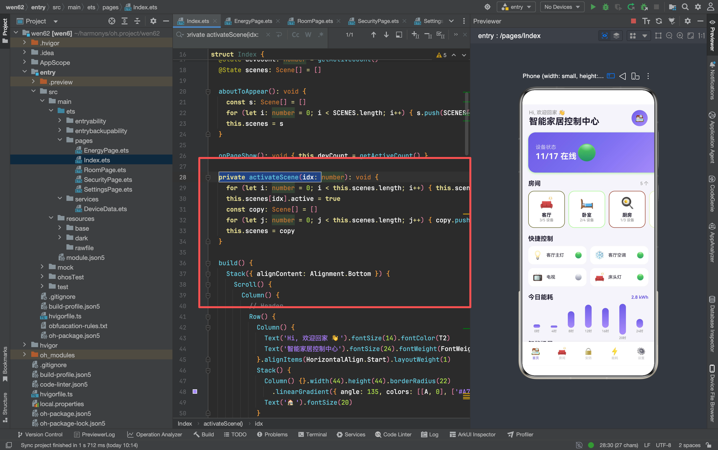
三步操作缺一不可:第一步保证排他性(只有一个场景激活),第二步激活目标场景,第三步触发 @State 刷新。如果省略第三步,即使 this.scenes[idx].active = true 执行了,UI 也不会更新——因为 @State 检测的是引用变化,不是属性变化。
为什么不直接 this.scenes = this.scenes(自赋值)?因为 ArkTS 的 @State 对自赋值有优化——引用没变,不会触发刷新。必须创建一个新数组(哪怕内容一样),让引用真正发生变化。
Index(aboutToAppear 初始化):
aboutToAppear(): void {
  const s: Scene[] = []
  for (let i: number = 0; i < SCENES.length; i++) {
    s.push(SCENES[i])
  }
  this.scenes = s
}
初始化时也需要复制 SCENES 到 @State。为什么不直接 this.scenes = SCENES?因为 SCENES 是模块级常量,所有页面共享。如果直接赋值引用,首页激活场景时修改 this.scenes[idx].active 会影响 SCENES 原始数据,导致其他页面读到被污染的数据。复制数组隔离了 @State 和原始数据。
三、Builder:页面内复用的两种模式
模式一:纯展示型 Builder
SecurityPage 的 StatusCard:
@Builder StatusCard(icon: string, label: string, status: string, color: string) {
  Row() {
    Text(icon).fontSize(22).margin({ right: 12 })
    Text(label).fontSize(14).fontColor(T1).layoutWeight(1)
    Text(status).fontSize(12).fontWeight(FontWeight.Bold).fontColor(color)
  }
  .width('100%').padding(16).backgroundColor(CW).borderRadius(16)
}

// 调用
this.StatusCard('🔒', '门锁状态', this.doorLocked ? '已锁定' : '未锁定',
  this.doorLocked ? '#00B894' : '#FF6B6B')
this.StatusCard('🚨', '安防警报', this.alarm ? '已布防' : '已撤防',
  this.alarm ? '#00B894' : '#FF6B6B')
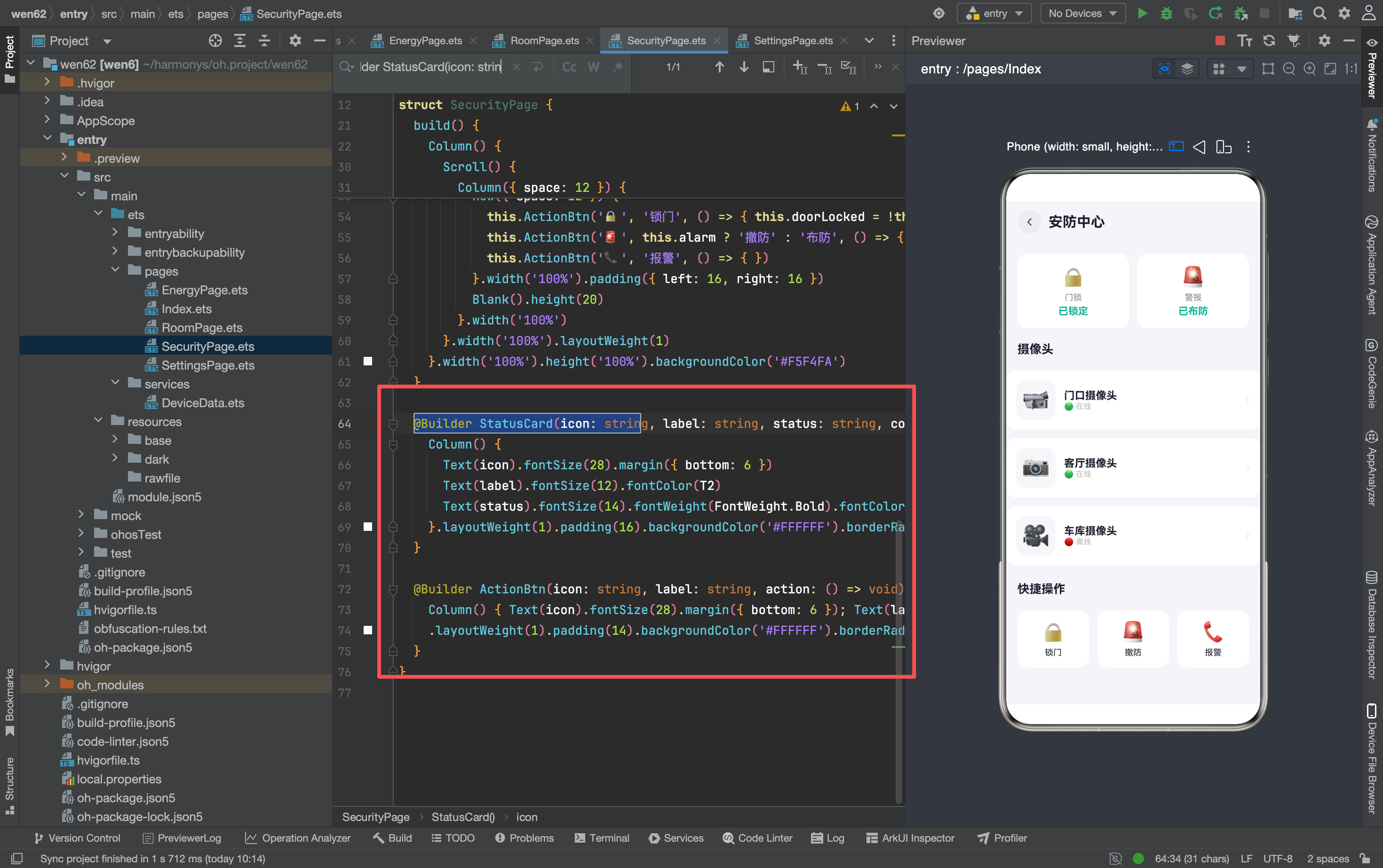
StatusCard 只负责展示,不处理交互——没有 onClick 回调。四个参数都是展示数据,没有行为参数。调用方通过三元表达式决定传什么值,Builder 不关心逻辑。
EnergyPage 的 ECard:
@Builder ECard(label: string, value: string, unit: string, color: string) {
  Column() {
    Text(value).fontSize(28).fontWeight(FontWeight.Bold).fontColor(color)
    Text(unit).fontSize(11).fontColor(T3).margin({ top: 2 })
    Text(label).fontSize(11).fontColor(T2).margin({ top: 4 })
  }.layoutWeight(1).padding(16).backgroundColor(CW).borderRadius(14)
}

// 调用
this.ECard('今日用电', '2.8', 'kWh', A)
this.ECard('预计本月', '86', 'kWh', '#FF9F43')
this.ECard('同比上月', '↓12', '%', '#00B894')
ECard 和 StatusCard 结构类似,但布局方向不同——StatusCard 是横向(Row),ECard 是纵向(Column)。纯展示型 Builder 的共同特点:参数全是数据,没有回调;样式固定,不随状态变化。
模式二:带交互的 Builder
SecurityPage 的 ActionBtn:
@Builder ActionBtn(icon: string, label: string, action: () => void) {
  Column() {
    Text(icon).fontSize(24)
    Text(label).fontSize(11).fontColor(T2).margin({ top: 4 })
  }
  .width(80).height(60).backgroundColor(CW).borderRadius(16)
  .justifyContent(FlexAlign.Center).onClick(action)
}

// 调用
this.ActionBtn('🔔', '报警', () => { /* 空函数 */ })
this.ActionBtn('🚨', '警报', () => { /* 空函数 */ })
this.ActionBtn('🔓', '解锁', () => { this.doorLocked = !this.doorLocked })
ActionBtn 比 StatusCard 多了一个 action: () => void 回调参数。Builder 内部只处理布局,不关心"点了之后做什么"——具体逻辑由调用方的回调函数决定。这让 ActionBtn 可以复用于不同操作:报警按钮传空函数,解锁按钮传状态切换逻辑。
SettingsPage 的 Link:
@Builder Link(icon: string, label: string, sub: string, action: () => void) {
  Row() {
    Text(icon).fontSize(18).margin({ right: 12 })
    Column() {
      Text(label).fontSize(14).fontColor(T1)
      Text(sub).fontSize(11).fontColor(T3).margin({ top: 1 })
    }.alignItems(HorizontalAlign.Start).layoutWeight(1)
    SymbolGlyph($r('sys.symbol.chevron_right')).fontSize(12).fontColor(['#DDD'])
  }.width('100%').padding({ left: 14, right: 14, top: 12, bottom: 12 })
  .onClick(action)
}

// 调用
this.Link('🏠', '家庭管理', '管理房间和设备',
  () => { router.pushUrl({ url: 'pages/RoomPage', params: { 'room': '客厅' } }) })
Link 有四个参数,其中三个是展示数据(icon、label、sub),一个是回调(action)。和 ActionBtn 的区别是多了一个 sub 副标题——Link 适合需要"标题 + 副标题"信息层次的场景。
SettingsPage 的 Toggle:
@Builder Toggle(icon: string, label: string, sub: string, on: boolean, action: () => void) {
  Row() {
    Text(icon).fontSize(18).margin({ right: 12 })
    Column() {
      Text(label).fontSize(14).fontColor(T1)
      Text(sub).fontSize(11).fontColor(T3).margin({ top: 1 })
    }.alignItems(HorizontalAlign.Start).layoutWeight(1)
    Text(on ? '🟢 开' : '⚫ 关').fontSize(12).fontColor(on ? A : T3)
  }.width('100%').padding({ left: 14, right: 14, top: 12, bottom: 12 })
  .onClick(action)
}

// 调用
this.Toggle('🔔', '通知提醒', '接收设备状态和警报通知',
  this.notifyOn, () => { this.notifyOn = !this.notifyOn })
Toggle 比 Link 多了一个 on: boolean 参数——控制右侧显示"开"还是"关"。这个参数让 Builder 能根据状态改变显示内容,但逻辑仍然由调用方控制(on ? '🟢 开' : '⚫ 关')。
带交互的 Builder 的共同特点:最后一个参数是 action: () => void 回调,Builder 内部通过 .onClick(action) 绑定。回调让 Builder 保持通用——同一个 Builder 可以用于不同操作。
四、条件渲染:两种实现方式
方式一:if 语句控制显隐
RoomPage(设备关闭时隐藏滑块):
Column() {
  Row() {
    Text(d.icon).fontSize(22).margin({ right: 10 })
    Text(d.name).fontSize(14).fontColor(T1).layoutWeight(1)
    Text(d.on ? '🟢' : '⚪').fontSize(18)
      .onClick(() => { toggleDevice(d.id); this.devices = getDevicesByRoom(this.room) })
  }
  if (d.on && d.type === 'light') {
    Row() {
      Text('亮度').fontSize(12).fontColor(T2).width(35)
      Slider({ value: d.value, min: 1, max: 100, step: 1 })
        .layoutWeight(1).blockColor(A).trackColor(A + '30')
        .onChange((v: number) => { d.value = Math.round(v); this.devices = getDevicesByRoom(this.room) })
      Text(Math.round(d.value) + '%').fontSize(12).fontColor(A).width(35).textAlign(TextAlign.End)
    }.margin({ top: 8 })
  }
  if (d.on && d.type === 'thermostat') {
    Row() {
      Text('温度').fontSize(12).fontColor(T2).width(35)
      Slider({ value: d.value, min: 16, max: 30, step: 1 })
        .layoutWeight(1).blockColor('#FF6B6B').trackColor('#FF6B6B30')
        .onChange((v: number) => { d.value = Math.round(v); this.devices = getDevicesByRoom(this.room) })
      Text(Math.round(d.value) + '°C').fontSize(12).fontColor('#FF6B6B').width(35).textAlign(TextAlign.End)
    }.margin({ top: 8 })
  }
}
两个 if 分支控制滑块的显隐——灯设备显示亮度滑块,空调设备显示温度滑块,其他设备不显示滑块。注意两个 if 是独立的(不是 if-else),因为每个设备只有一个 type,所以实际上只会进入一个分支。
条件判断是 d.on && d.type === 'light'——双重条件。设备关闭时滑块也隐藏,因为关闭的设备不需要调节参数。如果只判断 d.type === 'light',灯关闭时滑块仍然可见,用户可能会困惑"为什么关了灯还能调亮度"。
方式二:三元表达式控制样式
Index(场景卡片状态):
Text(s.active ? '运行中' : '点击启动').fontSize(9)
  .fontColor(s.active ? s.color : T2)
.backgroundColor(s.active ? s.color + '15' : CW)
.border({ width: s.active ? 1.5 : 1, color: s.active ? s.color : '#F0EEF4' })
三个属性都用三元表达式根据 s.active 切换:文字内容、背景颜色、边框样式。不需要隐藏/显示元素,只需要改变现有元素的视觉状态。
RoomPage(设备状态文字):
Text(d.on ? '已开启' : '已关闭').fontSize(12)
  .fontColor(d.on ? '#00B894' : '#888888')
文字内容和颜色都根据 d.on 切换。开启时显示绿色"已开启",关闭时显示灰色"已关闭"。
SecurityPage(门锁状态):
Text(this.doorLocked ? '已锁定' : '未锁定').fontSize(12)
  .fontWeight(FontWeight.Bold).fontColor(this.doorLocked ? '#00B894' : '#FF6B6B')
门锁状态用绿色/红色编码——绿色表示安全(已锁定),红色表示不安全(未锁定)。
两种方式的选择标准
| 场景 | 方式 | 原因 |
|---|---|---|
| 需要隐藏元素 | if | 元素不存在于 DOM,节省渲染 |
| 只改文字/颜色 | 三元 | 元素始终存在,只改属性 |
| 多个属性联动变化 | 三元 | 一个条件控制多个属性 |
| 需要渲染不同结构 | if | 两个分支的 UI 结构不同 |
RoomPage 的滑块用 if,因为灯和空调的滑块结构不同(颜色不同、范围不同),需要在两个独立的 if 分支里分别定义。场景卡片用三元,因为只是背景色和文字变化,结构不变。
五、颜色常量:跨页面的一致性规则
const A: string = '#6C5CE7'    // 主色 - 所有页面一致
const T1: string = '#1E1B2E'   // 标题文字 - 所有页面一致
const T2: string = '#888888'   // 副文字 - 所有页面一致
const T3: string = '#BBBBBB'   // 辅助灰 - 所有页面一致
const CW: string = '#FFFFFF'   // 卡片白 - 大部分页面一致
const BG: string = '#F5F4FA'   // 背景灰 - 首页/房间页一致
常量定义在每个页面文件的顶部(不是全局常量文件),每个页面各自定义一套。这意味着如果要改主色,需要改五个文件。更好的做法是提取到一个 constants 文件:
// constants/Colors.ets
export const A: string = '#6C5CE7'
export const T1: string = '#1E1B2E'
// ...
然后每个页面 import { A, T1 } from '../constants/Colors'。但在 5 个页面的规模下,各自定义更简单,不需要引入额外的文件层级。
透明度拼接的规律
项目里大量使用 颜色 + 透明度 的拼接:
| 表达式 | 实际颜色 | 透明度 | 用途 |
|---|---|---|---|
A + '25' | #6C5CE725 | 14% | 首页状态卡片投影 |
A + '30' | #6C5CE730 | 18% | 房间卡片边框 |
A + '40' | #6C5CE740 | 25% | 能耗条形图填充 |
s.color + '15' | 各场景色15 | 8% | 场景卡片背景 |
'#F0EEF4' | 固定色 | 100% | 未激活场景边框 |
透明度值遵循一个规律:越大面积的元素用越低的透明度。卡片背景(大面积)用 8%-15%,边框(中面积)用 18%,条形图填充(小面积)用 25%,投影(装饰性)用 14%。低透明度让大面积色块更柔和,高透明度让小面积色块更明显。
六、Grid 和 Scroll 的布局选择
Grid:2×2 快捷控制
Grid() {
  GridItem() { /* 客厅主灯 */ }
  GridItem() { /* 客厅空调 */ }
  GridItem() { /* 电视 */ }
  GridItem() { /* 床头灯 */ }
}
.columnsTemplate('1fr 1fr').columnsGap(10).rowsGap(10)
.width('100%').padding({ left: 16, right: 16 }).margin({ bottom: 20 })
Grid 用于固定数量的卡片布局——4 个快捷控制,2 列 2 行。columnsTemplate('1fr 1fr') 定义两列等宽,columnsGap(10) 和 rowsGap(10) 定义间距。Grid 适合"数量固定、需要对齐"的场景。
Scroll:房间列表和场景列表
Scroll() {
  Row({ space: 10 }) {
    ForEach(ROOMS, (room: Room) => { /* 房间卡片 */ })
  }.width('100%').padding({ left: 16, right: 16 })
}
.width('100%').scrollable(ScrollDirection.Horizontal).scrollBar(BarState.Off)
Scroll 用于"数量不固定、需要滚动"的场景——房间可能有 5 个也可能有 10 个,一排放不下就需要横向滚动。scrollBar(BarState.Off) 隐藏滚动条,视觉更干净。edgeEffect(EdgeEffect.Spring) 在首页的垂直 Scroll 上启用了弹性回弹效果,增加了交互的愉悦感。
选择标准
| 场景 | 选择 | 原因 |
|---|---|---|
| 数量固定(2-6个) | Grid | 对齐整齐,不需要滚动 |
| 数量不固定 | Scroll + Row | 一排放不下时可滚动 |
| 需要对齐的列表 | Grid | 列数固定,自动对齐 |
| 需要弹性效果 | Scroll | EdgeEffect.Spring |
七、路由跳转的两种参数模式
模式一:传递单个字符串参数
// 首页 → 房间页
router.pushUrl({ url: 'pages/RoomPage', params: { 'room': room.name } })

// 设置页 → 房间页
router.pushUrl({ url: 'pages/RoomPage', params: { 'room': '客厅' } })

// 房间页接收参数
aboutToAppear(): void {
  const p: Record<string, Object> = router.getParams() as Record<string, Object>
  this.room = (p['room'] as Object) as string
}
只传一个 room 字符串,接收方通过 router.getParams() 获取。参数类型是 Record<string, Object>,需要类型断言转成 string。
模式二:不传参数
// 首页 → 安防页
router.pushUrl({ url: 'pages/SecurityPage' })

// 首页 → 能耗页
router.pushUrl({ url: 'pages/EnergyPage' })

// 首页 → 设置页
router.pushUrl({ url: 'pages/SettingsPage' })
安防页、能耗页、设置页不需要参数——它们的数据要么是内部 @State,要么是全局 DeviceData。不传参数时,接收方不需要 router.getParams()。
两种模式的选择标准
| 场景 | 选择 | 原因 |
|---|---|---|
| 页面需要知道"看哪个" | 传参数 | 房间页需要知道显示哪个房间 |
| 页面内容与入口无关 | 不传参数 | 安防页总是显示相同的摄像头列表 |
| 参数是字符串/数字 | 直接传 | ArkTS router 支持基本类型 |
| 参数是对象/数组 | 不推荐传 | router 不支持复杂类型,需要其他方式 |

讨论HarmonyOS开发技术,专注于API与组件、DevEco Studio、测试、元服务和应用上架分发等。
更多推荐

 7
7 0
0- 0


 已为社区贡献159条内容

所有评论(0)