HarmonyOS7 聊天列表角标面板:用 Badge 把消息提醒做得更顺手
前言
这篇继续聊 HarmonyOS7 里的 Badge 综合聊天角标。如果你刚开始学 ArkUI,不建议一上来就背属性名,那样很容易看完就忘。更好的方式是先搞清楚:这个页面想解决什么问题,用户做了什么操作,代码又是怎么把这个操作反映到界面上的。
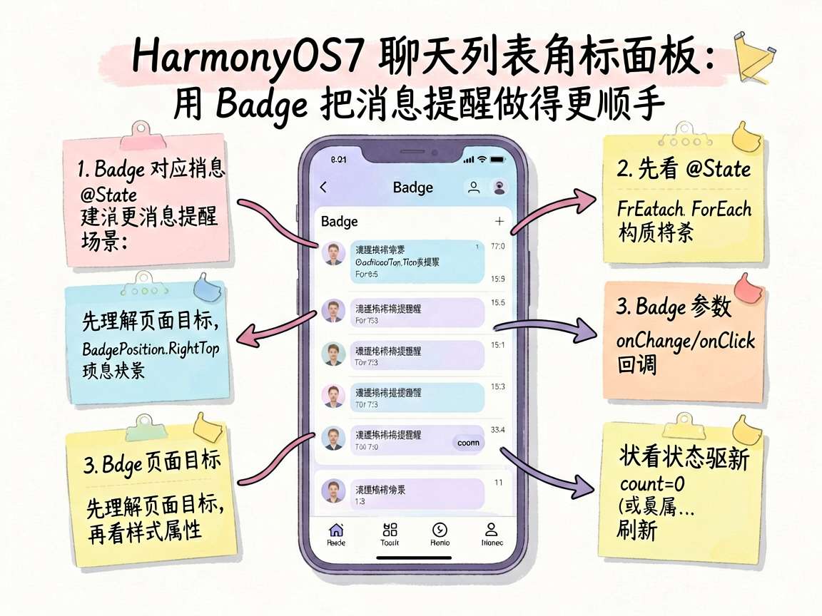
这个案例的核心是 Badge,它对应的使用场景是 消息提醒。我会把它当成一个真实业务里的小模块来拆,而不是只贴一段代码结束。读完之后,你至少应该能知道这几件事:
| 问题 | 答案 |
|---|---|
| 学什么 | Badge 在 消息提醒 场景里的用法 |
| 看哪里 | 状态字段、核心组件、事件回调 |
| 重点 | UI布局 |
| 适合谁 | 刚接触 HarmonyOS7 声明式 UI 的同学 |
先看页面在做什么
先把页面目标说清楚。这个案例不是为了炫技,而是展示一个常见交互片段:页面上有内容展示,有样式区分,也有用户操作后的反馈。小白读这类代码时,最容易犯的错误是从第一行样式属性开始抠细节,结果看了半天不知道页面到底在干什么。
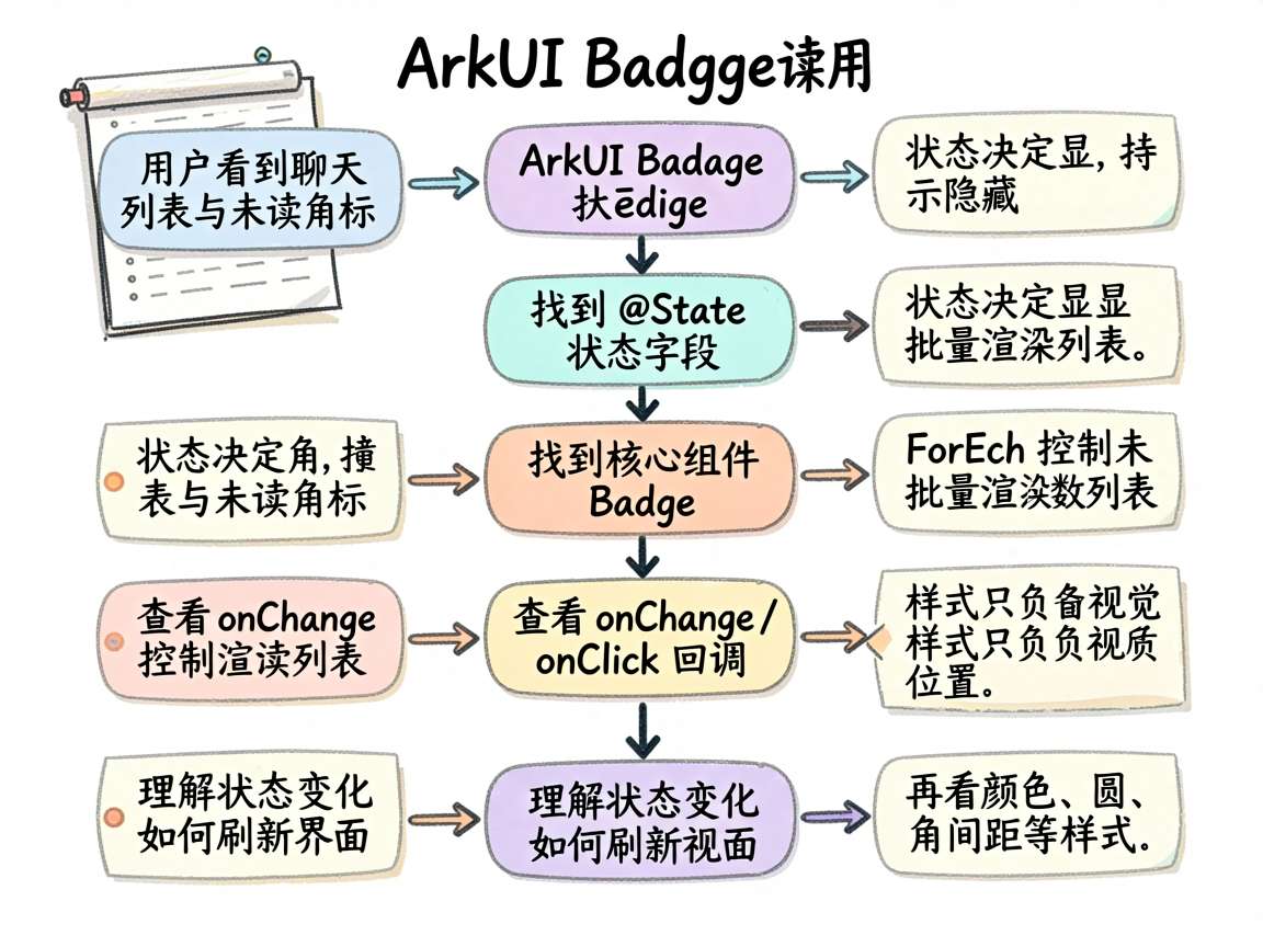
我更建议按这个顺序看:
- 找到
@State,确认页面有哪些会变化的数据。 - 找到核心组件,比如
Badge,看看它接收了哪些参数。 - 找到
onChange、onClick或类似回调,理解用户操作之后状态怎么变。 - 最后再看颜色、圆角、间距这些样式属性。
这样读下来,哪怕代码比较长,也不会迷路。
小白先抓这条主线
ArkUI 的声明式 UI 有个特点:界面是状态的结果。你不用手动去找某个控件再改它的文本,而是改状态,框架会根据状态重新刷新相关 UI。
在这个案例里,布局一般由 Column、Row、Scroll、Grid 这些容器搭起来。它们负责“东西放在哪里”;Badge 负责“这个功能怎么表现”;事件回调负责“用户操作后发生什么”。三者配合起来,页面才是完整的。
下面这段关键代码可以先看一遍,它保留了入口组件和核心逻辑:
@Entry
@Component
struct ChatBadgeDashboard {
  @State isShow: boolean = true

  build() {
    Column() {
      if (this.isShow) {
        Column() {
          Text('Badge 综合场景演示')
            .fontSize(18).fontWeight(FontWeight.Bold).fontColor('#9B59B6').margin({ bottom: 4 })
          Text('底部导航栏 + 消息列表 + 头像角标,模拟真实 App 界面')
            .fontSize(12).fontColor(SUBTEXT_COLOR).margin({ bottom: 12 })
        }
        .width('100%').alignItems(HorizontalAlign.Start)

        Column() {
          Row() {
关键代码拆开讲
把上面的代码拆开看,会更容易理解:
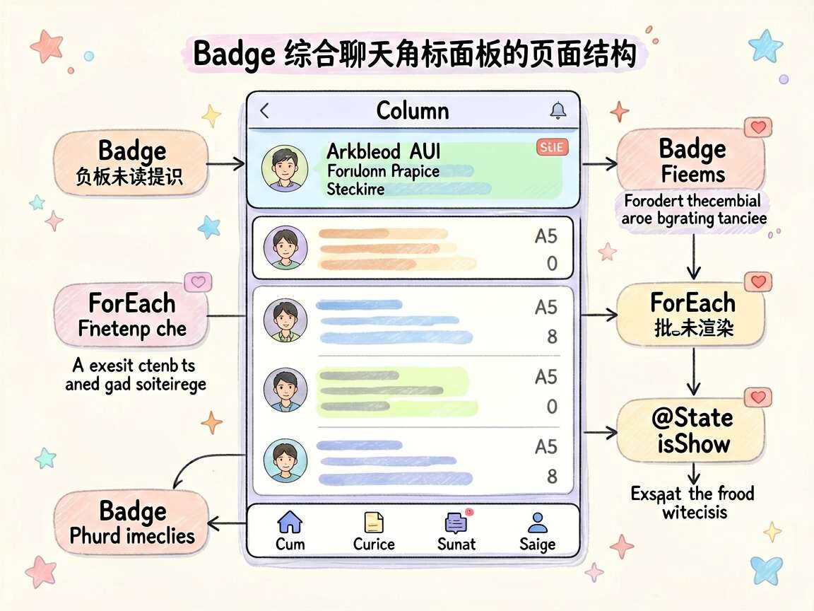
@State是页面的记忆点,输入、点击、选择这类变化都会先落到这里。ForEach说明页面不是硬编码一项项写死,而是用数组批量渲染。- 角标要控制尺寸和最大值,否则未读数一多就容易挤坏布局。
这里有一个很实用的判断方法:如果你删掉某个状态字段,页面还是否能表达当前交互?如果不能,说明这个状态就是业务状态;如果删掉只是少了颜色或间距,那它更多是视觉层面的东西。
对新手来说,先区分“业务状态”和“样式配置”很重要。很多页面写乱,都是因为把这两类东西混在一起了。
完整代码
下面是完整代码。文章里的组件名已经换成更贴近业务的英文命名,可以直接复制到独立页面里阅读。建议你先跑原样,再尝试改一个状态字段或一个样式属性,看界面怎么变化。
const CARD_BG_COLOR: string = '#FFFFFF'
const SUBTEXT_COLOR: string = '#8A8A8A'

interface ChatBadgeDashboardItem {
  icon: string
  label: string
  badge: number
  color: string
}
@Entry
@Component
struct ChatBadgeDashboard {
  @State isShow: boolean = true

  build() {
    Column() {
      if (this.isShow) {
        Column() {
          Text('Badge 综合场景演示')
            .fontSize(18).fontWeight(FontWeight.Bold).fontColor('#9B59B6').margin({ bottom: 4 })
          Text('底部导航栏 + 消息列表 + 头像角标,模拟真实 App 界面')
            .fontSize(12).fontColor(SUBTEXT_COLOR).margin({ bottom: 12 })
        }
        .width('100%').alignItems(HorizontalAlign.Start)

        Column() {
          Row() {
            Badge({ count: 0, position: BadgePosition.RightTop, style: { badgeSize: 12, badgeColor: '#6BCB77' } }) {
              Text('A').fontSize(24).fontWeight(FontWeight.Bold).fontColor('#FFFFFF')
                .width(44).height(44).backgroundColor('#4D96FF').borderRadius(22).textAlign(TextAlign.Center)
            }
            Column() {
              Text('HarmonyOS 技术交流群').fontSize(15).fontWeight(FontWeight.Medium).fontColor('#333')
              Text('李四: 这个 Badge 组件真好用').fontSize(12).fontColor('#999').margin({ top: 3 }).maxLines(1).textOverflow({ overflow: TextOverflow.Ellipsis })
            }.alignItems(HorizontalAlign.Start).layoutWeight(1).margin({ left: 12 })

            Column() {
              Text('10:28').fontSize(11).fontColor('#999')
              Badge({ count: 5, position: BadgePosition.Right, maxCount: 99, style: { badgeSize: 16, badgeColor: '#FA2A2D' } }) {
                Text('')
              }.margin({ top: 6 })
            }.alignItems(HorizontalAlign.End)
          }
          .width('100%').height(68).padding({ left: 16, right: 16 })
          .border({ width: { bottom: 0.5 }, color: '#F0F0F0' })

          Row() {
            Badge({ count: 0, position: BadgePosition.RightTop, style: { badgeSize: 12, badgeColor: '#E0E0E0' } }) {
              Text('B').fontSize(24).fontWeight(FontWeight.Bold).fontColor('#FFFFFF')
                .width(44).height(44).backgroundColor('#6BCB77').borderRadius(22).textAlign(TextAlign.Center)
            }
            Column() {
              Text('张三').fontSize(15).fontWeight(FontWeight.Medium).fontColor('#333')
              Text('好的,我看看文档').fontSize(12).fontColor('#999').margin({ top: 3 }).maxLines(1).textOverflow({ overflow: TextOverflow.Ellipsis })
            }.alignItems(HorizontalAlign.Start).layoutWeight(1).margin({ left: 12 })

            Column() {
              Text('09:15').fontSize(11).fontColor('#999')
              Badge({ count: 0, position: BadgePosition.Right, style: { badgeSize: 0, badgeColor: 'transparent' } }) {
                Text('')
              }.margin({ top: 6 })
            }.alignItems(HorizontalAlign.End)
          }
          .width('100%').height(68).padding({ left: 16, right: 16 })
          .border({ width: { bottom: 0.5 }, color: '#F0F0F0' })

          Row() {
            Badge({ count: 0, position: BadgePosition.RightTop, style: { badgeSize: 12, badgeColor: '#FFA500' } }) {
              Text('C').fontSize(24).fontWeight(FontWeight.Bold).fontColor('#FFFFFF')
                .width(44).height(44).backgroundColor('#FF6B6B').borderRadius(22).textAlign(TextAlign.Center)
            }
            Column() {
              Text('工作群').fontSize(15).fontWeight(FontWeight.Medium).fontColor('#333')
              Text('[图片]').fontSize(12).fontColor('#999').margin({ top: 3 })
            }.alignItems(HorizontalAlign.Start).layoutWeight(1).margin({ left: 12 })

            Column() {
              Text('昨天').fontSize(11).fontColor('#999')
              Badge({ count: 1, position: BadgePosition.Right, maxCount: 99, style: { badgeSize: 16, badgeColor: '#FA2A2D' } }) {
                Text('')
              }.margin({ top: 6 })
            }.alignItems(HorizontalAlign.End)
          }
          .width('100%').height(68).padding({ left: 16, right: 16 })
        }
        .backgroundColor(CARD_BG_COLOR)
        .borderRadius(12)

        Row() {
          ForEach([
            { icon: 'Chat', label: '消息', badge: 5, color: '#FA2A2D' },
            { icon: 'Call', label: '通话', badge: 0, color: '#6BCB77' },
            { icon: 'User', label: '联系人', badge: 0, color: '#4D96FF' },
            { icon: 'Set', label: '设置', badge: 12, color: '#FFA500' }
          ], (item: ChatBadgeDashboardItem) => {
            Column() {
              Badge({
                count: item.badge,
                position: BadgePosition.RightTop,
                maxCount: 99,
                style: { badgeSize: 16, badgeColor: item.color as string }
              }) {
                Text(item.icon as string).fontSize(28)
              }
              Text(item.label as string).fontSize(11).fontColor('#999').margin({ top: 4 })
            }.layoutWeight(1).alignItems(HorizontalAlign.Center)
          })
        }
        .width('100%').height(72)
        .backgroundColor(CARD_BG_COLOR)
        .borderRadius({ topLeft: 0, topRight: 0, bottomLeft: 12, bottomRight: 12 })
        .padding({ top: 8, bottom: 8 })
        .margin({ top: 4 })
        .border({ width: { top: 1 }, color: '#F0F0F0' })
      }
      Text('聊天列表角标面板:Badge 综合场景:聊天列表 + 底部导航栏角标')
        .fontSize(12).fontColor('#999999').margin({ top: 12 })
    }
    .width('100%').height('100%').backgroundColor('#F5F6FA').padding(16)
  }
}
常见误区
如果把这个案例放进真实项目,我会额外注意这些点:
- 命名要清楚:状态字段最好能直接看出用途,不要都叫
value或flag。 - 边界要处理:空内容、超长内容、禁用状态、加载状态都要提前考虑。
- 样式要克制:颜色和阴影不是越多越好,能表达层级就够了。
- 交互要有反馈:用户点了、输入了、选择了,页面要给出明确变化。
这些不是语法问题,但会直接影响页面质量。
继续扩展
这个案例可以继续往两个方向练。一个方向是改数据,把静态内容换成数组或接口返回;另一个方向是改交互,比如增加清空、重置、禁用、加载中等状态。
学 HarmonyOS7 组件时,不要只满足于“代码能跑”。能说清楚为什么这么写,才算真正理解了这个案例。

讨论HarmonyOS开发技术,专注于API与组件、DevEco Studio、测试、元服务和应用上架分发等。
更多推荐
 7
7 0
0- 0


 已为社区贡献110条内容

所有评论(0)