HarmonyOS菜谱——首页架构与搜索分类实现详解
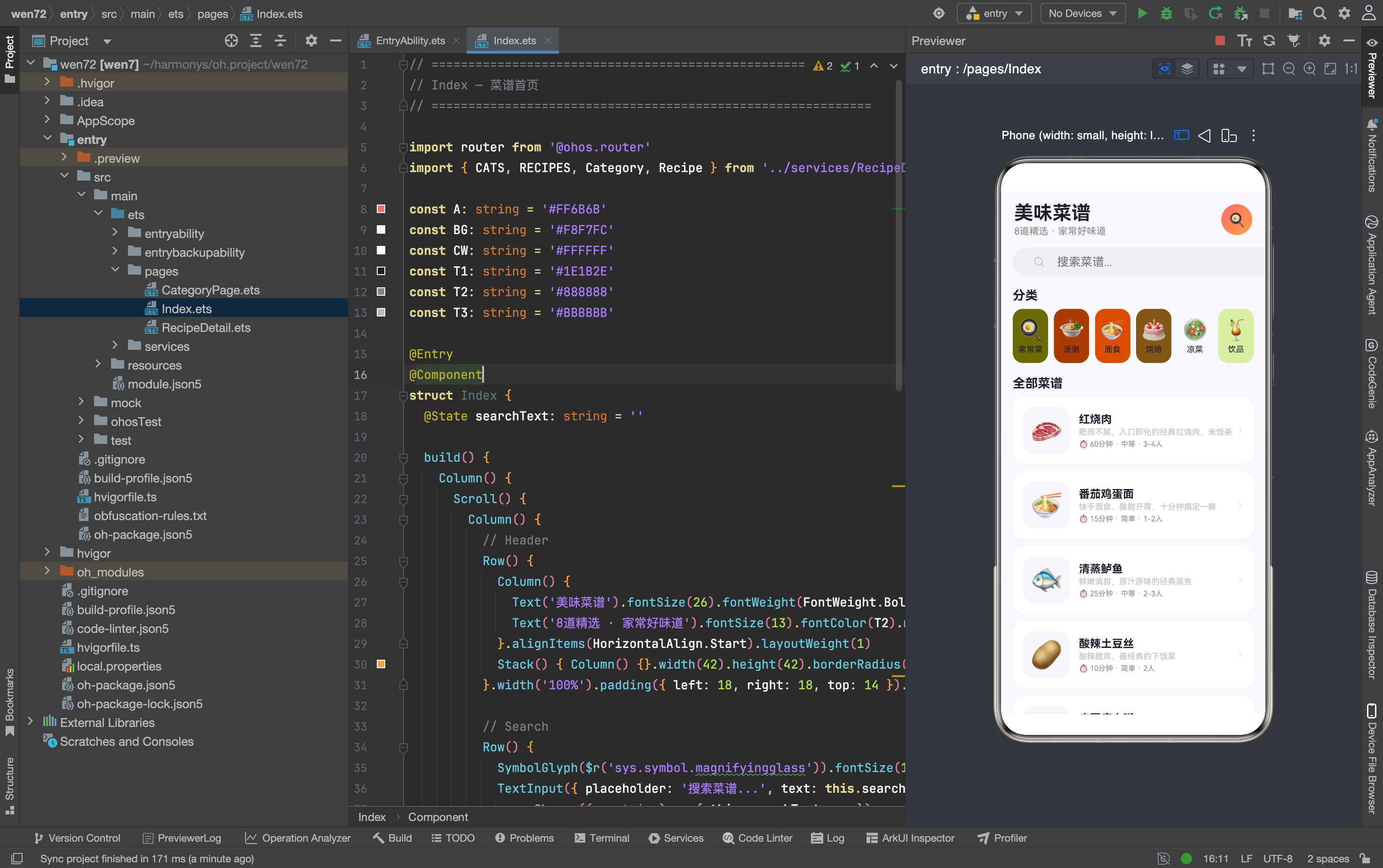
菜谱 App 是一个结构清晰的三页面应用——首页展示所有菜谱,分类页按类别筛选,详情页展示做法步骤。首页作为入口,承担了搜索、分类导航、菜谱列表三个核心功能。从截图看,页面从上到下依次是:标题区(“美味菜谱” + 渐变头像)、搜索栏、6 个分类图标、8 道菜谱卡片列表。
完整效果
一、数据层设计:接口与查询函数
export interface Recipe {
  id: number; name: string; icon: string; category: string; time: string; difficulty: string
  servings: string; desc: string; ingredients: Ingredient[]; steps: string[]; tips: string
}

export interface Ingredient { name: string; amount: string }

export interface Category { name: string; icon: string; color: string }
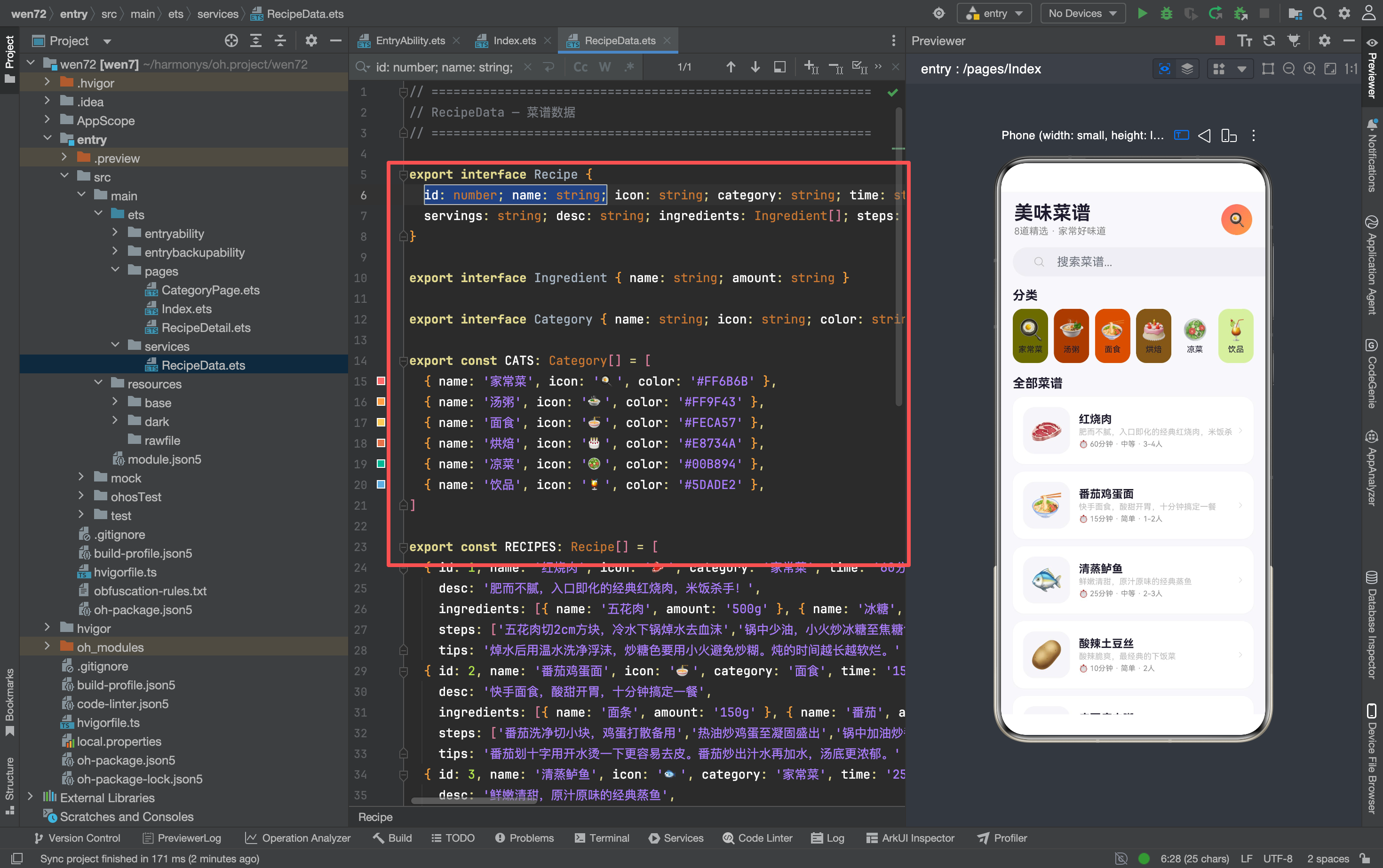
三个接口定义了三种数据结构。Recipe 接口有 12 个字段,是三个 App 里字段最多的接口——涵盖了菜谱的所有信息:基本信息(name/icon/category)、属性(time/difficulty/servings)、详细内容(ingredients/steps/tips)。
ingredients 是嵌套数组——每个食材是一个 { name, amount } 对象。这种"数组里套对象"的结构在详情页需要遍历展示。steps 是字符串数组——每步是一个完整的操作说明,不需要额外的结构。
Category 接口只有 3 个字段——name(分类名)、icon(emoji 图标)、color(主题色)。每个分类有独立的颜色,用于分类图标的背景色和分类页的强调色。
数据查询函数
export function getRecipeById(id: number): Recipe | undefined {
  for (let i: number = 0; i < RECIPES.length; i++) {
    if (RECIPES[i].id === id) return RECIPES[i]
  }
  return undefined
}

export function getRecipesByCat(cat: string): Recipe[] {
  const r: Recipe[] = []
  for (let i: number = 0; i < RECIPES.length; i++) {
    if (RECIPES[i].category === cat) r.push(RECIPES[i])
  }
  return r
}
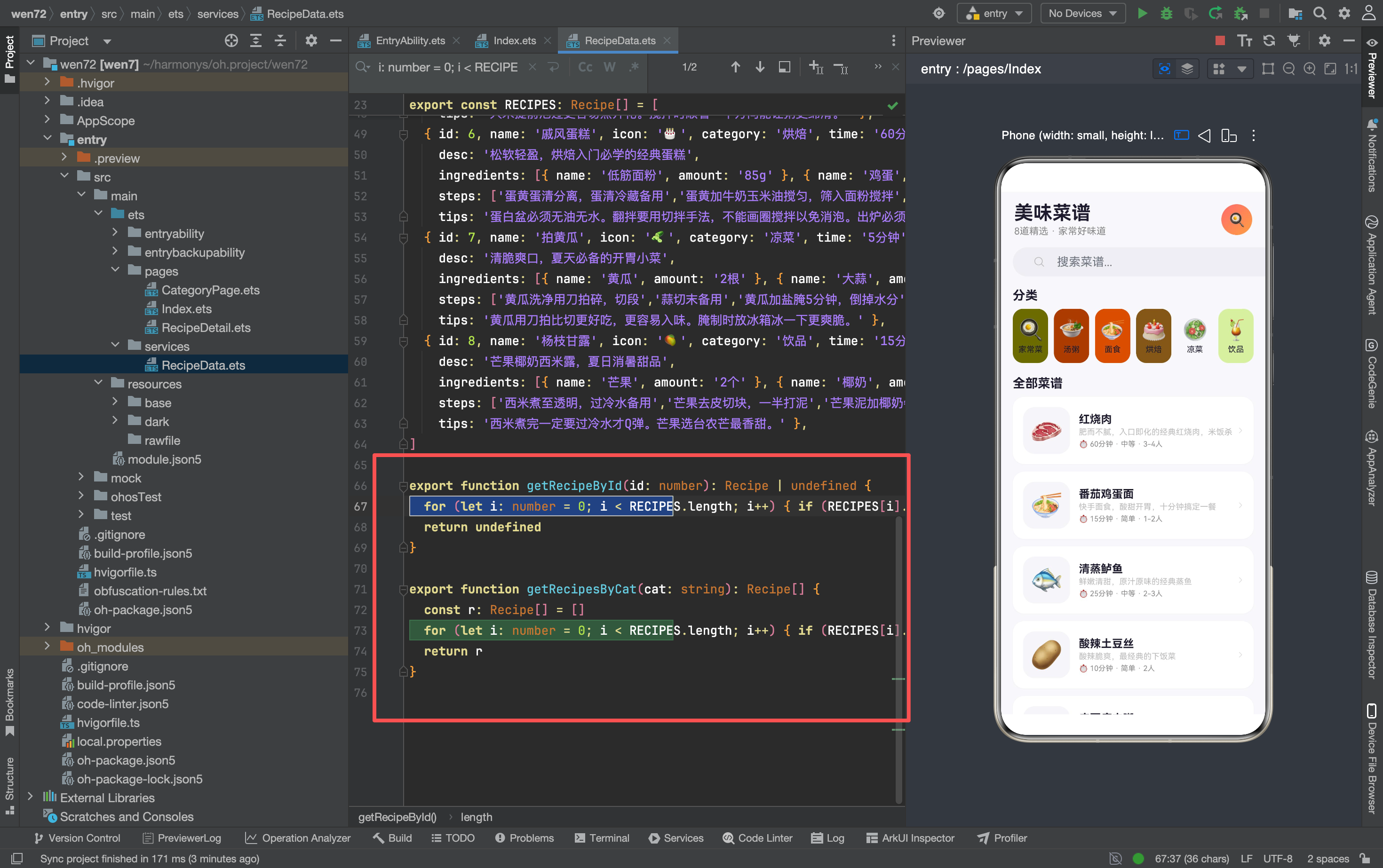
两个查询函数的实现风格和智能家居 App 的 DeviceData 一致——全部用 for 循环遍历数组。getRecipeById 返回单个 Recipe 或 undefined(找不到时),getRecipesByCat 返回新数组(过滤后的结果)。
getRecipeById 返回 Recipe | undefined 而不是 Recipe——TypeScript 的联合类型。调用方需要处理 undefined 的情况(比如 if (this.recipe) 判断后再使用),这比直接返回 null 更安全,编译器会强制你检查。
二、首页的四个区块
区块一:Header 标题区
Row() {
  Column() {
    Text('美味菜谱').fontSize(26).fontWeight(FontWeight.Bold).fontColor(T1)
    Text('8道精选 · 家常好味道').fontSize(13).fontColor(T2).margin({ top: 2 })
  }.alignItems(HorizontalAlign.Start).layoutWeight(1)
  Stack() {
    Column() {}.width(42).height(42).borderRadius(21)
      .linearGradient({ angle: 135, colors: [[A, 0], ['#FF9F43', 1]] })
    Text('🍳').fontSize(18)
  }
}
.width('100%').padding({ left: 18, right: 18, top: 14 }).margin({ bottom: 14 })
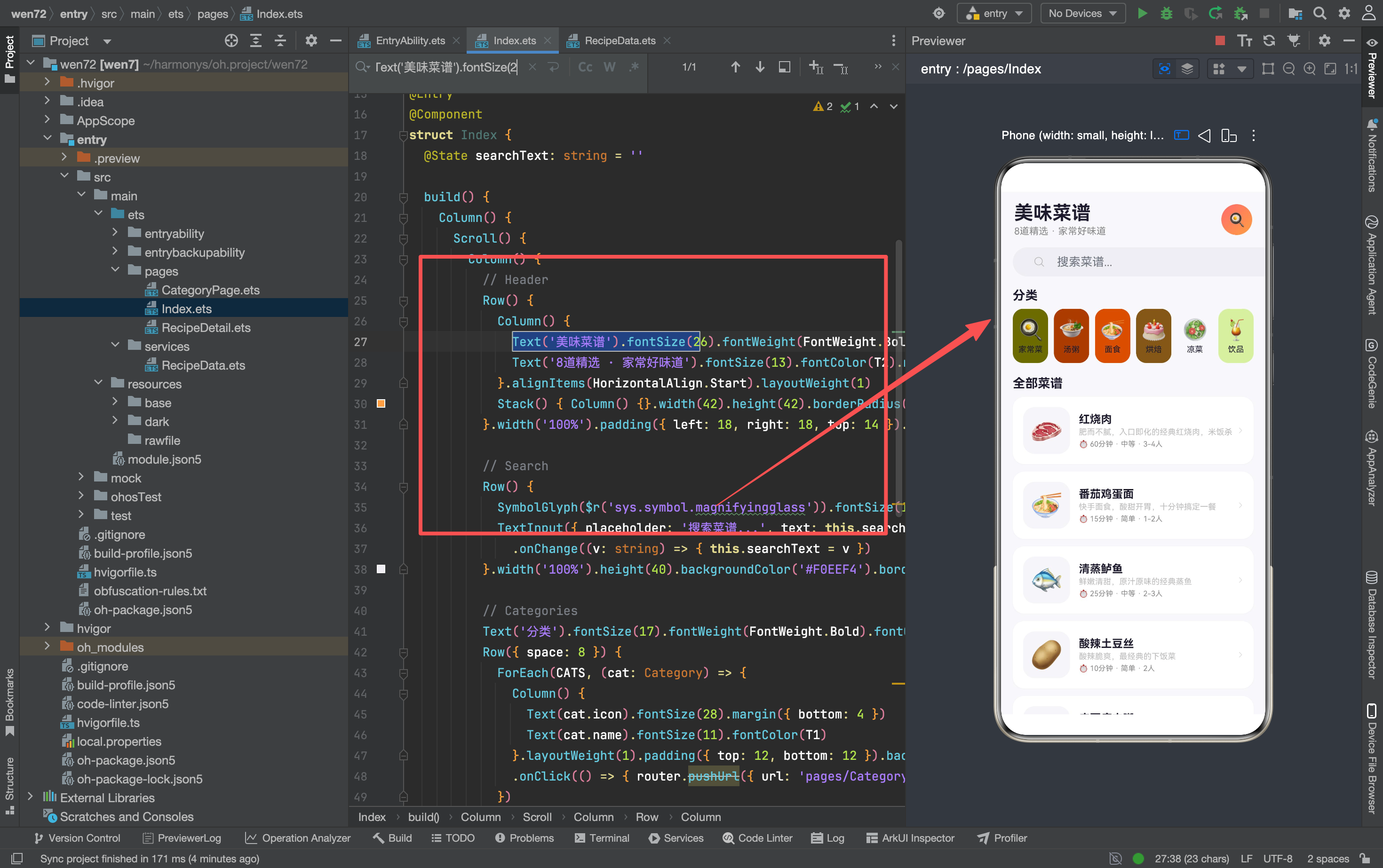
Header 结构和前面三个 App 的首页完全一致——左侧标题 + 右侧渐变头像。区别是渐变色从主色(#FF6B6B)渐变到橙色(#FF9F43),而不是主色到浅紫色。这个橙色渐变呼应了菜谱的"温暖"调性——红色和橙色都是暖色系,让人联想到食物和烹饪。
"8道精选 · 家常好味道"是硬编码的——没有从 RECIPES.length 动态计算。如果以后增加菜谱,需要手动更新这个数字。
区块二:搜索栏
Row() {
  SymbolGlyph($r('sys.symbol.magnifyingglass')).fontSize(16).fontColor([T3])
    .margin({ left: 12 })
  TextInput({ placeholder: '搜索菜谱...', text: this.searchText })
    .layoutWeight(1).height(40).backgroundColor('transparent')
    .fontSize(14).onChange((v: string) => { this.searchText = v })
}
.width('100%').height(40).backgroundColor('#F0EEF4').borderRadius(20)
.padding({ left: 16, right: 16 }).margin({ left: 16, right: 16, bottom: 16 })
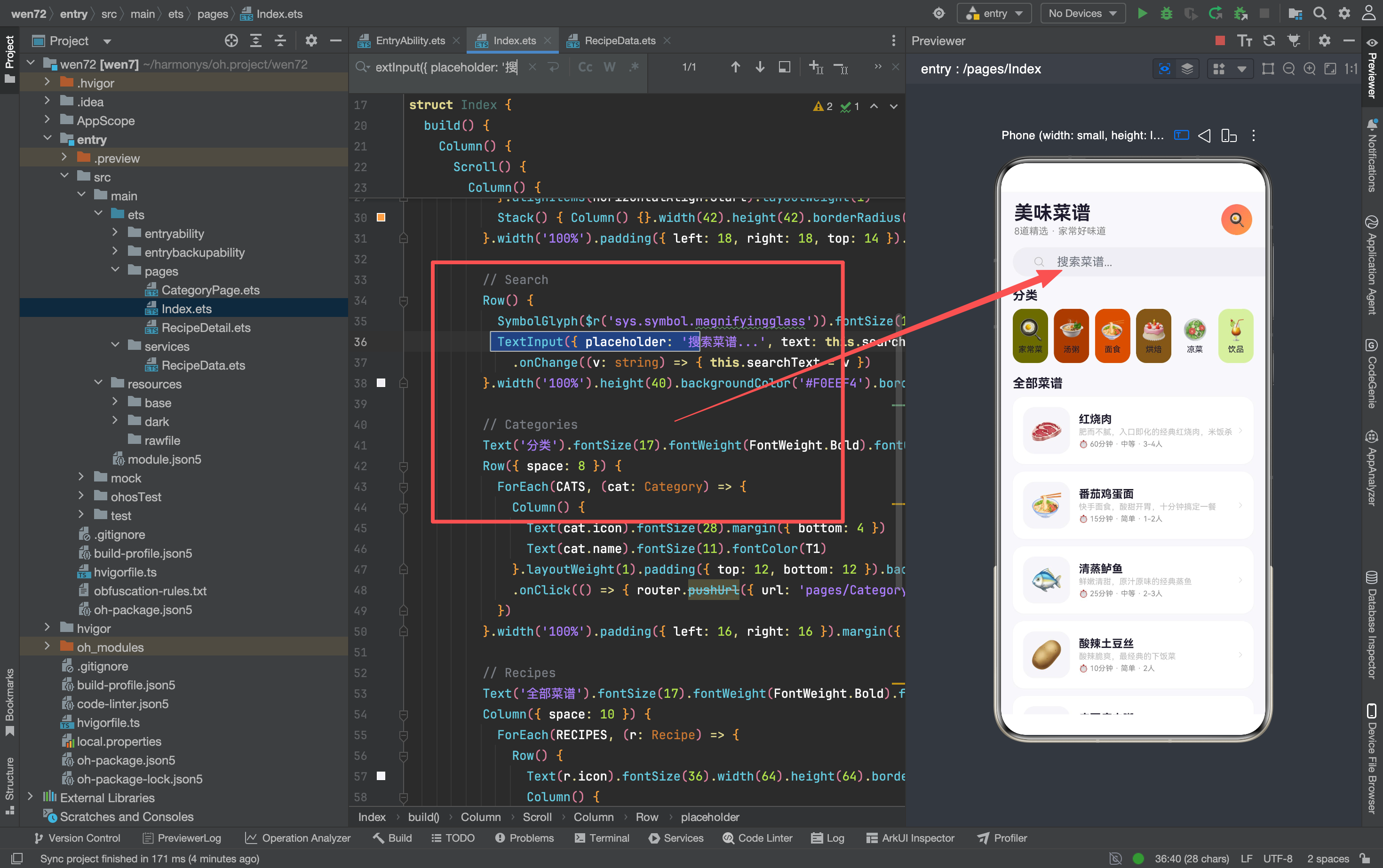
搜索栏用 Row 水平排列放大镜图标和输入框。逐行分析:
SymbolGlyph($r('sys.symbol.magnifyingglass'))——放大镜图标,用系统 SymbolGlyph 而不是 emoji。SymbolGlyph 的视觉风格更统一、更规范,适合做功能性图标(搜索、返回、箭头等)。emoji 适合做装饰性图标(食物、房间等)。
TextInput({ placeholder: '搜索菜谱...', text: this.searchText })——输入框,placeholder 是灰色提示文字,text 绑定 @State searchText。用户输入时触发 .onChange,更新 this.searchText。
backgroundColor('transparent')——输入框背景透明。输入框的背景色由外层 Row 的 #F0EEF4 提供,输入框本身不需要额外背景。如果给 TextInput 加了背景色,会和 Row 的背景叠加,看起来有两层颜色。
搜索功能的当前状态: searchText 会实时更新(输入什么显示什么),但没有实际的过滤逻辑——下方的菜谱列表始终显示全部 8 道菜,不会根据搜索文字筛选。这是一个 UI 占位,后续需要实现过滤:
// 后续需要实现的过滤逻辑
getFilteredRecipes(): Recipe[] {
  if (this.searchText === '') return RECIPES
  const result: Recipe[] = []
  for (let i = 0; i < RECIPES.length; i++) {
    if (RECIPES[i].name.includes(this.searchText) ||
        RECIPES[i].desc.includes(this.searchText)) {
      result.push(RECIPES[i])
    }
  }
  return result
}
区块三:分类导航
Text('分类').fontSize(17).fontWeight(FontWeight.Bold).fontColor(T1)
  .width('100%').padding({ left: 16 }).margin({ bottom: 8 })
Row({ space: 8 }) {
  ForEach(CATS, (cat: Category) => {
    Column() {
      Text(cat.icon).fontSize(28).margin({ bottom: 4 })
      Text(cat.name).fontSize(11).fontColor(T1)
    }.layoutWeight(1).padding({ top: 12, bottom: 12 })
    .backgroundColor(cat.color + '12').borderRadius(14)
    .onClick(() => {
      router.pushUrl({ url: 'pages/CategoryPage',
        params: { 'cat': cat.name } as Record<string,Object> })
    })
  })
}.width('100%').padding({ left: 16, right: 16 }).margin({ bottom: 18 })
分类区域用 Row 横向排列 6 个分类图标。逐个分析关键点:
Row({ space: 8 })——6 个分类之间间距 8vp。总宽度 = 6 个分类 × 各自宽度 + 5 个间距 × 8vp。每个分类用 .layoutWeight(1) 均分剩余空间,所以不需要手动计算宽度。
cat.color + '12'——分类背景色用主题色 + 18% 透明度。每个分类有自己的颜色(家常菜=#FF6B6B、汤粥=#FF9F43 等),加透明度后变成浅色背景。6 个分类的背景色各不相同,形成"彩色标签"的视觉效果。
路由跳转——点击分类跳转到 CategoryPage,传递 cat 参数(分类名)。CategoryPage 用 getRecipesByCat(cat) 过滤出该分类下的菜谱。参数是字符串(不是 id),因为分类数据比较简单,直接传名字比传 id 更直观。
分类和菜谱的关联方式——Category 的 name 和 Recipe 的 category 字段用中文字符串匹配(“家常菜”"汤粥"等)。这种"字符串外键"在原型阶段最直观,但真实 App 应该用数字 id 关联,避免中文编码问题。
区块四:菜谱列表
Text('全部菜谱').fontSize(17).fontWeight(FontWeight.Bold).fontColor(T1)
  .width('100%').padding({ left: 16 }).margin({ bottom: 8 })
Column({ space: 10 }) {
  ForEach(RECIPES, (r: Recipe) => {
    Row() {
      Text(r.icon).fontSize(36).width(64).height(64).borderRadius(16)
        .backgroundColor('#F5F5FA').textAlign(TextAlign.Center)
      Column() {
        Text(r.name).fontSize(15).fontWeight(FontWeight.Bold).fontColor(T1)
        Text(r.desc).fontSize(11).fontColor(T3).maxLines(1).margin({ top: 2 })
        Row() {
          Text('⏱ ' + r.time).fontSize(10).fontColor(T2)
          Text(' · ' + r.difficulty).fontSize(10).fontColor(T2)
          Text(' · ' + r.servings).fontSize(10).fontColor(T2)
        }.margin({ top: 4 })
      }.alignItems(HorizontalAlign.Start).margin({ left: 12 }).layoutWeight(1)
      SymbolGlyph($r('sys.symbol.chevron_right')).fontSize(14).fontColor(['#DDD'])
    }.width('100%').padding(14).backgroundColor(CW).borderRadius(16)
    .shadow({ radius: 4, color: 'rgba(0,0,0,0.03)', offsetY: 1 })
    .onClick(() => {
      router.pushUrl({ url: 'pages/RecipeDetail',
        params: { 'id': r.id } as Record<string,Object> })
    })
  })
}.width('100%').padding({ left: 16, right: 16 })
菜谱列表用 Column({ space: 10 }) 垂直排列,每个菜谱是一个横向卡片。逐行拆解卡片结构:
左侧 emoji 图标——Text(r.icon).fontSize(36).width(64).height(64)。64×64 的固定区域,emoji 居中显示。背景色 #F5F5FA 是极浅的灰色,让 emoji 在白色卡片上有一个"底座"。borderRadius(16) 让背景变成圆角矩形。
中间信息区——三行文字:
- 第一行:菜名,15px 粗体深色
- 第二行:描述,11px 灰色,
maxLines(1)限制最多一行,超出部分省略 - 第三行:时间 + 难度 + 人数,10px 灰色,用 “·” 分隔
maxLines(1)——文本截断。菜谱描述可能很长(比如红烧肉的"肥而不腻,入口即化的经典红烧肉,米饭杀手!"),限制一行后超出部分显示省略号。这保证所有卡片的高度一致,不会因为描述长短不同导致卡片高低不齐。
右侧箭头——SymbolGlyph($r('sys.symbol.chevron_right')),灰色 14px。和前面 App 的右箭头一致,表示"可点击查看详情"。
卡片阴影——.shadow({ radius: 4, color: 'rgba(0,0,0,0.03)', offsetY: 1 })。4vp 模糊半径、3% 黑色透明度、1vp 向下偏移。这是项目里最轻的阴影——首页的设备状态卡片用的是 radius: 16、A+‘25’ 的重阴影。菜谱卡片用轻阴影是因为卡片数量多(8 个),重阴影会让页面看起来太"厚重"。
路由跳转——点击卡片跳转到 RecipeDetail,传递 id 参数(菜谱 id)。和分类页传名字不同,详情页传数字 id——因为 Recipe 有 12 个字段,传 id 比传所有字段更高效,详情页通过 getRecipeById(id) 查询完整数据。
三、@State 的当前用途
首页只有一个 @State:
@State searchText: string = ''
这个 @State 绑定了搜索框的输入内容——用户输入时 .onChange 更新它,搜索框显示它的值。但目前没有用它做任何过滤操作——菜谱列表始终用 RECIPES(全量数据),没有根据 searchText 筛选。
和前面几个 App 对比,首页的 @State 数量是最少的——只有一个搜索文本。这说明首页的数据流很简单:所有数据从 RecipeData 直接读取,不需要在页面里维护额外的状态副本。搜索功能如果后续实现,需要新增一个 @State filteredRecipes: Recipe[] = [],在 searchText 变化时重新计算过滤结果。
四、首页和 CategoryPage 的代码复用
对比首页的菜谱卡片和 CategoryPage 的菜谱卡片:
首页:
Row() {
  Text(r.icon).fontSize(36).width(64).height(64).borderRadius(16)
    .backgroundColor('#F5F5FA').textAlign(TextAlign.Center)
  Column() {
    Text(r.name).fontSize(15).fontWeight(FontWeight.Bold).fontColor(T1)
    Text(r.desc).fontSize(11).fontColor(T3).maxLines(1).margin({ top: 2 })
    Row() {
      Text('⏱ ' + r.time).fontSize(10).fontColor(T2)
      Text(' · ' + r.difficulty).fontSize(10).fontColor(T2)
      Text(' · ' + r.servings).fontSize(10).fontColor(T2)
    }.margin({ top: 4 })
  }.alignItems(HorizontalAlign.Start).margin({ left: 12 }).layoutWeight(1)
  SymbolGlyph($r('sys.symbol.chevron_right')).fontSize(14).fontColor(['#DDD'])
}
CategoryPage:
Row() {
  Text(r.icon).fontSize(36).width(64).height(64).borderRadius(16)
    .backgroundColor('#F5F5FA').textAlign(TextAlign.Center)
  Column() {
    Text(r.name).fontSize(15).fontWeight(FontWeight.Bold).fontColor(T1)
    Text(r.desc).fontSize(11).fontColor(T3).maxLines(1).margin({ top: 2 })
    Text('⏱ ' + r.time + ' · ' + r.difficulty).fontSize(10).fontColor(T2).margin({ top: 4 })
  }.alignItems(HorizontalAlign.Start).margin({ left: 12 }).layoutWeight(1)
  SymbolGlyph($r('sys.symbol.chevron_right')).fontSize(14).fontColor(['#DDD'])
}
两段代码几乎完全一致——唯一的区别是第三行信息:首页用了三个独立的 Text + “·” 分隔符,CategoryPage 用了一个 Text 拼接字符串。最终视觉效果一样,但实现方式不同。
这种重复是抽取 Builder 的典型场景。如果以后更多页面(比如搜索结果页)也需要同样的菜谱卡片,可以抽取:
@Builder RecipeCard(r: Recipe) {
  Row() {
    Text(r.icon).fontSize(36).width(64).height(64).borderRadius(16)
      .backgroundColor('#F5F5FA').textAlign(TextAlign.Center)
    Column() {
      Text(r.name).fontSize(15).fontWeight(FontWeight.Bold).fontColor(T1)
      Text(r.desc).fontSize(11).fontColor(T3).maxLines(1).margin({ top: 2 })
      Text('⏱ ' + r.time + ' · ' + r.difficulty + ' · ' + r.servings)
        .fontSize(10).fontColor(T2).margin({ top: 4 })
    }.alignItems(HorizontalAlign.Start).margin({ left: 12 }).layoutWeight(1)
    SymbolGlyph($r('sys.symbol.chevron_right')).fontSize(14).fontColor(['#DDD'])
  }
}
当前没有抽取——因为只有两个页面用到,维护成本可接受。
五、项目文件结构
entry/src/main/ets/
  pages/
    Index.ets          首页(搜索 + 分类 + 菜谱列表)
    CategoryPage.ets   分类页(按分类筛选菜谱)
    RecipeDetail.ets   详情页(食材 + 步骤 + 计时器)
  services/
    RecipeData.ets     数据定义 + 查询函数
3 个页面 + 1 个服务层——三个 App 里结构最简单的。页面数量少意味着每个页面的职责更清晰:Index 负责展示和导航,CategoryPage 负责筛选,RecipeDetail 负责详情和交互(收藏、计时器、份量调整)。
数据层的 RecipeData 包含了完整的信息——8 道菜谱的食材、步骤、小贴士都是真实的 mock 数据(不是"测试数据1""测试数据2"这种占位符)。这让 App 的预览效果更接近真实产品。

讨论HarmonyOS开发技术,专注于API与组件、DevEco Studio、测试、元服务和应用上架分发等。
更多推荐

 3
3 0
0- 0


 已为社区贡献159条内容

所有评论(0)