HarmonyOS菜谱——详情页的多区块布局与交互实现
适用读者: 已经掌握 ArkTS 基础布局、想学习复杂页面拆分策略的开发者。本文以菜谱详情页为例,拆解六个功能区块的布局思路和交互实现。
完整效果
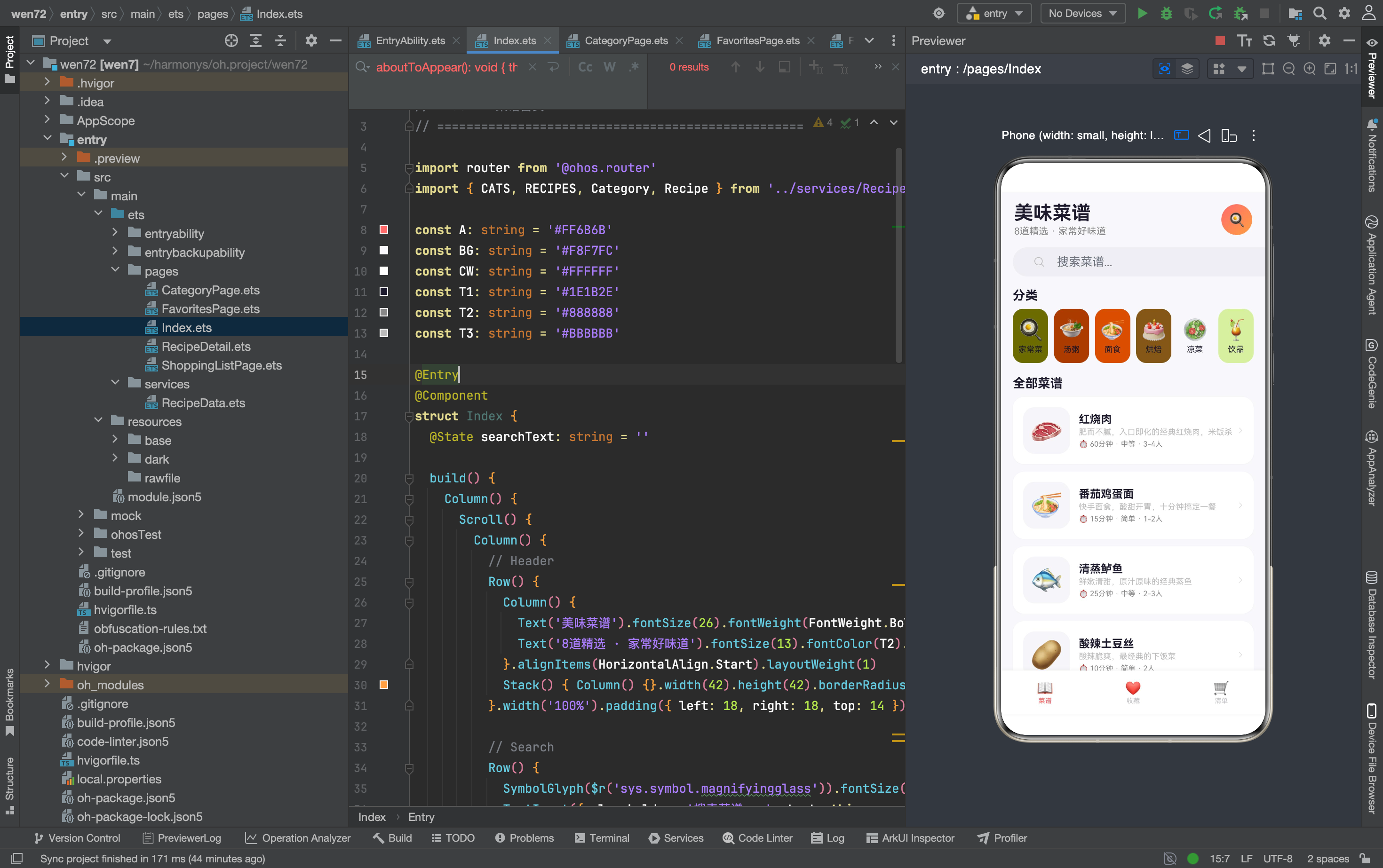
一、页面概览:六个区块的职责划分
从截图看,详情页从上到下依次是:
| 区块 | 内容 | 交互类型 |
|---|---|---|
| 导航栏 | 返回 + 菜名 + 收藏按钮 | 点击返回/收藏切换 |
| Hero | 大图标 + 菜名 + 描述 + 属性 | 纯展示 |
| 食材清单 | 标题 + 加入清单按钮 + 食材列表 | 点击加入清单 |
| 步骤 | 标题 + 编号时间线 | 纯展示 |
| 小贴士 | 背景提示文字 | 纯展示 |
| 份量调整 | −/数字/+ 按钮 | 点击增减 |
| 烹饪计时器 | 时间显示 + 预设按钮 + 开始/停止 | 点击切换 |
六个区块用 Column + Scroll 垂直排列,每个区块是一个独立的 Column 容器,外层统一加白色背景和圆角。这种"一区块一容器"的模式让每个区块可以独立调整样式,互不影响。
二、Hero 区块:视觉重心的设计
Column() {
  Text(this.recipe.icon).fontSize(72).margin({ bottom: 10 })
  Text(this.recipe.name).fontSize(24).fontWeight(FontWeight.Bold).fontColor(T1).margin({ bottom: 4 })
  Text(this.recipe.desc).fontSize(14).fontColor(T2)
  Row({ space: 12 }) {
    Text('⏱ ' + this.recipe.time).fontSize(12).fontColor(T2)
    Text('📊 ' + this.recipe.difficulty).fontSize(12).fontColor(T2)
    Text('🍽 ' + this.recipe.servings).fontSize(12).fontColor(T2)
  }.margin({ top: 10 })
}.width('100%').padding(24).backgroundColor('#FFFFFF').borderRadius(18)
.margin({ left: 16, right: 16, bottom: 16 }).alignItems(HorizontalAlign.Center)
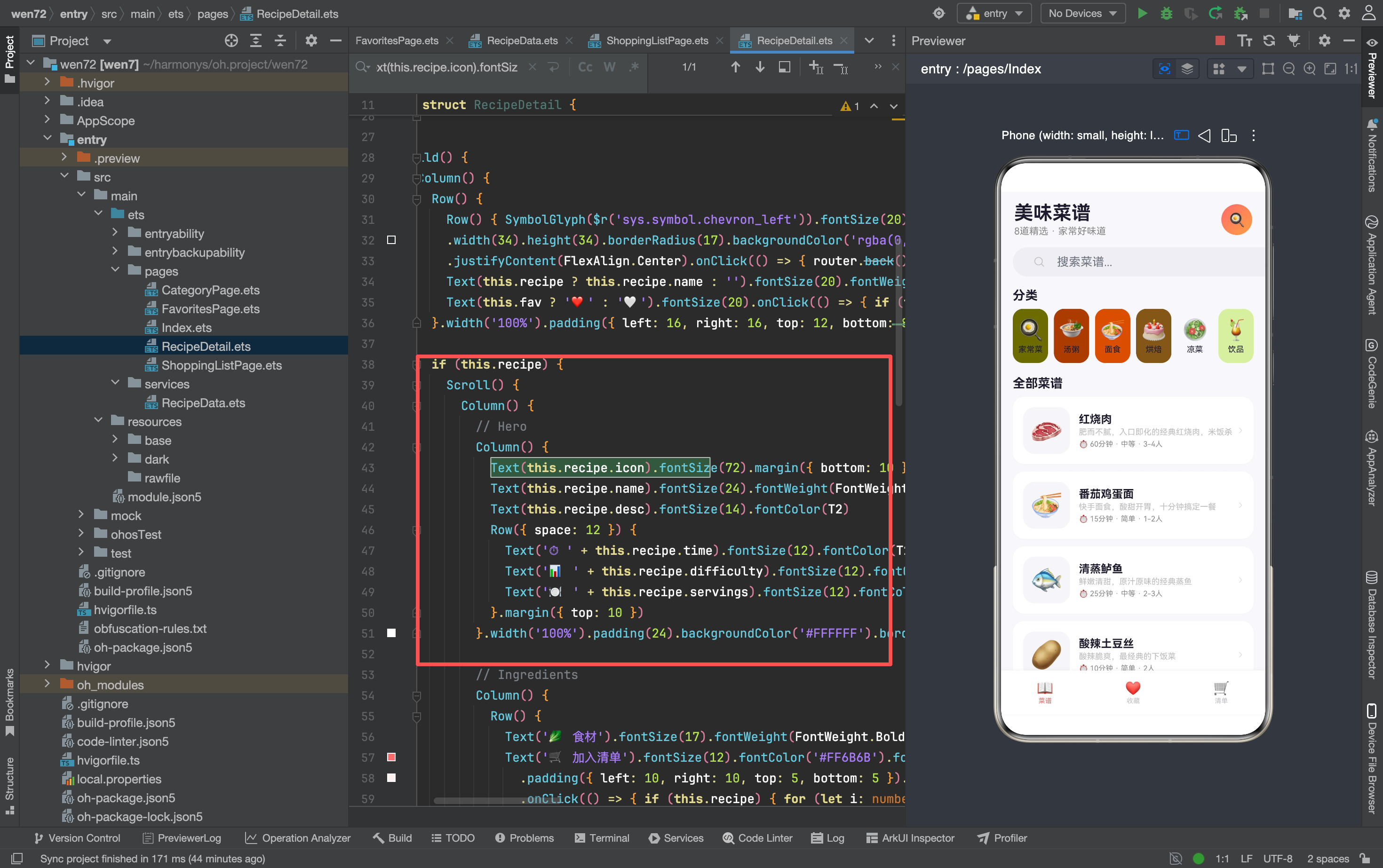
Hero 区块是整个页面的视觉重心——72px 的大 emoji 占据了最大的视觉面积。为什么用 emoji 而不是真实图片?因为 mock 阶段没有图片资源,emoji 是最轻量的视觉替代方案。真实 App 应该用高清食物照片,但 emoji 在 demo 阶段也能传达"这是什么菜"的信息。
alignItems(HorizontalAlign.Center) 让所有文字居中对齐。Hero 区块和其他区块不同——其他区块的文字都是左对齐(alignItems(HorizontalAlign.Start)),Hero 居中是为了营造"标题页"的感觉,和其他内容区块形成视觉区分。
三个属性用 Row({ space: 12 }) 横向排列。 时间、难度、人数用 “·” 分隔——这不是真正的分隔符,而是 Text 字符的一部分('⏱ ' + this.recipe.time)。这种写法比用三个独立 Text 加分隔符更简洁,但缺点是无法单独控制分隔符的颜色和间距。
三、食材清单:标题行复用与列表渲染
Column() {
  Row() {
    Text('🥬 食材').fontSize(17).fontWeight(FontWeight.Bold).fontColor(T1).layoutWeight(1)
    Text('🛒 加入清单').fontSize(12).fontColor('#FF6B6B').fontWeight(FontWeight.Medium)
      .padding({ left: 10, right: 10, top: 5, bottom: 5 })
      .backgroundColor('#FFF0F0').borderRadius(10)
      .onClick(() => {
        if (this.recipe) {
          for (let i: number = 0; i < this.recipe.ingredients.length; i++) {
            addToShop(this.recipe.ingredients[i].name + ' ' + this.recipe.ingredients[i].amount)
          }
        }
      })
  }.width('100%').margin({ bottom: 10 })
  Column({ space: 6 }) {
    ForEach(this.recipe.ingredients, (ing: Ingredient) => {
      Row() {
        Row() {}.width(6).height(6).borderRadius(3).backgroundColor(A).margin({ right: 10 })
        Text(ing.name).fontSize(14).fontColor(T1).layoutWeight(1)
        Text(ing.amount).fontSize(13).fontWeight(FontWeight.Medium).fontColor(A)
      }.width('100%').padding({ top: 4, bottom: 4 })
    })
  }
}
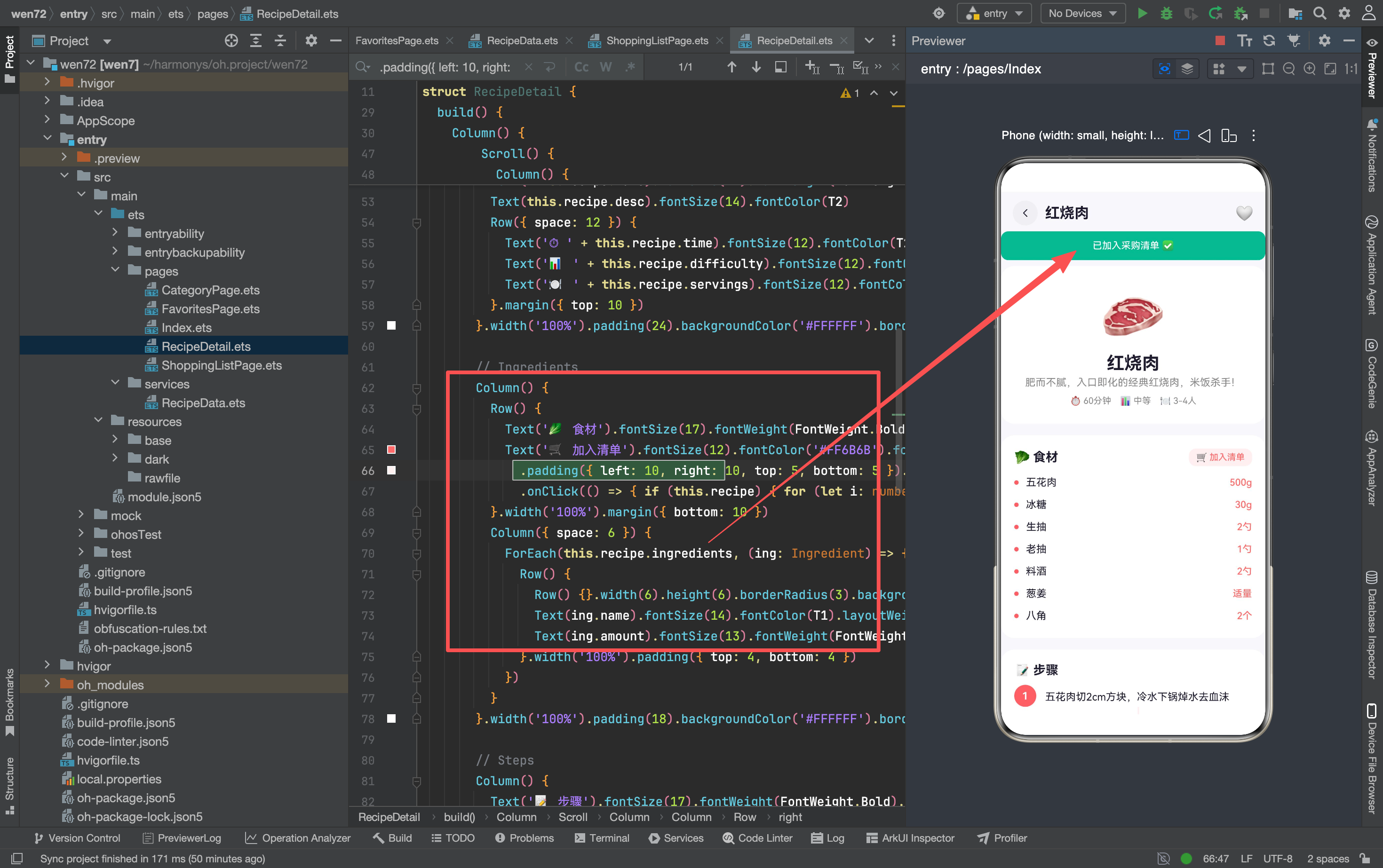
标题行的双按钮设计
标题行左侧是"🥬 食材"标题,右侧是"🛒 加入清单"按钮。这种"标题 + 操作按钮"的模式在前面的 App 里没有出现过——之前的标题行都是"标题 + 数字"(如"房间 5 个"),右侧是纯展示信息。这里的右侧是一个可点击的操作按钮。
layoutWeight(1) 让标题占据所有剩余空间。 这样"加入清单"按钮固定在右侧,不会被标题文字挤压。无论标题多长("🥬 食材"很短,但如果是"🥬 所需食材清单"就会很长),按钮位置不变。
"加入清单"按钮的样式——浅红背景 + 红色文字。 #FFF0F0 是主色 #FF6B6B 的极低透明度背景,#FF6B6B 是主色文字。这种"浅色背景 + 深色文字"的组合让按钮看起来像一个"标签"而不是"实心按钮",视觉上更轻量。
食材列表的小圆点
Row() {}.width(6).height(6).borderRadius(3).backgroundColor(A).margin({ right: 10 })
这是一个 6×6 的红色小圆点——用 Row 而不是 Circle 或 Dot 组件。Row 没有内容,纯色块,borderRadius(3) 让方形变成圆形(3 = 6/2)。这种"空 Row + borderRadius"的做法在 ArkTS 里是最简单的画圆方式,不需要引入额外的图形组件。
为什么用 Row 而不是 Text(‘●’)? Text 的圆点大小受 fontSize 控制,不容易精确到 6px。Row 的 width/height 可以精确控制尺寸,更适合做装饰性元素。
食材数量的动态性
食材列表用 ForEach(this.recipe.ingredients, ...) 渲染——每道菜的食材数量不同(红烧肉 7 种,拍黄瓜 6 种)。Column({ space: 6 }) 自动处理间距,不需要手动计算每个食材项的位置。
四、步骤时间线:编号圆圈 + 连接线
Column() {
  Text('📝 步骤').fontSize(17).fontWeight(FontWeight.Bold).fontColor(T1)
    .width('100%').margin({ bottom: 10 })
  ForEach(this.recipe.steps, (step: string, idx: number) => {
    Column() {
      Row() {
        Column() {
          Text((idx + 1).toString()).fontSize(14).fontWeight(FontWeight.Bold).fontColor('#FFFFFF')
        }.width(30).height(30).borderRadius(15).backgroundColor(A)
        .justifyContent(FlexAlign.Center).alignItems(HorizontalAlign.Center)
        Text(step).fontSize(14).fontColor(T1).lineHeight(22).margin({ left: 12 }).layoutWeight(1)
      }.width('100%')
      if (idx < this.recipe!.steps.length - 1) {
        Row() {}.width(2).height(16).backgroundColor('#FFF0F0').margin({ left: 14 })
      }
    }.width('100%')
  })
}
编号圆圈的实现
Column() {
  Text((idx + 1).toString()).fontSize(14).fontWeight(FontWeight.Bold).fontColor('#FFFFFF')
}.width(30).height(30).borderRadius(15).backgroundColor(A)
.justifyContent(FlexAlign.Center).alignItems(HorizontalAlign.Center)
编号用 Column 包裹 Text,Column 设定 30×30 的尺寸和圆形(borderRadius(15)),Text 居中显示步骤序号。idx + 1 而不是 idx——因为数组索引从 0 开始,但步骤编号从 1 开始。
为什么用 Column 而不是 Row? Row 是水平排列,Text 在 Row 里默认左对齐。Column 是垂直排列,配合 justifyContent(FlexAlign.Center) 和 alignItems(HorizontalAlign.Center) 能同时实现水平和垂直居中。如果用 Row,需要额外加 textAlign(TextAlign.Center) 和外层居中,代码更复杂。
连接线的条件渲染
if (idx < this.recipe!.steps.length - 1) {
  Row() {}.width(2).height(16).backgroundColor('#FFF0F0').margin({ left: 14 })
}
连接线只在非最后一个步骤之间显示。 idx < this.recipe!.steps.length - 1 判断当前步骤不是最后一步时,才渲染连接线。最后一步下方不需要连接线——因为下面没有更多步骤了。
margin({ left: 14 }) 让连接线和编号圆圈对齐。 编号圆圈宽 30px,居中后圆心在 15px 位置。连接线宽 2px,margin left 14px 让连接线的中心(14 + 1 = 15)和圆圈中心对齐。这种"手动计算 margin 对齐"的做法比较原始,但在 ArkTS 里没有更简便的方式。
踩坑记录: 最初连接线用的是 margin({ left: 15 }),视觉上连接线偏右 1px。改成 margin({ left: 14 }) 后完美对齐。这种 1px 的偏差在手机上不太明显,但在模拟器预览里能看出来。
this.recipe! 的非空断言
this.recipe!.steps.length 用了 ! 非空断言——告诉编译器 this.recipe 一定不是 undefined。这是因为外层已经有 if (this.recipe) 判断,进入这个分支后 this.recipe 肯定有值。但 TypeScript 编译器不会自动推断 if 分支内的类型收窄(因为 this.recipe 是 @State 变量,可能在异步操作中被改为 undefined),所以需要手动断言。
五、小贴士卡片:背景色的差异化
Column() {
  Text('💡 小贴士').fontSize(17).fontWeight(FontWeight.Bold).fontColor(T1)
    .width('100%').margin({ bottom: 8 })
  Text(this.recipe!.tips).fontSize(13).fontColor(T2).lineHeight(22)
}.width('100%').padding(18).backgroundColor('#FFF8F5').borderRadius(18)
.margin({ left: 16, right: 16 }).border({ width: 1, color: '#FFE8D0' })
小贴士卡片用了暖色背景 #FFF8F5(极浅橙色)和边框 #FFE8D0(浅橙色),和其他白色卡片形成视觉区分。这种"暖色背景 + 暖色边框"的组合暗示"这是提示/建议类信息",和正文内容在视觉上分开。
lineHeight(22) 控制行高。 小贴士是一段较长的文字,没有用 ForEach 逐行渲染,而是用一个 Text 组件显示整段文字。lineHeight(22) 让行间距适中,不会太挤也不会太松。如果不设 lineHeight,默认行高可能太小,长段文字阅读体验差。
六、份量调整:边界检查的实现
@State servings: number = 1

Column() {
  Text('🍽 份量调整').fontSize(17).fontWeight(FontWeight.Bold).fontColor(T1)
    .width('100%').margin({ bottom: 8 })
  Row() {
    Text('−').fontSize(20).fontWeight(FontWeight.Bold).fontColor(T2)
      .width(40).height(40).borderRadius(20).backgroundColor('#F5F5FA')
      .textAlign(TextAlign.Center)
      .onClick(() => { if (this.servings > 1) this.servings-- })
    Text(this.servings.toString() + ' 人份').fontSize(18)
      .fontWeight(FontWeight.Bold).fontColor(A).margin({ left: 16, right: 16 })
    Text('+').fontSize(20).fontWeight(FontWeight.Bold).fontColor(T2)
      .width(40).height(40).borderRadius(20).backgroundColor('#F5F5FA')
      .textAlign(TextAlign.Center)
      .onClick(() => { if (this.servings < 8) this.servings++ })
  }.width('100%').justifyContent(FlexAlign.Center)
}
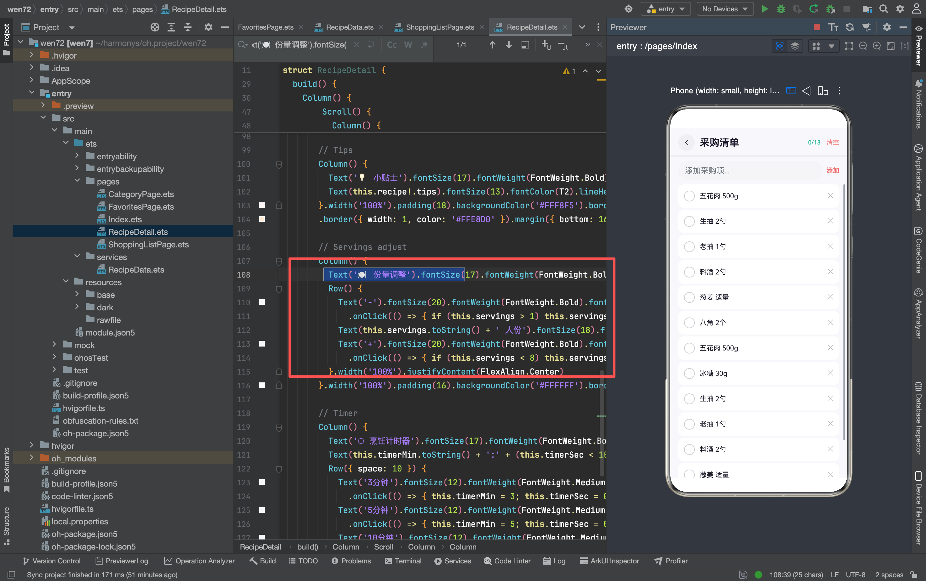
边界检查的重要性
// 减号按钮
.onClick(() => { if (this.servings > 1) this.servings-- })

// 加号按钮
.onClick(() => { if (this.servings < 8) this.servings++ })
两个边界检查:最小 1 人份(不能减到 0 或负数),最大 8 人份(不能无限加)。如果没有边界检查,用户可以减到 0 甚至负数——"0 人份"在业务上没有意义,可能导致后续计算出错(比如乘以 0 得到 0 食材用量)。
为什么最大是 8? 因为 mock 数据里最大的 servings 是"6-8人"(戚风蛋糕)。8 是一个合理的上限——家庭聚餐一般不会超过 8 人。这个上限是业务逻辑决定的,不是技术限制。
按钮样式的对称设计
减号和加号按钮用完全相同的样式——40×40 的圆形灰色背景按钮。对称设计让用户直觉上知道"这两个按钮功能相反"。中间的数字用红色粗体(fontColor(A).fontWeight(FontWeight.Bold)),视觉上最突出——用户一眼就能看到当前的份数。
textAlign(TextAlign.Center) 的必要性。 减号"−"和加号"+"都是单字符,但 Text 组件默认左对齐。在 40×40 的按钮里,单字符左对齐会偏左。textAlign(TextAlign.Center) 让字符在按钮内水平居中。
七、烹饪计时器:状态按钮的样式切换
@State timerOn: boolean = false
@State timerMin: number = 0
@State timerSec: number = 0

// 时间显示
Text(this.timerMin.toString() + ':' + (this.timerSec < 10 ? '0' : '') + this.timerSec.toString())
  .fontSize(32).fontWeight(FontWeight.Bold).fontColor(this.timerOn ? A : T3)

// 按钮组
Row({ space: 10 }) {
  Text('3分钟').onClick(() => { this.timerMin = 3; this.timerSec = 0; this.timerOn = true })
  Text('5分钟').onClick(() => { this.timerMin = 5; this.timerSec = 0; this.timerOn = true })
  Text('10分钟').onClick(() => { this.timerMin = 10; this.timerSec = 0; this.timerOn = true })
  Text(this.timerOn ? '⏸ 停止' : '▶ 开始')
    .fontColor('#FFFFFF').backgroundColor(this.timerOn ? '#FF6B6B' : A)
    .onClick(() => { this.timerOn = !this.timerOn })
}
时间显示的格式化
(this.timerSec < 10 ? '0' : '') 在秒数小于 10 时补零——“0:05"而不是"0:5”。这是时间显示的标准做法,保证冒号后面的数字始终是两位数。
状态按钮的双重切换
"开始/停止"按钮同时切换三个属性:
// 点击"3分钟"
this.timerMin = 3    // 设置分钟
this.timerSec = 0    // 清零秒
this.timerOn = true  // 启动计时

// 点击"停止"
this.timerOn = !this.timerOn  // 切换状态
按钮的文字和颜色都根据 timerOn 切换:
| 状态 | 文字 | 背景色 | 时间颜色 |
|---|---|---|---|
| 未启动 | ▶ 开始 | #FF6B6B(主色) | #BBBBBB(灰色) |
| 运行中 | ⏸ 停止 | #FF6B6B(主色) | #FF6B6B(主色) |
踩坑记录: 最初"开始"按钮的背景色是灰色(#F5F5FA),和预设时间按钮一样。用户分不清哪个是"开始"哪个是"预设"。改成主色后,"开始/停止"按钮在视觉上最突出,用户一眼就能找到。
当前未实现的功能
计时器目前只有 UI 和状态切换,没有实际的倒计时逻辑。要实现倒计时需要 setInterval:
// 后续需要实现的倒计时逻辑
aboutToAppear(): void {
  setInterval(() => {
    if (this.timerOn) {
      if (this.timerSec > 0) {
        this.timerSec--
      } else if (this.timerMin > 0) {
        this.timerMin--
        this.timerSec = 59
      } else {
        this.timerOn = false
        // 播放提示音或弹通知
      }
    }
  }, 1000)
}
setInterval 每秒执行一次——秒数减到 0 后分钟减 1、秒数重置为 59;分钟和秒都为 0 时停止计时。当前没有实现是因为 setInterval 在 ArkTS 里的生命周期管理比较复杂——页面销毁时需要 clearInterval,否则会内存泄漏。
八、六个区块的间距规律
六个区块之间的间距值:
| 区块间 | margin bottom | 原因 |
|---|---|---|
| Hero → 食材 | 16px | 大区块之间用大间距 |
| 食材 → 步骤 | 16px | 同上 |
| 步骤 → 小贴士 | 16px | 同上 |
| 小贴士 → 份量 | 16px | 同上 |
| 份量 → 计时器 | 无(紧挨) | 两个功能区紧密关联 |
前四个区块之间都是 16px 间距,计时器紧贴份量调整(没有额外 margin)。这种"功能相关的区块紧贴、功能独立的区块拉开"的间距策略让页面有节奏感——用户能感知到"份量调整和计时器是一组功能"。
所有区块的左右 margin 都是 { left: 16, right: 16 },和首页、分类页的边距一致。统一的边距让所有页面的视觉风格保持一致——用户切换页面时不会感到"页面宽度变了"。
九、整体嵌套结构
Column                                    页面容器
  ├→ Row                                  导航栏
  └→ if (this.recipe)                     数据加载判断
       └→ Scroll                          可滚动内容
            └→ Column                     垂直排列
                 ├→ Column + padding(24)   Hero 区块
                 ├→ Column + padding(18)   食材清单
                 ├→ Column + padding(18)   步骤时间线
                 ├→ Column + padding(18)   小贴士
                 ├→ Column + padding(16)   份量调整
                 ├→ Column + padding(16)   烹饪计时器
                 └→ Blank().height(20)     底部留白
每个区块都是 Column + 白色背景 + 圆角 + padding 的标准结构。区块之间的间距通过 margin({ bottom: 16 }) 控制。这种"区块 = Column + 样式"的模式让代码结构清晰——看到一个新的 Column 就知道是一个新的功能区块。
if (this.recipe) 的必要性。 aboutToAppear 里通过 getRecipeById 查询菜谱数据,如果传入的 id 无效(比如用户手动修改了 URL 参数),this.recipe 是 undefined。if (this.recipe) 保证只在数据加载成功后才渲染内容,避免访问 this.recipe.name 时抛出 undefined 错误。

讨论HarmonyOS开发技术,专注于API与组件、DevEco Studio、测试、元服务和应用上架分发等。
更多推荐



 3
3 0
0- 0


 已为社区贡献159条内容

所有评论(0)