HarmonyOS ArkUI 文本与输入组件:Text、TextInput、Button
·
适用版本:HarmonyOS 6.1(API 12)及以上
验证环境:Pura 90 Pro 模拟器(HarmonyOS 6.1.1,API 24)
关键概念:Text、TextInput、TextArea、Button、InputType、TextDecorationType
前言
ArkUI 的文本和输入组件是最基础的 UI 构建块。本文系统展示 Text 的样式属性、TextInput 的不同类型(普通/密码/搜索)、TextArea 多行输入,以及 Button 的多种外观。
一、Text 组件
// 基础文本
Text('标准正文文字').fontSize(16).fontColor('#1a1a1a')

// 粗体强调
Text('强调文字').fontSize(16).fontWeight(FontWeight.Bold).fontColor('#0066ff')

// 辅助说明
Text('辅助说明').fontSize(13).fontColor('#888')

// 下划线
Text('链接文字')
  .fontColor('#0066ff')
  .decoration({ type: TextDecorationType.Underline, color: '#0066ff' })

// 删除线
Text('已删除')
  .fontColor('#aaa')
  .decoration({ type: TextDecorationType.LineThrough, color: '#aaa' })

// 多行省略
Text('很长很长的文字内容...')
  .fontSize(13)
  .maxLines(2)
  .textOverflow({ overflow: TextOverflow.Ellipsis })
二、TextInput 类型
// 普通输入框
TextInput({ placeholder: '请输入内容', text: this.inputText })
  .onChange((v: string) => { this.inputText = v })
  .fontSize(15).borderRadius(8)

// 密码输入框(输入内容自动隐藏)
TextInput({ placeholder: '请输入密码', text: this.passwordText })
  .type(InputType.Password)
  .onChange((v: string) => { this.passwordText = v })
  .fontSize(15)

// 数字输入框
TextInput({ placeholder: '请输入数字' })
  .type(InputType.Number)
  .onChange((v: string) => { this.numText = v })

// 邮箱输入框(弹出邮箱键盘布局)
TextInput({ placeholder: '请输入邮箱' })
  .type(InputType.Email)
| InputType | 说明 |
|---|---|
Normal |
普通文本(默认) |
Password |
密码(内容隐藏) |
Number |
数字 |
Email |
邮箱 |
PhoneNumber |
手机号 |
三、TextArea 多行输入
TextArea({ placeholder: '可换行输入内容...', text: this.multiLineText })
  .onChange((v: string) => { this.multiLineText = v })
  .fontSize(14)
  .borderRadius(8)
  .height(80)
  .backgroundColor('#f5f5f5')
四、Button 样式
// 主要按钮(蓝色)
Button('主要按钮')
  .backgroundColor('#0066ff').fontColor('#fff').borderRadius(8)

// 危险按钮(红色)
Button('危险操作')
  .backgroundColor('#e74c3c').fontColor('#fff').borderRadius(8)

// 圆角按钮
Button('圆角按钮')
  .backgroundColor('#07C160').fontColor('#fff').borderRadius(20)

// 禁用态
Button('禁用态')
  .backgroundColor('#ccc').fontColor('#fff').enabled(false)
五、表单数据收集
@Entry
@Component
struct FormDemo {
  @State inputText: string = ''
  @State passwordText: string = ''
  @State multiLine: string = ''
  @State submitted: string = ''

  build() {
    Column({ space: 12 }) {
      TextInput({ placeholder: '用户名' })
        .onChange((v: string) => { this.inputText = v })
      TextInput({ placeholder: '密码' })
        .type(InputType.Password)
        .onChange((v: string) => { this.passwordText = v })
      TextArea({ placeholder: '备注...' })
        .onChange((v: string) => { this.multiLine = v })
        .height(80)
      Button('提交')
        .width('100%').height(44).backgroundColor('#0066ff').fontColor('#fff')
        .onClick(() => {
          this.submitted = `用户名: ${this.inputText}, 密码长度: ${this.passwordText.length}`
        })
      if (this.submitted !== '') {
        Text(this.submitted).fontColor('#07C160')
      }
    }
    .padding(20)
  }
}
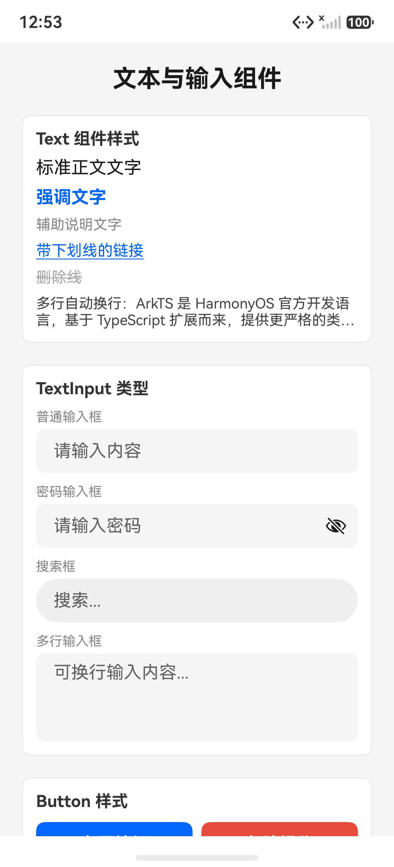
模拟器运行截图
初始状态(展示各组件静态样式)
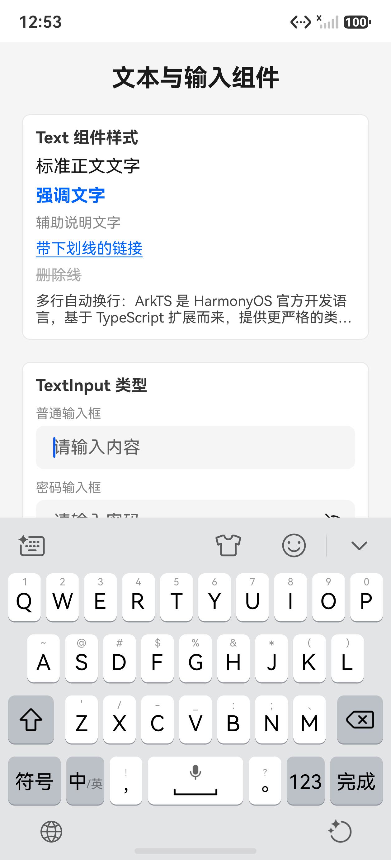
填写并提交
在各输入框填写内容后点击「提交表单」,底部显示汇总结果(密码以星号显示,多行字数统计)。
常见问题
Q:TextInput 如何监听回车键?
A:使用 .onSubmit() 回调:
TextInput({ placeholder: '搜索...' })
  .onSubmit(() => {
    // 用户按下键盘回车或确认键时触发
    this.doSearch()
  })
Q:如何限制 TextInput 的最大输入长度?
A:使用 .maxLength(n) 属性:
TextInput()
  .maxLength(20)  // 最多输入 20 个字符
  .showCounter(true)  // 显示已输入/最大字数
Q:如何让 TextInput 自动聚焦?
A:在 aboutToAppear 中调用 .focusControl.requestFocus('inputId'),并给 TextInput 设置 .id('inputId')。

讨论HarmonyOS开发技术,专注于API与组件、DevEco Studio、测试、元服务和应用上架分发等。
更多推荐



 8
8 0
0- 0


 已为社区贡献56条内容

所有评论(0)