HarmonyOS ArkUI 布局系统:Column、Row、Stack、Grid、List
·
适用版本:HarmonyOS 6.1(API 12)及以上
验证环境:Pura 90 Pro 模拟器(HarmonyOS 6.1.1,API 24)
关键概念:Column、Row、Stack、Grid、List、layoutWeight、FlexAlign
前言
ArkUI 采用声明式布局系统,核心容器组件有五种:Column(垂直)、Row(水平)、Stack(层叠)、Grid(网格)、List(列表)。合理组合这五种容器可以实现任意复杂的界面布局。
一、Column 垂直布局
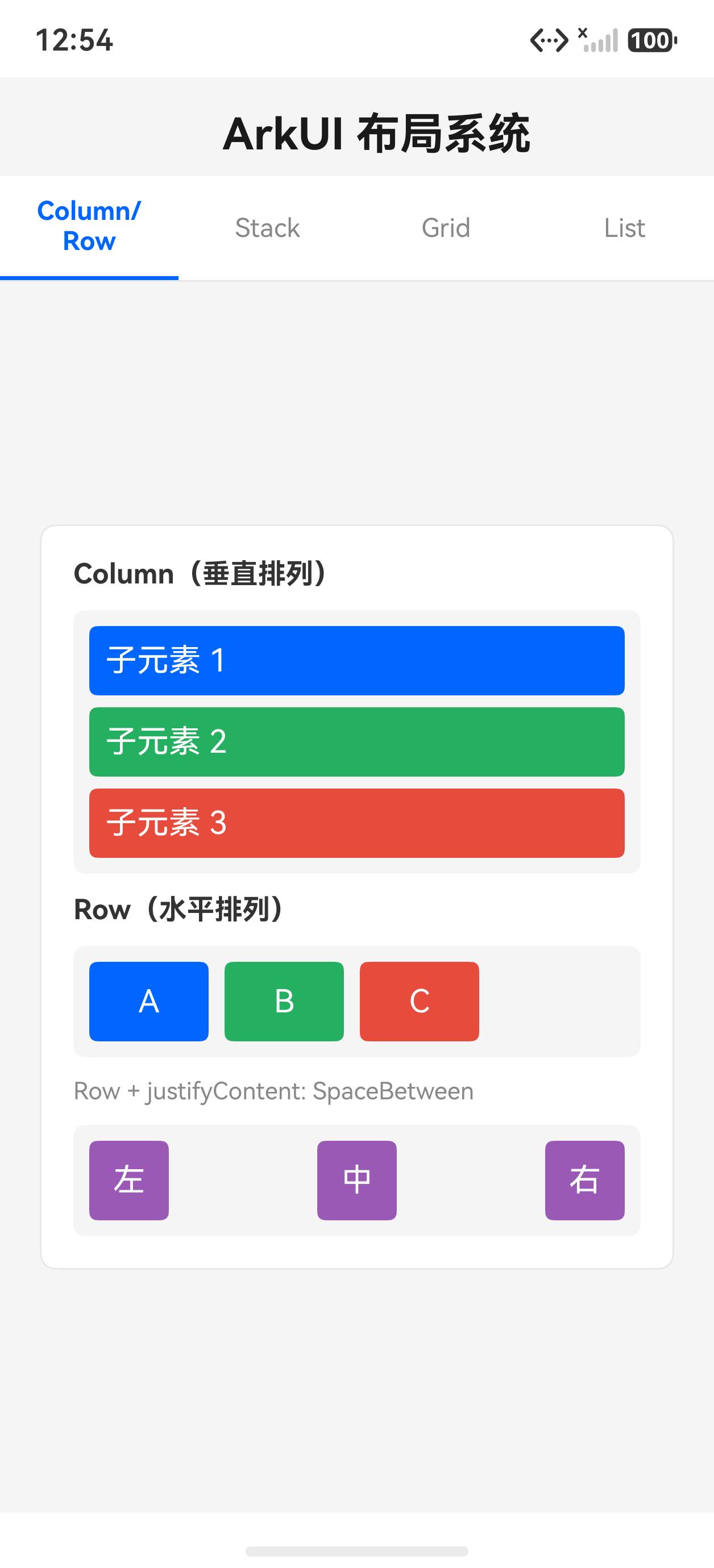
Column({ space: 12 }) {  // space: 子元素间距
  Text('子元素 1').padding(8).backgroundColor('#0066ff').fontColor('#fff').width('100%')
  Text('子元素 2').padding(8).backgroundColor('#27ae60').fontColor('#fff').width('100%')
  Text('子元素 3').padding(8).backgroundColor('#e74c3c').fontColor('#fff').width('100%')
}
.width('100%')
.alignItems(HorizontalAlign.Start)  // 子元素水平对齐
.justifyContent(FlexAlign.Center)   // 子元素垂直对齐
二、Row 水平布局
// 等间距三列
Row({ space: 8 }) {
  Text('A').width(60).height(40).backgroundColor('#0066ff').fontColor('#fff')
  Text('B').width(60).height(40).backgroundColor('#27ae60').fontColor('#fff')
  Text('C').width(60).height(40).backgroundColor('#e74c3c').fontColor('#fff')
}
.width('100%')

// 两端对齐(左、中、右)
Row() {
  Text('左').padding({ left: 12, right: 12 }).height(40)
  Text('中').padding({ left: 12, right: 12 }).height(40)
  Text('右').padding({ left: 12, right: 12 }).height(40)
}
.justifyContent(FlexAlign.SpaceBetween)
.width('100%')

// layoutWeight 按比例分配剩余空间
Row({ space: 8 }) {
  Button('取消').layoutWeight(1).height(44).backgroundColor('#888')
  Button('确认').layoutWeight(2).height(44).backgroundColor('#0066ff')
  // 确认:取消 = 2:1 宽度比
}
.width('100%')
三、Stack 层叠布局
// 三层叠放(后者在上)
Stack({ alignContent: Alignment.Center }) {
  Text('底层背景').width(240).height(120).backgroundColor('#2980b9')
  Text('中层').width(160).height(80).backgroundColor('#27ae60')
  Text('顶层').width(100).height(44).backgroundColor('#e74c3c')
}
.height(140)

// 实战:角标效果
Stack({ alignContent: Alignment.TopEnd }) {
  Image($r('app.media.icon')).width(60).height(60)
  Text('99+')
    .width(28).height(28).textAlign(TextAlign.Center)
    .backgroundColor('#e74c3c').fontColor('#fff')
    .borderRadius(14).fontSize(10)
    .margin({ top: -6, right: -6 })  // 超出父容器范围
}
四、Grid 网格布局
Grid() {
  ForEach(this.items, (item: AppGridItem) => {
    GridItem() {  // 注意:用 ArkUI 的 GridItem 组件
      Text(item.label)
        .width('100%').height(70).textAlign(TextAlign.Center)
        .fontColor('#fff').backgroundColor(item.bgColor).borderRadius(8)
    }
  })
}
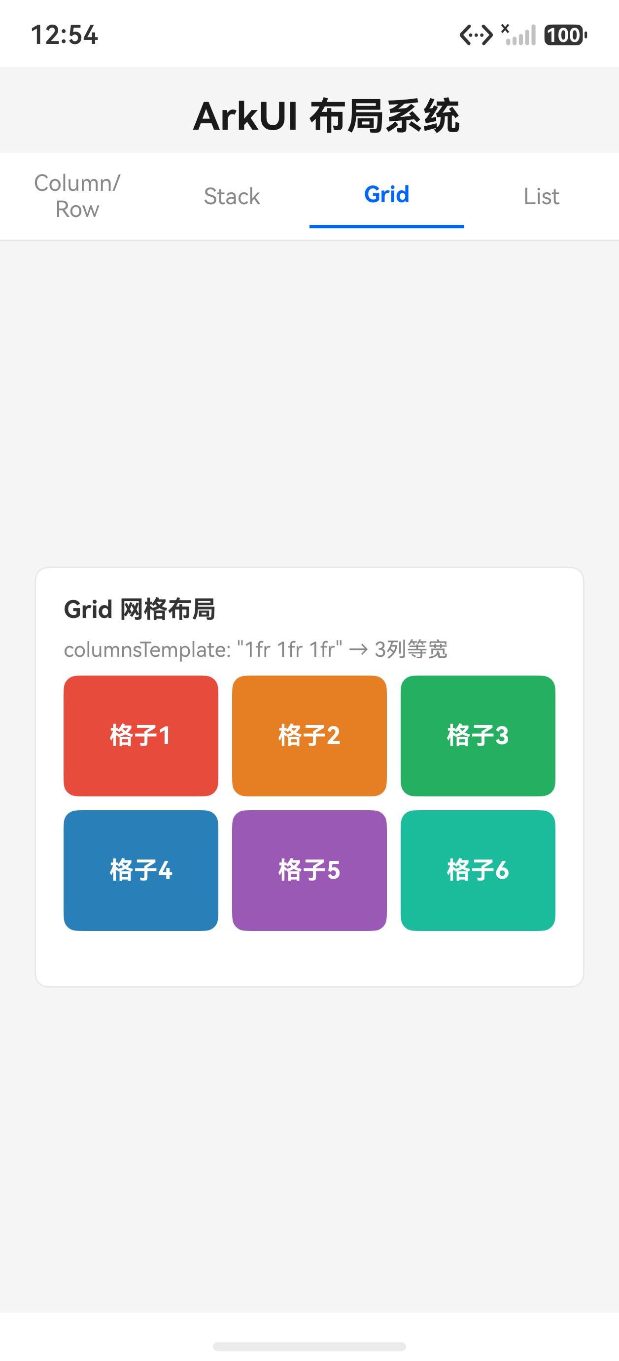
.columnsTemplate('1fr 1fr 1fr')  // 3列等宽
.rowsGap(8)     // 行间距
.columnsGap(8)  // 列间距
.width('100%').height(160)

// 常用 columnsTemplate 值
// '1fr 1fr'      → 2列等宽
// '1fr 2fr 1fr'  → 中间列是左右的2倍宽
// '100px 1fr'    → 左列固定,右列自适应
五、List 列表布局
List({ space: 0 }) {
  ForEach(this.listData, (item: ListRecord) => {
    ListItem() {
      Row({ space: 12 }) {
        Text((item.id + 1).toString())
          .width(36).height(36).textAlign(TextAlign.Center)
          .backgroundColor('#0066ff').fontColor('#fff').borderRadius(18)
        Column({ space: 2 }) {
          Text(item.title).fontSize(15).fontWeight(FontWeight.Medium)
          Text(item.subtitle).fontSize(12).fontColor('#888')
        }
        .alignItems(HorizontalAlign.Start).layoutWeight(1)
        Text('>').fontColor('#ccc')
      }
      .padding({ left: 16, right: 16, top: 12, bottom: 12 })
      .width('100%')
    }
  })
}
.width('100%').height(300)
.divider({ strokeWidth: 1, color: '#f0f0f0' })  // 分割线
六、布局选择指南
| 场景 | 推荐布局 |
|---|---|
| 垂直排列的内容区 | Column |
| 导航栏、工具栏 | Row |
| 卡片上的角标/悬浮按钮 | Stack |
| 图标宫格、九宫格 | Grid |
| 消息列表、设置项 | List |
| 复杂自适应 | Flex |
模拟器运行截图
初始状态(Column/Row 选项卡)
Grid 选项卡
切换到 Grid 选项卡后,展示 3×2 网格布局,每格独立着色。
常见问题
Q:Column 内的子组件如何水平居中?
A:Column 默认 alignItems(HorizontalAlign.Center)(子元素水平居中)。若要左对齐使用 .alignItems(HorizontalAlign.Start)。
Q:List 和 ForEach + Column 有什么区别?
A:List 支持虚拟化(仅渲染可见区域的 ListItem),适合大数据量(100+ 条)。Column + ForEach 会一次性渲染全部子组件,适合小数据量。
Q:Grid 的行数是如何确定的?
A:Grid 组件在指定 columnsTemplate 后会根据 GridItem 数量自动计算行数。也可以设置 rowsTemplate 固定行数(此时纵向滚动变横向滚动)。

讨论HarmonyOS开发技术,专注于API与组件、DevEco Studio、测试、元服务和应用上架分发等。
更多推荐
 3
3 0
0- 0


 已为社区贡献23条内容

所有评论(0)