【共创季稿事节】HarmonyOS 6.1 沉浸光感(Immersive Lighting)视觉适配实战
文章目录
每日一句正能量
一个人只有悦纳自己,才会拥有快乐的人生。
悦纳不是自满,而是完整地接受自己的优点、缺点、过去和现状。不与自己为敌,不持续自我攻击。当你成为自己的盟友,内心冲突减少,快乐才有生长的空间。
摘要
摘要: HarmonyOS 6.1 推出的沉浸光感(Immersive Lighting)特性,将系统级环境光感知能力与应用的视觉表现深度打通。本文从底层原理出发,系统讲解如何订阅光感事件、实现动态主题切换、绘制边缘光效,并完成状态栏与导航栏的沉浸式融合。通过完整的 ArkTS 代码示例与效果对比图,帮助开发者打造与环境同频呼吸的高品质视觉体验。
一、沉浸光感特性概述
1.1 什么是 Immersive Lighting?
沉浸光感是 HarmonyOS 6.1 在系统视觉层引入的环境感知渲染框架。它通过设备前置的环境光传感器、屏幕色温传感器以及系统壁纸取色引擎,向应用输出一套动态的"光感令牌"(Lighting Tokens)。应用可基于这些令牌实时调整自身的主题色、边缘辉光、阴影深度和模糊程度,使界面与周围环境光形成自然的视觉呼应。
通俗地说,就是让你的应用在明亮阳光下自动切换到高对比度主题,在温暖的灯光下自动泛起柔和的暖色调,在深夜暗光中自动收敛亮度并降低饱和度——全程无需用户手动干预。
1.2 核心能力矩阵
| 能力 | 说明 | 适用场景 |
|---|---|---|
| 环境光亮度感知 | 获取 lux 值,判断当前环境明暗 | 自动切换深浅主题、调整对比度 |
| 色温感知 | 获取屏幕色温(K 值) | 匹配暖光/冷光环境,减少视觉疲劳 |
| 壁纸取色 | 提取系统壁纸的主色与辅色 | 主题色与壁纸和谐统一 |
| 边缘光效 | 屏幕边缘跟随环境光变化 | 增强视觉沉浸感,提示通知 |
| 状态栏融合 | 状态栏背景与页面内容无缝过渡 | 沉浸式阅读、全屏媒体播放 |
1.3 与其他平台能力的对比
| 平台 | 能力 | 局限 |
|---|---|---|
| iOS | Dark Mode + True Tone | 仅支持深浅两套主题,无边缘光效 |
| Android 14 | Dynamic Color + Wallpaper Colors | 无环境光亮度联动,边缘光需自绘 |
| HarmonyOS 6.1 | Immersive Lighting 全链路 | 亮度/色温/壁纸三位一体,系统级边缘光效 |
二、环境光感知与主题动态切换
2.1 订阅光感事件
HarmonyOS 6.1 在 @kit.SensorKit 中新增了环境光与色温传感器 API,同时在 @kit.ArkUI 中提供了系统主题令牌接口。
// services/LightingService.ets
import { sensor } from '@kit.SensorKit';
import { display } from '@kit.ArkUI';

export class LightingService {
  private static instance: LightingService;
  private lightCallback: ((data: LightingData) => void) | null = null;

  static getInstance(): LightingService {
    if (!LightingService.instance) {
      LightingService.instance = new LightingService();
    }
    return LightingService.instance;
  }

  // 启动光感监听
  startListening(callback: (data: LightingData) => void): void {
    this.lightCallback = callback;

    // 1. 订阅环境光传感器(单位:lux)
    sensor.on(sensor.SensorId.AMBIENT_LIGHT, (data) => {
      this.emitLightingData({ lux: data.intensity });
    });

    // 2. 订阅色温传感器(单位:K,部分设备支持)
    if (this.isColorTemperatureSupported()) {
      sensor.on(sensor.SensorId.COLOR_TEMPERATURE, (data) => {
        this.emitLightingData({ colorTemp: data.temperature });
      });
    }

    // 3. 监听系统主题变化(深色/浅色模式切换)
    display.on('themeModeChange', (themeMode) => {
      this.emitLightingData({ themeMode });
    });
  }

  private isColorTemperatureSupported(): boolean {
    const sensorList = sensor.getSensorListSync();
    return sensorList.some(s => s.sensorId === sensor.SensorId.COLOR_TEMPERATURE);
  }

  private emitLightingData(partial: Partial<LightingData>): void {
    const data = this.buildLightingData(partial);
    this.lightCallback?.(data);
  }

  private buildLightingData(partial: Partial<LightingData>): LightingData {
    return {
      lux: partial.lux ?? this.lastLux,
      colorTemp: partial.colorTemp ?? this.lastColorTemp,
      themeMode: partial.themeMode ?? this.lastThemeMode,
      lightingMode: this.inferLightingMode(partial.lux ?? this.lastLux)
    };
  }

  private inferLightingMode(lux: number): LightingMode {
    if (lux < 10) return LightingMode.DEEP_DARK;
    if (lux < 50) return LightingMode.DIM;
    if (lux < 200) return LightingMode.INDOOR;
    if (lux < 1000) return LightingMode.BRIGHT;
    return LightingMode.SUNLIGHT;
  }

  stopListening(): void {
    sensor.off(sensor.SensorId.AMBIENT_LIGHT);
    sensor.off(sensor.SensorId.COLOR_TEMPERATURE);
    display.off('themeModeChange');
  }
}

// 数据类型定义
export interface LightingData {
  lux: number;                    // 环境光亮度
  colorTemp: number;              // 色温(K)
  themeMode: display.ThemeMode;   // 系统主题模式
  lightingMode: LightingMode;     // 推断的光感模式
}

export enum LightingMode {
  DEEP_DARK = 'deep_dark',       // 深夜极暗
  DIM = 'dim',                   // 暗光环境
  INDOOR = 'indoor',             // 室内正常
  BRIGHT = 'bright',             // 明亮环境
  SUNLIGHT = 'sunlight'          // 强光/户外
}
2.2 动态主题切换实现
基于 LightingService 采集的数据,在应用根组件中实现主题自动切换:
// entry/src/main/ets/pages/Index.ets
import { LightingService, LightingData, LightingMode } from '../services/LightingService';
import { display } from '@kit.ArkUI';

// 定义五档光感对应的主题令牌
const lightingThemes: Record<LightingMode, ThemeTokens> = {
  [LightingMode.DEEP_DARK]: {
    bgPrimary: '#0a0a0f',
    bgSecondary: '#12121a',
    textPrimary: '#e8e8ec',
    textSecondary: '#8a8a95',
    accent: '#5c7cfa',
    edgeGlow: 'rgba(92,124,250,0.15)',
    shadowDepth: 4,
    saturation: 0.85
  },
  [LightingMode.DIM]: {
    bgPrimary: '#12121a',
    bgSecondary: '#1a1a25',
    textPrimary: '#e0e0e5',
    textSecondary: '#7a7a88',
    accent: '#6b8cff',
    edgeGlow: 'rgba(107,140,255,0.12)',
    shadowDepth: 6,
    saturation: 0.9
  },
  [LightingMode.INDOOR]: {
    bgPrimary: '#f5f5f7',
    bgSecondary: '#ffffff',
    textPrimary: '#1a1a2e',
    textSecondary: '#6b6b78',
    accent: '#4c6ef5',
    edgeGlow: 'rgba(76,110,245,0.08)',
    shadowDepth: 8,
    saturation: 1.0
  },
  [LightingMode.BRIGHT]: {
    bgPrimary: '#ffffff',
    bgSecondary: '#f8f9fa',
    textPrimary: '#111827',
    textSecondary: '#4b5563',
    accent: '#2563eb',
    edgeGlow: 'rgba(37,99,235,0.06)',
    shadowDepth: 10,
    saturation: 1.05
  },
  [LightingMode.SUNLIGHT]: {
    bgPrimary: '#ffffff',
    bgSecondary: '#f0f4f8',
    textPrimary: '#0f172a',
    textSecondary: '#334155',
    accent: '#1d4ed8',
    edgeGlow: 'rgba(29,78,216,0.04)',
    shadowDepth: 12,
    saturation: 1.1
  }
};

interface ThemeTokens {
  bgPrimary: string;
  bgSecondary: string;
  textPrimary: string;
  textSecondary: string;
  accent: string;
  edgeGlow: string;
  shadowDepth: number;
  saturation: number;
}

@Entry
@Component
struct Index {
  @State currentTheme: ThemeTokens = lightingThemes[LightingMode.INDOOR];
  @State luxValue: number = 0;
  @State lightingModeText: string = '室内正常';

  aboutToAppear(): void {
    LightingService.getInstance().startListening((data: LightingData) => {
      this.luxValue = data.lux;
      this.currentTheme = lightingThemes[data.lightingMode];
      this.lightingModeText = this.getModeText(data.lightingMode);
    });
  }

  aboutToDisappear(): void {
    LightingService.getInstance().stopListening();
  }

  private getModeText(mode: LightingMode): string {
    const map: Record<LightingMode, string> = {
      [LightingMode.DEEP_DARK]: '深夜极暗',
      [LightingMode.DIM]: '暗光环境',
      [LightingMode.INDOOR]: '室内正常',
      [LightingMode.BRIGHT]: '明亮环境',
      [LightingMode.SUNLIGHT]: '强光户外'
    };
    return map[mode];
  }

  build() {
    Column() {
      // 顶部状态栏融合区域
      StatusBarFusion({ theme: this.currentTheme });

      // 主内容区
      Column({ space: 16 }) {
        Text('沉浸光感演示')
          .fontSize(28)
          .fontWeight(FontWeight.Bold)
          .fontColor(this.currentTheme.textPrimary)

        Text(`当前环境亮度: ${this.luxValue.toFixed(1)} lux · ${this.lightingModeText}`)
          .fontSize(14)
          .fontColor(this.currentTheme.textSecondary)

        // 卡片展示区域
        CardDemo({ theme: this.currentTheme });
        ChartDemo({ theme: this.currentTheme });
      }
      .width('100%')
      .layoutWeight(1)
      .padding(20)
      .backgroundColor(this.currentTheme.bgPrimary)

      // 底部导航栏融合区域
      NavBarFusion({ theme: this.currentTheme });
    }
    .width('100%')
    .height('100%')
    .backgroundColor(this.currentTheme.bgPrimary)
    .animation({ duration: 400, curve: Curve.EaseInOut })
  }
}
2.3 光感效果对比
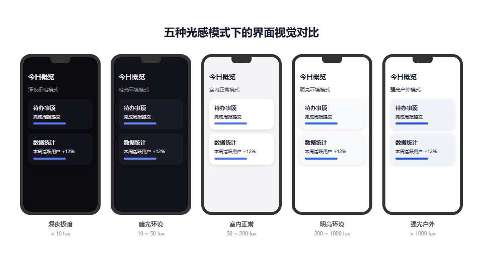
上图展示了同一界面在五种光感模式下的视觉差异。从左至右依次为:深夜极暗、暗光环境、室内正常、明亮环境、强光户外。注意观察背景色、文字对比度和强调色的渐进变化。
三、边缘光效绘制实战
3.1 原理与 API
边缘光效(Edge Glow)是 Immersive Lighting 最具辨识度的视觉元素。HarmonyOS 6.1 在 @kit.ArkGraphics2D 中提供了 EdgeLightingEffect 类,开发者也可通过 Canvas 自绘实现更灵活的效果。
// components/EdgeGlowPanel.ets
import { drawing } from '@kit.ArkGraphics2D';

@Component
export struct EdgeGlowPanel {
  @Prop theme: ThemeTokens;
  @Prop intensity: number = 0.5;  // 光效强度 0-1

  private settings: RenderingContextSettings = new RenderingContextSettings(true);
  private canvasCtx: CanvasRenderingContext2D = new CanvasRenderingContext2D(this.settings);

  build() {
    Canvas(this.canvasCtx)
      .width('100%')
      .height('100%')
      .onReady(() => {
        this.drawEdgeGlow();
      })
      .onAreaChange(() => {
        this.drawEdgeGlow();
      })
  }

  private drawEdgeGlow(): void {
    const ctx = this.canvasCtx;
    const width = ctx.width;
    const height = ctx.height;
    const glowWidth = 20 + this.theme.shadowDepth * 2;

    ctx.clearRect(0, 0, width, height);

    // 顶部边缘光
    const topGradient = ctx.createLinearGradient(0, 0, 0, glowWidth);
    topGradient.addColorStop(0, this.hexToRgba(this.theme.accent, this.intensity * 0.3));
    topGradient.addColorStop(1, 'rgba(0,0,0,0)');
    ctx.fillStyle = topGradient;
    ctx.fillRect(0, 0, width, glowWidth);

    // 底部边缘光
    const bottomGradient = ctx.createLinearGradient(0, height, 0, height - glowWidth);
    bottomGradient.addColorStop(0, this.hexToRgba(this.theme.accent, this.intensity * 0.2));
    bottomGradient.addColorStop(1, 'rgba(0,0,0,0)');
    ctx.fillStyle = bottomGradient;
    ctx.fillRect(0, height - glowWidth, width, glowWidth);

    // 左侧边缘光
    const leftGradient = ctx.createLinearGradient(0, 0, glowWidth, 0);
    leftGradient.addColorStop(0, this.hexToRgba(this.theme.accent, this.intensity * 0.15));
    leftGradient.addColorStop(1, 'rgba(0,0,0,0)');
    ctx.fillStyle = leftGradient;
    ctx.fillRect(0, 0, glowWidth, height);

    // 右侧边缘光
    const rightGradient = ctx.createLinearGradient(width, 0, width - glowWidth, 0);
    rightGradient.addColorStop(0, this.hexToRgba(this.theme.accent, this.intensity * 0.15));
    rightGradient.addColorStop(1, 'rgba(0,0,0,0)');
    ctx.fillStyle = rightGradient;
    ctx.fillRect(width - glowWidth, 0, glowWidth, height);
  }

  private hexToRgba(hex: string, alpha: number): string {
    const r = parseInt(hex.slice(1, 3), 16);
    const g = parseInt(hex.slice(3, 5), 16);
    const b = parseInt(hex.slice(5, 7), 16);
    return `rgba(${r},${g},${b},${alpha})`;
  }
}
3.2 系统级边缘光效(推荐)
对于系统级通知边缘光效,HarmonyOS 6.1 提供了更简洁的声明式接口:
// 在 EntryAbility 中启用系统边缘光效
import { window } from '@kit.WindowManager';

onWindowStageCreate(windowStage: window.WindowStage): void {
  windowStage.getMainWindow().then((mainWindow) => {
    // 启用沉浸光感边缘效果
    mainWindow.setImmersiveLightingEnabled(true);

    // 配置光效参数
    mainWindow.setImmersiveLightingConfig({
      glowColor: '#4c6ef5',           // 基础辉光色
      glowIntensity: 0.6,              // 强度
      pulseEnabled: true,              // 是否允许呼吸脉冲
      pulseSpeed: 'medium',            // 脉冲速度
      ambientSync: true                // 是否同步环境光
    });
  });
}
四、状态栏与导航栏沉浸式融合
4.1 状态栏融合方案
状态栏融合(Status Bar Fusion)是指让应用内容延伸到状态栏区域,并根据当前主题动态调整状态栏图标颜色,实现视觉上的无缝衔接。
// components/StatusBarFusion.ets
import { window } from '@kit.WindowManager';

@Component
export struct StatusBarFusion {
  @Prop theme: ThemeTokens;

  aboutToAppear(): void {
    this.applyStatusBarStyle();
  }

  aboutToUpdate(): void {
    this.applyStatusBarStyle();
  }

  private applyStatusBarStyle(): void {
    window.getLastWindow(getContext(this)).then((win) => {
      // 1. 设置状态栏透明
      win.setWindowSystemBarEnable(['status']);
      win.setWindowSystemBarProperties({
        statusBarColor: '#00000000',  // 完全透明
        statusBarContentColor: this.isLightBackground() ? '#000000' : '#ffffff'
      });
    });
  }

  private isLightBackground(): boolean {
    // 根据背景色亮度判断状态栏图标颜色
    const hex = this.theme.bgPrimary.replace('#', '');
    const r = parseInt(hex.slice(0, 2), 16);
    const g = parseInt(hex.slice(2, 4), 16);
    const b = parseInt(hex.slice(4, 6), 16);
    const luminance = (0.299 * r + 0.587 * g + 0.114 * b) / 255;
    return luminance > 0.5;
  }

  build() {
    Row() {
      // 状态栏占位区域,高度由系统提供
      Blank()
        .width('100%')
        .height(px2vp(AppStorage.get<number>('statusBarHeight') ?? 40))
        .backgroundColor(this.theme.bgPrimary)
    }
    .width('100%')
  }
}
4.2 导航栏融合方案
// components/NavBarFusion.ets
import { window } from '@kit.WindowManager';

@Component
export struct NavBarFusion {
  @Prop theme: ThemeTokens;

  aboutToAppear(): void {
    window.getLastWindow(getContext(this)).then((win) => {
      win.setWindowSystemBarProperties({
        navigationBarColor: this.theme.bgPrimary,
        navigationBarContentColor: this.isLightBackground() ? '#000000' : '#ffffff'
      });
    });
  }

  private isLightBackground(): boolean {
    const hex = this.theme.bgPrimary.replace('#', '');
    const r = parseInt(hex.slice(0, 2), 16);
    const g = parseInt(hex.slice(2, 4), 16);
    const b = parseInt(hex.slice(4, 6), 16);
    const luminance = (0.299 * r + 0.587 * g + 0.114 * b) / 255;
    return luminance > 0.5;
  }

  build() {
    Row() {
      // 底部手势导航条区域
      Blank()
        .width('100%')
        .height(px2vp(AppStorage.get<number>('navBarHeight') ?? 30))
        .backgroundColor(this.theme.bgPrimary)
    }
    .width('100%')
  }
}
4.3 主题切换动效
为了让主题切换过程更加自然,建议对颜色变化施加缓动动画:
// 在根组件中使用 animateTo 包裹主题切换
private onLightingChanged(newTheme: ThemeTokens): void {
  animateTo({
    duration: 600,
    curve: Curve.EaseInOut,
    iterations: 1
  }, () => {
    this.currentTheme = newTheme;
  });
}
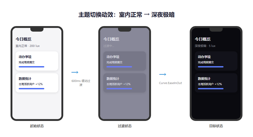
上图展示了从"室内正常"到"深夜极暗"的主题切换过程。所有颜色令牌在 600ms 内平滑过渡,避免了跳变带来的视觉突兀感。
五、完整配置代码汇总
5.1 module.json5 权限声明
{
  "module": {
    "requestPermissions": [
      {
        "name": "ohos.permission.ACCESS_AMBIENT_LIGHT",
        "reason": "$string:light_sensor_reason"
      },
      {
        "name": "ohos.permission.MODIFY_SYSTEM_SETTING",
        "reason": "$string:system_ui_reason"
      }
    ]
  }
}
5.2 核心配置一览
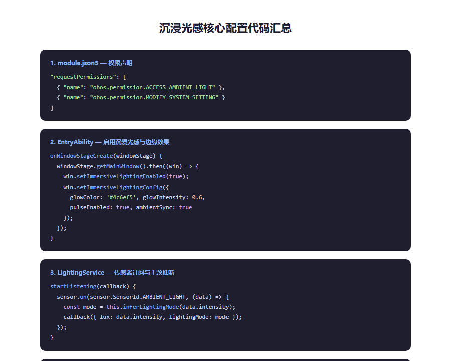
上图汇总了沉浸光感适配涉及的配置项,包括权限声明、Ability 初始化、主题令牌定义、传感器订阅和状态栏属性设置。
5.3 性能优化建议
| 优化项 | 说明 |
|---|---|
| 传感器采样率控制 | 环境光传感器默认 100Hz,应用层建议降采样至 5-10Hz |
| 主题切换防抖 | 光照波动频繁时,使用 500ms 防抖避免界面抖动 |
| 边缘光效降帧 | 边缘 Canvas 绘制可降至 30fps,主内容保持 60fps |
| 色温缓存 | 相同 lux 区间内的主题令牌可复用,避免重复计算 |
六、总结
HarmonyOS 6.1 的沉浸光感特性为应用视觉设计打开了新的维度。它不再是静态的"深色模式"或"浅色模式",而是让界面成为环境光的延伸,随环境呼吸、随场景变换。
本文从感知层到表现层,完整演示了光感适配的技术路径:
- 感知层:通过 SensorKit 订阅环境光与色温,结合系统主题模式,推断当前 LightingMode;
- 令牌层:定义五档光感对应的 ThemeTokens,涵盖背景、文字、强调色、阴影、饱和度等维度;
- 表现层:将令牌绑定到 ArkUI 组件属性,利用动画缓动实现平滑过渡;
- 增强层:绘制边缘光效、融合状态栏与导航栏,打造无边界的沉浸体验。
开发者行动清单:
- 在
module.json5中申请ACCESS_AMBIENT_LIGHT权限; - 封装
LightingService统一管理传感器订阅与主题推断; - 定义适合自身应用的光感主题令牌(建议 3-5 档即可);
- 根组件中绑定主题状态,对颜色变化施加 400-600ms 的缓动动画;
- 实现状态栏与导航栏的透明融合,动态计算图标颜色;
- 对传感器数据做降采样与防抖处理,避免性能损耗;
- 在设置中提供"关闭自动光感"选项,尊重用户偏好。
视觉设计正在从"像素精确"走向"情境感知"。掌握 Immersive Lighting,意味着你的应用将比竞品更早一步进入下一代视觉体验赛道。
转载自:https://blog.csdn.net/u014727709/article/details/162936875
欢迎 👍点赞✍评论⭐收藏,欢迎指正

讨论HarmonyOS开发技术,专注于API与组件、DevEco Studio、测试、元服务和应用上架分发等。
更多推荐


 1
1 0
0- 0


 已为社区贡献861条内容

所有评论(0)