HarmonyOS API 24 状态管理与@Builder装饰器技术详解
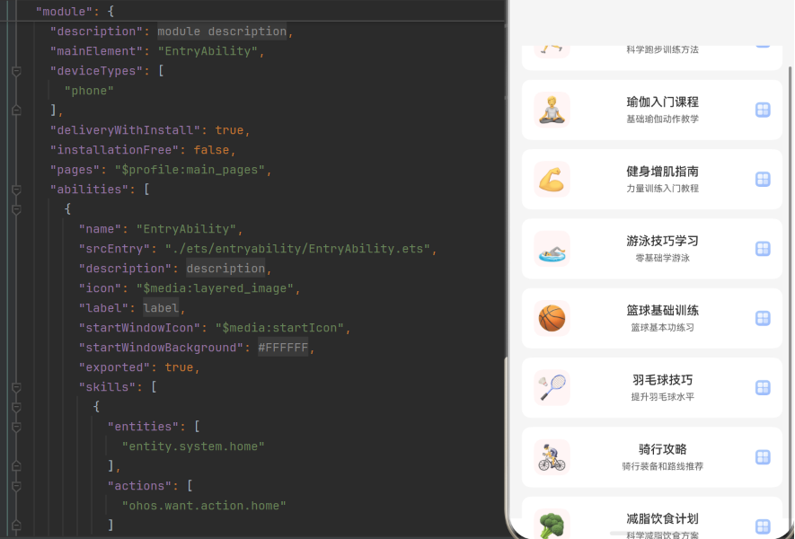
HarmonyOS API 24 状态管理与@Builder装饰器技术详解
引言
在鸿蒙应用开发中,状态管理是实现响应式UI的核心。ArkUI框架提供了丰富的状态管理机制和@Builder装饰器,为开发者提供了高效的UI构建能力。本文将深入探讨HarmonyOS API 24中状态管理的核心技术,包括@State、@Prop、@Link等装饰器,以及@Builder装饰器的使用方法和最佳实践。
第一章:状态管理概述
1.1 状态管理的重要性
状态管理是声明式UI框架的核心,它负责:
- 管理UI的动态数据
- 驱动UI的自动更新
- 实现组件间的状态共享
- 优化渲染性能
1.2 ArkUI状态管理体系
ArkUI框架提供了多种状态管理装饰器:
| 装饰器 | 说明 | 数据流向 | 适用场景 |
|---|---|---|---|
| @State | 组件内部状态 | 单向 | 组件内部使用 |
| @Prop | 父组件传入的状态 | 单向 | 子组件接收状态 |
| @Link | 双向绑定状态 | 双向 | 父子组件共享状态 |
| @Provide/@Consume | 跨层级状态 | 双向 | 祖孙组件共享状态 |
| @Observed/@ObjectLink | 对象状态 | 双向 | 对象属性变化 |
1.3 状态管理的工作原理
ArkUI框架的状态管理基于响应式原理:
- 当状态变量的值发生变化时
- 框架自动检测到变化
- 重新渲染依赖该状态的组件
- 只更新需要变化的部分
第二章:@State装饰器详解
2.1 @State概述
@State是最基础的状态管理装饰器,用于管理组件内部的状态。
2.2 基本用法
@Entry
@Component
struct StateDemo {
  @State count: number = 0

  build() {
    Column() {
      Text(`Count: ${this.count}`)
        .fontSize(24)
        .margin({ bottom: 16 })

      Button('+')
        .onClick(() => {
          this.count++
        })

      Button('-')
        .onClick(() => {
          this.count--
        })
    }
    .width('100%')
    .height('100%')
    .justifyContent(FlexAlign.Center)
    .space(16)
  }
}
2.3 @State的特性
2.3.1 响应式更新
当@State变量的值发生变化时,框架会自动更新依赖该变量的UI组件:
@State message: string = 'Hello'

build() {
  Text(this.message)  // 依赖message

  Button('Change')
    .onClick(() => {
      this.message = 'World'  // 修改会触发UI更新
    })
}
2.3.2 初始值要求
@State变量必须在声明时初始化:
@State count: number = 0  // 正确
@State name: string = ''  // 正确

@State value: number  // 错误:缺少初始值
2.3.3 支持的数据类型
@State支持多种数据类型:
@State count: number = 0
@State name: string = ''
@State isActive: boolean = false
@State items: string[] = []
@State user: User = { name: '', age: 0 }
2.4 @State的性能优化
2.4.1 避免频繁更新
@State counter: number = 0

startTimer() {
  setInterval(() => {
    this.counter++  // 每秒更新一次,会频繁触发UI更新
  }, 1000)
}
优化方案:
- 合并多次状态更新
- 使用防抖或节流
2.4.2 减少状态变量数量
@State firstName: string = ''
@State lastName: string = ''

// 优化:合并为一个对象
@State user: User = { firstName: '', lastName: '' }
第三章:@Prop装饰器详解
3.1 @Prop概述
@Prop用于从父组件接收状态,数据流向是单向的(父→子)。
3.2 基本用法
// 父组件
@Entry
@Component
struct ParentComponent {
  @State parentCount: number = 0

  build() {
    Column() {
      Text(`Parent Count: ${this.parentCount}`)

      ChildComponent({ count: this.parentCount })

      Button('+')
        .onClick(() => {
          this.parentCount++
        })
    }
  }
}

// 子组件
@Component
struct ChildComponent {
  @Prop count: number  // 接收父组件传入的状态

  build() {
    Text(`Child Count: ${this.count}`)
  }
}
3.3 @Prop的特性
3.3.1 单向数据流
@Prop的值只能从父组件传入,子组件修改不会影响父组件:
@Component
struct ChildComponent {
  @Prop count: number

  build() {
    Button('Change')
      .onClick(() => {
        this.count++  // 修改不会影响父组件
      })
  }
}
3.3.2 初始化要求
@Prop变量不需要在声明时初始化,由父组件传入:
@Prop count: number  // 正确:由父组件初始化
@Prop name: string = 'default'  // 正确:有默认值
3.3.3 值传递
@Prop是值传递,会创建一个副本:
@State items: string[] = ['a', 'b', 'c']

// 子组件接收的是副本,修改不会影响父组件
ChildComponent({ items: this.items })
3.4 @Prop的使用场景
场景一:子组件展示父组件数据
@Component
struct DisplayComponent {
  @Prop title: string
  @Prop content: string

  build() {
    Column() {
      Text(this.title)
        .fontSize(18)
        .fontWeight(FontWeight.Bold)

      Text(this.content)
        .fontSize(14)
    }
  }
}
场景二:子组件不需要修改数据
@Component
struct ReadOnlyComponent {
  @Prop data: Data

  build() {
    Text(`Value: ${this.data.value}`)
  }
}
第四章:@Link装饰器详解
4.1 @Link概述
@Link用于实现父子组件之间的双向绑定,数据流向是双向的。
4.2 基本用法
// 父组件
@Entry
@Component
struct ParentComponent {
  @State parentCount: number = 0

  build() {
    Column() {
      Text(`Parent Count: ${this.parentCount}`)

      // 使用$符号传递引用
      ChildComponent({ count: $parentCount })

      Button('+')
        .onClick(() => {
          this.parentCount++
        })
    }
  }
}

// 子组件
@Component
struct ChildComponent {
  @Link count: number  // 双向绑定

  build() {
    Column() {
      Text(`Child Count: ${this.count}`)

      Button('Change in Child')
        .onClick(() => {
          this.count++  // 修改会影响父组件
        })
    }
  }
}
4.3 @Link的特性
4.3.1 双向数据流
@Link实现了双向绑定,子组件修改会影响父组件:
@Component
struct ChildComponent {
  @Link count: number

  build() {
    Button('+')
      .onClick(() => {
        this.count++  // 父组件的count也会增加
      })
  }
}
4.3.2 引用传递
@Link是引用传递,不创建副本:
@State items: string[] = ['a', 'b', 'c']

// 子组件接收的是引用,修改会影响父组件
ChildComponent({ items: $items })
4.3.3 初始化要求
@Link变量不需要在声明时初始化,由父组件传入:
@Link count: number // 正确:由父组件初始化
4.4 @Link的使用场景
场景一:子组件需要修改父组件数据
@Component
struct EditComponent {
  @Link text: string

  build() {
    TextInput({ text: this.text })
      .onChange((value: string) => {
        this.text = value  // 修改会同步到父组件
      })
  }
}
场景二:父子组件共享状态
@Component
struct ToggleComponent {
  @Link isOn: boolean

  build() {
    Switch({ checked: this.isOn })
      .onChange((value: boolean) => {
        this.isOn = value  // 双向同步
      })
  }
}
第五章:@Provide/@Consume装饰器详解
5.1 @Provide/@Consume概述
@Provide/@Consume用于实现跨层级的状态共享,不需要通过每一层组件传递。
5.2 基本用法
// 祖先组件
@Entry
@Component
struct GrandParent {
  @Provide themeColor: Color = Color.Blue  // 提供状态

  build() {
    Column() {
      ParentComponent()
    }
  }
}

// 中间组件
@Component
struct ParentComponent {
  build() {
    Column() {
      ChildComponent()
    }
  }
}

// 后代组件
@Component
struct ChildComponent {
  @Consume themeColor: Color  // 消费状态

  build() {
    Text('使用主题颜色')
      .backgroundColor(this.themeColor)
  }
}
5.3 @Provide/@Consume的特性
5.3.1 跨层级传递
@Provide/@Consume可以跨越任意层级传递状态:
// 层级关系:GrandParent → Parent → Child → GrandChild
// @Provide在GrandParent中定义
// @Consume可以在GrandChild中直接使用,不需要Parent和Child传递
5.3.2 双向数据流
@Consume可以修改@Provide定义的状态:
@Component
struct ChildComponent {
  @Consume themeColor: Color

  build() {
    Button('Change Color')
      .onClick(() => {
        this.themeColor = Color.Red  // 修改会影响祖先组件
      })
  }
}
5.3.3 命名匹配
@Provide和@Consume通过变量名进行匹配:
@Provide themeColor: Color = Color.Blue  // 变量名必须一致
@Consume themeColor: Color  // 变量名必须一致
5.4 @Provide/@Consume的使用场景
场景一:主题管理
@Entry
@Component
struct App {
  @Provide theme: Theme = {
    primaryColor: Color.Blue,
    backgroundColor: Color.White,
    textColor: Color.Black
  }

  build() {
    Column() {
      Header()
      Content()
      Footer()
    }
    .backgroundColor(this.theme.backgroundColor)
  }
}

@Component
struct Header {
  @Consume theme: Theme

  build() {
    Text('Header')
      .backgroundColor(this.theme.primaryColor)
      .fontColor(this.theme.textColor)
  }
}
场景二:全局状态管理
@Entry
@Component
struct App {
  @Provide user: User = { name: '', isLoggedIn: false }

  build() {
    if (this.user.isLoggedIn) {
      MainPage()
    } else {
      LoginPage()
    }
  }
}

@Component
struct LoginPage {
  @Consume user: User

  build() {
    Button('Login')
      .onClick(() => {
        this.user.isLoggedIn = true
        this.user.name = 'John'
      })
  }
}
第六章:@Observed/@ObjectLink装饰器详解
6.1 @Observed/@ObjectLink概述
@Observed/@ObjectLink用于实现对象属性的响应式更新。
6.2 基本用法
@Observed
class User {
  name: string = ''
  age: number = 0
}

@Entry
@Component
struct ParentComponent {
  @State user: User = new User()

  build() {
    Column() {
      Text(`Name: ${this.user.name}`)
      Text(`Age: ${this.user.age}`)

      ChildComponent({ user: $user })

      Button('Update')
        .onClick(() => {
          this.user.name = 'John'
          this.user.age = 30
        })
    }
  }
}

@Component
struct ChildComponent {
  @ObjectLink user: User  // 对象属性变化时触发更新

  build() {
    Column() {
      TextInput({ text: this.user.name })
        .onChange((value: string) => {
          this.user.name = value
        })

      Text(`Age: ${this.user.age}`)
    }
  }
}
6.3 @Observed/@ObjectLink的特性
6.3.1 对象属性响应式
当对象的属性发生变化时,@ObjectLink会触发UI更新:
@Observed
class User {
  name: string = ''
}

@State user: User = new User()

// 修改对象属性会触发UI更新
this.user.name = 'New Name'
6.3.2 嵌套对象支持
@Observed支持嵌套对象:
@Observed
class Address {
  street: string = ''
  city: string = ''
}

@Observed
class User {
  name: string = ''
  address: Address = new Address()
}

@State user: User = new User()

// 修改嵌套对象属性会触发UI更新
this.user.address.city = 'Beijing'
6.3.3 数组支持
@Observed支持数组:
@Observed
class Item {
  name: string = ''
}

@State items: Item[] = []

// 修改数组元素属性会触发UI更新
this.items[0].name = 'New Name'
6.4 @Observed/@ObjectLink的使用场景
场景一:复杂对象状态管理
@Observed
class Order {
  id: string = ''
  items: OrderItem[] = []
  total: number = 0
  status: string = 'pending'
}

@Component
struct OrderDetail {
  @ObjectLink order: Order

  build() {
    Column() {
      Text(`Order ID: ${this.order.id}`)
      Text(`Total: ${this.order.total}`)
      Text(`Status: ${this.order.status}`)

      List() {
        ForEach(this.order.items, (item: OrderItem) => {
          ListItem() {
            Text(item.name)
          }
        })
      }
    }
  }
}
第七章:@Builder装饰器详解
7.1 @Builder概述
@Builder用于定义可复用的UI片段,类似于组件的方法。
7.2 基本用法
@Entry
@Component
struct BuilderDemo {
  @State count: number = 0

  build() {
    Column() {
      this.buildHeader()  // 调用自定义Builder

      Text(`Count: ${this.count}`)
        .fontSize(24)
        .margin({ bottom: 16 })

      this.buildButtons()  // 调用自定义Builder
    }
    .width('100%')
    .height('100%')
    .justifyContent(FlexAlign.Center)
    .space(16)
  }

  @Builder
  buildHeader() {
    Text('Title')
      .fontSize(18)
      .fontWeight(FontWeight.Bold)
      .margin({ bottom: 16 })
  }

  @Builder
  buildButtons() {
    Row({ space: 16 }) {
      Button('+')
        .onClick(() => {
          this.count++
        })

      Button('-')
        .onClick(() => {
          this.count--
        })
    }
  }
}
7.3 @Builder的特性
7.3.1 代码复用
@Builder可以将重复的UI代码提取为独立的方法:
@Builder
buildListItem(title: string, subtitle: string) {
  Row({ space: 12 }) {
    Text(title)
      .fontSize(16)
      .fontWeight(FontWeight.Medium)

    Text(subtitle)
      .fontSize(12)
      .fontColor(Color.Gray)
  }
}

// 在多个地方调用
this.buildListItem('标题1', '副标题1')
this.buildListItem('标题2', '副标题2')
7.3.2 访问组件状态
@Builder可以访问组件的状态变量:
@State isSelected: boolean = false

@Builder
buildSelectionIndicator() {
  if (this.isSelected) {
    Row()
      .width(24)
      .height(3)
      .backgroundColor(Color.Blue)
      .borderRadius(2)
  }
}
7.3.3 参数传递
@Builder可以接收参数:
@Builder
buildText(text: string, fontSize: number, fontColor: Color) {
  Text(text)
    .fontSize(fontSize)
    .fontColor(fontColor)
}

// 调用
this.buildText('Hello', 20, Color.Blue)
7.4 @Builder的使用场景
场景一:TabBar构建
@Builder
buildTabBar(title: string, index: number) {
  Column() {
    Text(title)
      .fontSize(16)
      .fontWeight(index === this.currentPage ? FontWeight.Bold : FontWeight.Normal)
      .fontColor(index === this.currentPage ? Color.Blue : Color.Gray)
      .padding({ left: 20, right: 20, top: 16, bottom: 12 })

    if (index === this.currentPage) {
      Row()
        .width(24)
        .height(3)
        .backgroundColor(Color.Blue)
        .borderRadius(2)
    }
  }
  .onClick(() => {
    this.currentPage = index
  })
}
场景二:列表项构建
@Builder
buildListItem(item: ItemData) {
  Row({ space: 16 }) {
    Text(item.icon)
      .fontSize(32)
      .width(48)
      .height(48)
      .backgroundColor(Color.Blue)
      .borderRadius(12)
      .textAlign(TextAlign.Center)

    Column({ space: 6 }) {
      Text(item.title)
        .fontSize(16)
        .fontWeight(FontWeight.Medium)

      Text(item.subtitle)
        .fontSize(12)
        .fontColor(Color.Gray)
    }
    .flexGrow(1)

    Image($r('app.media.arrow'))
      .width(20)
      .height(20)
      .opacity(0.4)
  }
}
第八章:状态管理最佳实践
8.1 选择合适的状态装饰器
| 场景 | 推荐装饰器 | 原因 |
|---|---|---|
| 组件内部状态 | @State | 最基础的状态管理 |
| 子组件展示父组件数据 | @Prop | 单向数据流,值传递 |
| 子组件需要修改父组件数据 | @Link | 双向绑定,引用传递 |
| 跨层级状态共享 | @Provide/@Consume | 不需要逐层传递 |
| 对象属性响应式 | @Observed/@ObjectLink | 对象属性变化触发更新 |
8.2 状态管理原则
1. 状态最小化:
- 将状态放在最需要的层级
- 避免不必要的状态提升
2. 单向数据流:
- 优先使用@Prop实现单向数据流
- 只有需要双向绑定时才使用@Link
3. 状态不可变:
- 对于复杂对象,创建新对象而不是原地修改
- 使用展开运算符创建新对象
// 错误:原地修改
this.user.name = 'New Name'

// 正确:创建新对象
this.user = { ...this.user, name: 'New Name' }
4. 避免状态冗余:
- 不要存储可以计算得出的状态
- 使用计算属性或方法
// 错误:冗余状态
@State firstName: string = ''
@State lastName: string = ''
@State fullName: string = ''

// 正确:计算属性
get fullName(): string {
  return `${this.firstName} ${this.lastName}`
}
8.3 性能优化策略
8.3.1 减少状态更新次数
// 错误:多次状态更新
updateUser() {
  this.user.name = 'John'
  this.user.age = 30
  this.user.email = 'john@example.com'
}

// 正确:合并状态更新
updateUser() {
  this.user = {
    ...this.user,
    name: 'John',
    age: 30,
    email: 'john@example.com'
  }
}
8.3.2 使用@Observed优化对象更新
// 错误:对象属性变化不会触发更新
class User {
  name: string = ''
}

@State user: User = new User()
this.user.name = 'New Name'  // 不会触发UI更新

// 正确:使用@Observed
@Observed
class User {
  name: string = ''
}

@State user: User = new User()
this.user.name = 'New Name'  // 会触发UI更新
8.3.3 避免在@Builder中使用复杂逻辑
// 错误:@Builder中包含复杂逻辑
@Builder
buildContent() {
  if (this.data.length > 0) {
    List() {
      ForEach(this.data, (item) => {
        // 复杂逻辑
      })
    }
  } else {
    Text('Empty')
  }
}

// 正确:将逻辑移到组件中
build() {
  Column() {
    if (this.data.length > 0) {
      this.buildList()
    } else {
      this.buildEmpty()
    }
  }
}
第九章:状态管理实战案例
9.1 案例一:计数器组件
实现一个计数器组件,支持增减操作:
@Entry
@Component
struct Counter {
  @State count: number = 0

  build() {
    Column() {
      Text(`Count: ${this.count}`)
        .fontSize(24)
        .fontWeight(FontWeight.Bold)
        .margin({ bottom: 16 })

      Row({ space: 16 }) {
        Button('-')
          .width(80)
          .height(40)
          .onClick(() => {
            this.count--
          })

        Text(`${this.count}`)
          .fontSize(20)

        Button('+')
          .width(80)
          .height(40)
          .onClick(() => {
            this.count++
          })
      }
    }
    .width('100%')
    .height('100%')
    .justifyContent(FlexAlign.Center)
  }
}
9.2 案例二:表单组件
实现一个表单组件,包含姓名、年龄输入:
@Observed
class FormData {
  name: string = ''
  age: number = 0
}

@Entry
@Component
struct FormPage {
  @State formData: FormData = new FormData()

  build() {
    Column() {
      TextInput({ placeholder: '请输入姓名', text: this.formData.name })
        .width('80%')
        .height(40)
        .margin({ bottom: 12 })
        .onChange((value: string) => {
          this.formData.name = value
        })

      TextInput({ placeholder: '请输入年龄', text: this.formData.age.toString() })
        .width('80%')
        .height(40)
        .margin({ bottom: 12 })
        .type(InputType.Number)
        .onChange((value: string) => {
          this.formData.age = parseInt(value) || 0
        })

      Button('提交')
        .width('80%')
        .height(40)
        .onClick(() => {
          console.log(`Name: ${this.formData.name}, Age: ${this.formData.age}`)
        })
    }
    .width('100%')
    .height('100%')
    .justifyContent(FlexAlign.Center)
    .space(12)
  }
}
9.3 案例三:主题切换
实现一个主题切换功能,支持全局主题更新:
@Observed
class Theme {
  primaryColor: Color = Color.Blue
  backgroundColor: Color = Color.White
  textColor: Color = Color.Black
}

@Entry
@Component
struct ThemePage {
  @Provide theme: Theme = new Theme()
  @State isDarkMode: boolean = false

  build() {
    Column() {
      Text('主题切换')
        .fontSize(24)
        .fontWeight(FontWeight.Bold)
        .margin({ bottom: 16 })

      Switch({ checked: this.isDarkMode })
        .margin({ bottom: 16 })
        .onChange((value: boolean) => {
          this.isDarkMode = value
          this.updateTheme(value)
        })

      ContentCard()

      Button('Change Color')
        .margin({ top: 16 })
        .onClick(() => {
          this.theme.primaryColor = Color.Green
        })
    }
    .width('100%')
    .height('100%')
    .backgroundColor(this.theme.backgroundColor)
    .padding(16)
  }

  updateTheme(isDark: boolean) {
    if (isDark) {
      this.theme.primaryColor = Color.Purple
      this.theme.backgroundColor = Color.Black
      this.theme.textColor = Color.White
    } else {
      this.theme.primaryColor = Color.Blue
      this.theme.backgroundColor = Color.White
      this.theme.textColor = Color.Black
    }
  }
}

@Component
struct ContentCard {
  @Consume theme: Theme

  build() {
    Column() {
      Text('内容卡片')
        .fontSize(18)
        .fontWeight(FontWeight.Medium)
        .fontColor(this.theme.textColor)

      Text('这是卡片内容')
        .fontSize(14)
        .fontColor(this.theme.textColor)
        .opacity(0.7)
    }
    .width('100%')
    .padding(16)
    .backgroundColor(this.theme.primaryColor)
    .borderRadius(12)
  }
}
第十章:常见问题与解决方案
10.1 状态更新后UI不刷新
问题描述:
修改状态变量后UI没有更新。
解决方案:
- 检查是否使用了正确的状态装饰器
- 对于对象,使用@Observed装饰类
- 确保状态变量是新的引用
// 错误:对象属性变化不会触发更新
class User {
  name: string = ''
}

@State user: User = new User()
this.user.name = 'New Name'  // 不会触发UI更新

// 正确:使用@Observed
@Observed
class User {
  name: string = ''
}

@State user: User = new User()
this.user.name = 'New Name'  // 会触发UI更新
10.2 @Link传递错误
问题描述:
使用@Link传递状态时出现编译错误。
解决方案:
- 确保父组件使用$符号传递引用
- 确保子组件使用@Link接收
// 父组件
ChildComponent({ count: $parentCount })  // 正确:使用$符号

// 子组件
@Link count: number  // 正确:使用@Link
10.3 @Builder中无法访问状态
问题描述:
在@Builder方法中无法访问组件的状态变量。
解决方案:
- 确保@Builder是组件的方法
- 使用this关键字访问状态变量
@State count: number = 0

@Builder
buildContent() {
  Text(`Count: ${this.count}`)  // 正确:使用this访问
}
10.4 状态更新导致性能问题
问题描述:
频繁的状态更新导致UI卡顿。
解决方案:
- 合并多次状态更新
- 使用防抖或节流
- 减少状态变量数量
// 正确:合并状态更新
updateData() {
  this.user = {
    ...this.user,
    name: 'John',
    age: 30
  }
}
10.5 @Provide/@Consume匹配失败
问题描述:
@Provide和@Consume无法正确匹配。
解决方案:
- 确保变量名一致
- 确保@Provide在祖先组件中定义
- 确保@Consume在后代组件中使用
// 祖先组件
@Provide themeColor: Color = Color.Blue

// 后代组件
@Consume themeColor: Color  // 变量名必须一致
第十一章:API 24特性与未来展望
11.1 API 24状态管理特性总结
通过本文的深入探讨,我们掌握了状态管理的核心技术:
- @State:组件内部状态管理
- @Prop:父子组件单向数据传递
- @Link:父子组件双向数据绑定
- @Provide/@Consume:跨层级状态共享
- @Observed/@ObjectLink:对象属性响应式
- @Builder:可复用UI片段定义
11.2 最佳实践建议
1. 合理选择状态装饰器:
- 根据数据流向和使用场景选择合适的装饰器
- 优先使用单向数据流,减少状态耦合
2. 保持状态简洁:
- 减少不必要的状态变量
- 避免状态冗余
3. 优化状态更新:
- 合并多次状态更新
- 使用@Observed优化对象更新
4. 善用@Builder:
- 将重复UI代码提取为@Builder
- 提高代码复用性和可维护性
5. 遵循单向数据流原则:
- 父组件向子组件传递数据
- 子组件通过事件通知父组件修改数据
11.3 未来发展方向
随着HarmonyOS的不断发展,状态管理能力将继续演进:
- 更强大的状态管理工具:类似Redux、Vuex的状态管理方案
- 更好的性能优化:自动合并状态更新
- 增强的调试工具:可视化状态变化
- 跨应用状态共享:支持多个应用之间共享状态
结语
状态管理是鸿蒙应用开发中最核心的技术之一。通过深入理解各种状态装饰器的用法和原理,我们可以构建出高效、可维护的响应式UI。希望本文能够帮助开发者更好地掌握状态管理技术,为用户提供优质的应用体验。
在实际开发中,建议结合具体场景灵活运用状态管理的各项特性,不断优化性能和代码质量。同时,关注HarmonyOS官方文档的更新,及时了解API的新特性和最佳实践。

讨论HarmonyOS开发技术,专注于API与组件、DevEco Studio、测试、元服务和应用上架分发等。
更多推荐
 7
7 0
0- 0


 已为社区贡献39条内容

所有评论(0)