HarmonyOS7 边框圆角装饰页实战:视觉层级不是多加几个阴影
圆角、边框、阴影这些属性很容易被当成“美化代码”。但真做页面时,它们其实是在表达层级:哪个区域可以点击,哪个卡片更重要,哪块内容需要从背景里浮出来。
这个案例把 borderRadius、borderWidth、borderStyle 和 shadow 放在同一个页面里对比,适合用来建立一套基础的视觉判断。
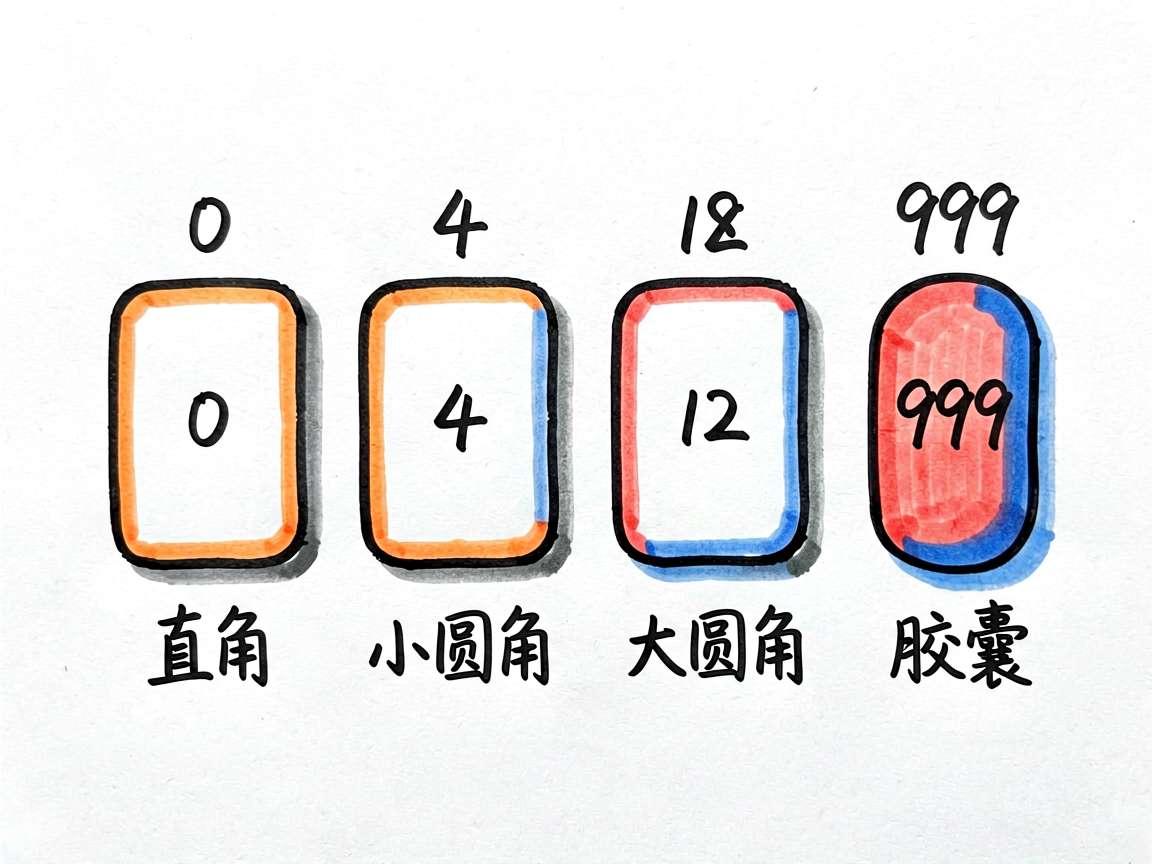
圆角不是越大越好
页面第一组展示了从直角到圆形的不同效果。小圆角通常适合输入框、按钮、普通卡片;大圆角更适合头像、标签、强调块。999 这种写法常用来做胶囊或圆形,但前提是组件宽高本身要配合。
四角独立圆角也很实用,比如顶部弹层只圆上边、底部卡片只圆下边。它不是炫技,而是让组件和所在位置更贴合。
边框负责“分出来”,阴影负责“浮起来”
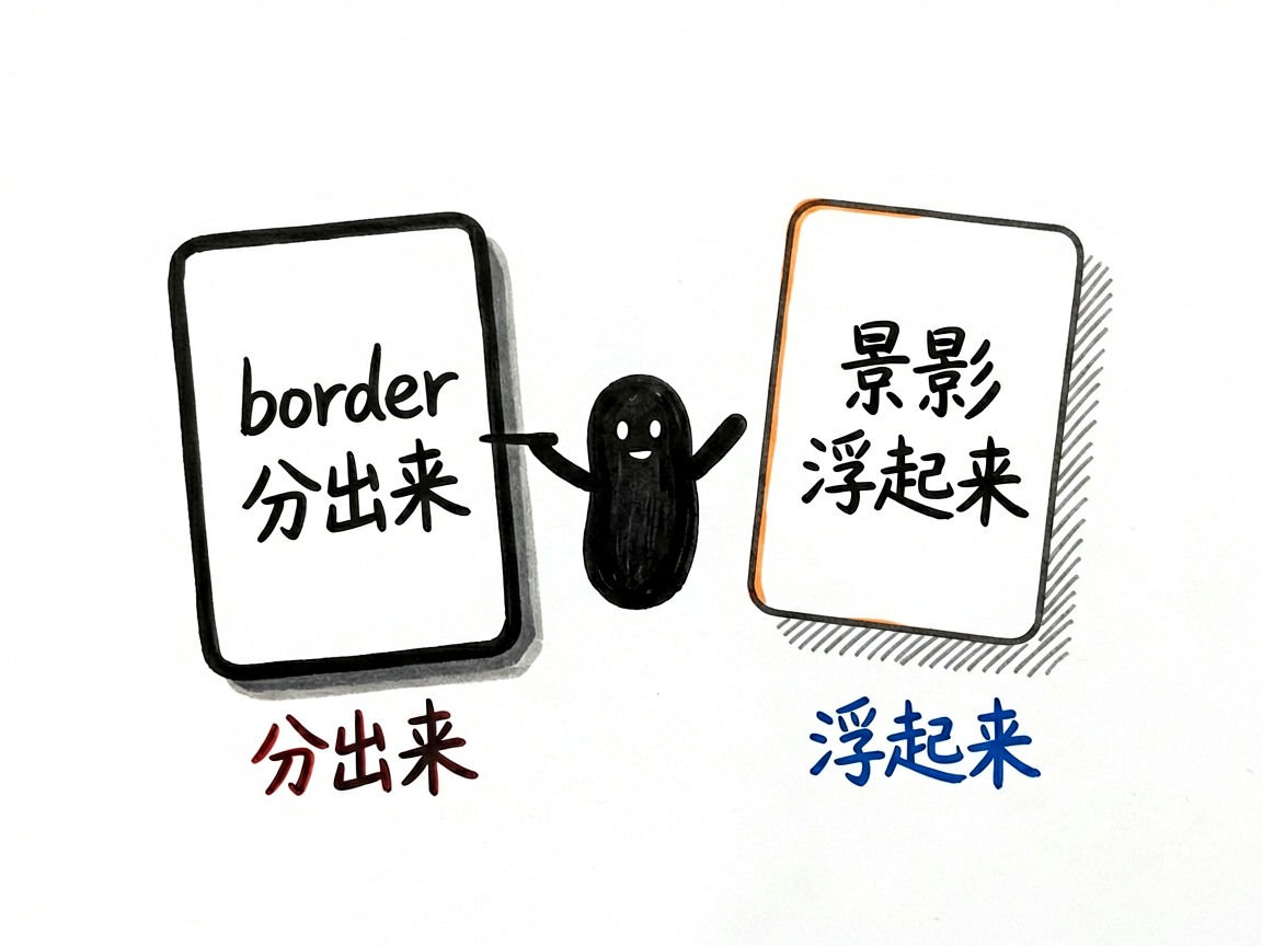
border 更像边界线,适合表单、卡片、选择态;shadow 更像空间关系,适合让内容从背景里抬起来。两者都能做层次,但含义不同。
如果页面里到处都是深阴影,视觉会很吵。这个案例把浅阴影、中阴影、深阴影和彩色阴影放在一起,对比后会更直观:大多数业务卡片其实浅阴影就够了。
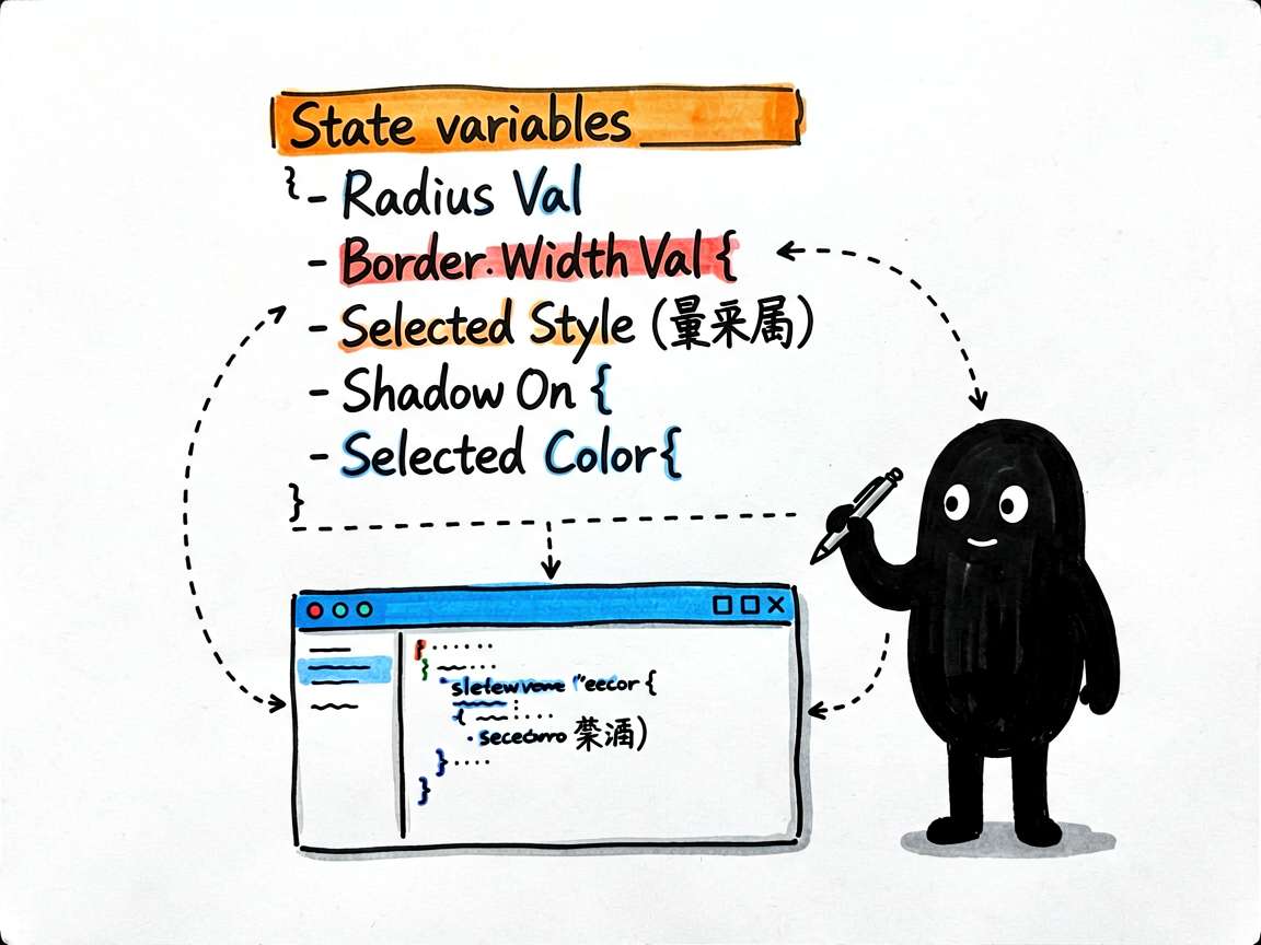
状态字段可以做成调试面板
这里的 radiusVal、borderWidthVal、selectedStyle、shadowOn、selectedColor 都是很适合联动 UI 的 @State。虽然完整代码主要是静态示例,但这些字段已经说明了一个方向:可以把它扩展成设计调试面板,实时调整圆角、边框和阴影。
  @State radiusVal: number = 12
  @State borderWidthVal: number = 2
  @State selectedStyle: BorderStyle = BorderStyle.Solid
  @State shadowOn: boolean = true
  @State selectedColor: string = '#2563EB'
这类状态不要散落在多个组件里。集中管理以后,页面上任何预览区域都可以读取同一套参数。
综合卡片最接近真实业务
前面的模块是在拆属性,最后的卡片示例才更接近项目代码。一个“今日完成”卡片用了白底、圆角、浅阴影;一个“小技巧”卡片用了浅色背景和左边框。两种写法都不复杂,但表达的层级不同。
我会把这个页面当成一个视觉备忘录:写业务页面前先确定卡片层级,再决定圆角、边框和阴影,而不是想到哪儿写到哪儿。
完整代码
下面是整理后的完整代码,入口组件名已经换成 BorderShapeDesignPage,可以直接按项目路由规则接入。
// 形状与边框装饰

interface CardItem {
  id: number
  label: string
  borderRadius: number | BorderRadiuses
  borderWidth: number
  borderColor: string
  borderStyle: BorderStyle
  shadow: boolean
  bgColor: string
}

@Entry
@Component
struct BorderShapeDesignPage {
  @State radiusVal: number = 12
  @State borderWidthVal: number = 2
  @State selectedStyle: BorderStyle = BorderStyle.Solid
  @State shadowOn: boolean = true
  @State selectedColor: string = '#2563EB'

  private borderColors: string[] = ['#2563EB', '#EF4444', '#059669', '#D97706', '#7C3AED', '#374151']
  private borderStyles: BorderStyle[] = [BorderStyle.Solid, BorderStyle.Dashed, BorderStyle.Dotted]
  private styleNames: string[] = ['实线', '虚线', '点线']

  build() {
    Scroll() {
      Column({ space: 0 }) {
        // 标题
        Text('边框与圆角装饰')
          .fontSize(20).fontWeight(FontWeight.Bold).fontColor('#111827')
          .width('100%').padding({ left: 20, right: 20, top: 20, bottom: 4 })
        Text('borderRadius / borderWidth / borderStyle / shadow')
          .fontSize(13).fontColor('#6B7280')
          .width('100%').padding({ left: 20, right: 20, bottom: 16 })

        // 一、圆角大小演示
        Column({ space: 12 }) {
          Text('一、borderRadius 圆角控制')
            .fontSize(14).fontWeight(FontWeight.Bold).fontColor('#374151').width('100%')

          Flex({ wrap: FlexWrap.Wrap, justifyContent: FlexAlign.Start }) {
            ForEach([0, 4, 8, 12, 16, 24, 999], (r: number) => {
              Column({ space: 4 }) {
                Row()
                  .width(60)
                  .height(60)
                  .backgroundColor('#2563EB')
                  .borderRadius(r)
                Text(r === 999 ? '圆形' : r.toString())
                  .fontSize(11)
                  .fontColor('#6B7280')
              }
              .alignItems(HorizontalAlign.Center)
              .margin({ right: 12, bottom: 8 })
            }, (r: number) => r.toString())
          }
          .padding(12)
          .backgroundColor('#F9FAFB')
          .borderRadius(10)
        }
        .width('100%')
        .padding({ left: 20, right: 20 })
        .alignItems(HorizontalAlign.Start)
        .margin({ bottom: 16 })

        // 二、四角独立圆角
        Column({ space: 12 }) {
          Text('二、四角独立圆角')
            .fontSize(14).fontWeight(FontWeight.Bold).fontColor('#374151').width('100%')

          Row({ space: 12 }) {
            Column({ space: 6 }) {
              Row()
                .width(70).height(70)
                .backgroundColor('#EF4444')
                .borderRadius({ topLeft: 24, topRight: 24, bottomLeft: 0, bottomRight: 0 })
              Text('上圆').fontSize(11).fontColor('#6B7280')
            }.alignItems(HorizontalAlign.Center)

            Column({ space: 6 }) {
              Row()
                .width(70).height(70)
                .backgroundColor('#059669')
                .borderRadius({ topLeft: 0, topRight: 0, bottomLeft: 24, bottomRight: 24 })
              Text('下圆').fontSize(11).fontColor('#6B7280')
            }.alignItems(HorizontalAlign.Center)

            Column({ space: 6 }) {
              Row()
                .width(70).height(70)
                .backgroundColor('#D97706')
                .borderRadius({ topLeft: 24, topRight: 0, bottomLeft: 24, bottomRight: 0 })
              Text('左圆').fontSize(11).fontColor('#6B7280')
            }.alignItems(HorizontalAlign.Center)

            Column({ space: 6 }) {
              Row()
                .width(70).height(70)
                .backgroundColor('#7C3AED')
                .borderRadius({ topLeft: 0, topRight: 24, bottomLeft: 0, bottomRight: 24 })
              Text('右圆').fontSize(11).fontColor('#6B7280')
            }.alignItems(HorizontalAlign.Center)
          }
          .width('100%')
          .justifyContent(FlexAlign.SpaceAround)
          .padding(12)
          .backgroundColor('#F9FAFB')
          .borderRadius(10)
        }
        .width('100%')
        .padding({ left: 20, right: 20 })
        .alignItems(HorizontalAlign.Start)
        .margin({ bottom: 16 })

        // 三、边框样式对比
        Column({ space: 12 }) {
          Text('三、border 样式对比')
            .fontSize(14).fontWeight(FontWeight.Bold).fontColor('#374151').width('100%')

          Column({ space: 10 }) {
            Row({ space: 10 }) {
              Text('实线 Solid').fontSize(13).fontColor('#374151').layoutWeight(1)
              Row().width(120).height(40).borderRadius(8)
                .borderWidth(2).borderColor('#2563EB').borderStyle(BorderStyle.Solid)
            }.alignItems(VerticalAlign.Center)

            Row({ space: 10 }) {
              Text('虚线 Dashed').fontSize(13).fontColor('#374151').layoutWeight(1)
              Row().width(120).height(40).borderRadius(8)
                .borderWidth(2).borderColor('#EF4444').borderStyle(BorderStyle.Dashed)
            }.alignItems(VerticalAlign.Center)

            Row({ space: 10 }) {
              Text('点线 Dotted').fontSize(13).fontColor('#374151').layoutWeight(1)
              Row().width(120).height(40).borderRadius(8)
                .borderWidth(2).borderColor('#059669').borderStyle(BorderStyle.Dotted)
            }.alignItems(VerticalAlign.Center)
          }
          .width('100%')
          .padding(14)
          .backgroundColor('#F9FAFB')
          .borderRadius(10)
        }
        .width('100%')
        .padding({ left: 20, right: 20 })
        .alignItems(HorizontalAlign.Start)
        .margin({ bottom: 16 })

        // 四、阴影效果
        Column({ space: 12 }) {
          Text('四、shadow 阴影效果')
            .fontSize(14).fontWeight(FontWeight.Bold).fontColor('#374151').width('100%')

          Flex({ wrap: FlexWrap.Wrap, justifyContent: FlexAlign.Start }) {
            Column({ space: 6 }) {
              Text('浅阴影')
                .fontSize(14).fontWeight(FontWeight.Medium).fontColor('#374151')
                .width(100).height(60).textAlign(TextAlign.Center)
                .backgroundColor(Color.White).borderRadius(10)
                .shadow({ radius: 4, color: 'rgba(0,0,0,0.08)', offsetX: 0, offsetY: 2 })
              Text('radius:4').fontSize(10).fontColor('#9CA3AF')
            }.alignItems(HorizontalAlign.Center).margin({ right: 16, bottom: 16 })

            Column({ space: 6 }) {
              Text('中阴影')
                .fontSize(14).fontWeight(FontWeight.Medium).fontColor('#374151')
                .width(100).height(60).textAlign(TextAlign.Center)
                .backgroundColor(Color.White).borderRadius(10)
                .shadow({ radius: 12, color: 'rgba(0,0,0,0.12)', offsetX: 0, offsetY: 4 })
              Text('radius:12').fontSize(10).fontColor('#9CA3AF')
            }.alignItems(HorizontalAlign.Center).margin({ right: 16, bottom: 16 })

            Column({ space: 6 }) {
              Text('深阴影')
                .fontSize(14).fontWeight(FontWeight.Medium).fontColor('#374151')
                .width(100).height(60).textAlign(TextAlign.Center)
                .backgroundColor(Color.White).borderRadius(10)
                .shadow({ radius: 24, color: 'rgba(0,0,0,0.18)', offsetX: 0, offsetY: 8 })
              Text('radius:24').fontSize(10).fontColor('#9CA3AF')
            }.alignItems(HorizontalAlign.Center).margin({ right: 0, bottom: 16 })

            Column({ space: 6 }) {
              Text('彩色阴影')
                .fontSize(14).fontWeight(FontWeight.Medium).fontColor(Color.White)
                .width(100).height(60).textAlign(TextAlign.Center)
                .backgroundColor('#2563EB').borderRadius(10)
                .shadow({ radius: 16, color: 'rgba(37,99,235,0.5)', offsetX: 0, offsetY: 6 })
              Text('彩色').fontSize(10).fontColor('#9CA3AF')
            }.alignItems(HorizontalAlign.Center).margin({ right: 16, bottom: 0 })

            Column({ space: 6 }) {
              Text('左上偏移')
                .fontSize(14).fontWeight(FontWeight.Medium).fontColor('#374151')
                .width(100).height(60).textAlign(TextAlign.Center)
                .backgroundColor(Color.White).borderRadius(10)
                .shadow({ radius: 10, color: 'rgba(0,0,0,0.15)', offsetX: -4, offsetY: -4 })
              Text('左上偏').fontSize(10).fontColor('#9CA3AF')
            }.alignItems(HorizontalAlign.Center).margin({ right: 0, bottom: 0 })
          }
          .padding(16)
          .backgroundColor('#F3F4F6')
          .borderRadius(10)
        }
        .width('100%')
        .padding({ left: 20, right: 20 })
        .alignItems(HorizontalAlign.Start)
        .margin({ bottom: 16 })

        // 五、卡片设计示例
        Column({ space: 12 }) {
          Text('五、卡片设计综合示例')
            .fontSize(14).fontWeight(FontWeight.Bold).fontColor('#374151').width('100%')

          Column({ space: 12 }) {
            // 简洁卡片
            Row({ space: 12 }) {
              Text('🏆').fontSize(28)
              Column({ space: 4 }) {
                Text('今日完成').fontSize(14).fontWeight(FontWeight.Bold).fontColor('#111827')
                Text('任务全部完成!继续保持').fontSize(12).fontColor('#6B7280')
              }.layoutWeight(1).alignItems(HorizontalAlign.Start)
              Text('100%').fontSize(18).fontWeight(FontWeight.Bold).fontColor('#059669')
            }
            .width('100%')
            .padding(16)
            .backgroundColor(Color.White)
            .borderRadius(12)
            .shadow({ radius: 8, color: 'rgba(0,0,0,0.06)', offsetY: 2 })
            .alignItems(VerticalAlign.Center)

            // 彩色边框卡片
            Row({ space: 12 }) {
              Text('💡').fontSize(24)
              Column({ space: 4 }) {
                Text('小技巧').fontSize(14).fontWeight(FontWeight.Bold).fontColor('#D97706')
                Text('使用 shadow + borderRadius 打造精美卡片').fontSize(12).fontColor('#6B7280')
              }.layoutWeight(1).alignItems(HorizontalAlign.Start)
            }
            .width('100%')
            .padding(14)
            .backgroundColor('#FFFBEB')
            .borderRadius(10)
            .borderWidth({ left: 4 })
            .borderColor({ left: '#D97706' })
            .alignItems(VerticalAlign.Center)
          }
        }
        .width('100%')
        .padding({ left: 20, right: 20 })
        .alignItems(HorizontalAlign.Start)
        .margin({ bottom: 24 })
      }
    }
    .width('100%')
    .height('100%')
    .backgroundColor('#F9FAFB')
  }
}
写在最后
这类视觉属性不用背太多,关键是知道它们各自表达什么。圆角让组件更柔和,边框划分边界,阴影制造层级,三者别混着乱用就够了。

讨论HarmonyOS开发技术,专注于API与组件、DevEco Studio、测试、元服务和应用上架分发等。
更多推荐

 0
0 0
0- 0



 已为社区贡献288条内容

所有评论(0)