HarmonyOS ArkTS Select 组件完全指南:24+ 属性详解与实战技巧
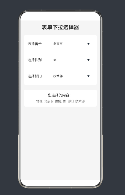
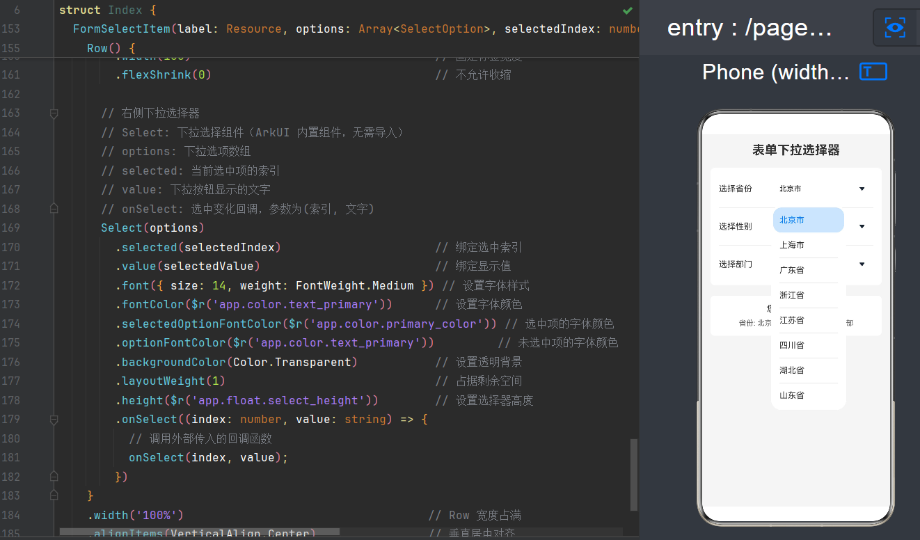
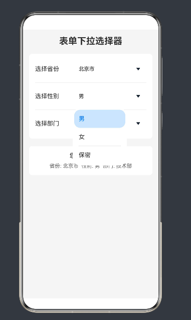
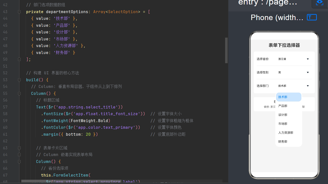
项目演示
引言
在 HarmonyOS NEXT 应用开发中,下拉选择器是表单、设置页面、筛选界面等场景下的核心交互组件。ArkUI 框架提供的 Select 组件以其声明式、响应式的设计理念,为开发者提供了一套优雅而强大的下拉选择解决方案。本文将从入门到精通,系统性地剖析 Select 组件的全部 24 个属性、事件、API 特性,并通过丰富的实战示例,帮助读者全面掌握这一关键组件的使用方法。
无论你是刚接触鸿蒙开发的新手,还是希望深入理解 Select 组件底层机制的进阶开发者,本文都将为你呈现一份详尽而实用的技术参考。
一、ArkUI 声明式 UI 基础
1.1 什么是声明式 UI
在深入学习 Select 组件之前,我们需要先理解 HarmonyOS ArkUI 的声明式 UI 范式。与传统的命令式 UI(如 Android View、iOS UIKit)不同,声明式 UI 具有以下核心特征:
- 状态驱动视图:UI 界面由应用状态自动生成,开发者只需描述"在什么状态下应该显示什么界面",而无需手动管理视图的创建、更新和销毁。
- 组件化构建:整个界面由一系列可复用、可组合的组件构成,每个组件都是一个独立的 UI 单元。
- 链式调用:组件属性通过链式调用方式设置,代码结构清晰、语义明确。
1.2 核心装饰器
ArkUI 通过一系列装饰器来定义组件的行为和属性。在使用 Select 组件时,以下几个装饰器最为常用:
| 装饰器 | 作用 | 使用场景 |
|---|---|---|
@Entry |
标记页面入口组件 | 应用的主页面、独立页面 |
@Component |
声明可复用的 UI 组件 | 所有需要构建的 UI 组件 |
@State |
声明响应式状态变量 | 需要驱动 UI 更新的数据 |
@Builder |
声明可复用的 UI 构建函数 | 抽取重复的 UI 构建逻辑 |
@Prop |
单向数据传递 | 父子组件间的数据传递 |
@Link |
双向数据绑定 | 父子组件间需要同步的状态 |
1.3 基本组件结构
一个典型的 ArkUI 组件具有如下结构:
@Entry
@Component
struct MyPage {
  // 状态变量
  @State message: string = 'Hello';

  // UI 构建方法
  build() {
    Column() {
      Text(this.message)
        .fontSize(20)
        .onClick(() => {
          this.message = 'Clicked!';
        })
    }
    .width('100%')
    .height('100%')
  }
}
理解了这些基础概念后,让我们正式进入 Select 组件的学习。
二、Select 组件概述
2.1 组件定位
Select 是 ArkUI 提供的下拉选择组件,自 API Version 8 开始支持。它的核心职责是:
- 在有限空间内展示多个可选项
- 当用户点击时弹出下拉菜单
- 允许用户从多个选项中选择一个
- 将选中结果反馈给应用逻辑
典型应用场景包括:
- 表单填写:选择省份、性别、部门等
- 设置页面:选择语言、主题、时间格式等
- 筛选过滤:按照分类、价格区间等筛选数据
- 导航菜单:提供跳转入口的下拉菜单
2.2 与其他选择组件的对比
ArkUI 中还提供了其他选择类组件,了解它们的差异有助于做出正确选择:
| 组件 | 特点 | 适用场景 |
|---|---|---|
Select |
下拉菜单形式,节省空间 | 移动端表单、设置项 |
Picker |
滚动选择器,支持多列联动 | 日期选择、地区选择(省/市/区) |
Radio |
单选按钮组 | 选项较少(2-5个)的单选场景 |
Checkbox |
复选框组 | 多选场景 |
Toggle |
开关按钮 | 布尔值选择 |
三、Select 组件核心 API 详解
3.1 组件接口
Select 组件的创建接口非常简洁:
Select(options: Array<SelectOption>)
参数说明:
options:SelectOption对象数组,定义下拉菜单的所有可选项
系统能力: SystemCapability.ArkUI.ArkUI.Full
从 API Version 11 开始,该接口支持在元服务中使用。
3.2 SelectOption 对象
每个下拉选项由 SelectOption 对象定义,包含以下属性:
| 属性名 | 类型 | 必填 | API Level | 说明 |
|---|---|---|---|---|
value |
ResourceStr |
是 | - | 下拉选项显示的文本内容 |
icon |
ResourceStr |
否 | - | 下拉选项旁显示的图标 |
symbolIcon |
SymbolGlyphModifier |
否 | 12+ | 下拉选项的 Symbol 图标,优先级高于 icon |
ResourceStr 类型说明:
ResourceStr 是 ArkUI 的联合类型,表示可以是字符串或资源引用。以下写法都是合法的:
// 直接字符串
{ value: '北京' }

// 资源引用
{ value: $r('app.string.city_beijing') }

// 带图标的选项
{ value: '北京', icon: $r('app.media.icon_beijing') }

// 带 Symbol 图标的选项(API 12+)
{ value: '北京', symbolIcon: new SymbolGlyphModifier($r('sys.symbol.location')) }
示例:创建 SelectOption 数组
// 基础用法:纯文本选项
const cityOptions: SelectOption[] = [
  { value: '北京' },
  { value: '上海' },
  { value: '广州' },
  { value: '深圳' }
];

// 带图标的选项
const optionsWithIcon: SelectOption[] = [
  { value: '拍照', icon: $r('app.media.camera') },
  { value: '相册', icon: $r('app.media.gallery') },
  { value: '录像', icon: $r('app.media.video') }
];
3.3 组件基本使用
让我们从一个最简单的 Select 组件开始:
@Entry
@Component
struct SimpleSelectExample {
  @State selectedIndex: number = 0;
  @State selectedValue: string = '选项一';

  private options: SelectOption[] = [
    { value: '选项一' },
    { value: '选项二' },
    { value: '选项三' }
  ];

  build() {
    Column() {
      Select(this.options)
        .selected(this.selectedIndex)
        .value(this.selectedValue)
        .onSelect((index: number, value: string) => {
          this.selectedIndex = index;
          this.selectedValue = value;
        })
    }
    .width('100%')
    .height('100%')
    .justifyContent(FlexAlign.Center)
    .alignItems(HorizontalAlign.Center)
  }
}
这个示例展示了 Select 组件的三大核心要素:
options:定义可选列表selected:设置/绑定当前选中项的索引onSelect:监听选中变化事件
四、Select 组件 24 个属性详解
Select 组件提供了丰富的属性来定制其外观和行为。下面我们将逐一介绍这 24 个属性。
4.1 核心交互属性
1. selected
selected(value: number | Resource)
设置下拉菜单初始选项的索引。
行为规则:
- 第一项的索引为 0
- 不设置或设置异常值时,默认为 -1(无选中项)
- 设置为
undefined或null时,选中第一项 - 从 API 10 开始支持
$$双向绑定
示例:
// 静态设置选中第二项(索引 1)
Select(options)
  .selected(1)

// 绑定状态变量
@State currentIndex: number = 0;
Select(options)
  .selected(this.currentIndex)

// 资源引用方式(API 11+)
Select(options)
  .selected($r('app.integer.default_index'))
2. value
value(value: ResourceStr)
设置下拉按钮本身显示的文本内容。当用户选择某个选项后,默认会被选中项的文本替换。
使用场景:
- 显示占位提示文字,如"请选择"
- 在未选择时显示默认提示
- 自定义按钮显示内容
示例:
// 显示占位提示
Select(options)
  .value('请选择城市')

// 绑定状态变量动态显示
@State displayText: string = '请选择';
Select(options)
  .value(this.displayText)
4.2 尺寸控制属性
3. controlSize(API 12+)
controlSize(value: ControlSize)
设置 Select 组件的预设尺寸。
可选值:
| 值 | 说明 |
|---|---|
ControlSize.SMALL |
小尺寸,适合紧凑布局 |
ControlSize.NORMAL |
正常尺寸(默认) |
ControlSize.LARGE |
大尺寸,适合强调显示 |
优先级规则:
- 如果只设置
width和height,文字以省略号方式显示 - 如果只设置
controlSize,宽高自适应文字,不超出 - 如果同时设置三者,
width/height优先,但不能小于controlSize的最小值
示例:
// 小尺寸选择器
Select(options)
  .controlSize(ControlSize.SMALL)

// 大尺寸选择器
Select(options)
  .controlSize(ControlSize.LARGE)
4. width(通用属性)
width(value: Length)
设置组件的宽度。
5. height(通用属性)
height(value: Length)
设置组件的高度。
4.3 字体样式属性
6. font
font(value: Font)
设置下拉按钮本身的文本样式。
Font 对象结构:
interface Font {
  size?: Length;           // 字体大小
  weight?: FontWeight;    // 字体粗细
  family?: string;        // 字体族
  style?: FontStyle;      // 字体样式(斜体等)
}
默认值:
- API 11 及以前:
{ size: $r('sys.float.ohos_id_text_size_button1'), weight: FontWeight.Medium } - API 12+,
controlSize.SMALL:size默认为 button2 - API 12+,其他:
size默认为 button1
注意事项:
size为 0 时,文本不显示size为负数时,按默认值显示
示例:
Select(options)
  .font({
    size: 18,
    weight: FontWeight.Bold,
    family: 'sans-serif'
  })
7. fontColor
fontColor(value: ResourceColor)
设置下拉按钮本身的文本颜色。
示例:
// 直接颜色值
Select(options)
  .fontColor('#333333')

// 颜色资源引用
Select(options)
  .fontColor($r('app.color.primary_text'))
8. selectedOptionFont
selectedOptionFont(value: Font)
设置下拉菜单中选中项的文本样式。
默认值: { size: $r('sys.color.ohos_id_text_size_body1'), weight: FontWeight.Regular }
示例:
Select(options)
  .selectedOptionFont({
    size: 16,
    weight: FontWeight.Bold,
    family: 'serif'
  })
9. selectedOptionFontColor
selectedOptionFontColor(value: ResourceColor)
设置下拉菜单中选中项的文本颜色。
默认值: $r('sys.color.ohos_id_color_text_primary_activated')
示例:
Select(options)
  .selectedOptionFontColor('#007DFF')
10. optionFont
optionFont(value: Font)
设置下拉菜单中所有选项的文本样式(包括选中和未选中)。
默认值: { size: $r('sys.color.ohos_id_text_size_body1'), weight: FontWeight.Regular }
示例:
Select(options)
  .optionFont({
    size: 14,
    weight: FontWeight.Normal
  })
11. optionFontColor
optionFontColor(value: ResourceColor)
设置下拉菜单中未选中项的文本颜色。
默认值: $r('sys.color.ohos_id_color_text_primary')
示例:
Select(options)
  .optionFontColor('#666666')
4.4 背景颜色属性
12. selectedOptionBgColor
selectedOptionBgColor(value: ResourceColor)
设置下拉菜单中选中项的背景色。
默认值: $r('sys.color.ohos_id_color_component_activated') 混合 $r('sys.color.ohos_id_alpha_highlight_bg') 的透明度
示例:
Select(options)
  .selectedOptionBgColor('#E6F7FF')
13. optionBgColor
optionBgColor(value: ResourceColor)
设置下拉菜单中选项的背景色。
默认值:
- API 11 及以前:
Color.White - API 11+:
Color.Transparent
示例:
Select(options)
  .optionBgColor('#FAFAFA')
4.5 菜单尺寸与位置属性
14. optionWidth(API 11+)
optionWidth(value: Dimension | OptionWidthMode)
设置下拉菜单的宽度。
参数说明:
Dimension:固定宽度值,不支持百分比OptionWidthMode:宽度模式
OptionWidthMode 枚举:
| 值 | 说明 |
|---|---|
OptionWidthMode.CONTAIN |
宽度根据内容自适应 |
OptionWidthMode.FILL |
宽度继承按钮宽度 |
注意事项:
- 设置值小于最小宽度 56vp 时,属性不生效
- 设置为异常值时,宽度默认为 2 栅格
示例:
// 固定宽度
Select(options)
  .optionWidth(200)

// 继承按钮宽度
Select(options)
  .optionWidth(OptionWidthMode.FILL)

// 根据内容自适应
Select(options)
  .optionWidth(OptionWidthMode.CONTAIN)
15. optionHeight(API 11+)
optionHeight(value: Dimension)
设置下拉菜单的最大高度。
默认值: 屏幕可用高度的 80%
注意事项:
- 不支持百分比
- 设置为 0 或异常值时,使用默认值
- 实际高度不会超过所有选项的总高度
示例:
Select(options)
  .optionHeight(300)
16. menuAlign(API 10+)
menuAlign(alignType: MenuAlignType, offset?: Offset)
设置下拉菜单与按钮的对齐方式。
MenuAlignType 枚举:
| 值 | 数值 | 说明 |
|---|---|---|
MenuAlignType.START |
0 | 按语言方向起始端对齐(默认) |
MenuAlignType.CENTER |
1 | 居中对齐 |
MenuAlignType.END |
2 | 按语言方向末端对齐 |
Offset 类型:
interface Offset {
  dx: number;  // 水平偏移量
  dy: number;  // 垂直偏移量
}
示例:
// 起始端对齐
Select(options)
  .menuAlign(MenuAlignType.START)

// 居中对齐并偏移
Select(options)
  .menuAlign(MenuAlignType.CENTER, { dx: 0, dy: 10 })

// 末端对齐
Select(options)
  .menuAlign(MenuAlignType.END)
17. menuBackgroundColor(API 11+)
menuBackgroundColor(value: ResourceColor)
设置下拉菜单的背景色。
默认值:
- API 11 及以前:
$r('sys.color.ohos_id_color_card_bg') - API 11+:
Color.Transparent
示例:
Select(options)
  .menuBackgroundColor(Color.White)
18. menuBackgroundBlurStyle(API 11+)
menuBackgroundBlurStyle(value: BlurStyle)
设置下拉菜单背景的模糊材质效果。
BlurStyle 枚举值:
| 值 | 效果说明 |
|---|---|
BlurStyle.Thin |
轻薄模糊 |
BlurStyle.Regular |
常规模糊 |
BlurStyle.Thick |
厚重模糊 |
BlurStyle.BackgroundUltraThin |
背景超薄模糊 |
BlurStyle.BackgroundThin |
背景轻薄模糊 |
BlurStyle.BackgroundRegular |
背景常规模糊 |
BlurStyle.BackgroundThick |
背景厚重模糊 |
BlurStyle.BackgroundUltraThick |
背景超厚模糊(默认) |
示例:
Select(options)
  .menuBackgroundBlurStyle(BlurStyle.BackgroundRegular)
4.6 箭头与间距属性
19. arrowPosition(API 10+)
arrowPosition(value: ArrowPosition)
设置箭头与文本的位置关系。
ArrowPosition 枚举:
| 值 | 说明 |
|---|---|
ArrowPosition.END |
文本在前,箭头在后(默认) |
ArrowPosition.START |
箭头在前,文本在后 |
示例:
// 箭头在前
Select(options)
  .arrowPosition(ArrowPosition.START)

// 箭头在后
Select(options)
  .arrowPosition(ArrowPosition.END)
20. space(API 10+)
space(value: Length)
设置文本与箭头之间的间距。
默认值: 8vp
注意事项:
- 不支持百分比
- 设置为 null、undefined 或小于 8 的值时,使用默认值
示例:
Select(options)
  .space(16)
4.7 分割线属性
21. divider(API 12+)
divider(options: Optional<DividerOptions> | null)
设置下拉菜单选项之间的分割线样式。
DividerOptions 对象:
interface DividerOptions {
  strokeWidth?: Length;      // 分割线宽度,默认 1px
  color?: ResourceColor;     // 分割线颜色,默认 #33182431
  startMargin?: Length;      // 起始边距
  endMargin?: Length;        // 结束边距
}
特殊用法:
- 传入具体对象:按设置样式显示分割线
- 传入
null:隐藏所有分割线
注意事项:
strokeWidth设置过宽时会覆盖文字startMargin + endMargin等于optionWidth时,分割线不显示
示例:
// 自定义分割线样式
Select(options)
  .divider({
    strokeWidth: 2,
    color: '#E0E0E0',
    startMargin: 16,
    endMargin: 16
  })

// 隐藏分割线
Select(options)
  .divider(null)

// 使用默认分割线
Select(options)
  .divider({})
4.8 自定义内容属性
22. menuItemContentModifier(API 12+)
menuItemContentModifier(modifier: ContentModifier<MenuItemConfiguration>)
完全自定义下拉菜单选项的内容区域。
MenuItemConfiguration 对象:
interface MenuItemConfiguration {
  value: ResourceStr;                                    // 选项文本
  icon?: ResourceStr;                                    // 选项图标
  symbolIcon?: SymbolGlyphModifier;                      // 选项 Symbol 图标
  selected: boolean;                                     // 是否被选中
  index: number;                                         // 选项索引
  triggerSelect: (index: number, value: string) => void; // 触发选中的回调
}
重要提示:
使用此属性后,大部分内置样式属性将不再生效,需要完全自定义样式。
自定义类实现:
class CustomMenuItemModifier implements ContentModifier<MenuItemConfiguration> {
  builder(node: Builder, config: MenuItemConfiguration) {
    Column() {
      Row() {
        if (config.icon) {
          Image(config.icon)
            .width(20)
            .height(20)
            .margin({ right: 8 })
        }
        Text(config.value)
          .fontSize(16)
          .fontColor(config.selected ? '#007DFF' : '#333333')
          .fontWeight(config.selected ? FontWeight.Bold : FontWeight.Normal)
        Blank()
        if (config.selected) {
          Text('✓')
            .fontColor('#007DFF')
            .fontSize(18)
        }
      }
      .width('100%')
      .padding({ left: 16, right: 16, top: 12, bottom: 12 })
    }
    .width('100%')
    .backgroundColor(config.selected ? '#E6F7FF' : Color.Transparent)
    .onClick(() => {
      config.triggerSelect(config.index, config.value as string)
    })
  }
}
使用自定义 Modifier:
Select(options)
  .menuItemContentModifier(new CustomMenuItemModifier())
4.9 通用样式属性
除了上述专用属性外,Select 组件还支持以下通用样式属性:
| 属性 | 说明 | 示例 |
|---|---|---|
backgroundColor |
设置背景色 | .backgroundColor(Color.White) |
border |
设置边框 | .border({ width: 1, color: '#E0E0E0', radius: 8 }) |
borderRadius |
设置圆角 | .borderRadius(8) |
padding |
设置内边距 | .padding({ left: 12, right: 12 }) |
margin |
设置外边距 | .margin({ bottom: 16 }) |
opacity |
设置透明度 | .opacity(0.8) |
shadow |
设置阴影 | .shadow({ radius: 4, color: '#1A000000', offsetY: 2 }) |
23. backgroundColor(通用属性)
backgroundColor(value: ResourceColor)
设置 Select 按钮的背景色。
示例:
Select(options)
  .backgroundColor(Color.White)
  .borderRadius(8)
  .border({ width: 1, color: '#E0E0E0' })
24. border / borderRadius(通用属性)
border(value: BorderOptions)
borderRadius(value: Length | BorderRadiuses)
设置边框和圆角。
示例:
// 带边框和圆角的选择器
Select(options)
  .border({
    width: 1,
    color: '#CCCCCC',
    radius: 8
  })
  .backgroundColor(Color.White)
五、Select 组件事件
5.1 onSelect 事件
Select 组件主要通过 onSelect 事件响应用户的选择操作。
onSelect(callback: (index: number, value: string) => void)
事件参数:
| 参数 | 类型 | 说明 |
|---|---|---|
index |
number |
选中项在 options 数组中的索引(从 0 开始) |
value |
string |
选中项的文本内容 |
触发时机:
- 用户点击某个下拉选项时触发
- 切换到新选项时触发
- 选中同一选项时不会触发
示例:
Select(options)
  .onSelect((index: number, value: string) => {
    console.info(`用户选择了第 ${index} 项,值为:${value}`);
    this.selectedIndex = index;
    this.selectedValue = value;
    // 执行其他业务逻辑
    this.submitForm();
  })
5.2 与状态变量的配合
在实际开发中,通常将 selected 属性与状态变量绑定,通过 onSelect 更新状态,实现数据驱动:
@Entry
@Component
struct StateBindingExample {
  @State selectedIndex: number = -1;
  @State selectedValue: string = '';

  private options: SelectOption[] = [
    { value: '选项一' },
    { value: '选项二' },
    { value: '选项三' }
  ];

  build() {
    Column({ space: 20 }) {
      // Select 组件
      Select(this.options)
        .selected(this.selectedIndex)
        .value(this.selectedValue || '请选择')
        .onSelect((index: number, value: string) => {
          this.selectedIndex = index;
          this.selectedValue = value;
        })

      // 状态显示
      Text(`当前选中:${this.selectedValue || '未选择'}`)
        .fontSize(16)
        .fontColor('#333333')

      // 根据状态显示不同内容
      if (this.selectedIndex >= 0) {
        Text(`选中索引:${this.selectedIndex}`)
          .fontSize(14)
          .fontColor('#666666')
      }
    }
    .padding(20)
    .width('100%')
  }
}
5.3 双向绑定(API 10+)
从 API Version 10 开始,selected 和 value 属性支持 $$ 双向绑定语法:
@Entry
@Component
struct TwoWayBindingExample {
  @State selectedIndex: number = 0;
  @State displayValue: string = '默认选项';

  private options: SelectOption[] = [
    { value: '默认选项' },
    { value: '选项A' },
    { value: '选项B' }
  ];

  build() {
    Column() {
      // 使用 $$ 双向绑定
      Select(this.options)
        .selected($$this.selectedIndex)
        .value($$this.displayValue)

      Text(`索引:${this.selectedIndex}, 值:${this.displayValue}`)
    }
    .padding(20)
    .width('100%')
  }
}
六、实战示例
6.1 示例一:基础表单选择器
这是最常见的使用场景 —— 在表单中嵌入多个下拉选择器:
@Entry
@Component
struct FormSelectExample {
  @State provinceIndex: number = 0;
  @State provinceValue: string = '北京市';
  @State genderIndex: number = 0;
  @State genderValue: string = '男';
  @State departmentIndex: number = 0;
  @State departmentValue: string = '技术部';

  private provinces: SelectOption[] = [
    { value: '北京市' }, { value: '上海市' },
    { value: '广东省' }, { value: '浙江省' },
    { value: '江苏省' }, { value: '四川省' }
  ];

  private genders: SelectOption[] = [
    { value: '男' }, { value: '女' }, { value: '保密' }
  ];

  private departments: SelectOption[] = [
    { value: '技术部' }, { value: '产品部' },
    { value: '设计部' }, { value: '市场部' },
    { value: '人力资源部' }, { value: '财务部' }
  ];

  build() {
    Column() {
      Text('用户信息表单')
        .fontSize(24)
        .fontWeight(FontWeight.Bold)
        .margin({ bottom: 24 })

      Column({ space: 16 }) {
        this.FormItem('所在省份', this.provinces, this.provinceIndex,
          (idx: number, val: string) => {
            this.provinceIndex = idx;
            this.provinceValue = val;
          })

        this.FormItem('性别', this.genders, this.genderIndex,
          (idx: number, val: string) => {
            this.genderIndex = idx;
            this.genderValue = val;
          })

        this.FormItem('部门', this.departments, this.departmentIndex,
          (idx: number, val: string) => {
            this.departmentIndex = idx;
            this.departmentValue = val;
          })
      }
      .width('100%')
      .padding(16)
      .backgroundColor(Color.White)
      .borderRadius(12)

      Button('提交表单')
        .width('100%')
        .height(48)
        .margin({ top: 24 })
        .backgroundColor('#007DFF')
        .onClick(() => {
          this.submitForm();
        })

      Text(`表单数据:${this.provinceValue} / ${this.genderValue} / ${this.departmentValue}`)
        .fontSize(14)
        .fontColor('#666666')
        .margin({ top: 16 })
    }
    .width('100%')
    .height('100%')
    .padding(20)
    .backgroundColor('#F5F5F5')
  }

  private submitForm(): void {
    console.info(`提交表单:省=${this.provinceValue}, 性别=${this.genderValue}, 部门=${this.departmentValue}`);
  }

  @Builder
  FormItem(label: string, options: SelectOption[], selectedIdx: number,
           onSelectCallback: (index: number, value: string) => void) {
    Row() {
      Text(label)
        .fontSize(16)
        .fontColor('#333333')
        .width(80)

      Select(options)
        .selected(selectedIdx)
        .value(options[selectedIdx].value)
        .layoutWeight(1)
        .height(44)
        .font({ size: 14 })
        .divider(null)
        .onSelect((idx: number, val: string) => {
          onSelectCallback(idx, val);
        })
    }
    .width('100%')
    .alignItems(VerticalAlign.Center)
  }
}
6.2 示例二:带图标的下拉菜单
在菜单选项中添加图标可以提供更好的视觉引导:
@Entry
@Component
struct IconSelectExample {
  @State actionIndex: number = 0;
  @State actionValue: string = '拍照';

  private actions: SelectOption[] = [
    { value: '拍照', icon: $r('app.media.icon_camera') },
    { value: '相册', icon: $r('app.media.icon_gallery') },
    { value: '录像', icon: $r('app.media.icon_video') },
    { value: '文件', icon: $r('app.media.icon_file') }
  ];

  build() {
    Column() {
      Text('选择操作方式')
        .fontSize(20)
        .fontWeight(FontWeight.Medium)
        .margin({ bottom: 16 })

      Select(this.actions)
        .selected(this.actionIndex)
        .value(this.actionValue)
        .font({ size: 16 })
        .optionFont({ size: 16 })
        .selectedOptionFont({ size: 16, weight: FontWeight.Bold })
        .selectedOptionFontColor('#007DFF')
        .selectedOptionBgColor('#E6F7FF')
        .optionBgColor(Color.White)
        .menuBackgroundColor(Color.White)
        .divider({ strokeWidth: 1, color: '#F0F0F0' })
        .optionWidth(200)
        .optionHeight(240)
        .onSelect((index: number, value: string) => {
          this.actionIndex = index;
          this.actionValue = value;
        })

      Text(`已选择:${this.actionValue}`)
        .fontSize(14)
        .fontColor('#666666')
        .margin({ top: 16 })
    }
    .width('100%')
    .height('100%')
    .justifyContent(FlexAlign.Center)
    .alignItems(HorizontalAlign.Center)
  }
}
6.3 示例三:带 Symbol 图标的菜单(API 12+)
使用 HarmonyOS 提供的 Symbol 图标可以获得更统一的视觉体验:
@Entry
@Component
struct SymbolIconExample {
  @State transportIndex: number = 0;
  @State transportValue: string = '汽车';

  private transports: SelectOption[] = [
    { value: '汽车', symbolIcon: new SymbolGlyphModifier($r('sys.symbol.car')) },
    { value: '飞机', symbolIcon: new SymbolGlyphModifier($r('sys.symbol.airplane')) },
    { value: '火车', symbolIcon: new SymbolGlyphModifier($r('sys.symbol.train')) },
    { value: '自行车', symbolIcon: new SymbolGlyphModifier($r('sys.symbol.bicycle')) }
  ];

  build() {
    Column({ space: 16 }) {
      Text('选择出行方式')
        .fontSize(20)
        .fontWeight(FontWeight.Medium)

      Select(this.transports)
        .selected(this.transportIndex)
        .value(this.transportValue)
        .controlSize(ControlSize.NORMAL)
        .font({ size: 16, weight: FontWeight.Medium })
        .fontColor('#333333')
        .optionFont({ size: 14 })
        .optionFontColor('#666666')
        .selectedOptionFont({ size: 14, weight: FontWeight.Bold })
        .selectedOptionFontColor('#007DFF')
        .arrowPosition(ArrowPosition.END)
        .space(12)
        .onSelect((index: number, value: string) => {
          this.transportIndex = index;
          this.transportValue = value;
        })
    }
    .width('100%')
    .height('100%')
    .justifyContent(FlexAlign.Center)
    .alignItems(HorizontalAlign.Center)
  }
}
6.4 示例四:自定义下拉菜单样式(API 12+)
使用 menuItemContentModifier 可以完全自定义菜单项的外观:
import { ContentModifier, MenuItemConfiguration } from '@kit.ArkUI';

class CustomOptionModifier implements ContentModifier<MenuItemConfiguration> {
  builder(node: Builder, config: MenuItemConfiguration) {
    Row() {
      if (config.icon) {
        Image(config.icon)
          .width(24)
          .height(24)
          .margin({ right: 12 })
      }

      Text(config.value)
        .fontSize(16)
        .fontWeight(config.selected ? FontWeight.Bold : FontWeight.Normal)
        .fontColor(config.selected ? '#007DFF' : '#333333')
        .layoutWeight(1)

      if (config.selected) {
        Text('✓')
          .fontSize(20)
          .fontColor('#007DFF')
          .fontWeight(FontWeight.Bold)
      }
    }
    .width('100%')
    .padding({ left: 16, right: 16, top: 14, bottom: 14 })
    .backgroundColor(config.selected ? '#F0F7FF' : Color.Transparent)
    .borderRadius(8)
    .margin({ left: 8, right: 8, top: 2, bottom: 2 })
    .onClick(() => {
      config.triggerSelect(config.index, config.value as string);
    })
  }
}

@Entry
@Component
struct CustomMenuExample {
  @State selectedIndex: number = 0;
  @State selectedValue: string = '自定义选项一';

  private options: SelectOption[] = [
    { value: '自定义选项一', icon: $r('app.media.icon_1') },
    { value: '自定义选项二', icon: $r('app.media.icon_2') },
    { value: '自定义选项三', icon: $r('app.media.icon_3') }
  ];

  build() {
    Column() {
      Text('自定义样式下拉菜单')
        .fontSize(20)
        .margin({ bottom: 20 })

      Select(this.options)
        .selected(this.selectedIndex)
        .value(this.selectedValue)
        .font({ size: 16 })
        .menuItemContentModifier(new CustomOptionModifier())
        .menuBackgroundColor(Color.White)
        .menuBackgroundBlurStyle(BlurStyle.BackgroundRegular)
        .optionWidth(240)
        .optionHeight(300)
        .onSelect((index: number, value: string) => {
          this.selectedIndex = index;
          this.selectedValue = value;
        })

      Text(`已选择:${this.selectedValue}`)
        .margin({ top: 16 })
        .fontColor('#666666')
    }
    .width('100%')
    .height('100%')
    .justifyContent(FlexAlign.Center)
    .alignItems(HorizontalAlign.Center)
  }
}
6.5 示例五:多级联动选择器
虽然 Select 不直接支持多级联动,但可以通过动态更新 options 数组实现:
@Entry
@Component
struct CascadingSelectExample {
  @State selectedCountryIndex: number = -1;
  @State selectedCountry: string = '';
  @State selectedCityIndex: number = -1;
  @State selectedCity: string = '';

  private countries: SelectOption[] = [
    { value: '中国' }, { value: '美国' }, { value: '日本' }
  ];

  private cityMap: Map<string, SelectOption[]> = new Map([
    ['中国', [
      { value: '北京' }, { value: '上海' }, { value: '广州' }, { value: '深圳' }
    ]],
    ['美国', [
      { value: '纽约' }, { value: '洛杉矶' }, { value: '旧金山' }
    ]],
    ['日本', [
      { value: '东京' }, { value: '大阪' }, { value: '京都' }
    ]]
  ]);

  @State cities: SelectOption[] = [];

  build() {
    Column({ space: 20 }) {
      Text('多级联动选择器')
        .fontSize(20)
        .fontWeight(FontWeight.Medium)

      Row({ space: 12 }) {
        Select(this.countries)
          .selected(this.selectedCountryIndex)
          .value(this.selectedCountry || '选择国家')
          .layoutWeight(1)
          .height(44)
          .divider(null)
          .onSelect((index: number, value: string) => {
            this.selectedCountryIndex = index;
            this.selectedCountry = value;
            this.cities = this.cityMap.get(value) || [];
            this.selectedCityIndex = -1;
            this.selectedCity = '';
          })

        Select(this.cities)
          .selected(this.selectedCityIndex)
          .value(this.selectedCity || '选择城市')
          .layoutWeight(1)
          .height(44)
          .divider(null)
          .enabled(this.cities.length > 0)
          .onSelect((index: number, value: string) => {
            this.selectedCityIndex = index;
            this.selectedCity = value;
          })
      }
      .width('100%')

      if (this.selectedCountry && this.selectedCity) {
        Text(`您选择的是:${this.selectedCountry} - ${this.selectedCity}`)
          .fontSize(16)
          .fontColor('#007DFF')
          .padding(12)
          .backgroundColor('#E6F7FF')
          .borderRadius(8)
      }
    }
    .width('100%')
    .height('100%')
    .padding(20)
  }
}
七、样式定制技巧
7.1 带边框和阴影的选择器
Select(options)
  .backgroundColor(Color.White)
  .border({ width: 1, color: '#E0E0E0', radius: 12 })
  .shadow({
    radius: 8,
    color: '#1A000000',
    offsetX: 0,
    offsetY: 4
  })
  .padding({ left: 16, right: 16 })
  .height(48)
7.2 透明背景的紧凑选择器
Select(options)
  .backgroundColor(Color.Transparent)
  .font({ size: 14 })
  .fontColor('#007DFF')
  .arrowPosition(ArrowPosition.END)
  .space(8)
  .height(32)
7.3 深色模式适配
Select(options)
  .backgroundColor($r('app.color.select_bg'))
  .fontColor($r('app.color.select_text'))
  .optionFontColor($r('app.color.menu_text'))
  .selectedOptionFontColor($r('app.color.menu_selected_text'))
  .selectedOptionBgColor($r('app.color.menu_selected_bg'))
  .menuBackgroundColor($r('app.color.menu_bg'))
在 resources/base/element/color.json 和 resources/dark/element/color.json 中分别定义对应颜色值。
八、常见问题与解决方案
8.1 选中项索引为 -1 时显示什么?
当 selected 设置为 -1 时,按钮显示 value 属性的值。如果 value 也为空,则显示第一个选项的占位符(具体显示效果取决于系统版本)。
建议: 在未选择状态下,设置一个有意义的 value 作为提示:
Select(options)
  .selected(-1)
  .value('请选择')
8.2 如何禁用 Select 组件?
使用通用属性 enabled:
Select(options)
  .enabled(false)
  .opacity(0.5)  // 可选:添加视觉反馈
8.3 如何动态添加/删除选项?
直接修改绑定的 options 数组即可,ArkUI 会自动响应变化:
@State options: SelectOption[] = [{ value: '初始选项' }];

// 添加选项
this.options.push({ value: '新增选项' });

// 删除选项
this.options.splice(index, 1);

// 替换所有选项
this.options = newOptions;
8.4 onSelect 的 value 参数一定有值吗?
在某些边界情况下(如程序主动更新 selected),value 参数可能为 undefined。建议做容错处理:
Select(options)
  .onSelect((index: number, value: string) => {
    const selectedValue = value ?? options[index]?.value ?? '';
    console.info(`选中:${selectedValue}`);
  })
8.5 Select 组件的无障碍支持
Select 组件默认支持无障碍功能,可以通过以下方式增强:
Select(options)
  .accessibilityText('请选择城市')
  .accessibilityDescription('点击展开城市列表')
九、性能优化建议
9.1 合理管理选项数组
- 选项数量不宜过多(建议不超过 50 个),否则会影响下拉菜单的滚动性能
- 如果选项需要从网络获取,使用
@State管理并在获取后更新
9.2 避免在 onSelect 中执行耗时操作
onSelect 回调应该快速返回,避免阻塞 UI 线程。如果需要执行网络请求等耗时操作,建议在后台线程执行:
Select(options)
  .onSelect((index: number, value: string) => {
    this.selectedValue = value;
    // 异步执行耗时操作
    this.performHeavyOperation(value);
  })

private async performHeavyOperation(value: string): Promise<void> {
  // 后台执行网络请求等
}
9.3 使用 @Builder 抽取重复 UI
当页面中有多个结构相似的 Select 组件时,使用 @Builder 抽取公共部分可以减少代码量、提高可维护性:
@Builder
function CommonSelect(options: SelectOption[], selectedIndex: number,
                      onSelectCallback: (index: number, value: string) => void) {
  Select(options)
    .selected(selectedIndex)
    .value(options[selectedIndex].value)
    .backgroundColor(Color.White)
    .border({ width: 1, color: '#E0E0E0', radius: 8 })
    .height(44)
    .divider(null)
    .onSelect((index: number, value: string) => {
      onSelectCallback(index, value);
    })
}
十、最佳实践总结
10.1 状态管理
| 实践 | 说明 |
|---|---|
使用 @State 管理选中状态 |
确保 UI 自动响应状态变化 |
| 同时保存索引和值 | 方便后续使用和显示 |
使用 $$ 双向绑定(API 10+) |
简化状态同步代码 |
10.2 样式规范
| 实践 | 说明 |
|---|---|
| 使用资源引用 | 颜色、尺寸等统一管理,便于主题切换 |
| 提供深色模式适配 | 在 dark 目录下定义对应的资源 |
| 保持一致的间距和圆角 | 提升视觉协调性 |
| 根据场景选择 controlSize | 大按钮用 LARGE,紧凑布局用 SMALL |
10.3 用户体验
| 实践 | 说明 |
|---|---|
| 提供有意义的占位符 | 未选择时显示"请选择"等提示 |
| 合理设置 optionHeight | 避免菜单过长或过短 |
| 添加图标辅助理解 | 带图标的选项更直观 |
| 响应式布局 | 使用 layoutWeight 等属性适配不同屏幕 |
10.4 代码组织
| 实践 | 说明 |
|---|---|
| 将 options 数组声明为类成员 | 避免每次 build 时重新创建 |
| 使用枚举管理常量选项 | 提高代码可读性和可维护性 |
| 抽取通用的 Select 样式 | 使用 @Builder 或自定义组件 |
| 错误处理与边界检查 | 确保 index 在有效范围内 |
结语
HarmonyOS ArkUI 的 Select 组件以其声明式的设计、丰富的属性和灵活的定制能力,成为构建现代化表单和设置界面的理想选择。本文详细介绍了 Select 组件的 24 个属性、事件机制,并通过五个实战示例展示了其在不同场景下的应用方式。
掌握 Select 组件不仅需要了解 API 的用法,更需要理解 ArkUI 的设计理念 —— 状态驱动视图、声明式描述、组件化构建。希望通过本文的学习,你能够在实际项目中灵活运用 Select 组件,构建出美观、易用、响应式的下拉选择界面。
附录:Select 组件 API 速查表
| 序号 | 属性/方法 | 类型 | API Level | 说明 |
|---|---|---|---|---|
| 1 | selected |
number | Resource |
8+ | 设置选中项索引 |
| 2 | value |
ResourceStr |
8+ | 设置按钮显示文本 |
| 3 | controlSize |
ControlSize |
12+ | 设置组件预设尺寸 |
| 4 | width |
Length |
通用 | 设置宽度 |
| 5 | height |
Length |
通用 | 设置高度 |
| 6 | font |
Font |
8+ | 设置按钮文本样式 |
| 7 | fontColor |
ResourceColor |
8+ | 设置按钮文本颜色 |
| 8 | selectedOptionFont |
Font |
8+ | 设置选中项文本样式 |
| 9 | selectedOptionFontColor |
ResourceColor |
8+ | 设置选中项文本颜色 |
| 10 | optionFont |
Font |
8+ | 设置未选中项文本样式 |
| 11 | optionFontColor |
ResourceColor |
8+ | 设置未选中项文本颜色 |
| 12 | selectedOptionBgColor |
ResourceColor |
8+ | 设置选中项背景色 |
| 13 | optionBgColor |
ResourceColor |
8+ | 设置选项背景色 |
| 14 | optionWidth |
Dimension | OptionWidthMode |
11+ | 设置菜单宽度 |
| 15 | optionHeight |
Dimension |
11+ | 设置菜单最大高度 |
| 16 | menuAlign |
MenuAlignType, Offset? |
10+ | 设置菜单对齐方式 |
| 17 | menuBackgroundColor |
ResourceColor |
11+ | 设置菜单背景色 |
| 18 | menuBackgroundBlurStyle |
BlurStyle |
11+ | 设置菜单背景模糊效果 |
| 19 | arrowPosition |
ArrowPosition |
10+ | 设置箭头位置 |
| 20 | space |
Length |
10+ | 设置文本与箭头间距 |
| 21 | divider |
Optional<DividerOptions> | null |
12+ | 设置分割线样式 |
| 22 | menuItemContentModifier |
ContentModifier<MenuItemConfiguration> |
12+ | 自定义菜单内容 |
| 23 | backgroundColor |
ResourceColor |
通用 | 设置组件背景色 |
| 24 | border/borderRadius |
BorderOptions/Length |
通用 | 设置边框和圆角 |

讨论HarmonyOS开发技术,专注于API与组件、DevEco Studio、测试、元服务和应用上架分发等。
更多推荐



 11
11 0
0- 0


 已为社区贡献24条内容

所有评论(0)