HarmonyOS NEXT 深度解析:Column + Expanded + Scroll + layoutWeight 自适应滚动布局实战
前置要求: HarmonyOS NEXT API 24 | ArkTS | DevEco Studio 5.0+
适用场景: 需要弹性撑满屏幕后内容可滚动的页面布局,如聊天界面、商品列表、新闻流、长表单等
项目演示
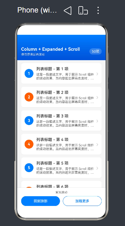
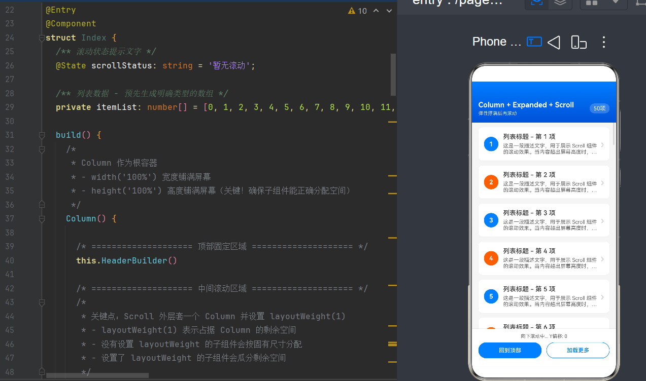
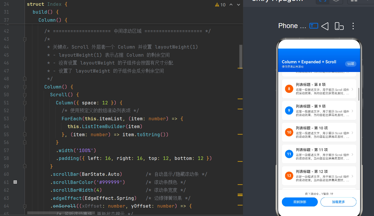
目录
一、引言:为什么选择这种布局方式
1.1 HarmonyOS NEXT 的布局革命
2024 年底,华为正式发布了 HarmonyOS NEXT,这是第一款完全脱离 Android AOSP、基于鸿蒙微内核架构的操作系统。对于开发者而言,最显著的变化之一就是 ArkTS 成为了原生开发的唯一主流语言,而 ArkUI 框架则提供了全新的声明式 UI 构建能力。
在 ArkUI 的六大核心布局组件中,Column(垂直线性布局)+ Scroll(滚动容器)+ layoutWeight(弹性权重分配)的组合,是构建"自适应填充 + 内容滚动"类页面的黄金方案。
┌─────────────────────────────────────────┐
│              Header (固定高度)             │  ← 标题栏、导航栏
├─────────────────────────────────────────┤
│                                         │
│                                         │
│   Scroll (layoutWeight: 1) 弹性填充      │  ← 内容区,可滚动
│                                         │
│                                         │
├─────────────────────────────────────────┤
│              Footer (固定高度)             │  ← 操作栏、输入区
└─────────────────────────────────────────┘
1.2 相比其他方案的优势
| 对比项 | Column + Scroll + layoutWeight | Flex + Scroll | 传统 Stack 嵌套 |
|---|---|---|---|
| 性能表现 | ⭐⭐⭐⭐⭐ 线性布局单次计算 | ⭐⭐⭐ 二次布局开销 | ⭐⭐ 层叠复杂度高 |
| 代码简洁度 | ⭐⭐⭐⭐⭐ 语义清晰 | ⭐⭐⭐ 需配置 flexGrow | ⭐⭐ 定位繁琐 |
| 自适应能力 | ⭐⭐⭐⭐⭐ 权重自动分配 | ⭐⭐⭐⭐ 需手动计算 | ⭐⭐ 需固定尺寸 |
| 维护成本 | ⭐⭐⭐⭐⭐ 易于理解 | ⭐⭐⭐ 需记忆属性组合 | ⭐⭐ 重构困难 |
1.3 应用场景举例
这种布局模式几乎适用于所有移动端页面:
- 聊天应用: 顶部联系人信息 + 中间消息列表(可滚动)+ 底部输入框
- 电商 App: 顶部分类导航 + 中间商品流(可滚动)+ 底部购物车
- 内容阅读: 顶部文章标题 + 中间正文内容(可滚动)+ 底部评论按钮
- 表单填写: 顶部说明文字 + 中间输入项(可滚动)+ 底部提交按钮
二、核心组件全景解析
2.1 Column:垂直线性布局容器
Column 是 ArkUI 中最基础也是最常用的布局容器之一。它将所有子组件按垂直方向依次排列,类似于 Android 中的 LinearLayout(orientation="vertical") 或 iOS 中的 UIStackView(axis=.vertical)。
基础语法
Column({ space: 12 }) {
  // 子组件...
}
.width('100%')
.height('100%')
关键属性详解
| 属性 | 类型 | 说明 | 默认值 |
|---|---|---|---|
space |
number |
子组件之间的间距 | 0 |
width |
number | string |
容器宽度 | 内容适配 |
height |
number | string |
容器高度 | 内容适配 |
alignItems |
HorizontalAlign |
子组件水平对齐方式 | Start |
justifyContent |
FlexAlign |
子组件垂直分布方式 | Start |
对齐方式枚举
HorizontalAlign(水平对齐):
Column() {
  // 子组件
}
.alignItems(HorizontalAlign.Center)   // 居中对齐
.alignItems(HorizontalAlign.Start)    // 左对齐
.alignItems(HorizontalAlign.End)      // 右对齐
FlexAlign(垂直分布):
Column() {
  Text('顶部')
  Text('中部')
  Text('底部')
}
.justifyContent(FlexAlign.SpaceBetween)  // 两端分布
.justifyContent(FlexAlign.Center)         // 居中分布
.justifyContent(FlexAlign.SpaceAround)    // 环绕分布
2.2 Scroll:滚动容器
Scroll 组件是 ArkUI 中实现滚动的核心组件。它本身只有一个直接子节点,该子节点的尺寸超过 Scroll 的可视区域时,即可产生滚动效果。
基础语法
Scroll() {
  Column() {
    // 大量子组件...
  }
  .width('100%')
}
.width('100%')
.height('100%')  // ⚠️ 必须设置明确高度才能滚动
核心属性全表
| 属性 | 类型 | 说明 | API 版本 |
|---|---|---|---|
scrollable |
ScrollDirection |
滚动方向 | 9+ |
scrollBar |
BarState |
滚动条显示策略 | 9+ |
scrollBarColor |
ResourceColor |
滚动条颜色 | 9+ |
scrollBarWidth |
number | string |
滚动条宽度 | 9+ |
edgeEffect |
EdgeEffect |
边缘回弹效果 | 9+ |
friction |
number |
滚动摩擦力 | 10+ |
nestedScroll |
NestedScrollMode |
嵌套滚动模式 | 10+ |
enableScrollInteraction |
boolean |
是否允许滚动交互 | 10+ |
enablePaging |
boolean |
是否分页滚动 | 11+ |
initialOffset |
{ x?: number; y?: number } |
初始滚动偏移 | 12+ |
ScrollDirection 枚举
// 垂直滚动(默认)
.scrollable(ScrollDirection.Vertical)

// 水平滚动
.scrollable(ScrollDirection.Horizontal)

// 双向滚动
.scrollable(ScrollDirection.All)

// 不允许滚动(禁用)
.scrollable(ScrollDirection.None)
BarState 枚举
// 自动模式:滚动时显示,停止后渐隐
.scrollBar(BarState.Auto)

// 始终显示
.scrollBar(BarState.On)

// 始终隐藏
.scrollBar(BarState.Off)
EdgeEffect 枚举(边缘回弹)
从 API 24 起,EdgeEffect.Spring 成为默认值。
// Spring:弹性回弹(iOS 风格)
.edgeEffect(EdgeEffect.Spring)

// Fade:边缘渐隐(Android 传统风格)
.edgeEffect(EdgeEffect.Fade)

// None:无效果,到边界即停
.edgeEffect(EdgeEffect.None)
滚动事件监听
Scroll() {
  // 内容
}
.onScroll((xOffset: number, yOffset: number) => {
  console.info(`当前滚动位置: ${yOffset}`);
})
.onScrollEdge((side: Edge) => {
  if (side === Edge.Top) {
    console.info('已滚动到顶部');
  } else if (side === Edge.Bottom) {
    console.info('已滚动到底部');
  }
})
.onScrollEnd(() => {
  console.info('滚动结束');
})
2.3 layoutWeight:弹性权重分配
layoutWeight 是 ArkUI 中实现弹性布局的核心属性。它允许子组件按权重比例分配父容器的剩余空间,类似于 Web 中的 flex-grow 或 Android 中的 layout_weight。
基础语法
Column() {
  Text('固定高度区域').height(100)

  // 这个组件会自动填充剩余空间
  Scroll() { /* 内容 */ }
  .layoutWeight(1)  // 权重为 1

  Text('固定高度区域').height(80)
}
权重分配规则
- 父容器尺寸必须确定:
layoutWeight只有在父容器设置了明确的主轴尺寸时才生效(如height('100%')) - 权重比例分配: 多个设置了
layoutWeight的子组件按权重比例瓜分剩余空间 - 不设置权重的子组件: 优先分配内容所需的尺寸
- 剩余空间 = 父容器尺寸 - 无子权重子组件的总尺寸
实际比例计算示例
// 剩余空间按 1:2:1 分配
Column() {
  Text('标题').height(60)         // 固定 60vp

  // 剩余空间的 1/4
  Scroll() { /* 内容1 */ }
  .layoutWeight(1)

  // 剩余空间的 2/4 (即 1/2)
  Column() { /* 内容2 */ }
  .layoutWeight(2)

  // 剩余空间的 1/4
  Row() { /* 内容3 */ }
  .layoutWeight(1)

  Button('提交').height(50)       // 固定 50vp
}
.height('100%')
Row 中的 layoutWeight
layoutWeight 不仅在 Column 中生效,在 Row(水平布局)中同样适用:
Row() {
  Text('左侧内容').width(100)

  // 中间区域自动填充剩余水平空间
  TextInput()
  .layoutWeight(1)

  Button('搜索').width(80)
}
.width('100%')
三、布局原理深度剖析
3.1 布局流程全解析
当 ArkUI 框架接收到一个 Column + Scroll + layoutWeight 的布局请求时,它会按照以下步骤进行计算:
┌─────────────────────────────────────────────────────────────────┐
│                      布局计算流程                                 │
├─────────────────────────────────────────────────────────────────┤
│ 1. 确定根容器 Column 的尺寸                                      │
│    └─ width('100%') → 屏幕宽度                                   │
│    └─ height('100%') → 屏幕高度                                   │
├─────────────────────────────────────────────────────────────────┤
│ 2. 第一轮遍历:计算无子权重子组件的尺寸                            │
│    └─ Header: height = 80 (固定)                                 │
│    └─ Footer: height = 100 (固定)                                │
├─────────────────────────────────────────────────────────────────┤
│ 3. 计算剩余可用空间                                               │
│    └─ 剩余高度 = 屏幕高度 - Header - Footer                      │
├─────────────────────────────────────────────────────────────────┤
│ 4. 第二轮遍历:按权重分配剩余空间                                  │
│    └─ Scroll: layoutWeight(1) → 获得全部剩余高度                  │
├─────────────────────────────────────────────────────────────────┤
│ 5. Scroll 内部布局                                                │
│    └─ 子组件 Column 宽度 = Scroll 宽度                            │
│    └─ 子组件高度 = 内容总高度(可超过 Scroll 高度)                │
├─────────────────────────────────────────────────────────────────┤
│ 6. 判定是否需要滚动                                               │
│    └─ 子组件高度 > Scroll 高度 → 启用滚动                         │
│    └─ 子组件高度 ≤ Scroll 高度 → 不滚动                           │
└─────────────────────────────────────────────────────────────────┘
3.2 为什么 Scroll 必须放在 layoutWeight 容器内
这是初学者最常遇到的问题之一。让我们通过对比来说明:
❌ 错误写法: Scroll 直接放在 Column 内,没有 layoutWeight
// 问题代码
Column() {
  Text('Header').height(80)

  Scroll() {
    Column() {
      // 大量内容...
    }
  }
  // ⚠️ 缺少 layoutWeight!Scroll 不知道该多高

  Button('Footer').height(50)
}
.height('100%')
这种情况下,Scroll 会尝试根据内容自适应高度,导致它可能把整个页面撑开,而不是在中间区域滚动。
✅ 正确写法: Scroll 或其父容器设置 layoutWeight
// 正确代码 - 方案一:直接给 Scroll 设置
Column() {
  Text('Header').height(80)

  Scroll() {
    Column() {
      // 大量内容...
    }
  }
  .layoutWeight(1)  // ✅

  Button('Footer').height(50)
}
.height('100%')

// 正确代码 - 方案二:给 Scroll 的父容器设置
Column() {
  Text('Header').height(80)

  Column() {  // 中间包装层
    Scroll() {
      Column() {
        // 大量内容...
      }
    }
    .height('100%')  // Scroll 填满父容器
  }
  .layoutWeight(1)  // ✅ 包装层获得剩余空间

  Button('Footer').height(50)
}
.height('100%')
3.3 Expanded 的概念等价
在部分文档中你可能会看到 “Expanded” 的说法,这个概念来自 Flutter。在 ArkUI 中,我们通过 layoutWeight 属性实现相同的效果:
| 框架 | Flutter | ArkUI |
|---|---|---|
| 弹性填充 | Expanded(child: ...) |
.layoutWeight(1) |
| 权重比例 | flex: 2 |
.layoutWeight(2) |
| 不设置权重 | 不包裹 Expanded | 不设置 layoutWeight |
3.4 嵌套滚动机制
当 Scroll 内部还包含可滚动组件(如嵌套 Scroll 或 List)时,需要正确配置嵌套滚动模式:
Scroll() {
  Column() {
    Text('外层内容').height(200)

    // 内层嵌套滚动
    Scroll() {
      Column() {
        // 更多内容...
      }
    }
    .height(300)
    .nestedScroll(NestedScrollMode.SELF_FIRST)  // 内层优先响应
  }
}
.height('100%')
NestedScrollMode 枚举
| 模式 | 说明 |
|---|---|
PARENT_FIRST |
父容器优先响应滚动 |
SELF_FIRST |
子容器优先响应滚动 |
PARALLEL |
父子同时响应(较少使用) |
四、完整实战代码示例
4.1 示例一:经典三栏布局
这是最基础也最常用的场景——顶部标题 + 中间可滚动内容 + 底部操作栏。
/**
 * 经典三栏布局示例
 * 顶部固定 + 中间弹性滚动 + 底部固定
 */
@Entry
@Component
struct ThreeColumnLayout {
  /** 滚动位置状态 */
  @State scrollY: number = 0

  /** 模拟数据列表 - 使用 number[] 避免复杂类型 */
  private itemList: string[] = [
    '项目启动会议纪要 - 2026年6月1日',
    '产品需求文档 V2.0 评审通过',
    '技术架构选型讨论会',
    'UI/UX 设计稿最终确认',
    'API 接口联调计划',
    '性能优化方案设计',
    '安全审计报告',
    '国际化支持清单',
    '测试用例评审会议',
    '发布计划制定',
    '上线前准备工作',
    '运维监控方案',
    '用户反馈处理',
    '数据迁移方案',
    '版本迭代规划',
    '代码规范制定',
    '团队培训计划',
    '跨部门协作会议',
    '季度总结报告',
    '年度规划讨论',
  ]

  build() {
    Column() {

      // ========== 顶部固定区域 ==========
      this.HeaderBuilder()

      // ========== 中间弹性滚动区域 ==========
      Scroll() {
        Column({ space: 12 }) {
          ForEach(this.itemList, (item: string, index: number) => {
            this.ListItemBuilder(item, index)
          }, (item: string, index: number) => `${index}`)
        }
        .width('100%')
        .padding(16)
      }
      .layoutWeight(1)                    // ✅ 弹性填充剩余空间
      .scrollBar(BarState.Auto)
      .scrollBarColor('#CCCCCC')
      .scrollBarWidth(4)
      .edgeEffect(EdgeEffect.Spring)
      .scrollable(ScrollDirection.Vertical)
      .onScroll((x: number, y: number) => {
        this.scrollY = y
      })

      // ========== 底部固定区域 ==========
      this.FooterBuilder()

    }
    .width('100%')
    .height('100%')
    .backgroundColor('#F5F5F5')
  }

  /**
   * 顶部标题栏
   */
  @Builder
  HeaderBuilder() {
    Row() {
      Column() {
        Text('项目文档中心')
          .fontSize(20)
          .fontWeight(FontWeight.Bold)
          .fontColor('#FFFFFF')
        Text(`共 ${this.itemList.length} 篇文档`)
          .fontSize(13)
          .fontColor('rgba(255,255,255,0.8)')
          .margin({ top: 4 })
      }
      .alignItems(HorizontalAlign.Start)
      .layoutWeight(1)

      Text('🔔')
        .fontSize(24)
        .padding(8)
        .backgroundColor('rgba(255,255,255,0.2)')
        .borderRadius(20)
    }
    .width('100%')
    .padding({ left: 16, right: 16, top: 48, bottom: 16 })
    .linearGradient({
      direction: GradientDirection.BottomRight,
      colors: [['#007DFF', 0], ['#0052D9', 1]]
    })
  }

  /**
   * 列表项组件
   */
  @Builder
  ListItemBuilder(content: string, index: number) {
    Row() {
      // 序号圆形标记
      Text(`${index + 1}`)
        .width(32)
        .height(32)
        .textAlign(TextAlign.Center)
        .fontSize(14)
        .fontWeight(FontWeight.Bold)
        .fontColor('#FFFFFF')
        .backgroundColor(index % 2 === 0 ? '#007DFF' : '#FF6B00')
        .borderRadius(16)
        .margin({ right: 12 })

      // 内容区域
      Column() {
        Text(content)
          .fontSize(15)
          .fontWeight(FontWeight.Medium)
          .fontColor('#333333')
          .maxLines(1)
          .textOverflow({ overflow: TextOverflow.Ellipsis })
        Text(`更新于 2026-06-${15 + (index % 10)}`)
          .fontSize(12)
          .fontColor('#999999')
          .margin({ top: 4 })
      }
      .alignItems(HorizontalAlign.Start)
      .layoutWeight(1)

      // 箭头
      Text('›')
        .fontSize(22)
        .fontColor('#CCCCCC')
    }
    .width('100%')
    .padding(14)
    .backgroundColor('#FFFFFF')
    .borderRadius(10)
    .shadow({
      radius: 2,
      color: 'rgba(0,0,0,0.06)',
      offsetX: 0,
      offsetY: 1
    })
  }

  /**
   * 底部操作栏
   */
  @Builder
  FooterBuilder() {
    Row({ space: 12 }) {
      Button('刷新列表')
        .layoutWeight(1)
        .height(42)
        .backgroundColor('#007DFF')
        .fontSize(15)
        .onClick(() => {
          // 刷新逻辑
        })

      Button('新建文档')
        .layoutWeight(1)
        .height(42)
        .backgroundColor('#FFFFFF')
        .fontColor('#007DFF')
        .borderColor('#007DFF')
        .borderWidth(1)
        .fontSize(15)
        .onClick(() => {
          // 新建逻辑
        })
    }
    .width('100%')
    .padding({ left: 16, right: 16, top: 12, bottom: 24 })
    .backgroundColor('#FFFFFF')
    .shadow({
      radius: 8,
      color: 'rgba(0,0,0,0.08)',
      offsetX: 0,
      offsetY: -4
    })
  }
}
4.2 示例二:复杂多区域弹性布局
当页面有多个可伸缩区域时,layoutWeight 可以按比例分配。
/**
 * 复杂多区域弹性布局示例
 * 演示多个 layoutWeight 区域的比例分配
 */
@Entry
@Component
struct MultiRegionLayout {
  /** 不同区域的内容数据 */
  private newsList: string[] = [
    '鸿蒙 NEXT 正式发布',
    '华为开发者大会召开',
    'ArkTS 性能优化指南',
    '跨设备协同新特性',
    '一次编写多端运行',
  ]

  private productList: string[] = [
    'Mate 60 Pro',
    'HarmonyOS Watch',
    'FreeBuds Pro 4',
    'Smart Screen X1',
  ]

  private serviceList: string[] = [
    '云备份服务',
    '会员中心',
    '技术支持',
    '社区论坛',
  ]

  build() {
    Column() {

      // ========== 顶部区域(固定) ==========
      Column() {
        Text('华为应用市场')
          .fontSize(22)
          .fontWeight(FontWeight.Bold)
          .fontColor('#1A1A1A')
        Text('探索精彩应用与服务')
          .fontSize(14)
          .fontColor('#666666')
          .margin({ top: 6 })

        // 搜索栏
        Row() {
          Text('🔍')
            .fontSize(18)
            .margin({ right: 8 })
          Text('搜索应用、游戏、主题...')
            .fontSize(14)
            .fontColor('#999999')
            .layoutWeight(1)
        }
        .width('100%')
        .height(40)
        .padding({ left: 12, right: 12 })
        .backgroundColor('#F0F0F0')
        .borderRadius(20)
        .margin({ top: 16 })
      }
      .width('100%')
      .padding({ left: 20, right: 20, top: 48, bottom: 16 })
      .backgroundColor('#FFFFFF')

      // ========== 中部滚动区域(弹性) ==========
      Scroll() {
        Column({ space: 16 }) {

          // 新闻专区
          Column() {
            Row() {
              Text('📰 热门资讯')
                .fontSize(16)
                .fontWeight(FontWeight.Bold)
                .layoutWeight(1)
              Text('查看全部 ›')
                .fontSize(13)
                .fontColor('#007DFF')
            }
            .width('100%')
            .margin({ bottom: 12 })

            ForEach(this.newsList, (news: string, idx: number) => {
              Row() {
                Text(`${idx + 1}`)
                  .fontSize(12)
                  .fontWeight(FontWeight.Bold)
                  .fontColor(idx < 3 ? '#FF4444' : '#999999')
                  .width(20)
                Text(news)
                  .fontSize(14)
                  .fontColor('#333333')
                  .layoutWeight(1)
                  .margin({ left: 8 })
              }
              .width('100%')
              .padding({ top: 8, bottom: 8 })
            }, (news: string, idx: number) => `news_${idx}`)
          }
          .width('100%')
          .padding(16)
          .backgroundColor('#FFFFFF')
          .borderRadius(12)

          // 产品推荐
          Column() {
            Row() {
              Text('📱 精选产品')
                .fontSize(16)
                .fontWeight(FontWeight.Bold)
                .layoutWeight(1)
              Text('更多 ›')
                .fontSize(13)
                .fontColor('#007DFF')
            }
            .width('100%')
            .margin({ bottom: 12 })

            Row({ space: 12 }) {
              ForEach(this.productList, (product: string) => {
                Column() {
                  Column()
                    .width(50)
                    .height(50)
                    .borderRadius(25)
                    .backgroundColor('#E8F4FF')
                  Text(product)
                    .fontSize(12)
                    .fontColor('#333333')
                    .margin({ top: 8 })
                }
                .layoutWeight(1)
                .alignItems(HorizontalAlign.Center)
              }, (product: string) => product)
            }
            .width('100%')
          }
          .width('100%')
          .padding(16)
          .backgroundColor('#FFFFFF')
          .borderRadius(12)

          // 服务入口
          Column() {
            Row() {
              Text('⚡ 常用服务')
                .fontSize(16)
                .fontWeight(FontWeight.Bold)
                .layoutWeight(1)
            }
            .width('100%')
            .margin({ bottom: 12 })

            Grid() {
              ForEach(this.serviceList, (service: string) => {
                GridItem() {
                  Column() {
                    Text('🔷')
                      .fontSize(24)
                    Text(service)
                      .fontSize(13)
                      .fontColor('#333333')
                      .margin({ top: 6 })
                  }
                  .width('100%')
                  .padding(12)
                  .alignItems(HorizontalAlign.Center)
                  .backgroundColor('#F8F8F8')
                  .borderRadius(8)
                }
              }, (service: string) => service)
            }
            .columnsTemplate('1fr 1fr')
            .rowsGap(12)
            .columnsGap(12)
            .width('100%')
          }
          .width('100%')
          .padding(16)
          .backgroundColor('#FFFFFF')
          .borderRadius(12)
        }
        .width('100%')
        .padding(16)
      }
      .layoutWeight(1)  // ✅ 弹性填充
      .scrollBar(BarState.Auto)
      .edgeEffect(EdgeEffect.Spring)

      // ========== 底部导航栏(固定) ==========
      Row() {
        this.NavItemBuilder('🏠', '首页', true)
        this.NavItemBuilder('📂', '分类', false)
        this.NavItemBuilder('🛒', '购物车', false)
        this.NavItemBuilder('👤', '我的', false)
      }
      .width('100%')
      .padding({ top: 10, bottom: 24 })
      .backgroundColor('#FFFFFF')
      .shadow({
        radius: 10,
        color: 'rgba(0,0,0,0.1)',
        offsetX: 0,
        offsetY: -5
      })
    }
    .width('100%')
    .height('100%')
    .backgroundColor('#F5F5F5')
  }

  @Builder
  NavItemBuilder(icon: string, label: string, isActive: boolean) {
    Column() {
      Text(icon)
        .fontSize(22)
      Text(label)
        .fontSize(11)
        .fontColor(isActive ? '#007DFF' : '#999999')
        .margin({ top: 2 })
    }
    .layoutWeight(1)
    .alignItems(HorizontalAlign.Center)
  }
}
4.3 示例三:聊天界面布局
聊天界面是 Column + Scroll 布局的经典应用场景。
/**
 * 聊天界面布局示例
 * 展示动态消息列表 + 固定输入框
 *
 * 注意:消息数据类型使用简单的 string[] 配合索引
 * 在实际项目中可以定义数据模型类
 */
@Entry
@Component
struct ChatLayout {
  /** 消息内容列表 - 偶数索引为自己发送 */
  @State messageList: string[] = [
    '你好!最近怎么样?',
    '挺好的,刚完成一个项目',
    '太棒了!什么项目呀?',
    '用 HarmonyOS NEXT 开发的应用',
    '听起来很有趣!能分享一下经验吗?',
    '当然可以,我们可以约个时间聊聊',
    '好呀,周五下午怎么样?',
    '没问题,到时候联系',
  ]

  /** 是否是自己发送的消息 - 根据索引判断 */
  private isSelfMessage(index: number): boolean {
    return index % 2 === 1
  }

  /** 获取发送时间 */
  private getMessageTime(index: number): string {
    const hour = 10 + Math.floor(index / 2)
    const minute = (index % 2) * 7
    return `${hour}:${minute.toString().padStart(2, '0')}`
  }

  /** 输入框内容 */
  @State inputText: string = ''

  /** Scroller 控制器 */
  private scroller: Scroller = new Scroller()

  build() {
    Column() {

      // ========== 顶部联系人信息(固定) ==========
      Row() {
        Column() {
          Text('张小明')
            .fontSize(18)
            .fontWeight(FontWeight.Bold)
            .fontColor('#1A1A1A')
          Text('在线')
            .fontSize(12)
            .fontColor('#07C160')
            .margin({ top: 2 })
        }
        .alignItems(HorizontalAlign.Start)
        .layoutWeight(1)

        Text('📞')
          .fontSize(24)
          .margin({ right: 16 })
        Text('⋯')
          .fontSize(28)
      }
      .width('100%')
      .padding({ left: 16, right: 16, top: 48, bottom: 12 })
      .backgroundColor('#FFFFFF')
      .shadow({
        radius: 2,
        color: 'rgba(0,0,0,0.06)',
        offsetX: 0,
        offsetY: 1
      })

      // ========== 消息列表(弹性滚动) ==========
      Scroll(this.scroller) {
        Column({ space: 12 }) {
          ForEach(this.messageList, (msg: string, index: number) => {
            this.MessageBubbleBuilder(msg, index)
          }, (msg: string, index: number) => `${index}`)
        }
        .width('100%')
        .padding({ left: 12, right: 12, top: 12, bottom: 12 })
      }
      .layoutWeight(1)
      .scrollBar(BarState.Off)
      .edgeEffect(EdgeEffect.Spring)
      .backgroundColor('#EDEDED')

      // ========== 底部输入区域(固定) ==========
      Row({ space: 8 }) {
        Text('+')
          .fontSize(28)
          .fontColor('#666666')
          .padding(4)

        Row() {
          TextInput({ placeholder: '输入消息...', text: this.inputText })
            .layoutWeight(1)
            .height(36)
            .fontSize(15)
            .backgroundColor(Color.Transparent)

          Text('😊')
            .fontSize(22)
            .padding({ left: 4 })
        }
        .layoutWeight(1)
        .height(40)
        .padding({ left: 12, right: 12 })
        .backgroundColor('#FFFFFF')
        .borderRadius(20)

        Button('发送')
          .height(40)
          .fontSize(14)
          .backgroundColor('#07C160')
          .enabled(this.inputText.length > 0)
          .onClick(() => {
            this.sendMessage()
          })
      }
      .width('100%')
      .padding({ left: 12, right: 12, top: 10, bottom: 24 })
      .backgroundColor('#F7F7F7')

    }
    .width('100%')
    .height('100%')
  }

  /**
   * 发送消息
   */
  private sendMessage(): void {
    if (this.inputText.trim().length === 0) {
      return
    }

    // 使用数组拼接代替 push,避免 ArkTS 的某些限制
    const newList: string[] = []
    for (let i = 0; i < this.messageList.length; i++) {
      newList.push(this.messageList[i])
    }
    newList.push(this.inputText)
    this.messageList = newList
    this.inputText = ''

    // 滚动到底部
    setTimeout(() => {
      this.scroller.scrollEdge(Edge.Bottom)
    }, 100)
  }

  /**
   * 消息气泡
   */
  @Builder
  MessageBubbleBuilder(content: string, index: number) {
    Row() {
      if (this.isSelfMessage(index)) {
        // 自己发的消息:右对齐
        Column() {
          Text(content)
            .fontSize(15)
            .fontColor('#1A1A1A')
            .padding(10)
            .backgroundColor('#95EC69')
            .borderRadius(12)
            .constraintSize({ maxWidth: '70%' })

          Text(this.getMessageTime(index))
            .fontSize(10)
            .fontColor('#999999')
            .margin({ top: 4 })
        }
        .alignItems(HorizontalAlign.End)
        .layoutWeight(1)
      } else {
        // 对方发的消息:左对齐
        Column() {
          Text(content)
            .fontSize(15)
            .fontColor('#1A1A1A')
            .padding(10)
            .backgroundColor('#FFFFFF')
            .borderRadius(12)
            .constraintSize({ maxWidth: '70%' })

          Text(this.getMessageTime(index))
            .fontSize(10)
            .fontColor('#999999')
            .margin({ top: 4 })
        }
        .alignItems(HorizontalAlign.Start)
        .layoutWeight(1)
      }
    }
    .width('100%')
  }
}
五、进阶技巧与最佳实践
5.1 使用 Scroller 控制器精确控制滚动
Scroller 是 Scroll 的控制器,可以实现编程式滚动:
@Component
struct ScrollControlExample {
  private scroller: Scroller = new Scroller()

  build() {
    Column() {

      // 控制按钮组(固定)
      Row({ space: 12 }) {
        Button('回到顶部')
          .layoutWeight(1)
          .onClick(() => {
            this.scroller.scrollEdge(Edge.Top)
          })

        Button('滚动到底部')
          .layoutWeight(1)
          .onClick(() => {
            this.scroller.scrollEdge(Edge.Bottom)
          })
      }
      .width('100%')
      .padding(16)

      // Scroll 绑定 Scroller
      Scroll(this.scroller) {
        Column() {
          // 大量内容...
        }
      }
      .layoutWeight(1)

      // 滚动到指定位置
      Button('滚动到 500vp')
        .onClick(() => {
          this.scroller.scrollTo({ xOffset: 0, yOffset: 500 })
        })
    }
    .height('100%')
  }
}
Scroller 常用方法
| 方法 | 说明 |
|---|---|
scrollTo({ xOffset, yOffset }) |
滚动到指定偏移位置 |
scrollEdge(Edge.Top / Bottom / Start / End) |
滚动到边缘 |
scrollPage({ next: true }) |
滚动一页 |
currentOffset() |
获取当前滚动偏移 |
5.2 懒加载与性能优化
当列表数据量很大时(如 1000+ 条),即使使用 Scroll 也可能导致性能问题。此时可以考虑:
方案一:使用 List 组件替代 Scroll
// Scroll + Column(全部渲染,适合少量数据)
Scroll() {
  Column() {
    ForEach(this.allItems, ...)  // 一次性创建所有组件
  }
}

// List(按需渲染,适合大量数据)
List() {
  ForEach(this.allItems, (item) => {
    ListItem() {
      // 只渲染可视区域的项
    }
  })
}
.layoutWeight(1)
方案二:分页加载
@Component
struct PaginatedScroll {
  @State page: number = 1
  @State items: string[] = []
  private pageSize: number = 20

  aboutToAppear(): void {
    this.loadPage()
  }

  private loadPage(): void {
    const newItems: string[] = []
    const start: number = (this.page - 1) * this.pageSize
    for (let i: number = start; i < start + this.pageSize; i++) {
      newItems.push(`第 ${i + 1} 项`)
    }

    // 使用数组拼接代替 push
    const combinedList: string[] = []
    for (let j: number = 0; j < this.items.length; j++) {
      combinedList.push(this.items[j])
    }
    for (let k: number = 0; k < newItems.length; k++) {
      combinedList.push(newItems[k])
    }
    this.items = combinedList
  }

  build() {
    Column() {
      Scroll() {
        Column() {
          ForEach(this.items, (item: string, idx: number) => {
            Text(item).fontSize(16).padding(12)
          }, (item: string, idx: number) => `${idx}`)

          // 加载更多触发器
          Text('加载更多...')
            .fontSize(14)
            .fontColor('#007DFF')
            .padding(16)
            .onClick(() => {
              this.page++
              this.loadPage()
            })
        }
      }
      .layoutWeight(1)
      .onScrollEdge((side: Edge) => {
        if (side === Edge.Bottom) {
          // 滚动到底部时自动加载
          this.page++
          this.loadPage()
        }
      })
    }
    .height('100%')
  }
}
5.3 深色模式适配
@Component
struct DarkModeExample {
  @State isDarkMode: boolean = false

  build() {
    Column() {

      // 使用 $r 资源引用,自动适配深色模式
      Text('标题')
        .fontColor($r('app.color.text_color'))

      Scroll() {
        Column() {
          ForEach(this.items, ...)
        }
        .backgroundColor($r('app.color.page_background'))
      }
      .layoutWeight(1)

    }
    .backgroundColor($r('app.color.page_background'))
    .height('100%')
  }
}
在 resources/base/element/color.json 中定义:
{
  "color": [
    {
      "name": "page_background",
      "value": "#FFFFFF"
    },
    {
      "name": "text_color",
      "value": "#333333"
    }
  ]
}
在 resources/dark/element/color.json 中覆盖:
{
  "color": [
    {
      "name": "page_background",
      "value": "#1A1A1A"
    },
    {
      "name": "text_color",
      "value": "#E5E5E5"
    }
  ]
}
5.4 安全区域处理
@Component
struct SafeAreaExample {
  build() {
    Column() {

      // 顶部安全区域自动避让状态栏
      Column() {
        Text('标题栏')
      }
      .padding({ top: 48 })  // 简单处理

      // 推荐:使用 expandSafeArea
      Scroll() {
        // 内容自动避开安全区域
      }
      .layoutWeight(1)

      Column() {
        Button('底部操作')
      }
      .padding({ bottom: 24 })  // 避开手势导航区

    }
    .expandSafeArea([SafeAreaType.SYSTEM], [SafeAreaEdge.TOP])
    .height('100%')
  }
}
六、常见问题与踩坑记录
6.1 Scroll 不滚动怎么办?
这是最常见的问题,原因通常有以下几种:
原因一:Scroll 没有设置明确高度
// ❌ 错误
Scroll() {
  Column() { /* 内容 */ }
}
// 缺少 .height('100%') 或 .layoutWeight(1)

// ✅ 正确
Scroll() {
  Column() { /* 内容 */ }
}
.layoutWeight(1)  // 或 .height('100%')
原因二:父容器没有明确高度
// ❌ 错误
Column() {
  Scroll() { /* 内容 */ }.layoutWeight(1)
}
// 父 Column 缺少高度约束

// ✅ 正确
Column() {
  Scroll() { /* 内容 */ }.layoutWeight(1)
}
.height('100%')  // 必须设置
原因三:内容没有超出 Scroll 高度
// 内容太少,不需要滚动
Scroll() {
  Column() {
    Text('只有一行').height(50)
  }
}
.height(300)  // 内容 50 < 容器 300,不会滚动
原因四:滚动方向不匹配
// ❌ 错误:水平滚动,但内容是垂直排列
Scroll() {
  Column() { /* 内容 */ }
}
.scrollable(ScrollDirection.Horizontal)

// ✅ 正确:垂直滚动
Scroll() {
  Column() { /* 内容 */ }
}
.scrollable(ScrollDirection.Vertical)
6.2 layoutWeight 不生效?
原因一:父容器没有明确尺寸
// ❌ layoutWeight 在没有尺寸约束的容器内无效
Column() {
  Text('Header').height(60)
  Scroll() { /* 内容 */ }.layoutWeight(1)
  // 父 Column 高度由内容决定,没有剩余空间可分配
}
// 缺少 .height('100%')

// ✅ 正确
Column() {
  Text('Header').height(60)
  Scroll() { /* 内容 */ }.layoutWeight(1)
}
.height('100%')  // 必须设置明确高度
原因二:同时设置了固定尺寸和 layoutWeight
// ❌ 冲突:固定尺寸会覆盖 layoutWeight
Scroll() { /* 内容 */ }
.width(300)          // 固定宽度
.layoutWeight(1)     // 会被忽略

// ✅ 正确:移除固定尺寸
Scroll() { /* 内容 */ }
.layoutWeight(1)
6.3 Scroll 与 List 如何选择?
| 场景 | 推荐组件 | 原因 |
|---|---|---|
| 少量数据(< 50 条) | Scroll + Column | 简单直接,全量渲染 |
| 大量数据(> 100 条) | List | 懒加载,只渲染可视区域 |
| 混合内容(图片+文字) | Scroll + Column | 布局灵活 |
| 同类数据列表 | List | 性能更优 |
| 需要网格布局 | Scroll + Grid | 支持自定义行列 |
6.4 键盘弹起遮挡输入框
@Component
struct KeyboardAvoidExample {
  @State inputText: string = ''

  build() {
    Column() {

      Scroll() {
        Column() {
          // 表单内容...
          TextInput({ placeholder: '姓名', text: '' })
          TextInput({ placeholder: '邮箱', text: '' })
        }
      }
      .layoutWeight(1)

      // 输入框在底部,键盘弹起时 Scroll 自动上推
      Row() {
        TextInput({ placeholder: '请输入...', text: this.inputText })
          .layoutWeight(1)
        Button('发送')
      }
      .padding(12)

    }
    .height('100%')
    // 自动避让键盘(API 14+)
    .expandSafeArea([SafeAreaType.KEYBOARD], [SafeAreaEdge.BOTTOM])
  }
}
6.5 滚动时性能卡顿?
问题原因: 滚动过程中频繁触发重绘
解决方案:
// 1. 使用 renderGroup 减少重绘范围
Column() {
  // 复杂的子组件树
}
.renderGroup(true)

// 2. 减少 onScroll 回调中的计算
Scroll() {
  // ...
}
.onScroll((x: number, y: number) => {
  // ✅ 只做简单的状态更新
  this.scrollY = y

  // ❌ 不要在这里做复杂计算
  // this.heavyCalculation()
})

// 3. 使用 List 替代大量子组件的 Scroll
List() {
  ForEach(this.items, (item) => {
    ListItem() {
      // List 内部有虚拟化机制
    }
  })
}

// 4. 避免在 Scroll 内部使用透明度动画
// ❌ 不要这样做
Column() {
  // ...
}
.opacity(this.isVisible ? 1 : 0.5)  // 滚动时触发重绘
.animation({ duration: 200 })
七、性能优化与调试指南
7.1 布局层级优化
过深的嵌套会增加布局计算时间,建议控制在 5 层以内:
// ❌ 过深嵌套
Column (1)
  └─ Row (2)
       └─ Column (3)
            └─ Stack (4)
                 └─ Column (5)
                      └─ Text (6)  ← 太深了!

// ✅ 合理扁平化
Column (1)
  ├─ Row (2)
  │    └─ Text (3)
  ├─ Column (2)
  │    └─ Text (3)
  └─ Stack (2)
       └─ Text (3)
7.2 使用 Layout Inspector 调试
DevEco Studio 提供了布局检查工具:
- 连接设备或模拟器运行应用
- 点击菜单 View → Tool Windows → Previewer
- 在 Previewer 中点击 Show Layout Bounds 按钮
- 可以看到每个组件的边界、间距、对齐方式
7.3 性能分析
使用 Profiler 工具分析:
1. Run → Profile 'app'
2. 选择 CPU 或 Memory 分析
3. 运行应用操作滚动
4. 查看布局渲染耗时
7.4 避免布局中的反模式
| 反模式 | 问题 | 推荐做法 |
|---|---|---|
| Scroll 嵌套 Scroll | 滚动冲突 | 用 List 或设置 nestedScroll |
| 硬编码大量固定尺寸 | 适配困难 | 使用 layoutWeight 或百分比 |
| 在 Scroll 中放大量图片 | 内存占用高 | 使用懒加载 + List |
| 使用 Position 代替布局 | 维护困难 | 使用 Column/Row 正常布局 |
| 深层嵌套无意义包装 | 性能下降 | 合并或扁平化 |
八、总结与展望
8.1 知识点回顾
本文系统讲解了 HarmonyOS NEXT 中 Column + Scroll + layoutWeight 组合布局的完整知识体系:
- Column 是垂直线性布局的基础容器
- Scroll 提供可滚动的视口容器
- layoutWeight 实现弹性空间分配
- 三者组合实现"弹性撑满 + 内容滚动"的经典模式
8.2 核心口诀
布局先看 Column/Row,
固定区域要定高宽,
弹性区域 layoutWeight(1),
Scroll 必须有高度,
父容器尺寸要确定,
权重比例自动算,
边缘效果 Spring/Fade,
滚动性能靠 List!
8.3 未来展望
随着 HarmonyOS 的不断演进:
- API 25+: 预计会带来更强大的声明式布局能力
- ArkTS 增强: 更好的类型推断和编译优化
- 跨设备协同: 布局自动适配手机、平板、PC、车机
- 动效系统: 更丰富的滚动联动动画支持
8.4 延伸学习资源
| 资源 | 链接 |
|---|---|
| 官方布局文档 | https://developer.huawei.com/consumer/cn/doc/harmonyos-guides/arkts-layout-development |
| Column API | https://developer.huawei.com/consumer/cn/doc/harmonyos-references/ts-container-column |
| Scroll API | https://developer.huawei.com/consumer/cn/doc/harmonyos-references/ts-container-scroll |
| layoutWeight | https://developer.huawei.com/consumer/cn/doc/harmonyos-references/ts-universal-attributes-size |
| 最佳实践 | https://developer.huawei.com/consumer/cn/doc/harmonyos-guides/best-practices |
如果你觉得这篇文章有帮助,请点赞收藏!有任何问题欢迎在评论区交流讨论。
┌─────────────────────────────────────────────────────────────────┐
│  ⭐ 点赞关注,获取更多 HarmonyOS 开发实战教程                      │
│  📚 系统学习,共建鸿蒙开发者生态                                    │
│  🚀 让每一行代码都充满创造力                                        │
└─────────────────────────────────────────────────────────────────┘

讨论HarmonyOS开发技术,专注于API与组件、DevEco Studio、测试、元服务和应用上架分发等。
更多推荐



 13
13 0
0- 0


 已为社区贡献24条内容

所有评论(0)