Tabs 与 State 联动:外部控制 Tab 切换深度解析
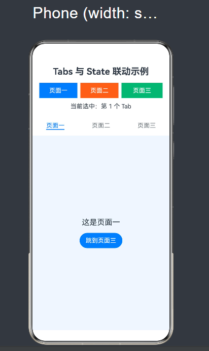
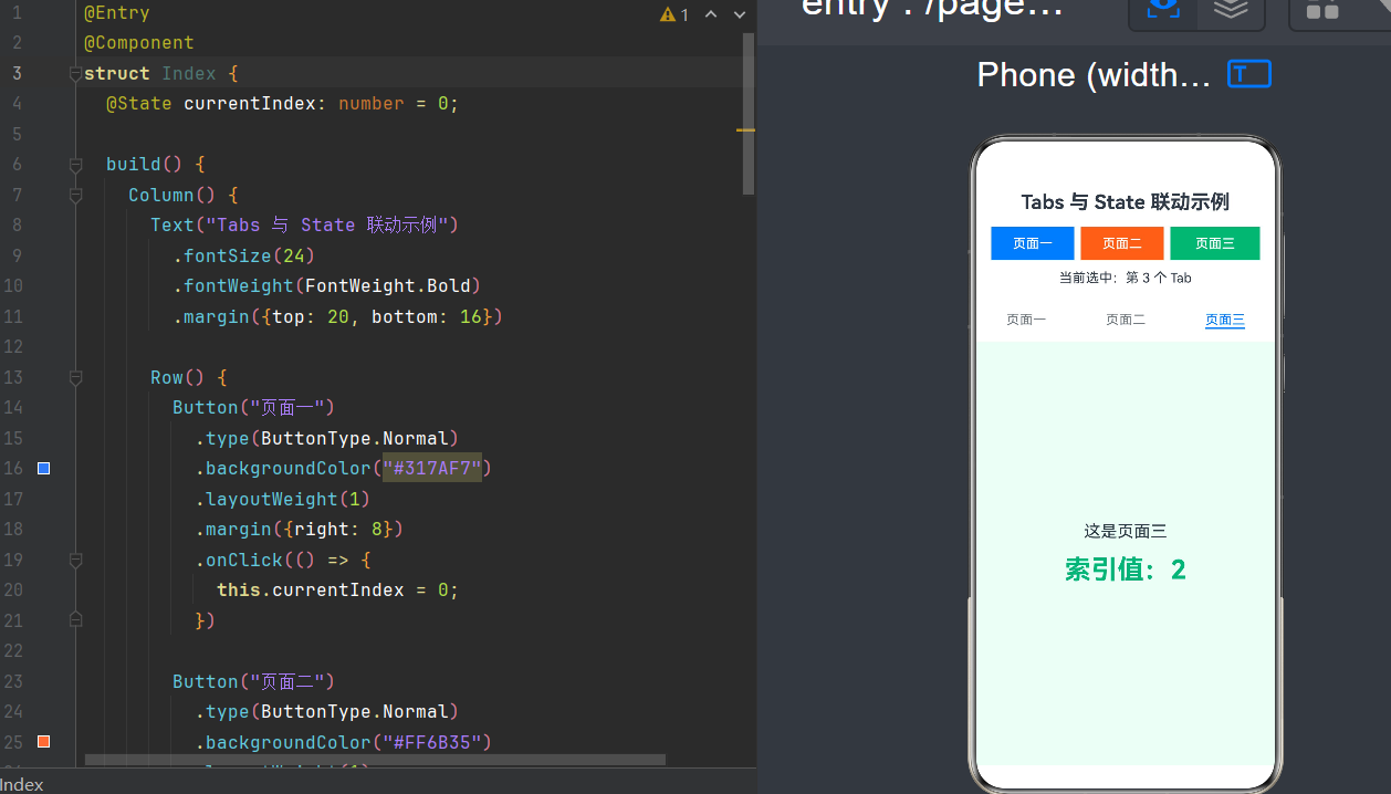
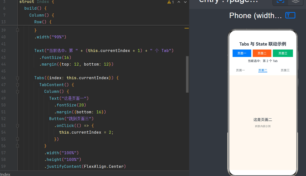
项目演示
目录
前言
在 HarmonyOS 应用开发中,Tabs(标签页)组件是使用频率最高的 UI 组件之一。无论是新闻资讯类应用的顶部分类导航、电商应用的底部 TabBar、还是设置页面的分组切换,Tabs 都扮演着重要的角色。
但在实际开发中,我们经常会遇到这样的需求场景:
- 用户完成某个操作后,需要自动跳转到指定的 Tab
- 需要根据应用状态动态切换当前显示的页面
- 多个组件需要协同工作,共同控制 Tab 的切换逻辑
- 需要拦截或验证用户的 Tab 切换行为
这些场景都超出了 Tabs 组件的默认行为范畴,需要我们通过 State(状态)与 Tabs 的联动来实现。
本文将基于 HarmonyOS NEXT(API 24)版本,深入解析 Tabs 与 State 联动的完整技术方案,从基础原理到进阶实践,帮助读者掌握外部控制 Tab 切换的核心能力。
一、基础概念回顾
1.1 Tabs 组件是什么
Tabs 是 ArkUI 框架中用于实现标签页切换的容器组件。它由两部分组成:
- TabBar:标签导航栏,显示所有可切换的选项
- TabContent:内容区域,显示当前选中标签对应的内容
┌─────────────────────────────────┐
│  TabBar  [首页] [分类] [我的]   │  ← 标签导航栏
├─────────────────────────────────┤
│                                 │
│  TabContent 内容区域            │  ← 内容显示区域
│  (显示当前选中标签的内容)      │
│                                 │
└─────────────────────────────────┘
1.2 Tabs 的基本用法
@Entry
@Component
struct BasicTabs {
  build() {
    Column() {
      Tabs() {
        TabContent() {
          Text("首页内容").fontSize(20)
        }
        .tabBar("首页")

        TabContent() {
          Text("分类内容").fontSize(20)
        }
        .tabBar("分类")

        TabContent() {
          Text("我的内容").fontSize(20)
        }
        .tabBar("我的")
      }
      .barPosition(BarPosition.End)  // TabBar 放在底部
      .layoutWeight(1)
    }
    .width("100%")
    .height("100%")
  }
}
1.3 什么是 State(状态)
State 是 ArkUI 中的响应式数据机制。通过 @State 装饰器声明的变量,当其值发生变化时,框架会自动重新渲染依赖该变量的 UI 组件。
@Entry
@Component
struct StateDemo {
  @State count: number = 0;  // 声明响应式状态

  build() {
    Column() {
      Text(`点击次数: ${this.count}`)  // 依赖 count 的 UI
        .fontSize(24)

      Button("点击我")
        .onClick(() => {
          this.count++;  // 修改状态,自动触发 UI 更新
        })
    }
    .justifyContent(FlexAlign.Center)
    .width("100%")
    .height("100%")
  }
}
1.4 为什么需要联动
在默认情况下,Tabs 的切换完全由用户交互(点击 TabBar 或滑动内容区)触发。但在实际开发中,我们需要:
| 场景 | 说明 |
|---|---|
| 自动跳转 | 用户完成注册后,自动跳转到"个人中心" |
| 条件切换 | 根据登录状态决定显示哪个 Tab |
| 编程控制 | 通过代码逻辑动态选择目标 Tab |
| 拦截验证 | 切换前进行权限检查或数据验证 |
二、Tabs 组件核心机制
2.1 Tabs 组件的关键属性
在 HarmonyOS NEXT (API 24) 中,Tabs 组件提供了以下与外部控制相关的核心属性:
| 属性 | 类型 | 默认值 | 说明 |
|---|---|---|---|
index | number | 0 | 当前选中的 Tab 索引,外部控制的关键入口 |
scrollable | boolean | true | 是否允许手势滑动切换 |
barPosition | BarPosition | BarPosition.Start | TabBar 位置 |
animationDuration | number | 300 | 切换动画时长(毫秒) |
animationCurve | Curve | Curve.EaseInOut | 切换动画曲线 |
2.2 index 属性的双向特性
index 属性是理解 Tabs 与 State 联动的核心:
// index 属性的作用
Tabs({ index: this.currentIndex }) {
  // ... TabContent 定义
}
单向控制:当 currentIndex 值改变时,Tabs 会自动切换到对应索引的内容页。
但这里有一个问题:当用户手动切换 Tab 时,currentIndex 并不会自动更新,导致状态与 UI 不同步。
2.3 onChange 事件回调
为了解决上述问题,Tabs 提供了 onChange 事件:
Tabs({ index: this.currentIndex }) {
  // ...
}
.onChange((index: number) => {
  this.currentIndex = index;  // 同步更新状态
})
onChange 触发时机:
- 用户点击 TabBar 上的某个标签
- 用户通过手势滑动切换内容页
- 编程方式修改 index 触发的切换(API 24 行为)
2.4 完整的联动模型
┌─────────────────────────────────────────────────────────────┐
│                      双向联动模型                             │
├─────────────────────────────────────────────────────────────┤
│                                                             │
│   ┌─────────────┐   修改值    ┌─────────────┐              │
│   │ 外部组件    │ ──────────► │   @State    │              │
│   │ (Button等)  │             │ currentIndex│              │
│   └─────────────┘             └──────┬──────┘              │
│                                      │                      │
│                                      │ 绑定到 index 属性    │
│                                      ▼                      │
│                                 ┌─────────────┐            │
│                                 │    Tabs     │            │
│                                 │   组件      │            │
│                                 └──────┬──────┘            │
│                                        │                    │
│                                        │ 用户手动切换时     │
│                                        ▼                    │
│                                 ┌─────────────┐            │
│                                 │  onChange   │            │
│                                 │   回调      │            │
│                                 └──────┬──────┘            │
│                                        │                    │
│                                        │ 更新状态值         │
│                                        ▼                    │
│                                 ┌─────────────┐            │
│                                 │   @State    │            │
│                                 │ currentIndex│            │
│                                 └─────────────┘            │
│                                                             │
└─────────────────────────────────────────────────────────────┘
三、State 状态管理原理
3.1 @State 装饰器的工作机制
@State 装饰器是 ArkUI 响应式系统的基础。其工作原理可以分为三个阶段:
声明阶段 → 收集阶段 → 更新阶段
声明阶段
@State currentIndex: number = 0;
框架在编译时为该变量生成 getter/setter,并重写所有读取该变量的表达式。
收集阶段
当 build() 方法执行时,框架会记录哪些 UI 组件依赖了 currentIndex:
Text(`当前索引: ${this.currentIndex}`)  // 记录 Text 组件依赖 currentIndex
Tabs({ index: this.currentIndex })       // 记录 Tabs 组件依赖 currentIndex
更新阶段
当 currentIndex 被修改时:
- setter 被调用
- 框架检测到值变化
- 重新渲染所有依赖该变量的组件
3.2 State 与 UI 的绑定类型
| 绑定类型 | 说明 | 示例 |
|---|---|---|
| 值绑定 | State 的值直接传递给 UI 属性 | Tabs({ index: this.index }) |
| 事件绑定 | UI 事件触发 State 修改 | .onClick(() => { this.index = 1 }) |
| 双向绑定 | State 与 UI 相互影响 | index + onChange 组合 |
3.3 State 的生命周期
State 变量的生命周期与其所属组件一致:
组件创建 → State 初始化 → State 响应式更新 → 组件销毁 → State 释放
3.4 State 的数据类型支持
在 ArkUI 中,@State 支持以下数据类型:
- 基本类型:
number、string、boolean - 类实例:自定义 class 的对象
- 数组:
Array<T> - 简单对象:由基本类型组成的对象字面量
注意:State 不支持 Map、Set 等复杂集合类型。
四、完整实现方案
4.1 方案设计
我们将实现一个功能完整的 Tab 外部控制示例,包含以下特性:
- 顶部导航栏显示当前选中状态
- 外部按钮组快速切换 Tab
- Tab 内部按钮跳转到其他页面
- 实时显示当前索引值
- 切换动画效果
4.2 完整代码实现
/**
 * Tabs 与 State 联动:外部控制 Tab 切换示例
 *
 * 功能特性:
 * 1. 顶部导航栏显示当前选中的 Tab 信息
 * 2. 外部按钮组实现快速切换
 * 3. Tab 内部支持跨页跳转
 * 4. 实时显示当前索引值
 * 5. 切换时显示动画效果
 *
 * 技术要点:
 * - @State 装饰器管理组件状态
 * - Tabs index 属性与状态绑定
 * - onChange 回调实现双向同步
 * - 组件嵌套与状态传递
 */

@Entry
@Component
struct TabControllerDemo {
  // 使用 @State 声明当前选中的 Tab 索引
  // 初始值为 0,表示默认选中第一个 Tab
  @State currentIndex: number = 0;

  // Tab 标题数据
  private tabTitles: Array<string> = ["首页", "分类", "我的"];

  build() {
    Column() {
      // ========== 顶部标题栏 ==========
      this.HeaderBar()

      // ========== 外部控制按钮组 ==========
      this.ControlButtons()

      // ========== 状态显示区 ==========
      this.StatusIndicator()

      // ========== Tabs 内容区 ==========
      this.MainTabs()
    }
    .width("100%")
    .height("100%")
    .backgroundColor("#F5F5F5")
  }

  /**
   * 顶部标题栏组件
   * 显示当前选中的 Tab 信息
   */
  @Builder
  HeaderBar() {
    Row() {
      Column() {
        Text("Tabs 外部控制示例")
          .fontSize(20)
          .fontWeight(FontWeight.Bold)
          .fontColor(Color.Black)

        Text("当前选中: " + this.tabTitles[this.currentIndex])
          .fontSize(14)
          .fontColor("#666666")
          .margin({ top: 4 })
      }
      .alignItems(HorizontalAlign.Start)
      .layoutWeight(1)

      Text("API 24")
        .fontSize(12)
        .fontColor("#317AF7")
        .padding({ left: 8, right: 8, top: 4, bottom: 4 })
        .backgroundColor("#E6F0FF")
        .borderRadius(12)
    }
    .width("100%")
    .padding({ left: 16, right: 16, top: 16, bottom: 12 })
    .backgroundColor(Color.White)
    .shadow({ radius: 2, color: "#1A000000", offsetY: 1 })
  }

  /**
   * 外部控制按钮组
   * 通过点击按钮切换到指定 Tab
   */
  @Builder
  ControlButtons() {
    Row() {
      // 按钮 1: 切换到首页
      Button("首页")
        .type(ButtonType.Normal)
        .backgroundColor(this.currentIndex === 0 ? "#317AF7" : "#E0E0E0")
        .fontColor(this.currentIndex === 0 ? Color.White : "#333333")
        .layoutWeight(1)
        .margin({ right: 6 })
        .onClick(() => {
          this.switchToTab(0);
        })

      // 按钮 2: 切换到分类
      Button("分类")
        .type(ButtonType.Normal)
        .backgroundColor(this.currentIndex === 1 ? "#FF6B35" : "#E0E0E0")
        .fontColor(this.currentIndex === 1 ? Color.White : "#333333")
        .layoutWeight(1)
        .margin({ right: 6 })
        .onClick(() => {
          this.switchToTab(1);
        })

      // 按钮 3: 切换到我的
      Button("我的")
        .type(ButtonType.Normal)
        .backgroundColor(this.currentIndex === 2 ? "#00B578" : "#E0E0E0")
        .fontColor(this.currentIndex === 2 ? Color.White : "#333333")
        .layoutWeight(1)
        .onClick(() => {
          this.switchToTab(2);
        })
    }
    .width("100%")
    .padding({ left: 12, right: 12, top: 12, bottom: 8 })
  }

  /**
   * 状态指示器
   * 显示当前索引值和进度条
   */
  @Builder
  StatusIndicator() {
    Column() {
      Row() {
        Text("索引:")
          .fontSize(14)
          .fontColor("#666666")

        Text(this.currentIndex.toString())
          .fontSize(14)
          .fontWeight(FontWeight.Bold)
          .fontColor("#317AF7")

        Text(" / ")
          .fontSize(14)
          .fontColor("#999999")

        Text((this.tabTitles.length - 1).toString())
          .fontSize(14)
          .fontColor("#999999")
      }

      Row() {
        // 进度指示器圆点
        ForEach(this.tabTitles, (title: string, index: number) => {
          Row() {}
            .width(index === this.currentIndex ? 24 : 8)
            .height(8)
            .borderRadius(4)
            .backgroundColor(index === this.currentIndex ? "#317AF7" : "#E0E0E0")
            .margin({ right: 6 })
        }, (title: string) => title)
      }
      .margin({ top: 8 })
    }
    .width("100%")
    .padding({ left: 16, right: 16, top: 8, bottom: 8 })
  }

  /**
   * 主 Tabs 组件
   * 实现双向联动的核心
   */
  @Builder
  MainTabs() {
    Tabs({ index: this.currentIndex }) {
      // ========== Tab 1: 首页 ==========
      TabContent() {
        Column() {
          Text("首页内容")
            .fontSize(24)
            .fontWeight(FontWeight.Bold)
            .margin({ bottom: 16 })

          Text("这是第一个 Tab 页面,展示推荐内容。")
            .fontSize(14)
            .fontColor("#666666")
            .margin({ bottom: 24 })

          // 页面内跳转按钮
          Button("跳转到分类")
            .type(ButtonType.Normal)
            .backgroundColor("#FF6B35")
            .fontColor(Color.White)
            .onClick(() => {
              this.switchToTab(1);
            })

          Button("跳转到我的")
            .type(ButtonType.Normal)
            .backgroundColor("#00B578")
            .fontColor(Color.White)
            .margin({ top: 12 })
            .onClick(() => {
              this.switchToTab(2);
            })
        }
        .width("100%")
        .height("100%")
        .justifyContent(FlexAlign.Center)
        .alignItems(HorizontalAlign.Center)
        .backgroundColor("#F0F7FF")
      }
      .tabBar(this.TabBarBuilder("首页", 0, "#317AF7"))

      // ========== Tab 2: 分类 ==========
      TabContent() {
        Column() {
          Text("分类内容")
            .fontSize(24)
            .fontWeight(FontWeight.Bold)
            .margin({ bottom: 16 })

          // 分类列表
          Column() {
            ForEach(["数码", "服饰", "美食", "旅行"], (category: string) => {
              Row() {
                Text(category)
                  .fontSize(16)
                  .layoutWeight(1)
                Text(">")
                  .fontSize(16)
                  .fontColor("#CCCCCC")
              }
              .width("100%")
              .padding({ left: 16, right: 16, top: 14, bottom: 14 })
              .backgroundColor(Color.White)
              .borderRadius(8)
              .margin({ bottom: 8 })
            }, (category: string) => category)
          }
          .width("90%")
        }
        .width("100%")
        .height("100%")
        .backgroundColor("#FFF8F0")
      }
      .tabBar(this.TabBarBuilder("分类", 1, "#FF6B35"))

      // ========== Tab 3: 我的 ==========
      TabContent() {
        Column() {
          Text("我的内容")
            .fontSize(24)
            .fontWeight(FontWeight.Bold)
            .margin({ bottom: 24 })

          // 用户信息展示
          Column() {
            Row() {
              Column() {
                Text("当前 Tab 索引")
                  .fontSize(14)
                  .fontColor("#999999")
                Text(this.currentIndex.toString())
                  .fontSize(48)
                  .fontWeight(FontWeight.Bold)
                  .fontColor("#00B578")
                  .margin({ top: 8 })
              }
            }
            .padding(24)
            .backgroundColor(Color.White)
            .borderRadius(16)
          }
          .margin({ bottom: 24 })

          Button("返回首页")
            .type(ButtonType.Normal)
            .backgroundColor("#317AF7")
            .fontColor(Color.White)
            .onClick(() => {
              this.switchToTab(0);
            })
        }
        .width("100%")
        .height("100%")
        .justifyContent(FlexAlign.Center)
        .alignItems(HorizontalAlign.Center)
        .backgroundColor("#F0FFF7")
      }
      .tabBar(this.TabBarBuilder("我的", 2, "#00B578"))
    }
    // ========== 关键:onChange 实现双向同步 ==========
    .onChange((index: number) => {
      this.onTabChanged(index);
    })
    // ========== 动画配置 ==========
    .animationDuration(300)
    .animationCurve(Curve.EaseInOut)
    // ========== 布局配置 ==========
    .layoutWeight(1)
    .barPosition(BarPosition.End)
    .backgroundColor(Color.White)
  }

  /**
   * 自定义 TabBar 构建器
   * @param title Tab 标题
   * @param index Tab 索引
   * @param color 主题色
   */
  @Builder
  TabBarBuilder(title: string, index: number, color: string) {
    Column() {
      Text(title)
        .fontSize(14)
        .fontColor(this.currentIndex === index ? color : "#999999")
        .fontWeight(this.currentIndex === index ? FontWeight.Bold : FontWeight.Normal)

      Row() {}
        .width(24)
        .height(3)
        .borderRadius(2)
        .backgroundColor(this.currentIndex === index ? color : Color.Transparent)
        .margin({ top: 4 })
    }
    .width("100%")
    .height("100%")
    .justifyContent(FlexAlign.Center)
    .alignItems(HorizontalAlign.Center)
  }

  /**
   * 切换到指定 Tab
   * 封装切换逻辑,便于复用和扩展
   * @param targetIndex 目标 Tab 索引
   */
  private switchToTab(targetIndex: number): void {
    // 边界检查
    if (targetIndex < 0 || targetIndex >= this.tabTitles.length) {
      console.error("Tab 索引越界: " + targetIndex);
      return;
    }

    // 防止重复设置
    if (this.currentIndex === targetIndex) {
      return;
    }

    // 更新状态,触发 Tabs 切换
    this.currentIndex = targetIndex;
  }

  /**
   * Tab 切换事件处理
   * 用户手动切换或编程切换时都会触发
   * @param index 新的 Tab 索引
   */
  private onTabChanged(index: number): void {
    console.info("Tab 切换: " + this.currentIndex + " -> " + index);

    // 更新状态,确保双向同步
    this.currentIndex = index;

    // 可以在这里添加额外逻辑
    // 例如:埋点统计、数据刷新、权限检查等
  }
}
4.3 代码结构解析
| 组件 | 作用 | 关键技术 |
|---|---|---|
HeaderBar | 顶部标题栏,显示当前状态 | 条件渲染、字符串拼接 |
ControlButtons | 外部控制按钮组 | 状态驱动样式变化、onClick 事件 |
StatusIndicator | 状态指示器 | ForEach 循环渲染、动态样式 |
MainTabs | 核心 Tabs 组件 | index 绑定、onChange 回调 |
TabBarBuilder | 自定义 TabBar | @Builder 装饰器、状态感知 |
switchToTab | 切换逻辑封装 | 边界检查、防抖处理 |
五、双向联动核心技术解析
5.1 index 属性的绑定机制
Tabs 组件的 index 属性支持两种绑定方式:
方式一:值绑定
// 基本绑定:单向控制
Tabs({ index: this.currentIndex }) {
  // ...
}
特点:修改 currentIndex 会触发 Tab 切换,但用户手动切换不会更新 currentIndex。
方式二:双向绑定
// 完整绑定:双向联动
Tabs({ index: this.currentIndex }) {
  // ...
}
.onChange((index: number) => {
  this.currentIndex = index;  // 同步更新状态
})
特点:完整实现状态与 UI 的双向同步。
5.2 onChange 回调的触发时机
在 API 24 中,onChange 回调的触发有以下特点:
| 触发方式 | 是否触发 onChange | 说明 |
|---|---|---|
| 用户点击 TabBar | ✅ 是 | index 为目标索引 |
| 用户手势滑动 | ✅ 是 | index 为目标索引 |
| 编程设置 index | ✅ 是(API 24 新特性) | index 为设置的值 |
5.3 状态更新的异步特性
ArkUI 的状态更新是异步批处理的:
// 以下代码只会触发一次 UI 更新
this.currentIndex = 1;
this.currentIndex = 2;  // 覆盖上一次设置
// 最终 Tabs 会直接切换到索引 2
注意:不要在同一个同步代码块中多次修改同一个 State 变量。
5.4 防抖处理
在实际应用中,可能需要防抖处理防止频繁切换:
// 使用时间戳防抖
private lastSwitchTime: number = 0;

private switchToTab(targetIndex: number): void {
  const now = Date.now();
  const minInterval = 200;  // 最小切换间隔 200ms

  if (now - this.lastSwitchTime < minInterval) {
    return;  // 忽略频繁切换
  }

  this.lastSwitchTime = now;
  this.currentIndex = targetIndex;
}
5.5 TabBar 的自定义实现
通过 @Builder 装饰器可以实现高度自定义的 TabBar:
@Builder
CustomTabBar(title: string, targetIndex: number, icon: Resource) {
  Column() {
    // 图标
    Image(icon)
      .width(24)
      .height(24)
      .fillColor(this.currentIndex === targetIndex ? Color.Blue : Color.Gray)

    // 文字
    Text(title)
      .fontSize(12)
      .fontColor(this.currentIndex === targetIndex ? Color.Blue : Color.Gray)

    // 选中指示线
    Row() {}
      .width(20)
      .height(2)
      .backgroundColor(this.currentIndex === targetIndex ? Color.Blue : Color.Transparent)
      .margin({ top: 4 })
  }
  .width("100%")
  .height("100%")
  .justifyContent(FlexAlign.Center)
  .alignItems(HorizontalAlign.Center)
}
5.6 动态 Tab 数量
在某些场景下,Tab 数量是动态的:
@State tabs: Array<string> = ["首页", "分类", "购物车", "我的"];

build() {
  Tabs({ index: this.currentIndex }) {
    ForEach(this.tabs, (title: string, index: number) => {
      TabContent() {
        Text(title).fontSize(20)
      }
      .tabBar(title)
    }, (title: string) => title)
  }
  .onChange((index: number) => {
    this.currentIndex = index;
  })
}
注意:动态增减 Tab 时,需要确保 currentIndex 在有效范围内。
六、进阶应用场景
6.1 场景一:登录状态控制 Tab 访问
某些应用需要根据登录状态限制 Tab 访问:
@Entry
@Component
struct ProtectedTabs {
  @State currentIndex: number = 0;
  @State isLoggedIn: boolean = false;

  // Tab 访问权限配置
  private tabPermissions: Array<boolean> = [true, true, false, true];

  build() {
    Column() {
      // 登录状态切换
      Button(this.isLoggedIn ? "退出登录" : "点击登录")
        .onClick(() => {
          this.isLoggedIn = !this.isLoggedIn;
        })

      // 受保护的 Tabs
      Tabs({ index: this.currentIndex }) {
        TabContent() {
          Text("首页").fontSize(20)
        }
        .tabBar("首页")

        TabContent() {
          Text("公开内容").fontSize(20)
        }
        .tabBar("公开")

        TabContent() {
          if (this.isLoggedIn) {
            Text("会员内容").fontSize(20)
          } else {
            Column() {
              Text("请先登录查看")
                .fontSize(16)
                .fontColor("#999999")
              Button("去登录")
                .onClick(() => {
                  this.isLoggedIn = true;
                })
                .margin({ top: 12 })
            }
          }
        }
        .tabBar("会员")

        TabContent() {
          Text("我的").fontSize(20)
        }
        .tabBar("我的")
      }
      .onChange((index: number) => {
        // 权限检查
        if (!this.isLoggedIn && index === 2) {
          // 无权限,跳转到首页
          this.currentIndex = 0;
          console.warn("需要登录才能访问此 Tab");
          return;
        }
        this.currentIndex = index;
      })
      .layoutWeight(1)
    }
    .width("100%")
    .height("100%")
  }
}
6.2 场景二:步骤式表单
在多步骤表单中,Tabs 可以作为步骤指示器:
@Entry
@Component
struct StepForm {
  @State currentStep: number = 0;
  @State formData: FormData = new FormData();

  private steps: Array<string> = ["基本信息", "联系方式", "完成"];

  build() {
    Column() {
      // 步骤进度指示
      this.StepIndicator()

      // Tabs 表单内容
      Tabs({ index: this.currentStep }) {
        TabContent() {
          this.StepOne()
        }
        .tabBar(this.StepTabBuilder(0))

        TabContent() {
          this.StepTwo()
        }
        .tabBar(this.StepTabBuilder(1))

        TabContent() {
          this.StepThree()
        }
        .tabBar(this.StepTabBuilder(2))
      }
      .scrollable(false)  // 禁止手势滑动,强制使用按钮控制
      .onChange((index: number) => {
        this.currentStep = index;
      })
      .layoutWeight(1)

      // 上一步 / 下一步按钮
      this.NavigationButtons()
    }
    .width("100%")
    .height("100%")
  }

  @Builder
  StepIndicator() {
    Row() {
      ForEach(this.steps, (step: string, index: number) => {
        Column() {
          // 步骤圆圈
          Row() {
            Text((index + 1).toString())
              .fontSize(14)
              .fontColor(this.currentStep >= index ? Color.White : "#666666")
          }
          .width(32)
          .height(32)
          .borderRadius(16)
          .backgroundColor(
            this.currentStep > index ? "#00B578" :  // 已完成:绿色
            this.currentStep === index ? "#317AF7" :  // 当前:蓝色
            "#E0E0E0"  // 未开始:灰色
          )

          // 步骤名称
          Text(step)
            .fontSize(12)
            .fontColor(this.currentStep >= index ? "#333333" : "#999999")
            .margin({ top: 4 })
        }
        .layoutWeight(1)

        // 连接线
        if (index < this.steps.length - 1) {
          Row() {}
            .width(20)
            .height(2)
            .backgroundColor(
              this.currentStep > index ? "#00B578" : "#E0E0E0"
            )
            .margin({ top: 16 })
        }
      }, (step: string) => step)
    }
    .width("100%")
    .padding(16)
  }

  @Builder
  StepOne() {
    Column() {
      Text("步骤一:基本信息")
        .fontSize(18)
        .fontWeight(FontWeight.Bold)
        .margin({ bottom: 16 })

      TextInput({ placeholder: "请输入姓名" })
        .onChange((value: string) => {
          this.formData.name = value;
        })
        .width("90%")

      TextInput({ placeholder: "请输入年龄" })
        .type(InputType.Number)
        .onChange((value: string) => {
          this.formData.age = parseInt(value);
        })
        .width("90%")
        .margin({ top: 12 })
    }
    .width("100%")
    .height("100%")
    .justifyContent(FlexAlign.Center)
    .alignItems(HorizontalAlign.Center)
  }

  @Builder
  StepTwo() {
    Column() {
      Text("步骤二:联系方式")
        .fontSize(18)
        .fontWeight(FontWeight.Bold)
        .margin({ bottom: 16 })

      TextInput({ placeholder: "请输入手机号" })
        .type(InputType.PhoneNumber)
        .onChange((value: string) => {
          this.formData.phone = value;
        })
        .width("90%")

      TextInput({ placeholder: "请输入邮箱" })
        .type(InputType.Email)
        .onChange((value: string) => {
          this.formData.email = value;
        })
        .width("90%")
        .margin({ top: 12 })
    }
    .width("100%")
    .height("100%")
    .justifyContent(FlexAlign.Center)
    .alignItems(HorizontalAlign.Center)
  }

  @Builder
  StepThree() {
    Column() {
      Text("提交成功!")
        .fontSize(24)
        .fontWeight(FontWeight.Bold)
        .fontColor("#00B578")
        .margin({ bottom: 16 })

      Text("您的信息已提交")
        .fontSize(14)
        .fontColor("#666666")
    }
    .width("100%")
    .height("100%")
    .justifyContent(FlexAlign.Center)
    .alignItems(HorizontalAlign.Center)
  }

  @Builder
  StepTabBuilder(index: number) {
    Column() {
      Text(this.steps[index])
        .fontSize(14)
        .fontColor(this.currentStep === index ? "#317AF7" : "#999999")
    }
  }

  @Builder
  NavigationButtons() {
    Row() {
      if (this.currentStep > 0) {
        Button("上一步")
          .type(ButtonType.Normal)
          .backgroundColor(Color.White)
          .fontColor("#333333")
          .layoutWeight(1)
          .margin({ right: 12 })
          .onClick(() => {
            this.currentStep--;
          })
      }

      Button(this.currentStep < 2 ? "下一步" : "完成")
        .type(ButtonType.Normal)
        .backgroundColor("#317AF7")
        .fontColor(Color.White)
        .layoutWeight(1)
        .onClick(() => {
          if (this.currentStep < 2) {
            this.currentStep++;
          } else {
            // 提交表单
            console.info("表单数据:", this.formData);
          }
        })
    }
    .width("100%")
    .padding(16)
  }
}

// 表单数据类
class FormData {
  name: string = "";
  age: number = 0;
  phone: string = "";
  email: string = "";
}
6.3 场景三:嵌套 Tabs
某些复杂应用需要嵌套 Tabs:
@Entry
@Component
struct NestedTabsDemo {
  @State outerIndex: number = 0;
  @State innerIndex: number = 0;

  build() {
    Tabs({ index: this.outerIndex }) {
      // 外层 Tab 1: 首页(包含内层 Tabs)
      TabContent() {
        Column() {
          // 内层 Tabs
          Tabs({ index: this.innerIndex }) {
            TabContent() {
              Text("热门").fontSize(20)
            }
            .tabBar("热门")

            TabContent() {
              Text("最新").fontSize(20)
            }
            .tabBar("最新")
          }
          .onChange((index: number) => {
            this.innerIndex = index;
          })
          .layoutWeight(1)
          .barPosition(BarPosition.Start)
        }
        .width("100%")
        .height("100%")
      }
      .tabBar("首页")

      // 外层 Tab 2: 设置
      TabContent() {
        Text("设置页面").fontSize(20)
      }
      .tabBar("设置")
    }
    .onChange((index: number) => {
      this.outerIndex = index;
    })
    .layoutWeight(1)
    .barPosition(BarPosition.End)
  }
}
6.4 场景四:与路由联动
Tabs 切换可以与应用路由结合:
@Entry
@Component
struct RoutingTabs {
  @State currentIndex: number = 0;

  // Tab 与路由映射
  private routes: Array<string> = ["/pages/Home", "/pages/Category", "/pages/Mine"];

  build() {
    Tabs({ index: this.currentIndex }) {
      TabContent() {
        Text("首页内容").fontSize(20)
      }
      .tabBar("首页")

      TabContent() {
        Text("分类内容").fontSize(20)
      }
      .tabBar("分类")

      TabContent() {
        Text("我的内容").fontSize(20)
      }
      .tabBar("我的")
    }
    .onChange((index: number) => {
      this.currentIndex = index;

      // 同步路由状态
      // router.replaceUrl({ url: this.routes[index] });

      // 记录历史
      console.info("Tab 切换到路由:", this.routes[index]);
    })
    .layoutWeight(1)
  }
}
七、常见问题与解决方案
7.1 问题一:Tab 切换了但 onChange 没触发
原因分析:
- 在旧版本 API 中,编程方式设置 index 可能不触发 onChange
- 需要检查 API 版本支持情况
解决方案:
// 方案一:添加延时确保状态同步
private switchToTab(index: number): void {
  this.currentIndex = index;

  // API 24 中,编程切换也会触发 onChange
  // 如果在旧版本中,可以手动调用
  setTimeout(() => {
    this.onTabChanged(index);
  }, 0);
}

// 方案二:使用 TabsController(如果可用)
private tabsController: TabsController = new TabsController();

build() {
  Tabs({ controller: this.tabsController, index: this.currentIndex }) {
    // ...
  }
  .onChange((index: number) => {
    this.currentIndex = index;
  })
}

private switchToTab(index: number): void {
  this.tabsController.changeIndex(index);
}
7.2 问题二:切换动画卡顿
原因分析:
- TabContent 内容过于复杂
- 切换时触发大量重渲染
- 嵌套层级过深
解决方案:
// 方案一:使用懒加载
TabContent() {
  // 只在选中时才加载内容
  if (this.currentIndex === 0) {
    this.LazyContent()
  }
}
.tabBar("懒加载")

@Builder
LazyContent() {
  // 复杂内容
}

// 方案二:调整动画时长
Tabs({ index: this.currentIndex }) {
  // ...
}
.animationDuration(200)  // 缩短动画时长
.animationCurve(Curve.FastOutSlowIn)  // 使用更流畅的曲线

// 方案三:使用 cachedMaxCount 缓存(API 19+)
Tabs({ index: this.currentIndex }) {
  // ...
}
.cachedMaxCount(2)  // 缓存最近两个 Tab
7.3 问题三:手势滑动冲突
原因分析:
- 嵌套的滚动组件(如 List、Scroll)与 Tabs 的滑动手势冲突
- 需要配置手势优先级
解决方案:
// 方案一:禁用手势滑动,只允许点击切换
Tabs({ index: this.currentIndex }) {
  // ...
}
.scrollable(false)  // 禁用手势

// 方案二:配置嵌套滚动(API 24+)
Tabs({ index: this.currentIndex }) {
  // 嵌套的 List 组件
  List() {
    // ...
  }
  .nestedScroll({
    scrollForward: NestedScrollMode.PARENT_FIRST,
    scrollBackward: NestedScrollMode.SELF_FIRST
  })
}

// 方案三:使用 edgeEffect 控制边缘效果
Tabs({ index: this.currentIndex }) {
  // ...
}
.edgeEffect(EdgeEffect.Spring)  // 使用弹簧效果提示边界
7.4 问题四:TabBar 样式不生效
原因分析:
- 自定义 TabBar 的高度设置不当
- 父容器约束问题
解决方案:
// 正确设置 TabBar 高度
Tabs({ index: this.currentIndex }) {
  // ...
}
.barHeight(56)  // 显式设置高度

// 自定义 TabBar 需要指定布局
@Builder
CustomTabBar(title: string) {
  Row() {
    Text(title)
      .fontSize(14)
  }
  .width("100%")  // 重要:必须占满宽度
  .height("100%")  // 重要:必须占满高度
  .justifyContent(FlexAlign.Center)
}
7.5 问题五:State 更新不触发 UI
原因分析:
- 修改了对象属性但 State 绑定的是对象引用
- ArkUI 的状态检测是浅比较
解决方案:
// 错误示例
@State user: UserInfo = new UserInfo();

private updateName(name: string): void {
  this.user.name = name;  // 可能不会触发 UI 更新
}

// 正确示例一:整体替换
private updateName(name: string): void {
  this.user = { ...this.user, name: name };
}

// 正确示例二:直接绑定属性
@State userName: string = "";

build() {
  Text(this.userName)
}

private updateName(name: string): void {
  this.userName = name;  // 直接修改 State 变量
}
八、性能优化策略
8.1 Tab 内容懒加载
避免一次性加载所有 Tab 的内容:
@State loadedTabs: Set<number> = new Set();

build() {
  Tabs({ index: this.currentIndex }) {
    TabContent() {
      if (this.loadedTabs.has(0)) {
        this.TabOneContent()
      } else {
        Text("加载中...")
      }
    }
    .tabBar("Tab 1")

    // ...
  }
  .onChange((index: number) => {
    this.currentIndex = index;
    this.loadedTabs.add(index);  // 标记为已加载
  })
}
8.2 减少重渲染范围
合理拆分组件,避免父组件的小更新导致所有子组件重渲染:
// 不好:所有内容都在一个 build 方法中
build() {
  Column() {
    // 几百行代码...
  }
}

// 好:拆分为独立组件
build() {
  Column() {
    HeaderBar()
    TabContentArea()
    BottomNavigation()
  }
}
8.3 使用 @Builder 提取公共结构
减少重复代码,提高复用性:
@Builder
TabWithTitle(title: string, content: CustomBuilder) {
  TabContent() {
    Column() {
      Text(title)
        .fontSize(20)
        .fontWeight(FontWeight.Bold)
      content()
    }
  }
  .tabBar(title)
}

// 使用
Tabs({ index: this.currentIndex }) {
  this.TabWithTitle("首页", () => {
    Text("首页内容")
  })

  this.TabWithTitle("分类", () => {
    Text("分类内容")
  })
}
8.4 合理设置 animationDuration
过长的动画会让用户感觉卡顿,过短则显得突兀:
// 推荐配置
Tabs({ index: this.currentIndex }) {
  // ...
}
.animationDuration(250)  // 200-300ms 是比较舒适的范围
.animationCurve(Curve.FastOutSlowIn)  // Material Design 推荐曲线
8.5 使用 pageFlipMode 优化翻页效果
// API 15+ 支持
Tabs({ index: this.currentIndex }) {
  // ...
}
.pageFlipMode(PageFlipMode.CONTENT_FIRST)  // 内容先切换,再切换背景
8.6 避免在 TabContent 中使用过多嵌套
// 不好:过深的嵌套
TabContent() {
  Stack() {
    Column() {
      Row() {
        Column() {
          // ...
        }
      }
    }
  }
}

// 好:扁平化布局
TabContent() {
  Row() {
    Text("内容")
  }
}
九、最佳实践总结
9.1 状态管理最佳实践
| 实践 | 说明 |
|---|---|
| State 粒度适中 | 不要一个 State 包含过多数据 |
| 及时更新 | 确保 State 与 UI 同步 |
| 避免循环依赖 | State A 影响 B,B 又影响 A 会导致问题 |
| 使用封装 | 将 Tab 切换逻辑封装为方法 |
9.2 代码组织最佳实践
components/
├── HeaderBar.ets        # 顶部导航栏
├── TabControl.ets       # Tab 控制器组件
├── TabOne.ets           # Tab 1 内容
├── TabTwo.ets           # Tab 2 内容
└── TabThree.ets         # Tab 3 内容

utils/
└── TabManager.ets       # Tab 管理工具类

pages/
└── Index.ets            # 主页面入口
9.3 错误处理最佳实践
private switchToTab(targetIndex: number): void {
  try {
    // 参数校验
    if (targetIndex < 0 || targetIndex >= this.totalTabs) {
      throw new Error(`Tab 索引越界: ${targetIndex}`);
    }

    // 重复检查
    if (this.currentIndex === targetIndex) {
      return;
    }

    // 执行切换
    this.currentIndex = targetIndex;

    // 埋点上报
    this.reportTabSwitch(targetIndex);

  } catch (error) {
    console.error("Tab 切换失败:", error);
    // 可以在这里添加降级处理
  }
}
9.4 可维护性最佳实践
// 定义常量避免魔法值
private static readonly MAX_TABS: number = 5;
private static readonly ANIMATION_DURATION: number = 250;
private static readonly DEBOUNCE_INTERVAL: number = 200;

// 使用枚举定义 Tab
enum TabType {
  HOME = 0,
  CATEGORY = 1,
  MINE = 2
}

private switchToTab(tabType: TabType): void {
  this.currentIndex = tabType;
}
9.5 测试最佳实践
| 测试项 | 测试方法 |
|---|---|
| 初始状态 | 验证默认选中第一个 Tab |
| 编程切换 | 验证修改 index 后 Tab 正确切换 |
| 手动切换 | 验证 onChange 正确触发 |
| 边界情况 | 测试第一个和最后一个 Tab 的切换 |
| 性能测试 | 测试大量 Tab 的切换速度 |
结语
Tabs 与 State 的联动是 HarmonyOS 应用开发中最常用的技术模式之一。通过本文的学习,我们掌握了:
- 核心原理:理解了 index 属性与 onChange 回调如何实现双向联动
- 完整实现:从简单示例到功能完善的实现方案
- 进阶场景:登录控制、步骤表单、嵌套 Tabs 等复杂应用
- 问题排查:常见问题的原因分析与解决方案
- 性能优化:懒加载、减少重渲染、合理动画等策略
- 最佳实践:状态管理、代码组织、错误处理等建议
在实际开发中,建议读者:
- 先实现基础功能,再逐步添加高级特性
- 注意边界情况处理(如 Tab 索引越界)
- 合理使用 @Builder 提取公共代码
- 关注性能,避免不必要的重渲染
希望本文能帮助读者在 HarmonyOS 应用开发中更加得心应手地使用 Tabs 组件。
参考资料

讨论HarmonyOS开发技术,专注于API与组件、DevEco Studio、测试、元服务和应用上架分发等。
更多推荐



 13
13 0
0- 0


 已为社区贡献24条内容

所有评论(0)