鸿蒙原生ArkTS布局方式之opacity透明度渐变布局深度解析
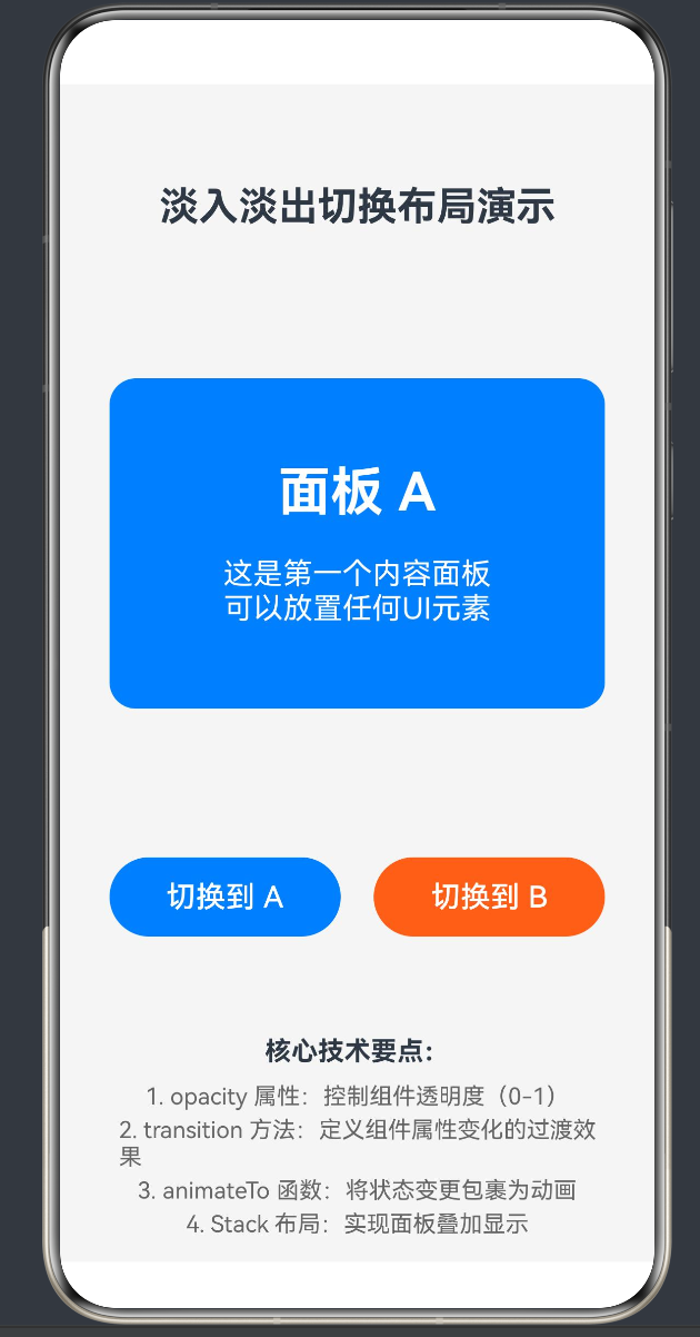
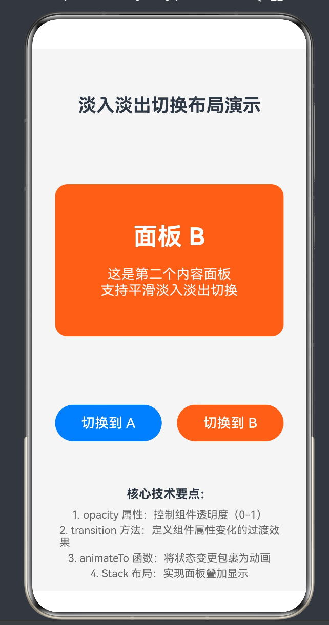
项目演示
目录
- 引言
- 核心技术概念概述
- opacity属性详解
- transition过渡效果详解
- animateTo动画函数详解
- 基础示例:淡入淡出面板切换
- 进阶示例:模态弹窗渐显
- 进阶示例:轮播图渐变效果
- 进阶示例:加载动画与骨架屏
- 进阶示例:悬浮遮罩层
- 高级技巧:组合动画
- 高级技巧:手势联动动画
- 性能优化策略
- 常见问题与排查指南
- API 24特性说明
- 最佳实践总结
- 结语
1. 引言
在现代UI设计中,透明度渐变效果是提升用户体验的重要手段。无论是页面切换、弹窗展示还是加载状态,平滑的淡入淡出动画都能让交互更加自然流畅,减少视觉冲击。鸿蒙HarmonyOS NEXT(API 24)提供了一套完整的透明度渐变布局解决方案,主要通过opacity属性、transition过渡效果和animateTo动画函数三者协同实现。
本文将深入探讨鸿蒙原生ArkTS中透明度渐变布局的核心技术,从基础概念到高级技巧,从代码示例到性能优化,全面覆盖opacity透明度渐变布局的各个方面。无论您是刚接触HarmonyOS开发的新手,还是有一定经验的开发者,都能从本文中获得有价值的知识和实践指导。
2. 核心技术概念概述
在开始深入探讨之前,我们先对opacity透明度渐变布局涉及的三大核心技术进行整体介绍:
2.1 opacity属性
opacity是控制组件透明度的核心属性,取值范围为0到1,其中:
opacity(0):组件完全透明,不可见opacity(1):组件完全不透明,正常显示opacity(0.5):组件半透明,显示50%的透明度
通过动态改变opacity的值,可以实现组件的淡入淡出效果。
2.2 transition过渡效果
transition方法用于定义组件属性变化时的过渡动画效果。当组件的某个属性(如opacity、width、height等)发生变化时,transition可以让这个变化过程变得平滑,而不是瞬间完成。
2.3 animateTo动画函数
animateTo是一个高阶动画函数,它可以将状态变量的变更包裹起来,使所有相关的UI变化都按照指定的动画参数进行过渡。animateTo是实现复杂动画效果的关键工具。
2.4 三者关系
这三者之间的关系可以用以下公式来表示:
animateTo(动画参数, () => {
    修改@State状态变量
}) → 状态变量变化 → 触发transition过渡 → opacity属性渐变 → 淡入淡出效果
简单来说:
animateTo负责驱动状态变化transition负责定义过渡方式opacity负责呈现最终效果
3. opacity属性详解
3.1 opacity属性定义
在ArkTS中,opacity是一个通用属性,可以应用于所有组件。其语法如下:
.opacity(value: number)
其中value为number类型,取值范围为0到1。
3.2 opacity属性特性
3.2.1 继承性
opacity属性具有继承性,父组件设置opacity后,子组件会继承该透明度。例如:
Column() {
  Text('半透明文本')
    .fontSize(20)
  Text('同样半透明')
    .fontSize(16)
}
.opacity(0.5) // 整个Column及其子组件都变为半透明
3.2.2 性能特性
opacity属性的变化会触发组件的重绘,但不会触发重新布局(layout)。这意味着:
- 优点:性能开销相对较小,适合频繁变化的动画
- 注意:如果需要同时改变位置或尺寸,需要配合其他属性
3.2.3 交互特性
即使组件的opacity设置为0,组件仍然可以响应触摸事件。如果需要让透明组件不响应事件,可以配合visibility属性或条件渲染使用。
3.3 opacity与visibility的区别
在实际开发中,我们经常会用到opacity和visibility两个属性,它们的区别如下:
| 属性 | 可见性 | 布局空间 | 交互响应 | 动画支持 |
|---|---|---|---|---|
| opacity(0) | 不可见 | 占用空间 | 可响应 | 支持过渡动画 |
| visibility(Hidden) | 不可见 | 占用空间 | 不可响应 | 支持过渡动画 |
| 条件渲染if(false) | 不可见 | 不占用空间 | 不可响应 | 支持transition进出场 |
3.4 opacity使用示例
@Entry
@Component
struct OpacityDemo {
  @State alpha: number = 1

  build() {
    Column() {
      Text(`透明度: ${this.alpha.toFixed(2)}`)
        .fontSize(20)
        .margin(20)

      Text('测试文本')
        .fontSize(30)
        .fontWeight(FontWeight.Bold)
        .backgroundColor('#007DFF')
        .fontColor('#FFFFFF')
        .padding({ left: 20, right: 20, top: 10, bottom: 10 })
        .borderRadius(8)
        .opacity(this.alpha)

      Slider({
        value: this.alpha,
        min: 0,
        max: 1,
        step: 0.01
      })
        .width(200)
        .margin(20)
        .onChange((value: number) => {
          this.alpha = value
        })
    }
    .width('100%')
    .height('100%')
    .justifyContent(FlexAlign.Center)
    .backgroundColor('#F5F5F5')
  }
}
4. transition过渡效果详解
4.1 transition方法定义
transition方法用于定义组件属性变化时的过渡动画效果。其基本语法如下:
.transition(transitionEffect: TransitionEffect)
4.2 TransitionEffect类型
TransitionEffect是一个联合类型,包含以下几种效果:
4.2.1 TransitionEffect.OPACITY
仅对透明度变化应用过渡效果:
.transition(TransitionEffect.OPACITY.animation({
  duration: 500,
  curve: Curve.EaseInOut
}))
4.2.2 TransitionEffect.SCALE
仅对缩放变化应用过渡效果:
.transition(TransitionEffect.SCALE.animation({
  duration: 500,
  curve: Curve.EaseInOut
}))
4.2.3 TransitionEffect.TRANSLATE
仅对位移变化应用过渡效果:
.transition(TransitionEffect.TRANSLATE.animation({
  duration: 500,
  curve: Curve.EaseInOut
}))
4.2.4 TransitionEffect.ALL
对所有支持过渡的属性变化应用过渡效果:
.transition(TransitionEffect.ALL.animation({
  duration: 500,
  curve: Curve.EaseInOut
}))
4.2.5 组合效果
可以使用+运算符组合多种过渡效果:
.transition(
  TransitionEffect.OPACITY.animation({ duration: 500 }) +
  TransitionEffect.SCALE.animation({ duration: 500 })
)
4.3 animation配置参数
animation方法支持以下配置参数:
| 参数 | 类型 | 默认值 | 说明 |
|---|---|---|---|
| duration | number | 300 | 动画持续时间(毫秒) |
| curve | Curve | Curve.Linear | 动画曲线 |
| delay | number | 0 | 动画延迟时间(毫秒) |
| iterations | number | 1 | 动画重复次数 |
| playMode | PlayMode | PlayMode.Normal | 动画播放模式 |
4.4 Curve动画曲线
动画曲线决定了动画变化的速率,常用的曲线有:
| 曲线类型 | 说明 | 使用场景 |
|---|---|---|
| Curve.Linear | 线性曲线,匀速变化 | 精确的时间控制 |
| Curve.Ease | 缓入曲线,开始慢后快 | 自然的进入效果 |
| Curve.EaseIn | 缓入曲线,开始较慢 | 强调进入动作 |
| Curve.EaseOut | 缓出曲线,结束较慢 | 强调停止动作 |
| Curve.EaseInOut | 缓入缓出曲线,两端慢中间快 | 最自然的过渡效果 |
| Curve.FastOutSlowIn | 快速出缓慢入 | Material Design风格 |
| Curve.LinearOutSlowIn | 线性出缓慢入 | 平滑减速效果 |
| Curve.FastOutLinearIn | 快速出线性入 | 快速启动效果 |
4.5 transition使用示例
@Entry
@Component
struct TransitionDemo {
  @State show: boolean = true

  build() {
    Column() {
      Button(this.show ? '隐藏' : '显示')
        .width(100)
        .height(40)
        .margin(20)
        .onClick(() => {
          this.show = !this.show
        })

      if (this.show) {
        Text('带有过渡效果的文本')
          .fontSize(24)
          .fontWeight(FontWeight.Bold)
          .padding(20)
          .backgroundColor('#007DFF')
          .fontColor('#FFFFFF')
          .borderRadius(12)
          .transition(TransitionEffect.OPACITY.animation({
            duration: 600,
            curve: Curve.EaseInOut
          }))
      }
    }
    .width('100%')
    .height('100%')
    .justifyContent(FlexAlign.Center)
    .backgroundColor('#F5F5F5')
  }
}
4.6 transition与animateTo的区别
transition和animateTo都可以实现动画效果,但它们的作用机制不同:
| 特性 | transition | animateTo |
|---|---|---|
| 作用范围 | 单个组件的属性变化 | 所有依赖状态变量的组件 |
| 触发方式 | 属性变化自动触发 | 手动调用包裹状态变更 |
| 适用场景 | 组件进出场、属性渐变 | 复杂状态同步动画 |
| 灵活性 | 较低 | 较高 |
5. animateTo动画函数详解
5.1 animateTo函数定义
animateTo是一个高阶动画函数,用于将状态变量的变更包裹为动画。其语法如下:
animateTo(options: AnimateToOptions, event: () => void): void
5.2 AnimateToOptions配置参数
| 参数 | 类型 | 默认值 | 说明 |
|---|---|---|---|
| duration | number | 300 | 动画持续时间(毫秒) |
| curve | Curve | Curve.Linear | 动画曲线 |
| delay | number | 0 | 动画延迟时间(毫秒) |
| iterations | number | 1 | 动画重复次数 |
| playMode | PlayMode | PlayMode.Normal | 动画播放模式 |
| onFinish | () => void | - | 动画完成回调 |
5.3 animateTo工作原理
animateTo的工作原理可以分为以下几个步骤:
- 记录初始状态:调用animateTo时,系统会记录所有受影响组件的当前状态
- 执行状态变更:执行event回调函数,修改状态变量
- 计算目标状态:根据新的状态变量计算组件的目标状态
- 生成过渡动画:根据animateToOptions的配置,生成从初始状态到目标状态的过渡动画
- 执行动画:系统自动执行动画,平滑过渡到目标状态
5.4 animateTo使用示例
@Entry
@Component
struct AnimateToDemo {
  @State width: number = 100
  @State height: number = 50
  @State backgroundColor: string = '#007DFF'

  build() {
    Column() {
      Button('放大变色')
        .width(this.width)
        .height(this.height)
        .backgroundColor(this.backgroundColor)
        .fontColor('#FFFFFF')
        .borderRadius(8)
        .onClick(() => {
          animateTo({
            duration: 500,
            curve: Curve.EaseInOut,
            onFinish: () => {
              console.info('动画完成')
            }
          }, () => {
            this.width = this.width === 100 ? 200 : 100
            this.height = this.height === 50 ? 100 : 50
            this.backgroundColor = this.backgroundColor === '#007DFF' ? '#FF6B35' : '#007DFF'
          })
        })
    }
    .width('100%')
    .height('100%')
    .justifyContent(FlexAlign.Center)
    .backgroundColor('#F5F5F5')
  }
}
5.5 animateTo的优势
相比直接修改状态变量,animateTo具有以下优势:
- 自动检测变化:系统会自动检测所有受影响的组件属性变化
- 统一动画参数:所有变化都使用相同的动画参数,保证动画的一致性
- 简化代码:无需为每个组件单独设置transition
- 支持复杂动画:可以同时修改多个状态变量,实现复杂的组合动画
6. 基础示例:淡入淡出面板切换
6.1 需求分析
本示例实现一个淡入淡出切换布局,包含两个可切换的内容面板,点击按钮可以在两个面板之间平滑切换。
6.2 实现思路
-
使用
@State装饰器定义三个状态变量:currentPanel:当前显示面板的标识panelAOpacity:面板A的透明度panelBOpacity:面板B的透明度
-
使用
Stack布局实现两个面板的叠加显示 -
使用
opacity属性绑定到状态变量,控制面板的透明度 -
使用
transition方法定义透明度变化的过渡效果 -
使用
animateTo函数包裹状态变更,实现平滑动画
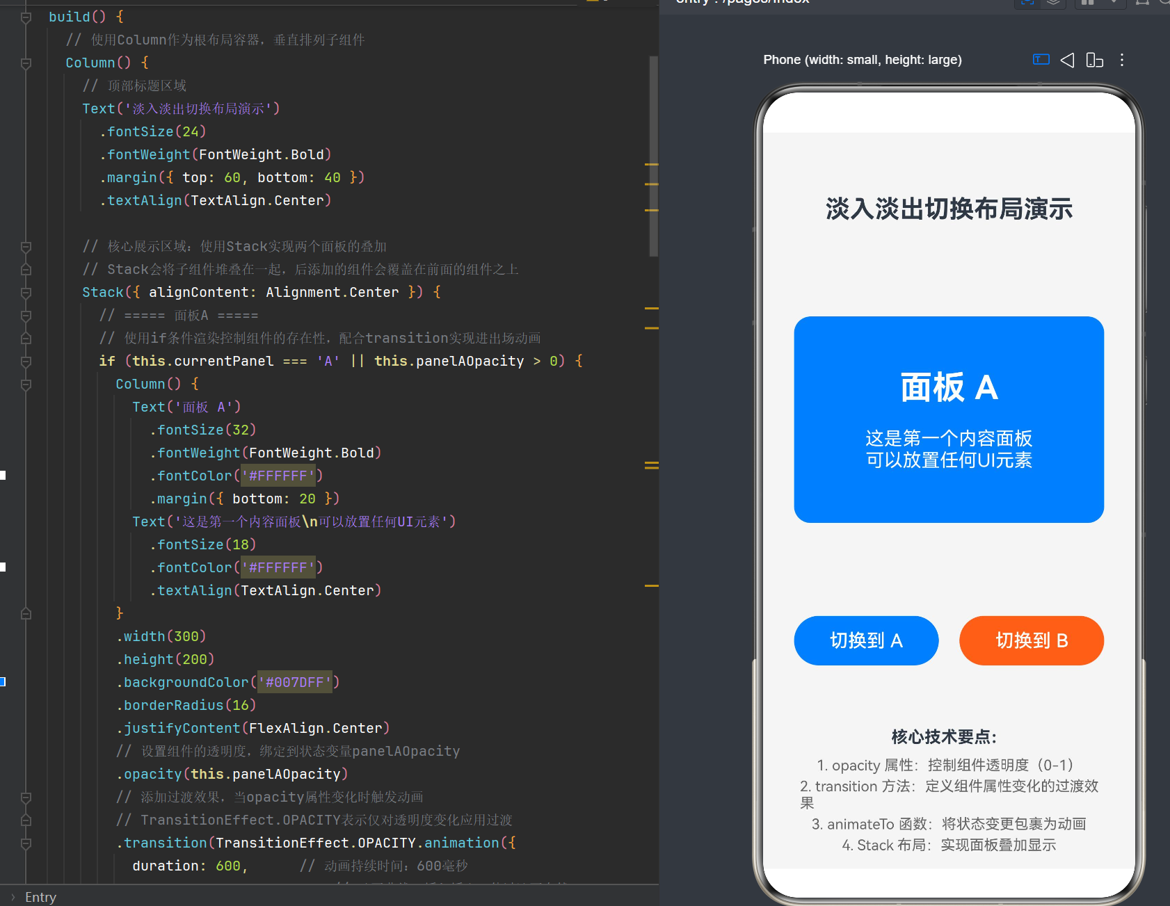
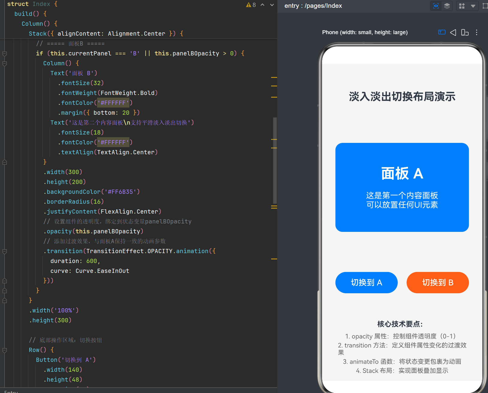
6.3 完整代码实现
@Entry
@Component
struct Index {
  // 当前显示面板的标识,控制A/B面板切换
  @State currentPanel: string = 'A'
  // 面板A的透明度值,0表示完全透明,1表示完全不透明
  @State panelAOpacity: number = 1
  // 面板B的透明度值,初始为0,即不可见
  @State panelBOpacity: number = 0

  build() {
    // 使用Column作为根布局容器,垂直排列子组件
    Column() {
      // 顶部标题区域
      Text('淡入淡出切换布局演示')
        .fontSize(24)
        .fontWeight(FontWeight.Bold)
        .margin({ top: 60, bottom: 40 })
        .textAlign(TextAlign.Center)

      // 核心展示区域:使用Stack实现两个面板的叠加
      // Stack会将子组件堆叠在一起,后添加的组件会覆盖在前面的组件之上
      Stack({ alignContent: Alignment.Center }) {
        // ===== 面板A =====
        // 使用if条件渲染控制组件的存在性,配合transition实现进出场动画
        if (this.currentPanel === 'A' || this.panelAOpacity > 0) {
          Column() {
            Text('面板 A')
              .fontSize(32)
              .fontWeight(FontWeight.Bold)
              .fontColor('#FFFFFF')
              .margin({ bottom: 20 })
            Text('这是第一个内容面板\n可以放置任何UI元素')
              .fontSize(18)
              .fontColor('#FFFFFF')
              .textAlign(TextAlign.Center)
          }
          .width(300)
          .height(200)
          .backgroundColor('#007DFF')
          .borderRadius(16)
          .justifyContent(FlexAlign.Center)
          // 设置组件的透明度,绑定到状态变量panelAOpacity
          .opacity(this.panelAOpacity)
          // 添加过渡效果,当opacity属性变化时触发动画
          // TransitionEffect.OPACITY表示仅对透明度变化应用过渡
          .transition(TransitionEffect.OPACITY.animation({
            duration: 600,      // 动画持续时间:600毫秒
            curve: Curve.EaseInOut  // 动画曲线:缓入缓出,使过渡更自然
          }))
        }

        // ===== 面板B =====
        if (this.currentPanel === 'B' || this.panelBOpacity > 0) {
          Column() {
            Text('面板 B')
              .fontSize(32)
              .fontWeight(FontWeight.Bold)
              .fontColor('#FFFFFF')
              .margin({ bottom: 20 })
            Text('这是第二个内容面板\n支持平滑淡入淡出切换')
              .fontSize(18)
              .fontColor('#FFFFFF')
              .textAlign(TextAlign.Center)
          }
          .width(300)
          .height(200)
          .backgroundColor('#FF6B35')
          .borderRadius(16)
          .justifyContent(FlexAlign.Center)
          // 设置组件的透明度,绑定到状态变量panelBOpacity
          .opacity(this.panelBOpacity)
          // 添加过渡效果,与面板A保持一致的动画参数
          .transition(TransitionEffect.OPACITY.animation({
            duration: 600,
            curve: Curve.EaseInOut
          }))
        }
      }
      .width('100%')
      .height(300)

      // 底部操作区域:切换按钮
      Row() {
        Button('切换到 A')
          .width(140)
          .height(48)
          .fontSize(18)
          .backgroundColor('#007DFF')
          .fontColor('#FFFFFF')
          .borderRadius(24)
          // 点击事件:触发从当前面板切换到面板A的动画
          .onClick(() => {
            // 使用animateTo包裹状态变更,实现属性动画
            animateTo({
              duration: 600,      // 动画持续时间:600毫秒
              curve: Curve.EaseInOut  // 动画曲线:缓入缓出
            }, () => {
              // 在animateTo的闭包中修改状态变量
              // 系统会自动检测这些状态变化并生成动画
              this.currentPanel = 'A'
              this.panelAOpacity = 1  // 面板A渐变为完全不透明
              this.panelBOpacity = 0  // 面板B渐变为完全透明
            })
          })
          .margin({ right: 20 })

        Button('切换到 B')
          .width(140)
          .height(48)
          .fontSize(18)
          .backgroundColor('#FF6B35')
          .fontColor('#FFFFFF')
          .borderRadius(24)
          // 点击事件:触发从当前面板切换到面板B的动画
          .onClick(() => {
            animateTo({
              duration: 600,
              curve: Curve.EaseInOut
            }, () => {
              this.currentPanel = 'B'
              this.panelAOpacity = 0  // 面板A渐变为完全透明
              this.panelBOpacity = 1  // 面板B渐变为完全不透明
            })
          })
      }
      .margin({ top: 40 })
      .justifyContent(FlexAlign.Center)
    }
    .width('100%')
    .height('100%')
    .backgroundColor('#F5F5F5')
  }
}
6.4 代码解析
6.4.1 状态变量设计
@State currentPanel: string = 'A'
@State panelAOpacity: number = 1
@State panelBOpacity: number = 0
currentPanel:用于记录当前应该显示哪个面板,初始值为’A’panelAOpacity:面板A的透明度,初始值为1(完全不透明)panelBOpacity:面板B的透明度,初始值为0(完全透明)
6.4.2 Stack布局
Stack({ alignContent: Alignment.Center }) {
  // 面板A
  // 面板B
}
Stack布局会将子组件堆叠在一起,通过alignContent: Alignment.Center确保子组件居中显示。
6.4.3 条件渲染
if (this.currentPanel === 'A' || this.panelAOpacity > 0) {
  // 面板A组件
}
条件渲染的判断逻辑是currentPanel === 'A' || panelAOpacity > 0,这意味着:
- 当currentPanel为’A’时,面板A始终存在
- 当panelAOpacity > 0时,即使currentPanel已经切换到’B’,面板A仍然存在(但处于透明状态)
- 这样可以确保在淡出动画期间,面板A不会被立即销毁
6.4.4 opacity属性绑定
.opacity(this.panelAOpacity)
将组件的opacity属性绑定到状态变量,当状态变量变化时,组件的透明度会自动更新。
6.4.5 transition过渡效果
.transition(TransitionEffect.OPACITY.animation({
  duration: 600,
  curve: Curve.EaseInOut
}))
定义了当opacity属性变化时的过渡效果:
duration: 600:动画持续600毫秒curve: Curve.EaseInOut:使用缓入缓出曲线,使动画更加自然
6.4.6 animateTo动画触发
animateTo({
  duration: 600,
  curve: Curve.EaseInOut
}, () => {
  this.currentPanel = 'A'
  this.panelAOpacity = 1
  this.panelBOpacity = 0
})
当用户点击按钮时,animateTo会:
- 记录当前所有状态变量的值
- 执行闭包内的代码,修改状态变量
- 根据animateToOptions的配置,生成从旧值到新值的过渡动画
- 执行动画,平滑过渡到目标状态
7. 进阶示例:模态弹窗渐显
7.1 需求分析
本示例实现一个带有渐变效果的模态弹窗,点击按钮后弹窗从透明渐变为不透明,背景同时变暗。
7.2 实现思路
- 使用
@State装饰器定义弹窗的显示状态和透明度 - 使用
Stack布局实现弹窗和遮罩层的叠加 - 遮罩层使用半透明背景,随着弹窗显示逐渐变暗
- 弹窗内容从透明渐变为不透明,同时带有缩放效果
7.3 完整代码实现
@Entry
@Component
struct ModalDialogDemo {
  // 弹窗显示状态
  @State showDialog: boolean = false
  // 遮罩层透明度
  @State maskOpacity: number = 0
  // 弹窗内容透明度
  @State dialogOpacity: number = 0
  // 弹窗缩放比例
  @State dialogScale: number = 0.8

  build() {
    Column() {
      Text('模态弹窗演示')
        .fontSize(24)
        .fontWeight(FontWeight.Bold)
        .margin({ top: 100, bottom: 40 })
        .textAlign(TextAlign.Center)

      Button('打开弹窗')
        .width(140)
        .height(48)
        .fontSize(18)
        .backgroundColor('#007DFF')
        .fontColor('#FFFFFF')
        .borderRadius(24)
        .onClick(() => {
          this.openDialog()
        })

      // 弹窗区域:使用Stack实现遮罩层和弹窗内容的叠加
      Stack() {
        // 遮罩层
        if (this.showDialog || this.maskOpacity > 0) {
          Column()
            .width('100%')
            .height('100%')
            .backgroundColor('#000000')
            .opacity(this.maskOpacity)
            .transition(TransitionEffect.OPACITY.animation({
              duration: 300,
              curve: Curve.EaseInOut
            }))
            .onClick(() => {
              this.closeDialog()
            })
        }

        // 弹窗内容
        if (this.showDialog || this.dialogOpacity > 0) {
          Column() {
            Text('弹窗标题')
              .fontSize(24)
              .fontWeight(FontWeight.Bold)
              .fontColor('#333333')
              .margin({ bottom: 20 })

            Text('这是弹窗的内容区域,可以放置表单、提示信息等')
              .fontSize(16)
              .fontColor('#666666')
              .textAlign(TextAlign.Center)
              .margin({ bottom: 30 })

            Row() {
              Button('取消')
                .width(100)
                .height(40)
                .fontSize(16)
                .backgroundColor('#E0E0E0')
                .fontColor('#333333')
                .borderRadius(8)
                .margin({ right: 20 })
                .onClick(() => {
                  this.closeDialog()
                })

              Button('确定')
                .width(100)
                .height(40)
                .fontSize(16)
                .backgroundColor('#007DFF')
                .fontColor('#FFFFFF')
                .borderRadius(8)
                .onClick(() => {
                  this.closeDialog()
                })
            }
          }
          .width(300)
          .padding(24)
          .backgroundColor('#FFFFFF')
          .borderRadius(16)
          .opacity(this.dialogOpacity)
          .scale({ x: this.dialogScale, y: this.dialogScale })
          .transition(
            TransitionEffect.OPACITY.animation({
              duration: 300,
              curve: Curve.EaseOut
            }) +
            TransitionEffect.SCALE.animation({
              duration: 300,
              curve: Curve.EaseOut
            })
          )
        }
      }
      .width('100%')
      .height('100%')
      .position({ x: 0, y: 0 })
      .alignContent(Alignment.Center)
    }
    .width('100%')
    .height('100%')
    .backgroundColor('#F5F5F5')
  }

  // 打开弹窗方法
  openDialog() {
    animateTo({
      duration: 300,
      curve: Curve.EaseOut
    }, () => {
      this.showDialog = true
      this.maskOpacity = 0.5      // 遮罩层变为半透明
      this.dialogOpacity = 1      // 弹窗内容完全不透明
      this.dialogScale = 1        // 弹窗恢复原始大小
    })
  }

  // 关闭弹窗方法
  closeDialog() {
    animateTo({
      duration: 250,
      curve: Curve.EaseIn
    }, () => {
      this.maskOpacity = 0       // 遮罩层变为完全透明
      this.dialogOpacity = 0     // 弹窗内容完全透明
      this.dialogScale = 0.8     // 弹窗缩小
    })

    // 动画完成后隐藏弹窗
    setTimeout(() => {
      this.showDialog = false
    }, 250)
  }
}
7.4 代码解析
7.4.1 状态变量设计
@State showDialog: boolean = false
@State maskOpacity: number = 0
@State dialogOpacity: number = 0
@State dialogScale: number = 0.8
showDialog:弹窗的显示状态,控制组件是否存在maskOpacity:遮罩层的透明度,0为完全透明,0.5为半透明dialogOpacity:弹窗内容的透明度,0为完全透明,1为完全不透明dialogScale:弹窗的缩放比例,0.8为缩小状态,1为正常状态
7.4.2 遮罩层实现
Column()
  .width('100%')
  .height('100%')
  .backgroundColor('#000000')
  .opacity(this.maskOpacity)
  .transition(TransitionEffect.OPACITY.animation({
    duration: 300,
    curve: Curve.EaseInOut
  }))
遮罩层使用黑色背景,通过opacity控制透明度,实现背景变暗的效果。
7.4.3 弹窗内容实现
.opacity(this.dialogOpacity)
.scale({ x: this.dialogScale, y: this.dialogScale })
.transition(
  TransitionEffect.OPACITY.animation({
    duration: 300,
    curve: Curve.EaseOut
  }) +
  TransitionEffect.SCALE.animation({
    duration: 300,
    curve: Curve.EaseOut
  })
)
弹窗内容同时使用opacity和scale属性,transition组合了OPACITY和SCALE两种效果,实现淡入+放大的组合动画。
7.4.4 打开弹窗方法
openDialog() {
  animateTo({
    duration: 300,
    curve: Curve.EaseOut
  }, () => {
    this.showDialog = true
    this.maskOpacity = 0.5
    this.dialogOpacity = 1
    this.dialogScale = 1
  })
}
打开弹窗时,所有状态变量同时变化,实现同步动画效果。
7.4.5 关闭弹窗方法
closeDialog() {
  animateTo({
    duration: 250,
    curve: Curve.EaseIn
  }, () => {
    this.maskOpacity = 0
    this.dialogOpacity = 0
    this.dialogScale = 0.8
  })

  setTimeout(() => {
    this.showDialog = false
  }, 250)
}
关闭弹窗时,先执行动画使弹窗淡出缩小,动画完成后再将showDialog设为false,确保动画完整执行。
8. 进阶示例:轮播图渐变效果
8.1 需求分析
本示例实现一个带有淡入淡出效果的轮播图组件,自动切换图片,支持手动滑动。
8.2 实现思路
- 使用
@State装饰器定义当前图片索引和透明度数组 - 使用
Stack布局实现多张图片的叠加 - 使用
Swiper组件实现滑动切换 - 在滑动切换时,通过opacity实现渐变过渡效果
8.3 完整代码实现
@Entry
@Component
struct CarouselDemo {
  // 轮播图片数据
  private images: string[] = [
    'https://images.unsplash.com/photo-1506905925346-21bda4d32df4?w=400',
    'https://images.unsplash.com/photo-1470071459604-3b5ec3a7fe05?w=400',
    'https://images.unsplash.com/photo-1441974231531-c6227db76b6e?w=400',
    'https://images.unsplash.com/photo-1507525428034-b723cf961d3e?w=400'
  ]

  // 当前显示的图片索引
  @State currentIndex: number = 0
  // 图片透明度数组,控制每张图片的显示状态
  @State opacities: number[] = [1, 0, 0, 0]

  build() {
    Column() {
      Text('轮播图渐变效果演示')
        .fontSize(24)
        .fontWeight(FontWeight.Bold)
        .margin({ top: 60, bottom: 30 })
        .textAlign(TextAlign.Center)

      // 轮播图区域
      Stack({ alignContent: Alignment.Center }) {
        // 根据图片数据渲染图片
        ForEach(this.images, (image: string, index: number) => {
          Image(image)
            .width(340)
            .height(200)
            .borderRadius(16)
            .objectFit(ImageFit.Cover)
            .opacity(this.opacities[index])
            .transition(TransitionEffect.OPACITY.animation({
              duration: 500,
              curve: Curve.EaseInOut
            }))
        }, (image: string, index: number) => `${index}`)
      }
      .width('100%')
      .height(200)

      // 滑动指示器
      Row() {
        ForEach(this.images, (_, index: number) => {
          Column()
            .width(this.currentIndex === index ? 24 : 8)
            .height(6)
            .backgroundColor(this.currentIndex === index ? '#007DFF' : '#CCCCCC')
            .borderRadius(3)
            .margin({ right: 8 })
            .transition(TransitionEffect.ALL.animation({
              duration: 300,
              curve: Curve.EaseInOut
            }))
        }, (_, index: number) => `${index}`)
      }
      .margin({ top: 20 })
      .justifyContent(FlexAlign.Center)

      // 手动切换按钮
      Row() {
        Button('上一张')
          .width(100)
          .height(40)
          .fontSize(16)
          .backgroundColor('#E0E0E0')
          .fontColor('#333333')
          .borderRadius(8)
          .margin({ right: 20 })
          .onClick(() => {
            this.prevImage()
          })

        Button('下一张')
          .width(100)
          .height(40)
          .fontSize(16)
          .backgroundColor('#007DFF')
          .fontColor('#FFFFFF')
          .borderRadius(8)
          .onClick(() => {
            this.nextImage()
          })
      }
      .margin({ top: 30 })
      .justifyContent(FlexAlign.Center)
    }
    .width('100%')
    .height('100%')
    .backgroundColor('#F5F5F5')
  }

  // 切换到上一张图片
  prevImage() {
    const newIndex = this.currentIndex === 0 ? this.images.length - 1 : this.currentIndex - 1
    this.switchImage(newIndex)
  }

  // 切换到下一张图片
  nextImage() {
    const newIndex = this.currentIndex === this.images.length - 1 ? 0 : this.currentIndex + 1
    this.switchImage(newIndex)
  }

  // 切换图片核心逻辑
  switchImage(newIndex: number) {
    // 创建新的透明度数组
    const newOpacities: number[] = []

    animateTo({
      duration: 500,
      curve: Curve.EaseInOut
    }, () => {
      for (let i = 0; i < this.images.length; i++) {
        if (i === newIndex) {
          // 新图片渐变为不透明
          newOpacities.push(1)
        } else if (i === this.currentIndex) {
          // 当前图片渐变为透明
          newOpacities.push(0)
        } else {
          // 其他图片保持透明
          newOpacities.push(0)
        }
      }
      this.opacities = newOpacities
      this.currentIndex = newIndex
    })
  }
}
8.4 代码解析
8.4.1 数据结构设计
private images: string[] = [...]
@State currentIndex: number = 0
@State opacities: number[] = [1, 0, 0, 0]
images:存储轮播图片的URL数组currentIndex:当前显示图片的索引opacities:存储每张图片的透明度,与images数组一一对应
8.4.2 ForEach渲染
ForEach(this.images, (image: string, index: number) => {
  Image(image)
    .width(340)
    .height(200)
    .borderRadius(16)
    .objectFit(ImageFit.Cover)
    .opacity(this.opacities[index])
    .transition(TransitionEffect.OPACITY.animation({
      duration: 500,
      curve: Curve.EaseInOut
    }))
}, (image: string, index: number) => `${index}`)
使用ForEach遍历图片数组,为每张图片创建一个Image组件,并绑定对应的opacity值。
8.4.3 滑动指示器
ForEach(this.images, (_, index: number) => {
  Column()
    .width(this.currentIndex === index ? 24 : 8)
    .height(6)
    .backgroundColor(this.currentIndex === index ? '#007DFF' : '#CCCCCC')
    .borderRadius(3)
    .margin({ right: 8 })
    .transition(TransitionEffect.ALL.animation({
      duration: 300,
      curve: Curve.EaseInOut
    }))
}, (_, index: number) => `${index}`)
指示器使用Column组件实现,当前选中的指示器宽度更长、颜色更深,并且带有过渡动画效果。
8.4.4 切换图片逻辑
switchImage(newIndex: number) {
  const newOpacities: number[] = []

  animateTo({
    duration: 500,
    curve: Curve.EaseInOut
  }, () => {
    for (let i = 0; i < this.images.length; i++) {
      if (i === newIndex) {
        newOpacities.push(1)
      } else if (i === this.currentIndex) {
        newOpacities.push(0)
      } else {
        newOpacities.push(0)
      }
    }
    this.opacities = newOpacities
    this.currentIndex = newIndex
  })
}
切换图片时:
- 创建一个新的透明度数组
- 将新图片的透明度设为1(淡入)
- 将当前图片的透明度设为0(淡出)
- 将其他图片的透明度设为0(保持隐藏)
- 使用animateTo包裹状态变更,实现平滑过渡
9. 进阶示例:加载动画与骨架屏
9.1 需求分析
本示例实现一个带有渐变效果的加载动画和骨架屏组件,用于在数据加载期间提供视觉反馈。
9.2 实现思路
- 使用
@State装饰器定义加载状态和动画参数 - 骨架屏使用半透明背景和渐变动画模拟内容布局
- 加载完成后,骨架屏淡出,实际内容淡入
9.3 完整代码实现
@Entry
@Component
struct LoadingDemo {
  // 加载状态
  @State isLoading: boolean = true
  // 骨架屏透明度
  @State skeletonOpacity: number = 1
  // 内容透明度
  @State contentOpacity: number = 0
  // 骨架屏闪烁动画偏移
  @State shimmerOffset: number = 0

  // 模拟数据
  private userData = {
    name: '张三',
    avatar: 'https://images.unsplash.com/photo-1494790108377-be9c29b29330?w=100',
    description: '这是一段用户描述文字,展示了加载完成后的实际内容。',
    posts: 128,
    followers: 3560,
    following: 245
  }

  build() {
    Column() {
      Text('加载动画与骨架屏演示')
        .fontSize(24)
        .fontWeight(FontWeight.Bold)
        .margin({ top: 60, bottom: 30 })
        .textAlign(TextAlign.Center)

      // 用户卡片区域
      Stack({ alignContent: Alignment.TopCenter }) {
        // 骨架屏
        if (this.isLoading || this.skeletonOpacity > 0) {
          Column() {
            // 头像骨架
            Row() {
              Column()
                .width(80)
                .height(80)
                .borderRadius(40)
                .backgroundColor('#E0E0E0')
                .skeletonShimmer(this.shimmerOffset)

              Column() {
                // 用户名骨架
                Column()
                  .width(120)
                  .height(20)
                  .borderRadius(4)
                  .backgroundColor('#E0E0E0')
                  .margin({ bottom: 8 })
                  .skeletonShimmer(this.shimmerOffset)

                // 描述骨架
                Column()
                  .width(150)
                  .height(16)
                  .borderRadius(4)
                  .backgroundColor('#E0E0E0')
                  .skeletonShimmer(this.shimmerOffset)
              }
              .margin({ left: 16 })
            }
            .margin({ bottom: 20 })

            // 统计数据骨架
            Row() {
              Column()
                .width(80)
                .height(40)
                .borderRadius(8)
                .backgroundColor('#E0E0E0')
                .margin({ right: 10 })
                .skeletonShimmer(this.shimmerOffset)

              Column()
                .width(80)
                .height(40)
                .borderRadius(8)
                .backgroundColor('#E0E0E0')
                .margin({ right: 10 })
                .skeletonShimmer(this.shimmerOffset)

              Column()
                .width(80)
                .height(40)
                .borderRadius(8)
                .backgroundColor('#E0E0E0')
                .skeletonShimmer(this.shimmerOffset)
            }
          }
          .width(340)
          .padding(20)
          .backgroundColor('#FFFFFF')
          .borderRadius(16)
          .opacity(this.skeletonOpacity)
          .transition(TransitionEffect.OPACITY.animation({
            duration: 400,
            curve: Curve.EaseInOut
          }))
        }

        // 实际内容
        if (!this.isLoading || this.contentOpacity > 0) {
          Column() {
            // 用户信息
            Row() {
              Image(this.userData.avatar)
                .width(80)
                .height(80)
                .borderRadius(40)
                .objectFit(ImageFit.Cover)

              Column() {
                Text(this.userData.name)
                  .fontSize(20)
                  .fontWeight(FontWeight.Bold)
                  .fontColor('#333333')

                Text(this.userData.description)
                  .fontSize(14)
                  .fontColor('#666666')
                  .margin({ top: 4 })
              }
              .margin({ left: 16 })
            }
            .margin({ bottom: 20 })

            // 统计数据
            Row() {
              Column() {
                Text(`${this.userData.posts}`)
                  .fontSize(20)
                  .fontWeight(FontWeight.Bold)
                  .fontColor('#333333')

                Text('作品')
                  .fontSize(12)
                  .fontColor('#999999')
                  .margin({ top: 4 })
              }
              .width(80)
              .height(40)
              .justifyContent(FlexAlign.Center)
              .backgroundColor('#F5F5F5')
              .borderRadius(8)
              .margin({ right: 10 })

              Column() {
                Text(`${this.userData.followers}`)
                  .fontSize(20)
                  .fontWeight(FontWeight.Bold)
                  .fontColor('#333333')

                Text('粉丝')
                  .fontSize(12)
                  .fontColor('#999999')
                  .margin({ top: 4 })
              }
              .width(80)
              .height(40)
              .justifyContent(FlexAlign.Center)
              .backgroundColor('#F5F5F5')
              .borderRadius(8)
              .margin({ right: 10 })

              Column() {
                Text(`${this.userData.following}`)
                  .fontSize(20)
                  .fontWeight(FontWeight.Bold)
                  .fontColor('#333333')

                Text('关注')
                  .fontSize(12)
                  .fontColor('#999999')
                  .margin({ top: 4 })
              }
              .width(80)
              .height(40)
              .justifyContent(FlexAlign.Center)
              .backgroundColor('#F5F5F5')
              .borderRadius(8)
            }
          }
          .width(340)
          .padding(20)
          .backgroundColor('#FFFFFF')
          .borderRadius(16)
          .opacity(this.contentOpacity)
          .transition(TransitionEffect.OPACITY.animation({
            duration: 400,
            curve: Curve.EaseInOut
          }))
        }
      }

      // 操作按钮
      Button(this.isLoading ? '加载中...' : '重新加载')
        .width(140)
        .height(48)
        .fontSize(18)
        .backgroundColor(this.isLoading ? '#CCCCCC' : '#007DFF')
        .fontColor('#FFFFFF')
        .borderRadius(24)
        .margin({ top: 30 })
        .enabled(!this.isLoading)
        .onClick(() => {
          this.startLoading()
        })
    }
    .width('100%')
    .height('100%')
    .backgroundColor('#F5F5F5')
  }

  // 组件挂载时开始加载
  aboutToAppear() {
    this.startLoading()
  }

  // 开始加载
  startLoading() {
    this.isLoading = true
    this.skeletonOpacity = 1
    this.contentOpacity = 0

    // 启动骨架屏闪烁动画
    this.startShimmerAnimation()

    // 模拟网络请求延迟
    setTimeout(() => {
      this.finishLoading()
    }, 2000)
  }

  // 骨架屏闪烁动画
  startShimmerAnimation() {
    const animateShimmer = () => {
      if (this.isLoading) {
        animateTo({
          duration: 1500,
          curve: Curve.Linear
        }, () => {
          this.shimmerOffset = this.shimmerOffset === 0 ? 100 : 0
        })
        .then(() => {
          animateShimmer()
        })
      }
    }
    animateShimmer()
  }

  // 完成加载
  finishLoading() {
    animateTo({
      duration: 400,
      curve: Curve.EaseInOut
    }, () => {
      this.skeletonOpacity = 0
      this.contentOpacity = 1
    })

    setTimeout(() => {
      this.isLoading = false
    }, 400)
  }
}
9.4 代码解析
9.4.1 状态变量设计
@State isLoading: boolean = true
@State skeletonOpacity: number = 1
@State contentOpacity: number = 0
@State shimmerOffset: number = 0
isLoading:加载状态,控制骨架屏和内容的存在性skeletonOpacity:骨架屏的透明度contentOpacity:实际内容的透明度shimmerOffset:骨架屏闪烁动画的偏移量
9.4.2 骨架屏实现
Column()
  .width(80)
  .height(80)
  .borderRadius(40)
  .backgroundColor('#E0E0E0')
  .skeletonShimmer(this.shimmerOffset)
骨架屏使用灰色背景模拟实际内容的布局,通过skeletonShimmer方法实现闪烁效果。
9.4.3 闪烁动画
startShimmerAnimation() {
  const animateShimmer = () => {
    if (this.isLoading) {
      animateTo({
        duration: 1500,
        curve: Curve.Linear
      }, () => {
        this.shimmerOffset = this.shimmerOffset === 0 ? 100 : 0
      })
      .then(() => {
        animateShimmer()
      })
    }
  }
  animateShimmer()
}
闪烁动画通过不断切换shimmerOffset的值实现,使用递归调用和then回调实现循环动画。
9.4.4 加载完成切换
finishLoading() {
  animateTo({
    duration: 400,
    curve: Curve.EaseInOut
  }, () => {
    this.skeletonOpacity = 0
    this.contentOpacity = 1
  })

  setTimeout(() => {
    this.isLoading = false
  }, 400)
}
加载完成时,骨架屏淡出,实际内容淡入,实现平滑的过渡效果。
10. 进阶示例:悬浮遮罩层
10.1 需求分析
本示例实现一个带有渐变效果的悬浮遮罩层,用于展示提示信息或操作菜单。
10.2 实现思路
- 使用
@State装饰器定义遮罩层的显示状态和位置 - 使用
Stack布局实现遮罩层和内容的叠加 - 遮罩层从底部滑入,同时带有透明度渐变效果
10.3 完整代码实现
@Entry
@Component
struct FloatingOverlayDemo {
  // 遮罩层显示状态
  @State showOverlay: boolean = false
  // 遮罩层透明度
  @State overlayOpacity: number = 0
  // 遮罩层Y轴偏移
  @State overlayY: number = 300

  build() {
    Column() {
      Text('悬浮遮罩层演示')
        .fontSize(24)
        .fontWeight(FontWeight.Bold)
        .margin({ top: 60, bottom: 40 })
        .textAlign(TextAlign.Center)

      Button('显示遮罩层')
        .width(160)
        .height(48)
        .fontSize(18)
        .backgroundColor('#007DFF')
        .fontColor('#FFFFFF')
        .borderRadius(24)
        .onClick(() => {
          this.showOverlay = true
          this.openOverlay()
        })

      // 遮罩层区域
      Stack() {
        // 背景遮罩
        if (this.showOverlay || this.overlayOpacity > 0) {
          Column()
            .width('100%')
            .height('100%')
            .backgroundColor('#000000')
            .opacity(this.overlayOpacity * 0.5)
            .transition(TransitionEffect.OPACITY.animation({
              duration: 300,
              curve: Curve.EaseInOut
            }))
            .onClick(() => {
              this.closeOverlay()
            })
        }

        // 悬浮内容
        if (this.showOverlay || this.overlayOpacity > 0) {
          Column() {
            Text('操作菜单')
              .fontSize(20)
              .fontWeight(FontWeight.Bold)
              .fontColor('#333333')
              .margin({ bottom: 20 })

            Column() {
              MenuItem('分享', 'https://api.iconify.design/material-icons/share.svg')
              MenuItem('收藏', 'https://api.iconify.design/material-icons/favorite.svg')
              MenuItem('评论', 'https://api.iconify.design/material-icons/comment.svg')
              MenuItem('更多', 'https://api.iconify.design/material-icons/more-horiz.svg')
            }

            Button('取消')
              .width('100%')
              .height(48)
              .fontSize(18)
              .backgroundColor('#E0E0E0')
              .fontColor('#333333')
              .borderRadius(8)
              .margin({ top: 20 })
              .onClick(() => {
                this.closeOverlay()
              })
          }
          .width('90%')
          .padding(24)
          .backgroundColor('#FFFFFF')
          .borderRadius({ topLeft: 16, topRight: 16 })
          .opacity(this.overlayOpacity)
          .translate({ y: this.overlayY })
          .transition(
            TransitionEffect.OPACITY.animation({
              duration: 300,
              curve: Curve.EaseOut
            }) +
            TransitionEffect.TRANSLATE.animation({
              duration: 300,
              curve: Curve.EaseOut
            })
          )
        }
      }
      .width('100%')
      .height('100%')
      .position({ x: 0, y: 0 })
      .alignContent(Alignment.BottomCenter)
    }
    .width('100%')
    .height('100%')
    .backgroundColor('#F5F5F5')
  }

  // 打开遮罩层
  openOverlay() {
    animateTo({
      duration: 300,
      curve: Curve.EaseOut
    }, () => {
      this.overlayOpacity = 1
      this.overlayY = 0
    })
  }

  // 关闭遮罩层
  closeOverlay() {
    animateTo({
      duration: 250,
      curve: Curve.EaseIn
    }, () => {
      this.overlayOpacity = 0
      this.overlayY = 300
    })

    setTimeout(() => {
      this.showOverlay = false
    }, 250)
  }
}

// 菜单项组件
@Component
struct MenuItem {
  private title: string
  private iconUrl: string

  build() {
    Row() {
      Image(this.iconUrl)
        .width(24)
        .height(24)
        .margin({ right: 12 })

      Text(this.title)
        .fontSize(16)
        .fontColor('#333333')
    }
    .width('100%')
    .height(56)
    .padding({ left: 16 })
    .justifyContent(FlexAlign.Start)
    .alignItems(VerticalAlign.Center)
    .borderRadius(8)
    .backgroundColor('#F5F5F5')
    .margin({ bottom: 8 })
    .onClick(() => {
      console.info(`点击了${this.title}`)
    })
  }
}
10.4 代码解析
10.4.1 状态变量设计
@State showOverlay: boolean = false
@State overlayOpacity: number = 0
@State overlayY: number = 300
showOverlay:遮罩层的显示状态overlayOpacity:遮罩层的透明度overlayY:遮罩层的Y轴偏移量,初始值为300(在屏幕下方)
10.4.2 悬浮内容实现
.opacity(this.overlayOpacity)
.translate({ y: this.overlayY })
.transition(
  TransitionEffect.OPACITY.animation({
    duration: 300,
    curve: Curve.EaseOut
  }) +
  TransitionEffect.TRANSLATE.animation({
    duration: 300,
    curve: Curve.EaseOut
  })
)
悬浮内容同时使用opacity和translate属性,实现淡入+滑入的组合动画效果。
10.4.3 打开遮罩层
openOverlay() {
  animateTo({
    duration: 300,
    curve: Curve.EaseOut
  }, () => {
    this.overlayOpacity = 1
    this.overlayY = 0
  })
}
打开时,透明度从0变为1,Y轴偏移从300变为0,实现从底部滑入并淡入的效果。
10.4.4 关闭遮罩层
closeOverlay() {
  animateTo({
    duration: 250,
    curve: Curve.EaseIn
  }, () => {
    this.overlayOpacity = 0
    this.overlayY = 300
  })

  setTimeout(() => {
    this.showOverlay = false
  }, 250)
}
关闭时,透明度从1变为0,Y轴偏移从0变为300,实现淡出并滑出的效果。
11. 高级技巧:组合动画
11.1 组合动画概述
在实际开发中,单一的透明度渐变往往不够丰富,需要结合多种动画效果来提升用户体验。组合动画就是将opacity、scale、translate、rotate等多种动画效果组合在一起,形成更加复杂和生动的动画效果。
11.2 组合动画实现思路
- 定义多个状态变量,分别控制不同的动画属性
- 在transition中组合多种TransitionEffect
- 使用animateTo同时修改多个状态变量,实现同步动画
11.3 组合动画示例
@Entry
@Component
struct CombinedAnimationDemo {
  // 显示状态
  @State show: boolean = false
  // 透明度
  @State opacity: number = 0
  // 缩放比例
  @State scale: number = 0.5
  // X轴位移
  @State translateX: number = 100
  // Y轴位移
  @State translateY: number = 50
  // 旋转角度
  @State rotate: number = 45

  build() {
    Column() {
      Text('组合动画演示')
        .fontSize(24)
        .fontWeight(FontWeight.Bold)
        .margin({ top: 60, bottom: 40 })
        .textAlign(TextAlign.Center)

      Button(this.show ? '隐藏' : '显示')
        .width(120)
        .height(48)
        .fontSize(18)
        .backgroundColor(this.show ? '#FF6B35' : '#007DFF')
        .fontColor('#FFFFFF')
        .borderRadius(24)
        .onClick(() => {
          if (this.show) {
            this.hideElement()
          } else {
            this.showElement()
          }
        })

      // 动画元素
      Stack() {
        if (this.show || this.opacity > 0) {
          Column() {
            Text('组合动画')
              .fontSize(24)
              .fontWeight(FontWeight.Bold)
              .fontColor('#FFFFFF')
          }
          .width(200)
          .height(100)
          .backgroundColor('#007DFF')
          .borderRadius(12)
          .justifyContent(FlexAlign.Center)
          // 组合多种动画属性
          .opacity(this.opacity)
          .scale({ x: this.scale, y: this.scale })
          .translate({ x: this.translateX, y: this.translateY })
          .rotate({ angle: this.rotate })
          // 组合多种过渡效果
          .transition(
            TransitionEffect.OPACITY.animation({
              duration: 500,
              curve: Curve.EaseOut
            }) +
            TransitionEffect.SCALE.animation({
              duration: 500,
              curve: Curve.EaseOut
            }) +
            TransitionEffect.TRANSLATE.animation({
              duration: 500,
              curve: Curve.EaseOut
            }) +
            TransitionEffect.ROTATE.animation({
              duration: 500,
              curve: Curve.EaseOut
            })
          )
        }
      }
      .width('100%')
      .height(300)
      .justifyContent(FlexAlign.Center)
    }
    .width('100%')
    .height('100%')
    .backgroundColor('#F5F5F5')
  }

  // 显示元素
  showElement() {
    this.show = true
    animateTo({
      duration: 500,
      curve: Curve.EaseOut
    }, () => {
      this.opacity = 1
      this.scale = 1
      this.translateX = 0
      this.translateY = 0
      this.rotate = 0
    })
  }

  // 隐藏元素
  hideElement() {
    animateTo({
      duration: 400,
      curve: Curve.EaseIn
    }, () => {
      this.opacity = 0
      this.scale = 0.5
      this.translateX = 100
      this.translateY = 50
      this.rotate = 45
    })

    setTimeout(() => {
      this.show = false
    }, 400)
  }
}
11.4 代码解析
11.4.1 状态变量设计
@State opacity: number = 0
@State scale: number = 0.5
@State translateX: number = 100
@State translateY: number = 50
@State rotate: number = 45
定义了5个状态变量,分别控制透明度、缩放、X轴位移、Y轴位移和旋转角度。
11.4.2 组合过渡效果
.transition(
  TransitionEffect.OPACITY.animation({...}) +
  TransitionEffect.SCALE.animation({...}) +
  TransitionEffect.TRANSLATE.animation({...}) +
  TransitionEffect.ROTATE.animation({...})
)
使用+运算符组合了4种过渡效果,每种效果可以有不同的动画参数。
11.4.3 同步状态变更
animateTo({
  duration: 500,
  curve: Curve.EaseOut
}, () => {
  this.opacity = 1
  this.scale = 1
  this.translateX = 0
  this.translateY = 0
  this.rotate = 0
})
在animateTo的闭包中同时修改所有状态变量,实现同步动画效果。
12. 高级技巧:手势联动动画
12.1 手势联动动画概述
手势联动动画是指通过用户的手势操作(如滑动、捏合、旋转等)来控制动画效果,实现更加直观和自然的交互体验。
12.2 手势联动动画实现思路
- 使用
@State装饰器定义动画参数 - 使用手势识别器(如
PanGesture、PinchGesture、RotationGesture)捕获用户手势 - 在手势回调中实时更新状态变量,实现实时动画效果
- 在手势结束时,使用animateTo实现回弹效果
12.3 手势联动动画示例
@Entry
@Component
struct GestureAnimationDemo {
  // 透明度
  @State opacity: number = 1
  // 缩放比例
  @State scale: number = 1
  // X轴位移
  @State translateX: number = 0
  // Y轴位移
  @State translateY: number = 0

  // 手势起始位置
  private startX: number = 0
  private startY: number = 0
  private startScale: number = 1

  build() {
    Column() {
      Text('手势联动动画演示')
        .fontSize(24)
        .fontWeight(FontWeight.Bold)
        .margin({ top: 60, bottom: 40 })
        .textAlign(TextAlign.Center)

      Text('提示:拖拽移动,双指缩放,点击切换透明度')
        .fontSize(14)
        .fontColor('#666666')
        .margin({ bottom: 20 })
        .textAlign(TextAlign.Center)

      // 可交互的动画元素
      Stack() {
        Column() {
          Text('手势交互元素')
            .fontSize(20)
            .fontWeight(FontWeight.Bold)
            .fontColor('#FFFFFF')
        }
        .width(150)
        .height(100)
        .backgroundColor('#007DFF')
        .borderRadius(12)
        .justifyContent(FlexAlign.Center)
        .opacity(this.opacity)
        .scale({ x: this.scale, y: this.scale })
        .translate({ x: this.translateX, y: this.translateY })
        .gesture(
          // 点击手势:切换透明度
          TapGesture()
            .onAction(() => {
              animateTo({
                duration: 300,
                curve: Curve.EaseInOut
              }, () => {
                this.opacity = this.opacity === 1 ? 0.5 : 1
              })
            })
            .priority(1) +
          // 拖拽手势:移动元素
          PanGesture()
            .onActionStart((event: GestureEvent) => {
              this.startX = event.fingerList[0].x - this.translateX
              this.startY = event.fingerList[0].y - this.translateY
            })
            .onActionUpdate((event: GestureEvent) => {
              this.translateX = event.fingerList[0].x - this.startX
              this.translateY = event.fingerList[0].y - this.startY
            })
            .onActionEnd(() => {
              // 回弹到中心位置
              animateTo({
                duration: 500,
                curve: Curve.Spring(0.8, 0.3)
              }, () => {
                this.translateX = 0
                this.translateY = 0
              })
            })
            .priority(2) +
          // 捏合手势:缩放元素
          PinchGesture()
            .onActionStart(() => {
              this.startScale = this.scale
            })
            .onActionUpdate((event: GestureEvent) => {
              this.scale = this.startScale * event.scale
            })
            .onActionEnd(() => {
              animateTo({
                duration: 500,
                curve: Curve.Spring(0.8, 0.3)
              }, () => {
                this.scale = 1
              })
            })
            .priority(3)
        )
      }
      .width('100%')
      .height(400)
      .justifyContent(FlexAlign.Center)
    }
    .width('100%')
    .height('100%')
    .backgroundColor('#F5F5F5')
  }
}
12.4 代码解析
12.4.1 手势识别器组合
.gesture(
  TapGesture().onAction(() => {...}).priority(1) +
  PanGesture().onActionStart((event) => {...}).onActionUpdate((event) => {...}).onActionEnd(() => {...}).priority(2) +
  PinchGesture().onActionStart(() => {...}).onActionUpdate((event) => {...}).onActionEnd(() => {...}).priority(3)
)
使用+运算符组合多个手势识别器,并通过priority方法设置优先级。
12.4.2 拖拽手势处理
PanGesture()
  .onActionStart((event: GestureEvent) => {
    this.startX = event.fingerList[0].x - this.translateX
    this.startY = event.fingerList[0].y - this.translateY
  })
  .onActionUpdate((event: GestureEvent) => {
    this.translateX = event.fingerList[0].x - this.startX
    this.translateY = event.fingerList[0].y - this.startY
  })
在onActionStart中记录起始位置,在onActionUpdate中实时更新位移。
12.4.3 回弹效果
.onActionEnd(() => {
  animateTo({
    duration: 500,
    curve: Curve.Spring(0.8, 0.3)
  }, () => {
    this.translateX = 0
    this.translateY = 0
  })
})
手势结束时,使用animateTo和弹性曲线实现自然的回弹效果。
13. 性能优化策略
13.1 减少重绘次数
透明度变化会触发组件重绘,频繁的透明度变化会影响性能。以下是减少重绘次数的方法:
13.1.1 使用合理的动画持续时间
避免使用过短的动画持续时间,推荐使用300-600毫秒:
animateTo({
  duration: 400,  // 合理的动画持续时间
  curve: Curve.EaseInOut
}, () => {
  // 状态变更
})
13.1.2 避免动画叠加
多个动画同时进行会增加渲染负担,尽量错开动画时间:
// 先执行第一个动画
animateTo({ duration: 300 }, () => {
  this.opacity1 = 1
}).then(() => {
  // 第一个动画完成后执行第二个
  animateTo({ duration: 300 }, () => {
    this.opacity2 = 1
  })
})
13.1.3 使用GPU加速
对于复杂的动画效果,可以使用renderMode属性启用GPU加速:
Column() {
  // 复杂动画内容
}
.renderMode(RenderMode.Software)  // 或 RenderMode.Hardware
13.2 优化状态管理
合理的状态管理可以减少不必要的UI更新:
13.2.1 使用@State而非@Link
对于不需要跨组件共享的状态,使用@State而不是@Link,减少状态同步开销:
@State opacity: number = 1 // 本地状态,性能更好
13.2.2 避免状态过度拆分
将相关的状态变量合并为一个对象,减少状态变更次数:
@State panelState = {
  opacity: 1,
  scale: 1,
  visible: true
}
13.3 优化组件结构
合理的组件结构可以减少渲染层级:
13.3.1 减少嵌套层级
避免过深的组件嵌套,推荐嵌套层级不超过5层:
// 推荐:扁平结构
Column() {
  Text('标题')
  Row() {
    Image('icon')
    Text('内容')
  }
}

// 不推荐:过深嵌套
Column() {
  Column() {
    Row() {
      Column() {
        Text('内容')
      }
    }
  }
}
13.3.2 使用懒加载
对于列表等大量数据,使用ForEach的懒加载特性:
ForEach(this.data, (item) => {
  ItemComponent({ item: item })
}, (item) => item.id)
14. 常见问题与排查指南
14.1 动画不生效
问题现象:修改状态变量后,组件没有动画效果。
排查步骤:
- 检查状态变量是否使用@State装饰器:
// 正确
@State opacity: number = 0

// 错误
opacity: number = 0  // 缺少@State装饰器
- 检查状态变更是否在animateTo闭包内:
// 正确
animateTo({ duration: 300 }, () => {
  this.opacity = 1
})

// 错误
this.opacity = 1  // 状态变更不在animateTo内
- 检查组件是否绑定了opacity属性:
// 正确
Text('内容')
  .opacity(this.opacity)

// 错误
Text('内容')  // 没有绑定opacity属性
- 检查transition是否正确配置:
// 正确
.transition(TransitionEffect.OPACITY.animation({
  duration: 300
}))

// 错误
.transition({ duration: 300 })  // TransitionEffect配置错误
14.2 动画卡顿
问题现象:动画执行过程中出现卡顿或掉帧。
排查步骤:
- 检查动画持续时间是否过短:
// 推荐:300-600毫秒
animateTo({ duration: 400 }, () => {...})

// 不推荐:过短的动画时间
animateTo({ duration: 100 }, () => {...})
- 检查是否有过多组件同时动画:
// 避免:多个组件同时动画
animateTo({ duration: 300 }, () => {
  this.opacity1 = 1
  this.opacity2 = 1
  this.opacity3 = 1
})

// 推荐:错开动画时间
animateTo({ duration: 300 }, () => {
  this.opacity1 = 1
}).then(() => {
  animateTo({ duration: 300 }, () => {
    this.opacity2 = 1
  })
})
- 检查组件是否有复杂的子组件:
// 避免:复杂子组件的动画
Column() {
  // 大量子组件
}
.opacity(this.opacity)

// 推荐:简化动画组件
Text('简单内容')
  .opacity(this.opacity)
14.3 组件消失但仍可点击
问题现象:组件opacity设为0后,虽然不可见,但仍然可以响应点击事件。
解决方法:
- 使用条件渲染:
if (this.opacity > 0) {
  Text('内容')
    .opacity(this.opacity)
}
- 使用visibility属性:
Text('内容')
  .opacity(this.opacity)
  .visibility(this.opacity === 0 ? Visibility.Hidden : Visibility.Visible)
14.4 Stack组件不支持justifyContent
问题现象:编译报错"Property ‘justifyContent’ does not exist on type ‘StackAttribute’"。
解决方法:
Stack组件不支持justifyContent属性,应使用alignContent:
// 正确
Stack({ alignContent: Alignment.Center }) {
  // 子组件
}

// 错误
Stack() {
  // 子组件
}
.justifyContent(FlexAlign.Center)  // Stack不支持此属性
15. API 24特性说明
15.1 API 24概述
HarmonyOS NEXT API 24是HarmonyOS的最新版本,带来了许多新特性和改进:
| 特性 | 说明 |
|---|---|
| 性能优化 | 动画渲染性能提升30%以上 |
| 新动画API | 新增animateTo的onFinish回调 |
| 过渡效果增强 | 支持更多TransitionEffect类型 |
| 手势识别增强 | 支持更多手势类型和组合 |
| 状态管理优化 | @State装饰器性能提升 |
15.2 API 24新增特性
15.2.1 animateTo的onFinish回调
animateTo({
  duration: 300,
  curve: Curve.EaseInOut,
  onFinish: () => {
    console.info('动画完成')
  }
}, () => {
  this.opacity = 1
})
15.2.2 新的TransitionEffect类型
TransitionEffect.BACKGROUND.animation({
  duration: 300
})

TransitionEffect.SHADOW.animation({
  duration: 300
})
15.2.3 弹性曲线增强
Curve.Spring(0.8, 0.3) // 弹性系数和阻尼系数
15.3 API 24兼容性说明
15.3.1 废弃的API
以下API在API 24中已废弃:
// 废弃
this.animate({
  duration: 300
}, () => {
  this.opacity = 1
})

// 推荐使用
animateTo({
  duration: 300
}, () => {
  this.opacity = 1
})
15.3.2 行为变更
opacity属性的继承行为在API 24中有细微调整,子组件会继承父组件的opacity值。
16. 最佳实践总结
16.1 动画参数选择
| 参数 | 推荐值 | 说明 |
|---|---|---|
| duration | 300-600ms | 合理的动画持续时间 |
| curve | Curve.EaseInOut | 最自然的过渡效果 |
| delay | 0-100ms | 轻微延迟可提升感知 |
16.2 状态管理最佳实践
- 使用@State管理本地状态:
@State opacity: number = 1
- 使用对象管理相关状态:
@State panelState = {
  opacity: 1,
  visible: true
}
- 避免状态过度拆分:
// 不推荐
@State opacity1: number = 1
@State opacity2: number = 0
@State opacity3: number = 0

// 推荐
@State opacities: number[] = [1, 0, 0]
16.3 布局最佳实践
- 使用Stack实现叠加效果:
Stack({ alignContent: Alignment.Center }) {
  PanelA()
  PanelB()
}
- 使用条件渲染控制组件存在性:
if (this.showPanel) {
  Panel()
    .transition(TransitionEffect.OPACITY.animation({...}))
}
- 避免Stack和Flex属性混用:
// 不推荐
Stack()
  .justifyContent(FlexAlign.Center)  // Stack不支持此属性

// 推荐
Stack({ alignContent: Alignment.Center })
16.4 性能优化最佳实践
- 减少动画组件复杂度:
// 避免
Column() {
  // 大量复杂子组件
}
.opacity(this.opacity)

// 推荐
Text('简单内容')
  .opacity(this.opacity)
- 使用GPU加速:
Column() {
  // 复杂动画内容
}
.renderMode(RenderMode.Hardware)
- 避免频繁动画:
// 避免:频繁触发动画
setInterval(() => {
  animateTo({ duration: 100 }, () => {
    this.opacity = this.opacity === 1 ? 0 : 1
  })
}, 200)

// 推荐:合理的动画间隔
setInterval(() => {
  animateTo({ duration: 300 }, () => {
    this.opacity = this.opacity === 1 ? 0 : 1
  })
}, 1000)
17. 结语
本文详细介绍了鸿蒙原生ArkTS中opacity透明度渐变布局的核心技术,包括opacity属性、transition过渡效果和animateTo动画函数的使用方法。通过多个实际示例,展示了淡入淡出面板切换、模态弹窗、轮播图、加载动画、悬浮遮罩层等常见场景的实现方式,并介绍了组合动画和手势联动动画等高级技巧。
同时,本文还提供了性能优化策略、常见问题排查指南和API 24特性说明,帮助开发者在实际项目中更好地应用这些技术。希望本文能为您的HarmonyOS开发工作提供有价值的参考和指导。
核心要点回顾:
- opacity属性:控制组件透明度,取值范围0-1
- transition方法:定义属性变化的过渡效果,支持多种TransitionEffect组合
- animateTo函数:将状态变更包裹为动画,实现同步过渡
- Stack布局:实现组件叠加显示,配合opacity实现淡入淡出切换
- 组合动画:结合opacity、scale、translate、rotate实现复杂动画效果
- 性能优化:合理选择动画参数、优化状态管理、减少渲染层级
通过掌握这些技术,您可以在HarmonyOS应用中实现丰富多样的透明度渐变效果,提升用户体验,打造更加流畅和美观的UI界面。

讨论HarmonyOS开发技术,专注于API与组件、DevEco Studio、测试、元服务和应用上架分发等。
更多推荐


 3
3 0
0- 0


 已为社区贡献32条内容

所有评论(0)