#跟着若城学鸿蒙# UI组件篇-Stepper及其属性
ArkUI中的Stepper组件详解
Stepper是ArkUI框架中一个重要的导航组件,它能够引导用户按照预设的步骤顺序完成任务流程。本文将全面介绍Stepper组件的特性、使用方法、事件处理以及实际应用场景。
一、Stepper组件概述
1.1 基本概念
Stepper组件是一个步骤导航器,适用于需要用户按照特定顺序完成任务的场景。它通过可视化的步骤指示和导航控制,帮助用户清晰地了解当前进度和后续步骤。
// 基本使用示例 Stepper() { // StepperItem子组件 }
1.2 版本支持
Stepper组件从API Version 8开始支持,并在后续版本中不断增强了功能:
- API Version 8:基础功能支持
- API Version 10:支持$$双向绑定变量
- API Version 11:支持原子化服务
1.3 核心特性
Stepper组件具有以下核心特性:
- 支持多步骤导航
- 提供丰富的状态管理
- 支持多种事件回调
- 可自定义导航按钮和行为
二、Stepper组件结构
2.1 子组件
Stepper只能包含StepperItem子组件,每个StepperItem代表一个步骤页面。
Stepper() { StepperItem() { // 第一步内容 } StepperItem() { // 第二步内容 } }
2.2 接口定义
Stepper组件的主要接口如下:
Stepper(value?: { index?: number })
参数说明:
| 参数名 | 类型 | 必填 | 说明 |
|---|---|---|---|
| value | { index?: number } | 否 | 设置当前显示的StepperItem索引 |
从API version 10开始,index参数支持$$双向绑定变量。
三、StepperItem组件
3.1 基本用法
StepperItem用作Stepper的页面子组件,支持单个子组件:
StepperItem() { Column() { Text("第一步内容") } }
3.2 关键属性
3.2.1 nextLabel
设置右侧文本按钮内容:
.nextLabel("下一步")
- 最后一页默认值为"开始"
- 其他页默认值为"下一步"
3.2.2 status
设置步骤导航器nextLabel的显示状态:
.status(ItemState.Normal)
支持的状态类型:
| 状态值 | 说明 |
|---|---|
| Normal | 正常状态 |
| Disabled | 不可用状态 |
| Waiting | 等待状态 |
| Skip | 跳过状态 |
3.3 使用限制
StepperItem组件有以下使用限制:
- 不支持设置通用宽度属性,宽度默认撑满Stepper父组件
- 不支持设置通用高度属性,高度由父组件高度减去label按钮高度
- 不支持设置aspectRadio/constrainSize等影响长宽的属性
四、事件处理
Stepper组件提供了丰富的事件回调,用于处理步骤导航的各种交互。
4.1 onFinish
当最后一个StepperItem的nextLabel被点击且ItemState为Normal时触发。
.onFinish(() => { console.log("所有步骤完成"); })
4.2 onSkip
当前显示的StepperItem状态为ItemState.Skip时,nextLabel被点击触发。
.onSkip(() => { console.log("跳过当前步骤"); })
4.3 onChange
在以下情况触发:
- 点击prevLabel进行步骤切换
- 点击nextLabel且当前不是最后一个步骤且ItemState为Normal
.onChange((prevIndex: number, index: number) => { console.log(`从步骤${prevIndex}切换到步骤${index}`); })
4.4 onNext
点击nextLabel切换下一步骤时触发(当前不是最后一个步骤且ItemState为Normal)。
.onNext((index: number, pendingIndex: number) => { console.log(`当前步骤${index},即将切换到${pendingIndex}`); })
4.5 onPrevious
点击prevLabel切换上一步骤时触发。
.onPrevious((index: number, pendingIndex: number) => { console.log(`当前步骤${index},即将返回${pendingIndex}`); })
五、完整示例
下面是一个完整的Stepper组件使用示例,展示了状态管理和事件处理的综合应用。
@Styles
function itemStyle() { .width(336)
  .height(621)
  .margin({ top: 48, left: 12 })
  .borderRadius(24)
  .backgroundColor('#FFFFFF')
}

@Extend(Text)
function itemTextStyle() { .fontColor('#182431')
  .fontSize(36)
  .fontWeight(500)
  .opacity(0.4)
  .margin({ top: 82, bottom: 40 })
}

@Entry
@Component
struct StepperExample {
  @State currentIndex: number = 0
  @State firstState: ItemState = ItemState.Normal
  @State secondState: ItemState = ItemState.Normal
  @State thirdState: ItemState = ItemState.Normal

  build() {
    Stepper({ index: this.currentIndex }) {
      // 第一个步骤页
      StepperItem() {
        Column() {
          Text('Page One').itemTextStyle()
          Button('change status:' + this.firstState).backgroundColor('#007dFF').onClick(() => {
            this.firstState = this.firstState === ItemState.Skip ? ItemState.Normal : ItemState.Skip
          })
        }.itemStyle()
      }.nextLabel('Next').status(this.firstState)

      // 第二个步骤页
      StepperItem() {
        Column() {
          Text('Page Two').itemTextStyle()
          Button('change status:' + this.secondState).backgroundColor('#007dFF').onClick(() => {
            this.secondState = this.secondState === ItemState.Disabled ? ItemState.Normal : ItemState.Disabled
          })
        }.itemStyle()
      }.nextLabel('Next').prevLabel('Previous').status(this.secondState)

      // 第三个步骤页、
      StepperItem() {
        Column() {
          Text('Page Three').itemTextStyle()
        }.itemStyle()
      }.prevLabel('Previous')
    }
    .onFinish(() => {
      console.log('All steps completed')
    })
    .onSkip(() => {
      console.log('Step skipped')
    })
    .onChange((prevIndex, index) => {
      console.log(`Changed from ${prevIndex} to ${index}`)
    })
    .onNext((index, pendingIndex) => {
      console.log(`Next from ${index} to ${pendingIndex}`)
    })
    .onPrevious((index, pendingIndex) => {
      console.log('Previous from ${index} to ${pendingIndex}')
    })
  }
}
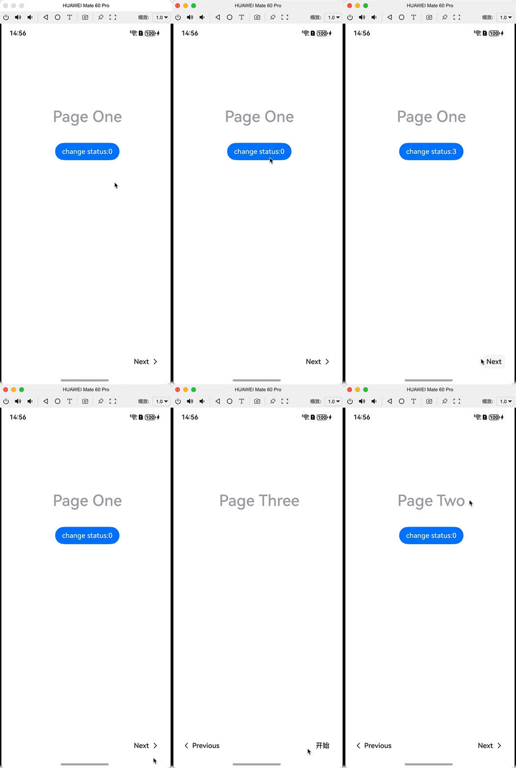
六、高级用法
6.1 双向绑定
从API Version 10开始,可以使用$$语法实现index的双向绑定:
@State stepperIndex: number = 0 Stepper({ index: $$this.stepperIndex }) { // StepperItems... }
6.2 动态步骤管理
可以通过状态变量动态控制Stepper的步骤内容和顺序:
@State steps: Array<{title: string, content: string}> = [ {title: "Step 1", content: "Content 1"}, {title: "Step 2", content: "Content 2"}, {title: "Step 3", content: "Content 3"} ] build() { Stepper() { ForEach(this.steps, (step) => { StepperItem() { Text(step.content) } .nextLabel("Next") }) } }
6.3 自定义步骤样式
通过@Styles和@Extend装饰器可以统一管理步骤页面的样式:
@Styles function stepContainer() { .width('100%') .height('100%') .padding(20) .backgroundColor(Color.White) } @Extend(Text) function stepTitle() { .fontSize(24) .fontWeight(FontWeight.Bold) .margin({ bottom: 20 }) } // 使用样式 StepperItem() { Column() { Text('Step Title') .stepTitle() // 其他内容... } .stepContainer() }
七、最佳实践
7.1 表单分步填写
Stepper非常适合多步骤表单场景:
@State formData = { personalInfo: {}, contactInfo: {}, preferences: {} } build() { Stepper() { // 个人信息步骤 StepperItem() { PersonalInfoForm( data: $$this.formData.personalInfo ) } // 联系信息步骤 StepperItem() { ContactInfoForm( data: $$this.formData.contactInfo ) } // 偏好设置步骤 StepperItem() { PreferencesForm( data: $$this.formData.preferences ) } } .onFinish(() => { // 提交所有表单数据 submitForm(this.formData); }) }
7.2 引导流程
对于新用户引导或教程流程,Stepper可以提供良好的用户体验:
@State currentTutorialStep = 0 build() { Stepper({ index: $$this.currentTutorialStep }) { // 欢迎步骤 StepperItem() { TutorialWelcome() } // 功能介绍步骤 StepperItem() { TutorialFeatures() } // 完成步骤 StepperItem() { TutorialComplete() } } .onFinish(() => { // 完成引导,进入主应用 navigateToMainApp(); }) }
7.3 复杂任务分解
将复杂任务分解为多个简单步骤:
@State setupState = { currentStep: 0, networkConfigured: false, accountLoggedIn: false, preferencesSet: false } build() { Stepper({ index: $$this.setupState.currentStep }) { // 网络设置步骤 StepperItem() { NetworkSetup( onComplete: () => { this.setupState.networkConfigured = true; this.setupState.currentStep++; } ) } .status(this.setupState.networkConfigured ? ItemState.Normal : ItemState.Disabled) // 账户登录步骤 StepperItem() { AccountLogin( onComplete: () => { this.setupState.accountLoggedIn = true; this.setupState.currentStep++; } ) } .status(this.setupState.accountLoggedIn ? ItemState.Normal : ItemState.Disabled) // 偏好设置步骤 StepperItem() { PreferenceSetup( onComplete: () => { this.setupState.preferencesSet = true; } ) } } }
八、常见问题与解决方案
8.1 步骤状态管理问题
问题:步骤状态在不同步骤间混乱
解决:为每个步骤维护独立的状态变量:
@State step1State = ItemState.Normal @State step2State = ItemState.Normal @State step3State = ItemState.Normal
8.2 动态步骤内容更新
问题:动态更新步骤内容后界面不刷新
解决:确保步骤数据使用@State装饰器:
@State steps: Array<StepData> = [...]
8.3 自定义样式冲突
问题:自定义样式与系统样式冲突
解决:使用明确的样式优先级和!important修饰符:
@Styles function customStepStyle() { .width('100%').height('100%').backgroundColor(Color.White) !important }
九、总结
Stepper组件是ArkUI框架中强大的导航工具,特别适合多步骤任务场景。通过合理使用其丰富的API和事件系统,开发者可以创建直观、用户友好的流程导向界面。关键点包括:
- 合理规划步骤结构和顺序
- 明确每个步骤的状态和转换条件
- 提供清晰的导航反馈
- 优化步骤间的数据传递和状态管理
随着ArkUI的持续发展,Stepper组件将会引入更多强大的功能,帮助开发者构建更出色的应用体验。
----
以上

讨论HarmonyOS开发技术,专注于API与组件、DevEco Studio、测试、元服务和应用上架分发等。
更多推荐



 10
10 0
0- 0


 已为社区贡献280条内容

所有评论(0)