鸿蒙基础组件 list
·
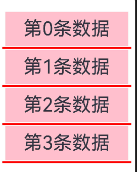
/**
 * list
 *  自带滚动效果
 *  只可以嵌套三种
 *      ListItem ListItemGroup  ComposeListItem
 *  ListItemGroup 组件内只可以嵌套 ListItem
 *  设置主轴方向
 *  .listDirection()
 *    Axis.Vertical
 *    Axis.Horizontal
 *
 */
@Entry
@Component
struct ListPage {
  @State message: string = 'Hello World';
  @State list: number[] = [0, 1, 2, 3, 4, 5, 6, 7, 8, 9, 10, 11]

  build() {
    Column() {
      List({space : 10}) {
        ForEach(this.list, (item: number, index: number) => {
          ListItem() {
            Row(){
              Text(`第${item}条数据`)
                .fontSize(50)
                .textAlign(TextAlign.Center)
                .height(90)
                .width('90%')
                .backgroundColor(Color.Pink)
            }.width('100%').justifyContent(FlexAlign.Center)

          }
        })
      }.width('100%').height(400)
      //设置主轴方向
      .listDirection(Axis.Vertical)
      //设置几列/行
      .lanes(1)
      //分割线
      .divider({
        strokeWidth : 5,
        color :Color.Red,
        startMargin:10,
        endMargin:10
      })
    }
    .height('100%')
    .width('100%')
  }
}
ListItemGroup 类似安卓的多条目
准备数据源的时候需要区别好
@State list: (number | number[])[] = [0, 1, [2, 1, 2, 3], 2, [1, 2, 3], 4, 5, 6, [7, 7, 2, 5, 1], 8, 9, 10, 11]
通过类型判断
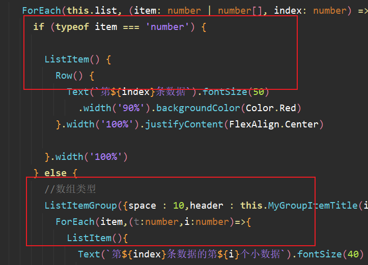
还可以添加吸顶 吸底部的效果
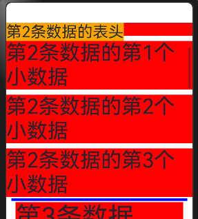
.sticky(StickyStyle.Header)
/**
 * list
 *  自带滚动效果
 *  只可以嵌套三种
 *      ListItem ListItemGroup  ComposeListItem
 *  ListItemGroup 组件内只可以嵌套 ListItem
 *  设置主轴方向
 *  .listDirection()
 *    Axis.Vertical
 *    Axis.Horizontal
 *
 */
@Entry
@Component
struct ListPage {
  @State list: (number | number[])[] = [0, 1, [2, 1, 2, 3], 2, [1, 2, 3], 4, 5, 6, [7, 7, 2, 5, 1], 8, 9, 10, 11]

  //Group 的表头
  @Builder MyGroupItemTitle(index : number){
    Row(){
      Text(`第${index}条数据的表头`).fontSize(30).backgroundColor(Color.Orange)
    }
  }

  build() {
    Column() {
      List({ space: 10 }) {
        ForEach(this.list, (item: number | number[], index: number) => {
          if (typeof item === 'number') {

            ListItem() {
              Row() {
                Text(`第${index}条数据`).fontSize(50)
                  .width('90%').backgroundColor(Color.Red)
              }.width('100%').justifyContent(FlexAlign.Center)

            }.width('100%')
          } else {
            //数组类型
            ListItemGroup({space : 10,header : this.MyGroupItemTitle(index)}){
              ForEach(item,(t:number,i:number)=>{
                ListItem(){
                  Text(`第${index}条数据的第${i}个小数据`).fontSize(40)
                    .width('100%').backgroundColor(Color.Red)
                }
              })
            }

          }

        })
      }
      .width('100%')
      .height(400)
      //设置主轴方向
      .listDirection(Axis.Vertical)
      //设置几列/行
      .lanes(1)
      //分割线
      .divider({
        strokeWidth: 5,
        color: Color.Blue,
        startMargin: 10,
        endMargin: 10
      })
      .sticky(StickyStyle.Header)
    }
    .height('100%')
    .width('100%')
  }
}
ListItem 提供了一个圆角居中的卡片效果
ListItem({
  style :ListItemStyle.CARD
})
滑动按钮 侧滑选项
.swipeAction({
  start:this.SwipeView(),
  end:this.SwipeView(),
  edgeEffect:SwipeEdgeEffect.Spring,//None
  onOffsetChange:(offset)=>{ //滑动偏移量
  }
})
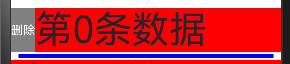
.swipeAction({
              start: this.SwipeView(),
              end: {
                builder: this.SwipeView(),
                actionAreaDistance: 100, //滑动超过距离就会触发
                onAction: () => {

                },
                onEnterActionArea:()=>{
                  // 进入区域触发
                  const i=this.list.findIndex(i => i===item)
                  this.list.splice(i,1)
                },
                onStateChange:(state)=>{
                  //三种状态 隐藏  展开  进入超长距离区
                }
              },
              edgeEffect: SwipeEdgeEffect.Spring, //None
              onOffsetChange: (offset) => { //滑动偏移量
              }
            })
onAction 需要抬手才会触发
官方添加动画
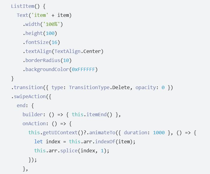
因为官方给的就是单项  所以想让所有的都展开
华为开发者问答 | 华为开发者联盟  可以参考


//设置子组件的布局情况
.alignListItem(ListItemAlign.Center)
事件:
onScrollIndex 可以拿到start end center 三个索引 开始滑动的索引 结束的索引 和当前位于中间的索引
//到顶
.onReachStart(()=>{})
//到底
.onReachEnd(()=>{})
list 控制器
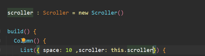
滑动到指定索引
this.scroller.scrollToIndex(0)
其他的方法类似scroll 的
第二种控制器
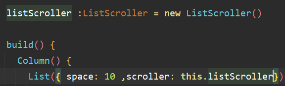
Button('指定项的项').onClick(() => {
  /**
   * index
   * indexInGroup  组内下标
   * smooth   是否平滑
   * align  哪个位置  在整个屏幕的位置
   */
  this.listScroller.scrollToItemInGroup(2, 1, true, ScrollAlign.START)
})
Button('获取指定索引的位置信息').onClick(() => {
  /**
   *获取的位置是 相对于整个list的左上角开始算的
   */
  this.listScroller.getItemRectInGroup(2,0)
  this.listScroller.getItemRect(2)
})
Button('获取指定位置信息的索引').onClick(() => {
  /**
   *获取到的有可能包括group
   */
  this.listScroller.getVisibleListContentInfo(20,20)
})

讨论HarmonyOS开发技术,专注于API与组件、DevEco Studio、测试、元服务和应用上架分发等。
更多推荐

 5
5 0
0- 0


 已为社区贡献19条内容

所有评论(0)